10,000 search results
(0.027 seconds)
- Moneta by Monotype,
$35.99 Moneta is an elegant transitional serif with high contrast. Its morphology is based on the study of traditional broad-edge pen script. It comes in 4 different weights (Light, Regular, Bold and Black) and has variable features. Designed by Santi Rey and launched on January 2020.
 - Houschka Rounded by G-Type,
$72.00 Houschka Rounded is the companion family to Houschka Pro, featuring CE, Baltic, Turkish & Cyrillic language support plus small caps, stylistic sets, contextual alternates, ligatures and 4 sets of numerals. Houschka Rounded may be a softer & cuter sans serif than her big sister but she's equally versatile.
 - ITC Golden Type by ITC,
$29.99 Canadian designer Anthony De Meester created the font in 1989. Vienna Extended is a light, elegant sans serif. Simplicity is the hallmark of Vienna and it can be used most effectively where a look of regal elegance is desired. Vienna is a trademark of International Typeface Corporation.
 - Berfilem by Deeezy,
$14.00 Trendy, elegant, artistic, luxury & modern style serif font for your fancy projects. Elegant, fashion and editorial style on Berfilem font will be great for any branding project. Lot of alternates and ligatures will help you to create unique and original logo design or website header! Enjoy :)
 - Poster Moderne JNL by Jeff Levine,
$29.00 In the 1960 edition of Sam Welo’s “Studio Handbook – Letter and Design for Artists and Advertisers” is a stylized, condensed slab serif alphabet he referred to as “Poster Slab”. This has been digitally redrawn as Poster Moderne JNL, and is available in both regular and oblique versions.
 - Jahilliah by Canden Meutuah,
$15.00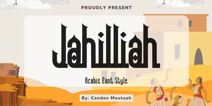 this is a simple and elegant serif font full of modern style. This font is very suitable for you to use for many purposes such as branding, logos, wedding designs, social media posts, advertising, product packaging, product design, labels, photography, watermarks, invitations, stationery, and any project.
 - Oleragie by Hishand Studio,
$15.00 Introducing Oleragie, a classic modern serif with an aesthetic look inspired by the Egyptian and middle east atmosphere. Perfect for those who need a touch of elegance, stylish, classy, beautifully thin, and modernity for their design. Complete with ligatures alternates regular italic icon kerning multilingual support
 - Autoprom Pro by Stefan Stoychev,
$29.88 AutopromPro is a modern sans serif display font with a geometric touch contains 24 styles. It comes in 6 weights and its matching rounded and italics. The Thin weight and Black Rounded Italic is a free of charge, so you can use them to your projects.
 - Marbellya by Namara Creative Studio,
$5.00 Marbellya an Condensed Sans Serif Font with luxurious style. Available in 6 styles : Regular, Italic, Outline, Bold, Bold Italic and Bold Outline. Included alternates, ligatures and multilingual support. It's perfect for headlines, logos, quotes, packaging, magazine covers, editorial design, and many more project with suitable purpose!
 - Zimric by Ingrimayne Type,
$5.00 Zimric is a family with 28 styles. It has the look of neat hand printing. It is monoline and sans-serif, friendly and legible. The Zimric family has three widths, each width has four or five weights, and each weight comes in both upright and italic styles.
 - Destrod by Tanya Savchenko,
$11.00 Destrod is a modern techno sans serif font. Its futuristic and minimalist style makes it incredibly suitable for all your projects that need a sci-fi touch. Uppercase letters with alternate characters in lower case. Included: Latin base and extended. Cyrillic base and extended. Multilingual support.
 - Moondays by Greentrik6789,
$18.00 Moondays Font is a unique and contemporary serif font that adds a distinctive aesthetic to your design projects. This versatile display font is perfect for creating eye-catching headlines, titles, and logos. Discover the beauty of Moondays Font and elevate your designs to the next level.
 - Concord by Soneri Type,
$39.00 Yet another typeface with simplicity as its core element. Concord is derived from a successful type family ‘Accord Alternate’ with an added geometric touch. Concord is a geometric sans serif. It has large counters which enhance readability. It is available in seven different weights for emphasis.
 - Show Card Elite JNL by Jeff Levine,
$29.00 One example in the 1919 instructional book “One Hundred Alphabets for the Show Card Writer” was for an elegant sans serif with a subtle Art Nouveau style to the letter forms. This is now available digitally as Show Card Elite JNL in both regular and oblique versions.
 - Zeo xay by Saxofont,
$25.00 Zeo Xay is bold and elegant serif font. Simple and easy to use, this font will be very beautiful if you mix it with your various craft designs. This font is PUA encoded which means you can access all of the glyphs and swashes with ease!
 - Gacor by Din Studio,
$29.00 Gacor is urban sans serif font. Made for any professional project branding. It is the best for branding, printing, and quotes. Every letter has a unique and beautiful touch. Features: PUA Encoded Multilingual Support Numerals and Punctuation Thank you for downloading premium fonts from Din Studio
 - RBNo2.1 by René Bieder,
$25.00 RBNo2.1 is a condensed sans serif typeface with a technical and geometric appearance. The family includes 2 versions (RBNo2.1a and RBNo2.1b) and has 7 weights with matching italics. RBNo2.1 feels comfortable in technical surroundings with short text passages, in brochures, catalogs, magazines, posters, websites headlines and logos.
 - Geographica by Three Islands Press,
$29.00 Thomas Jefferys (ca. 1710–1771) was the best-known map maker in 18th-century England, chiefly because he won (and hyped) the title “Geographer to King George III.” Jefferys was really more an engraver/publisher than a geographer, since he mostly relied on the cartographic materials of others. Still, his maps of the North American colonies were well known. Geographica is a legible, four-style serif family modeled after the neat hand-lettered place names and peripheral text on Jefferys’s maps. With its long serifs, tall x-height, and robust curves, Geographica somehow combines classic elegance with a whiff of coastline and sea. The italic styles have the slant and warmth of the hand-drawn source materials. And the typeface comes with a slew of distinctive map-based ornaments—including compass wheels and sailing ships. This evocative serif works well in both display situations and long blocks of text, whether on paper or screen. OpenType features include small capitals, numerous ligatures, and two stylistic sets of titling caps. Geographica offers full support for Central and Eastern European languages—more than 1,200 glyphs in all.
 - Akoya by Cocodesign,
$10.00 Akoya hand-drawn serif font , including Regular. This font is casual and beautiful with swash. Can be used for various purposes. such as logos, product packaging, wedding invitations, branding, headlines, signage, labels, signatures, book covers, posters, quotes, and more. the Akoya Serif includes a change in the OpenType language style, binding and international support for most Western languages. To activate the OpenType Stylistic alternative, you need a program that supports OpenType features such as Adobe Illustrator CS, Adobe Indesign & CorelDraw X6-X7, Microsoft Word 2010 or newer versions. How to access all alternative characters using Adobe Illustrator: https://www.youtube.com/watch?v=XzwjMkbB-wQ the Akoya Serif is coded with PUA Unicode, which allows full access to all additional characters without having to design special software. Mac users can use the Font Book, and Windows users can use Character Map to view and copy one of the additional characters to insert into your favorite text editor / application. How to access all alternative characters, using Windows Character Map with Photoshop: https://www.youtube.com/watch?v=Go9vacoYmBw If you need help or have questions, please let me know. I am happy to help :) Thank you & Congratulations on Designing!
 - The Fright House by IKIIKOWRK,
$17.00 Proudly Present The Fright House - Classic Horror Type, created by ikiiko. Inspired by classic horror movie posters, The Fright House, with its retro appeal and traditional serif styling, revives the spirit of horror from the 1970s. The nostalgia and appeal of a past of dread is captured by this typeface, which pays homage to the typefaces that covered horror novels, movie posters, and spooky magazines during that time. The Fright House is a classic elongated condensed serif typeface with a timeless elegance inspired by 1970s fonts. With a precisely defined serif that gives it a sharp and unsettling feel. Each character has graceful contours and precise proportions, seamlessly blending vintage design with the thrilling charm of suspense. This typeface is perfect for an vintage poster, movie title, classic stuff, magazine layout, book cover, and also good for quotes, or simply as a stylish text overlay to any background image. What's included? Uppercase & Lowercase Number & Punctuation Ligature (Bonus) Multilingual Support Works on PC & Mac Get also a good offer & FREEBIE at our site : www.ikiiko.com Enjoy our font and if you have any questions, you can contact us by email : ikiikowrk@gmail.com
 - Raiken by Artisticandunique,
$9.00 Raiken - Serif font family - 8 Styles - Multilingual supports Raiken is a stylistic and powerful serif font family with different alternative type designs. You will have the opportunity to enrich the content of your projects with alternative characters. This font comes with multi-language support and 8 styles. It has an elegant structure that can be effective in the development of your projects. According to the purpose of use in typographic compositions that you will create with the aesthetic structure of alternative characters; You can enrich your titles in books or magazines, and your logos in branding. You can take advantage of the elegant structure of standard characters in your plain texts. It provides flexibility in all your projects with the alternatives it offers you with its multi-language option, 8 styles and 441 glyphs. Especially for editorials, magazines, books, branding, logo design, web design, headlines, movie titles etc. If you are looking for a font with stylistic alternatives, Raiken serif font can meet your needs. With this font you can create your unique designs. If you have a question, please contact me. Have a good time.
 - ITC Quay Sans by ITC,
$41.99 London-based designer David Quay designed ITC Quay Sans in 1990. One of the precursors to the long run of functionalist European sans serif faces that has been a dominating force in type design since the 1990s, ITC Quay sans is based on the proportions of 19th Century Grotesk faces. Grotesk, the German word for sans serif, defines an entire branch of the sans serif movement, which culminated in the 1950s with the design of Helvetica. ITC Quay Sans is made up of very simple, legible letters. The weights of the strokes throughout the alphabet vary very little. Microscopic flares on the ends of each terminal add a bit of dimension to the design. This helps prevent the onset of the monotony, a danger when one repeats countless near mono-weight stroked letters throughout a large body of text. ITC Quay Sans is a very readable face; it works equally well in all sizes. Six fonts of the ITC Quay Sans typeface are available: Book, Book Italic, Medium, Medium Italic, Black, and Black Italic. ITC Quay Sans is similar to Hans Eduard Meier's Syntax, and Tim Ahrens' Linotype Aroma."
 - Respace by Dora Typefoundry,
$17.00 Respace - is a strong neoclassical serif font family with high contrast, cool, unique style and appearance with alternative fonts, Ligature and multilingual support. This font idea has a variety of references, from vintage to classic to the modern era, making it the perfect typeface for an understated, modern, and sophisticated look. all forms of beautiful and luxurious binders are suitable for brands and designs. The multitude of options for changing styles and ligatures make this Respace serif font incredibly versatile for your branding, magazine design, logo design, headlines, posters, packaging, cards, or wedding invitations. Space includes two styles (Standard / Bold) which each include 245 glyphs. OpenType features include 59 collection ligatures and a small number of character variants, and multilingual support (including multiple currency symbols). Features: • 2 Font weight • Uppercase & Lowercase • Alternative & Ligature Styles • Numbers & Punctuation • Characters with accents • Supports Multiple Languages This type of family has been the work of real love, making it as easy and enjoyable as possible. I really hope you enjoy it! I can't wait to see what you do with Respace! Feel free to use the #Dora Typefoundry tag and the # Respace Serif font to show what you've been up to!
 - Dilemma by Sudtipos,
$39.00 Dilemma is a sans/sans serif type system with 42 styles; it is inspired by the anonymous Polyphème, Cyclopéen and Extra Condensé designs from the early 1900s at the Peignot Fonderie. From these initial points of reference, Sudtipos went further and reimagined these projects for an actual use by blending them into a unique and complex type system. Dilemma is defined as ‘a situation in which a difficult choice has to be made between two or more alternatives, especially ones that are equally undesirable’ and that is exactly how we designed this font. We created a workhorse system where each style functioned well alone but would be more powerful when working as a team, pairing the sans styles with the serifs. Dilemma comes in 3 different widths and 7 weights in both the sans and the serif, ranging from the more economical yet legible condensed styles, to the opulent bold and expanded weights. Dilemma also contains 2 Variable Fonts. We imagine Dilemma being used in a limitless array of graphic projects including identity systems, digital platforms, public spaces, editorial design and beyond. Now the Dilemma is yours.
 - Speakeasy by Sudtipos,
$79.00 Speakeasy is a 5-font combo thematically built as a toolset for designing menus and liquor labels as well as coffees, restaurants and signs when the desire is to communicate with style. Originally put together to be used by the most famous speakeasy in Buenos Aires, this set contains a script, a minor (almost flat) wedge serif, a flare serif, a sans serif, and a bold Didone. The seed for the script was found in a German lettering book, and the other fonts reflect the familiar advertising and announcement styles of the early 20th century. The Speakeasy script comes with two different ways to connect the letterforms. Also included are many alternates, swashes, endings and flourishes — all accessible via OpenType features or glyph palettes. Speakeasy Modern and Speakeasy Flare are small cap fonts, and come with a few alternates. Speakeasy Sans and Speakeasy Gothic come with full sets of majuscules and minuscules, but contain small caps and a few alternates as well. A few rules and ornaments are also sprinkled throughout the set. This combination of fonts worked wonderfully for the project that called for it. Hopefully it will work just as well for your project.
 - Aminah by Shakira Studio,
$19.00 Start good day for new font! present to you, Aminah! Aminah is a retro serif font that brings a classic and charming vintage touch to your designs. This font combines elegant serif elements with a stylish retro feel, creating a unique and eye-catching combination. Aminah is suitable for use in a variety of retro design projects, such as posters, greeting cards, logo designs, and brand displays that want to convey a vintage, classic yet modern feel. With Aminah, you'll have an elegant, stylish, and full of character retro serif font with a large selection of ligatures to bring that special touch to each of your designs. This font will be the perfect choice for designers who want to explore design inspiration from the classic retro era but still trendy. What did you get? Unique letterforms Works on PC & Mac Simple Installations Accessible in the Adobe Illustrator, Adobe Photoshop, Microsoft Word even work on Canva! PUA Encoded Characters Fully accessible without additional design software. I really hope you'll get pleasure using Aminah font and it will be perfect addition to your font collection! If you have some questions, please write me a letter! Shakira Studio
 - Alkes by Fontfabric,
$35.00Features: Over 1200 gyphs in 14 styles; True form of italics; Humanist character and proportions; Extended Latin, Extended Cyrillic & Greek scripts; For more than 130 languages Moderate contrast; Perfect for text, headlines and web; Coverage of many OpenType features Ligatures, Small Caps, Case sensitive forms, OldStyle figures, Tabular figures, Fractions Named after a star and inspired by the cosmos, Alkes traveled a long way from a graduation project to a published multiscript serif type family. Designed with the intention of harmonising between three scripts - Latin, Cyrillic and Greek, the contemporary, yet well defined humanist serif combines the best out of the digital and analog worlds. Featuring a generous x-height, wide letter spacing, large open counters and angled stress contrast, Alkes is highly effective for editorials and publishing, where long texts and legibility are the key forces. Its attractive details, calligraphic structure and asymmetrical serifs shine through in the larger sizes and make Alkes suitable for headlines. Alkes has a pull with editorial designers, graphic designers and publishers who aim for a clear structure, hierarchy and coherent non-Latin scripts for both print and on-screen environments, in order to achieve otherworldly designs - FHA Eccentric French by The Fontry,
$25.00 The curves are vintage and the serifs are big. They're so big that for years I never had the courage to tackle this intimidating font. But when fellow signmaker Frank Smith laid the groundwork for this intriguing typeface by Frank H. Atkinson, I couldn't pass on the opportunity to take it from paper to keyboard. After all, at over 100 years old, I felt this alphabet had never been given a proper, digital treatment. So how did this face survive the last century? Well, for those who don't know the history, it survived in Atkinson's ubiquitous book, Sign Painting, published first in 1908, the generational standard for anyone interested in sign-related type design. The layouts and lettering treatments in this book have influenced countless designers for more than a hundred years, but most haunting to me was this strange face with the big serifs. Well, I'm haunted no more. The work is done, the kerning is complete, and nothing but a mouse-click separates a very old idea from the modern world. It's wide, it's big, and with those crazy serifs, it is definitely eccentric-!!!
 - Renois by Craft Supply Co,
$20.00 Introducing Renois – Display Sans Serif Powerful Impact, Bold and Condensed Renois – Display Sans Serif is more than just a font; it’s a meticulously designed tool for achieving a commanding presence in a variety of display applications. Command Attention Instantly Furthermore, Renois is purpose-built to command attention instantly. Its bold and condensed design ensures that your message takes center stage and captures the viewer’s gaze right away, making it perfect for headlines and displays that demand immediate attention. Clarity in Boldness Remarkably, despite its boldness, Renois prioritizes clarity. Each character is thoughtfully crafted for optimal readability, guaranteeing that your message is not only impactful but also effectively communicated, even at larger sizes. Versatile for Diverse Displays Moreover, Renois’s versatility shines in various display applications, whether it’s for posters, banners, or promotional materials. This typeface seamlessly adapts to your design needs, making a bold and impactful statement in any context. In Conclusion In summary, Renois – Display Sans Serif is the font of choice when you need to make a powerful and clear statement in your displays. Elevate your designs with Renois, ensuring your message rises above the noise, leaving an indelible and memorable impact on your audience.
 - Logistra by Riasyletter_Studio,
$19.00 Make the typography logo on your brand more elegant and professional by using the Logistra font, The Logistra font is a serif font that has thick and thin strokes that contrast in the glyphs and is made with a straight line structure and smooth curves so that the Logistra font looks professional and elegant, and there are alternative letters and ligatures to make your typography design look unique and attractive. Logistra font is also perfect for various projects such as hand lettering, merchandise, advertisements, invitations, social media posts, video thumbnails, quotes and etc. What's Included : - Logistra (otf/ttf/woff) - More than 280 of glyphs (include Uppercase, Lowercase, Numerals & Punctuations,Ligatures and Stylistic) - multilingual support - Works on PC & Mac - Simple installations - Accessible in the Adobe Illustrator, Adobe Photoshop, Adobe InDesign, even work on Microsoft Word. - PUA Encoded Characters (fully accessible without additional design software) Support For Language : Albanian, Basque, Breton, Chamorro, Danish, Dutch, English, Finnish, French, Frisian, Galician, German, Italian, Malagasy, Norwegian, Portuguese, Spanish, Alsatian, Aragonese, Arapaho, Arrernte, Asturian, Aymara, Bislama, Cebuano, Corsican, Fijian, French_creole, Genoese, Gilbertese, Greenlandic, Haitian_creole, Hiligaynon, Hmong, Hopi, Ibanag, Iloko_ilokano, Indonesian, Interglossa_glosa, Interlingua, Irish_gaelic, Jerriais, Lojban, Lombard, Luxembourgeois, Manx, Mohawk, Norfolk_pitcairnese, Occitan, Oromo, Pangasinan, Papiamento, Piedmontese, Potawatomi, Rhaeto-romance, Romansh, Rotokas, Sami_lule, Samoan, Sardinian, Scots_gaelic, Seychelles_creole, Shona, Sicilian, Somali, Southern_ndebele, Swahili, Swati_swazi, Tagalog_filipino_pilipino, Tetum, Tok_pisin, Uyghur_latinized, Volapuk, Walloon, Warlpiri, Xhosa, Yapese, Zulu, Latinbasic, Ubasic, Demo
 - Carl Gauss by Mans Greback,
$59.00 Carl Gauss is a modern sans-serif font that combines geometric precision with the beauty of neo-classic design. Its clean lines and sleek appearance make it an excellent choice for logotypes, branding, and other projects that require a crisp, contemporary touch. The font's distinct elegance and attention to detail make it an attractive choice for a wide range of applications, from digital to print. Carl Gauss is designed to bring clarity and sophistication to your projects while maintaining a sense of warmth and approachability. The Carl Gauss font family includes eight high-quality styles to suit various design needs: Regular: A balanced, versatile style for everyday use Italic: Adds a touch of movement and expressiveness to the regular style Bold: A stronger, more assertive version for impactful designs Bold Italic: Combines the boldness of bold with the energy of italic Caps: An all-caps variant of the regular style for a more commanding presence The font is built with advanced OpenType functionality and has a guaranteed top-notch quality, containing stylistic and contextual alternates, ligatures and more features; all to give you full control and customizability. It has extensive lingual support, covering all Latin-based languages, from Northern Europe to South Africa, from America to South-East Asia. It contains all characters and symbols you'll ever need, including all punctuation and numbers.
 - Qualion Text by ROHH,
$39.00 Qualion Text™ is a modern geometric sans serif typeface with humanist and calligraphic inspirations. It is a text family designed for excellent legibility. Qualion Text™ is a sibling of Qualion™ & Qualion Round™, geometric family with lots of swashes and ornaments. Letter shapes and proportions has been adjusted to fit paragraph text and small sizes: - typeface is narrower now in order to fit more text in the design space - larger stroke contrast - pronounced ink traps and tapering - elegant true italics made even more calligraphic - adjusted spacing and kerning - adjusted font weights The main purpose of the family is clean and legible paragraph text, however it is very attractive choice for branding, headlines and display use, too. The italic styles as well as thin, bold and black upright styles have very strong character and look great in display sizes. Italics are very fluent, calligraphic, subtle and elegant, from the other side bold and black uprigths are very modern, powerful and unique thanks to the pronounced ink traps. Qualion Text™ family consists of 20 styles - 10 weights with corresponding true italics. Both have extended language support, as well as broad number of OpenType features, such as small caps, case sensitive forms, standard and discretionary ligatures, swashes, stylistic sets, contextual alternates, lining, oldstyle, tabular and small cap figures, slashed zero, fractions, superscript and subscript, ordinals, currencies and symbols.
 - Yorkten Slab by insigne,
$- The Yorkten family of fonts is back with another satisfying addition to its clean style. The rhythmic, new Yorkten Slab expands Yorkten’s basic, contemporary form of geometric and simple lines and adds a level of self-confidence and elegance to your work. Slab's basic structure is compact. It’s more condensed than most slabs, so you can save space yet still have clear, consistent readability. The added serifs create a fresh text color, too, that syncs well with the new font’s inherited features. Like its predecessor, Yorkten Slab offers its natural, simple structure with more than fifty fonts in the family and three different widths - extended, normal or condensed. Each group has eight weights from a lean thin to tough looking black, giving Yorkten Slab plenty of bragging rights among its peers. And like Yorkten, too, Yorkten Slab’s greatest value is the ability of its members to work easily and well together and with a variety of other fonts. Yorkten Slab ensures that you have the necessary tools for any challenge. In combination with its superior functionality and excellent readability, this versatile font can be effectively used for many print and screen operations: e-books, applications, headlines, banners, posters and websites to name a few options. Don’t wait any longer. Start tapping the possibilities that Yorkten Slab offers your work.
 - Novin by Naghi Naghachian,
$85.00 Novin Font family is designed by Naghi Naghashian. This Font is developed on the basis of specific research and analysis on Arabic characters and definition of their structure. This innovation is a contribution to modernisation of Arabic typography, gives the font design of Arabic letters real typographic arrangement and provides more typographic flexibility. This step was necessary after more than two hundred years of relative stagnation in Arabic font design. Novin supports Arabic, Persian, and Urdu. It also includes proportional and tabular numerals for the supported languages. Novin Font is available in Light, Regular and Bold. Novin design fulfills the following needs: A Explicitly crafted for use in electronic media fulfills the demands of electronic communication. Novin is based on Aldo Novareses Eurostile Extended. B Suitability for multiple applications. Gives the widest potential acceptability. C Extreme legibility not only in small sizes, but also when the type is filtered or skewed, e.g., in Photoshop or Illustrator. Novin’s simplified forms may be artificial obliqued in InDesign or Illustrator, without any loss in quality for the effected text. D An attractive typographic image. Novin was developed for multiple languages and writing conventions. E The highest degree of geometric clarity and the necessary amount of calligraphic references. This typeface offers a fine balance between calligraphic tradition and the contemporary sans serif aesthetic now common in Latin typography.
 - Belugia by Riasyletter_Studio,
$19.00 Make the typography logo on your brand more elegant and professional by using the Belugia font, Belugia font is a serif font that has thick and thin strokes that contrast in the glyphs and is made with a straight line structure and smooth curves so that the Belugia font looks professional and elegant, and there are alternative letters and ligatures to make your typography design look unique and attractive. Belugia font is also perfect for various projects such as hand lettering, merchandise, advertisements, invitations, social media posts, video thumbnails, quotes and etc. What's Included : - More than 310 of glyphs (include Uppercase, Lowercase, Numerals & Punctuations, Ligatures and Stylistic) - multilingual support - Works on PC & Mac - Simple installations - Accessible in the Adobe Illustrator, Adobe Photoshop, Adobe InDesign, even work on Microsoft Word. - PUA Encoded Characters (fully accessible without additional design software) Support For Language : Albanian, Basque, Breton, Chamorro, Danish, Dutch, English, Finnish, French, Frisian, Galician, German, Italian, Malagasy, Norwegian, Portuguese, Spanish, Alsatian, Aragonese, Arapaho, Arrernte, Asturian, Aymara, Bislama, Cebuano, Corsican, Fijian, French_creole, Genoese, Gilbertese, Greenlandic, Haitian_creole, Hiligaynon, Hmong, Hopi, Ibanag, Iloko_ilokano, Indonesian, Interglossa_glosa, Interlingua, Irish_gaelic, Jerriais, Lojban, Lombard, Luxembourgeois, Manx, Mohawk, Norfolk_pitcairnese, Occitan, Oromo, Pangasinan, Papiamento, Piedmontese, Potawatomi, Rhaeto-romance, Romansh, Rotokas, Sami_lule, Samoan, Sardinian, Scots_gaelic, Seychelles_creole, Shona, Sicilian, Somali, Southern_ndebele, Swahili, Swati_swazi, Tagalog_filipino_pilipino, Tetum, Tok_pisin, Uyghur_latinized, Volapuk, Walloon, Warlpiri, Xhosa, Yapese, Zulu, Latinbasic, Ubasic, Demo
 - RRollie by Eurotypo,
$38.00 RRollie is a typeface family inspired on the proportions of the Roman capital in the Augusto's age, some of them can be seen in inscriptions of Pompeii; in this particular case, it has taken an inscription from a tomb of the year 15 AD. The subtlety of the serif is hardly insinuates, helping to strut the terminals of the stems. Ascenders and descenders are very short. The thickness variation is presented quite delicate, highlighting the light-dark passage and even the agile counterblocks of the typeface. These fonts can be used in many kind of graphic works by its strong personality, visual impact and readability. This font family include OpenType features: Standard and discretionary ligatures, small caps, case sensitive from, old style figures, tabular, diacritics for western languages and many others. Roberto Rollie (1935-2003) was an outstanding professional of Graphic Design, Photography and Visual Artist. He was involved in the creation of the career of Visual Communication Design at the Faculty of Fine Arts (National University of La Plata, Argentina), in the late '60s; he was a pioneer and great teacher too, who loved the Roman Capitals for its subtle and balanced design, especially for high readability and clever design. Those who, like me, knew him as a person and teacher, we are deeply grateful for having received their warmth and enthusiasm for graphic design.
 - Akagi Pro by Positype,
$29.00 Akagi Pro is a complete rebuild and expansion of my popular Akagi typeface. Contemporary, clean, simple and friendly continue to serve as the adjectives for an expansion that includes 250+ additional characters per weight, many new ligature options, expanded stylistic alternates, 4 sets of figures, new symbols, case-sensitive punctuation, superscripts, subscripts, ordinals, expanded language support and two new styles that provide even more flexibility within the lighter weights of the family. When I designed Akagi in 2007, I wanted this new sans serif to "smile" at you — with this new expansion, I hope you smile back. Akagi Pro is economical while keeping a distinctive, expressive personality on the page that distinguishes it from among many of the mechanical/rigid/emotionless sans out there without becoming cliché. Perfect for the page and the screen, the flexible weights available allow for pinpoint selection at whatever size. Each style of Akagi Pro has a robust character set made even more functional with expansive OpenType features. A typesetter's dream — case-sensitive punctuation, tabular and proportional variants of lining and oldstyle numerals, true italics, small caps, expansive language support, an alternate 'g' and 'y', highlight a wealth of features of the typeface. This versatility infused within Akagi Pro will allow it to assume both roles of the utilitarian workhorse and light-hearted go-to typeface — and make the user happy.
 - Farao by Storm Type Foundry,
$21.00Originally designed in 1998 as a 3-font family, updated in 2016 by new italics, small caps and many OpenType functions, resulting in a set of highly visible poster typefaces. If a text is set in a good Egyptienne, we can observe a kind of sparkle in the lines. Slab-serifs are cheerful typefaces, possibly due to the fact that they developed simultaneously with Grotesque typefaces. The design principle originating from the first half of the 19th century does not have such firm and long-established roots as for example, the Venetian Roman typefaces, hence it’s much more prone to a “decline”. We know of Egyptiennes with uneven color, with letters falling backwards (this often happens in the case of “S”), and especially with slightly bizarre modeling of details. In the course of time, however, it was realized that such things could be quite pleasant and tempting. After a century and a half, we find that such Egyptiennes could refresh uniform computer typography. The forms of many twisted letters resemble the gestures of a juggler: others, rectangularly static ones, reflect the profile of a rail or a steel girder – things which, in their times, were new and were observed by the first creators of Egyptiennes. These typefaces are ideal for circus posters and programs for theatre performances, just as for printing on cement sacks. - TG Riota Gothic by Tegami Type,
$35.00 TG Riota Gothic is a brand new digital sans serif typeface in geometric style with many faces and possibilities with good proportions forms. TG Riota Gothic is outstanding for use in small text or even bigger sizes with seven weights, two axes & 14 styles, including the variable font. It comes with three alternative groups (single story alternates, no tail alternates & square dot alternates), which you can combine to maximize your needs—also supplied with a bunch of ligatures (standard & discretionary ligatures), lining figures (proportional, denominators, numerators, fractions, subscript & superscript), case-sensitive forms, symbol & Each typeface contains over 674 glyphs covered more than 90 languages Latin based. Language Supports: Afrikaans, Albanian, Asu, Azerbaijani, Basque, Bemba, Bena, Bosnian, Catalan, Chiga, Colognian, Cornish, Croatian, Czech, Danish, Dutch, Embu, English, Estonian, Faroese, Filipino, Finnish, French, Friulian, Galician, German, Gusii, Hungarian, Icelandic, Indonesian, Irish, Italian, Kabuverdianu, Kalaallisut, Kalenjin, Kamba, Kikuyu, Kinyarwanda, Latvian, Lithuanian, Low German, Lower Sorbian, Luo, Luxembourgish, Luyia, Machame, Makhuwa-Meetto, Makonde, Malagasy, Malay, Maltese, Manx, Meru, Morisyen, North Ndebele, Norwegian Bokmål, Norwegian Nynorsk, Nyankole, Oromo, Polish, Portuguese, Romanian, Romansh, Rombo, Rundi, Rwa, Samburu, Sango, Sangu, Scottish Gaelic, Sena, Shambala, Shona, Slovak, Slovenian, Soga, Somali, Spanish, Swahili, Swedish, Swiss-German, Taita, Teso, Thai, Turkish, Turkmen, Upper Sorbian, Vunjo, Walser, Welsh, Western Frisian, Zulu. Typeface Designed by Iqbal Firdaus Published by Tegamitype® Foundry Presentation Design by Eunike Agatha & Dennise Nathalie
 - Eclectic Two by Altered Ego,
$45.00STF Eclectic Two contains more of the useful and the sublime. Alarm clock time icons and many characters which connect add extra usefulness to this dingbat font. Stuff you'll need someday for a graphic element, bullet or dingbat application. Perfect for website icons! The Eclectic family is legendary, with a cult-like following among the inititated. With over 100 characters in the complete set, you'll find yourself using Eclectic Two almost daily to add spice to your otherwise san-serif typographic existence. This font is essentially a soap opera of typographic image elements, created for projects when I couldn't find the "thingbat" I needed. Almost more of a collection of illustrations, there are many characters which connect to form patterns, and of course it's like a "small neutral European country" army knife for the creative community. EcTwo features an complete architecturally-inspired alphabet, more of those smiley face variations, the eight ball, alarm clocks for the hours, the bouncing ball (with connecting dotted lines!), the paper airplane (flying and crashed!), the work dog, the chainsaw, Dorothy's slippers, the sideways arrows again, a handicapped symbol, chicken feet tracks, male/female symbols, gears, polynesian-inspired ornaments for patterns, a lighthouse, a torch, and more. Sounds twisted, eh? Make your own juxtapositionsof characters for funky borders. Available in Mac and PC formats. License it today!