10,000 search results
(0.04 seconds)
- Vinicius by Jehoo Creative,
$19.00 Introducing the Vinicius font, a gorgeous typeface that combines the timeless allure of gothic typefaces with a contemporary twist. Inspired by the rich heritage of medieval calligraphy, Vinicius offers beautiful forms that attract attention and inspire courage. Vinicius offers a range of Stylistic Alternate, allowing you to explore artistic possibilities and customize your typography creations. One of Vinicius' standout features is his striking collection of ligatures. These skillfully crafted letter combinations enhance the flow and coherence of your text, giving it a harmonious and seamless appearance. Whether you're crafting a headline, invitation or logo, Vinicius ligatures add a signature touch that sets your design apart. Italic variants add a touch of dynamism and flair to your text, allowing you to emphasize specific words, phrases or paragraphs with a visually appealing slant. Vinicius font is ideal for a variety of creative projects, including branding, editorial design, packaging, and more. Its ability to seamlessly blend tradition and modernity makes it a powerful tool for conveying both classic and contemporary aesthetics.
 - Andriani by Hatftype,
$15.00 Andriani is an elegant display typeface. It is characterized by its sleek and sophisticated appearance, making it suitable for use in headlines, headings and other prominent design elements. The elegant display typeface exudes timeless charm with its graceful, thoughtfully crafted letterforms. Each character is imbued with a sense of sophistication, featuring subtle serifs or exquisite details that enhance the overall aesthetic. The typeface features a harmonious balance between sleek strokes and subtle ornate elements, contributing to a refined and luxurious appearance. The design of this typeface reflects attention to detail, with curves and lines seamlessly intertwining to create a seamless flow. The letterform conveys a sense of luxury and refinement, making it an ideal choice for high-end branding, invitations and editorial designs that desire a touch of class. Whether used in large headlines or smaller display settings, elegant display typefaces attract attention and leave a lasting impression. Its timeless appeal ensures versatility across a wide range of design applications, adding a touch of sophistication and refinement to any project.
 - Seuchter Experimental by HiH,
$10.00 Seuchter Experimental is a product of the fertile Jugendstil period in Austria. Drawn by Bruno Seuchter, about whom little biographical information is available, the design first appeared in Seuchter’s publication, Die Fläche, in 1902. Die Fläche means “surface or expanse,” presumably a reference to a “tabula rasa” or clean slate. The implication is one of starting anew, rejecting the past and searching for fresh, different modes of visual expression — which is exactly what Art Nouveau attempted to do. Seuchter Experimental is a quirky and light-hearted font. Ligatures include AT, AV, CH, CK, FJ, LO and ST. Although basically an all-cap font, several of the accented letters in the lower case position represent the oft-seen desire to keep the accents below cap-height. The a-umlaut at 228 and u-umlaut at 252 reflect Seuchter’s original design. For a discussion of the difference between a diaresis and an umlaut, see Appendix B of Bringhurst’s The Elements of Typographical Style. In the meantime, give this font room to breathe.
 - Explorer by Fenotype,
$30.00 Explorer - a classy typeface collection. Explorer collection includes following: • 8 Fonts - a clean and textured version of each • Catchwords • Swooshes • Pictures Explorer’s core is a strong script type with straight edges. All the fonts are designed to work nice together. Here’s a short introduction to the styles: •Explorer Script is equipped with Contextual Alternates that make the connections between letters smooth. In addition it has Swash, Stylistic and Titling Alternates for standard characters for more customised look. Explorer Script has three weights. •Explorer Sans is a wide all caps sans-serif that doesn’t shy away from taking it’s own space. Explorer Sans has two weights. •Explorer Condensed is a sturdy all caps condensed sans-serif with rounded edges. Explorer Condensed has two weights. •Explorer Serif is a bulky all caps serif. •Explorer Swoosh is a collection of strokes and swooshes designed to go with the Script. Try adding a connecting one in the end of a word written with Script or place a loose swoosh above or below a word. •Explorer Catchword is a collection of catchwords designed to go with Explorer fonts.
 - 99 Names of ALLAH Clear by Islamic Calligraphy75,
$12.00 We have transformed the “99 names of ALLAH” into a font. That means each key on your keyboard represents 1 of the 99 names of ALLAH Aaza Wajal. The fonts work with both the English and Arabic Keyboards. We call this Calligraphy "Clear" because of how clear and easy to read the design is. The first "Alef" has a "hamzit wasel", this indicates that you can pronounce it as both "AR-RAHMAAN" or "R-RAHMAAN" (in the zip file you will find a pdf file explaining the differences in the "harakat", pronunciation and spelling according to the Holy Quran). The "Ye" in this calligraphy doesn't have the two dots, nor does it have a decorative "Ye", just like the Holy Quran. Also, we went for the traditional "soukoun" instead of the Quranic "soukoun" & decorative symbols are at a minimum. Decorative letters used in this calligraphy: "Mim, Aain, Sin, HHe, He, Kaf, Tah & Saad". Purpose & use: - Writers: Highlight the names in your texts in beautiful Islamic calligraphy. - Editors: Use with kinetic typography templates (AE) & editing software. - Designers: The very small details in the names does not affect the quality. Rest assured it is flawless. The MOST IMPORTANT THING about this list is that all the names are 100% ERROR FREE, and you can USED THEM WITH YOUR EYES CLOSED. All the “Tachkilat” are 100% ERROR FREE, all the "Spelling" is 100% ERROR, and they all have been written in accordance with the Holy Quran. No names are missing and no names are duplicated. The list is complete "99 names +1". The +1 is the name “ALLAH” 'Aza wajal. Another important thing is how we use the decorative letters. In every font you will see small decorative letters, these letters are used only in accordance with their respective letters to indicate pronunciation & we don't include them randomly. That means "mim" on top or below the letter "mim", "sin" on top or below the letter "sin", and so on and so forth. Included: Pdf file telling you which key is associated with which name. In that same file we have included the transliteration and explication of all 99 names. Pdf file explaining the differences in the harakat and pronunciation according to the Holy Quran. --------------------------------------------------------------------------------------------------------------------------- Here is a link to all the extra files you will need: https://drive.google.com/drive/folders/1Xj2Q8hhmfKD7stY6RILhKPiPfePpI9U4?usp=sharing ---------------------------------------------------------------------------------------------------------------------------
 - Dr Slab by Dharma Type,
$14.99 Extraordinary impact and visual conspicuousness. Dr Slab is a super 3D serif family for posters, logos and all display. The basic idea is not a brand new. Stacking type system have been used since before wood type age. As you imagined, colored wood type(woodcut), many other engravings and contemporary printer machine print many colors separately with different printing plates for each colors. Dr Slab uses the same system for 3d effect. Please use Photoshop or Illustrator, or your favorite graphic design apps that can handle layers. Layers are the printing plates of wood type. You should be able to change text color for each layers. Dr Slab "Base" style is the core of this font family. You can add effects by using the other styles(Rim, Shadow, Ext). Instruction 1. Type your text as you like. 2. Set font-name "Dr Slab" and font-style "Base" 3. Set color for "Base". 4. Duplicate the layer which includes "Base" text. 5. Set font-style and color for new layers. 6. Stacked layers in different font-style and color make the text in 3D. For further detail, https://www.dropbox.com/s/9p9083zv2855bcq/DrSlab.pdf Dr Slab "Base" style can be used solely. Rounded slabs add soft, cute and casual impressions to your design. Spec: OpenType Format (.otf) with over 500 glyphs! Basic Latin ✓ Western Europe ✓ Central Europe ✓ South Eastern Europe ✓ Mac Roman ✓ Windows 1252 ✓ Adobe Latin 1 ✓ Adobe Latin 2 ✓ Adobe Latin 3 ✓ Almost all Latins are covered.
 - Beachwood by Swell Type,
$25.00 Los Angeles’ distinctive “shotgun” style street signs were last produced over sixty years ago, but these durable porcelain and steel signs are still in use all over the city, by both humans and birds, who like to build their nests between the panels. The street names were drawn at wildly different widths to fit on panels which were manufactured in only one size. Beachwood faithfully re-creates the extreme range of widths & weights on these vintage signs, and adds a new matching lowercase. Use the Beachwood Variable font file to access any width, weight or italic angle between the presets — a technology 20th Century sign painters could only dream of! Each weight of Beachwood includes numbers based on the street signs, plus four alternate number sets based on the jerseys of Los Angeles' pro football teams. Beachwood is named for Beachwood Drive, the street which leads to the famous HOLLYWOOD sign, so we just had to include a bouncy HOLLYWOOD mode! FAMILY FEATURES: Five widths (from XTall to XWide), with eight Weights (from ExtraLight to UltraBold), each with matching italics Variable font to access any width, weight or italic slant EACH WEIGHT INCLUDES: 584 glyphs to support 223 languages in Western Europe, Central Europe, Vietnam and Oceania, plus Cyrillics Five styles of numbers, plus Tabular Lining for screen display Ordinals, Fractions and Arrows Hollywood mode!
 - HWT Roman Extended Fatface by Hamilton Wood Type Collection,
$24.95 The design of the first "Fat Face" is credited to Robert Thorne just after 1800 in England. It is considered to be the first type style designed specifically for display or jobbing, rather than for book work. The first instance of Fat Face in wood type is found in the first wood type specimen book ever produced: Darius Wells, Letter Cutter 1828. This style was produced by all early wood type manufacturers. The style is derived from the high contrast, thick and thin Modern style of Bodoni and Didot developed only decades previously. The extended variation makes the face even more of a display type and not at all suitable for text. This type of display type was used to compete with the new Lithographic process which allowed for the development of the poster as an artform unto itself. This new digitization by Jim Lyles most closely follows the Wm Page cut. The crisp outlines hold up at the largest point sizes you can imagine. This font contains a full CE character set.
 - Shackle One by Christoph Reichelt,
$18.00 Shackle One is a geometric Sans Serif with a twist. As a modern classic that does not wear out visually it is suitable, for example, for luxury items, leather goods, watches and jewelry, high-class sports, documentation of historical technology or graphics in the field of art and design. It works excellently for huge headlines, but can also show particular strengths in continuous text – its gray value is almost flawlessly uniform. All line connections and terminations are perpendicular, which means that slopes or curves have a light bend at their ends, similar to the lordosis of the cervical spine. This makes the font look upright and straight and at the same time agile and dynamic, like an athlete with good posture – a typeface that is powerful and confident without appearing steely or violent. Shackle One is a classic but casual looking font with sophisticated details. It has a classy appearance without being pretentious. It can appear stern and serious as well as playful and humorous. Its strong character also makes it an excellent corporate font for certain branches. You will love it.
 - Preto Semi OT Std by DizajnDesign,
$- Preto Semi is an experiment. It is an attempt to create a readable type for text point sizes (other than sans-serif and serif). Preto Semi is not a Sans with added serifs or Serif with serifs removed. The use of the serifs is redefined and used for other purpose(s). The serifs became the extension of the stroke, they help to solve the spacing problem of sans-serif types and they use the primary function of serifs – keeping the eye on the baseline and emphasize the horizontal rhythm of the lines of text. Preto Semi is intended for magazines and editorial design, as other members of Preto family. Preto is an extensive type family, which explores the function of serifs on readability and legibility. Preto consist of three subfamilies: Sans, Semi and Serif. Preto is designed for multilingual typesetting. All of the subfamilies have equal gray value but different texture which can be use to differentiate languages. Preto sub-families have two text weights and two bold styles (Regular -> Bold, Medium -> Black). Every weight has a companion Italic style as well.
 - Carey Castle by Putracetol,
$24.00 Introducing Carew Castle, a new display sans font inspired by luxury displays from classic book covers and combined with an elegant typeface style. With a total of 291 glyphs, this font offers endless display combinations for your lettering needs. Carew Castle comes packed with open type features, including numerous alternates and end swashes, to help you create amazing lettering. The font also supports multiple languages, making it a versatile choice for a wide range of design projects. Carew Castle is best used for logotypes, headings, covers, posters, logos, quotes, product packaging, headers, merchandise, social media, greeting cards, and more. To access the alternate glyphs, you will need a program that supports OpenType features, such as Adobe Illustrator CS, Adobe Photoshop CC, Adobe InDesign, or CorelDRAW. The zip package includes Carew Castle in otf, ttf, and woff formats, and comes with a range of features, including uppercase and lowercase letters, opentype alternates and ligatures, numbers, punctuation and symbols, and multilanguage support. Thanks for choosing Carew Castle - we can't wait to see what amazing designs you create
 - Westblue by Ditatype,
$29.00 Westblue is a captivating sans-serif display font. Crafted in bold style and intricate brushwork, this font is a versatile choice for designers seeking a perfect combination of impact and creativity. The characters in Westblue command attention with their substantial size and clean, sans-serif lines. What sets this font apart is the meticulously added brushed details, which bring an organic and handcrafted touch to each letter. These details create a sense of dynamism, making Westblue ideal for projects that demand both modernity and a hint of artistic flair. In addition, enjoy the features here. Features: Multilingual Supports PUA Encoded Numerals and Punctuations Westblue fits in headlines, logos, posters, flyers, branding materials, greeting cards, print media, editorial layouts, and many more designs. Find out more ways to use this font by taking a look at the font preview. Thanks for purchasing our fonts. Hopefully, you have a great time using our font. Feel free to contact us anytime for further information or when you have trouble with the font. Thanks a lot and happy designing.
 - Preto Semi by DizajnDesign,
$24.00 Preto Semi is an experiment. It is an attempt to create a readable type for text point sizes (other than sans-serif and serif). Preto Semi is not a Sans with added serifs or Serif with serifs removed. The use of the serifs is redefined and used for other purpose(s). The serifs became the extension of the stroke, they help to solve the spacing problem of sans-serif types and they use the primary function of serifs – keeping the eye on the baseline and emphasize the horizontal rhythm of the lines of text. Preto Semi is intended for magazines and editorial design, as other members of Preto family. Preto is an extensive type family, which explores the function of serifs on readability and legibility. Preto consist of three subfamilies: Sans, Semi and Serif. Preto is designed for multilingual typesetting. All of the subfamilies have equal gray value but different texture which can be use to differentiate languages. Preto sub-families have two text weights and two bold styles (Regular -> Bold, Medium -> Black). Every weight has a companion Italic style as well.
 - Rollik by Alit Design,
$19.00 Presenting the ✨Rollik Typeface✨ by alitdesign. Inspired by music posters of the 70s and 80s, the Rollik font was created in a calm and simple style but still gives it a uniquely retro and playful feel. Besides that, combined with a dynamic serif style makes the Rollik font more stylish and retro elegant, especially if the design to be made uses swash on alternative fonts for creativity, for example lettering or logotypes designed to make your design look cool and different. The Rollik font is very suitable for making designs with retro concepts, simple and playful designs, for example making magazine cover designs, music covers, YouTube thumbs, text headers, logotypes and so on with an elegant retort theme. Besides that this font is very easy to use both in design and non-design programs because everything changes and glyphs are supported by Unicode (PUA). The Rollik font has a total of 940 glyphs including symbol, multilingual and alternative glyphs. We really enjoyed the process of making the Rollik font, we hope you are also happy when using the Brolike font.
 - Friendly Yellow by PizzaDude.dk,
$16.00 Friendly Yellow is my sketchy/scratchy handmade sans font. I've made several layers for you to play around with, in order to get that feel-good handmade-sketch-font-look! I've also added ligature substitution for the most common double letters
 - Stay Gold by Decade Typefoundry,
$35.00 Stay Gold Script is a highly usable, powerful typeface. Perfect for everything from street wear brand to wedding invitations, sports team logos to band logos. Use it however you see fit. Just one thing - it’s not designed for all-caps settings.
 - High Beginning by Twinletter,
$12.00 High Beginning is our newest script font, a product font with a modern, artistic style. each letter has a strong and beautiful character to be used as a title, a sentence that if you use it creates an elegant effect in the appearance of your design. not limited to that, the bold calligraphy font is designed to keep paying attention to the beauty of each letter, there are alternate options for the letters which are certainly easy for you to access, so you can automatically customize the letters you want to enhance the visual appearance of your design project. This font also offers harmoniously beautiful abstract typography for a wide variety of design projects. This font is also perfect for wedding invitations, quote designs, for social media business designs, advertisements, trademarks, food and beverage promotion banners, text, posters, signatures, and any design that requires handwriting. This font is equipped with uppercase, lowercase, numbers, punctuation marks, swhas and several variations on each character including multi-language. ================================================== This font is best suited for open type friendly applications. How to get alternative glyphs from open type fonts: http://adobe.ly/1m1fn4Y PUA Character Code - Fully accessible without additional design software. we hope you enjoy this font. Feel free to send whatever message you want to convey.
 - This Notes by Afkari Studio,
$13.00 Introducing This Notes - Handwritten Marker Note Font is a delightful testament to the artistry of handwriting, meticulously crafted to infuse your designs with an authentic, hand-drawn aesthetic. With a distinctive yet versatile style, This Note is poised to enhance a diverse array of design projects, serving as a conduit for creativity and expression. At its core, This Note embodies the charm of handwritten notes, capturing the nuances and imperfections that make each stroke unique. It's a natural flow and effortless elegance make it an ideal choice for a multitude of graphic endeavors, ensuring its relevance across various platforms and applications. Highlighted Features: - Complete set of uppercase and lowercase letters, numerals, and punctuation marks - Unique alternates and ligatures for added character variation - Compatible with both PC and Mac platforms - Hassle-free installation process - Seamless integration with Adobe Illustrator, Adobe Photoshop, Adobe InDesign, and Microsoft Word - No additional design software is required for full accessibility - Multilingual support encompassing characters such as ä, ö, ü, Ä, Ö, Ü, ß, ¿, and ¡ This Note transcends mere functionality; it becomes a catalyst for innovation and inspiration. Its versatility knows no bounds, seamlessly integrating into digital notes, quote designs, book covers, logos, posters, menu layouts, apparel designs, scrapbooks, comic illustrations, magazine headers, and numerous other creative avenues. The font’s adaptability is matched only by its ability to breathe life into every project it graces. Whether adorning a playful children's illustration or adding a touch of personality to a sophisticated magazine title, This Note lends an air of authenticity that captivates audiences. In conclusion, This Note Handwritten Marker Note Font isn’t merely a font; it's a conduit for creativity, a bridge between imagination and realization, poised to elevate your projects to new heights. Embrace its charm, leverage its versatility, and allow it to become the catalyst for your creative journey. Unlock the boundless potential of This Note, where each stroke tells a story and every design bears the mark of authenticity.
 - Witchkin by Factory738,
$15.00 Are you looking for a font that can take your horror projects to the next level? Look no further than Witchkin – the perfect font for all your spooky needs! With its unique atmosphere and high-quality design, you’ll be able to create a project that will give your audience chills. Try Witchkin and bring your nightmares to life! 6 Styles Basic Latin A-Z and a-z Numerals & Punctuation Stylistic Ligatures and Alternate Glyphs Multilingual Support for ä ö ü Ä Ö Ü … Thanks for looking, and I hope you enjoy it.
 - AM Siola by URW Type Foundry,
$39.99 AM Siola is designed as a pure display font. The starting point for this type design was a customized logotype. Logotypes usually just need the design of some characters to form a harmonious, individual lettering. Obviously, it is much more difficult to create a complete font on the basis of just a few characters. The semi-serifs partly running in the opposite direction form the basic idea for this font. AM Siola can well be used for packaging design, logo design and individual headlines for anything from advertising to posters.
 - Camping Holiday by Hanoded,
$15.00 My family and I are off to England for a camping holiday this summer. I have booked some small, basic campsites which are close to nature. The kids love to camp, especially since we can have a campfire at night! I was thinking about this when I worked on Camping Holiday font. It is a cute sans serif ‘book cover’ font. That doesn’t mean that you cannot use it for something else; fancy a poster? No problem. Need a font for your website? Go ahead! It’s yours for the taking!
 - Secret Scrypt by Canada Type,
$29.95Emulating real handwriting has always been an aim of font designers in the digital age. The standard mainstream scripts and doodles that were available for the longest time have not successfully reached that goal. A letter always looked the same wherever you placed it. Some workarounds, such as letter alternates and ligatures, were used in many fonts, but they were a bit inconvenient to use, and in some cases didn't work correctly because they had to be placed in separate fonts from the main character set. Not until now, with OpenType technology, have we been able to emulate real handwriting, by including multiple character sets in the same font and programming it for smart form changes through letter sequence counting. Secret Scrypt was the first Canada Type font to make it to the bestseller list in the summer of 2004. In early 2005 a New York restaurant chain picked Secret Scrypt to use on its menus and internal signage, but they wanted to look even more like real handwriting, where two or three instances of the same letter used in one word would automatically change and look different from each other. Using OpenType technology, Canada Type produced a Secret Scrypt Pro for that restaurant chain under the direction of Mucca Design in New York City. That initial version contained three different character sets in the same font, and some intelligent programming that determines the sequence of the letters and change their shapes accordingly. Now the retail version of Secret Scrypt Pro is available, with four character sets built into the font for even more variety on the real handwriting theme. Make sure to check out the Secret Scrypt Pro PDF in the MyFonts gallery for tips on using Secret Scrypt Pro. Secret Scrypt is perfect for menus, handwritten notes, theater programmes, charity organization posters, and any design that attempts to get close to people with the personal magic of real handwriting. - Khatt by Arabetics,
$39.00 Khatt tries to mimic the concept behind the meaning of the Arabic word Khatt: a straight horizontal line. The word Khatt is also the word for calligraphy in the Arabic language. Even though Khatt is a cursive style font it offers clearly distinguished and visually unified letter shapes in every position of a word. Khatt supports all Arabetic scripts covered by Unicode 6.1, and the latest Arabic Supplement and Extended-A Unicode blocks, including support for Quranic texts. It comes with five weights, regular, medium, bold, light, and ultra-light. Each weight has normal and left-slanted “italic” styles. The script design of this font family follows the Arabetics Mutamathil Taqlidi style and utilizes varying x-heights. The Mutamathil Taqlidi type style uses one glyph per every basic Arabic Unicode character or letter, as defined by the Unicode Standards, and one additional final form glyph, for each freely-connecting letter in an Arabic text. Khatt includes the required Lam-Alif ligatures in addition to all vowel diacritic ligatures. Katts’s soft-vowel diacritic marks (harakat) are positioned with most of them appearing on similar lower or upper positions to emphasize they are not part of letters.
 - Southern Hills by Cooldesignlab,
$15.00 Southern Hills calligraphy an elegant new font! This font is made especially for those of you who need a touch of elegance to design your next project with perfect and amazing results. Southern Hills is equipped with lines that are perfect for use for various purposes. Such as titles, signatures, logos, correspondence, wedding invitations, letterhead, sign boards, labels, bulletins, posters, badges, Branding, Greeting Cards, etc. So beautiful on invitations like greeting cards, and more !! Southern Hills includes alternative glyphs and stirs beautifully in fonts including set styles, ligatures etc. The Open Type feature can be accessed by using Open Type savvy programs such as Adobe Illustrator CS, Adobe Indesign & CorelDraw X6-X7 and Microsoft Word. And this font has provided a unicode PUA (special code font). so all alternative characters can be easily accessed in full by craftsmen or designers. If you do not have a program that supports OpenType features such as Adobe Illustrator and CorelDraw X Version, you can access all alternative glyphs using Font Book (Mac) or Character Map (Windows). If you have questions, don't hesitate to contact me via Gmail: Cooldesignlab@gmail.com. Thank you and love to design :-)
 - Mettalian by Gilar Studio,
$16.00 Mettalian is an modern calligraphy font that is suitable for branding, signature, wedding invitation, promotion, product packaging, logo, quote, and other needs. This font is modern, simple, but still authentic. You will get full set of lowercase and uppercase letters, numerals and punctuation, multilingual symbols, lowercase beginning and ending swashes, and ligatures. All of features and special characters of this font are included in one file. So it is easy to accessed by using program or software that support the opentype like Adobe Illustrator, Adobe Photosop, and Adobe Indesign). This font also very easy to use because compatible for all software even for non-opentype supported. If you don't have a program that supports OpenType features such as Adobe Illustrator and CorelDraw X Versions, you can access all the alternate glyphs using Font Book (Mac) or Character Map (Windows). To Access Alternate Characters Click The Link Below: Adobe illustrator CS https://www.youtube.com/watch?v=geL0Ye02Ryk Adobe illustrator CC https://www.youtube.com/watch?v=V25yiUh8BcE Ms Word https://www.youtube.com/watch?v=HxkhZiCuwEw Coreldraw X7 https://www.youtube.com/watch?v=UBVsufJjons Adobe Photoshop CC https://www.youtube.com/watch?v=BYKXl58AdNY Indesign CS https://www.youtube.com/watch?v=HgZTCxKG14Q Check my other Font here : https://gilarstudio.com/
 - Therok by Twinletter,
$12.00 Introducing our newest font named Therok. We design this san serif family font with attention to the combination of each letter to create an elegant impression and appearance so that it makes it easy for you to use it according to what you need, both formal and non-formal needs. This font is powerful for your very extraordinary project. This font is perfect for games, sporting events, branding, banners, posters, movie titles, food and beverage, technology, quotes, clothing, logo types and more. of course, your various design projects will be perfect and extraordinary if you use this font because this font is equipped with a font family, both for titles and subtitles and sentence text, start using our fonts for your extraordinary projects.
 - Warkat by Wahyu and Sani Co.,
$29.00 Back in late 2019, Wahyu Wibowo designed a logotype for Wahyu and Sani Co., he decided to shorten the name to be WSCo. for the logo. Then by the end year of 2021, he got an idea to develop the typeface he did for the logo and start developing a font family which can be used for company branding. Now the typeface has come to life with the name "Warkat". The font family comes in two styles, upright and italic. It has 14 styles in total and additional two variable fonts. Each font has more than 580 glyphs including the alternates which covers Western and Eastern Europe Latin based languages and equipped with functional OpenType features like standard and discretionary ligatures, various format for numbers, ordinal, etc.
 - Kaligrafia Galana by Lián Types,
$14.95 Intended mainly for invitations, Galana is available in 4 styles: Uno, Dos, Tres, and Alt. The first three styles use the Open-Type ligature function for a better legibility. Alt style was thought for those who love swashes and flourishes. Galana was designed to look elegant and sentimental, each glyph being unique and hard to forget.
 - Story Brush by Majestype,
$20.00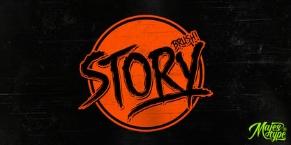 Story Brush is the high detailed brush font that has over 240 glyphs. This font is equipped with OpenType feature to make custom feel for your design. The story brush typeface is designed for t-shirts design, logos, horror design, grunge & etc. Use discretionary ligatures to make your design really nice! See all picture for detail.
 - Selatine by Larin Type Co,
$10.00 Selatine - a handwritten bold brush font with streaked. Fall in love with its incredible charm, and turn any design idea into a stunner. Use this font for branding or create a logo, beautiful frame for your home, decorate your any project. Or just use for your small business, book covers, stationery, marketing, blog, magazines and more.
 - Rolf by MysticalType,
$10.00 Rolf is a modern font of condensed typeface, Rolf is a narrow neutral geometric font designed for headlines and posters. The Italic weights are designed with high-quality compensation for all circles and strokes, made to combine rotalik techniques and details on each slope. Rolf has expanded Latin coverage to be ideal for Western, Central and Eastern European languages.
 - MBF Logonarium by Moonbandit,
$21.00 A full-on go to font for logotype with modern minimalist treatment in design. This is the only font you need for all your branding needs, from text to display, we got it. Designed for clarity and simplicity, MBF Logonarium can deliver wide range of design style. This typeface also comes with plenty of ligatures and multilingual coverage
 - Qbig by Roman Cernohous Typotime,
$10.00 Qbig was originally designed as a typeface for an amateur sci-fi movie in 2006. The basic style can be complemented with two types of shadows (Block and Superblock) which leads to 3D effect. The "Shadow" styles can also be used individually for example to create various graphic structures. This typeface is determined for use in larger sizes.
 - Charmantine by Prestige Artsy Studio,
$29.99 Charmantine is a revolutionary, classy and delicate ligature sans-serif that has been designed uniquely for modern projects. An excellent arsenal for branding, mark logos, monograms, packaging, invitations, magazines and more. The delicacy of Charmantine with its perfect curves makes it a great choice for anyone who would like to add a touch of modernity to their projects.
 - Nusqie by PizzaDude.dk,
$20.00 Slightly blurred, and handwritten - looks good with massive text. With ligatures for both upper- and lowercase double letters, and alternate letters, also for upper- and lowercase, it makes your text look soooo smooth! Oh, I almost forgot: Nusqie also comes with ligatures for double numbers! You will need to use OpenType supporting applications to use the autoligatures.
 - Dealoras Font Duo by Attract Studio,
$17.00 Dealoras is a duo font that is all geometric typeface with simplicity and directness that stands out with its modern minimalist style and clean feel. There are also Dealoras Outline and Dealoras Signature to help you mix and match to match your creative work in harmony. perfect for magazine pictures, for wedding invitations, for branding, poster design and more.
 - Retiro Std by Typofonderie,
$59.00 Full of life Hispanic Didot in 2 optical sizes Retiro is a daring interpretation of Spanish typography. Severe, austere and yet, full of life, Retiro is a vernacular version of Castilian and Andalusian in a typical Didot. Named after a lovely park in Madrid, Retiro started life as a a bespoke typeface designed to give a unique voice to the magazine Madriz. In 2006, the founder of Madriz was looking for a Didot for his new magazine. The Didot is the archetypal typeface used in high-end magazines. Retiro is a synthesis of these high contrast styles mixed with an Hispanic mind. Result is then, after 2-3 years of work, a typeface with countless variations to establish typographic shades adapted to different sections and pages of the Madriz. In 2014, it was necessary to further revise the typeface before its launch at Typofonderie. In order to keep its originality, the unique weight was retained, but complemented with optical size variants to set highly contrasted headlines into various sizes, visually balanced. How to use Retiro optical sizes? Each font provided in Retiro family is named according to the scale of body size: 24 pt and 64 pt. Of course, these names are referring to the body sizes used in typographic design. In the “glorious old days,” the letterpress period, it was customary to cut punches directly to the size at which typefaces would be used. The punchcutter had to visually adapt his design to the engraving size. The aim was to optimize the best contrast and general weight, but also to respect both design’s and reader’s needs. In Retiro’s case, intended for large titling sizes, it’s an adaptation of this ancient practice for our contemporary uses. Although each font is named by a typographic point size, do not feel obliged to use this font at this precise size, but why not, in larger or smaller. It’s rather the concept of gradients that must be preserved in layouts, rather than strictly size numbers. It’s up to the designer to select the right font size for his own designs. Granshan Awards 2012 Creative Review Type Annual 2011 Designpreis 2011 Club des directeurs artistiques, 41e palmarès Type Directors Club 2010 Certificate of Type design Excellence
 - Best Choice by Dharma Type,
$9.99 Best Choice is a family of next-generation monospaced fonts for developing, programming, coding, and table layout. Some desirable features in monospaced fonts are listed below. 1.Easy to distinguish 2.Easy to identify 3.Easy to read Best Choice has very distinguishing letterforms for confusable letters such as Zero&Oh, One&I, and Two&Z. A lot of ingenuity makes this family very distinguishable. Italics have a very large inclination angle to be distinguished from their Roman. For the same reason, Italics are slightly lighter than Romans. Italic is not cursive Italic. It is near the slanted Roman. This is an intentional design to identify Italic letters. Cursive is not suitable for programming font. Very clean and natural letterform is good for reading. Common curvature for tails and hooks makes harmony and a sense of unity. Best Choice supports almost all Latin including Vietnamese and Cyrillic. Try this all-new experiment.
 - Heidan by Craft Supply Co,
$20.00 Introduction to Heidan Wedge Serif Font Heidan – Wedge Serif Font, embodies a classic yet bold style. It’s designed for versatility and impact. The font showcases a traditional serif structure. It’s perfect for both print and digital media. Distinctive Features Heidan stands out with its noticeable contrast. The strokes vary in thickness, offering a dynamic feel. Wedge serifs add a unique character to each letter. This font is not just a typeface but an artistic statement. Versatility and Usability Heidan’s design ensures readability across various applications. It’s suitable for headings, body text, and branding. The font effortlessly adapts to diverse design needs. It’s ideal for designers seeking a blend of classic and modern. Accessibility and Appeal With its straightforward design, Heidan reaches a wide audience. Its simplicity makes it easy to read, yet it retains a strong presence. The font is a go-to choice for projects needing a touch of elegance. Heidan is more than a font; it’s a versatile tool for creative expression.
 - Honey Cages by Nathatype,
$29.00 Honey Cages is a lovely display serif font in thick weights to show friendly, expressive, motional, balanced nuances between functionality and creativity. Generally, the letter shapes are round with consistent heights and wide spaces. There are also curved wipes on some of the letters’ edges to add decorative styles. Use Honey Cages for big-sized texts for a legibility reason. This font comes with some lovely features for you to enjoy. Features: Stylistic Sets Ligatures Multilingual Supports PUA Encoded Numerals and Punctuations Honey Cages font fits for various design projects, such as posters, banners, logos, magazine covers, quotes, headings, printed products, merchandise, social media, etc. Find out more ways to use this font by taking a look at the font preview. Thanks for purchasing our fonts. Hopefully, you have a great experience using our font. Feel free to contact us for further information when you have a problem using the font. Thank you. Happy designing.