10,000 search results
(0.057 seconds)
- BD LoFi by Typedifferent,
$30.00 The BD LoFi typeface was originally designed on an Amiga 1200 with TypeSmith in 1997. In 2023 BD LoFi received an update with a wider language support and a variable version with a bolder look.
 - Sablon Class by Roman Cernohous Typotime,
$29.00 Sablon is back! This time on the edge in Thick & Thin version, keeping its significant features especially in letters B, G, M and N. With new expressive figures best suitable in headlines and packaging graphics.
 - Abagail Jackson by Ingrimayne Type,
$6.00 Abagail Jackson is a wild-looking face that was one of my early designs. I had no particular use in mind when I designed it and I no longer remember what inspired this whimsical font.
 - Lucida Blackletter by Monotype,
$40.99Lucida is a family of fonts with one basic design, but offered in two variations. It has both serif and sans serif characters. Lucida is suitable for books/text, documentation/business reports, posters, advertisement, multimedia. - Yogyakarta by Letterafandi Studio,
$10.00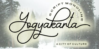 Yogyakarta is a handwritten script font, with an elegant and beautiful look. It looks stunning on invitations, thank you cards, quotes, greeting cards, logos, business cards and every other design which needs a handwritten touch.
 - Auster Slab by Resistenza,
$39.00 Auster Slab, is a new slab version of our reversed contrast sans serif font Auster. This font family works very well on packagings, branding and editorial purposes. More About Opentype Features: https://bit.ly/opentype-rsz
 - Vivala Pix by Johannes Hoffmann,
$5.00 The pixel font is designed based on a 25 grid. Ideal for headlines, but also easy to read in smaller font sizes. The font supports 219 languages and is equipped with a large symbol set.
 - Latinaires by Sudtipos,
$39.00Latinaires Pro is a new version of one of the first published Sudtipos typefaces. Now covering more latin languages and extended to 9 fonts, Latinaires is specially designed for modern brand communication and editorial use. - Faerie Queen NF by Nick's Fonts,
$10.00Based on a typeface named "Titania" from a 1930s specimen book from the Fundición Richard Gans in Madrid, this exquisite design will add a touch of elegance and nostalgic charm to any project it graces. - Richfont BT by Bitstream,
$50.99Based on Mr. Hubbard's own hand printing, Richfont Medium is an extremely casual design. Actually light in weight, it renders best at 14 point and above. Richfont Light and Bold are available from the designer. - Lucida Bright by Monotype,
$29.99Lucida is a family of fonts with one basic design, but offered in two variations. It has both serif and sans serif characters. Lucida is suitable for books/text, documentation/business reports, posters, advertisement, multimedia. - DinoTracks by Ingrimayne Type,
$9.00 DinoTracks is a novelty or letterbox font in which the letters are formed with dinosaur footprints. It is readable at small point sizes, but then one cannot see that the letters are made from footprints
 - Vulcano by Type-Ø-Tones,
$40.00 Vulcano is the mesmerising creation of Salvador –Tori– Alimbau, the one-type-man who gave us this maze. José Manuel Urós took months to devise a negative-positive system for these characters. Hypnotic, charming sophisticated.
 - Progreso by CastleType,
$59.00 Progreso is a condensed, unicase, serif gothic type design inspired by the hand-lettering on Russian posters from the 1920s. Supports most European languages, including modern Greek and most languages that use the Cyrillic alphabet.
 - Nouveau Arts JNL by Jeff Levine,
$29.00 The hand lettered title on sheet music for 1915's novelty song "Gasoline Gus and His Jitney Bus" by Byron Gay and Charley Brown offered up the lettering style which is now Nouveau Arts JNL.
 - Geometa Deco by Wiescher Design,
$39.50 Geometa Deco is based on Paul Renners Futura Classic. The design is timeless, but I always missed some decorative characters. So I sat down and did some. The type-designer for surprising solutions, Gert Wiescher
 - Vendome by Linotype,
$40.99One of the most famous modern Old Face fonts, designer Francois Ganeua developed Vendome with the special features and extravagance typical of such forms. Strong and lively, such details give Vendome its unmistakeable, unique appearance. - Hybi4 Script Neo by Hybi-Types,
$3.99 This typically handwritten script fonts are based on my own handwriting. First release of the Hybi4-Script was back in 1999. Now it’s renewed and completed with many more special characters and a bold style.
 - Mercadillo by Monotype,
$16.99 Mercadillo is a casual script typeface based on the hand painted signs you can see in markets, shops and bars. Comes in 4 different weights (Black, Bold, Regular and Light) and it has OpenType features.
 - Garcon Grotesque by Thomas Jockin,
$50.00 From pastiche to sophistication, Garçon Grotesque improves on a classic for today's designer. Designed in a multitude of weights, extended latin character set, small capitals and a working lowercase, Garçon is built for any situation that calls for sophistication, elegance and culture. Built in five weights, Garçon Grotesque allows for great flexibility. Use the Bold weight for beefy headlines. Use the the medium and regular weights for subheads and decks. Use the Light and Thin weights for a softer, more delicate tone. All weights have the same size spurs, so you can mix and match! Right out of the box, Garçon Grotesque offers full language support to most eastern european speaking territories. Most foundries release these accent characters as a "pro" release at an additional fee. Just because you speak Turkish or Croatian, shouldn't mean you have to pay more than a designer who speaks English. Please see the Specimen PDF for more information about languages supported. Accessible as an OpenType Feature, Garçon Grotesque offers alternate forms of the uppercase "J", and the lowercase "a" and "g". Use Stylistic Set 01 for the alternate form capital J. Use Stylistic Set 02 for the alternate form of the lowercase a. Use Stylistic Set 03 for the alternate form of the lowercase g. Also accessible as an OpenType Feature, Garçon Grotesque offers tabular figures in all five weights. Perfect for menus, tabular figures allow for number listings to align easily and without shifting if a different font weight is selected for emphasis.
 - Schism Three by Alias,
$55.00 Schism is a modulated sans-serif, originally developed from our Alias Didot typeface, as a serif-less version of the same design. It was expanded to three sub-families, with the thin stroke getting progressively heavier from Schism One to Schism Three. The different versions explore how this change in contrast between thick and thin strokes changes the character of the letterforms. The shape is maintained, but the emphasis shifts from rounded to angular, elegant to incised. Schism One has high contrast, and the same weight of thin stroke from Light to Black. Letter endings are at horizontal or vertical, giving a pinched, constricted shape for characters such as a, c, e and s. The h, m, n and u have a sharp connection between curve and vertical, and are high shouldered, giving a slightly square shape. The r and y have a thick stress at their horizontal endings, which makes them impactful and striking at bolder weights. Though derived from an elegant, classic form, Schism feels austere rather than flowery. It doesn’t have the flourishes of other modulated sans typefaces, its aesthetic more a kind of graphic-tinged utility. While in Schism Two and Three the thin stroke gets progressively heavier, the connections between vertical and curves — in a, b, n etc — remain cut to an incised point throughout. The effect is that Schism looks chiselled and textural across all weights. Forms maintain a clear, defined shape even in Bold and Black, and don’t have the bloated, wide and heavy appearance heavy weights can have. The change in the thickness of the thin stroke in different versions of the same weight of a typeface is called grading. This is often used when the types are to used in problematic print surfaces such as newsprint, or at small sizes — where thin strokes might bleed, and counters fill in and lose clarity, or detail might be lost or be too thin to register. The different gradings are incremental and can be quite subtle. In Schism it is extreme, and used as a design device, giving three connected but separate styles, from Sans-Didot to almost-Grotesk. The name Schism suggests the differences in shape and style in Schism One, Two and Three. Three styles with distinct differences, from the same start point.
 - Schism Two by Alias,
$55.00 Schism is a modulated sans-serif, originally developed from our Alias Didot typeface, as a serif-less version of the same design. It was expanded to three sub-families, with the thin stroke getting progressively heavier from Schism One to Schism Three. The different versions explore how this change in contrast between thick and thin strokes changes the character of the letterforms. The shape is maintained, but the emphasis shifts from rounded to angular, elegant to incised. Schism One has high contrast, and the same weight of thin stroke from Light to Black. Letter endings are at horizontal or vertical, giving a pinched, constricted shape for characters such as a, c, e and s. The h, m, n and u have a sharp connection between curve and vertical, and are high shouldered, giving a slightly square shape. The r and y have a thick stress at their horizontal endings, which makes them impactful and striking at bolder weights. Though derived from an elegant, classic form, Schism feels austere rather than flowery. It doesn’t have the flourishes of other modulated sans typefaces, its aesthetic more a kind of graphic-tinged utility. While in Schism Two and Three the thin stroke gets progressively heavier, the connections between vertical and curves — in a, b, n etc — remain cut to an incised point throughout. The effect is that Schism looks chiselled and textural across all weights. Forms maintain a clear, defined shape even in Bold and Black, and don’t have the bloated, wide and heavy appearance heavy weights can have. The change in the thickness of the thin stroke in different versions of the same weight of a typeface is called grading. This is often used when the types are to used in problematic print surfaces such as newsprint, or at small sizes — where thin strokes might bleed, and counters fill in and lose clarity, or detail might be lost or be too thin to register. The different gradings are incremental and can be quite subtle. In Schism it is extreme, and used as a design device, giving three connected but separate styles, from Sans-Didot to almost-Grotesk. The name Schism suggests the differences in shape and style in Schism One, Two and Three. Three styles with distinct differences, from the same start point.
 - Hua by YXType,
$14.99 Hua type family is a sans-serif with very humanist details to represent the essence of nature. It features 14 weights from the very thin to the very bold, generously covering a wide range of the natural spectrum. Aiming to represent the soft and elegant side of nature, Hua features very unique italics that have their own take on the identity. The letterforms of the italic fonts are inspired by the lineage of both traditional calligraphic approaches for serifs and much simpler forms for sans-serifs. Hua provides very crisp performances on screens and its large x-height combined with fine-tuned proportions help it retain legibility very well on smaller sizes. Features: • Support for 200+ Latin languages • Double & single storie “a” & “g” • Unique italic letterforms • Low contrast with unique details • Small caps with symbols • Arbitrary and defined fractions • Support for superscript & subscript in normal & scientific alignments • Proportional lining, proportional old-style, tabular lining, tabular old-style
 - Leidener by Talavera,
$40.00 This font family is inspired by printed work made by the Elzevir family back in the XVIIth century at Leiden (NL). They worked with material from several type designers, but further investigations sends us to the tracks of one in particular: Robert Granjon. Granjon italics were way ahead of his time, making some really beautiful signs like swashy ampersands and minuscule v letters. This font also contains old style figures in the same fashion as they were printed, like the flipped number 8 and open forms in 6 and 9. This is as much a revival as an original design, because of their weights bold and heavy (both with italics) that were inspired on some titles. In this font you can also find a lot of ligatures, small caps, diacritics and even a fleuron for each weight and variation. Leidener came up from two books: Constantini Imperiatoris (1611) and Exercitationum Mathematicarum (1657), printed by Louis and John Elzevir on their Leiden Workshop, back in the day.
 - Celestina by Piñata,
$- Celestina is the lively spirit, just like drops of ink on a piece of paper or clouds in the sky. The same spirit is maintained by the rounded letters of the script and by the characters' small whorls. Celestina has come to life as a result of a peculiar game in which I tried to bring together the letters with different tempers with help of calligraphic instruments. I wanted to create a very light and playful font which would look like a quick inscription on a piece of paper, but would also be easy to read in a text array. As I was working on the font, my cat Celestina has been very interested in the brush painting process, and I had no other option but to name the font after her! Celestina works perfect for both Moomins stories and personal blogs, as well as for the design of hand-made things, and even just then when you want to put yourself into a good mood!
 - VIP by Canada Type,
$29.95 VIP is a humanist sans serif uppercase and figures combined with a freshly redrawn revival of the classic Constanze initials originally designed by Joachim Romann for Stempel in 1956. As well as a vehicle to revive the Constanze initials, VIP was inspired by modern typography found in many artful books, on many product packages, and on the windows and literature of high-end restaurants, jewelry stores, haute couture fashion sellers, architecture firms and trendy brand name establishments. If you've walked through the soho or downtown of any major metropolitan, you've seen them: Widely tracked words or lines starting with a script majuscule and going on with clean and comfortable sans serif caps. If classy modern combination typography is your thing, you will find much pleasure in using VIP. VIP was updated with expanded language support in 2012. It now supports a very wide range of codepages, including Cyrillic, Greek, Central and Eastern European, Turkish, Baltic, Vietnamese, and of course Celtic/Welsh.
 - P22 Vale by IHOF,
$24.95 The Vale Press was a contemporary of Willam Morris's Kelmscott Press. The types used by the Vale Press were designed by artist Charles Ricketts, who also supervised the design and printing of Vale Press books. The main type used, Vale, was based on the Jenson 15th century roman type style. The King's Fount was an experimental semi-uncial font based on the Vale type. The King's Fount was designed in 1903 for the Vale edition of the 15h century poem "The Kingis Quair". This semi-uncial font evokes old English and Anglo-Saxon lettering. P22 Vale Pro combines the two fonts P22 Vale Roman and P22 Vale King's Fount into one "Pro" font. This pro font also includes a Central European character set, old style figures, fractions, ornaments and a special faux "Middle English" feature to make "anee text appeer Olde." This feature is not known to exist in any other font.
 - Excalibur SCF by Scholtz Fonts,
$21.00 Let it be known that this font is named for Excalibur, King Arthur's Magic Sword. The font is derived from a note that Arthur hastily penned to his Queen, Guinevere, during a lull in one of his many battles against the Saxons. Arthur's armour was so hefty that he could not easily seat himself, and so to pen his letter to Guinevere he plunged his legendary sword Excalibur into the marshy soil on which he had been fighting and thereby steadied his writing hand with the hasp of his magical sword. This ancient and battle-weary font is based on the writing from a fragment of that original document. It has been heralded by modern scholars as "grunge" writing of great antiquity. The font Excalibur SCF contains a full character set and it is professionally letterspaced and kerned. Use this font to create a feeling of haste, of authentic ancient history, of magical times, of chivalry, of dragons and of brave battles fought.
 - Marcel Merlina by Pixesia Studio,
$16.00 Introducing Marcel Merlina - A Lovely Chic Script Font Marcel and Marlina is now released as beautiful as romance is. This font-type gives you the vibe of an elegant and the classic-yet-so fresh kind of feeling. The curves and the flexibility of the fonts provide you the warm and familiar sense—as if you are reading letters from your beloved ones. Marcel and Marlina is meant to be endearing—portray the warmth of love. This font is designed to be used in such occasions which require high involvement of delightful emotion. This font would be best to be used in wedding invitations, love letters, and sincere greeting cards for someone so dear to you. FEATURES - Stylistic Alternates - Ligatures - PUA Encoded - Uppercase and Lowercase letters - Numbering and Punctuations - Multilingual Support - Works on PC or Mac - Simple Installation - Support Adobe Illustrator, Adobe Photoshop, Adobe InDesign, also works on Microsoft Word Hope you Like it. Thanks.
 - Axion RX-14 by Type Innovations,
$39.00 Axion RX-14 is an original design by Alex Kaczun. It is but one of several alternate designs based on his original Axion family of fonts. Alternate design elements, specifically on capitals like 'A' , 'V' and terminals of 'C' and 'G', along with contrasting sharp and rounded corners, create a tension within this modern grotesque and add a class of destinction and interest. This display font is not intended for text use. It was designed specifically for display headlines, logotype, branding and similar applications. The entire font has an original look which is strong, dynamic, machine generated and can be widely used in publications and advertising. Axion RX-14 is a futuristic, techno-looking and expressive typeface with an apperance of machined parts with sharp and rounded edges. This attractive display comes in roman with lower case and lining figures. The large Pro font character set supports most Central European and many Eastern European languages.
 - Walnut Candy by Nathatype,
$29.00 Ready to enhance your branding? Looking for that “something” that’ll make your audience go WOW and clients get on board immediately? Ready to enhance your branding? Looking for that “something” that’ll make your audience go WOW and clients get on board immediately? If you need to create a big, bold logo for your business, work on a poster for an event, or whatever your project may be-then this is the perfect font for you. Walnut Candy-A Signature Font Walnut Candy is a handcrafted font designed to bring your branding to life and add a touch of elegance, modernity and style. Perfect for social media branding projects, fashion designs, printed quotes, packaging, or even as a stylish text overlay to any background image. Our font always includes Multilingual Support to make your branding reach a global audience. Features: - Ligatures - Stylistic Sets - PUA Encoded - Numerals and Punctuation Thank you for downloading premium fonts from Nathatype
 - Absentia Slab by DR Fonts,
$19.00 Conceived as a slab serif companion to the Absentia Sans family, this typeface complements its sibling with charisma and style. Built on the same geometric framework, they combine and harmonize gracefully. Yet Absentia Slab stands on its own as a novel alternative to conventional options. Anchored by blocky serifs, it presents an appearance of stability and steadiness. Its audacious design integrates unique features such as vertical terminals in glyphs ‘a’, ‘e’ and ‘6’. To make optimal use of available space, one-sided serifs (and in some cases, simple strokes without any serifs) help maintain an airy, uncluttered footprint as seen in letters ‘m’, ‘E’ and ‘N’. This forward-looking typeface is well suited for a variety of projects: understated yet spirited, technical yet welcoming. It has a modernist appeal, while reminiscent of XIXth Century woodblock lettering. Designed by Daniel Robichaud, Absentia Slab is available in ten weights with matching italics and two variable fonts.
 - Marlin Soft by FontMesa,
$25.00 Marlin Soft is a rounded corner version of our Marlin Geo font family and like its parent font also includes two sets of italics. The standard italic is set at twelve degrees and the slant version set at six degrees, the slant version is perfect for signage and headlines where you may want the look of an italic but are limited on horizontal space. Marlin Soft includes many alternates which may be accessed using opentype aware applications, with over three hundred alternates to choose from your creative possibilities are great. Whether you're looking for a round dot or a square dot Marlin Soft is one font family that delivers both set up as two separate fonts so you may change a whole page of text at one time. Your projects are sure to look nice and cozy with the warm feeling Marlin Soft will bring to your product label or page design. Three free sample basic fonts are available which are fully functional minus the alternates.
 - HWT Unit Gothic by Hamilton Wood Type Collection,
$39.95 The Unit Gothic series was released by Hamilton Manufacturing Co. in 1907. This sans serif family features one of the first multi width/weight type 'systems' anticipating the Univers font system by 50 years. This set of 7 fonts was designed to aid in press room efficiency and with its incremental variation in widths gave poster printers unprecedented flexibility in fitting copy while using consistently harmonious fonts. This HWT release is the first ever digital version of these fonts. Each font contains 600 glyphs including Greek and Cyrillic character sets as well as alternate characters which are based on the actual special character production patterns from the Hamilton Wood Type Museum collection. HWT Unit Gothic system features: •HWT Unit Gothic 716 - 50% wider •HWT Unit Gothic 717 - 25% wider •HWT Unit Gothic 718 - (Standard width which others are based on) •HWT Unit Gothic 719 - 25% narrower •HWT Unit Gothic 720 - 50% narrower •HWT Unit Gothic 721 - 62.5% narrower •HWT Unit Gothic 722 - 75% narrower
 - Diablo by Monotype,
$29.99Jim Parkinson's Diablo typeface is a single weight display design. The look comes from samples found in early 20th century books on hand-lettering books, as well as general poster lettering styles from that same of the period. Diablo has a touch of the Arts and Crafts" movement in its appearance, and it also looks rather heavy. It is a unicase design, in that there is no real "lowercase." Some glyphs on the uppercase keys are alternates to the capital-style forms found on the lowercase keyboard, like A, E, F, H, J, K, M, N, Q, R, V, W, and Z. In fact, the uppercase itself is a bit more decorated and round than the lowercase. Nevertheless, the upper and lowercase letters may be freely interchanged with each other to create the best possible image for the text. The name of the typeface, Diablo, is another term for the devil, or Satan." - Ghitta Bodoni Cancellaresca by Spurnej Type Foundry,
$39.00 Giambattista Bodoni was an Italian engraver, printer, and publisher who was one of the best typographers of the 18th century and became known worldwide for his iconic serif typeface. In the posthumous edition of Bodoni’s “Manual of Typography” published in 1818 by his widow Margherita “Ghitta” Dall’Aglio may also be found, among the other treasures, the Cancellaresca (Chancery). Ghitta is a redesign of this typeface in its finest form. With strong stroke contrast in 4 optical grades, 850 glyphs with wide range of language support, accented ligatures, oldstyle figures, 8 stylistic sets, and unique way of letter connection, Ghitta Bodoni Cancellaresca follows and builds on the best of Bodoni’s historical prototype and shifts further to a contemporary script typeface full of grace, neatness, and beauty. *** This font is powered by OpenType feature “Ligatures”, so it is necessary to have this function turned on. If you need support or more information, please kindly contact me: spurnej@email.cz
 - Roma by Canada Type,
$29.95 Tom Lincoln's award-winning type design work since the 1960s has been one way or another of expressing his fascination for the Roman majuscules inscribed at the base of the Trajan Column in Rome. This time he has really outdone himself by bringing us Roma, a definitive, contemporary, mature sans serif expression of those majuscules. With Roma, Lincoln is not satisfied with simply creating a proper "Trajan Sans". He goes on to make it a family of four weights, with built-in small caps and oldstyle figures, then he really goes to town with the options he makes available for shading and multi-color settings. Precise renderings of the Roma capitals are provided in different fonts that can function individually or be layered atop each other for two- or three-color treatments. The Roma family comes with extended language support that spans the majority of Latin-based languages. For more information on the design, complete character sets, technological features, and print tests, consult the accompanying PDF.
 - Nikola by Untype,
$29.00 Nikola is a text typeface that offers a wide range of possibilities. While its regular and medium weights were specially optimized for maximum performance, balanced for excellent legibility and carefully crafted to spread a scent of tradition on long text settings; its extreme weights, on the other hand, were designed with a more display use in mind, and thanks to the flexibility place at disposal by its many alternates, swashes, decorative cartouches, borders and ornaments, can deliver a vintage, reliable, dynamic, fancy and even playful inflection to the text. Nikola includes a large set of over 1400 glyphs, support for more than 200 latin script languages and 1.21 gigawatts of the finest type design generated by classic proportions, the elegance and formality of the early XX century and a glimpse of expressionism on terminals and serifs. Nikola was named after Nikola Tesla as a tribute to the pioneers of the electric age.
 - Aldine 401 by ParaType,
$30.00Aldine 401 is a Bitstream version of Bembo type family. It was designed on the base of artwork of Francesco Griffo for Aldus Manutius. Originally the font appeared in “De Aetna” in 1495 — the book by Pietro Bembo about his journey to Mount Etna. Griffo’s design was one of the first old style typefaces followed by Garamond. It was the forerunner for the standard text types in Europe for the next two centuries. A modern version of Bembo was designed at Monotype under the supervision of Stanley Morison in 1929. Aldine 401 is still very popular in book design due to its well-proportioned classic letterforms and lack of peculiarities. Italic was based on the handwriting of Giovanni Tagliente. Books and other texts set in Aldine 401 can encompass a large variety of subjects and formats because of its classical beauty and high readability. Cyrillic version was developed by Isabella Chaeva and released by ParaType in 2008. - Ongunkan Adinkra Script by Runic World Tamgacı,
$80.00 The Adinkra alphabet is a way to write some of the languages spoken in Ghana and Ivory Coast, such as Akan, Dagbani, Ewe and Ga. It is a simplified version of the Adinkra symbols, and was introduced in 2015 by Charles M. Korankye, who has written a number of books about it. According to tradition, the Adinkra symbols were created by Nana Kwadwo Agyemang Adinkra, the King Gyaman people in the Ashanti region of Ghana from 1810 to 1820. Or they were created by Gyaman people, and the king liked them so much that he wore them on his clothes and named that after himself. The Adinkra symbols are used as decoration, logos, arts, sculpture, pottery and so on. The symbols represent sayings, proverbs or concepts, such as wisdom, authority, strength, unity, love adaptability, wealth, peace, war or agreement. Since Unicode codes have not been assigned yet, it is designed on a latin-based font. Please contact me if you want changes to the keyboard layout.