10,000 search results
(0.04 seconds)
- Plinc Buffalo by House Industries,
$33.00 Just as its eponymous ancestors graced vast Western vistas, Buffalo fills broad horizontal typographic topography with distinctive dignity. Buffalo’s migration across a visual landscape that straddles two millennia saw it survive the threat of extinction similar to its mammalian ancestors and emerge with rotund relevance. Now fortified with modern character sets and digital flexibility, nothing espouses an artisanal post-western industrial craft renaissance quite like Buffalo. Legendary lettering artist and type designer Ed Benguiat created the original film version of Buffalo for Photo-Lettering Inc. Working under the direction of the current Photo-Lettering partners, Dutch type designer Donald Roos digitized and expanded Buffalo while expertly maintaining the organic nuances found in the original version. Like all good subversives, House Industries hides in plain sight while amplifying the look, feel and style of the world’s most interesting brands, products and people. Based in Delaware, visually influencing the world.
 - ALT Fatgami by ALT,
$- Fatgami is a origami typeface for use on logos and titles.
 - KG Inimitable Original by Kimberly Geswein,
$5.00 A bold kid-friendly title font in a whimsical unicase style.
 - Olech by Sebastian Cabaj,
$14.00 Olech is great typeface for titles, posters, books, covers and labels.
 - Bitsumishi Pro v2 by CheapProFonts,
$10.00 A squarish uppercase font perfect for logos and short eye-catching headings. The lowercase contains some alternate letterforms - more specifically: uppercase have closed forms (I made a new A D and R), and lowercase have some open alternatives (new B E F P and T in addition to the A D and R). I noticed the two width version of the H and made similar normal and wide versions of J and L. Then I added lots of missing glyphs and all the diacritic letters, of course - and finally the family has been expanded to 7 weights AND corresponding Italics! Enjoy! ALL fonts from CheapProFonts have very extensive language support: They contain some unusual diacritic letters (some of which are contained in the Latin Extended-B Unicode block) supporting: Cornish, Filipino (Tagalog), Guarani, Luxembourgian, Malagasy, Romanian, Ulithian and Welsh. They also contain all glyphs in the Latin Extended-A Unicode block (which among others cover the Central European and Baltic areas) supporting: Afrikaans, Belarusian (Lacinka), Bosnian, Catalan, Chichewa, Croatian, Czech, Dutch, Esperanto, Greenlandic, Hungarian, Kashubian, Kurdish (Kurmanji), Latvian, Lithuanian, Maltese, Maori, Polish, Saami (Inari), Saami (North), Serbian (latin), Slovak(ian), Slovene, Sorbian (Lower), Sorbian (Upper), Turkish and Turkmen. And they of course contain all the usual "western" glyphs supporting: Albanian, Basque, Breton, Chamorro, Danish, Estonian, Faroese, Finnish, French, Frisian, Galican, German, Icelandic, Indonesian, Irish (Gaelic), Italian, Northern Sotho, Norwegian, Occitan, Portuguese, Rhaeto-Romance, Sami (Lule), Sami (South), Scots (Gaelic), Spanish, Swedish, Tswana, Walloon and Yapese.
 - Advertisers Gothic by HiH,
$12.00 Advertisers Gothic is bold and brash, like the city it comes from, Chicago. It was designed by the accomplished German-American matrix engraver, Robert Wiebking, for the Western Type Foundry in 1917. As its name suggests, it was designed for commercial headliner work, much as Publicity Gothic by Sidney Gaunt for BB&S the year before. See our Publicity Headline. Alternate letters ‘A’ & ‘S’ are provided. The most popular ad words “Free!”, “New!” and “Sale” (with both esses) are provided at an angle for dramatic tension. Advertisers Gothic became quite popular because it was effective. It can work equally well for a flyer advertising a non-profit event as for a magazine product ad. This font refuses to be a wimp. Use it boldly. Advertisers Gothic ML represents a major extension of the original release, with the following changes: 1. A total of 335 glyphs (compare) with added glyphs for the 1250 Central Europe, the 1252 Turkish and the 1257 Baltic Code Pages. 2. Added OpenType GSUB layout features: pnum, ornm, liga, hist & salt ˜ with total 13 lookups. 3. Added 209 kerning pairs. 4. Revised vertical metrics for improved cross-platform line spacing. 5. The most popular ad words “Free!”, “New!” and “Sale” (with both esses) are provided at an angle for dramatic tension The zip package includes two versions of the font at no extra charge. There is an OTF version which is in Open PS (Post Script Type 1) format and a TTF version which is in Open TT (True Type)format. Use whichever works best for your applications.
 - Auline by Sensatype Studio,
$15.00 Auline is Modern Luxury Serif Font is a well-balanced contemporary font with a fancy, unique, and versatile Luxury serif, font that you can combine to get any variations and unique shapes easily just in seconds with choose alternates of them. What's Included: Character set A-Z Normal & Italic Style Numerals & Punctuation Accented Characters (West Europe) Stylistic alternates Works on PC & Mac Recommended using Adobe Illustrator or Adobe Photoshop. Wish you enjoy our font. :)
 - Gliker by Studio Sun,
$8.00 Gliker was designer in the early 2019 and published in June 2020. Gliker is inspired by the characteristics of Hobo Typefaces. All corners of this typeface is founded, giving a more dynamic and vintage feel. Gliker is available in 4 Weights (Regular, Semi Bold, Bold, Black) and 7 Widths (Extra Condensed, Condensed, Semi Condensed, Normal, Semi Expanded, Expanded, Extra Expanded) with a total 28 Styles. Also includes support for 75+ Latin (Extended) Languages.
 - Tenby by Paragraph,
$12.00 Tenby is a series of modular geometric display sans serif fonts with a hint of Art Deco combined with a 1980s finish. The fonts' underlying grid is ten squares high. Their widths correspond to condensed (Tenby Four), normal (Tenby Five) semi-extended (Tenby Six), extended (Tenby Seven), and extra-extended (Tenby Eight). Each contains two weights, light and regular. Although smaller text sizes are still quite legible, the fonts work better at large sizes.
 - Tumbling Dice NF by Nick's Fonts,
$10.00An unnamed scroll typeface featured in the 1869 MacKellar Smiths and Jordan specimen book provided the pattern for this font. You may begin and end the scrolls with parentheses, braces or brackets, and employ the space bar as you normally would to construct headlines "in a pretty box". Both versions of this font contain the complete Unicode 1252 (Latin) and Unicode 1250 (Central European) character sets, with localization for Romanian and Moldovan. - Banner Year NF by Nick's Fonts,
$10.00An unnamed scroll typeface featured in the 1869 MacKellar Smiths and Jordan specimen book provided the pattern for this font. You may begin and end the scrolls with parentheses, braces or brackets, and employ the space bar as you normally would to construct headlines "in full-flowing draperies". Both versions of this font contain the complete Unicode 1252 (Latin) and Unicode 1250 (Central European) character sets, with localization for Romanian and Moldovan. - Orev by Typesketchbook,
$39.00 Chatnarong Jingsuphatada is a Thailand based typeface designer of foundry Typesketchbook. In 2014, he has created Orev, a type family that consists of 18 fonts, including 9 weights available as normal and oblique style. It’s a unique and modern sans typeface, which is well suited for a variety of typographic applications such as headlines and small texts. The Orev font family supports multiple languages and is available as both webfont and desktop font.
 - Vild Scapes by Typesketchbook,
$49.00 With the intention to create a family of modern calligraphy, Vild Scapes offers different feels in different effects. The Normal option cuts back the imperfections created from freehand writing, while Inkless keeps those details. There’s also the Rust option, which imitates letterpress printing effects. In addition, the family comes in three designs: Brush (big paint brush style), Script (small paint brush style), and Marker (brush tip maker style), offering you more possibilities for creativity.
 - Supra Compressed by Wiescher Design,
$29.00 Supra-compressed – designed by Gert Wiescher in 2013 – is the extreme version of this family. But despite it being very slim it is still – because of its openness – a very readable font. The light and normal weights and the dominant x-height with its high ascenders make for easy reading of long copy. The heavy and x-light weights are great for elegant headlines. Supra is a versatile OpenType family with lots of different weights.
 - Armetica by Hsan Fonts,
$18.00 Armetica is an ultra condensed sans serif typeface with a unique personality. It comes in normal and display versions, with 9 weights, as well as italics totaling 18 fonts. Armetica is a modern elegant typeface that would be perfect for branding, logos, headlines or captions. The font could also work as a stylish text overlay on any background image you like, minimalist and warm while still being versatile enough to use anywhere!
 - Masifa Rounded by Hurufatfont,
$19.00 Masifa Rounded has compact, simple, functional and neutral body structure. It has 5 widths from Normal to Ultra Condensed. Each width includes 9 weights from Hairline to Black and their matching italics. Also, every weight includes rich OpenType Features like Small Caps and custom number styles. Due to its large family, it is ideal for a wide range of usage from large-scale designs to small product labels. Masifa Rounded updated on September 25, 2021.
 - DIN 2014 by ParaType,
$47.00 A contemporary interpretation of the famous DIN typeface. Regular style suits for long texts, while Light and Bold variations work well in large sizes. The typeface includes 24 styles: 6 upright and 6 normal-width italics, as well as 6 Narrow and 6 Condensed styles. The typeface was designed by Vasily Biryukov and released by Paratype in 2015. The set of Condensed styles was added by Alexander Lubovenko and Isabella Chaeva in 2022.
 - Ports Play by Alandya TypeFoundry,
$19.00 Port Play ... Based on Density Slab Serif, now with other styles, Normal and Expand, equipped with alternative letters that are so wide that they give a strong, clear, masculine feel, and have good legibility. Port Play comes in regular, oblique, outline, and outline oblique styles along with regular and oblique variable files. This font is perfect for every project. suitable for branding logo, badge design, or apparel design. This font also comes with multilingual support.
 - Geogrotesque Expanded Series by Emtype Foundry,
$69.00 Geogrotesque Expanded Series comes in three widths: Wide, Extended and Expanded, that go between 120% and 200% of the normal width. Since the original Geogrotesque is slightly condensed, the Wide family becomes a good option for texts. Whereas the Extended and Expanded are ideal for display sizes. With the inclusion of the Expanded Series and the preceding Condensed ones, the Geogrotesque super family is now a complete widths system. For more details see the PDF.
 - Bodoni Classic Inline by Wiescher Design,
$49.00 Bodoni Classic Inline is a very elaborate extension of my Bodoni Classic family. The font has 5 different swashes for each capital letter, diverse swashes for lowercase letters and a full set of ligatures, oldstyle and normal numerals, all together 669 glyphs. This Inline font is good for all kind of official looking documents and of course goes together well with my forever growing Bodoni Classic family. Your Bodonian type-designer Gert Wiescher
 - HU Discopangpang KR by Heummdesign,
$25.00 "Disco Pang Pang" is the Korean name for Tagada rides. It is a characteristic typeface that is good to use when you want to make use of a unique and bouncy feeling. Light and Extrabold are made with the thickness of normal typefaces, but Left and Right have strange shapes with stroke thicknesses that are biased to one side. Its unique shape can make a strong impression on people. This font contains Korean.
 - Bottle Fork by PizzaDude.dk,
$15.00 Here is my font with carved out letters, like a really bad stamp. Each lowercase letter has 3 different versions, and that makes your text more natural, organic and handmade. Normally I kern my fonts throughout, but this time there is no kerning at all...and that's odd, when we're not talking about monospaced fonts. Anyway, Bottle Fork has its flaws and jumpy x-height...but that's exactly the charm of it all! :)
 - Minik by Ahmet Altun,
$16.00 Minik Font Family comes in 2 weights; Regular and Bold. It is completely hand-drawn. While the capital letters have normal sizes, the lowercase letters are smaller than the common form in the vertical axis to have a cute view. The Minik Font Family has a few ornaments and stylistic alternates. With this font family, you can create eye-pleasing and nice works such as posters, printings, t-shirts, adds, magazines etc.
 - Chairdrobe by XTOPH,
$25.00 Chairdrobe is minimalistic typeface with a contemporary, urban style. It feels pure, raw and a bit dirty. You can use it as display type as well as in longer text. Try to space it up. It looks super tight with a lot of spacing! Chairdrobe is a sans-serif, condensed typeface. Available in 3 different variations – Normal, Rounded and Grunge. It features upper and lowercase letters and up to 7 Weights and Italics.
 - Otoiwo Grotesk by Pepper Type,
$39.00 Otoiwo Grotesk is an extremely versatile sans-serif typeface with a closed aperture. It features whopping 126 styles over 7 widths, each containing 9 weights with corresponding italics. The mood of the family ranges from fairy neutral in Normal and Condensed widths to very flavorful Compressed and Ultra Wide. Rich language support, which includes Cyrillic and spans 131 language ovarall, makes Otoiwo Grotesk a worthy choice for brands that strive to reach international audience.
 - Fab Figures by Letterwerk,
$10.00 Fab Figures is a numbers-only font. This high contrast display font family with curly terminals is a great choice for infographics and posters. The entire font family consists of 10 styles: 2 styles for big usage, 2 styles for normal usage, 2 styles for small usage and 3 patterned styles (fitting to the big styles). Character Set: 1 2 3 4 5 6 7 8 9 0 | % # • ~ { $ £ € } . , : ; + - = ÷ / ° * ' ’ (Arrows) (No-Symbol) (Nr-Symbol)
 - Olimpos by Gatype,
$8.00 Olimpos is a Display sans font that is absolutely perfect for editorial headlines. Her large, bold and slender figure is perfect for posters, t-shirts, and magazine covers. Reserved for capital letters only, this calm and bold typeface is a content creator's best friend. font files Uppercase, Numbers, Punctuation & Symbols. Diacritic for Multilingual Support This Olimpos is a modern sans-serif font that includes 4 weights of the normal style and the Italic style.
 - Troia by Ahmet Altun,
$10.00 Troia Font Family comes in three weights; normal and italic. In addition, with rounded corners, each weight has its own smoother version. Thanks to its large letters and added spaces between the letters, this font can be used to get perfect results and create great works such as web typography, banners, logos, texts, t-shirts and printings, and also presentations. Troia's eye-pleasing and nice-looking style makes writing much more pleasant.
 - Quebra Ex Condensed by Vanarchiv,
$55.00 Quebra Ex Cn (Extra Condensed) is an extend display sans-serif font family, available with four widths (Extra Condensed, Condensed, Normal and Expanded) and ten weights, italics versions are available. The main strokes contain small breaks simulating modulated variations on the letterforms, these details are more present on large body sizes. All font versions contain Latin and Cyrillic encoding characters and also ligatures, case-sensitive forms, fractions, oldstyle and finally tabular figures.
 - Blood Script Italic Personal Us - Personal use only

- Black Memory by Dumadi,
$25.00 Black Memory is a Brush-style font created with the App. The natural stroke texture makes this font look more perfect to use. Black Memory consists of capital letters and lowercase letters with different shapes so that you have a choice that fits the design you make. This font is perfect for Movie Titles, horror movie titles, action, murder, spooky, ghost, and other movie titles. You can see the sample preview above for comparison, stay the center of attention and classy!
 - Asbanur by Mightyfire,
$10.00 Hello! Asbanur is here. Asbanur brings modern, clean and neat looks. This font can be used as the logo of your brand, headline title, magazine title or many things. We have two versions: light and regular, but both of the versions is cool! Try them and enjoy!
 - MC Sarling by Maulana Creative,
$14.00 Sarling monoline script font. This font is good for logo design, Social media, Movie Titles, Books Titles, a short text even a long text letter and good for your secondary text font with signature or script typeface. Make a stunning work with Sarling font. Cheers, Maulana Creative
 - MC Hittre by Maulana Creative,
$16.00 Hittre brush font. This font is good for logo design, Social media, Movie Titles, Books Titles, a short text even a long text letter and good for your secondary text font with signature or script typeface. Make a stunning work with Hittre brush font. Cheers, Maulana Creative
 - Kora Vibes by Jehansyah,
$15.00 Kora Vibes is an elegant and modern serif font with a luxurious feel. Perfect for any title or large font, emails, magazines, book titles, movies, notes, brands, logos and more. This font is PUA coded, which means you can easily access all the glyphs and swashes!
 - Laraboyok by Differentialtype,
$10.00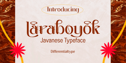 Laraboyok is an ethnic display font inspired by Javanese script. This font is perfect for displays with traditional and ethnic themes, and also works great for logos, branding, greeting cards, invitation cards, advertisements, titles, headlines, book titles, stickers, packaging, quotes, posters, t-shirts/apparel, billboards, etc.
 - Bluesman JNL by Jeff Levine,
$29.00 The classic blues album "I'm Jimmy Reed" released on the legendary Vee-Jay label out of Chicago featured title lettering in a bouncy, fun, casual take on the classic Latin Wide style of alphabet. Bluesman JNL offers a full digital typeface based on that album titling.
 - De Fonte Plus by Ingo,
$39.00 A variation of ”Helvetica according to the blur principle.“ The underlying typeface is ”Helvetica“, the only true ”run-of-the-mill“ typeface of the twentieth century. The distortion principle used simulates the photographic effect of halation and/or overexposure. The light weight, »DeFonte Léger«, nearly breaks on the thin points, whereas on those points where the lines meet or cross, dark spots remain. The characters are ”nibbled at“ from the inner and outer brightness. On the normal and semibold typestyles, »DeFonte Normale« and »DeFonte Demi Gras«, the effect is limited almost exclusively to the end strokes and corners, which appears to be strongly rounded off. The bold version »DeFonte Gros« is especially attractive. As a result of ”overexposure“, counters (internal spaces) are closed in, while characters become blurred and turn into spots; new characteristic forms are created which are astoundingly legible. The fat version »DeFonte Gros« is particularly appealing. “Overexposure” leads to drifted counters, letters blur into spots; new characteristic forms emerge, which are surprisingly easy to read.
 - Down Home JNL by Jeff Levine,
$29.00 In the October 31, 1920 edition of Wid's Daily (the predecessor to The Film Daily), a block of ad copy from a 1920 film called "Down Home" had the text printed in such a fluent pen-lettered style that a bit of a shortcut was used at the beginning of the design process for this typeface. Normally, font inspirations are redrawn [and not by simply using auto-trace] except under specialized circumstances like this one where that feature is a help, rather than a replacement for the creative process. The entire block of text copy was auto-traced, then the necessary letters were selected from the available wording and cleaned up to remove any sharp points and irregular curves in an effort to make the end results as close to the original and unusual hand-drawn text. From there the missing characters needed to produce a finished type font were created utilizing the standard methods of drawing and font construction. The end results turned out very well. Using the film's title as its namesake, this design is now available digitally as Down Home JNL in both regular and oblique versions.
 - PT Sans Pro by ParaType,
$50.00PT Sans Pro is a comprehensive type family intended for a wide range of applications. It consists of 32 styles: 6 weights (from light to black) with corresponding italics of normal proportions; 6 narrow styles; 6 condensed styles; 6 extra condensed styles and 2 caption styles (regular and bold). The design combines traditional conservative appearance with modern trends of humanistic sans serif and possess enhanced legibility especially in caption styles. These features, besides conventional use in business applications and printed materials, make the fonts usable for direction and guide signs, schemes, screens of information kiosks, and other objects of urban visual communications. The fonts have extended Latin and Cyrillic character sets serving alphabets of all title languages of the national republics of Russian Federation and supporting the most of the languages of neighboring countries. Each font contains about 1400 characters including small caps for all alphabetic characters, 4 sets of figures with lining and old style variations, stressed Cyrillic vowels, indices, fractions and so on. Design -- Alexandra Korolkova with assistance of Olga Umpeleva and supervision of Vladimir Yefimov. The fonts released by ParaType in 2010.
