10,000 search results
(0.032 seconds)
- Aestero by Craft Supply Co,
$20.00
- Eastern by me55enjah,
$14.00
- Webster by Solotype,
$19.95 - Bistern by Letterhend,
$19.00
- Westrine by Aminmario Studio,
$20.00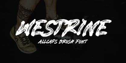
- Jostern by EMME grafica,
$14.99
- Westman by Almarkha Type,
$29.00
- EnglishTowne-Normal - Unknown license

- Scrypticali Normal - Unknown license

- Kismet-Normal - 100% free

- Platonick-Normal - Unknown license

- WildWest-Normal - Unknown license

- FirstGrader-Normal - Unknown license

- Eklektic-Normal - Unknown license

- So Normal - Unknown license

- Heidelbe-Normal - Unknown license

- Nickerbocker-Normal - Unknown license

- Present-Normal - Unknown license

- Viking-Normal - Unknown license

- Slogan-Normal - Unknown license

- Flemish-Normal - Unknown license

- Juniper-Normal - Unknown license

- Domino normal - Unknown license

- StrangePhenomena Normal - Unknown license

- Houters-Normal - Unknown license

- Ironick-Normal - Unknown license

- Chizzler Normal - Unknown license

- DearTeacher-Normal - Unknown license

- StrangePhenomena [normal] - Unknown license

- Coliseo-Normal - Unknown license

- Slam Normal by Wiescher Design,
$12.00
- Sagata Normal by Lemonthe,
$10.00
- Fabrikat Normal by HVD Fonts,
$40.00
- CA Normal by Cape Arcona Type Foundry,
$40.00
- TILT by SzarDesign,
$19.95
- Titillation by Suomi,
$30.00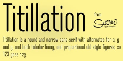
- Titul by ParaType,
$30.00
- Titus by Linotype,
$29.99 - Titus by URW Type Foundry,
$35.99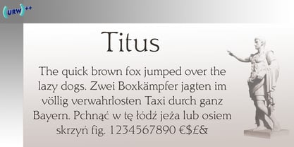
- Titla by ParaType,
$25.00


