10,000 search results
(0.015 seconds)
- Mauline by Yukita Creative,
$14.00 a modern, stylish serif font that offers excellent legibility for a variety of applications. This font is ideal for use in any kind of graphic design or advertising work, from logo designs to web design and print projects. Its easy-to-read character shapes, distinct letterforms, and beautiful typographic details make this typeface perfect for creating impactful and captivating visual designs.
 - Printers Plant Ornaments by Gerald Gallo,
$20.00 Printers Plant Ornaments was inspired by the decorative motifs used to fill in page space that have been around since moveable type printing commenced in the 15th century. All the ornaments are representations of plants. There is an assortment of 47 ornaments located under the character set keys. Under their respective shift + character set keys are the same 47 ornaments flopped.
 - Omar by Ahmet Altun,
$- The Omar Font was completely created by graphic tablet. Omar font family comes in two weights; Normal and Italic. They're all capital but lowercase and capital letters are different from each other.It is legible in small type sizes. With its decorative view, you can get matchless products in typographic works, t-shirt prints, posters, logos and every kind of graphic works.
 - Bix Metric by S6 Foundry,
$20.00 Bix Metric is a stylistic display font developed within a set grid. The mono-spaced first set of the family comes in 3 styles in both upper and lowercase glyphs allowing mixing of infinite combinations. Perfectly suited for headlines, large-format prints, brand identities, social media, advertising, editorial design, posters, magazines, logos, headings, digital and more. With multi-language support.
 - Picto Handwriting by SoftMaker,
$15.99 Digitized handwriting fonts are a perfect way to give documents the “very special touch”. Invitations look simply better when handwritten than when printed in bland Arial or Times New Roman. Short handwritten notes look authentic and appealing. There are numerous occasions where handwritten text makes a better impression. “Picto Handwriting” comes with beautiful handwritten pictograms that let you quickly spruce up your designs.
 - Which Is by Gassstype,
$23.00 Hello Everyone, introduce our new product Font Which Is it is Special Handwritten Font.This is a Textured Natural Style and classy style with a clear style and dramatic movement. This font Which Is is great for your next creative project such as logos, printed quotes, invitations, cards, product packaging, headers, Logotype, Letterhead, Poster. You can activate 18 Ligatures glyphs OpenType panel.
 - Gratitude Script by Sudtipos,
$59.00 The quality or feeling of being grateful or thankful. An appreciation for the world around us. Gratitude for being a part of it all. No matter what’s happening in our lives, there’s always something to be grateful for. When we have an appreciation for all we have, life gives us more to feel grateful for. It’s a naturally occurring cycle. Some of the most profoundly grateful times in our lives can be felt when we find ourselves surrounded by beauty: in art, nature, music, special places, the seasons, family, loving relationships, a cozy home, meaningful work; in doing what brings us joy, comfort, and feelings of deep love and satisfaction. There is beauty everywhere, and creating beauty is an artist’s mission. We all have the ability to create and experience beauty. In this high-tech, fast paced world of strict, unbending rules, we give you Gratitude Script: A celebratory font that’s deeply rooted in tradition letterforms but with a modern, updated twist; a casual, whimsical, fun look that is also elegant and versatile! Partnering with Ale Paul is seasoned wedding calligrapher Kathy Milici, who is well known for her passionate writing style and highly ornamental pen flourishing. With its signature hand-written look, flowing lines, graceful curves and flourishes, Gratitude Script’s space saving, vertical style is perfect for small printing areas as well as large format presentations. An extended variety of alternates makes it a perfect and versatile addition to your font repertoire.. These are tender times. Long hours and work pressures add to our stress. Time spent with family and friends is more valuable than ever before, as we try to balance it all. It’s important to mark time with special, happy events in our lives that we can all appreciate and enjoy. Let’s be grateful for it all! Hooray for Gratitude, and Gratitude Script! About the font: Gratitude Script is an OpenType font that contains more than 1400 glyphs icluding ligatures, alternates, endings , a wide range of latin languages and a set of ornaments and words specially designed to use in stationery for weddings, birthdays, etc. There is a smooth version of Gratitude Script too. To access to all the extra characters you will need to use software that actually supports OpenType like Adobe CS apps or later where we recommend the use of the Glyph palette. About the presentation: Every time we publish a new typeface we love to invite an artist to collaborate. Vero Scherini, an argentinian and very talented designer and illustrator, fits perfectly with Gratitude.
 - Tristan by Suomi,
$25.00 A headline font with medieval feel.
 - Ravishing by Bogstav,
$17.00 Art Deco meets organic - don't panic! :)
 - Mangarans by Raditya Type,
$13.00 Mangarans is a Modern Victorian Blackletter, which is combining modern and classic typography. It has a vintage feel, and as a result, it matches a wide variety of designs. Get inspired by its retro feel.
 - Honey Notes by Ali Hamidi,
$10.00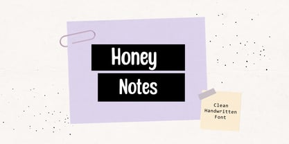 Honey Notes is a simple and neat handwritten font that can be used for all chalkboard quotes or teaching material! Its authentic look and feel will add a personal and realistic feel to your designs.
 - The Cartel by Say Studio,
$12.00 About the Product The Cartel is a elegant serif font . This typeface has been made carefully to make sure its premium quality and luxury feel. The ligatures makes this typeface unique and stands out rather than the regular serif font. Very suitable for logo, headline, tittle, and the other various formal forms such as invitations, labels, logos, magazines, books, greeting / wedding cards, packaging, fashion, make up, stationery, novels, labels or any type of advertising purpose. Features : numbers and punctuation multilingual ligatures alternates PUA encoded FAQ's : Where are the TTF's? They are included in a download link( in a text file) in your main download file. 1 user 2 computers installation (Desktop License) You may NOT use for broadcast or Cinema/Motion Picture. You may NOT resell this font in any platform without further permission from designer. Do NOT embed font files in app/game/e-pub (for desktop license) You may NOT use the fonts in templates for sale/free. ( web/print/app ) For other license use please contact us. SOFTWARE REQUIREMENTS : Fonts and alternate : No special software required they may be used in any basic program /website apps that allows standard fonts That's it folks! You can go ahead and get cracking :) Follow My Shop For Upcoming Updates Including Additional Glyphs And Language Support. And Please Message Me If You Want Your Language Included or If There Are Any Features or Glyph Requests, Feel Free to Send me A Message. Have a Good Day !
 - saxMono - Unknown license

- Obschepit by Zaporozhan Dmitriy,
$15.00 When did it start. One day I was designing some stuff for a fast food café. By style the Café was made as an old Soviet canteen. So I had to do a special accent on this in menu, advertising posters and other print products. I decided to do this by interesting old school font. There are many cool retro fonts on the Internet, but not one of them satisfied me on 100%. The next step was to look at the old posters and find some inspiration. So I found some cool pictures with exact letters that I needed, but there were no typefaces to buy so that I can print some text with this exact letters. That's why I decided to do such typeface for my own. You can use this typeface in the field of nutrition, and it also will suit for cinema posters.
 - Velino Compressed Headline by DSType,
$50.00 Velino is one of our most complete type families. The serif version comes in two packages with three widths: Velino, Velino Condensed, and Velino Compressed. The display package contains high-contrast typefaces, with a modern flair—very feminine but with plenty of character, specially designed for fine print in big text sizes. The text package was designed for any running text. Its proportions and colors make it ideal for text, even in very difficult conditions such as newspaper printing. We also designed the perfect companion to this enormous type system: Velino Poster, a slab serif typeface with only one weight and its respective italic, but with plenty of muscle, for every time some extra strength is needed, such as setting very big text, magazine covers or newspapers’ special sections. Finally, we designed Velino Sans and Velino Sans Condensed to perfectly match the weight and proportions of Velino, all with matching italics.
 - Velino Sans Condensed by DSType,
$55.00 Velino is the most recent of our Premium Typefaces. The serif version comes in two packages with three widths: Velino, Velino Condensed and Velino Compressed. The Display package contains high contrast typefaces, with a modern flair, very feminine but with plenty of character, specially designed for fine print in big text sizes. The Text package was designed for any running text. It’s proportions and colors make it the ideal for text, even in very difficult conditions such as newspaper printing. We also designed the perfect companion to this enormous type system: Velino Poster, a Slab Serif typeface with only one weight and it’s respective italic, but with plenty of muscle, for every time some extra strength is needed, like setting very big text, magazine covers or newspaper’s special sections. Finally we designed Velino Sans and Velino Sans Condensed to perfectly match the weight and proportions of Velino, all with matching italics.
 - Velino Condensed Headline by DSType,
$50.00 Velino is one of our most complete type families. The serif version comes in two packages with three widths: Velino, Velino Condensed, and Velino Compressed. The display package contains high-contrast typefaces, with a modern flair—very feminine but with plenty of character, specially designed for fine print in big text sizes. The text package was designed for any running text. Its proportions and colors make it ideal for text, even in very difficult conditions such as newspaper printing. We also designed the perfect companion to this enormous type system: Velino Poster, a slab serif typeface with only one weight and its respective italic, but with plenty of muscle, for every time some extra strength is needed, such as setting very big text, magazine covers or newspapers’ special sections. Finally, we designed Velino Sans and Velino Sans Condensed to perfectly match the weight and proportions of Velino, all with matching italics.
 - Velino Ultra by DSType,
$50.00 Velino is one of our most complete type families. The serif version comes in two packages with three widths: Velino, Velino Condensed, and Velino Compressed. The display package contains high-contrast typefaces, with a modern flair—very feminine but with plenty of character, specially designed for fine print in big text sizes. The text package was designed for any running text. Its proportions and colors make it ideal for text, even in very difficult conditions such as newspaper printing. We also designed the perfect companion to this enormous type system: Velino Poster, a slab serif typeface with only one weight and its respective italic, but with plenty of muscle, for every time some extra strength is needed, such as setting very big text, magazine covers or newspapers’ special sections. Finally, we designed Velino Sans and Velino Sans Condensed to perfectly match the weight and proportions of Velino, all with matching italics.
 - HWT Artz by Hamilton Wood Type Collection,
$24.95 HWT Artz is the newest wood type to be cut at Hamilton Wood Type and Printing Museum. It was designed by venerable type designer Erik Spiekermann exclusively for his own print studio (P98a in Berlin), specifically to be cut into large size wood type. The digital version is being offered to the general public with proceeds of sales to benefit the museum's ongoing operations. HWT Artz evokes bold early 20th century European poster lettering. The design itself is intended to minimize hand-finishing and thus production time with rounded corners rather than sharp interior corners that would normally have to be hand-finished. In keeping with the tradition of naming new Hamilton designs after key figures from the living history of Hamilton (and following Spiekermann's tradition of four letter font names), Artz is named after Dave Artz- Hamilton Manufacturing retiree and master type trimmer.
 - Velino Condensed Ultra by DSType,
$50.00 Velino is one of our most complete type families. The serif version comes in two packages with three widths: Velino, Velino Condensed, and Velino Compressed. The display package contains high-contrast typefaces, with a modern flair—very feminine but with plenty of character, specially designed for fine print in big text sizes. The text package was designed for any running text. Its proportions and colors make it ideal for text, even in very difficult conditions such as newspaper printing. We also designed the perfect companion to this enormous type system: Velino Poster, a slab serif typeface with only one weight and its respective italic, but with plenty of muscle, for every time some extra strength is needed, such as setting very big text, magazine covers or newspapers’ special sections. Finally, we designed Velino Sans and Velino Sans Condensed to perfectly match the weight and proportions of Velino, all with matching italics.
 - Velino Condensed Text by DSType,
$55.00 Velino is the most recent of our Premium Typefaces. The serif version comes in two packages with three widths: Velino, Velino Condensed and Velino Compressed. The Display package contains high contrast typefaces, with a modern flair, very feminine but with plenty of character, specially designed for fine print in big text sizes. The Text package was designed for any running text. It’s proportions and colors make it the ideal for text, even in very difficult conditions such as newspaper printing. We also designed the perfect companion to this enormous type system: Velino Poster, a Slab Serif typeface with only one weight and it’s respective italic, but with plenty of muscle, for every time some extra strength is needed, like setting very big text, magazine covers or newspaper’s special sections. Finally we designed Velino Sans and Velino Sans Condensed to perfectly match the weight and proportions of Velino, all with matching italics.
 - Velino Sans by DSType,
$55.00 Velino is the most recent of our Premium Typefaces. The serif version comes in two packages with three widths: Velino, Velino Condensed and Velino Compressed. The Display package contains high contrast typefaces, with a modern flair, very feminine but with plenty of character, specially designed for fine print in big text sizes. The Text package was designed for any running text. Its proportions and colors make it the ideal for text, even in very difficult conditions such as newspaper printing. We also designed the perfect companion to this enormous type system: Velino Poster, a Slab Serif typeface with only one weight and its respective italic, but with plenty of muscle, for every time some extra strength is needed, like setting very big text, magazine covers or newspapers’ special sections. Finally we designed Velino Sans and Velino Sans Condensed to perfectly match the weight and proportions of Velino, all with matching italics.
 - Velino Display by DSType,
$55.00 Velino is the most recent of our Premium Typefaces. The serif version comes in two packages with three widths: Velino, Velino Condensed and Velino Compressed. The Display package contains high contrast typefaces, with a modern flair, very feminine but with plenty of character, specially designed for fine print in big text sizes. The Text package was designed for any running text. It’s proportions and colors make it the ideal for text, even in very difficult conditions such as newspaper printing. We also designed the perfect companion to this enormous type system: Velino Poster, a Slab Serif typeface with only one weight and it’s respective italic, but with plenty of muscle, for every time some extra strength is needed, like setting very big text, magazine covers or newspaper’s special sections. Finally we designed Velino Sans and Velino Sans Condensed to perfectly match the weight and proportions of Velino, all with matching italics.
 - Velino Compressed Display by DSType,
$55.00 Velino is the most recent of our Premium Typefaces. The serif version comes in two packages with three widths: Velino, Velino Condensed and Velino Compressed. The Display package contains high contrast typefaces, with a modern flair, very feminine but with plenty of character, specially designed for fine print in big text sizes. The Text package was designed for any running text. It’s proportions and colors make it the ideal for text, even in very difficult conditions such as newspaper printing. We also designed the perfect companion to this enormous type system: Velino Poster, a Slab Serif typeface with only one weight and it’s respective italic, but with plenty of muscle, for every time some extra strength is needed, like setting very big text, magazine covers or newspaper’s special sections. Finally we designed Velino Sans and Velino Sans Condensed to perfectly match the weight and proportions of Velino, all with matching italics.
 - Niedermann Grotesk by steve mehallo,
$19.14 With the printing of the Futurist poem “Zang Tumb Tuuum” in 1914, modern art had taken a typographic twist: “words in freedom” (parole in libertà) were now a major part of the art world. The avant garde followed suit. Niedermann Grotesk is based on the everyday type that appeared in early modernist collages, journals and manifestos. It is a peculiar style of lettering—which was originally inspired by the Sachplakat (object poster) work of Lucian Bernhard—and adapted for hot metal in 1908 by Heinz Hoffmann. 100 years ago, the style became a workhorse of the German printing industry. Niedermann Grotesk is an updated variant, referencing the original poster art, each letter carefully drawn with an old brush. Bumpy, bold and blunt—with a suite of alternate characters and a few dingbats—Niedermann Grotesk is perfect for advertising, packaging, poetry, art, protests and retro homage.
 - Velino Headline by DSType,
$50.00 Velino is one of our most complete type families. The serif version comes in two packages with three widths: Velino, Velino Condensed, and Velino Compressed. The display package contains high-contrast typefaces, with a modern flair—very feminine but with plenty of character, specially designed for fine print in big text sizes. The text package was designed for any running text. Its proportions and colors make it ideal for text, even in very difficult conditions such as newspaper printing. We also designed the perfect companion to this enormous type system: Velino Poster, a slab serif typeface with only one weight and its respective italic, but with plenty of muscle, for every time some extra strength is needed, such as setting very big text, magazine covers or newspapers’ special sections. Finally, we designed Velino Sans and Velino Sans Condensed to perfectly match the weight and proportions of Velino, all with matching italics.
 - Snatched by Cititype,
$16.00 'Snatched' is a spontaneous handwriting. This name is taken from the slang term in the 2022 era to describe someone or something in a positive manner. This font consists of the same uppercase and lowercase, often referred to as 'all capital letterform', complete with numerals and punctuation. Composed in tends to widen form which is more like the typical handwriting of architects. This font looks like it was written with a marker or technical pen, very bold stylish and legible. For designers this is an interesting thing, the design looks very natural and rhythmic to beautify presentations and blue prints. Can be installed for CAD programs, Sekthup and other applications. This font is very suitable for various media related to handmade, craft businesses, logos, quotes, prints, social media posts, indie business, outdoor sports and other applications to strengthen the impression of handwriting and demand attention.
 - Velino Compressed Text by DSType,
$55.00 Velino is the most recent of our Premium Typefaces. The serif version comes in two packages with three widths: Velino, Velino Condensed and Velino Compressed. The Display package contains high contrast typefaces, with a modern flair, very feminine but with plenty of character, specially designed for fine print in big text sizes. The Text package was designed for any running text. It’s proportions and colors make it the ideal for text, even in very difficult conditions such as newspaper printing. We also designed the perfect companion to this enormous type system: Velino Poster, a Slab Serif typeface with only one weight and it’s respective italic, but with plenty of muscle, for every time some extra strength is needed, like setting very big text, magazine covers or newspaper’s special sections. Finally we designed Velino Sans and Velino Sans Condensed to perfectly match the weight and proportions of Velino, all with matching italics.
 - Velino Poster by DSType,
$55.00 Velino is the most recent of our Premium Typefaces. The serif version comes in two packages with three widths: Velino, Velino Condensed and Velino Compressed. The Display package contains high contrast typefaces, with a modern flair, very feminine but with plenty of character, specially designed for fine print in big text sizes. The Text package was designed for any running text. It’s proportions and colors make it the ideal for text, even in very difficult conditions such as newspaper printing. We also designed the perfect companion to this enormous type system: Velino Poster, a Slab Serif typeface with only one weight and it’s respective italic, but with plenty of muscle, for every time some extra strength is needed, like setting very big text, magazine covers or newspaper’s special sections. Finally we designed Velino Sans and Velino Sans Condensed to perfectly match the weight and proportions of Velino, all with matching italics.
 - Velino Compressed Ultra by DSType,
$50.00 Velino is one of our most complete type families. The serif version comes in two packages with three widths: Velino, Velino Condensed, and Velino Compressed. The display package contains high-contrast typefaces, with a modern flair—very feminine but with plenty of character, specially designed for fine print in big text sizes. The text package was designed for any running text. Its proportions and colors make it ideal for text, even in very difficult conditions such as newspaper printing. We also designed the perfect companion to this enormous type system: Velino Poster, a slab serif typeface with only one weight and its respective italic, but with plenty of muscle, for every time some extra strength is needed, such as setting very big text, magazine covers or newspapers’ special sections. Finally, we designed Velino Sans and Velino Sans Condensed to perfectly match the weight and proportions of Velino, all with matching italics.
 - Velino Condensed Display by DSType,
$55.00 Velino is the most recent of our Premium Typefaces. The serif version comes in two packages with three widths: Velino, Velino Condensed and Velino Compressed. The Display package contains high contrast typefaces, with a modern flair, very feminine but with plenty of character, specially designed for fine print in big text sizes. The Text package was designed for any running text. It’s proportions and colors make it the ideal for text, even in very difficult conditions such as newspaper printing. We also designed the perfect companion to this enormous type system: Velino Poster, a Slab Serif typeface with only one weight and it’s respective italic, but with plenty of muscle, for every time some extra strength is needed, like setting very big text, magazine covers or newspaper’s special sections. Finally we designed Velino Sans and Velino Sans Condensed to perfectly match the weight and proportions of Velino, all with matching italics.
 - Westcoast Letters by Cultivated Mind,
$18.00 Westcoast Letters is a fun hand painted headline font by Cultivated Mind. Westcoast Letters comes in four font styles, extras, frames and page rulers. Westcoast Letters is a sister typeface to the ever popular Pacific Northwest font family. Westcoast characters are wider than Pacific Northwest and offer a new style of letters. Extras include hand painted pacific ocean icons, wild animals, a set of numbers and symbols. Frames and page rulers are decorative and look great with the Westcoast fonts.
 - Enjoika by Fontiko,
$10.99 Enjoika serif font family Enjoika is an elegant and neat font inspired by the Petrykivka painting (traditional Ukrainian decorative painting style) distinctive features of this folk art style are its flower patterns and Art Nuevo style by Alphonse Mucha with the floral and nature thematic and the swirls. This font looks luxury, stylish, elegant and clean and . This font is great for logo branding & invitations, photography, quotes, wedding design, business cards, posters, watermark, holiday cards, special events and much more.
 - Tecna Light Square BNF V1.2 by Descarflex,
$30.00 The Tecn@ Square family were designed to head, enumerate, point out or highlight a point in a writing or plan. In this sense and for this reason, the characters are available only in capital letters and some signs or symbols that could serve such purposes. Among other applications, these characters are used in the personalization of plans, highlighting or indicating parts of the design that facilitate the Descriptive Memory of the plan or the development of a Manual or Installation Instructions.
 - Marli by URW Type Foundry,
$36.99 Marli is an adaption of a face designed by F. Schweimanns and issued by the Stempel Foundry from 6 to 48 point, as “Korso”, in 1913. In 1936 the American Intertype issued their version for the line composing machines in 12 and 14 point as “Camera”. It is a very suitable type face for personal stationery, announcements, greeting cards and the like. The font is updated with a full Open Type character set, while also a Cyrillic has been added.
 - Boarding House by Hanoded,
$15.00 I have never stayed at a boarding house myself, but I’ve heard some horror stories. When I have finished painting the three fonts (using Chinese ink and a small brush), I didn’t have to think long for a name. Boarding House family consists of three distinct hand painted fonts - the complement each other, but can be used separately as well. Use Boarding House for your halloween posters, mystery novels or websites. All fonts come with an attic full of diacritics.
 - Tecna Dark Square BNF V1.2 by Descarflex,
$30.00 The Tecn@ Square family were designed to head, enumerate, point out or highlight a point in a writing or plan. In this sense and for this reason, the characters are available only in capital letters and some signs or symbols that could serve such purposes. Among other applications, these characters are used in the personalization of plans, highlighting or indicating parts of the design that facilitate the Descriptive Memory of the plan or the development of a Manual or Installation Instructions.
 - Tiresias by Bitstream,
$29.99Tiresias was designed for subtitling by Dr. John Gill from the Royal National Institute for the Blind (RNIB), in the United Kingdom. The Tiresias font is designed to have characters that are easy to distinguish from each other, especially important for the visually impaired. The following key factors were considered during the design process: character shapes, relative weight of character stokes, intercharacter spacing, and aspect ratios that affect the maximum size at which the type could be used. The benefits of the Tiresias font are greatest on lower resolution displays, such as televisions, train and airline information terminals, and low resolution displays on wireless communication and handheld devices. InfoFont is for printed instructions on public terminals where legibility is the primary consideration; these instructions are often read at a distance of 30 to 70 cm. Infofont is not designed for large quantities of text. The Tiresias LPfont is a large print typeface specifically designed for people with low vision. Large print publications should be designed to specifically help with reading problems, and should not just be an enlarged version of the ordinary print. The Tiresias LPfont family, made up of roman, italic, and bold weights, was designed to address and solve these issues. The RNIB developed PCfont for people with low vision to use on computer screens. It is designed for use at larger sizes only. PCfont includes delta hinting technology in the font to ensure pixel-perfect display at key sizes. Signfont is for fixed (not internally illuminated) signage. The recommended usage is white or yellow characters on a matt dark background. Note that the “Z” versions have slashed zeroes, and are identical in all other respects. These faces were developed together with Dr. John Gill of the National Institute of the Blind, Dr. Janet Silver; optometrist of Moorfields Eye Hospital, Chris Sharville of Laker Sharville Design Associates, and Peter O'Donnell; type consultant. Tiresias himself is a figure from Greek mythology, a blind prophet from Thebes. - Garamond Premier by Adobe,
$35.00Claude Garamond (ca. 1480-1561) cut types for the Parisian scholar-printer Robert Estienne in the first part of the sixteenth century, basing his romans on the types cut by Francesco Griffo for Venetian printer Aldus Manutius in 1495. Garamond refined his romans in later versions, adding his own concepts as he developed his skills as a punchcutter. After his death in 1561, the Garamond punches made their way to the printing office of Christoph Plantin in Antwerp, where they were used by Plantin for many decades, and still exist in the Plantin-Moretus museum. Other Garamond punches went to the Frankfurt foundry of Egenolff-Berner, who issued a specimen in 1592 that became an important source of information about the Garamond types for later scholars and designers. In 1621, sixty years after Garamond's death, the French printer Jean Jannon (1580-1635) issued a specimen of typefaces that had some characteristics similar to the Garamond designs, though his letters were more asymmetrical and irregular in slope and axis. Jannon's types disappeared from use for about two hundred years, but were re-discovered in the French national printing office in 1825, when they were wrongly attributed to Claude Garamond. Their true origin was not to be revealed until the 1927 research of Beatrice Warde. In the early 1900s, Jannon's types were used to print a history of printing in France, which brought new attention to French typography and the Garamond" types. This sparked the beginning of modern revivals; some based on the mistaken model from Jannon's types, and others on the original Garamond types. Italics for Garamond fonts have sometimes been based on those cut by Robert Granjon (1513-1589), who worked for Plantin and whose types are also on the Egenolff-Berner specimen. Linotype has several versions of the Garamond typefaces. Though they vary in design and model of origin, they are all considered to be distinctive representations of French Renaissance style; easily recognizable by their elegance and readability. Garamond Pemiere Pro was designed by Robert Slimbach, and released in 2005." - Selestyna by Cooldesignlab,
$12.00 Meet the new slick calligraphy font - Selestyna. This gorgeous script is for those who need some elegance and style for their designs and is perfect for wedding invitations, saving date cards, feminine branding, and other necessities. This font is modern with a love style, but still authentic. Selestyna includes the complete set of Basic Uppercase and Lowercase Characters, Numbers, and Punctuation. It also contains binders and many stylistic alternatives to perfectly recreate natural calligraphy (check the preview to see all of them). If you have any questions regarding my products, feel free to write a message or contact me via email Cooldesignlab@gmail.com. Thank you very much for visiting my shop! ~ Cooldesignlab
