10,000 search results
(0.014 seconds)
- Present Snow by NJ Studio,
$19.00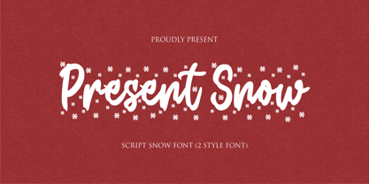 Hi...Thank for your visit :) Present Snow a script font is a beautiful script font with snow effect. It features Snow-themed characters that will take your projects to the next level! This font is PUA code which means you can easily access all the glyphs and alternates that are full of love! It also features many special features including glyphs and alternate. font designs that are made for various vector designs, printing such as digital wedding blogs, online shops, social media, while printing can be used in the field of product clothing, accessories, bags, pins, logos, business cards, watermarks and many others ... so it can make your product look cute and attractive, and also Multilingual support!!! Happy design ...
 - Pink blossom by NJ Studio,
$19.00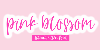 Hi...Thank for your visit :) pink blossom a handdwritten script font is a unique script font. It features bouncy characters that will take your projects to the next level! This font is PUA code which means you can easily access all the glyphs and swashes that are full of unique! It also features many special features including glyphs and alternate ligatures. font designs that are made for various vector designs, printing such as digital wedding blogs, online shops, social media, while printing can be used in the field of product clothing, accessories, bags, pins, logos, business cards, watermarks and many others ... so it can make your product look cute and attractive, and also Multilingual support!!! Happy design ...
 - Wood Bonnet Antique No.7 by astype,
$41.00 Wood Bonnet Antique No.7 is based on real vintage wood type blocks from Switzerland. The very distressed letters give a warm analogue vintage charm on printing. These kind of wood type letters were very common and often named by generic names like Roman, French or Antique followed by a catalog number. But these letters have some very quirky details hard to find else were. » pdf specimen « The font offers up to five glyph variations of all the Latin base letters, figures and some additional letters. An OpenType glyph-rotator is programmed to emulate the randomness of old school printing on live typing. All dingbats of the specimen file are included in the font data too.
 - Holla bella by NJ Studio,
$19.00 Hi...Thank for your visit :) Holla bella a lovely script font family is a beautiful script font. It features love-themed characters that will take your projects to the next level! This font is PUA code which means you can easily access all the glyphs and swashes that are full of love! It also features many special features including glyphs and alternate ligatures. font designs that are made for various vector designs, printing such as digital wedding blogs, online shops, social media, while printing can be used in the field of product clothing, accessories, bags, pins, logos, business cards, watermarks and many others ... so it can make your product look cute and attractive, and also Multilingual support!!! Happy design ...
 - Wood Heinz No. 2 by astype,
$50.00 Wood Heinz No.2 - the close friend of Wood Heinz No.4 The Regular font style offers up to four »printed look« variations of all the Latin base letters and figures. An OpenType letter rotator is build into the font to emulate the randomness of wood type printing. You can switch manually to the alternate letters by using the Stylistic Sets 1–4. Stylistic Set 5 will activate the more common look of the capital letter R with a straight leg. The New font style has clean outlines and of course the alternate letter R. Wood Heinz No.2 and No.4 working seamlessly with each other. You can both mix them easily. PDF Specimen
 - Morganhand by Morganismi,
$9.00 Morganhand is a very individual typeface based on the handwriting of Finnish outsider artist Heikki Morgan Hämäläinen. Its economical lines make it very serviceable for numerous uses like cards, notes, prints, comics and so on. Morganhand Outline is based on Morganhand Regular, a handwritten font imitating the writing of Finnish outsider artist Heikki Morgan Hämäläinen. Every drawn line of each glyph is outlined giving a fun expression. The two fonts can be used separately or mixed together. Mightly usable in cards, notes, prints, comics etc. Morganhand Outline supports many European languages. Morganhand supports many European languages. The font works fine with its sister Morganhand Outline which is kind of a modification of it.
 - Andreae by Proportional Lime,
$9.99 Hieronymus Andreae or latter in life Hieronymus Formenschneider as he proudly took a new surname to proclaim his success in the printing industry as the man who introduced the Fraktur script to the world of print. This project was undertaken at the orders of Emperor Maximilian I. One of Fraktur’s first appearances was in a joint venture with the great Albrecht Dürer. This font was based on a later work, Andreae’s magnus opus in the music field, the Coralis Constantini by Henry Isaac. Andreae worked as woodblock cutter and then became a publisher in the city of Nuremberg until his death in 1565. We at PLTF are proud to revive this enormously influential typeface.
 - Masterbaker by NJ Studio,
$19.00 Hi...Thank for your visit :) Masterbaker a modern script font is a unique script font. It features bread-themed characters that will take your projects to the next level! This font is PUA code which means you can easily access all the glyphs and swashes that are full of unique! It also features many special features including glyphs and alternate ligatures. font designs that are made for various vector designs, printing such as digital wedding blogs, online shops, social media, while printing can be used in the field of product clothing, accessories, bags, pins, logos, business cards, watermarks and many others ... so it can make your product look cute and attractive, and also Multilingual support!!! Happy design ...
 - Cosmopolitan by Fenotype,
$35.00 Cosmopolitan is a monoline font family with script and sans versions that both work great together or alone. It comes with five weights and “printed” versions. For extra swashes, swirls and pictograms there is Cosmopolitan Extras. Cosmopolitan Script is packed with OpenType alternates: turn on Swash, Stylistic or Titling Alternates in any OpenType savvy program or find even more alternates from the Glyph Palette. Cosmopolitan Sans has different Swash Alternates for both upper and lowercase characters. Cosmopolitan Family gives an elegant look for any project from print to digital. For the very best price purchase the whole family! Cosmopolitan Family is inspired by two other great monoline font families: Selfie and Beloved.
 - Augsburger2009 by Proportional Lime,
$24.95 This typeface was inspired strongly by one of Ernhardt Ratdolt’s (1442-1528?) many beautiful typefaces. Mr. Ratdolt was a printer from the city of Augsburg, who had also worked for several years as a printer in Venice. He made many advances in printing technique and technology, including the decorated title page. Early books have a mysterious rhythm to the appearance of the text, due to small variances in letters caused by casting irregularities and ink transfer from the press. This supposed defect, which is present in this typeface, gives a pleasing effect when compared to the sterile regularity of modern printing technology. This font has been released as version 2.0 with over two hundred additional characters and improved metrics.
 - Jaroslaw by NJ Studio,
$19.00 Hi...Thank for your visit :) Jaroslaw a monoline bold script font is a unique script font with many swash. It features swash characters that will take your projects to the next level! This font is PUA code which means you can easily access all the glyphs and swashes that are full of unique! It also features many special features including glyphs. font designs that are made for various vector designs, printing such as digital wedding blogs, online shops, social media, while printing can be used in the field of product clothing, accessories, bags, pins, logos, business cards, watermarks and many others ... so it can make your product look cute and attractive, and also Multilingual support!!! Happy design ...
 - Get Married by NJ Studio,
$19.00 Hi...Thank for your visit :) Get Married a modern calligraphy font with 192 alternate, swash and ligature. It features ligatures characters that will take your projects to the next level! This font is PUA code which means you can easily access all the glyphs that are full of natural! It also features many special features including glyphs. font designs that are made for various vector designs, printing such as digital wedding blogs, online shops, social media, while printing can be used in the field of product clothing, accessories, bags, pins, logos, business cards, watermarks and many others ... so it can make your product look natural and attractive, and also Multilingual support!!! Happy design ...
 - Rich and Famous by NJ Studio,
$19.00 Hi...Thank for your visit :) Rich and Famous a modern script font with beginning and ending swash. It features ligatures characters that will take your projects to the next level! This font is PUA code which means you can easily access all the glyphs and swash that are full of authentic! It also features many special features including glyphs. font designs that are made for various vector designs, printing such as digital wedding blogs, online shops, social media, while printing can be used in the field of product clothing, accessories, bags, pins, logos, business cards, watermarks and many others ... so it can make your product look authentic and attractive, and also Multilingual support!!! Happy design ...
 - Khalid by Flawlessandco,
$9.00 Khalid is a modern Arabic font that combines traditional elements with a fresh, contemporary aesthetic. This versatile font is perfect for creating eye-catching designs for both digital and print projects. With its unique alternates and ligatures, Khalid offers a level of customization that sets it apart from other Arabic fonts. There's some connected letters and some alternates that suitable for any graphic designs such as branding materials, t-shirt, print, business cards, logo, poster, t-shirt, photography, quotes .etc This font support for some multilingual. Also contains uppercase A-Z and lowercase a-z, alternate character, numbers 0-9, and some punctuation. If you need help, just write me! Thanks so much for checking out my shop!
 - Aeronic by Hanoded,
$15.00 Aeronic is a work of love. I stumbled upon a fantastic Japanese poster for Nikke Coat by Gihachiro Okuyama (1907 - 1981). Gihachiro Okuyama (also: Okayama) was a very prolific Japanese print artist who started his career making woodblock prints, but later moved on to posters and advertisements. I tried to recreate the hand lettering in the original 1937 Nikke Coat poster, but since I had to work with a few glyphs only, I designed the remaining ones myself. The outline of Aeronic is rather thin, with thicker bits in some glyphs. It is quite rough in places, but it all adds to its unique look. Aeronic comes with a bonanza of diacritics.
 - Dear Sarah Pro by Betatype,
$119.00 Carefully considered letters written long-hand, sealed in an envelope and sent across continents were once the only connection for distant friends and lovers. Dear Sarah is a type that evokes the emotion of those handwritten messages. Using alternates, ligatures and a complex system for randomization and natural connected characters, Dear Sarah seeks to push the boundaries of digital type. The guiding question that drove the design of Dear Sarah was whether it was possible to create a natural looking script that worked well in running text. Hand-written types often work for two or three words, but as soon you you look at them in a paragraph, their unnatural textures make them feel contrived. As one of the first serious types to explore OpenType for a connected script, Dear Sarah uses a unique system to create natural connections. Often script types rely on one connecting point to make sure that all their characters fit together properly. Characters that naturally connect much higher, such as the ‘o’ or ‘v’ are distorted to connect at the same point as an ‘a’ or a ‘c’. Dear Sarah uses multiple sets of lower-case characters to connect at multiple points, creating a much more natural looking script. OpenType is also used to create variety, by using randomization techniques to insert disconnected characters as well as alternates, ligatures, swashes and ink blots to create a natural rhythm across multiple lines.
 - Coranto 2 by TypeTogether,
$49.00 Now available as Opentype font with extended character set, Coranto 2. It is originally based on Unger’s typeface Paradox, and arose from a desire to transfer the elegance and refinement of that type to newsprint. Coranto 2 has a larger x-height and in many places has been made more robust. Over the past 25 years newspaper production has seen spectacular improvements in paper and print quality, the introduction of colour printing, and vastly better register. Newspaper production still demands a lot of letter forms, but advanced printing brings out details better and makes typography more appealing to readers. For text type the newspaper is no longer an environment in which survival is the chief assignment. Today, newspapers are not merely a matter of cheap grey paper, thin ink and super-fast rotary printing, and type design no longer has to focus on surviving the mechanical technology and providing elementary legibility. Now there is also room to create an ambience, to give a paper a clearer identity of its own; there is scope for precision and refinement. One consequence of this is that newspaper designers can now look beyond the traditional group of newsfaces. Conversely, a newsface can be used outside the newspaper — not an uncommon occurrence. The update to this beautiful font family, Coranto 2, includes the addition of over 250 glyphs featuring full Latin A language support, new ligatures, 4 sets of numerals, arbitrary fractions and superiors/inferiors. Furthermore, kerning was added and fine tuned for better performance.
 - Typist Slab Mono by VanderKeur,
$25.00 The typeface Typist originated during an extensive research on the origin and development of typewriter typestyles. The first commercially manufactured typewriter came on the market in 1878 by Remington. The typestyles on these machines were only possible in capitals, the combination of capitals and lowercase came available around the end of the nineteenth century. Apart from a few exceptions, most typestyles had a fixed letter width and a more or less unambiguous design that resembled a thread-like structure. A lot of this mechanical structure was due to the method the typestyles were produced. Looking at type-specimens for print before the first typewriters were good enough to came on the market we can see that in 1853 and in 1882 Bruce’s Type Foundry already had printing type that had a structure of the typewriter typestyles. Of course printing types were proportional designed as typewriter typestyles had a fixed width. So it is possible that except from the method of production for typewriter typestyles, the design of printing types were copied. In the design of the Typist, the purpose was – next to the monospace feature – to include some of the features of the early typewriter typestyles. Features such as the ball terminals and the remarkable design of the letter Q. This new typeface lacks the mechanical and cold look of the early typewriter typestyles. The Typist comes in six weights with matching italics in two versions. One that resembled the early typewriter typestyles (Typist Slab) and a version designed with coding programmers in mind (Typist Code).
 - Typist Code Mono by VanderKeur,
$25.00 The typeface Typist originated during an extensive research on the origin and development of typewriter typestyles. The first commercially manufactured typewriter came on the market in 1878 by Remington. The typestyles on these machines were only possible in capitals, the combination of capitals and lowercase came available around the end of the nineteenth century. Apart from a few exceptions, most typestyles had a fixed letter width and a more or less unambiguous design that resembled a thread-like structure. A lot of this mechanical structure was due to the method the typestyles were produced. Looking at type-specimens for print before the first typewriters were good enough to came on the market we can see that in 1853 and in 1882 Bruce’s Type Foundry already had printing type that had a structure of the typewriter typestyles. Of course printing types were proportional designed as typewriter typestyles had a fixed width. So it is possible that except from the method of production for typewriter typestyles, the design of printing types were copied. In the design of the Typist, the purpose was – next to the monospace feature – to include some of the features of the early typewriter typestyles. Features such as the ball terminals and the remarkable design of the letter Q. This new typeface laks the mechanical and cold look of the early typewriter typestyles. The Typist comes in six weights with matching italics in two versions. One that resembled the early typewriter typestyles (Typist Slab) and a version designed with coding programmers in mind (Typist Code).
 - Ptilia MF by Masterfont,
$59.00 This font family, of 3 weights, was inspired by old hand painted signs in Tel Aviv.
 - Revoluzia MF by Masterfont,
$59.00 A revival of old hand painted sign in Old Jaffa, from the mid of 20th century.
 - Ransahoff CT by CastleType,
$19.00 A very light, elegant, condensed typeface, which must be used very large (at least 100 points).
 - DB Once Upon A Time by Illustration Ink,
$3.00The classic story of princes and princesses is represented here in DoodleBat Once Upon A Time. - Atlantic Avenue by Fonts of Chaos,
$10.00 Atlantic Avenue is an experimental font made with paint brush on wood, large scan and vectorized.
 - Textus Receptus by Lascaris,
$60.00 Textus Receptus is a historical revival based on the Roman and Greek types used by Johann Bebel (and later also Michael Isengrin) in Basel in the 1520s. The Roman is a low-contrast medium-to-heavy Venetian reminiscent of Jenson or Golden Type. The unusual polytonic Greek, not previously digitized, is lighter in weight and supplied with all the ligatures and variants of the original. Yet when used without historial forms the Greek has a surprisingly contemporary feel: it’s quirky and playful as a display face, but still easily legible in running text. Bebel’s Greek extended and refined the one used for the first printed Greek New Testament, Desiderius Erasmus’ Novum Instrumentum Omne, published in Basel in 1516 by Johann Froben. The name of the font was chosen in honor of this edition, which was so influential that it was later called the Textus Receptus (the “received text”), serving as the basis for Luther’s German Bible in 1522 and much subsequent scholarship for over 300 years. Following 16th century practice, Textus Receptus contains 130 ligatures and stylistic alternates for Greek, accessible either with OpenType features or with five stylistic sets. The Greek capitals, often printed bare in early editions, have been equipped with accents and breathings for proper polytonic or monotonic typesetting. The Roman includes both standard and historical ligatures along with the abbreviations and diacritics typically employed in early printed Latin. For expanded language coverage it has the entire unicode Latin Extended‑A range and part of Latin Extended-B. The capital A is surmounted by a horizontal stroke, as in some 16th century Italian designs, and the hyphen and question mark have both modern and historical form variants. Mark-to-base positioning correctly renders fifty combining diacritics, and with mark-to-mark positioning the most common diacritics may be stacked, permitting, for example, accents and breathings on top of length-marked vowels. Numerals include old-style, proportional lining and tabular lining. For further details, please download the 31-page Textus Receptus User Guide.
 - M Razor HK by Monotype HK,
$523.99 M Razor is so called ""neo Sung-style"" typefaces. Crossbars (橫) and stems (豎) are orthogonal and upright. Their entry and finial points are squarish, parallel without flare. Contrast of strokes is extremely high. This creates sharpness, stiffness in the midst of elegance of Sungti. Even distribution of space, careful positioning, size and proportion of radicals create a slightly expanded, opened and balanced construction. Zhonggong are slightly expanded, its relatively less inter-character spacing makes the line of text better coupled and aligned. Its features and construction create a feel of wholesome, elegance with contrasting sharpness and stiffness. It is best suited for casual, creative display eye-catching text, set upright (non-slanted), non-condensed.
 - M Finance PRC by Monotype HK,
$523.99 M Finance is a design inspired by the popular M Elle. M Finance incorporates features of M Yuen or other rounded Gothic-style typefaces. Crossbars (橫) and stems (豎) have squarish entry and finial points with slight round corners, parallel without flare. Thick-thin contrast of strokes is low and the text is visible. Its extra bold stems (豎) make it suitable for eye-catching display. Even distribution of space, careful positioning, size and proportion of radicals create a slightly expanded, opened and balanced construction. Its features and construction create a feel of subtle sharpness and stiffness with wholesome elegance. It is best suited for casual display text, illustrations, set upright (non-slanted), non-condensed.
 - Apnea by The Type Fetish,
$25.00 Apnea is a layerable type family consisting of fifty weights. It is an all caps font with a few lowercase alternatives (a, e, i, m, n, t, w, and y) thrown in for a more casual feel. The base letterforms are inspired by a painted sign I found in the garage of an old house I moved into years ago. All the hand-drawn elements were done directly in FontLab to keep them loose and playful without getting distorted or grungy. At its core Apnea consists of eight base weights (Base, Drop Shadow, Halftone, Inline Fill, Outline, Outline 3D, Shading and Shadow) that when combined, can make up the rest of the family. Have fun, experiment and play!
 - M Finance HK by Monotype HK,
$523.99 M Finance is a design inspired by the popular M Elle. M Finance incorporates features of M Yuen or other rounded Gothic-style typefaces. Crossbars (橫) and stems (豎) have squarish entry and finial points with slight round corners, parallel without flare. Thick-thin contrast of strokes is low and the text is visible. Its extra bold stems (豎) make it suitable for eye-catching display. Even distribution of space, careful positioning, size and proportion of radicals create a slightly expanded, opened and balanced construction. Its features and construction create a feel of subtle sharpness and stiffness with wholesome elegance. It is best suited for casual display text, illustrations, set upright (non-slanted), non-condensed.
 - M Razor PRC by Monotype HK,
$523.99 M Razor is so called ""neo Sung-style"" typefaces. Crossbars (橫) and stems (豎) are orthogonal and upright. Their entry and finial points are squarish, parallel without flare. Contrast of strokes is extremely high. This creates sharpness, stiffness in the midst of elegance of Sungti. Even distribution of space, careful positioning, size and proportion of radicals create a slightly expanded, opened and balanced construction. Zhonggong are slightly expanded, its relatively less inter-character spacing makes the line of text better coupled and aligned. Its features and construction create a feel of wholesome, elegance with contrasting sharpness and stiffness. It is best suited for casual, creative display eye-catching text, set upright (non-slanted), non-condensed.
 - Genia by Akufadhl,
$40.00 Genia is a script typeface that carries roundhand calligraphy DNA. Instead of using pointed nib pen, Genia was created using a fine brush resulting in clean and wavy character. With the OpenType features, Genia creates the natural feel of calligraphy writing. This contextual feature makes the font 'smart'. It knows which letters are the initial and which one is the finial. The feature can be activated in the OpenType section under the names of CALT or Contextual Alternates. Genia also gives you old style and proportional number options. Our advice is always turn the contextual alternates, and don't use the OPTICAL kerning on Adobe softwares. The preview on this site does not support the contextual alternates.
 - Beletrio by Storm Type Foundry,
$29.00 Beletrio was made as companion to Beletria, it has many shapes in common. We already have plenty of sans-serif fonts with classical proportions in the Stormtype library, such as John Sans, Sebastian or Andulka, but Beletrio is certainly the most peaceful of the bunch – it shares not only the feel of its serif originator, but its soft curves provide lovely visual caress as well. The smooth endings are not visible at first, they are balanced for easy reading as they solve some critical relations such as "rv, ry, rt", but in larger sizes you'll fully enjoy the picturesque details. It handles the smallest point sizes as well as large billboards, fashion magazines and philosophic tractates.
 - Thigles by Abbasy Studio,
$15.00 Thigles, is a font inspired by Signs Painting, these pretty hand painted letters that you can see on buildings, billboards and signboards. Thigles font comes with some alternates and ligature as well to create your design more unique. With additional shadow font you will be able to create the beautiful combination and bring retro touch to your artworks!
 - PR Mysticon 01 by PR Fonts,
$5.00 There has long been interest in the talismanic value of different numbers and their varied many - pointed stars or patterns. This font presents star designs with points numbering between five and twelve, in solid form, outlined, interlaced, and placed within a circle. Whether your interest is mathematical or mystical, We hope you will enjoy this collection of forms.
 - Bellis by Nine Font,
$25.00 Bellis is a hand painted brush font. Painted on absorbent paper with a chinese brush to make the ink spreading texture. The original texture was a little bit messy but we translated into a more clean textured font. Bellis is a very easy to read brush font and it can be used for posters, magazines or graphic artworks.
 - Soul Lotion by TypoGraphicDesign,
$19.00 CONCEPT/CHARACTERISTICS The typeface “Soul Lotion” is a sans serif font for display sizes. Constructed, clear and simply with monoline character. The round and unadorned look is modern & simple. APPLICATION AREA The modern, clear and simply sans serif font “Soul lotion” would be happy as a display typeface in headline size on the following areas and there simply feel good: Logos/Wordmarks, party flyer, album covers, CD covers, Poster design, video game design, and much more as display typeface for print and digital magazines, books and websites. TECHNICAL SPECIFICATIONS Headline Font | Display Font | Sans Serif Font “Soul Lotion” OpenType Font (Mac + Win) with 6 styles (regular, bold, light + 3x italic) & 354 glyphs. Incl. accents, alternative letters, ligatures & €. Desktop Font (.otf) + Web Font (.svg, .eot, .woff) KONZEPT/BESONDERHEITEN Die Schrift »Soul Lotion« ist ein serifenloser Font für Headlinegrößen. Konstruiert, klar und einfach mit gleichbleibender Strichstärke. Die runden und schnörkellosen Formen wirken modern & schlicht. EINSATZGEBIETE Die moderne, klare und einfache Sans Serif Schrift »Soul Lotion«, würde sich als Auszeichnungsschrift in Headlinegröße über folgende Einsatzgebiete sehr freuen und sich dort schlicht wohlfühlen: Logos/Wortmarken, Flyer für fast jede Party, PlattenCover, CD-Cover, PlakatDesign, Videospiel Design, als Headlineschrift für print und digitale Magazine, Bücher und Webseiten u.v.m. TECHNISCHE INFORMATIONEN Headline Font | Display Font | Sans Serif Font »Soul Lotion« OpenType Font (Mac + Win) mit 6 Schriftschnitten (regular, bold, light + 3x italic) & 354 Glyphen. Inkl. diakritisches Zeichen, alternative Buchstaben, Ligaturen & €. Desktop Font (.otf) + Web Font (.svg, .eot, .woff)
 - P22 Morris by P22 Type Foundry,
$24.95 William Morris (1834-1896) was probably the most influential figure in the decorative arts and private press movements of the late 19th and early 20th century. In reaction to the increasing lack of quality that the industrial revolution brought on, Morris sought a return to the ideals of the medieval craftsman. Dissatisfied with the commercially available typefaces of the day, he undertook the design of the fonts for his books himself. The P22 Morris font set features new versions of Morris's famous type designs for his Kelmscott Press. The two main fonts include full international character sets for Western European languages. P22 created MORRIS GOLDEN with a rough edge to simulate the look of printing on handmade paper. There is a more "refined" recent version of Golden, but its sterile digitization does not approach the effect that Morris achieved in his Kelmscott books. You'll notice the handmade effect less in the smaller sizes but will find it quite decorative in the larger sizes. (Morris cut his Golden type in only one size for the Kelmscott Press, approximately equal to 14 points.) P22's version of MORRIS TROY is more smooth than Morris Golden and is true to the original Morris design. It is based on the Kelmscott Troy type (an 18 point font) and its smaller counterpart, the Chaucer type (a 12 point font). American Type Founders made an unauthorized version of Troy, "Satanick," 189?, contrary to Morris's wish that it not be made available commercially.(Legend has it that the naming of Satanick comes from William Morris telling the agent inquiring about making copies of his fonts available to go to hell) Several digital versions of Troy (and Satanick) have appeared over the years. The P22 version offers a much more accurate rendering than any previous version. Morris designed the original Troy font to be spaced very tightly; our version reflects and honors his intention. The MORRIS ORNAMENTS are based on those Morris designed and used in his Kelmscott Press books. Characters in the positions of the letters A to Z are decorative drop cap initials. Characters in the number key positions reproduce other Morris embellishments. (See the accompanying key chart.) As with all headline fonts and complex dingbats characters, this font is best used at larger point sizes (e.g., 48, 72, 120). Use in body text or at small point sizes on-screen may not achieve desired results. P22 is grateful to William S. Peterson, Steven O. Saxe and the Lightsey-Offutt Library who gave invaluable research assistance to this project.
 - Minimalist by Ingrimayne Type,
$12.95 PostScript fonts are constructed by connecting dots, dots that have special attributes that control the shape of the connecting lines. In designing Minimalist, I wanted to see how few dots could be used to construct each letter. This is the source of the name--it is (or was) a minimum-point alphabet. I did not expect much from it, and was surprised that it turned out as well as it did. Since I originally drew it, I have added some points to some of the letters to get them to generate proper bitmaps, so it no longer has minimum points.
 - Sanctum Island by Skinny Type,
$19.00 Introducing Sanctum Island an handwritten font with a high detailed dry brush texture. Sanctum Island has been designed to fit a wide range of projects from urban style to classic branding with a characters set to completely change the look of your design. You can use it for business branding, Instagram quotes, blog headers, fashion apparel, stationery and more... Please note that Sanctum Island includes both standard and alphabets. Sanctum Island includes: Sanctum Island • A dry brush script font with uppercase and lowercase characters, ligatures, numerals and punctuation. Kingston Extras • A full set of brushed elements : 52 hand-drawn swashes, doodles and paint drips. How to use Sanctum Island Extras To use the Sanctum Island Extras characters simply install the Sanctum Island Extras.otf file, select it from your font menu and type any letter from uppercase A to lowercase z to have a swash or a paint splat. You can refer to the Sanctum Island Extras Map Character included in the folder to see which letter correspond to which element. Multilingual support Sanctum Island supports multilingual characters for western, central and south-east European languages. Feel free to message me if you're unsure of any language support. More Sanctum Island is compatible with any software that can read a standard font, though ligatures require a software that is Opentype capable. Most programs now are compatible with Opentype features. Fonts are provided in OTF and TTF. Any question? Feel free to contact me i’ll be glad to help you :) Enjoy!
 - Rapscallion - 100% free

