10,000 search results
(0.024 seconds)
- Oregon Street by Arendxstudio,
$15.00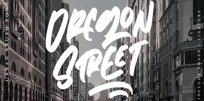 Oregon Street - Urban Brush Font with its distinctive character that can be easily implemented in your various design projects . Oregon Street came with opentype features such stylistic alternates, stylistic sets & ligatures good for logotype, poster, badge, book cover, tshirt design, packaging and any more. Features : • Character Set A-Z • Numerals & Punctuations (OpenType Standard) • Accents (Multilingual characters) • Ligature
 - Cendhany by Javatypestd,
$10.00 Introducing Cendhany is a hand lettered typeface. This font is made by handwriting naturally using a brush pen so it can produce good quality fonts. They work perfectly for you who needs a typeface for headline, logotype, apparel, invitation, branding, packaging, wedding, advertising, etc. This typeface comes in uppercase, lowercase, punctuation, symbols, numerals, alternate, ligatures, etc also supports multilingual.
 - Shockfest by Arendxstudio,
$15.00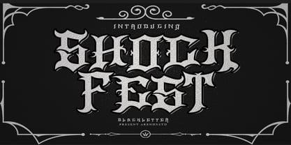 ShockFest is a very powerful Blackletter font in terms of design, has a unique and fancy character making every design project with that style look perfect. ShockFest came with opentype features such stylistic alternates, stylistic sets & ligatures good for logotype, poster, badge, book cover, tshirt design, packaging and any more. Features: -Uppercase & Lowercase -Multilingual support -Numbers -Symbols -Punctuation -Ornament
 - Organic Space by Melissa Lapadula,
$19.95Organic Space is about preserving what natural goodness there is left in the world, with its use of curves and space usage. It represents the selection of consumers, which choose organic products instead of the alternative genetically modified version. This typeface aims to be organic and unique. This font can function as headings, subheadings and body text. - Romantina Script by Jorsecreative,
$20.00 Romantina is Font Calligraphy Script, designed in modern style so that this font is beautiful and nice to see. very good to use for brand, t-shirts, packaging brand, greeting card, invitation card etc. The features of this font is: • STANDARD UPERCASE • STANDARD LOWERCASE • SWITH ALTERNATIVES UPERCASE • STYLISTIC ALTERNATIVES LOWERCASE • NITIAL & TERMINAL ALTERNATIVE • STANDARD LIGATURES • DISCRETIONARY LIGATUR
 - Neue Alte Grotesk by VisualWorks,
$20.00 Inspired by German grotesk from XIXth century. Driven by the spirit of 1950s Swiss Style. Designed with a hint of constructivist approach. Neue Alte Grotesk is a minimalistic typeface with a distinct character. It is created to connect both new and old. It will look good in juxtaposition with retro-styled illustrations and ultra-modern graphics.
 - Thoolloves by Maulana Creative,
$12.00 Thoolloves is a Cute modern calligraphy font. It's a clean store with high contrast line. It readable in short text. Thoolloves includes opentype features Ligatures. It support multilingual more than 100+ language. This font is good for logo design, Movie Titles, Books Titles and any awesome project you create. Make a stunning work with Thooloves handwriting font. Cheers, MaulanaCreative
 - UT Sugar Cane by Uniontype,
$15.00 Sugar Cane by Uniontype is a fresh and light multilingual script inspired by vintage monoline fonts. It provides advanced typographical support with contextual alternates, ligatures and swashes. That way, you’ll have automatic access to the dozens of extra glyphs in each of the fonts. This font is good for menu, signs, packaging, posters, letterings and logos.
 - IA Airship Captain by Invisible Art Studio,
$14.99 IA Airship Captain is a good readable comic book dialogue font made with a marker with wavy lines, giving it uniqueness and recognition. The family includes Regular, Italic, Bold, and Bold Italic. And contains a large number of kerning pairs. Added extended Latin, extended Cyrillic and contextual autoreplacing crossbar "I" in words like I, I'm, etc.
 - Bandera Display by AndrijType,
$21.00 This contrast serif typeface is good for display use. Bandera Display has six weights with original italics. It catches attention in headlines of posters and magazines. It works well with Bandera (slab serif), Osnova (sans serif) and Bandera Text (serif) fonts. Bandera is Spanish for ‘flag’. And Bandera is a symbol of Ukrainian fighting for freedom for many years.
 - Linotype Auferstehung by Linotype,
$29.99Linotype Auferstehung is part of the Take Type Library, selected from contestants of Linotype’s International Digital Type Design Contests of 1994 and 1997. German designer Johannes Plass was influenced by historic broken letter faces, particularly Caslon Gotisch, although the rounded corners give the font a handwritten look. Linotype Auferstehung is particularly good for headlines in larger point sizes. - Sunny Weather by Hanoded,
$15.00 Spring is in the air! My chickens are broody and are sitting on an ever increasing pile of eggs; my fruit trees are budding and the sun is shining! Sunny Weather is a happy kind of font: it was handwritten, using a Sharpie pen. It comes with double letter ligatures and a good dose of vitamin D!
 - Kybul by Invasi Studio,
$19.00 A bubbly, sweet font with a cutoff letterform on detail. Kabul takes another step and brings the bubbly into a casual style. Perfect for use in big sizes on posters or flyers. It's a good combination with sans font. Its imperfections keep it casual while still providing legibility. This is a great combination of casual and retro eras.
 - Prima Sans by Bitstream,
$29.99Prima is a series of fonts designed at Bitstream by Jim Lyles (Sans and Serif) and Sue Zafarana (Sans Mono), released in 1998. The fonts have been tuned to give exceptionally good quality at low screen resolutions. The fonts are therefore suitable for sustained use in browsers and other applications where users read for long periods from the screen. Of course, Prima looks great printed out too. - Prima Serif by Bitstream,
$29.99Prima is a series of fonts designed at Bitstream by Jim Lyles (Sans and Serif) and Sue Zafarana (Sans Mono), released in 1998. The fonts have been tuned to give exceptionally good quality at low screen resolutions. The fonts are therefore suitable for sustained use in browsers and other applications where users read for long periods from the screen. Of course, Prima looks great printed out too. - Café Brasil by Sofia Mohr,
$39.00 Café Brasil is a font designed to represent coffee, especially for use in packaging, brand titles, logos and menus. Based on the shape of a coffee bean, Café Brasil has delicate details and ligatures that represent the liquid, foam and steam of a good cup of coffee. In March 2014, Café Brasil was chosen to be part of the main exhibition at the “Tipos Latinos 2014”.
 - Lets get crazy by Pedro Teixeira,
$14.00 Let's get crazy is a font inspired by modern lettering and calligraphy with pronounced swashes, ascending / descending and crazy ear in "r" (btw you have more ordinary alternates) and so on, challenging the boundaries of reasonable. This font is good for titles or short sentences in combo with Let's get crazy sans serif majuscule letters, giving you a nice pairing of the modern lettering.
 - Regatta Condensed by ITC,
$29.00Regatta is a bold, narrow sans serif designed by Alan Meeks in 1987. Its strong, robust figures makes it a particularly good font for headlines in larger point sizes. Regatta is distinguished by its diamond shaped dots on i and j as well as the slanted strokes of several figures. These characteristics relax the closed, static image of Regatta and let the font seem cheerful and friendly. - Sprouts by Wundes,
$18.00Sprouts is probably best described as "Bonsai-Nouveau". It's designed to look 100% organic up close, while maintaining good readability even at a distance. The looped letters terminate in playful swirls perfect for use on the cover of a menu or cookbook, yet would be equally at home in corporate logo art or as initials. Play with it, because creativity is an organic process. - Kg Stuttgart 1930 by Martin L'Allier,
$10.00KgStuttgart1930 -- Kunstgewerbeschule Stuttgart 1930 -- is based on a printed sample of a font designed in 1930 at the Stuttgart School of Applied Arts. Found in the book ABZ, more alphabets and other signs by J. Rothenstein and M. Goodings. I recreated the grid and kept some awkward letters of this bauhaus-era inspired design. I created the missing glyphs and added alternate versions of already existing ones. - Retail Merchant JNL by Jeff Levine,
$29.00Retail Merchant JNL is strictly for making prices. The 0-9 keys have large numbers, the shift position of the same keys have smaller, centered numbers, and the alphabet keys have a variety of smaller numbers with underscores in single digits, pairs of numerals and even a few complete prices such as "$1.00". Thrown in for good measure are companion words... "at", "for, "each", "lb." and "dozen"... - Wargear by Grontype,
$12.00 Wargear is a black display type. Simple in a good way and tough look. This font designed with tight kerning making this font a perfect choice if you want a bold way in your design. The font is great to create a logo tagline, flyer header, or even magazine title. Features: All Standard Glyphs Multilingual Support Numbering & Punctuation Thankyou for Choosing this font Regard, Grontype
 - Sticky Annie by Sander's Conspiracy,
$20.00Sticky Annie is the latest in the series of fonts I've designed that are named after my wife. Little bundles of overlapping sticks or lines make up each character. It's made to look good at small font sizes, but the bigger, the better. At small sizes it's fun and a little childish. At bigger sizes, especially in all-caps, it looks intricate, distinctive and stately. - Wasp by NaumType,
$29.00 Wasp is a super-display typeface, which in a few words can be described as well-structured calligraphic humanist sans. It's come to life as an idea to make calligraphy-oriented sans but consciously avoid any horizontal middle strokes. Wasp has a few alternates for each letter, which (despite its unruly nature) allows for finding a good-looking solution in almost any typographic situation.
 - Nibbles by Typogama,
$19.00 Nibbles is a linear dingbat typeface inspired by the theme of food and food trucks. With symbols ranging from burgers, pancakes, or desserts, to food trucks and toilet signs, this font aims to cover all your hungry design needs! To help with its application, each pictogram can either be found through its glyph placement or by simply typing out the name of the food item. Type burger and presto, your burger pictogram will appear! With its simple application and extensive symbols, Nibbles can be used for branding, menus, editorial layouts, posters, and any food related projects.
 - Baronessa by Juraj Chrastina,
$39.00 Baronessa is a handmade font with a “once-upon-a-time” world feeling, warm and friendly but not excessively childish. No swashes or ornaments, subtle irregularity and carefully chosen letter shapes make it sweet and funny but not crazy.
 - Makeup by Andinistas,
$28.00 Andinistas.net presents Makeup Script. Expressive hand-made typography to design sentences with high textured impact; has 4 creative tools. Our priorities are continually updated and we prefer to use the elevator since taking the stairs is a very long process. If you see a long text, you close it and look for something shorter. For quick calligraphy you need to consume hours and hours of learning, discomfort and effort. Think of calligraphic words or phrases to write about a photo no matter how expressive it may be. Try to write quickly with signature style for logos, labels or packaging for clothes, suitcases, shops, malls, department stores, etc. Do you want to be able to calligraphy well? STUDY. Do you want to be a calligrapher? PRACTICE. Want to produce good ideas? PUSH YOURSELF. If you practice for hours every day, those hours will turn into years, but for many, to think in years of study and practice is too long, since most want everything instantaneous and few want to cultivate skills related to calligraphic patience. Makeup was born in the midst of this type of reflections about countless themes about art, beauty and calligraphy. All the ideas that revolve around makeup parade through its insightful and solitary design, lover of instant and fast writing for graphic design related to food, household goods, fashion, etc. CFCG. teamwork by Carolina Suarez & Illustrations by Eder Salas. In that order of ideas Makeup offers the following tools: • Makeup Script (238 glyphs): It is a script with vibrant fleeting strokes that form capital letters, lowercase letters, numbers and character sets and extended punctuation for Central, Eastern and Western Europe. • Makeup Alternates (238 glyphs): Offers new script possibilities, different from uppercase, lowercase, numbers that work at the beginning or end of words, in a way that your design will look more real and calligraphic. • Makeup Swashes (238 glyphs): These are tiny script letters that reinforce the idea of fast binding between handwritten letters that will fill your design or concepts with power and expressiveness through multiple textured contours. • Makeup Extras (80 glyphs): Here you'll find over 70 exciting, hand-crafted decorations that are ideal for underlining your ideas written in Makeup.
 - Arame by DMTR.ORG,
$20.00 This font with the technical feel of movies and games, was featured in Iron Man Avengers, Halo 4 and Game Reaktor Magazine. Version 1.2 features Cyrillic, arrows and reorganized family (Monospaced in all variations) and a new weight.
 - Alimentary by Missy Meyer,
$12.00 Alimentary (adjective): relating to nourishment or sustenance. If you've seen my other fonts, you know I tend to lean into food-based names. This name has to do with food and science combined, so it's double nerdy in the ways I like to be nerdy! I started with Alimentary Medium, which was inspired by my shorter, wider font MacGuffin - I wanted something taller, narrower, with a hip and retro feel. When I finished the Medium weight, I felt like I wanted a Light weight. Then a Heavy weight. Then I figured, "what the heck," and made an outline version of the Medium weight too. In the end, I wound up with four members of the Alimentary family, each with over 700 glyphs! Not only do they all have the basics (A-Z, a-z, 0-9, and tons of punctuation), but they also each have 330 characters for European language support, and a limited selection of Greek, Coptic, and Cyrillic characters. Plus a double handful of alternates and ligatures to add a little variety to your designs! And of course, all of the Alimentary fonts are super-smoothed, with reduced nodes and clean curves, so whether you're cutting them out, printing them, engraving them, or using them in a way I haven't even thought of, these fonts will be sharp and crisp!
 - Ostent by Stuart Hazley,
$10.00 Ostent is a font family which is inspired by the early Din-Type fonts. In particular, Din 1451. This is reflected in Ostents simple and uncomplicated design, which results in creating a good sense of legibility. Each of the three weights have been carefully designed to work in conjunction with one another, or individually, complimenting other typefaces. Ostent can be used across a wide range of design mediums (both print and screen).
 - VanishInTheHeat - Unknown license

- West Fork JNL by Jeff Levine,
$29.00 West Fork JNL is based on the classic wood type Latin Extended (Hamilton, 1888) and is available in both regular and oblique versions.
 - Nouveau Impression JNL by Jeff Levine,
$29.00 Inspired by an image of some Art Nouveau wood type spotted online, Nouveau Impression JNL is available in both regular and oblique versions.
 - Churchward Newstype by BluHead Studio,
$20.00 Originally released in 2008, Churchward Newstype is a workhorse text family, designed by the late Joseph Churchward back in the early 2000’s. If you’re familiar with Churchward’s typefaces, you might know that he always brought a little something quirky to his designs. Churchward Newstype doesn’t disappoint. The exaggerated concave serifs make a statement that is subtle, yet gives the typeface a unique flavor. The proportions and scale of the letters lend themselves to very good legibility in text applications, and the Bold weights are strong enough for headlines. Churchward Newstype is good for text copy, and headlines, and at giant point sizes, great for adding emphasis to posters! The Churchward Newstype family has four weights, Light to Bold, with 13 degree slanted italics. Each font has a second set of tabular figures. In this updated release, each weight now has an extended character set that supports most Western and Eastern European languages.
 - Alliance by Degarism Studio,
$40.00 Alliance Update to version 2.0 Alliance™ 28 weights, 14 uprights and matching italics. Each typeface contains over 592 glyphs with extensive Western, Central and Eastern European language support. ALLIANCE NO.1 Inspired by Industrial-era types from the end of the 19th century. Attempts to follow the best traditions of Grotesk typefaces. Features monolinear strokes and a good amount of contrast between the stroke thickness of each weight. With its distinctive inktraps, subtle in light versions and more visible in the black ones, Alliance No.1 was developed with unique glyphs to offer maximum flexibility. An airy metric aids good legibility in short texts. ALLIANCE NO.2 Alliance No.2 is a Display typeface. Developed from the original font family for use in large sizes. Based on the combination of contrasting shapes. This is a set useful for branding and advertising. Symbols for public areas, environment, transportation, digital and urban life. OPENTYPE FEATURES Including tabular figures, alternate characters, ligatures, fractions, case-sensitive forms, superscripts, subscripts etc.
 - Spillsbury by Greater Albion Typefounders,
$9.50 Spillsbury was inspired by some examples of 1920s signwriting (principally seen on the side of some vintage vans-good thing they were in a photograph and not on the move!). Spillsbury draws inspiration from these sources to provide a unique combination of legibility and flair, which echoes the charm of advertising and publicity material from the halcyon days of the 1920s. A basic range of four display faces os offered - Regular, Plain (not all that plain really!), Shaded and Shadowed. In a new departure for Greater Albion, three pairs of 'Duo' faces are also offered. These are designed to be used in pairs-and only sold on that basis for little more than the cost of a single face-to provide for two-coloured typographic design, enabling the recreation of those evokative two coloured blocked lettering styles that were used to such good effect in the past. Take a trip back to more colourful times today with Spillsbury!
 - Scrungy Picnic by Bogstav,
$17.00 Scrungy Picnic is my handpainted all-purpose typeface with a fresh and legible feeling to it. With all-purpose, I feel that the shapes and organic feeling of each letter, suits designs such as a headline, massive text, toys for kids, candy, posters, invitations, signs...well, the list goes on and on! I've added 4 different versions of each letter, and they automatically cycle as you type - or you can pick the individual letters from the glyph menu!
 - Midon by Khoir,
$15.00 Midon font type is a thick serif with an elegant appearance. Having a personality that dares to create feelings and expressions that are firm but gentle so that they can be used as work tools so that the communication conveyed will easily feel beautiful. Midon Uppercase 75+ Language Alternate & Ligature So what are you waiting for? immediately purchase this font, feel free to comment, or send me my PM or email at khoirtypework@gmail.com Thank you for seeing
 - Repra by Khoir,
$15.00 The Repra font creates a vintage feel by adding alternative glyphs that create a retro style, ideal for those of you who want to bring a retro style to your work, with unique alternative glyphs that are perfect for posters, packaging projects, flayers or branding with a retro feel. Repra Uppercase Lowercase 75+ Language Alternate & Ligature So what are you waiting for? immediately purchase this font, feel free to comment, or send me my PM. Thank you for seeing
 - Warheim by Ironbird Creative,
$15.00 Warheim is a organic display typeface with handdrawn feel. Comes with regular, stamp, spurs and spurs stamp styles. This typefaces is perfect for people looking for vintage aesthetic and organic feel. Suitable for any graphic designs such as branding materials, t-shirt, print, logo, poster, t-shirt, quotes .etc We hope you enjoy the font, please feel free to comment if you have any thoughts or feedback. Thanks for purchasing and have fun! Regards, Ironbird Creative
