10,000 search results
(0.018 seconds)
- Lady Ice - Unknown license

- Lady Ice - Unknown license

- 4YEO IN - Unknown license

- Lady Ice - Unknown license

- All in by Handpik,
$13.00 hello !! this time I released a new product called "all in" which has an elegant and modern style.This font is suitable for invitation cards, decorations, clothing products, greeting cards and others. This font also has uppercase, lowercase, numeric, puntuation and multilingual. and there are several ligature and stylistic alternate.
 - Ice Valley by Good Java Studio,
$25.00 Introducing Ice Valley Hand-drawn Fonts The Ice Valley hand-drawn font is perfect for logos, invitations, stationery, wedding designs, social media posts, advertisements, product packaging, product designs, label, photography, watermark, special events or anything. This font includes: Ice Valley OTF font file, Ligatures, and Multilingual support.
 - IC Havolane by Ironbird Creative,
$7.00 Havolane, A display serif font with a modern vintage twist, ideal for branding, headlines, and packaging. Havolane offers two styles, "Regular" and "Inked," to add versatility and depth to your designs. Perfectly complements sans-serif fonts, making your creations stand out effortlessly.
 - Ice Flowers by kapitza,
$69.00 Kapitza's 2009 Ice Flowers font is a derivative of their snowflake font Snow. It is a much bolder interpretation of the theme, with strong black and white contrasts. The graphic style of Ice Flowers is inspired by 1960s folk art and embroidery.
 - NCS Rogueland by Namara Creative Studio,
$8.00 NCS Rogueland is Modern extended sans serif font that is out of this world. A strong balance between pointed corners and smooth curves with luxurious styles. Perfect for all purposes but especially for headlines. With 10 Variant to choose : NCS Rogueland Light NCS Rogueland Light Italic NCS Rogueland Light Rounded NCS Rogueland Regular NCS Rogueland Italic NCS Rogueland Rounded NCS Rogueland Outline NCS Rogueland Bold NCS Rogueland Bold Italic NCS Rogueland Bold Rounded Include uppercase, lowecase, numeral and punctuation. This font also includes alternative glyphs, ligatures and multilingual support.
 - Ice Creamery by FontMesa,
$29.00Ice Creamery is a new variation of our Saloon Girl font family complete with italics and fill fonts which may be used to layer different colors into the open parts of each glyph. We don’t recommend using the fill fonts for Ice Creamery as stand alone solid fonts, Ice Creamery Chocolate was designed as a the stand alone solid font for this font family. Fill fonts go back to the 1850's where they would design matched sets of printing blocks and the layering of colors took place on the printing press, they would print a page in black then on a second printing they would print a solid letter in red or blue over the letters with open spaces to fill them in. Most of the time the second printing didn't line up exactly to the open faced font and it created a misprinted look. With the fill fonts in Ice Creamery and other FontMesa fonts you have the option to perfectly align the fill fonts with the open faced fonts or shift it a little to create a misprinted look which looks pretty cool in some projects such as t-shirt designs. I have some ice cream making history in my family, my Grandfather Fred Hagemann was the manager of the ice cream plant for thirty years at Cock Robin Ice Cream and Burgers in Naperville IL. In the images above I've included an old 1960's photo of the Cock Robin Naperville location, the ice cream plant was behind the restaurant as seen by the chimney stack which was part of the plant. If you were to travel 2000 feet directly behind the Cock Robin sign in the photo, that's where I started the FontMesa type foundry at my home in Naperville. My favorite ice cream flavor was their green pistachio ice cream with black cherries, they called it Spumoni even though it wasn't a true Spumoni recipe. Their butter pecan ice cream was also incredibly good, the pecans were super fresh, their Tin Roof Sundae ice cream was chocolate fudge, caramel and peanuts swirled into vanilla ice cream. One unique thing about Cock Robin and Prince Castle was they used a square ice cream scoop for their sundaes. - Ice Cream by Positype,
$25.00 Ice Cream is the product of an abandoned typeface concept a non-connected script for food packaging. The original exemplars were so iconic, so inspiring, it demanded completion. Curvy with a huge dollop of fun, to be honest, and I wouldn’t have it any other way with this one. Influenced heavily by Kari and Juicy (and even the shameless copies of my originals, wink wink), Ice Cream’s recipe blends in some very simple elements that are unobtrusive and clean, perfect for packaging designs, children’s books, and anywhere a light-hearted scoop with a cherry on top is needed.
 - Ice Age by URW Type Foundry,
$35.00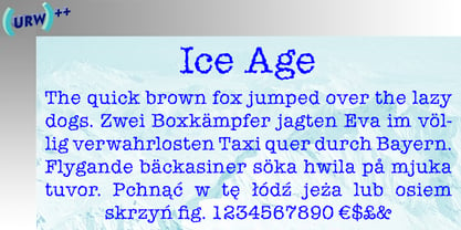
- NCS Radhiumz by Namara Creative Studio,
$12.00 NCS Radhiumz is a modern powerful quality sans serif font with great versatility. This extended font can be used for bold editorial statements, graphic heavy prints or just as a simple logo. This new type will definitely make your designs stand out and unique. Included 08 variant to choose : Light Light Italic Regular Italic Bold Bold Italic Bold Rounded Bold Shadow Included uppercase, lowercase, numerals, punctuations, multilingual support, and some alternates & ligatures.
 - IC Kindwall by Ironbird Creative,
$7.00 Kindwall, Fraktur Blackletter is carefully hand-drawn and organically crafted, boasting two captivating styles: Regular & Stamped. This font is tailor-made for commanding headlines, captivating packaging, and alluring labels, exuding a robust and assertive persona while exquisitely channeling a vintage aesthetic, characteristic of the esteemed blackletter tradition.
 - Ice Cube by Blankids,
$19.00 Hello, Are you looking for a SVG font? Do you want of creating Something that stand out and inspire creativity, imagination, and endless fun? Wait no more, we will give you the best choice. Ice cube a SVG Color Font Inspiring from Playful typography. This font is perfect for a design that makes it more attractive and playful. made with a very good level of aesthetics making this font suitable for book cover, poster, packging, merchandise, logotype and much more.
 - KG God Gave Me You - Personal use only

- KG God Gave Me You by Kimberly Geswein,
$5.00 This font is reminiscent of teen girl handwriting, with very round letters and a mixed-print-cursive style.
 - Once upon a time - Unknown license

- SF Minced Meat Shaded - Unknown license

- SF Minced Meat Extended - Unknown license

- SF Minced Meat Shaded - Unknown license

- SF Minced Meat Extended - Unknown license

- ITC Caslon No. 224 by ITC,
$40.99 The Englishman William Caslon (1672-1766) first cut his typeface Caslon in 1725. His major influences were the Dutch designers Christoffel van Dijcks and Dirck Voskens. The Caslon font was long known as the script of kings, although on the other side of the political spectrum, the Americans used it as well for their Declaration of Independence. The characteristics of the earlier Renaissance typefaces are only barely detectable. The serifs are finer and the axis of the curvature is almost or completely vertical. The overall impression which Caslon makes is serious, elegant and linear. Next to Baskerville, Caslon font is known as the embodiment of the English Baroque-Antiqua and has gone through numerous new interpretations, meaning that every Caslon is slightly different. ITC Caslon 224 was designed by Edward Benguiat and appeared with ITC in 1982. It is the text font which expanded upon the title font ITC Caslon 223. The alterations in the proportions of the letters make this Caslon 224 a noticeable departure from the original, but make the font overall more legible.
 - ITC Japanese Garden Ornaments by ITC,
$29.99ITC Japanese Garden Ornaments is a symbol font designed by Akira Kobayashi (before Kobayashi became Linotype's Type Director in 2001, he worked as an independent typeface designer in Tokyo). The images in Japanese Garden are, as the name suggests, mostly floral or herbaceous, derived from designs used in Japanese indigo stencil dyeing. In Japanese Garden," Kobayashi says, "I tried to create a set of type fleurons that are very familiar to a Japanese eye, but not too exotic to people in other countries." Several of the designs fit together seamlessly in repeating patterns; others work either together or as isolated ornaments, a flexibility that also characterizes traditional Western type fleurons. "The original illustrations," notes Kobayashi, "were mostly cut from white paper squares, about two by two inches in size, and were simply scanned and traced. That is why there are few smooth curves and perfectly straight lines in the illustrations. I simply liked the ragged textures of them."" - ITC Berkeley Old Style by ITC,
$29.99 ITC Berkeley Old Style is based on a typeface designed by Frederic W. Goudy in 1938 called University of California Old Style. It was a private press type for the publishing house of that school. In 1958, about ten years after Goudy's death, Monotype re-issued the type under the name Californian, and it became a very successful face for book typography. Goudy himself said he designed this face to have the greatest legibility possible, and it is indeed free from the exuberances in some of his other faces. Tony Stan redrew the family for ITC for 1983, and it was named ITC Berkeley Old Style, Berkeley being the city where the University of California Press is located. Stan did a careful drawing of eight styles including italics. ITC Berkeley Old Style is a crisply beautiful tribute to a distinguished typeface, and it works well for books, magazines, and advertising display. Featured in: Best Fonts for Tattoos
 - ITC Avant Garde Gothic by ITC,
$42.99 ITC Avant Garde Gothic is a font family based on the logo font used in the Avant Garde magazine. Herb Lubalin devised the logo concept and its companion headline typeface, then he and Tom Carnase, a partner in Lubalin’s design firm, worked together to transform the idea into a full-fledged typeface. The condensed fonts were drawn by Ed Benguiat in 1974, and the obliques were designed by André Gürtler, Erich Gschwind and Christian Mengelt in 1977. The original designs include one version for setting headlines and one for text copy. However, in the initial digitization, only the text design was chosen, and the ligatures and alternate characters were not included. The font family consists of 5 weights (4 for condensed), with complementary obliques for widest width fonts. When ITC released the OpenType version of the font, the original 33 alternate characters and ligatures, plus extra characters were included. ITC Avant Garde Gothic® font field guide including best practices, font pairings and alternatives. Featured in: Best Fonts for Logos, Best Fonts for Websites, Best Fonts for PowerPoints
 - ITC Handel Gothic Arabic by ITC,
$103.99 ITC Handel Gothic Arabic is a modern Kufi design by Nadine Chahine, created especially for headlines and display purposes. It comes in 5 different weights ranging from Light to Heavy which extends its usage capabilities considerably. The design is mono-linear and with the typical geometric construction associated with the Kufi style. Its usage can vary from headlines to logos to packaging. Given its large counters, it can function quite well in very small sizes too. Its pattern is quite homogenous, so it is not recommended to use this for whole paragraphs. The character set supports Arabic, Persian, and Urdu and also includes Basic Latin.
 - PB Roman Uncial IIc by Paweł Burgiel,
$32.00 PB Roman Uncial IIc is a font face designed for imitate Roman uncial writing style found in manuscripts from 1st to 2nd century. All characters are handwritten by use ink and reed pen (calamus), scanned, digitized and optimized for best quality without lost its handwritten visual appearance. Character set support codepages: 1250 Central (Eastern) European, 1252 Western (ANSI), 1254 Turkish, 1257 Baltic. Include also additional characters for Cornish, Danish, Dutch and Welsh language, spaces (M/1, M/2, M/3, M/4, M/6, thin, hair, zero width space etc.), historical characters (overlined Roman numerals, I-longa, historical ligatures for "nomina sacra" and "notae communes") and wide range of ancient punctuation. OpenType TrueType TTF (.ttf) font file include installed OpenType features: Access All Alternates, Localized Forms, Fractions, Alternative Fractions, Ordinals, Superscript, Tabular Figures, Proportional Figures, Stylistic Alternates, Stylistic Set 1, Historical Forms, Historical Ligatures. Include also kerning as single 'kern' table for maximum possible backwards compatibility with older software. Historical ligatures for "nomina sacra" and "notae communes" are mapped to Private Use Area codepoints.
 - ITC New Rennie Mackintosh by ITC,
$50.99 Looking to add a little Arts & Crafts flavor to your next project? Perhaps you just need a distinctive, new sans serif design? And one with a large international character set. In either case, ITC New Rennie Mackintosh™ may be the typeface for you. Its narrow proportions saves space, and the design shines at large sizes. While it can be an excellent typeface for Art Nouveau flavored labels, name tags and chapter call-outs, this is a suite of fonts that you can also turn to for a bevy of print and on screen uses. Games and apps, as well as print headlines and menus all benefit from ITC New Rennie Mackintosh’s vintage vibe. Based on Phill Grimshaw’s original 1996 design, Monotype Studio designers reimagined the iconic family, added lowercase characters, a new weight structure of light, regular and a more robust bold design; each with an italic counterpart. In addition, a large international character set that include support for many Western and Eastern European languages – including Cyrillic and Greek – give the family a deep typographic bench. An added benefit: the new designs can also be combined with Grimshaw’s original ornament and initial character fonts.
 - Dirty Deo Hand Ink by TypoGraphicDesign,
$19.00 CONCEPT/CHARACTERISTICS Experimental analog handwritten style. Handwritten in ink in a conventional roll-on deodorant. The dirty, grimmy Grunge-Look and the sloppy, rough Handwritten-Look script character, gives the typeface a high recognition value and uniqueness. The motto is handmade, rough & experimental. APPLICATION AREA The rough, ink-like, handwritten look of the handmade font „dirty deo hand ink“ would look good at logos, display size for poster, flyer, comics and graphic novel lettering, headlines in magazines or websites, packaging, music covers or webbanner etc. TECHNICAL SPECIFICATIONS Headline Font | Display Font | Raw Trash Script Font „dirty deo hand ink“ OpenType Font with & 282 glyphs & 1 style (regular). Symbols and ligatures (with accents & €)
 - ITC Franklin Gothic LT by ITC,
$43.99 Franklin Gothic was designed between 1903 and 1912 by Morris Fuller Benton for the American Type Founders Company. The font serves as the American Grotesk prototype. It was named after Benjamin Franklin. Even today, Franklin Gothic remains one of the most widely used sans serif typefaces. The robust character of the font gives text a modern feel. It is widely used in newspapers and advertising and is frequently seen in posters, placards and other material where space is restricted. Featured in: Best Fonts for Tattoos
 - PB Capitalis Rustica IVc by Paweł Burgiel,
$32.00 PB Capitalis Rustica IVc is a font face designed for imitate latin writing style found in manuscripts from 1st to 9th century. All characters are handwritten by use ink and reed pen (calamus), scanned, digitized and optimized for best quality without lost its handwritten visual appearance. Character set support codepages: 1250 Central (Eastern) European, 1252 Western (ANSI), 1254 Turkish, 1257 Baltic. Include also additional characters for Cornish, Danish, Dutch and Welsh language, spaces (M/1, M/2, M/3, M/4, M/6, thin, hair, zero width space etc.) and historical characters (overlined Roman numerals, I-longa, historical ligatures for "nomina sacra" and "notae communes"). OpenType TrueType TTF (.ttf) font file include installed OpenType features: Access All Alternates, Localized Forms, Fractions, Ordinals, Superscript, Tabular Figures, Proportional Figures, Stylistic Alternates, Stylistic Set 1, Historical Forms, Historical Ligatures. Include also kerning as single 'kern' table for maximum possible backwards compatibility with older software. Historical ligatures for "nomina sacra" and "notae communes" are mapped to Private Use Area codepoints. Use of OpenType features to get historical characters: ïTo get "I-longa" use Stylistic Alternates for: "I"(U+0049), "i"(U+0069), "dotless i"(U+0131). ïTo get "nomina sacra" use Historical Ligatures and write uppercase letters: DS for: "Deus", DMS or DNS for: "Dominus" EPS for: "Episcopus", IHS for: "Iesus", PBR for: "Presbiter", SCS for: "Sanctus", SPS for: "Spiritus", XPS for: "Christus". ïTo get "notae communes" use Historical Ligatures and write: B(U+0042) + "middle dot"(U+00B7) for: "-BUS", Q(U+0051) + "middle dot"(U+00B7) for: "-QUE". ïTo get "scriptio continua" (writing without words separation) use Historical Forms (regular spaces are replaced by zero width spaces between words). ïTo get "middle dot" for separate words use Stylistic Set 1 (regular spaces are replaced by middle dot between words).
 - ITC Seven Treasures Ornaments by ITC,
$29.99Akira Kobayashi's ITC Seven Treasures is a symbol font for use in patterns and textures. The interlocking patterns, usually circular or oval, are taken primarily from motifs used in Japanese textiles. Most of these designs are known as komon, or tiny patterns," and they are often applied to kimono and other textiles, although their use is not limited to fabrics. They also appear carved in wood in traditional architecture, and painted in pictures as background patterns. Each of the individual designs in ITC Seven Treasures Ornaments is carefully sized and spaced so that it will fit together into a continuous pattern. Most overlap slightly but precisely, so that when you type a row of them you can't tell where one leaves off and the next begins. They may be combined or alternated to vary the texture of a background pattern." - ITC Legacy Square Serif by ITC,
$40.99 .
. - ITC Stone Sans II by ITC,
$45.99 The ITC Stone Sans II typeface family is new from the drawing board up. Sumner Stone, who designed the original faces in 1988, recently collaborated with Delve Withrington and Jim Wasco of Monotype Imaging to update the family of faces that bears his name. Sumner was the lead designer and project director for the full-blown reworking – and his own greatest critic. The collaborative design effort began as a relatively simple upgrade to the ITC Stone Sans family. As so often happens, however, the upgrade proved to be not so simple, and grew into a major design undertaking. “My initial intent,” recalls Sumner, “was to provide ITC Stone Sans with even greater versatility. I planned to add an additional weight, maybe two, and to give the family some condensed designs.” As Sumner began to look more closely at his twenty-year-old typeface, he decided that it would benefit from more extensive design improvements. “I found myself making numerous refinements to character shapes and proportions,” says Sumner. “The project scope expanded dramatically, and I’m pleased with the final result. The redesign has improved both the legibility and the overall appearance of the face.” The original ITC Stone Sans is part of the ITC Stone super family, along with ITC Stone Serif and ITC Stone Informal. In 2005 ITC Stone Humanist joined the family. All of these designs have always offered the same three weights: Medium, Semibold, and Bold – each with an italic counterpart. Over time, Stone Sans has emerged as the godfather of the family, a powerful design used for everything from fine books, annual reports and corporate identity programs, to restaurant menus, movie credits and advertising campaigns. ITC Stone Sans, however, lacked one attribute of many sans serif families: a large range of widths and weights. “These fonts had enjoyed great popularity for many years – during which graphic designers repeatedly asked for more weights and condensed designs in the family,” says Sumner. “Their comments were the impetus.” ITC Stone Sans II includes six weights ranging from an elegant Light to a commanding Extra Bold. An italic counterpart and suite of condensed designs complements every weight. In all, the new family encompasses 24 typefaces. The ITC Stone Sans II family is also available as a suite of OpenType Pro fonts, allowing graphic communicators to pair its versatile design with the capabilities of OpenType. These fonts offer automatic insertion of ligatures, small caps and use-sensitive figure designs; their extended character set also supports most Central European and many Eastern European languages. ITC Stone® Sans II font field guide including best practices, font pairings and alternatives.
 - ITC Modern No. 216 by ITC,
$40.99 Modern typefaces refer to designs that bear similarities to Bodoni and other Didone faces, which were first created during the late 1700s. Ed Benguiat developed ITC Modern No. 216 in 1982 for the International Typeface Corporation (ITC). Showing a high degree of contrast between thick and thin strokes, as well as a large x-height, this revival is more suited to advertising display purposes than the setting of long running text, or books. Many traits in Benguiat's design are worth further notice. The thick stems of the roman weights have a very stately, solid presence. Their thin serifs have been finely grafted on, a masterful solution to the challenge of bracketing presented by Modernist designs. The italic weights have a very flowing, script-like feel to them, and the letters take the form of true italics, not obliques. The ITC Modern No. 216 family contains the following font styles: Light, Light Italic, Medium, Medium Italic, Bold, Bold Italic, Heavy, and Heavy Italic.
 - KG By The Grace Of God by Kimberly Geswein,
$5.00 Inspired by the decayed lettering on the signs at Siesta Key beach painted on weather-worn old wood in Florida, these letters are made to look like peeling paint.
 - Serene Textured by Pedro Teixeira,
$14.00 Serene Textured Script is informal, good for logos, headlines in magazines or titles in food recipes with a slight retro feel and textured that add value to your designs.
 - Jolgoria in Town - Personal use only

- Big In America - Unknown license


