10,000 search results
(0.067 seconds)
- Pismo Clambake NF by Nick's Fonts,
$10.00This stylish stout script was originally issued in the 1930s under the name “Fulgor” by the spanish foundry Fundición Gans. Cursory research suggests that Saks-Fifth Avenue found it suitably snooty to use extensively in its newspaper ads of that period. Perhaps somewhat ironically, this version takes its name from one of comedian W. C. Fields' many odd aliases. - Hebrew Liane Std by Samtype,
$59.00 This is a modern, wonderful, and beautiful font. This font is super readable and can be used from Posters to a Hebrew Bible. The readability of this font is amazing. This font has the modern Hebrew punctuation: Shevana, Kamatz Katan, Dagesh Hazak, and Cholam Chaser. Designers: Sami Artur Mandelbaum Publisher: Samtype MyFonts debut: Jan 17, 2022
 - Hullabaloo by Solotype,
$19.95We saw a few letters of this in a catalog, and liked it so well we drew it up and made it as a film font for photolettering. Due to a surplus of interesting types in our shop this one never made it into our catalog, so we can¹t tell you anything about its popularity. - Bareback by Solotype,
$19.95The devil does indeed find work for idle hands. This was designed by Dan X. Solo about with no excuse whatsoever. The name comes from the fact that a circus that we regularly did work for used it in one of their programs, the only time it was ever used as far as we can recall. - Art Lover JNL by Jeff Levine,
$29.00While browsing through a Dan Solo type reference book, Jeff Levine fell in love with the multiline stylings of one particular typeface, then sat down and re-drew from scratch his own interpretation of the design. Jeff's version is called Art Lover JNL - offering kudos to art in general, the Art Deco movement and (of course) type design. - Samira by CastleType,
$29.00 I must admit that I am not a big fan of the Art Nouveau style. However, I found this particularly beautiful alphabet and decided to use it as the basis for this new font. Very graceful, elegant, and dare I say, organic. Includes some intertwined ligatures. Complete uppercase, numerals, basic punctuation. Supports most Western European languages.
 - HD Colton by HyperDeluxe,
$35.00 HD Colton is a 90-style super-sans from London Design Studio HyperDeluxe®. Using a combination of horizontal & vertical terminals along with squarish ovals, it is built with a confident structure that feels so much more than a neutral sans, it feels iconic. Engineered in 5 widths, compressed to extra wide, and in nine weights, HD Colton features a huge 90 styles that will offer your brand ultimate flexibility and variation in one font family. The black weights will help bring prominence to your brand while the light to mid weights will help you tell your story at a smaller size. HD Colton includes 1200+ glyphs per style, providing you with a workhorse sans that supports 200+ languages including extended Latin, extended Cyrillic and basic Greek. Also included are 5 stylistic sets, 2 arrow sets & numerous OpenType features (see last poster for complete list). The HD Colton complete family package comes with a single, 3-axis variable font so you'll have an infinite amount of combinations and uses for you to experiment with and add that touch of finesse to your visuals. Variable fonts are tech friendly providing smaller sizes for developers to work with, while also being responsive and used for motion design on the web. HD Colton key features: 3-Axis Variable Font. 90 Styles. 1200+ Glyphs Per Style. 5 Widths (Compressed, Condensed, Regular, Wide, Extra Wide). 200+ Languages Supported. Extended Latin, Extended Cyrillic, Greek Support. Stylistic Alternates for some key glyphs (J, Q, G, l, &, Arrows). Extensive OpenType features.
 - Rever by ParaType,
$30.00 Rever is an experimental typeface by a young designer Sasha Smirnov. It clearly alludes to 19th century typefaces with reverse contrast, but still the character shapes are as simple and geometric as possible. Rever answers the question “What can a reverse-contrast typeface look like today?” Its set of styles is non-traditional: in addition to a regular one, there are also an oblique (slanted to the left, not to the right!) and a stencil styles. The typeface can work for typographic experiments of any kind -- web, print or motion design. The font was released by Paratype in 2019.
 - Serena by Canada Type,
$24.95The story of Serena is a unique one among revivals. Serena was neither a metal face nor a film one. In fact it never went anywhere beyond Stefan Schlesinger’s 1940-41 initial sketches (which he called Saranna). A year later, while working with Dick Dooijes on the Rondo typeface, Schlesinger was sent to a concentration camp where he died, along with any material prospects for the gorgeous letters he'd drawn. The only sketches left of Schlesinger’s Saranna work are found in the archives of the Drukkerij Trio (the owner of which was Schlesinger’s brother-in-law). The sketches were done in pencil and ink over pencil on four sheets of paper. And now Hans van Maanen revives Schlesinger’s spirit as closely as the drawings permit, and elaborately expands the work to cover a multitude of codepages and languages. It took more than 65 years for Schlesinger’s drawings to see the light, so van Maanen made sure to bring them to life stylishly and respectfully. Serena embodies the peace and calm rarely ever found in mainstream calligraphy or other genres of display type. With upright elegance and a slight Eastern touch, this typeface expertly bridges the gracefully casual with the deeply spiritual. The light and soft letter forms add a pleasant, breezy element to anything they touch. When used sparingly in titling or display, Serena is like a sigh of desire, rare but quite memorable and very appreciated. - Corton by Greater Albion Typefounders,
$14.00 Corton was inspired by the traditional lettering on a gravestone in an English village. While that might sound a rather solemn beginning, Corton has wonderfully lively air, with distinctive lively serifs and beautifully swashed downstrokes. Eight faces are offered: regular and titular each in three weights plus regular condensed. Between them they are ideal signage and display faces, merging 'olde-worlde' charm and fun character, but remaining clear and legible.
 - Zoom by MDS,
$9.00 This font is fast. Carving apexes, drafting competitors, and breaking away for the finish line. This is a sleek and extended font family designed for top speed while squeezing into tight places. Zoom is intended for display and would be right at home, nested gently on a carbon fiber bike frame, forged as the nameplate on the back of a vehicle, or printed stoutly on any number of sporting products.
 - Dalcora by Linotype,
$29.99Dalcora was designed by Erwin Koch in 1989 in a single weight. The most distinguishing characteristic of this font is its unusual proportions. Text fonts are usually designed with more delicate horizontal strokes as the verticals, but Dalcora is exactly the opposite. Its slight slant to the right and the round forms of the letters make the font dynamic and cheerful. Dalcora is intended exclusively for headlines in larger point sizes. - Frescito by Mans Greback,
$49.00 Frescito is a modern sans-serif typeface that embodies a fresh, cool, and street-smart aesthetic. Designed to be both balanced and versatile, its clear and legible monoline style is designed for branding and advertising in editorial and digital design. The Frescito font family comes in the five classic weights: Thin, Light, Medium, Bold, and Black, along with a Variable font for ultimate flexibility and customization, as well as Italics. Inspired by the energetic spirit of the city and its vibration, Mans Greback set out to create a typeface that would stand out against vivid moment; a type that would work in a traditional café just as well as for contemporary merchandise. The result is a font that combines the best of both worlds: an air of freshness and modernity with an unpretentious, timeless and classy appeal. The font is built with advanced OpenType functionality and has a guaranteed top-notch quality, containing stylistic and contextual alternates, ligatures, and more features; all to give you full control and customizability. It has extensive lingual support, covering all Latin-based languages, from Northern Europe to South Africa, from America to South-East Asia. It contains all characters and symbols you'll ever need, including all punctuation and numbers.
 - Metromedium #2 by Linotype,
$29.00American graphic designer William Addison Dwiggins' (W.A.D. for short) first typefaces were the Metro family, designed from 1927 onward. The project grew out of Dwiggins' dissatisfaction with the new European sans serif typefaces of the day, such as Futura, Erbar, and Kabel, a feeling he expressed in his seminal book Layout in Advertising. Urged by Mergenthaler Linotype to create a solution for the problem, Dwiggins began a professional relationship that would span over the next few decades. The first Metro family typeface to be released was Metroblack, brought to market by Linotype in 1929 (Metroblack #2™ the only one of the two versions that Mergenthaler Linotype eventually put into production which is available in digital form). With more of a humanist quality than the geometric styles popular in Europe at the time, Dwiggins drew what he believed to be the ideal sans serif for headlines and advertising copy. Metroblack has a warmer character than the Modernists' achievements, and the type is full of mannered curves and angled terminals (Metroblack also has an astoundingly beautiful Q). The other weights of the Metro family, Metromedium #2™ and Metrolite #2™, were designed by Mergenthaler Linotype's design office under Dwiggins' supervision. Despite having been created more than three-quarters of a century ago, the Metro family types have aged well, and remain a popular sans serif family. Although spec'd less often than other bestsellers, like Futura, Metro continues to find many diverse uses. The typeface has appeared throughout Europe and the North America for decades in newspapers and magazines, and can even help create a great brand image when used in logos and corporate identity. Dwiggins ranks among the most influential graphic designers and typeface designers of the 20th Century. He has several other quality fonts in the Linotype Originals, including the serif text faces Electra™ and New Caledonia™, as well as Caravan™, a font of typographic ornaments." - Vernacular Serif by jpFonts,
$19.95 The Vernacular trilogy was designed by Swiss designer Hans-Jürg Hunziker, who had worked for Adrian Frutiger in Paris for many years. Based on the concept of a transitional Linear Antiqua, he has developed a colorful bouquet of typefaces that contain the entire spectrum of typefaces for book design and corporate identity. Thanks to his "Swiss school" and his outstanding skills, he has succeeded in giving the typefaces a particularly noble and sympathetic expression. In addition to the Sans family, there is a Serif family and a Clarendon family, each of which, including the separately drawn italics, is equipped with 12 font weights that are finely tuned to one another. Each of the 3 font styles develops its own character, but thanks to a concept that brings the different font styles closer together, they also work well together and complement each other perfectly. Sans and Clarendon have a vertical axis and similar endings in contrast to the Serif, which has a traditional diagonal axis and horizontal endings. The straight stems and the proportions are used as an element to stress the closeness of the typeface-trilogy. They thus share a comon feature. All fonts contain tabular and proportional figures as well as old style figures. Small caps and small cap figures are also available in all fonts. In addition, some fonts have alternative characters available via style set, such as «g», which can be used to further vary the typeface. Vernacular offers all the options for well-kept typesetting for print and web - for small and large orders.
 - Vernacular Clarendon by jpFonts,
$19.95 The Vernacular trilogy was designed by Swiss designer Hans-Jürg Hunziker, who had worked for Adrian Frutiger in Paris for many years. Based on the concept of a transitional Linear Antiqua, he has developed a colorful bouquet of typefaces that contain the entire spectrum of typefaces for book design and corporate identity. Thanks to his "Swiss school" and his outstanding skills, he has succeeded in giving the typefaces a particularly noble and sympathetic expression. In addition to the Sans family, there is a Serif family and a Clarendon family, each of which, including the separately drawn italics, is equipped with 12 font weights that are finely tuned to one another. Each of the 3 font styles develops its own character, but thanks to a concept that brings the different font styles closer together, they also work well together and complement each other perfectly. Sans and Clarendon have a vertical axis and similar endings in contrast to the Serif, which has a traditional diagonal axis and horizontal endings. The straight stems and the proportions are used as an element to stress the closeness of the typeface-trilogy. They thus share a comon feature. All fonts contain tabular and proportional figures as well as old style figures. Small caps and small cap figures are also available in all fonts. In addition, some fonts have alternative characters available via style set, such as «g», which can be used to further vary the typeface. Vernacular offers all the options for well-kept typesetting for print and web - for small and large orders.
 - Planetype by CozyFonts,
$20.00 The Planetype Font Family is Modern. It has 6 Font Styles: X-Light, Light, Medium, Inline, Bold, & X-Bold. Each style has a consistent weight with a square serif of equal weight to its vertical and horizontal strokes. Planetype™ for short or Planet-Type font styles all have extremely clean edges and are sharply defined. There is a standard kerning applied, however evenly letter-spacing these family members give a distinct personality and continues to command the negative space just as in tight kerned examples. The compatible relationship of these font family members, weight to weight, and X-Light to X-Bold is seamless and the overall design coloring of words and sentences is well balanced and extremely legible. The Planetype Family fonts are matching members glyph to glyph. This family works in modern, contemporary and vintage settings. The Planetype Medium matches the outer weight of Planetype Inline. Their are several unique Glyphs that set the character of this family, such as: Caps B, M, Q, R, X and Lower Case a, e, k, r, z to begin with. The numerals and dingbats also have several unique glyphs that flow with the family Style in every matching weight. These characteristics lend well in designing logos, brands, and even monograms. Starting with Planetype X-Light the designer has a command of the clean lines yet expressing Modernism and a touch of Architectural structure. Planetype Medium & Planetype Inline are a dynamic duo giving a positive/negative readability.
 - Palatino Nova Paneuropean by Linotype,
$67.99Palatino® Nova is Prof. Hermann Zapf's redesign of his own masterpiece, Palatino. The original Palatino was cut in metal by August Rosenberger at D. Stempel AG typefoundry in Frankfurt, and released in 1950. Palatino was later adapted for mechanical composition on the Linotype machine, and became one of the most-used typefaces of the 20th Century. Palatino was designed for legibility, and has open counters and carefully weighted strokes. The type was named after Giambattista Palatino, a master of calligraphy from the time of Leonardo da Vinci. Palatino is a typeface based on classical Italian Renaissance forms. A modern classic in its own right, Palatino is popular among professional graphic designers and amateurs alike, working well for both text and display typography. Hermann Zapf and Akira Kobayashi redeveloped Palatino for the 21st Century, creating Palatino Nova. Released by Linotype in 2005, the Palatino Nova family is part of Linotype's Platinum Collection. Palatino Nova includes several weights (Light, Regular, Medium, and Bold), each with companion italics. Four styles (Regular, Italic, Bold, and Bold Italic) have Greek and Cyrillic glyphs built into their character sets. The Palatino Nova family also includes revised versions of Aldus (now called Aldus Nova), as well as two titling weights. The first titling weight, Palatino Nova Titling, is based on Hermann Zapf's metal typeface Michelangelo, including Greek glyphs from Phidias Greek. The heavier titling weight, Palatino Nova Imperial, is based on Sistina. The fonts in the Palatino Nova family support all 48 Western, Central, and Eastern European languages. Additional features: ligatures and historical ligatures, Small Caps, ornaments, and a range of numerals (proportional & tabular width lining and Old style Figures, fractions, inferiors, and superiors)." - Palatino Nova by Linotype,
$50.99 Palatino® Nova is Prof. Hermann Zapf's redesign of his own masterpiece, Palatino. The original Palatino was cut in metal by August Rosenberger at D. Stempel AG typefoundry in Frankfurt, and released in 1950. Palatino was later adapted for mechanical composition on the Linotype machine, and became one of the most-used typefaces of the 20th Century. Palatino was designed for legibility, and has open counters and carefully weighted strokes. The type was named after Giambattista Palatino, a master of calligraphy from the time of Leonardo da Vinci. Palatino is a typeface based on classical Italian Renaissance forms. A modern classic in its own right, Palatino is popular among professional graphic designers and amateurs alike, working well for both text and display typography. Hermann Zapf and Akira Kobayashi redeveloped Palatino for the 21st Century, creating Palatino Nova. Released by Linotype in 2005, the Palatino Nova family is part of Linotype's Platinum Collection. Palatino Nova includes several weights (Light, Regular, Medium, and Bold), each with companion italics. Four styles (Regular, Italic, Bold, and Bold Italic) have Greek and Cyrillic glyphs built into their character sets. The Palatino Nova family also includes revised versions of Aldus (now called Aldus Nova), as well as two titling weights. The first titling weight, Palatino Nova Titling, is based on Hermann Zapf's metal typeface Michelangelo, including Greek glyphs from Phidias Greek. The heavier titling weight, Palatino Nova Imperial, is based on Sistina. The fonts in the Palatino Nova family support all 48 Western, Central, and Eastern European languages. Additional features: ligatures and historical ligatures, Small Caps, ornaments, and a range of numerals (proportional & tabular width lining and Old style Figures, fractions, inferiors, and superiors)."
 - Rasheda by Keristyper Studio,
$14.00 Rasheda is a beautiful italic font. Inspired by classic cursive calligraphy from the Renaissance era in the 8th Century. This font is good for logo design, Social media, Movie Titles, Books Titles, short text even long text letters, and good for your secondary text font with script, sans, or serif. **Featured:** * Standard Uppercase & Lowercase * Numeral & Punctuation * Multilingual : ä ö ü Ä Ö Ü ß ¿ ¡ * Alternate & Ligature * PUA encoded We recommend programs that support the OpenType feature and the Glyphs panel such as Adobe applications or Corel Draw. so you can use all the variations of the glyphs. Hope you enjoy our fonts!
 - Almefia by Keristyper Studio,
$14.00 Proudly present Almefia Signature, a handwritten script font based on the expression of real handwriting. This font is good for logo design, Social media, Movie Titles, Books Titles, short text even long text letters, and good for your secondary text font with sans or serif. **Featured:** * Standard Uppercase & Lowercase * Numeral & Punctuation * Multilingual : ä ö ü Ä Ö Ü ß ¿ ¡ * Alternate & Ligature * PUA encoded We recommend programs that support the OpenType feature and the Glyphs panel such as Adobe applications or Corel Draw. so you can use all the variations of the glyphs. Hope you enjoy our fonts!
 - Saint Pauline by Keristyper Studio,
$14.00 Saint Pauline is a modern minimalist serif font. Elegant Vintage aesthetic design inspired by the Art deco era. This font is good for logo design, Social media, Movie Titles, Books Titles, short text even long text letters, and good for your secondary text font with sans or serif. Featured: Standard Uppercase & Lowercase Numeral & Punctuation Multilingual : ä ö ü Ä Ö Ü ß ¿ ¡ Alternate & Ligature PUA encoded We recommend programs that support the OpenType feature and the Glyphs panel such as Adobe applications or Corel Draw. so you can use all the variations of the glyphs. Hope you enjoy our fonts!
 - Kamigoya by Keristyper Studio,
$14.00 Kamigoya is a classy font with visual elegance, and smooth curves, making your work look true and attractive. This font is good for logo design, Social media, Movie Titles, Books Titles, short text even long text letters, and good for your secondary text font with sans or serif. Featured: Standard Uppercase & Lowercase Numeral & Punctuation Multilingual : ä ö ü Ä Ö Ü ß ¿ ¡ Alternate & Ligature PUA encoded We recommend programs that support the OpenType feature and the Glyphs panel such as Adobe applications or Corel Draw. so you can use all the variations of the glyphs. Hope you enjoy our fonts!
 - Fatbun by Keristyper Studio,
$14.00 Introducing Fatbun - playful hand-lettered bold typeface inspired by classic groovy retro display font. This font is good for logo design, Social media, Movie Titles, Books Titles, short text even long text letters, and good for your secondary text font with sans or serif. **Featured:** * Standard Uppercase & Lowercase * Numeral & Punctuation * Multilingual : ä ö ü Ä Ö Ü ß ¿ ¡ * Alternate & Ligature * PUA encoded We recommend programs that support the OpenType feature and the Glyphs panel such as Adobe applications or Corel Draw. so you can use all the variations of the glyphs. Hope you enjoy our fonts!
 - Nixon Script by Barnbrook Fonts,
$30.00 NixonScript is a display typeface inspired by the typographic emancipation given voice by 1950s and '60s north American vernacular type. NixonScript's starting point was lettering found on a 1960s camera found in a Chicago junk shop, but its development saw it transformed from a punchy sans-serif to a more thoughtful serif, with a lowered x-height and a vibe of almost priestly piousness. Rather than a simple regular italic, a bold italic is offered. During its development, the regular version seemed almost placid but with the double emphasis of bold and italic, NixonScript gained an energetic, self-congratulatory form.
 - Mellofian by Keristyper Studio,
$14.00 Proudly present Mellofian a romantic script font Inspired by drama and love story. This font is good for logo design, Social media, Movie Titles, Books Titles, short text even long text letters, and good for your secondary text font with the script, sans, or serif. Featured: Standard Uppercase & Lowercase Numeral & Punctuation Multilingual : ä ö ü Ä Ö Ü ß ¿ ¡ Alternate & Ligature PUA encoded We recommend programs that support the OpenType feature and the Glyphs panel such as Adobe applications or Corel Draw. so you can use all the variations of the glyphs. Hope you enjoy our fonts!
 - Wayville by Keristyper Studio,
$14.00 Wayville is a casual script font, with clean high contrast stroke, slanted and fun character. This font is good for logo design, Social media, Movie Titles, Books Titles, short text even a long text letter, and good for your secondary text font with sans or serif. Featured: Standard Uppercase &Lowercase Numeral & Punctuation Multilingual : ä ö ü Ä Ö Ü ß ¿ ¡ Alternate &Ligature PUA encoded We recommend programs that support the OpenType feature and the Glyphs panel such as Adobe applications or Corel Draw. so you can use all the variations of the glyphs. Hope you enjoy our fonts!
 - ITC Berranger Hand by ITC,
$29.99Controlled casualness is the watchword in this new handwriting script from the prolific young French designer Éric de Berranger, who also designed the sans serif type family ITC Octone. ITC Berranger Hand has its roots in chancery calligraphy, yet its surface looks like contemporary informal lettering that was written quickly with a felt-tip pen on slightly absorbent paper. The counters of some letters appear to almost fill in from ink spread, yet Berranger Hand is admirably readable at small sizes. The capital letters are restrained, without swashes, so they can be used together in all-caps combinations. - Kruger by Keristyper Studio,
$14.00 Kruger is a Horror font ready to be splattered on your design projects. Inspired by horror movies. This font is good for logo design, Social media, Movie Titles, Books Titles, short text even long text letters, and good for your secondary text font with sans or serif. Featured: Standard Uppercase & Lowercase Numeral & Punctuation Multilingual : ä ö ü Ä Ö Ü ß ¿ ¡ Alternate & Ligature PUA encoded We recommend programs that support the OpenType feature and the Glyphs panel such as Adobe applications or Corel Draw. so you can use all the variations of the glyphs. Hope you enjoy our fonts!
 - Marlivane by Keristyper Studio,
$14.00 Marlivane has a strong characteristic sports display font that is suitable for Esports or sports activity. This font is good for logo design, Social media, Movie Titles, Books Titles, short text even long text letters, and good for your secondary text font with sans or serif. Featured: Standard Uppercase & Lowercase Numeral & Punctuation Multilingual : ä ö ü Ä Ö Ü ß ¿ ¡ Alternate & Ligature PUA encoded We recommend programs that support the OpenType feature and the Glyphs panel such as Adobe applications or Corel Draw. so you can use all the variations of the glyphs. Hope you enjoy our fonts!
 - Elvogena by Keristyper Studio,
$14.00 Elvogane is a classy chic font that is both stylish and unique with smooth curves. This font is good for logo design, Social media, Movie Titles, Books Titles, short text even long text letters, and good for your secondary text font with sans or serif. **Featured:** * Standard Uppercase & Lowercase * Numeral & Punctuation * Multilingual : ä ö ü Ä Ö Ü ß ¿ ¡ * Alternate & Ligature * PUA encoded We recommend programs that support the OpenType feature and the Glyphs panel such as Adobe applications or Corel Draw. so you can use all the variations of the glyphs. Hope you enjoy our fonts!
 - Kevlar by Letterbox,
$50.00 Kevlar was initially inspired by an obscure logo discovered in a 1960s radio-fan magazine. Of immediate interest was that the upper half of the typeface appeared to be a sans while the lower half appeared as a curious blend of a slab serif imbued with a script-like quality. First came Kevlar Bold in 2003, closely followed by its text weight companion Kevlar Regular. The original source of the inspiration as then revisited to develop the third in the set, Kevlar Slab, a truly individual mix of script-like fluency with the heavy weight base of a slab serif.
 - Maat by Wordshape,
$20.00 Maat is a modular geometric stencil display font that includes a number of modular pattern characters, and can be used to create designs that echo early Modernism by merely applying letters, patterns and color. Maat is a loose interpretation of a hand lettered alphabet by the late Dutch designer Jurrian Schrofer called Sans Serious which was included in Wim Crouwel's publication Letters of Maat. It is inflected with a bit of influence from British designer Ken Garland's similar lettering form the cover of his textbook, The Graphics Handbook. Maat derives its name from the title of Couwel's booklet.
 - Niwatch by Keristyper Studio,
$14.00 Niwatch is an elegant modern script font. With high contrast stroke and fun character. This font is good for logo design, Social media, Movie Titles, Books Titles, short text even long text letters, and good for your secondary text font with sans or serif. Make a stunning work with Roselites font. Featured: Standard Uppercase & Lowercase Numeral & Punctuation Multilingual : ä ö ü Ä Ö Ü ß ¿ ¡ Alternate & Ligature PUA encoded We recommend programs that support the OpenType feature and the Glyphs panel such as Adobe applications or Corel Draw. so you can use all the variations of the glyphs. Hope you enjoy our fonts!
 - Neftora by Keristyper Studio,
$14.00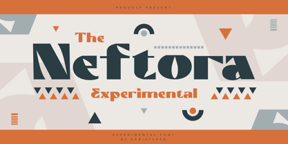 Neftora is an experimental display font with aesthetic and modern touch inspired by contemporary typography. This font is good for logo design, Social media, Movie Titles, Books Titles, short text even long text letters, and good for your secondary text font with sans or serif. Featured: Standard Uppercase & Lowercase Numeral & Punctuation Multilingual : ä ö ü Ä Ö Ü ß ¿ ¡ Alternate & Ligature PUA encoded We recommend programs that support the OpenType feature and the Glyphs panel such as Adobe applications or Corel Draw. so you can use all the variations of the glyphs. Hope you enjoy our fonts!
 - Kajju by Twinletter,
$15.00 Introducing Kajju, a premium font family designed to help you create visually stunning projects of any kind. Kajju San Serif comes in 18 different styles and has everything you need for your design projects. This is an all-in-one font pack with a wide variety of font styles to choose from. So whatever your needs, Kajju can do the job! of course, your various design projects will be perfect and extraordinary if you use this font because this font is equipped with a font family, both for titles and subtitles and sentence text, start using our fonts for your extraordinary projects.
 - Juvelith by Keristyper Studio,
$14.00 Proudly present Juvelith a modern black letter font inspired by contemporary design and calls back to Old English Gothic Scriptures. This font is good for logo design, Social media, Movie Titles, Books Titles, short text even long text letters, and good for your secondary text font with sans or serif. **Featured:** * Standard Uppercase & Lowercase * Numeral & Punctuation * Multilingual : ä ö ü Ä Ö Ü ß ¿ ¡ * Alternate & Ligature * PUA encoded We recommend programs that support the OpenType feature and the Glyphs panel such as Adobe applications or Corel Draw. so you can use all the variations of the glyphs. Hope you enjoy our fonts!
 - Kidyzen by Niznaztype,
$10.00 Kidyzen is a sans handwritten typeface. Inspired from the character of kids writing in their book. Kidyzen have unique style because it like same with typing of children. Kidyzen is perfect for comic, illustration, cartoon, kids design and very suitable for speech bubble text. It have very fun, cute, easy communication, easy reading and unique styles. You can use it for kids t-shirt, cover book, tagline, poster, branding, advertising, wall painting letter and graphic designs that use kids character . Kidyzen have 6 styles, there are regular, italic, bold, bold italic, thin and thin italic. Be enjoy it with my fonts.
 - Lucky Duke by Keristyper Studio,
$14.00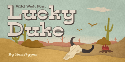 Introducing Lucky Duke font a western display typeface, inspired by cowboy wild west styles. This font is good for logo design, Social media, Movie Titles, Books Titles, short text even long text letters, and good for your secondary text font with sans or serif. **Featured:** * Standard Uppercase & Lowercase * Numeral & Punctuation * Multilingual : ä ö ü Ä Ö Ü ß ¿ ¡ * Alternate & Ligature * PUA encoded We recommend programs that support the OpenType feature and the Glyphs panel such as Adobe applications or Corel Draw. so you can use all the variations of the glyphs. Hope you enjoy our fonts!
 - Sign Painter by Vintage Voyage Design Supply,
$10.00 The Sign Painter – a layered type system with a lot of decor stuff. Inspired by Victorian era signs of IX and XX century. Traditional sans with moonlike script are cool pair to give you really vintage touch, especially with Decoration, which one you find inside. Simple layered system give you easy way to get really cool result. You will get many variations of your inscription with layered system (PDF "How To Use" instruction inside). The Sign Painter script has stylistic alternate with swashes for each letter (Initial, Middle and Final) so you can have swashes for any length of your inscription.