10,000 search results
(0.24 seconds)
- Snare by In-House International,
$5.00 A typeface that celebrates marching to the beat of your own drum. Snare is a jazzy little display type that presents like a stencil but behaves in its own way.Featuring angled section breaks and variable heights, Snare keeps each character’s footprint steady as as its heights change, revealing unique crossbars, periscoping capitals and deep-sinking descenders. Because each character follows its own rules, the more each word grows, the more it shows the beautiful rhythm of variety. Or stretch individual characters to shape the contours of your words. Beyond just being playful, fun to dress in colors, and delightfully useful for tight spaces,Snare’s lanky verticals and nervous energy reflect the time it was created. In this second pandemic spring, Snare brings up the drumroll-expectant heartbeat of our uncertainty, and the wish that when we can all meet again, our newfound weirdnesses will find a home in the world. The Snare font family includes one uppercase alphabet with two lowercase variants and comes in ten standard weights-which-are-just-really-heights (.otf) and as a variable type(.ttf) for designers using compatible platforms. Snare was designed by Alexander Wright and In-House International and developed byRodrigo Fuenzalida at FragType. In-House International’s foundry was launched in the summer of 2020 to offer bold, experimental, display typefaces that tell a story. Our previous releases have been featured on Design Milk, DesignBoom, Slanted and all sorts of exciting places.
 - Vintage Mintage by VP Creative Shop,
$30.00 Introducing Vintage Mintage retro font Vintage Mintage is fat, rounded font. Retro serif font loaded with alternate and ligature glyphs to make you typography truly unique! Language Support : Belarusian, Bosnian, Bulgarian, Chechen, Macedonian, Russian, Serbian, Afrikaans, Albanian, Asu, Basque, Bemba, Bena, Breton, Chiga, Colognian, Cornish, Czech, Danish, Dutch, Embu, English, Estronian, Faroese, Filipino, Finnish, French, Friulian, Galician, Ganda, German, Gusii, Hungarian, Indonesian, Irish, Italian, Jola-Fonyi, Kabuverdianu, Kalenjin, Kamba, Kikuyu, Kinyarwadna, Litvian, Lithuanian, Lower Sorbian, Luo, Luxembourish, Luyia, Machame, Makhuwa-Meetoo, Makonde, Malagasy, Maltese, Manx, Meru, Morisyen, North Ndebele, Norwegian Bokm ål, Norwegian Nynorsk, Nyankole, Ormo, Polish, Portuguese, Quechua, Romanian, Romansh, Rombo, Rundi, Rwa, Samburu, Sango, Sangu, Scottish Gaelic, Sena, Shambala, Shona, Slovak, Soga, Somali, Spanish, Swahili, Swedish, Swiss German, Taita, Teso, Turkish, Ukrainian, Upper Sorbian, Uzbek (Latin), Volap ük, Vunjo, Walser, Welsh, Western Frisian, Zulu FEATURES Uppercase, lowercase, numeral, punctuation & Symbol Cyrillic support ligature glyphs alternates Multilingual support - 95 languages No special software is required to type out the standard characters of the Typeface. How to access alternate glyphs? To access alternate glyphs in Adobe InDesign or Illustrator, choose Window Type & Tables Glyphs In Photoshop, choose Window Glyphs. In the panel that opens, click the Show menu and choose Alternates for Selection. Double-click an alternate's thumbnail to swap them out. Feel free to contact me if you have any questions! Mock ups and backgrounds used are not included. Thank you! Enjoy!
 - Nexa Slab by Fontfabric,
$35.00 Nexa Slab is a geometric slab serif font whose design is based on the already popular best-seller Nexa . The font family contains 3 basic forms: italics, obliques and uprights, each of which has 8 different weights. This visual richness makes it the ideal slab serif font family for the web as well as for print, for motion graphics, logos, t-shirts and so on. It is also great for headings, fitting nicely with both small and large typesetting text blocks. Nexa Slab draws from the rich traditions of the classic Neo-Grotesque slab serif fonts such as Lubalin Graph, Rockwell and Memphis, which conceal the richness of typesetting text in its crucial advertising function. Just like these fonts, it’s design is subject to rational, carefully thought-out, thick and thin bars with a low contrast between them. The letters are characterized by the strict geometry and square proportions of the original, extra-fortified by suitably balanced slab serifs. Nexa Slab is serious without being rigid and inflexible, finished and lacking in nothing, systematic without being monotonous, and though it may seem at first glance to be more suitable for short, direct messages; in the hands of a master designer... it can build and create exquisite and harmonic designs. Open Type Features: Lining figures (proportional and tabular) The “f” ligature set Alternate characters (a, g, y) Automatic fractions Automatic numerators Automatic denomerators Automatic subscript and superscript Automatic ordinals Extended language support (most Latin-based scripts supported)*
 - Namaste by Latinotype,
$49.00 With open palms, place your hands together at the center of your chest, close your eyes and bow the head slightly. Namaste! Welcome to a beautiful spiritual journey. Namaste is a font collection, designed by Coto Mendoza, consisting of two variants: a capital sans and a script font (based on watercolor calligraphy strokes). Each variant comes in 5 weights—Thin, Light, Regular, Bold and Black—and 2 versions: Essential and Pro. The script font, in its Pro version, provides a wide range of OpenType features such as swashes, alternates, ligatures and different stylistic sets. The Namaste family also includes a set of ornaments inspired by Hindu and Buddhist symbols—that Coto Mendoza saw virtually everywhere on her trip to India—like Mandalas and Yantras, and others found in textiles and monuments. Namaste is the perfect choice for wellness, healing and therapy oriented products. Its smooth shape and soft curves allow the user to create beautiful designs for essential oils, bath salts, quartz crystals, mindfoodness, candles, incense and aromatherapy products packaging. The font is well-suited for publishing design (short text); self-help and healing handbooks; tarot and divination cards; and women’s empowerment and spirituality publications. Namaste is an ideal typeface for yoga (and other body disciplines) center branding; holistic centers; and group meditation, womb blessing and circle of women invitations. Namaste is a beautiful journey full of love and inspiration. Namaste: a spiritual journey.
 - Quercus 10 by Storm Type Foundry,
$69.00 Quercus is characterised by open, yet a little bit condensed drawing with sufficient spacing so that the neighbouring letters never touch. It has eight interpolated weights with respective italics. Their fine gradation allows to find an exact valeur for any kind of design, especially on the web. Quercus serif styles took inspiration from classicistic typefaces with vertical shadows, ball terminals and thin serifs. The italics have the same width proportion as upright styles. This “modern” attitude is applied to both families and calls for use on the same page, e g in dictionaries and cultural programmes. Serif styles marked by “10” are dedicated to textual point sizes and long reading. The sans-serif principle is rather minimalistic, with subtle shadows and thinned joints between curved shapes and stems. Quercus family comprises of the usual functionality such as Small Caps, Cyrillics, diacritics, ligatures, scientific and aesthetic variants, swashes, and other bells & whistles. It excels in informational and magazine design, corporate identity and branding, but it’s very well suited for book covers, catalogues and posters as well. When choosing a name for this typeface I've been staring out from my studio window, thinking helplessly without any idea in sight. Suddenly I realised that all I can see is a spectacular alley of oaks (Quercus in Latin) surrounding my house. These oaks were planted by the builders of local ponds under the leadership of Jakub Krčín in the fifteenth century.
 - Hope Sans by Monotype,
$50.99 Hope Sans™ takes the jaunty style of 1950s and 60s lettering and melds it with the jubilant 1970s swashes of Bookman. The result is a sans serif family that is lively, inviting and deeply customizable. Its basic sans serif forms create engaging text, while a roaring collection of swash designs, alternate characters and ligatures make it a natural for attention-grabbing display typography. Hope Sans has been selected by the judges of the 22nd Annual TDC Typeface Design Competition to receive the Certificate of Typographic Excellence. The middle weights of the family are easy on the eyes and shine at smaller sizes and in blocks of text copy. Their friendly vibe also translates well to web and interactive design projects. Spacing is open, counters are large and Hope Sans’ range of six weights can provide just the right design for virtually any need. Headlines, subheads, banners and navigational links are naturals for its lightest and boldest weights – either with, or without, the swash letters. “Hope Sans is a paint box,” says its designer, Charles Nix. “In its basic form, it’s a sturdy grotesque, capable of setting text in a cool and relaxed way. But a bit of accenting with the alternate forms easily creates an entirely different mood and meaning. And for those that are willing to really mix with it, the variety of alternate characters can build truly unique typographic statements.”
 - Quercus Whiteline by Storm Type Foundry,
$69.00 Quercus is characterised by open, yet a little bit condensed drawing with sufficient spacing so that the neighbouring letters never touch. It has eight interpolated weights with respective italics. Their fine gradation allows to find an exact valeur for any kind of design, especially on the web. Quercus serif styles took inspiration from classicistic typefaces with vertical shadows, ball terminals and thin serifs. The italics have the same width proportion as upright styles. This “modern” attitude is applied to both families and calls for use on the same page, e g in dictionaries and cultural programmes. Serif styles marked by “10” are dedicated to textual point sizes and long reading. The sans-serif principle is rather minimalistic, with subtle shadows and thinned joints between curved shapes and stems. Quercus family comprises of the usual functionality such as Small Caps, Cyrillics, diacritics, ligatures, scientific and aesthetic variants, swashes, and other bells & whistles. It excels in informational and magazine design, corporate identity and branding, but it’s very well suited for book covers, catalogues and posters as well. When choosing a name for this typeface I've been staring out from my studio window, thinking helplessly without any idea in sight. Suddenly I realised that all I can see is a spectacular alley of oaks (Quercus in Latin) surrounding my house. These oaks were planted by the builders of local ponds under the leadership of Jakub Krčín in the fifteenth century.
 - Chiq by Ingo,
$36.00 The name suggests it: the Chiq is based on a well-known system font from Apple's classic Mac OS operating system. By revamping and expanding good old “Chicago“, I want to make that 90s tech charm available for the future. The model consisted of just a single style and inspired me to create “Chiq Bold,” which later became the starting point for the entire font family. The shapes of the Chiq are constructed according to a very simple principle. The contrast of stems and hairlines becomes more pronounced towards the bolder cuts. A few basic shapes form the framework for all characters. The shapes are very regular and sometimes form somewhat unusual figures, which has a negative effect on readability and makes the font rather unsuitable for long passages of text, but results in a very even typeface. This is particularly true for the extra-wide “UltraExpanded,” which is so wide that you can no longer recognize word images but literally have to spell them out. In this way, words are turned into letter bands with a great decorative effect. With variants from “Light” to “Black”, from “Normal” to “Ultra Expanded” and the italics, Chiq reaches beyond its archetype. This opens up a wide range of uses. It is even clearer, even more sober, and to a certain extent speaks an even more modern formal language. Chiq is also a variable font!
 - Capitolium 2 by TypeTogether,
$58.00 Capitolium was designed in 1998 at the request of the Agenzia romana per la preparatione del Giubileo for the Jubilee of the Roman Catholic Church in 2000. This type design was the central part of the project for a wayfinding and information system to guide pilgrims and tourists through Rome. Capitolium also continues Rome’s almost uninterrupted two-thousand-year-old tradition of public lettering . It is a modern typeface for the twenty-first century and strongly related to the traditions of Rome. Soon after the completion of this project Unger began contemplating the possibility of bringing the atmosphere of this design to newspapers. Though Capitolium works well in most modern production processes and also on screens, it is too fragile for newsprint. For newspapers sturdier shapes were required as well as more characters to a line of text, and Capitolium News has a bigger x-height than Capitolium. Capitolium News is a thoroughly modern newsface, with classic letterforms linked to a strong tradition. Capitolium News for running text comes in the variations regular, italic, semibold, semibold italic, bold and bold italic. As is possible with most of Unger’s type designs, Capitolium News can be condensed and expanded without any harm to the letterforms. The update to this beautiful font family, Capitolium News, includes the addition of over 250 glyphs featuring full Latin A language support, new ligatures, 4 sets of numerals, arbitrary fractions and superiors/inferiors. Furthermore, kerning was added and fine tuned for better performance.
 - Benguiat Caslon by House Industries,
$33.00 Designed to be set in big, large and huge sizes in classic TNT (tight-not-touching) style, Benguiat Caslon is dynamite for a wide range of display demands. We also included outline and drop-shadow versions as well as numerous swash caps, ligatures, contextual alternates and automatically-shifting punctuation. Ed Benguiat originally designed this alphabet for the Photo-Lettering library during his tenure as the legendary type house’s art director. When we purchased Photo-Lettering in 2003, one of the first things we did was start picking some of our favorite films to digitize as fonts. Photo-Lettering partner Christian Schwartz chose this expressive serif specimen for its high contrast strokes that stand up to the most vigorous display typography demands without withering against pesky design limitations like screen resolution, ink spread and dot gain. FEATURES: Alternate characters, ligatures and contextual substitutions add an unexpected flair to words and phrases. We also provided a drop shadow to add depth and dimension. Shifting punctuation marks take care of those optical tricks so you don't have to. A delicately expressive outline version adds color even in black and white. BENGUIAT CASLON CREDITS: Typeface Design: Ed Benguiat Typeface Digitization: Christian Schwartz, Bas Smidt Typeface Production: Ben Kiel, Jason Campbell Like all good subversives, House Industries hides in plain sight while amplifying the look, feel and style of the world’s most interesting brands, products and people. Based in Delaware, visually influencing the world.
 - Redmark by VP Creative Shop,
$30.00 Introducing Redmark - Elegant all caps serif font Redmark is vintage yet clean font inspired from 80s typeface loaded with alternate and ligature glyphs to make you typography truly unique! Language Support : Belarusian, Bosnian, Bulgarian, Chechen, Macedonian, Russian, Serbian, Afrikaans, Albanian, Asu, Basque, Bemba, Bena, Breton, Chiga, Colognian, Cornish, Czech, Danish, Dutch, Embu, English, Estronian, Faroese, Filipino, Finnish, French, Friulian, Galician, Ganda, German, Gusii, Hungarian, Indonesian, Irish, Italian, Jola-Fonyi, Kabuverdianu, Kalenjin, Kamba, Kikuyu, Kinyarwadna, Litvian, Lithuanian, Lower Sorbian, Luo, Luxembourish, Luyia, Machame, Makhuwa-Meetoo, Makonde, Malagasy, Maltese, Manx, Meru, Morisyen, North Ndebele, Norwegian Bokm ål, Norwegian Nynorsk, Nyankole, Ormo, Polish, Portuguese, Quechua, Romanian, Romansh, Rombo, Rundi, Rwa, Samburu, Sango, Sangu, Scottish Gaelic, Sena, Shambala, Shona, Slovak, Soga, Somali, Spanish, Swahili, Swedish, Swiss German, Taita, Teso, Turkish, Ukrainian, Upper Sorbian, Uzbek (Latin), Volap ük, Vunjo, Walser, Welsh, Western Frisian, Zulu FEATURES Uppercase, numeral, punctuation & Symbol ligature glyphs alternates Multilingual support - 95 languages No special software is required to type out the standard characters of the Typeface. How to access alternate glyphs? To access alternate glyphs in Adobe InDesign or Illustrator, choose Window Type & Tables Glyphs In Photoshop, choose Window Glyphs. In the panel that opens, click the Show menu and choose Alternates for Selection. Double-click an alternate's thumbnail to swap them out. Feel free to contact me if you have any questions! Mock ups and backgrounds used are not included. Thank you! Enjoy!
 - Ongunkan South Picene by Runic World Tamgacı,
$50.00 South Picene (also known as Paleo-Sabellic, Mid-Adriatic or Eastern Italic) is an extinct Italic language belonging to the Sabellic subfamily. It is apparently unrelated to the North Picene language, which is not understood and therefore unclassified. South Picene texts were at first relatively inscrutable even though some words were clearly Indo-European. The discovery in 1983 that two of the apparently redundant punctuation marks were in reality simplified letters led to an incremental improvement in their understanding and a first translation in 1985. Difficulties remain. It may represent a third branch of Sabellic, along with Oscan and Umbrian (and their dialects), or the whole Sabellic linguistic area may be best regarded as a linguistic continuum. The paucity of evidence from most of the 'minor dialects' contributes to these difficulties. The corpus of South Picene inscriptions consists of 23 inscriptions on stone or bronze dating from as early as the 6th century BC to as late as the 4th century BC. The dating is estimated according to the features of the letters and in some cases the archaeological context. As the known history of the Picentes does not begin until their subjugation by Rome in the 3rd century, the inscriptions open an earlier window onto their culture as far back as the late Roman Kingdom. Most are stelai or cippi of sandstone or limestone in whole or fragmentary condition sculpted for funerary contexts, but some are monumental statues.
 - LunchBox Slab by Kimmy Design,
$25.00 LunchBox Slab is the pair of LunchBox, a uniquely hand-drawn typeface that gives numerous customizable options and a fully authentic look. The serifs in LunchBox Slab are simple blocks, with bulbous terminals on curved letters, which creates a unique effect. Identical to its pair behind the scenes, LunchBox Slab’s OpenType features allow access to over 1,500 different characters. Contextual alternatives give each letter 4 different character styles, all cycling through each other to ensure that no two letters ever show up together. There is also a custom set of small caps, each with 4 style variations as well. Stylistic alternatives give an extra hand-drawn flourish, loop and slight variation, also with 4 different styles per letter. Discretionary ligatures pertain to both regular all caps LunchBox as well as stylistic alternatives. It gives special letter combinations a unique interaction, giving your design a unique and personalized look without spending hours creating it and outlining your text. Included are also a set of swashes that also have four style variations to both the regular and stylistic alternatives, as well as lowercase letters with ascenders and descenders. All of these options are available in Light, Regular and Bold. LunchBox Slab Ornaments includes nearly 200 different graphics, flourishes, frames, catchwords, text breaks and arrows. If you do not use OpenType but are using a program that includes a full glyph panel, you will be able to manually access each of the style variations you want. Enjoy!
 - PGF Now by PeGGO Fonts,
$24.00 Geometric Sans with Humanistic proportions Typeface (Roman a.k.a. ‘Capitalis Monumentalis’), Inspired on vintage minimalism, with a subtle Art Déco air, where the configuration of the basic and open shape (long ascenders/descenders and a moderate ‘x’ height) star a crisp and luminous look, manufactured under an analytical and handmade process as used to be in ancient times. Among its graphic virtues are a special focus on relaxed and fluid reading rhythm while looking clear and sophisticated, an upright version representing a formal voice paired with an Italic with a more expressive vocal tone, easily distinguished as a second quoted content in Editorial and Branding communicational contexts. Equipped with generous stylistic options controlled by OpenType features as: 17 glyphs variations stored as stylistic sets Standard and Discretionary Ligatures Lining and Old Style Numeral forms Tabular forms Superior and Inferior Scientific Numeric Notation Numerators and Denominators for fractional compositions Pre-Composed Fractions, ordinals Dotted Zero for alphanumeric contexts Circled numbers An Art Déco style Border Set Bullets set for multiple levels ordered list Arrow set Monetary Symbols Mathematical Operators Publishing and Social Media Markers Wide range of Diacritics allowing you to set contents in more than 200 Latin base languages. The access to all these options is also possible via character set panel. With no hesitation, PGF Now is a highly valuable publishing and Branding tool that deserves to flaunt in the more elegant contexts but also daily situations that need a clear and modern voice.
 - Quercus Serif by Storm Type Foundry,
$69.00 Quercus is characterised by open, yet a little bit condensed drawing with sufficient spacing so that the neighbouring letters never touch. It has eight interpolated weights with respective italics. Their fine gradation allows to find an exact valeur for any kind of design, especially on the web. Quercus serif styles took inspiration from classicistic typefaces with vertical shadows, ball terminals and thin serifs. The italics have the same width proportion as upright styles. This “modern” attitude is applied to both families and calls for use on the same page, e g in dictionaries and cultural programmes. Serif styles marked by “10” are dedicated to textual point sizes and long reading. The sans-serif principle is rather minimalistic, with subtle shadows and thinned joints between curved shapes and stems. Quercus family comprises of the usual functionality such as Small Caps, Cyrillics, diacritics, ligatures, scientific and aesthetic variants, swashes, and other bells & whistles. It excels in informational and magazine design, corporate identity and branding, but it’s very well suited for book covers, catalogues and posters as well. When choosing a name for this typeface I've been staring out from my studio window, thinking helplessly without any idea in sight. Suddenly I realised that all I can see is a spectacular alley of oaks (Quercus in Latin) surrounding my house. These oaks were planted by the builders of local ponds under the leadership of Jakub Krčín in the fifteenth century.
 - Vernaccia by Eurotypo,
$32.00 Last year I went to visit a friend in Tuscany. One day he took me to meet his neighbor, a nice old man; Mr. Giulio. After giving us a tour of his small vineyard, he insisted us to try his production: a delicious Vernaccia! When his wife left the bottle containing the gold liquid on the table, I fell in love with the label: it was handwritten by herself, as if to highlight the "homemade" feature. As a tribute to this beautiful and hardworking couple, I asked permission to be inspired to make a typeface ... and here goes! The family Font Vernaccia... Vernaccia is a type family of four fonts: Regular, Bold, Condensed and Condensed Italic. Is a modern and casual calligraphy family font. As an exclusively Open Type release, with 759 glyphs and 45 ornaments, it has several special alternatives for all letters with lots of possibility and an infinity of combinations. Most of the ornaments can be used alone, but really were especially designed to combine with the different glyphs. There are plenty of options to allow you to create something unique and special: standard and discretionary ligatures, several swashes and stylistics alternates for each letter, catchwords, tails that can be added to the beginning or end of each letter, ornaments, and much more. These lovely fonts have already an extended character set to support Western European languages. Vernaccia was made to make your project more beautiful and attractive! Have fun with it!
 - Golden Clouds by Anastasia Kuznetsova,
$22.00 Say hello to Golden Clouds :) A charming and cute font duo with handwritten letters and doodles!! Bring some irresistible fun to your design with Golden Clouds Font Duo! This playful font duo consists of a fast-flowing signature font and a charming font with small capital letters as the perfect companion. But that's not all - the set also includes a bonus Doodle font containing hand-drawn drawings designed to give your "Golden Clouds" fonts the appeal of handmade. Golden Clouds Script • A clean, smooth handwritten signature font containing uppercase and lowercase characters, numbers and a wide range of punctuation marks. Golden Clouds SmallCaps • Clean, charming handwritten font with capital letters. Golden Clouds Doodles • A set of hand-drawn drawings designed in combination with Script and Small Caps fonts. Just set it as your own font and enter any character to create each drawing. "Golden Clouds" is ideal for everyday use in greeting cards, illustrations, quotes, original branding, book covers, children's books, packaging and much more :) Font Features: A-Z; a-z character set; 1 language (English); numbers and punctuation marks, symbols. Fonts can be opened and used in any software that can read standard fonts, even in MS Word. No special software is required to get started. It is recommended to use it in Adobe Illustrator or Adobe Photoshop. Made with love and magic ♡ Thank you for reading it, and do not hesitate to send me a message if you have any questions! ~ Anastasia
 - FS Rosa by Monotype,
$52.99 FS Rosa is a free-spirited and optimistic serif typeface – reminiscent of those used on fanzines, film sequences and book covers of the 1970s, such as Cooper and Windsor, it has a laid-back nature with a touch of rebellion. It also reminds of type used in colourful protest graphics by nun-turned-designer Corita Kent, and its personality is akin with brands like Whole Foods - positive rather than preachy. While unconventional, it’s sensible enough to work perfectly for socially conscious brands, magazines, websites and campaigns that want a fairer and more responsible world. Hand-drawn digitally, FS Rosa is warm and open-minded – its irregular letterforms are rounded, with soft terminals, a large x-height and wide apertures. But it is also quirky and eclectic, with irregular shapes – its short ascenders and descenders have slanted serifs, its uppercase forms have unusually low crossbars and the letters are filled with oddities and surprises. The typeface looks to stand out against a sea of homogenous, geometric sans serifs, and celebrates beauty through imperfection. It comes in five weights of Thin, Light, Regular, Bold and Black. The heavier weights make an impact and are great for loud, headline statements. The Regular weight is functional, balanced and robust for text, and the lighter weights have an elegance and contemporary beauty. FS Rosa is eclectic yet with its soft roundness, also positive and progressive. Its name, inspired by the phrase “rose-tinted glasses”, reflects its optimism.
 - Quercus Sans by Storm Type Foundry,
$69.00 “Quercus” is characterised by open, yet a little bit condensed drawing with sufficient spacing so that the neighbouring letters never touch. It has eight interpolated weights with respective italics. Their fine gradation allows to find an exact valeur for any kind of design, especially on the web. Quercus serif styles took inspiration from classicistic typefaces with vertical shadows, ball terminals and thin serifs. The italics have the same width proportion as upright styles. This “modern” attitude is applied to both families and calls for use on the same page, e g in dictionaries and cultural programmes. Serif styles marked by “10” are dedicated to textual point sizes and long reading. The sans-serif principle is rather minimalistic, with subtle shadows and thinned joints between curved shapes and stems. Quercus family comprises of the usual functionality such as Small Caps, Cyrillics, diacritics, ligatures, scientific and aesthetic variants, swashes, and other bells & whistles. It excels in informational and magazine design, corporate identity and branding, but it’s very well suited for book covers, catalogues and posters as well. When choosing a name for this typeface I've been staring out from my studio window, thinking helplessly without any idea in sight. Suddenly I realised that all I can see is a spectacular alley of oaks (Quercus in Latin) surrounding my house. These oaks were planted by the builders of local ponds under the leadership of Jakub Krčín in the fifteenth century.
 - Probity by VP Creative Shop,
$29.00 Introducing Probity creative serif font (latin and Cyrillic) Probity is casual and creative font loaded with 95 languages support, alternate and ligature glyphs to make you typography truly unique! Language Support : Belarusian, Bosnian, Bulgarian, Chechen, Macedonian, Russian, Serbian, Afrikaans, Albanian, Asu, Basque, Bemba, Bena, Breton, Chiga, Colognian, Cornish, Czech, Danish, Dutch, Embu, English, Estronian, Faroese, Filipino, Finnish, French, Friulian, Galician, Ganda, German, Gusii, Hungarian, Indonesian, Irish, Italian, Jola-Fonyi, Kabuverdianu, Kalenjin, Kamba, Kikuyu, Kinyarwadna, Litvian, Lithuanian, Lower Sorbian, Luo, Luxembourish, Luyia, Machame, Makhuwa-Meetoo, Makonde, Malagasy, Maltese, Manx, Meru, Morisyen, North Ndebele, Norwegian Bokm ål, Norwegian Nynorsk, Nyankole, Ormo, Polish, Portuguese, Quechua, Romanian, Romansh, Rombo, Rundi, Rwa, Samburu, Sango, Sangu, Scottish Gaelic, Sena, Shambala, Shona, Slovak, Soga, Somali, Spanish, Swahili, Swedish, Swiss German, Taita, Teso, Turkish, Ukrainian, Upper Sorbian, Uzbek (Latin), Volap ük, Vunjo, Walser, Welsh, Western Frisian, Zulu FEATURES Uppercase, numeral, punctuation & Symbol ligature glyphs alternates Multilingual support - 95 languages Cyrillic support No special software is required to type out the standard characters of the Typeface. How to access alternate glyphs? To access alternate glyphs in Adobe InDesign or Illustrator, choose Window Type & Tables Glyphs In Photoshop, choose Window Glyphs. In the panel that opens, click the Show menu and choose Alternates for Selection. Double-click an alternate's thumbnail to swap them out. Feel free to contact me if you have any questions! Mock ups and backgrounds used are not included. Thank you! Enjoy!
 - Malinger VP by VP Creative Shop,
$40.00 Introducing Malinger - Stylish Serif font - latin and cyrillic Malinger is stylish and creative font loaded with 95 languages support, alternate and ligature glyphs to make you typography truly unique! Language Support : Belarusian, Bosnian, Bulgarian, Chechen, Macedonian, Russian, Serbian, Afrikaans, Albanian, Asu, Basque, Bemba, Bena, Breton, Chiga, Colognian, Cornish, Czech, Danish, Dutch, Embu, English, Estronian, Faroese, Filipino, Finnish, French, Friulian, Galician, Ganda, German, Gusii, Hungarian, Indonesian, Irish, Italian, Jola-Fonyi, Kabuverdianu, Kalenjin, Kamba, Kikuyu, Kinyarwadna, Litvian, Lithuanian, Lower Sorbian, Luo, Luxembourish, Luyia, Machame, Makhuwa-Meetoo, Makonde, Malagasy, Maltese, Manx, Meru, Morisyen, North Ndebele, Norwegian Bokm ål, Norwegian Nynorsk, Nyankole, Ormo, Polish, Portuguese, Quechua, Romanian, Romansh, Rombo, Rundi, Rwa, Samburu, Sango, Sangu, Scottish Gaelic, Sena, Shambala, Shona, Slovak, Soga, Somali, Spanish, Swahili, Swedish, Swiss German, Taita, Teso, Turkish, Ukrainian, Upper Sorbian, Uzbek (Latin), Volap ük, Vunjo, Walser, Welsh, Western Frisian, Zulu FEATURES Uppercase, lowercase, numeral, punctuation & Symbol ligature glyphs alternates Multilingual support - 95 languages Cyrillic support No special software is required to type out the standard characters of the Typeface. How to access alternate glyphs? To access alternate glyphs in Adobe InDesign or Illustrator, choose Window Type & Tables Glyphs In Photoshop, choose Window Glyphs. In the panel that opens, click the Show menu and choose Alternates for Selection. Double-click an alternate's thumbnail to swap them out. Feel free to contact me if you have any questions! Mock ups and backgrounds used are not included. Thank you! Enjoy!
 - Forbidden Love by VP Creative Shop,
$30.00 Introducing Forbidden Love - Display font | Latin & Cyrillic Forbidden Love is stylish and creative font loaded with alternate and ligature glyphs, 95 languages support to make you typography truly unique! Language Support : Belarusian, Bosnian, Bulgarian, Chechen, Macedonian, Russian, Serbian, Afrikaans, Albanian, Asu, Basque, Bemba, Bena, Breton, Chiga, Colognian, Cornish, Czech, Danish, Dutch, Embu, English, Estronian, Faroese, Filipino, Finnish, French, Friulian, Galician, Ganda, German, Gusii, Hungarian, Indonesian, Irish, Italian, Jola-Fonyi, Kabuverdianu, Kalenjin, Kamba, Kikuyu, Kinyarwadna, Litvian, Lithuanian, Lower Sorbian, Luo, Luxembourish, Luyia, Machame, Makhuwa-Meetoo, Makonde, Malagasy, Maltese, Manx, Meru, Morisyen, North Ndebele, Norwegian Bokm ål, Norwegian Nynorsk, Nyankole, Ormo, Polish, Portuguese, Quechua, Romanian, Romansh, Rombo, Rundi, Rwa, Samburu, Sango, Sangu, Scottish Gaelic, Sena, Shambala, Shona, Slovak, Soga, Somali, Spanish, Swahili, Swedish, Swiss German, Taita, Teso, Turkish, Ukrainian, Upper Sorbian, Uzbek (Latin), Volap ük, Vunjo, Walser, Welsh, Western Frisian, Zulu FEATURES Uppercase, lowercase, numeral, punctuation & Symbol ligature glyphs alternates Multilingual support - 95 languages No special software is required to type out the standard characters of the Typeface. How to access alternate glyphs? To access alternate glyphs in Adobe InDesign or Illustrator, choose Window Type & Tables Glyphs In Photoshop, choose Window Glyphs. In the panel that opens, click the Show menu and choose Alternates for Selection. Double-click an alternate's thumbnail to swap them out. Feel free to contact me if you have any questions! Mock ups and backgrounds used are not included. Thank you! Enjoy!
 - Amantea Script by Create Big Supply,
$25.00 Experience the enchanting allure of Amantea Script, a stunning and delicate font that embodies elegance and grace in every stroke. With its thin and flowing style, this script font captures the essence of sophistication, making it the perfect choice for a wide range of design projects. Amantea Script is a true gem for those seeking to create captivating wedding invitations that leave a lasting impression. Its intricate and graceful curves evoke a sense of romance and beauty, adding a touch of magic to any special occasion. The versatility of this font extends beyond weddings, as it effortlessly enhances stationary art, creating stunning pieces that exude refinement and style. In the realm of digital design, Amantea Script shines on social media platforms, effortlessly captivating audiences with its captivating charm. Whether it's engaging posts, inspiring quotes, or eye-catching advertisements, this font adds an element of sophistication and allure that commands attention. With its extensive language support, Amantea Script opens up a world of possibilities. From English to Spanish, French to German, and beyond, you can seamlessly incorporate this font into your projects, ensuring that your message reaches a global audience. Amantea Script comes complete with a wide range of features, including alternate characters and ligatures, allowing you to create unique and personalized designs. The font is PUA encoded, providing easy access to a plethora of stunning glyphs that add depth and flair to your creations.
 - Hand Stamp Play Rough Serif by TypoGraphicDesign,
$25.00 “Hand Stamp Play Rough Serif” is a rough and dirty serif Font with authentic & real stamp look. Original Hand Stamped. A–Z, a–z, and 0–9 are each 3× different forms (every letter/glyph has two additional alternate characters) and is intended to show the hand-made nature and the vibrancy of the display font. The different pressure (velocity) of the stamp on paper creates a liveliness in the typeface. Ligatures like ae, oe, AE, OE, ff, fl, fi, fj, ffl, ffj, ffi, and additional logotypes like and, the, by, tel fax, web, www … and a Versal Eszett (Capital Letter Double S) give the Font more life and shows that despite their retro-looks works with modern OpenType technology (from ❤ love is, from luck will ✤ … ). Replacing the glyphs “E” instead of “3” to convey that typeface invites you to play. It is the desire to experiment and promote uninhibited experimentation. A variety of alternative letters and a few glyphs follow her own head @, &, ₤, £, “,”, * … The typeface has its quirks and downright human characteristics to “just love.” Have fun with this font – Just Stamp It. Application Area The serif font works best for headline size. Logo, Poster, Editorial Design (Magazine or Fanzine) or Webdesign (Headline Webfont for your website), Webbanner, party flyer, movie poster, music poster, music covers … How To Use – awesome magic OpenType-Features in your layout application ■ In Adobe Photoshop and Adobe InDesign, font feature controls are within the Character panel sub-menu → OpenType → Discretionary Ligatures … Checked features are applied/on. Unchecked features are off. ■ In Adobe Illustrator, font feature controls are within the OpenType panel. Icons at the bottom of the panel are button controls. Darker ‘pressed’ buttons are applied/on. ■ Additionally in Adobe InDesign and Adobe Illustrator, alternate glyphs can manually be inserted into a text frame by using the glyphs panel. The panel can be opened by selecting Window from the menu bar → Type → Glyphs. Or use sign-overview of your operating system. ■ For a overview of OpenType-Feature compatibility for common applications, follow the myfonts-help http://www.myfonts.com/help/#looks-different ■ It may process a little bit slowly in some applications, because the font has a lot of lovely rough details (anchor points). Technical Specifications ■ Font Name: Hand Stamp Play Rough Serif ■ Font Weights: Regular, Bold ■ Fonts Category: Display for Headline Size ■ Desktop-Font: OTF (OpenType Font for Mac + Win) + TTF (TrueType Font) ■ Web-Font: SVG + EOT + TTF + WOF ■ Font License: Desktop license, Web license, App license, eBook license, Server license ■ Glyph coverage: 617 ■ Language Support: Albanian, Alsatian, Aragonese, Arapaho, Aromanian, Arrernte, Asturian, Aymara, Basque, Bislama, Bosnian, Breton, Cebuano, Chamorro, Cheyenne, Chichewa (Nyanja), Cimbrian, Corsican, Croatian, Czech, Danish, Dutch, English, Estonian, Faroese, Fijian, Finnish, French, French Creole (Saint Lucia), Frisian, Friulian, Galician, Genoese, German, Gilbertese (Kiribati), Greenlandic, Guarani, Haitian Creole, Hawaiian, Hiligaynon, Hmong, Hopi, Hungarian, Ibanag, Iloko (Ilokano), Indonesian, Interglossa (Glosa), Interlingua, Irish (Gaelic), Islandic, Istro-Romanian, Italian, Jèrriais, Kashubian, Kurdish (Kurmanji), Ladin, Latvian, Lithuanian, Lojban, Lombard, Low Saxon, Luxembourgian, Malagasy, Maltese, Manx, Maori, Megleno-Romanian, Mohawk, Nahuatl, Norfolk/Pitcairnese, Northern Sotho (Pedi), Norwegian, Occitan, Oromo, Pangasinan, Papiamento, Piedmontese, Polish, Portuguese, Potawatomi, Rhaeto-Romance, Romanian, Romansh (Rumantsch), Rotokas, Sami (Inari), Sami (Lule), Samoan, Sardinian (Sardu), Scots (Gaelic), Seychellois Creole (Seselwa), Shona, Sicilian, Slovak, Slovenian (Slovene), Somali, Southern Ndebele, Southern Sotho (Sesotho), Spanish, Swahili, Swati/Swazi, Swedish, Tagalog (Filipino/Pilipino), Tahitian, Tausug, Tetum (Tetun), Tok Pisin, Tongan (Faka-Tonga), Tswana, Turkish, Turkmen, Turkmen (Latinized), Tuvaluan, Uyghur (Latinized), Veps, Volapük, Votic (Latinized), Walloon, Warlpiri, Welsh, Xhosa, Yapese, Zulu ■ Specials: Alternative letters, Versal Eszett (German Capital Sharp S), symbols, dingbats, digits, accents & €, incl. OpenType-Features like Access All Alternates (aalt), Contextual Alternates (calt), Glyph Composition/Decomposition (ccmp), Discretionary Ligatures (dlig) Denominators (dnom), Fractions (frac), Kerning (kern), Standard Ligatures (liga), Numerators (numr), Ordinals (ordn), Stylistic Alternates (salt), Stylistic Set 01 (ss01), Stylistic Set 02 (ss02), Stylistic Set 03 (ss03), Superscript (sups), Slashed Zero (zero) ■ Design Date: 2014 ■ Type Designer: Manuel Viergutz
 - Athens Classic - Unknown license

- The Devils Poetry by Michael W. Moss,
$10.00 The Devil's Poetry is a new blackletter typeface from Michael W. Moss. The lowercase letters feature a pleasing hexagonal visual cadence while the capital letters stand tall and modestly ornate. The Devil's Poetry is available in three styles and features a Unicode Latin Extended-A character set. "Sarcasm is The Devil's Poetry."
 - Baby Chipmunk by Stefani Letter,
$14.00 Baby Chipmunk is a cute and sweet handwritten font with an incredibly friendly feel. Get inspired by its playful feel! This font is PUA encoded which means you can access all of the cute glyphs and swashes with ease! It also features a wealth of special features including alternate glyphs and ligatures.
 - Saintecy by Ditatype,
$29.00 Saintecy is an equally relaxed and timeless handwritten font. It features an incredibly classic style, while still keeping a friendly feel. Saintecy is the perfect font for making original and outstanding designs, whether for formal or informal projects. Featured : Accents (Multilingual characters) PUA encoded Numerals and Punctuation (OpenType Standard) Full Support Dita Type
 - Encorpada Classic Condensed by dooType,
$20.00 Encorpada Classic, designed by Eduilson Coan, brings the best features of the Didone genre, but with a 21st century look and feel. With smooth details Encorpada Classic is an elegant choice for your type library. The family has three widths – compressed, condensed & normal, support for more than 40 languages and opentype features.
 - Bolyvina by Almarkha Type,
$33.00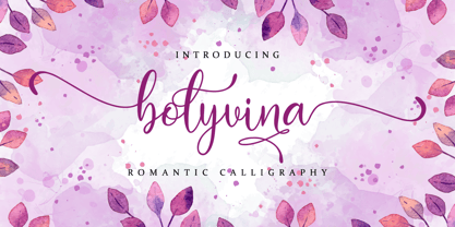 Bolyvina is a beautiful script that feels classy, elegant, and modern. It is perfectly suited for a wide variety of projects! This font is PUA encoded which means you can access all of the magical glyphs and swashes with ease! It also features a wealth of special features including alternate glyphs and ligatures.
 - Nossible by Gassstype,
$25.00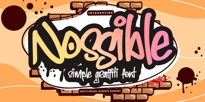 Introducing Nossible It's Simple Graffiti Font is a Natural Style and Authentic classy style, this font is great for your creative projects such as watermark on photography, and perfect for logos & branding, invitation,advertisements,product designs, stationery. It also features a wealth of special features including You can activate 11 Ligatures OpenType panel.
 - Fiest by Panatype Studio,
$9.00 Fiest Font Duo is a handwritten font containing 3 font styles: script and sans serif plus matching slanted. OpenType features make the design more natural and attractive. It's perfect for signature, logotype, wedding invites, posters, brochures or any display use. OpenType Features : Ligatures Stylistic Alternates Ordinals Initial Form Fraction Extended Latin support
 - Sweet Unicorn by Stefani Letter,
$12.00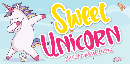 Sweet Unicorn is a cute and sweet handwritten font with an incredibly friendly feel. Get inspired by its playful feel! This font is PUA encoded which means you can access all of the cute glyphs and swashes with ease! It also features a wealth of special features including alternate glyphs and ligatures.
 - Unytour Display by NicolassFonts,
$25.00 Unytour Display is a modern sans-serif font family of 36 fonts. It includes nine weights with italics from Extra Light to Heavy. Each weight includes alternatives (A,G,I,R,a,l) and OpenType features. Unytour Display features excellent legibility for print, as it does for reproduction on TV screens and more.
 - Encorpada Classic Compressed by dooType,
$20.00 Encorpada Classic, designed by Eduilson Coan, brings the best features of the Didone genre, but with a 21st century look and feel. With smooth details Encorpada Classic is an elegant choice for your type library. The family has three widths – compressed, condensed & normal, support for more than 40 languages and opentype features.
 - Cleanliness Power by Letterara,
$12.00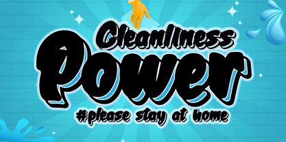 Cleanliness Power is bold script script that looks elegant and classy. It will add a charming touch to anything project This font is PUA encoded which means you can access all of the cute glyphs and swashes with ease! It also features a wealth of special features including alternate glyphs and ligatures.
 - Rolleston by Pepper Type,
$40.00 Rolleston is a rigid 42-style serif font family with peculiar spiky serifs. It comes in three optical sizes: Text, Title, and Display. Rolleston features extensive language support including Cyrillic, contains a variety of Opentype features, and an abundance of ligatures and alternative to choose from – for fancy headlines and elegant body copy.
 - Story of Christmas by Amarlettering,
$15.00 Story of Christmas is a sweet handwritten font. It will add a unique and romantic touch to your Christmas projects! This font is PUA encoded which means you can access all of the cute glyphs and swashes with ease! It also features a wealth of special features including alternate glyphs and ligatures.
 - Eeeek Images by Atlantic Fonts,
$59.00 Brew up some sweet Halloween fun with Eeeek Images, a Halloween picture font featuring 60 Amy Dietrich illustrations. From curious crows to cascading candy, Dracula to darling bats - Eeeek Images is MONSTEROUSLY fun... DARE NOT pass it up! Posters feature various fonts by Atlantic Fonts including Rowboat, Mountain Goat, Farmstand, Trailmap, and Judlebug.
 - Bilground by Prioritype,
$17.00 Introducing Bilground - Handwritten Fonts Beautiful handwritten fonts with strong characters are now here to accompany your design projects. You can apply it to wedding designs, logos, quotes, social media posts, video content display etc. See some of the previews above for reference. Features: • Uppercase • Lowercase • Numeral • Punctuation • Multilingual • PUA Encoded • Opentype Features Thanks.
