10,000 search results
(0.04 seconds)
- Lubaline by Lián Types,
$39.00 Who haven't heard the phrase that ‘any past time was better’?. Although I sometimes find this phrase a little too pessimistic (because I try to think that the best is yet to come), it may be true regarding my passion, typography. I'm too young (29) unfortunately, and this means I did not have the pleasure of being contemporary with maybe the man who has influenced my work the most (1). The man that showed that letters are more than just letters to be read. Herb Lubalin (1918-1981), also called sometimes as ‘the rule basher’ (2), smashed the taboos and sacred rules of type design and gave it personality. He rejected the functionalist philosophy of europeans in favor of an eclectic and exuberant style. To him, letters were not merely vessels of form, they were objects of meaning. (3). Nowadays, when looking at his portfolio, who dares to deny that the term ‘typography’ and ‘beauty’ may go hand-in-hand without any problem? Ed Benguiat, one of Herb’s partners, still likes making jokes with the phrase “screw legibility, type should be beautiful” and what I understand of this is not to forget the rules, but to know and break them carefully. In an era of pure eclecticism, we, the lovers of flourishes and swashes, can't do nothing but admire all the legacy that Lubalin, this wonderful type-guru, left. My font Lubaline read as “the line of Lubalin” is my humble tribute to him. Those who know his work, may see the influences easily like in his ‘Beards’ (1976) and ‘The Sound of Music’ (1965) posters; the art-deco forms in many of his amazing logos and practically in all his creations where letters seem to be alive just like you and me. I really hope that the future finds me still learning more and more about type-design and letterforms, and like him, always willing to make innovations in my field: Because letters are not just letters to be read. NOTES (1) These are some of my fonts in which some of Lubalin’s influences can be seen (in order of creation): Reina, Aire, Erotica, String, Beatle, Heroe, Selfie, Model, Seventies, and many others that are still in progress. (2) (3) Steven Heller. Herb Lubalin: Rule Basher. U&lc (1998) http://www.printmag.com/imprint/my-favorite-lubalin/
 - PF Stamps Pro by Parachute,
$79.00 PF Stamps covers a wide range of applications which require the stamp effect. This is a form of lettering which was very popular in the mid-twentieth century for product labeling. Special machinery was developed by mainly two companies, one in the United States and the other in Germany. This machinery produced paper die cuts which were later used as a base for the marking with a paintbrush. PF Stamps Paint was developed to simulate this type of lettering. Two other styles, Metal and Flex, have been very popular since its original release. The first one was developed from a metallic stamp imprint, whereas the second one with its slight 3-D look simulates letters stamped on plastic. To insure realistic results, uppercase letters are different from lowercase. This is very useful when two similar letters sit next to each other. There 3 more styles: Solid (the stencil in its regular clean form), Rough and the very interesting Blur. The all new “Pro” version comes to complete this series with what was missing: 93 matching frames and frames parts which will satisfy the most demanding designer. This is a bonus font which is available only with the purchase of the whole family. Use these frames “as is” at any size, or connect the frame parts to each other to create longer frames. Finally, this series supports more than hundred languages which are based on the Latin, Greek or Cyrillic scripts.
 - Rankday by Alit Design,
$14.00 Presenting the 🎃 Rankday Typeface 🦇 by alitdesign. Rankday typeface is designed for the needs of design concepts themed about Halloween and events in October and November. The Rankday font has a horror character with a character shaped like dripping blood, making the horor Halloween themed design concept even better and unique. The Rankday font also gets a bonus character of 150 Halloween-themed illustrations that make creating designs even easier. Simply by downloading the Rankday font, creating a Halloween themed design is very quick and easy. The Rankday Typeface is perfect for magazine cover designs, brochures, flyers. Instagram ads, Canva Design and so on with halloween and dark concepts. besides that this font is very easy to use both in design and non-design programs because everything changes and glyphs are supported by Unicode (PUA). The Rankday Typeface contains 607 + 150 bonus glyphs with many unique and interesting alternative options. Language Support : Latin, Basic, Western European, Central European, South European,Vietnamese. In order to use the beautiful swashes, you need a program that supports OpenType features such as Adobe Illustrator CS, Adobe Photoshop CC, Adobe Indesign and Corel Draw. but if your software doesn't have Glyphs panel, you can install additional swashes font files.
 - Colville by Canada Type,
$29.95 The Colville fonts began their existence in 2015 as a project-specific typeface, made to be used on a custom-made headstone commemorating Canadian artist Alex Colville (1920-2013) and his wife Rhoda Wright. For that purpose, some initial shapes were modelled after letters Colville himself had used on a Governor General gold medal he designed in the mid-1970s. From there started a year-long project that culminated in a set of four comprehensive fonts ranging in weight from Light to Bold, each containing over 750 glyphs to cover Pan European language support, stylistic alternates, five sets of figures, automatic fractions, and some ornaments rooted in Alex Colville’s art. These fonts exhibit a strong art deco aesthetic that has always been a favourite of architects, metal casters, and sign makers. This is a very humanist geometry alternating from the precisely calculated to the curvy and lithe, subtle contrast, flat stroke stops, and airy proportions that make for a counterspace built for accommodation and comfort. The breadth and timeless humanism of the Colville set makes fit in a variety of applications, from straightforward headlines, titles, and emphasis captions, to branding and packaging.
 - Crispo by Resistenza,
$48.00 Prepare to be enchanted by the artistry of "Crispo," a font meticulously crafted through the delicate strokes of pointed pen calligraphy. In the world of typography, each character becomes a masterpiece, resonating with the eloquence of a brushstroke. Experience the Dynamic Elegance of Pointed Pen Mastery: Elegance with "Crispo" transcends mere quality; it embodies the essence of pointed pen calligraphy as a true masterpiece. The flowing lines and timeless grace of every character reflect the precision and artistry embedded in this refined craft. In the realm of fonts, "Crispo" emerges as a distinctive personality, each character meticulously handcrafted with a pointed pen. These letters aren't mere symbols; they roar with the passion and personality of a master calligrapher's ink, leaving an indelible mark on your creative endeavors. "Crispo" is more than a font; it's a genuine work of art inspired by the rich traditions of calligraphy. It serves as the embodiment of the pointed pen's craftsmanship, where each curve and ligature is shaped with meticulous care, inviting you to delve into the world of true artistic expression. The elegance within "Crispo" extends beyond appearances; it resides in the essence of each stroke. Every character, ligature, and swash is a testament to the beauty of pointed pen calligraphy, culminating in a font that stands unparalleled in its grace and sophistication. Whether you're crafting wedding invitations, establishing brand identities, or embarking on any project that craves distinction, "Crispo" unlocks the door to limitless creative expression. Courtesy of pointed pen calligraphy's mastery, this font becomes your brush, painting a story of elegance and distinction. "Crispo" is not just a font; it's a journey through the soul of pointed pen calligraphy. It encapsulates the brushstroke of a skilled hand, the dance of ink on paper, and the unwavering passion behind every character. Step into the enchanting world of "Crispo" and infuse your designs with the dynamic elegance and strong personality of pointed pen calligraphy.
 - xmess - Unknown license

- Estandar by Latinotype,
$- Estandar is a retro and vintage wayfinding sans serif font, inspired by old signal in central park and Europe.
 - Ambroise Std by Typofonderie,
$59.00 An exquisite Didot font in 18 series Ambroise is a contemporary interpretation of various typefaces belonging to Didot’s late style, conceived circa 1830, including the original forms of g, y, &; and to a lesser extent, k. These unique glyphs are found in Gras Vibert, cut by Michel Vibert. Vibert was the appointed punchcutter of the Didot family during this period. It is the Heavy, whom sources were surest that Jean François Porchez has been used as the basis for the design of the typeface family. In the second half of the 19th century, it was usual to find fat Didots in several widths in the catalogs of French type foundries. These same typefaces continued to be offered until the demise of the big French foundries in the 1960s. Ambroise attempts to reproduce more of what we see printed on paper in the 19th century; a more accurate representation of Didot punches. So, the unbracketed serifs are not truly square straight-line forms but use tiny transitional curves instead. The result on the page appears softer and less straight, particularly in larger sizes. The illustrious Didot family of type founders and printers Every variation of the typeface carries a name in homage to a member of the illustrious Didot family of type founders and printers. The condensed variant is called Ambroise Firmin. The extra-condensed is called Ambroise François. Ambroise Pro brought back to life: fifteen years in the making! Club des directeurs artistiques, 48e palmarès Bukva:raz 2001
 - Affair by Sudtipos,
$99.00 Type designers are crazy people. Not crazy in the sense that they think we are Napoleon, but in the sense that the sky can be falling, wars tearing the world apart, disasters splitting the very ground we walk on, plagues circling continents to pick victims randomly, yet we will still perform our ever optimistic task of making some little spot of the world more appealing to the human eye. We ought to be proud of ourselves, I believe. Optimism is hard to come by these days. Regardless of our own personal reasons for doing what we do, the very thing we do is in itself an act of optimism and belief in the inherent beauty that exists within humanity. As recently as ten years ago, I wouldn't have been able to choose the amazing obscure profession I now have, wouldn't have been able to be humbled by the history that falls into my hands and slides in front of my eyes every day, wouldn't have been able to live and work across previously impenetrable cultural lines as I do now, and wouldn't have been able to raise my glass of Malbeck wine to toast every type designer who was before me, is with me, and will be after me. As recently as ten years ago, I wouldn't have been able to mean these words as I wrote them: It’s a small world. Yes, it is a small world, and a wonderfully complex one too. With so much information drowning our senses by the minute, it has become difficult to find clear meaning in almost anything. Something throughout the day is bound to make us feel even smaller in this small world. Most of us find comfort in a routine. Some of us find extended families. But in the end we are all Eleanor Rigbys, lonely on the inside and waiting for a miracle to come. If a miracle can make the world small, another one can perhaps give us meaning. And sometimes a miracle happens for a split second, then gets buried until a crazy type designer finds it. I was on my honeymoon in New York City when I first stumbled upon the letters that eventually started this Affair. A simple, content tourist walking down the streets formerly unknown to me except through pop music and film references. Browsing the shops of the city that made Bob Dylan, Lou Reed, and a thousand other artists. Trying to chase away the tourist mentality, wondering what it would be like to actually live in the city of a billion tiny lights. Tourists don't go to libraries in foreign cities. So I walked into one. Two hours later I wasn't in New York anymore. I wasn't anywhere substantial. I was the crazy type designer at the apex of insanity. La La Land, alphabet heaven, curves and twirls and loops and swashes, ribbons and bows and naked letters. I'm probably not the very first person on this planet to be seduced into starting an Affair while on his honeymoon, but it is something to tease my better half about once in a while. To this day I can't decide if I actually found the worn book, or if the book itself called for me. Its spine was nothing special, sitting on a shelf, tightly flanked by similar spines on either side. Yet it was the only one I picked off that shelf. And I looked at only one page in it before walking to the photocopier and cheating it with an Argentine coin, since I didn't have the American quarter it wanted. That was the beginning. I am now writing this after the Affair is over. And it was an Affair to remember, to pull a phrase. Right now, long after I have drawn and digitized and tested this alphabet, and long after I saw what some of this generation’s type designers saw in it, I have the luxury to speculate on what Affair really is, what made me begin and finish it, what cultural expressions it has, and so on. But in all honesty it wasn't like that. Much like in my Ministry Script experience, I was a driven man, a lover walking the ledge, an infatuated student following the instructions of his teacher while seeing her as a perfect angel. I am not exaggerating when I say that the letters themselves told me how to extend them. I was exploited by an alphabet, and it felt great. Unlike my experience with Ministry Script, where the objective was to push the technology to its limits, this Affair felt like the most natural and casual sequence of processions in the world – my hand following the grid, the grid following what my hand had already done – a circle of creation contained in one square computer cell, then doing it all over again. By contrast, it was the lousiest feeling in the world when I finally reached the conclusion that the Affair was done. What would I do now? Would any commitment I make from now on constitute a betrayal of these past precious months? I'm largely over all that now, of course. I like to think I'm a better man now because of the experience. Affair is an enormous, intricately calligraphic OpenType font based on a 9x9 photocopy of a page from a 1950s lettering book. In any calligraphic font, the global parameters for developing the characters are usually quite volatile and hard to pin down, but in this case it was particularly difficult because the photocopy was too gray and the letters were of different sizes, very intertwined and scan-impossible. So finishing the first few characters in order to establish the global rhythm was quite a long process, after which the work became a unique soothing, numbing routine by which I will always remember this Affair. The result of all the work, at least to the eyes of this crazy designer, is 1950s American lettering with a very Argentine wrapper. My Affair is infused with the spirit of filete, dulce de leche, yerba mate, and Carlos Gardel. Upon finishing the font I was fortunate enough that a few of my colleagues, great type designers and probably much saner than I am, agreed to show me how they envision my Affair in action. The beauty they showed me makes me feel small and yearn for the world to be even smaller now – at least small enough so that my international colleagues and I can meet and exchange stories over a good parrilla. These people, whose kindness is very deserving of my gratitude, and whose beautiful art is very deserving of your appreciation, are in no particular order: Corey Holms, Mariano Lopez Hiriart, Xavier Dupré, Alejandro Ros, Rebecca Alaccari, Laura Meseguer, Neil Summerour, Eduardo Manso, and the Doma group. You can see how they envisioned using Affair in the section of this booklet entitled A Foreign Affair. The rest of this booklet contains all the obligatory technical details that should come with a font this massive. I hope this Affair can bring you as much peace and satisfaction as it brought me, and I hope it can help your imagination soar like mine did when I was doing my duty for beauty.
 - Seiston by Skinny Type,
$19.00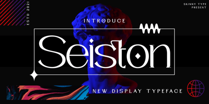 Seiston is the New Modern Typeface. This other Serif collection is perfect for your next branding project, great for your business. Gallient has smooth edges, so this font gives this style an authentically handcrafted feel. Seiston also features: - Lowercase - Uppercase - Numbers and punctuation marks - Multilingual Seiston is the perfect choice for people looking for a clean, modern, minimalist, elegant and beautiful design style. Suitable for almost any graphic design such as logos, branding materials, business cards, gift cards, t-shirts, covers, thumbnails, prints, posters, photography, quotes .etc Happy Designing
 - Nightmark BB by Blambot,
$12.00 Nightmark BB is a roman-inspired, all-caps calligraphy typeface, hand lettered by Nate Piekos. Intended for comic book dialogue lettering, it features contextual alternates for six versions of each letter, three versions of each number, exclamation point, and question mark, serif-I correction, manga-specific characters, bouncy baselines for three or more consecutive letters, and a ton of European characters!
 - Damonte by IbraCreative,
$17.00 Damonte is an extraordinary adventure style font that embodies a sense of exploration and wonder. Its distinct letterforms are inspired by rugged landscapes and daring expeditions, making it a perfect choice for projects that seek to evoke a spirit of adventure and discovery. With its unique and captivating design, Damonte adds a touch of mystique to logos, book covers, and outdoor-themed designs.
 - Victorian Supremacy by Burntilldead,
$14.00 With over a year of design and development, Victorian Supremacy is ready to help you and your clients make a statement by adding elegance and unique flair to your next design project. Victorian Supremacy inspired by letterheads from the late 1800's and early 1900's. Set includes four major styles and layered version (gradient, outline & extrude). Victorian Supremacy offers an expansive set of options, making it the perfect choice for books, magazines, packaging, branding and signage. From period style and Victorian to modern and elegant, Victorian Supremacy is strong and stately, yet elegant and decorous.
 - Canned Whale by Hanoded,
$15.00 Each year whalers from Japan kill more than 1000 whales. Japan says that the killing of whales is a 'cherished Japanese tradition', and that it is taking 'scientific data'. A portion of the whale meat is canned and marketed as 'traditional food'. How sad is that? A huge whale being reduced to a chunk in a can… Canned Whale is a hand drawn, outline style font with a cartoonesque twist to it. It can be used in ads and posters, it can be filled in with color, or kept as an outline. Canned Whale comes with extensive language support.
 - LiebeLotte by LiebeFonts,
$29.90 Forget that hipster coolness for a minute and design something cute and charming with LiebeLotte! Go ahead and make beautiful things with her: birthday cards, wedding invitations, love letters, new signage for your deli—so many things look sweeter when you use this well-crafted handwriting font. We’ve put all of our heart and soul into this typeface—it took us a whole year to draw, refine, and interconnect all these loopy letterforms. We hope it’s really hard to tell that this is a typeface at all—the perfect connections and many swash variations make it look like you actually sat down with a pen. A pretty good pen in fact. LiebeLotte comes with a state-of-the-art character set. She also sports a variety of ligatures and alternative forms, available through OpenType features. (Please make sure your software supports ligatures for the letter connections and OpenType if you wish to use the advanced features.) Advanced designers, please take a look at our best-sellers LiebeErika and LiebeKlara: the all-new LiebeLotte makes a great companion for these popular fonts. We do think you’ll have plenty of fun with this versatile package of loopy letters for letter lovers. Or lovely letters for loop lovers. And hey, you can absolutely use LiebeLotte to make happy hipster designs, too! Promise!
 - FF Bauer Grotesk Paneuropean by FontFont,
$40.99FF Bauer Grotesk is a revival of the metal type Friedrich Bauer Grotesk, released between 1933 and 1934 by the foundry Trennert & Sohn in Hamburg Altona, Germany. The geometric construction of the typeface, infused with the art deco zeitgeist of that era, is closely related to such famous German designs as Futura, Erbar, Kabel and Super Grotesk that debuted a few years earlier. However, FF Bauer Grotesk stands out for being less dogmatic with the geometry, lending the design a warmer, more homogenous feeling. The oval “O” is a good example of that, as well as characteristic shapes like the capital M or the unconventionally differing endings of “c” and “s” which make for a less constructed look. The design was started by Thomas Ackermann, and he collaborated with Felix Bonge to evolve his original ideas into this fresh, modern geometric typeface family. FF Bauer Grotesk contains 6 weights with accompanying italics, and a wide range of OpenType typographic features including small caps, figure styles, fractions and contextual alternates. NEW: the new FF Bauer Grotesk W1G versions features a pan-European character set for international communications. The W1G character set supports almost all the popular languages/writing systems in western, eastern, and central Europe based on the Latin alphabet including Vietnamese, and also several based on Cyrillic and Greek alphabets. - Clari by Creative9,
$15.00 Meet "Clari" — where simplicity meets style. This user-friendly font effortlessly blends clarity and creativity. Perfect for sleek presentations, user-friendly websites, or captivating social media posts. Its modern design ensures your message is clear and impactful. Elevate your brand with "Clari" — simplicity at its best. Can be used for the design of poster, Big sale sign, greeting card , packaging designs, New Year design and so on with the winter season concept. Apart from that this font is very easy to use in both design and non-design programs because all alternates and glyphs are supported by Unicode (PUA). Features: - A-Z Character Set - Numerals & Punctuations (OpenType Standard) - Stylish and Fashionable - Multilingual Thank you
 - Textworthy Serif by Caron twice,
$78.00 Textworthy Serif is a simple serif typeface with a human character. It is based on writing with a classic pen. Serif form we know as the trustworthy type style. Similar shapes we’ve been reading about since the 15th century when letterpress began. And antique can be developed after blackletter type. Textworthy Serif was created because we still believe in serif type for over 500 years. And we still need to use serif types in today’s world for comfortable and rational acceptance of text information. Italic styles are in production. We wanted to offer these 5 styles for those purposes where the number of styles is enough.
 - Bourget by Julien Fincker,
$24.00 Bourget is a Display-Sans, which is inspired by the Art Déco Typography of the 1920´s, 1930´s years. It has a very characteristic and unique style by its thin line through every letter. The upright and italic versions have each 750+ Glyphs with Open Type Features, playful Ligatures and a lot of Alternates as Stylistic Sets. So there is a lot to discover and to play around with. Bourget is good to use for Branding, Signage, Packaging, Invitations, Advertising, Headlines, Displays, Magazines, Book titles or everything you want to use it for. Bourget has an extended character set to support 219 latin based languages in 212 countries and Pinyin.
 - Kingthings Willow Pro by CheapProFonts,
$10.00 These fonts just ooze Christmas and holiday spirit from every curve of every letter! If Kingthings Willowless Pro is a Christmas font, well... then Kingthings Willow Pro is a Christmas tree complete with decorations and lights! This font is sooooo ornamented - but still quite readable. I have cleaned up all the outlines, redesigned the F (which looked more like a J), tweaked some more letters and then expanded the font with the usual multilingual glyphs. I loved this font when I first saw it, but was very nervous that it would be difficult to design the accents - but it was a breeze! It has been one of the most enjoyable fonts to rework so far. Hope you will enjoy it, too. ALL fonts from CheapProFonts have very extensive language support: They contain some unusual diacritic letters (some of which are contained in the Latin Extended-B Unicode block) supporting: Cornish, Filipino (Tagalog), Guarani, Luxembourgian, Malagasy, Romanian, Ulithian and Welsh. They also contain all glyphs in the Latin Extended-A Unicode block (which among others cover the Central European and Baltic areas) supporting: Afrikaans, Belarusian (Lacinka), Bosnian, Catalan, Chichewa, Croatian, Czech, Dutch, Esperanto, Greenlandic, Hungarian, Kashubian, Kurdish (Kurmanji), Latvian, Lithuanian, Maltese, Maori, Polish, Saami (Inari), Saami (North), Serbian (latin), Slovak(ian), Slovene, Sorbian (Lower), Sorbian (Upper), Turkish and Turkmen. And they of course contain all the usual "western" glyphs supporting: Albanian, Basque, Breton, Chamorro, Danish, Estonian, Faroese, Finnish, French, Frisian, Galican, German, Icelandic, Indonesian, Irish (Gaelic), Italian, Northern Sotho, Norwegian, Occitan, Portuguese, Rhaeto-Romance, Sami (Lule), Sami (South), Scots (Gaelic), Spanish, Swedish, Tswana, Walloon and Yapese.
 - Ciseaux Matisse by Harald Geisler,
$65.74 Ciseaux Matisse was inspired by the exhibition Drawing With Scissors, which I visited at the Kunsthalle Schirn in my hometown of Frankfurt am Main in 2003 and the book Jazz published in 1947 by Henri Matisse. Admittedly, before that time I wasn’t a fan of Matisse’s work, neither his late nor the early work. That definitely changed after the exhibition. While his motifs have been overused on postcards and mouspads, in front of the originals you forget those tiny pictures. Some of the works were massive—larger than 24ft. By cutting directly into the color Matisse created shapes with strong dynamics. Years later, in 2007, I used that inspiration to cut an exclusive font for a newspaper that I designed at that time (see Gallery Pictures). Later I developed that font into the four styles featured here. The cut-out style is a paper cutout; boxed is the paper background. Both linear and boxed linear have no curved outlines, so they are more aggressive. As drawing with scissors implies, all characters are cut by hand. With only uppercase letters, this font is designed for editorial use: headlines, slogans in ads, or musical usage in posters and flyers that need the little touch of the jazz scissors. In special cases the lowercase letters contain alternate shapes to the uppercase forms.
 - DINfun Pro Removed by CheapProFonts,
$10.00 A collection of DIN Mittelschrift variants where parts of the letters have been removed to create different effects. The Plain font is included if you buy the family pack, and can be mixed in. The DINfun Pro fonts are special versions of the classic DIN 1451 Mittelschrift, far removed from the original typeface's serious and no-nonsense roots. I have made them as companions to the classic, with some some very different expressions, complete with a large multilingual character set. Time to spice up that DIN profile! :) ALL fonts from CheapProFonts have very extensive language support: They contain some unusual diacritic letters (some of which are contained in the Latin Extended-B Unicode block) supporting: Cornish, Filipino (Tagalog), Guarani, Luxembourgian, Malagasy, Romanian, Ulithian and Welsh. They also contain all glyphs in the Latin Extended-A Unicode block (which among others cover the Central European and Baltic areas) supporting: Afrikaans, Belarusian (Lacinka), Bosnian, Catalan, Chichewa, Croatian, Czech, Dutch, Esperanto, Greenlandic, Hungarian, Kashubian, Kurdish (Kurmanji), Latvian, Lithuanian, Maltese, Maori, Polish, Saami (Inari), Saami (North), Serbian (latin), Slovak(ian), Slovene, Sorbian (Lower), Sorbian (Upper), Turkish and Turkmen. And they of course contain all the usual "western" glyphs supporting: Albanian, Basque, Breton, Chamorro, Danish, Estonian, Faroese, Finnish, French, Frisian, Galican, German, Icelandic, Indonesian, Irish (Gaelic), Italian, Northern Sotho, Norwegian, Occitan, Portuguese, Rhaeto-Romance, Sami (Lule), Sami (South), Scots (Gaelic), Spanish, Swedish, Tswana, Walloon and Yapese.
 - Seraphina by Muksal Creatives,
$15.00 Seraphina is a variable serif font that boasts beauty across 18 distinct styles, ranging from the delicate "Thin" to the boldest "Black". Each style offers italic capabilities, enriching the spectrum of your design possibilities. The elegance encapsulated within each letter creates a captivating impression, making it ideal for branding seeking prominence and fashion styles aiming to convey an elegant and exclusive message. Seraphina beckons to be applied across various design mediums, leaving a distinctive mark on logos, posters, and other design products. With a bestowment of grace and luxury within each character, Seraphina unlocks doors to captivating creations and consistent impressions. It stands as an outstanding choice for design projects that demand a touch of both refined classicism and modernity.
 - Weisy by MIX.Jpg,
$12.00 Weisy Signature is a modern calligraphy font that is light, smooth, modern with original pen strokes. This script includes holes or spaces in strokes, because all handwritten strokes with brushes use the ink flow structure. Suitable for branding, signatures, wedding invitations, and cards. Weisy Signature includes a complete set of upper and lower case letters, numbers, various punctuation marks and binders. All lowercase letters include the beginning and end of swash, giving a realistic handwriting style. All uppercase letters include the beginning of swash, which makes the font look great! If you don't have the Glyph panel to use swash, don't worry. You can type -1 instead of swash. For example, if you type -1A, the initial "A" swash appears and the "a" swash ends. If you type-1, the initial "a" swash will appear. PLEASE NOTE: With a Standard License you are NOT permitted to sell digital goods using fonts in editable software such as Templates. Please, contact me for a license extension. Thank you and enjoy MIX.Jpg
 - P22 Victorian Gothic by P22 Type Foundry,
$24.95 P22 Victorian is a font set created in conjunction with the Albright-Knox Art Gallery's exhibition of Victorian-era French artist James Tissot. The fonts developed for the P22 Victorian set are based on historic typefaces dating from the late 19th century. Victorian Gothic was based on a type style called ‘Atlanta’, a simple, expanded width, quirky, yet elegant face similar to ‘Copperplate’. Victorian Swash was inspired by the willowy, delicate face ‘Columbian’, which has also been known in recent years as ‘Glorietta’. The P22 version includes ‘snap-on’ flourishes based on the original 'Columbian' ornamental embellishment designs. Victorian Ornaments features over 150 decorative embellishments.
 - Swishine by Dumadi,
$18.00 Swishine is a modern, freestyle aesthetic handwritten font perfect for beauty branding, cosmetics, wedding invitations and other design branding. Swishine includes a full set of beautiful upper and lowercase letters, numbers, multiple punctuation marks, alternative styles, ending swsh, and ligatures. provides a very beautiful handwritten style.
 - BD Megalona by Balibilly Design,
$25.00 The fundamental in creating this typeface is the implementation of our interest in typography over the past year. Inspired by the elegance, consistency, and hard work of Times New Roman pull up our minds to a daunting blank canvas and began to think about what we had to do to take this idea even further. Whatever comes to our mind and when it is poured out, it will certainly remain within the rules of the letterforms. This typeface is created by a careful approach, consisting of 28 fonts 13 weights with matching true italics forms. Feature an extended charset of over 1800 glyphs, covering 219 languages using Latin, Cyrillic (basic to extended), and Greek alphabets. Included advanced open type features like stylistic alternates, terminal form, swash, discretionary ligatures, ordinals, small caps, positional numbers, fractions, and case-sensitive forms. BD Megalona provides a range of choices that will give luxury vibes in symmetrical layouts with selective deviations, and work well in a stylish look for your typographic project. This is a complete package of problem solvers perfectly suited for body text and high-impact headlines. Advance open-type features definitely stunning on logos, branding, magazines, website, etc. BD Megalona is our ego in expression that aims to supply the necessity of design nowadays while still in the corridors of the glory of past traditions as a source of our inspiration. We would like to show you a SHORT FILM about the process of designing BD Megalona Font Family, Click Here!!!
 - Imagine a font that stepped right out of a time machine, quill in hand, daring to bridge the gap between the grandeur of the Renaissance and the sleek screens of the digital age. That, dear reader, i...
- Brahma by Tall Chai,
$15.00 Brahma V2 is here. The new version has been three years in the making. It has multiple new updates and improvements based on user feedback. The focus for this version has been improved readability while maintaining the unique, modern identity of Brahma type family that has received so much love since V1 was launched in Dec 2020. Brahma is a modern geometric sans-serif font family with weights ranging from Thin (100) to Black (900). Features: Available in 9 weights Over 550 glyphs supporting extended Latin Ideal for display texts: Titles, Logos and Headlines etc. Perfect for branding and rebranding Supports OpenTypes features like Ligatures and Stylistic Alternates Tabular Numerals included Symbols for 10 major currencies including Bitcoin provided in all weights Description: The name comes from Brahmā who is known as the god of creation. And manifesting the same spirit, the Brahma font family focuses on modern creativity. Every character effortlessly integrates with current design standards and interfaces. The fonts are professional yet have a hint of informal personality in them. This makes Brahma perfect for use in modern apps and websites. Brahma is built for the designing and marketing squads. It has a trendy geometric characteristic which is ideal for any branding and rebranding. Brahma has lot of OpenType features (like ligatures and tabular numerals) and the Extended Latin character set supports over a hundred languages. Start Creating!
 - Catherova by Mokatype Studio,
$25.00 Hello Introducing, Catherova - Elegant and luxurious serif display inspired by the famous Elegant Luxury logo, suitable for designing logos, templates, brochures, videos, advertising branding, and more. Perfect for adding a unique touch to word mark logos, the monogram comes with 31 ligatures that create lots of choice and uniqueness for your designs. What's Included: + Standard glyphs + Ligatures + Web Font + International Accent + Works on PC and Mac + Simple installations accessible in Adobe Illustrator, Adobe Photoshop, Adobe InDesign, and even works on Microsoft Word. PUA Encoded Characters: Fully accessible without additional design software. Fonts include multilingual support. + Image used : All photographs/pictures/vector used in the preview are not included, they are intended for illustration purpose only. Thank you
 - Totally Terrific by Set Sail Studios,
$12.00 I love Tea. Do you love Tea? Good. Because there's a whole load of T's in the Totally Terrific Typeface! Bursting with fun and bouncy brush-strokes, this typeface will undoubtedly add a dash of cheeky playfulness to your text - ideal for greeting cards, branding, merchandise, invitations & hand-made quotes. The awesome thing about this typeface is that it's so easy to mix up the various font styles and create totally unique, hand-made looking words each time. The lowercase characters can be connected (Totally Terrific Regular) or un-connected (Totally Terrific Two), and will work in any combination of these two versions. Not only does it also look great in all-caps, but the uppercase letters will fit in with the lowercase at any location - I'm serious! Just throw one in the middle of a word, I dare you ;). Your download will contain 2 font files: Totally Terrific Regular • Contains a full set of connected lowercase letters, uppercase letters, a large range of punctuation, numerals, and multilingual support. Totally Terrific Two • A second version of the Totally Terrific Typeface, with a completely new set of un-connected lowercase characters. These are designed to work in perfect harmony with the connected set from the other font file. Just keep switching between the two fonts to create unique word layouts!
 - The VINTAGE COLLEGE DEPT_DEMO_worn font by Fontsandfashion is a distinctive typeface that embodies the spirit of classic collegiate and varsity aesthetics, with a distinctly retro feel that harks bac...
- Quixley by ITC,
$29.00Quixley was designed by Vince Whitlock, who was inspired by an old Zoltan Nagy typeface. The capitals can be used alone or combined with the lowercase and should be set with close letter and word spacing. Quixley is an eye-catching, condensed display typeface whose unusual angles and marked stroke contrast lend it marvelous visual appeal. - Farringdon by Solotype,
$19.95An old wood type we picked up in London from the Fredrick Ullmer Company. It's not marked, and we've never seen it in a catalog, so we don't know who made it. We like it for antique-looking western posters and playbills. We added the lowercase. We have seen it used on British music hall bills. - Vatella by Ws Studio,
$15.00 Vatella is a vintage-inspired calligraphy script font, perfect for the elegant touch needed for logos, wedding invitations, modern websites, greeting cards and more! Included is a full set of uppercase swash letters, as well as a final lowercase swash version, for a more custom branded look. Thank you so much for checking out my shop. Vatella Script Features Complete Set of standard alphabet and punctuation marks Additional set of washed initial capital letters Additional set of brushed lowercase endings Alternate extra styles and fasteners PUA Encoded - no special software required to access additional swashed characters Multilingual Characters (ÁÂÄÀÅÃÆÇÐÉÊËÈÍÎÏÌÑÓÔÖÒØÕŒÞÚÛÜÙẂŴẄẀÝŶŸỲ áâäàåãæçðéêëèíîïìñóôöòøõœþßúûüùẃŵẅẁýŷÿỳŠŽšž€£¥ªº)
 - Snow Mountain by Senekaligrafika,
$12.00 “Snow Mountain” is a playful handwriting font special for winter display,that puts a smile on your project and will inspire you to create something fun and memorable. “Snow Mountain” will help you to create special and touching typographical design for vacation and new year projects, for every day or the happiest day in life, happy birthday cards, winter project, greeting card, headings, flyer, product packaging, book cover, printed quotes, logos, and many more. It is really universal and modern font. The owner of endless possibilities!
 - Sunny Citrus by Anastasia Kuznetsova,
$26.00 Add a stylish touch to your design with the new duo Sunny Citrus font. Consisting of textured sans-serif capital letters and bold offers you many possibilities in your professional design projects. Perfect for creating beautiful typographic designs - perfect for branding, posters, book covers, social media, merchandise and more. This font is filled with a whole bunch of amazing additions - bold strokes and rough pieces. Font Features • character set A-Z, a-z; • 1 languages (English); • numbers and punctuation marks, symbols It is recommended to use it in Adobe Illustrator or Adobe Photoshop Made with love ♡ Thank you for stopping by, and I wish you a creative day!
 - Henares Street by Arendxstudio,
$15.00 Heares Street - Brush Font inspired by urban fonts with sharp and beautiful letters that create fonts that are modern, trendy and elegant. Heares Street came with opentype features such stylistic alternates, stylistic sets & ligatures good for logotype, poster, badge, book cover, tshirt design, packaging and any more. Features : • Character Set A-Z • Numerals & Punctuations (OpenType Standard) • Accents (Multilingual characters) • Ligature • Alternate
 - Heavy Black by Panritype Studio,
$17.00 Heavy Black is all capital brush font, made from real brush pen with original texture. it can work with any design project, such as clothing or street wear logos, headlines, social media, quotes, and more. The original texture will give a strong impression on your design.
 - Trade Gothic Next Rust by Linotype,
$29.00 Trade Gothic Next is Akira Kobayashi's 2008 revision of Jackson Burke's 1948 design. Developed over many years, the original Trade Gothic was filled with many inconsistencies. Under the direction of Akira Kobayashi, Linotype's Type Director, the american type designer Tom Grace, a graduate of the MA Typeface Design in Reading, was commissioned to redesign, revise, and expand the Trade Gothic family. Kobayashi and Grace refined many details such as the terminals and stroke endings, symbols, and the spacing and kerning. Moreover, there are newly added compressed widths and heavy weights perfect for setting even more powerful headlines. The Regular weight has been beefed up making it stronger and more robust in text settings. Trade Gothic is a staple of the advertising and newspaper industries, and now Trade Gothic Next brings more features and better quality for today's astute typographers. In addition several weights are available as soft rounded versions.
