10,000 search results
(0.02 seconds)
- Gentlysoftly by Maulana Creative,
$11.00 Gentlysoftly is a characteristic signature font of Maulana creative, with clean monoline storke, slanted, condensed and fun character. It has Opentype features of ligatures character, To give you an extra creative work. Gentlysoftly signature font support multilingual more than 100+ language. This font is good for logo design, Social media, Movie Titles, Books Titles, a short text even a long text letter and good for your secondary text font with sans or serif. Make a stunning work with Gentlysoftly signature font. Cheers, MaulanaCreative
 - Le Greg by Maulana Creative,
$15.00 Le Greg is a modern soft sans display font. With bold stroke, fun character with a bit of ligatures and ton of stylistic alternates. To give you an extra creative work. Le Greg font support multilingual more than 100+ language. This font is good for logo design, Social media, Movie Titles, Books Titles, a short text even a long text letter and good for your secondary text font with sans or serif. Make a stunning work with Le Greg font. Cheers, Maulana Creative
 - MC High Nobiety by Maulana Creative,
$24.00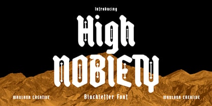 High Nobiety is a modern style of blackletter font. With medium low contrast stroke, fun character with a bit of ligatures and alternates. To give you an extra creative work. High Nobiety font support multilingual more than 100+ language. This font is good for logo design, Social media, Movie Titles, Books Titles, a short text even a long text letter and good for your secondary text font with sans or serif. Make a stunning work with High Nobiety font. Cheers, Maulana Creative
 - Blufcrowds by Maulana Creative,
$16.00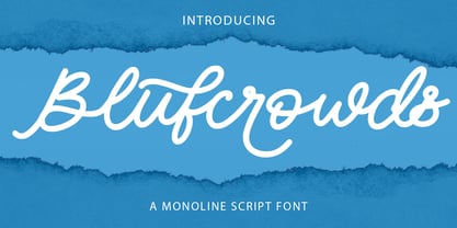 Blufcrowds is a classic style of script font. With regular mono-line stroke, slanted and fun character with a bit of ligatures and lowercase alternatives. To give you an extra creative work. Blufcrowds font support multilingual more than 100+ language. This font is good for logo design, Social media, Movie Titles, Books Titles, a short text even a long text letter and good for your secondary text font with sans or serif. Make a stunning work with Blufcrowds font. Cheers, MaulanaCreative
 - Thyga by Fateh.Lab,
$10.00 Thyga is our newest font, this is good news for those of you who are designing your best work and your biggest projects. Thyga has a very strong and elegant character, comes with the support of three styles in one family and is supported by 92 languages. Thyga is the best answer for you right now. One more good news is. Thyga has Italic font and dingbats Icon font!. Be the first to use this professional and premium Thyga font!
 - Roxfranks by Maulana Creative,
$11.00 Roxfranks is a Fancy Brush Script font. With rough brush stroke, slant and fun character with a bit of ligatures and bit of alt lowercase. To give you an extra creative work. Roxfranks font support multilingual more than 100+ language. This font is good for logo design, Social media, Movie Titles, Books Titles, a short text even a long text letter and good for your secondary text font with sans or serif. Make a stunning work with Roxfranks font. Cheers, MaulanaCreative
 - VVDS Praliner by Vintage Voyage Design Supply,
$15.00 PRALINER – New elegant font family with a lot of stylish alternates and ligatures. Really good looked for branding projects, packaging, headers, posters and signs. Playful and Stylish. Uppercase and lowercase initials. You can use it as for modern style typography and also it looks good in a vintage style projects. Especially when you combine strokes with shadow. A lot of alternates and ligatures give you a many unique variations for the same words. Comes with three widths with stroke styles.
 - Robusto by Galapagos,
$39.00Thirteen or 14 years ago I admired, out loud, a book I found on a shelf in Matt Carter's office. That Christmas I was pleasantly surprised to find that Matt had found another copy of the book and he gave it to me. The book was about the life of Oswald Cooper and it contained numerous specimens of Cooper's lettering jobs. Among them was an interesting image of 7 letter that spelled out the word 'Robusto'. These letters were used as the model for the font Robusto. All I needed to do was develop 221 other glyphs to finish the font. - Human Sans by Ian Farnam,
$20.00 Human Sans is a humanist sans serif font created as an experiment. The goal, how much a simple substitution of a small set of characters could change a font's nature. In its base form, Human Sans is a humanist sans serif geared toward text. However, through stylistic sets, it can adopt a myriad of different visual styles. This includes geometric alternates, uncials alternates, contextual swash caps, and the high and low midlines, typically seen in Art Deco lettering. These features are combinable for whatever look you may need. Human Sans comes with a full set of diacritics, in 9 weights and corresponding Italics.
 - Ambient by IHOF,
$24.95 “When you push the stage props of the life aside, there will remain the truth ...” Ambient is a deconstructed sans-serif font, which captures the essence of basic Roman letterforms... with a few twists. Gabor Kothay was born July 19th, 1962. He works as a graphic designer and teaches second-form art students. Typeface design was a hobby for many years but it has become an everyday routine with Fontmunkasok and Fontana Type Foundry. He lives with his wife and two daughters in a suburb of Szeged, a sunny southern Hungary town that lies on the banks of the Tisza river.
 - Brochette by Hanoded,
$15.00 A ‘Brochette’ in French is a skewer. I used to be a tour guide and some years ago, I guided a couple of tours in Mali. Every night at dinner we had the choice of a ‘Brochette de Capitaine’ (grilled Nile perch on a skewer) or a ‘Brochette de Bœuf’ (grilled beef on a skewer). Of course, every night the Brochette came with French fries and ‘petits pois’ (peas). It was really nice, but after 4 months of eating Brochettes, I longed for something different! Brochette is a very nice rounded font. It comes with curls, swirls and swashes.
 - Caleb Mono by Brenners Template,
$19.00Caleb Mono Font Family It is originally inherited from Caleb Grotesk. And, It is a reinterpretation of the proportional and grotesque sensibility of Glphs with a more modern and rarity feeling. Monospace fonts are a great choice for any designer who wants to create a retro, and minimalist feel. The disadvantages of ambiguous readability due to its wide width and mechanical placement are clearly present, but still attractive and elegant. To overcome these shortcomings, this font family gave variable side bearing values to each glyph and adjusted the width of the glyphs themselves. It is designed with a more human sensibility. - SK Greenland by Salih Kizilkaya,
$9.99 SK Greenland is a humanist sans serif font family with geometric and organic forms. Synthesizing Greenland's thousands of years of organic history and modern period, this font combines the organic nature of Greenland with the geometric structure of its urban areas. This font family, which contains 14 fonts and 9856 glyphs in total, contains all the typographic elements you will need in your designs. You can use this font family, which includes many unique ligatures, without any problems, from headlines to long text. Greenland offers full support for the Latin alphabet while also supporting many other alphabets.
 - Blue Island by Adobe,
$29.00British designer Jeremy Tankard began Blue Island in 1996 with the idea of creating a completely ligature-based roman typeface, an original but complex task that took years to realize. Individually, Blue Island's letters can appear a bit dismembered, but when set together, they are clearly transformed into words which fall in waves down the page. Successfully balancing readability with intriguing decorative forms, Blue Island is especially effective for titling. As for its romantic name, Blue Island is the title of a poem, also by Tankard, which evokes notions of freedom, escape, intrigue, and the undulating beauty of the sea. - Karol by Type-Ø-Tones,
$60.00 Karol was designed in 2011 as a project in the MA in Advanced Typography from EINA/UAB, in Barcelona. It was born as text typeface inspired by the work of East European type designers. Two years later, Karol is ready for public release, in a collection of eight styles (four weights and matching italics) with high readability, strength and character. A few days before its publication, we received the news that Karol had been awarded the Certificate of Typographic Excellence (Judges’ Choice) of the Type Directors Club. Please check the ‘Read me’ file located in the gallery for more specifications.
 - Eixample Glaces by Type-Ø-Tones,
$55.00 The Eixample project is inspired by modernist signage of various examples found in the Eixample neighbourhood in Barcelona. The name of each subfamily is related to its location or to specific elements of the original sign. In 2003 we photographed a sign with the word GLACES painted on a refrigerator, on which, over the years, we have speculated on how to manage the concept of double vertical modulation. This model has been expanded and the original idea has been developed in three variants that oscillate between monolinear and high contrast. In order to increase its versatility, the character set includes small caps.
 - Audela by Fontfabric,
$40.00 Surpassing traditional Antiqua, our new collaborative font family Audela emerges after overcoming time, national borders, language differences, cultural gaps, and professional challenges. Starting off as an exercise project of our very first intern Léa Bruneau in 2018, Audela slowly shaped into a full-fledged elegant serif typeface of 14 styles under the watchful eye of Plamen Motev, Fontfabric’s Type Director. Three years later, Audela is internally regarded as a breaker of limits earning its name from the French “au-delà,” meaning “beyond.” This new rising star features sharp serifs, flowing letterforms, advanced OpenType features, Extended Latin and Cyrillic support, to name a few.
 - Live by Lián Types,
$30.00 After Bird Script's ballet, Sproviero comes with these fast strokes, resulting in a font full of life and a youthful spirit. The aim of Live was again to see how far calligraphy & lettering could dive into the world of type-design. The font is perfect for logos, posters, magazines, perfumes and all pieces of design related to music, and the feminine world. You can also have a lot of fun with Live More, which contains a set of pre-designed catch words and lovely ornaments.
 - Elephantmen by Comicraft,
$19.00 Worn and torn, dry and cracked, resistant to wind and rain... the skin of the elephant is a thing of dry beauty and ancient wisdom... During the gold rush, the phrase “Seeing the elephant” became synonymous with the high cost of each prospector’s dreams and hopes --- not only the prospect of wealth beyond the dreams of avarice in California but also the possibilities of encountering misfortune on the journey. Like the circus elephant, gold was an exotic sight, and seeking it was an unequalled experience, the adventure of a lifetime. Now we've created a font much like the skin of an Elephant and Adventure, Excitement and Really Wild Things are available in the pages of the comic book of the same name, Elephantmen.
 - Rolling Pen by Sudtipos,
$79.00 After doing this for so many years, one would think my fascination with the old history of writing would have mellowed out by now. The truth is that alongside being a calligraphy history buff, I'm a pop technology freak. Maybe even keener on the tech thing, since I just can't seem to get enough new gadgets. And after working with type technologies for so many years, I'm starting to think that writing and design technologies as we now know them, being about 2.5 post-computer generations, keep becoming more and more detached from what the very old humanity arts/tasks they essentially want to facilitate. In a world where command-z is a frequently used key combination, it’s difficult to justify expecting a Morris-made book or a Zaner-drawn sentence, but accidental artistic “mutations” become welcome, marketable features. When fluid pens were introduced, their liquid saturation influenced type design to a great extent almost overnight an influence professional designers tend to play down. Now round stroke endings are a common sight, and the saturation is so clean and measured, unlike any liquid-paper relationship possible in reality. Some designers even illustrate their work by overlaying perfect circles at stroke ends, in order to illustrate how “geometric” their work was. Because if it’s measured with precise geometry, it’s got to be meaningful design. And once in a while, by a total freak accident, the now-cherished mutations prove to have existed long before the technology that caused them. Rolling Pen was cued by just such a thing: A rounded, circular, roll-flowing calligraphy from the late nineteenth century seemingly one of those experimental takes on what inspired Business Penmanship, another font of mine. Looking at it now it certainly seems to be friendlier, more legible, and maybe even more practical and easier to execute than the standard business penmanship of those days, but I guess friendliness and simplicity were at odds with the stiff manner business liked to present itself back then, so that kind of thing remained buried in the professional penman’s oddities drawer. It would be quite a few years before all this curviness and rounding were thought of as symbolic of graceful movement, which brought such a flow closer to the idea of fine art. Even though in this case the accidental mutation just happens to not be a mutation after all, the whole technology-transforms-application argument still applies here. I'm almost sure “business” will be the last thing on people’s minds when they use this font today. One extreme example of that level of disconnect between origin and current application is shown here, with the so-called business penmanship strutting around in gloss and neon. Rolling Pen is another cup of mine that runneth over with alternates, swashes, ligatures, and other techy perks. To explore its full potential, please use it in a program that supports OpenType features for advanced typography. Enjoy the new Rolling Pen designed by Ale Paul with Neon’s visual poetry by Tomás García.
 - Bouncer by Ingrimayne Type,
$6.95 The letters in Bouncer are round because they all begin as a ball and then have parts of the ball cut away. Bouncer was one of the earliest typefaces from Ingrimayne Type. Lower-case letters are smaller versions of the upper-case letters. BouncerTwo, designed twenty years after the original Bouncer, continues playing with the idea of making letters by cutting out parts of a circle, but in this case the circles are interlocking. All letters are upper-case but some of those on the lower-case keys differ from those on the upper-case keys. BouncerTwo is eye-catching but not highly legible.
 - Alfabet by Borutta Group,
$39.00 Alfabet is the result of over 3 years of work on a typeface inspired by Swiss and German designers & researchers. The main idea was to create a sans-serif with geometric and strong feeling. Whole family will work wherever we want to emphasize modernity and a rational way of visual thinking. Alfabet will be perfect choice for multiscript branding purposes, all styles support Latin (+Vietnamese), Greek and Cyrillic scripts (with Ukrainian,Bulgarian and Serbian forms). The whole family consists of 20 styles – 10 weights and matching italics. In addition to the rich set of characters, Alfabet includes Alternates, Superscript, Subscript, Ligatures, Arrows set and 7 different styles of digits.
 - MC Delyndo by Maulana Creative,
$15.00 Delyndo signature script handmade font. Monoline contrast stroke, fun character with a bit of ligatures and alternates. To give you an extra creative work. This font is good for logo design, Social media, Movie Titles, Books Titles, a short text even a long text letter and good for your secondary text font with script or serif. Make a stunning work with Delyndo font. Cheers, Maulana Creative
 - Bienboia by Maulana Creative,
$14.00 Bienboia Bold Font . Strong character with a bit of ligatures and alternates. To give you an extra creative work. Bienboia font support multilingual more than 100+ language. This font is good for logo design, Social media, Movie Titles, Books Titles, a short text even a long text letter and good for your secondary text font with Signature. Make a stunning work with Bienboia font. Cheers, Maulana Creative
 - Jhon Wave by Maulana Creative,
$15.00 Jhon Wave signature script handmade font. Fun character with a bit of ligatures and alternates. To give you an extra creative work. This font is good for logo design, Social media, Movie Titles, Books Titles, a short text even a long text letter and good for your secondary text font with script or serif. Make a stunning work with Jhon Wave font. Cheers, Maulana Creative
 - Geekabeat by PizzaDude.dk,
$20.00 Geekabeat is my wooden lookalike grunge typeface! All uppercase letters has got a funky swirl. Comes with different upper- and lowercase letters, alternate letters (both upper- and lowercase!) and ligatures for both double letters and double numbers, along with ligatures for most common letter-combinations - and of course it has got unique accented letters! You will need to use OpenType supporting applications to use the ligatures.
 - Joyful Heart by Azetype,
$12.00 Have you ever used a handwritten font on your design project? Have you ever felt bored or dissatisfied with its glyphs style that looks stiff and doesn't flow even doesn't really characterize the peculiarities of a handwritten font? Or fonts that don't have alternative glyphs so they look monotonous in a word or even sentence. And in the end, it makes your projects so far from your expectations, even your clients. It's so frustrating, isn't it? Just wake up from your dissatisfaction and this is your time to make a good choice for your design project. So, we have a solution to fix it. We introduce 'Joyful Heart' just for you. This is a font that really characterizes from the handwritten style. This font is crafted carefully in every its single scratch, created to look as close to a natural handwritten font so that it can create the perfect combination on each glyph. Happy Creating www.azetypestudios.com
 - FS Dillon by Fontsmith,
$80.00 Bauhaus Geometric, economical, functional... The good, wholesome, modernist values that once fired up the tutors and students of the Bauhaus became the inspiration for FS Dillon after an exploration of the work of the pre-war art and design powerhouse in the Fontsmith studio. The font combines simplicity and directness with a characteristic Fontsmith warmth. Letterforms are compact, with a generous x-height, and built for maximum clarity and impact. The Bauhaus sought beauty through function. FS Dillon achieves it. Made for TV The weights of fonts for TV sometimes have to be adjusted so as not to “blow” on-screen. FS Dillon was originally drawn for the on-screen presentation branding of Film Four, whose primary colour was red. Black type on a red background looks heavier than white, so Dillon needed two weights that would allow white and black type to be used together, looking balanced and equal. Type design is an organic process. Years after developing FS Dillon, we revisited it, redrawing elements and adding italics to maintain consistency. Olympic You don’t get a much higher confirmation of the functional fitness of a typeface than to have it selected to guide visitors around an Olympic complex. FS Dillon was selected as the font for signage at some of the key venues at the London 2012 Olympic Park, helping to get spectators, athletes and officials from all over the world to their seats and starting blocks on time.
 - Antica by Sudtipos,
$39.00 Antica has sharp triangular serifs, and in 8 weights with true italics, it forms a family that stylistically finds its origins in Latin styles of the nineteenth century. The font incorporates additional swashes, small caps and stylish alternates that advance the aesthetic from its roots and make it appropriate for modern design. Commonly named ‘Latin types’ did not vary in weight, but we decided to create Antica with a range that goes from thin to black and we also added extra curlicues to the letterforms. Antica borrows from the versatility and freedom granted to type founders of the nineteenth century – a time when the meteoric growth of mass-produced consumer goods led to an increased demand for publicity that needed fresh, attention grabbing typefaces. And as an homage to these Latin types we designed Antica to function well with an array of projects from stylized labels and formal editorial design requiring small type sizes to large-scale posters and billboards. The Antica family supports a wide variety of Latin alphabet-based languages.
 - MBF Umami by Moonbandit,
$14.00 Introducing Umami, a playful bold font. It's quirky construction is inspired by the flavour of all things tasty and good. Perfect for headlines, title, display, logo and many more.
 - Inabitavel Typewriter by Intellecta Design,
$25.00 The Inabitavel Typewriter is a unique typewriter font design, great for mimicking the effect of typewriting older machines. Has an erased and much-inked style, good for exquisite designs.
 - Messcara by SparkyType,
$19.00Drawn very small with a brush-tipped felt pen, Messcara has qualities of freedom, toughness, with a few girly loops thrown in for good measure. A true handwriting workhorse. - Paula by Autographis,
$39.50 Paula is a non-joining rough brush script with traces of the brush's backstroke that give it that typical look. Paula is an open script with very good readability.
 - Qiltray by Tour De Force,
$25.00 Qiltray is a good example of how handwritten fonts can be made for use in long texts. With clear and readable letters, Qiltray may be used in any kind of publications. Includes Cyrilic and CE character set support.
 - Drummer by Harvester Type,
$20.00 Drummer is a large futuristic font family inspired by the Expansion TV series, old science fiction book covers and Honda Prelude and Porsche logos. The family contains a large number of styles and a lot of language support. 54 styles, 6 in width (Ultra Condensed, Condensed, Normal, Expanded, Extra Expanded, Ultra Expanded) and 9 in weight (Thin, Extra Light, Light, Regular, Medium, Semi Bold, Bold, ExtraBold, Black). The font also has a variable version. 573 glyphs, including 40 alternate characters. A lot of work has been done on the font. The fillets on the symbols have been well worked out and tested for a better visual and practical experience. The font combines the monospacing of many characters combined with kerning, which makes it very convenient for many purposes, such as vertical typography. The font is good in all sizes, both small and large, which makes it possible to use it anywhere. Branding, logos, titles, posters, texts, covers, merch, prints, web, titles, banners, games and design in games and much more. In the near future, it is planned to add another axis of variability - the slant. Consequently, the family itself will increase. It is also planned to add a small case (capital). If you want to say something about the font or get a font in other formats, then write to the mail: bunineugene@gmail.com .
 - Frutiger by Linotype,
$42.99 In 1968, Adrian Frutiger was commissioned to develop a sign and directional system for the new Charles de Gaulle Airport in Paris. Though everyone thought he would want to use his successful Univers font family, Frutiger decided instead to make a new sans serif typeface that would be suitable for the specific legibility requirements of airport signage: easy recognition from the distances and angles of driving and walking. The resulting font was in accord with the modern architecture of the airport. In 1976, he expanded and completed the family for D. Stempel AG in conjunction with Linotype, and it was named Frutiger. The Frutiger™ family is neither strictly geometric nor humanistic in construction; its forms are designed so that each individual character is quickly and easily recognized. Such distinctness makes it good for signage and display work. Although it was originally intended for the large scale of an airport, the full family has a warmth and subtlety that have, in recent years, made it popular for the smaller scale of body text in magazines and booklets. The family has 14 weights and 14 companion fonts with Central European characters and accents. Another 14 Cyrillic companion fonts are available as well. See also the new revised version Frutiger Next from the Linotype Platinum Collection. Featured in: Best Fonts for Logos
 - Athelas by TypeTogether,
$65.00 An attempt to go back towards the beauty of fine book printing, inspired in Britain's literary classics. Athelas takes full advantage of the typographic silence, that white space in the margins, between the columns, the lines, the words, the lettershapes and finally, within the characters themselves. It is also intended to take advantage of the great advances and technical developments made in offset printing. Athelas shows its best side in finely crafted book editions and good printing conditions. Athelas has a large character set that covers most of the languages that use the Latin script. Although inspired in British literature, this typeface respects the cultural values behind different languages, where diacritic marks have an utterly important role. Athelas features four weights and about 800 characters per weight, including small caps, discretionary ligatures, fractions, a complete range of numerals for every use and a set of ornaments and arrows.
 - Amebo & Oboni by Volcano Type,
$19.00 Oboni, how are you. I am fine, thank you! This little song is what you will hear in Ghana and Togo. The white people are called Oboni and the black people are the Amebo. We'll bring both cultures together!
 - GHEA Ayb by Edik Ghabuzyan,
$40.00 This light weight Display font includes Basic Latin, Latin 1 Supplement, Latin extended A, Cyrillic + Bulgarian Cyrillic + Ukrainian Cyrillic, Armenian. May be used in titles, posters, labels, etc. Publisher: GHEA Fonts Designer: Edik Ghabuzyan, Yerevan, Armenia. Creation year 2020.
 - Nadall by Solotype,
$19.95This stylish lightface was designed by Bernd Nadall for Barnhart Bros. & Spindler as a caps-only font in 1895. The lowercase was added at Solotype a hundred years later, resulting in a font quite at home in modern advertising.