10,000 search results
(0.016 seconds)
- Garbentas by IbraCreative,
$17.00 Garbentas is a contemporary sans-serif typeface that seamlessly blends modern aesthetics with timeless simplicity. Its clean lines and balanced proportions exude a sense of sophistication, making it an ideal choice for a wide range of design applications. The typeface embodies a harmonious combination of elegance and readability, with each character meticulously crafted to achieve optimal legibility across various platforms. Garbentas’ versatility shines through in both digital and print media, offering a sleek and polished look that caters to the demands of today’s design landscape. With a distinct and refined personality, Garbentas elevates visual communication by providing a fresh, contemporary take on the classic sans-serif genre.
 - Cassius by W Type Foundry,
$23.00 Cassius & Cassius Italic are a postmodern typeface system from the Garaldes family. The main characteristic of this type family is its inverted anatomy and projected terminals. Cassius was meticulously designed with special focus on its structure. With its proposal for a fresh, attractive and rhythmic system, Cassius gives great personality to all kinds of composition. The family consists of 5 weights from regular to black, with respective Italics. Each instance includes; Case sensitives Accents, Ligatures, Fractions, Small Caps, Old Style Figures, Case Sensitives (symbols and punctuation) and more. This font is perfect for books and magazines compositions, and in general for the construction of immersive printed or digital texts.
 - Jalopy JNL by Jeff Levine,
$29.00 History, as it's said, tends to repeat itself. The round-point pen lettering used in the 1920s logo and ads for Dodge Brothers cars (pre-General Motors) is an early predecessor to the techno type styles of the 1980s. Square in shape, with unique stylization to some letters, Jalopy JNL can cross the decades and be used for a 1920s period piece and still look fresh in an ad for computer parts. Rather than round out the inside lines of the characters to fully emulate the strokes of a lettering pen, the inside lines have straight intersections for the contemporary side of this font's design.
 - Titla by ParaType,
$25.00 The name of the font Titla emphasizes it heading and display functionality. At the same time low contrast, narrow proportions, wide variety of weights and clear glyph constructions make it possible to use it for long texts as well. Combination of modern serifs with flexing stems (see n, p,…) brings to the font fresh, informal and noticeable appearance. The character set includes alternative variations and specific 'vertical ligatures' for paired letters that are built with the help of diacritical forms of letters placed above basic ones. This feature also was reflected in the name of the font as Greek 'titlos' means diacritical mark. The font was designed by Oleg Karpinsky and released by ParaType in 2009.
 - Ambigane by IbraCreative,
$17.00 Ambigane is a modern and elegant serif font that seamlessly blends sophistication with contemporary design. Its refined, timeless aesthetic is characterized by the subtle curves and clean lines of its letterforms, exuding a sense of luxury and professionalism. Ambigane strikes a harmonious balance between traditional serif elements and a fresh, modern twist, making it versatile for a range of design applications. With its well-crafted serifs and balanced proportions, Ambigane communicates a sense of refinement and style, making it an ideal choice for projects that require a touch of sophistication and a contemporary edge. Whether used in print or digital media, Ambigane conveys a sense of timeless elegance that elevates any visual composition.
 - Silex by Our House Graphics,
$14.00 A different kind of beauty. Silex began life in the labs of R.U.S.S.T Institute a number of years ago, starting with a skeleton of C.A.D./C.A.M system fonts, a disused tungsten carbide blade off an old milling machine for a soul and a little box of OpenType features for brains. This family of 3 solid, Silex is a hard-edged, hard-working display fonts. Suitable for headlines, logos, heavy equipment and... If you are a wrestler or mixed martial arts fighter, your resume. OpenType features include stylistic alternates, discretionarily ligatures, case sensitive glyphs, small caps, dozens of standard and discretionary ligatures.
 - Stencil Box JNL by Jeff Levine,
$29.00 The lettering for Stencil Box JNL was found on the packaging of a children's toy stencil set circa the 1940s. Popular for years, Pencil Stencils were a series of "connect the line" stencils where a series of dashed lines were traced from the cutouts and the lines connected to complete pictures of animals or other subjects. Although the packaging itself was often updated to reflect the current times during the life of the product, it was this hand-lettered example of stencil-meets-Art Deco from the 40s that proved worthy of saving as a digital typeface.
 - Architype Aubette by The Foundry,
$50.00 Architype Konstrukt is a collection of avant-garde typefaces deriving mainly from the work of artists/designers of the inter-war years, whose ideals have helped to shape the design philosophies of the modernist movement in Europe. Due to their experimental nature character sets may be limited. Architype Aubette is based on Theo van Doesburg’s 1928 signage lettering for the Café Aubette in Strasbourg. A collaborative project with Jean and Sophie Arp, the design and decoration of the entire restaurant and leisure complex was one of the largest projects to exemplify 1920s avant-garde, and the theories of Dutch De Stijl.
 - ND Raster by NeueDeutsche,
$20.00 Transport yourself back to the year 1994, a time when MS DOS games ignited the imagination of an impressionable young boy. Enchanted by the pixelated wonders of that era, he embarks on a journey that will shape his creative destiny. As the boy loses himself in the captivating landscapes of Commander Keen, the strategic depths of Warcraft: Orcs & Humans, and the mysterious quests of The Secret of Monkey Island, a seed is planted in his mind. The beauty of these games' typography, crafted pixel by pixel, captivates his young heart and fuels a passion for design.
 - Fontropolis by Comicraft,
$49.00 When you're ready to leave your cozy picket fence life in Typeville, make the move to the hustle and bustle of Fontropolis! FONTROPOLIS is populated by friendly-faced characters you can always count on to help you through the thick and thin of everyday life in the Capital. Why not take a day to admire the classic arches of the ascenders, descenders and horizontals featured in Fontropolis's architecture? Indulge in a little idle chitchat with your fellow Fontropolitans! Fear not! The People of Fontropolis will stand firm beside you when the unavoidable Supervillains and Crackpots descend on the capitals, spouting Arrogant Expositions of their Nefarious Plans as they seek to usurp our great country’s democracy! FONTROPOLIS will always prevail! The Fontropolis font family includes four weights (Regular, Italic, Bold & Bold Italic) with alternate uppercase characters, Western & Central European & Vietnamese support, Manga characters and Crossbar I Technology™
 - 1584 Rinceau by GLC,
$20.00 This set of initial letters is an entirely original creation, inspired by French renaissance patterns used by Bordeaux printers circa 1580-1590. It contains two roman alphabets : the first of decorated letters, the second of single large capitals, all with Garamond style, and a few fleurons using the same background pattern style. Both containing Thorn, Eth, L slash and O slash. It can be used as variously as website titles, posters and flyers design, publishing texts looking like ancient ones, or greeting cards, all various sorts of presentations, as a very decorative, elegant and luxurious additional font... This font is conceived for enlargements, possibly strong ones, remaining very smart and very fine (especially decorated initials). This font may be used with all GLC Foundry blackletter fonts, but preferably with 1543 Humane Jenson, 1557 Italique, 1589 Humane Bordeaux, 1742 Civilite, 1776 Independence without any fear of anachronism.
 - Murga by Sudtipos,
$39.00 Angel Koziupa was drawing letters for labels since forty years ago, now he meets SudTipos and his beautiful works could be used around the world. Murga is a dance, it’s Latin, it’s carnival....
 - Americana by Bitstream,
$29.99 An original design by Richard Isbell for ATF; in exaggerating the tapered stroke introduced eleven years earlier in Hermann Zapf’s Optima, Isbell created the first flareserif to achieve popularity in the United States.
 - 1565 Venetian by GLC,
$20.00 This set of initial decorated letters is an entirely original creation, drawn inspired by Italian renaissance engraver Vespasiano Amphiareo's paterns published in Venice circa 1568. It contains two roman alphabets : the first of large Initials, the second of small caps. Both containing thorn, eth, L & l slash, O & o slash. It can be used as variously as web-site titles, posters and flyers design, publishing texts looking like ancient ones, or greeting cards, all various sorts of presentations, as a very decorative, elegant and luxurious additional font... This font is conceived for enlargements remaining very smart and fine. The original height of the initials is at least about one inch equivalent to about four lines of characters, small caps may have the same height than the caps of the font used with, but cover two lines is better. This font may be used with all GLC blackletter fonts, but preferably with "1543 Humane Jenson", "1557 Italic", "1742 Civilite", "1776 Independence" without any fear for doing anachronism.
 - Alas, my dear inquirer, the font named Conformyst, crafted by the elusive artisans at Clearlight Fonts, remains a figment in the limitless cosmos of typography, as it does not exist (to my current, l...
- Hoodie & Sweater by Ira Natasha,
$10.00 Hoodie & Sweater is a bold handwritten sans serif font. A new fresh handmade font with smooth edges. This font is support multi language. Available in OTF file. This font will perfect for many different project ex: quotes, logo, blog header, poster, branding, fashion, apparel, letter, invitation, stationery, etc….
 - Airwave by A New Machine,
$19.00 Airwave is suitable for display and logo work. It comes in three faces and would work well for technical designs or for giving a fresh, modern look. It is an all cap font with a few (A, E, N, R) lower cap alternates and contains West European diacritics.
 - Popstick by Creativemedialab,
$14.00 A simple and cool retro, pop art, stylish font for your design. Popstick has a modern, clean and fresh look with nice perfect rounded shapes. This font is best suited for commercial and editorial uses like advertising, apps, sports brand, packaging, logos, headers, corporate identity and much more.
 - Black Mint by Ira Natasha,
$10.00 Black Mint is a bold handwritten sans serif font. A new fresh handmade font with smooth edges. This font is support multi language and available in OTF file. This font will perfect for many different project ex: quotes, logo, blog header, poster, branding, fashion, apparel, letter, invitation, stationery, etc….
 - Zembrush by Figuree Studio,
$20.00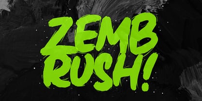 Zembrush is natural and strong hand-drawn brush font that combines attractive curves with a fresh urban edge; delivering a stylish brush font that is guaranteed to add an eye-catching appeal to your logo designs, brand imagery, handwritten quotes, product packaging, merchandise, social media post, or website font.
 - Amalina Script by Subectype,
$15.00 Amalina Script - a new modern and fresh Monoline script, elegant, natural, stylish and perfect for any awesome projects that needs a handwritten touch. Amalina is great for photography, watermark, social media posts, advertisements, logos & branding, invitation, product designs, label, stationery, wedding designs, product packaging, special events and many more.
 - Pixel_Block by fontkingz,
$19.00The Pixel_Block font-family is specially designed for use with Flash so that it doesn't blur or fill. In contrast to most other pixelfonts Pixel_Block also works well in dynamic and input text fields. Pixel_Block fonts include a full character set and also contain outlines for any print application. - Holdem by Garisman Studio,
$22.00 Introducing Holdem - Display Block Font Holdem combines attractive curves with a fresh urban edge; delivering a stylish script which is guaranteed to add an eye-catching appeal to your logo designs, brand imagery, quotes, product packaging, merchandise & social media posts. Simple installation Work for PC and MAC Multilingual Support.
 - Roulletes Handrawn by Siwox Studios,
$11.00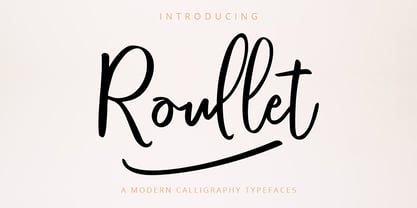 Roullet Fonts is a handwriting style. For designers, Instagrammers, bloggers, YouTubers, fashion lovers or somebody who Loves Fresh design. Roullet Fonts are suitable for any modern-design such as ad banner, modern card, invitation, announcement, seasonal design, social media promotion, web design, branding and logo stylist and many more.
 - Potato Peel by Ira Natasha,
$5.00 Potato Peel is a handwritten sans serif font. A new fresh handmade font with smooth edges. This font is support multi language and available in OTF file. This font will perfect for many different project ex: quotes, logo, blog header, poster, branding, fashion, apparel, letter, invitation, stationery, etc….
 - Divulge by Typodermic,
$11.95 Welcome to the world of Divulge—a modern grotesque that echoes the refined beauty of nineteenth and early twentieth-century sans-serif metal type. With its austere and nuanced voice, Divulge exudes an old-fashioned charm that feels both familiar and fresh. In a world of cookie-cutter fonts, Divulge is a standout. Its idiosyncrasies are generously peppered throughout, giving your message a unique and memorable character. But fear not—these quirks are not distracting. Rather, they add just the right touch of personality without overwhelming your reader. Divulge comes in three weights—light, regular, and bold—and two widths, allowing you to choose the perfect style for your message. And if you really want to make a statement, the elegant italics add a touch of class and sophistication. So whether you’re crafting a classic, old-fashioned design or looking to add warmth and personality to a modern project, Divulge has you covered. Try it out today and see how it elevates your message to new heights. Most Latin-based European writing systems are supported, including the following languages. Afaan Oromo, Afar, Afrikaans, Albanian, Alsatian, Aromanian, Aymara, Bashkir (Latin), Basque, Belarusian (Latin), Bemba, Bikol, Bosnian, Breton, Cape Verdean, Creole, Catalan, Cebuano, Chamorro, Chavacano, Chichewa, Crimean Tatar (Latin), Croatian, Czech, Danish, Dawan, Dholuo, Dutch, English, Estonian, Faroese, Fijian, Filipino, Finnish, French, Frisian, Friulian, Gagauz (Latin), Galician, Ganda, Genoese, German, Greenlandic, Guadeloupean Creole, Haitian Creole, Hawaiian, Hiligaynon, Hungarian, Icelandic, Ilocano, Indonesian, Irish, Italian, Jamaican, Kaqchikel, Karakalpak (Latin), Kashubian, Kikongo, Kinyarwanda, Kirundi, Kurdish (Latin), Latvian, Lithuanian, Lombard, Low Saxon, Luxembourgish, Maasai, Makhuwa, Malay, Maltese, Māori, Moldovan, Montenegrin, Ndebele, Neapolitan, Norwegian, Novial, Occitan, Ossetian (Latin), Papiamento, Piedmontese, Polish, Portuguese, Quechua, Rarotongan, Romanian, Romansh, Sami, Sango, Saramaccan, Sardinian, Scottish Gaelic, Serbian (Latin), Shona, Sicilian, Silesian, Slovak, Slovenian, Somali, Sorbian, Sotho, Spanish, Swahili, Swazi, Swedish, Tagalog, Tahitian, Tetum, Tongan, Tshiluba, Tsonga, Tswana, Tumbuka, Turkish, Turkmen (Latin), Tuvaluan, Uzbek (Latin), Venetian, Vepsian, Võro, Walloon, Waray-Waray, Wayuu, Welsh, Wolof, Xhosa, Yapese, Zapotec Zulu and Zuni.
 - ITC Tabula by ITC,
$29.99 ITC Tabula is meant to be read. The design grew out of a study to create a font to set film subtitles. According to Julien Janiszewski, the face's Paris-based designer, “I set parameters for the design whereby the letters had to be able to hold up at very small sizes when set on film and yet must be able to be enlarged 2000 times to be read on a theatre screen.” The subtitle font was not completed, but several months later Janiszewski revisited the design and made a discovery. “I realized that the constraints I had established for the subtitling font was not that far from those people could have in creating typographic signage. Many time this calls for a font that can be used easily in very large sizes for headlines on highway billboards and quite small for text copy.” Work proceeded for two more years before Janiszewski was satisfied with the results. The final design is a somewhat squared sans serif family of four weighs with corresponding italics. Janiszewski also wanted to create what he calls a “sensitive sans-one that is not restricted to geometric shapes but has a subtle calligraphic, foundation.” ITC Tabula is not only easy to read, it is also a distinctive and handsome design.
 - PR Viking by PR Fonts,
$20.00 This typeface is inspired by the angular shapes of runes; the early writing of Northern European peoples. The letters have been given an eroded finish, as though they were carefully carved a thousand years ago, and weathered over time. This font includes at least two versions of every letter one simple, one more ornate, with all alternate characters for other European languages. The Alternates Font includes additional variations of some characters as well as Ligatures, astrological and elemental symbols. More Nordic symbols are available in the Valknut font.
 - MollyO by Atlantic Fonts,
$28.00 MollyO font family is based on the original, reliably cool handwriting of illustrator (and dear friend), MollyO of mollyOcards. Like MollyO herself, this font is unique, unpretentious, and beautiful. Part printed and part script, it has the authentic connections and stops of a contemporary, casual font. For the truest handwritten feel, keep discretionary ligatures on, or turn them off where you want more evenness. MollyO is expressive in all-caps, available in two weights, and with effortless warmth and inky flow, will bring a wide range of creative projects to life.
 - Architype Van Doesburg by The Foundry,
$99.00 Architype Konstrukt is a collection of avant-garde typefaces deriving mainly from the work of artists/designers of the inter-war years, whose ideals have helped to shape the design philosophies of the modernist movement in Europe. Due to their experimental nature character sets may be limited. Architype Van Doesburg derives from the 1919 experimental geometric alphabet by Theo van Doesburg, whose work was heavily influenced by De Stijl theories, specifically rectangularity. The typeface has been constructed on the same 5 x 5 grid, and is limited by his ‘single alphabet’ theory.
 - Ballard by Proportional Lime,
$5.95 This typeface was inspired by a font used by Henrie Ballard. Ballard operated on Fleet Street at the Signe of the Bear in London, England. He was active in the industry from 1597-1608. The font is meant to capture the feel of the original typeface with the capability of reproducing the many ligatures that are part of what make that era's printing interesting. The Italic version has a dramatic feel that is almost handwritten in appearance. Every Proportional Lime font comes with a complete guide to its Unicode extended character set.
 - Drowsy Lunch by PizzaDude.dk,
$15.00 The inspiration for this font (as well as the name!) comes from a London cafe I visited years ago. I was fascinated with the handwritten menu - irregular and awkward, yet refreshingly charming. I did my best to recall that particular look by adding 4 slightly different versions of each lowercase letter. The name of the font comes from the speed of the waiter...or the lack of it! But luckily he took his time, otherwise I wouldn't have had the time to really look at the handwritten menu! :)
 - YahoschWormy by Ingrimayne Type,
$9.00 Years ago the company that developed Fontographer marketed a program called Font-o-Matic, a program that distorted fonts in various ways. 99% of what it produced was garbage, but every once in a while it would yield something interesting. Since I had designed a lot of typefaces by that time, I had lots of material to feed it and it was fun to see what it produced. YahoschWormy is one of rare results that was interesting enough to save and clean up. The source font was Yahosch.
 - Golum by Type Innovations,
$39.00 Deep in the bowels of the earth a tortured creature tries to mimic the writings of mankind. It labors long and hard carving the letter forms on the walls of its cave. Many years later, rubbings where taken of these impressions and fashioned to create this hideous font. All kidding aside, with such a formal training in type design, it was not easy for me to create these ill-shaped letters. I kept wanting to smooth out the outlines. Anyway, it was a good exercise and we now have this antique heavy-weight.
 - KolkFizzy by Ingrimayne Type,
$9.95 Years ago the company that developed Fontographer marketed a program called Font-o-Matic, a program that distorted fonts in various ways. 99% of what it produced was garbage, but every once in a while it would yield something interesting. Since I had designed a lot of typefaces by that time, I had lots of material to feed it and it was fun to see what it produced. KolkFizzy is one of rare results that was interesting enough to save and clean up. The source font is Kolkman.
 - BaumSquiggle by Ingrimayne Type,
$9.00 Years ago the company that developed Fontographer marketed a program called Font-o-Matic, a program that distorted fonts in various ways. 99% of what it produced was garbage, but every once in a while it would yield something interesting. Since I had designed a lot of typefaces by that time, I had lots of material to feed it and it was fun to see what it produced. BaumSquiggle is one of rare results that was interesting enough to save and clean up. The source font is Baumfuss.
 - Stately GG by Baseline Fonts,
$39.00 TWO LAYERED FONT: Be sure to get both the FRONT and the BACK! Maintaining simultaneous shades of whimsy and versatility is no simple feat, but the meticulously constructed Stately Gothic accomplishes just that, elegantly. Stately Gothic is a redrawn version of Grit Gothic. The strong vertical character of this stacking/layered typeface make it an ideal solution for use where legibility matters most: posters, logos, book and album covers, and so on. It is part of Grit History Series B along with Heirloom Artcraft, Worn Gothic, Grit Sans, and Grit Gothic.
 - Bocahe by IbraCreative,
$13.00 Bocahe, a delightful and whimsical doodle kids font, captures the essence of youthful imagination and playful charm. Each letter in Bocahe is carefully crafted with endearing doodles, resembling the spontaneous drawings of children at play. The font exudes a carefree spirit, making it perfect for projects geared toward a younger audience. Bocahe’s adorable characters bring a sense of innocence to any design, from playful invitations to colorful educational materials. The font’s hand-drawn aesthetic and vibrant personality make it an enchanting choice for conveying joy, creativity, and the boundless wonder of childhood in typographic form.
 - American Calligraphic by TypeSETit,
$39.99 In recent years with the popularity of hand written brush styles, there seems to be a relaxation of more formal calligraphic letterforms. Traditional calligraphy has always been a love of mine. American Calligraphic brings the look of hand written italic forms right to your fingertips. Get more customization with the free flowing forms that brings life to your formal designs. Whether you create greeting cards, invitations or simply want to announce a special event in your life, American Calligraphic gives you powerful options when the numerous alternate letterforms are used.
 - Nisse by Typoforge Studio,
$30.00 Say hello to a new Typoforge member! Nisse is a display font family that consists of 4 styles (including italics). The regular and rough versions differ in the amount of wear. It’s inspired by Rex typeface first published by „The Jan Idzikowski and Co. Foundry“ in 1930. Nisse has a high amount of detail making it ideal for large prints and poster design. It is specified by a huge amount of automatic alternates. Each basic latin letter has five versions, the numbers have thee versions and extended latin letters have two versions.