10,000 search results
(0.033 seconds)
- Chequers by Greater Albion Typefounders,
$15.00 Chequers was inspired by the all-capitals lettering seen on a 1920s magazine cover. It is a family of six small-serifed display faces, including a selection of stylistic alternates. Use it for a comfortable period feel in your design work. Article abstract: Chequers was inspired by the all-capitals lettering seen on a 1920s magazine cover. It is a family of six small-serifed display faces, including a selection of stylistic alternates. Use it for a comfortable period feel in your design work.
 - Amira by Rhd Studio,
$19.00 Amira Script with a modern calligraphy type font, I hope you are interested in this font, if you want to use it for your work, this font can be used easily and simply because there are many features in it containing a complete set of uppercase and lowercase letters, various kinds of punctuation. , numbers, and multilingual support. This font also contains several ligatures and alternative Style Stylistic Sets for those of you who have software capable of running OpenType (Photoshop / Illustrator / InDesign). what is included:
 - Twentieth Century by Pelavin Fonts,
$20.00 Twentieth Century was designed for the cover of 20th Century French Poetry and was drawn with pure geometric shapes. It is the distillation of a broad variety of styles loosely known as Art Deco but, also categorized under such terms as Moderne, Streamline, Machine Age, Futurist, 70s Art Deco, Memphis among others. If there were a source in particular that I would cite as my inspiration, however, it would definitely be the work of Frank Lloyd Wright. I mean, look at the "W" for cryin' out loud!
 - Vin Sans Pro by Mint Type,
$35.00 Vin (translated from Ukrainian as “he”) is a superfamily consisting of three robust typefaces with pronounced vertical stems and rounded corners. All three typefaces feature very large x-height for even more expression and assertiveness. Vin Sans Pro is a quite narrow rigid sans-serif typeface with extra-large x-height and rounded corners. It is perfect for any kind of short copy with lots of attention guaranteed. Be sure to check other two typefaces of Vin superfamily: Vin Slab Pro and Vin Mono Pro .
 - Mentone by Paragraph,
$18.00 Mentone is a new general purpose typeface, an attempt at extending the line of the great sans-serifs of the previous century, Frutiger - Stone Sans - Myriad. The font has round corners and subtle chamfers, which are all but invisible at text sizes, but add an upbeat, irreverent expression at display sizes. The typeface is named after the beautiful bayside suburb of Melbourne, Australia, where the designer lives. This new version (2.01) was spaced and kerned by Igino Marini of iKern. The semibold cuts are now free!
 - Irakly BT by Bitstream,
$50.99Perhaps one of the more difficult typeface styles to space convincingly, Irakly, a serif-sans by Russian designer Oleg Karpinsky imparts an unfamiliar elegance. The odd mixture of superficial details such as the half serifs and the protruding horizontal strokes confuse your visual senses, yet the simple geometric roots of the letterforms are apparent and ultimately reassuring. Irakly Light and Bold make a great addition to any library. The OpenType versions have alternates that are more conservative in design and broaden the usefulness of the typefaces - Teenage Workhood by Teenage Foundry,
$19.00 Teenage Workhood typeface, a classic and vintage-inspired font that brings a charming and nostalgic touch to your designs. Designed to evoke the essence of youthful creativity and the timelessness of workmanship, this typeface is perfect for projects that require a touch of vintage appeal. This versatile typeface lends itself well to a range of design projects. Whether you're creating old-school logos, vintage posters, retro packaging, or even designing an authentic vintage-inspired website, Teenage Workhood is the go-to choice to add that classic touch.
 - Inklination by Emtype Foundry,
$69.00 Inklination is a new grotesque that goes against the 'genre rules' and has a low x-height. It breathes quite better than larger x-height typefaces, with the sensation of air and more whitespace. This, combined with long ascenders and descenders, makes it look luxurious, elegant and refined. The family has two sets of italics, a regular one with 10º of inclination, and a more brutalist one with 20º. A monospaced version of five weights complete this versatile family. For more info visit emtype website.
 - Lumio emerges as a captivating font choice that draws inspiration from the interplay of light and modern design elements. Designed with a keen eye for detail, Lumio encompasses the essence of clarity...
- DejaVu Sans Mono - Unknown license

- DejaVu Serif - Unknown license

- DejaVu Serif Condensed - Unknown license

- Keep Calm by K-Type,
$20.00 Keep Calm is a family of fonts developed from the now famous World War 2 poster that was designed in 1939 but never issued, then rediscovered in 2000. As well as the original Keep Calm font, the medium weight of the poster, new weights are now available – Keep Calm Book (regular weight), Heavy and Light – and each weight comes with a complimentary italic. Version 2.0 (2017) is a comprehensive update which consists of numerous refinements and improvements across all weights. The family now contains a full complement of Latin Extended-A characters, Welsh diacritics and Irish dotted consonants. The four italics have been optically corrected with revised, ‘true italic’ forms of a and f. The crown motif from the top of the Keep Calm poster is located at the plus minus ± and section § keystrokes (Alt 0177 and Alt 0167 on Windows). The lowercase g follows the Gill/Johnston eyeglass model, but also included is an alternative, single-story g at the Alt G keystroke (Alt 0169 on a Windows keyboard), the normal location of the copyright symbol which has been relocated elsewhere in the fonts. An alternative lowercase t, without the curved wedge cutaway, is provided at the Alt T (dagger) keystroke (Alt 0134 on Windows). When I first saw the Keep Calm and Carry On poster, I wrongly assumed the letters to be Gill Sans. Recent research at the National Archive by Dr. Bex Lewis of Manchester Metropolitan University has revealed that the original poster was hand drawn by the illustrator and painter, Ernest Wallcousins. The Gill Sans influence is apparent, in the R particularly, the M’s perfectly pointed vertex is redolent of Johnston’s Underground, and the most anomalous character, the C, resembles the ‘basic lettering’ of engineers that provided the vernacular sources for the Gotham typeface. Developing the Keep Calm typeface has been an exercise in extrapolation; an intriguing challenge to build a whole, high quality font family based on the twelve available capitals of the Keep Calm poster, and on similar lettering from the other two posters in the original series. This has required the creation of new lowercase letters that are believably 1939; that maintain the influence of Gill and Johnston while also hinting at the functional imperative of a wartime drawing office. Wallcousins’s lettering balanced intuitive human qualities and the pure pleasure of drawing elegant contemporary characters, against an underlying geometry of ruled lines, perfect circles, 45° terminals, and a requirement for no-nonsense clarity.
 - TE Classic 2 by Tharwat Emara,
$79.00 TE Classic2 Tharwat Emara is an exquisite Arabic Thuluth font that is designed to add a touch of elegance and sophistication to any project. This font is named after the renowned calligrapher Tharwat Emara, who is widely celebrated for his outstanding work in the field of Arabic calligraphy. One of the most remarkable features of TE Classic2 Tharwat Emara is its impeccable balance between the thick and thin lines. The font's curves and strokes are carefully crafted to create a seamless and harmonious flow, giving it a unique and mesmerizing appearance. The intricacies and details of the font's characters reflect the skill and artistry of the calligrapher and demonstrate the perfect balance between tradition and modernity. TE Classic2 Tharwat Emara is a perfect choice for designers and artists who want to add a touch of Arabic culture and tradition to their projects. The font comes with a full set of Arabic characters, including ligatures, diacritical marks, and numerals. The characters are designed to be easily legible and readable, making it suitable for use in both print and digital media. One of the most striking aspects of TE Classic2 Tharwat Emara is its versatility. It can be used for a wide range of applications, from branding and advertising to editorial and publishing. Its unique and captivating design will make any project stand out and attract customers, making it a valuable investment for designers and artists. The font's exquisite design is not only limited to its characters, but it extends to its overall layout and spacing. TE Classic2 Tharwat Emara has a perfect balance between its characters' shapes and spaces, giving it a smooth and consistent look. The font's spacing is also carefully crafted to ensure that the characters are well-organized and easy to read. TE Classic2 Tharwat Emara is not just a font; it's a work of art. Its unique design and intricate details make it stand out from other Arabic fonts in the market. The font's exquisite design is a result of the meticulous attention to detail paid by the calligrapher, which is evident in every stroke and curve of the font's characters. Overall, TE Classic2 Tharwat Emara is a font that celebrates the beauty and elegance of Arabic calligraphy. Its captivating design and versatility make it an excellent choice for designers and artists who want to add a touch of tradition and culture to their projects. With its unique and mesmerizing appearance, TE Classic2 Tharwat Emara is sure to attract customers and make any project stand out.
 - Figgins Tuscan by HiH,
$12.00 Early in the 19th century, foundries began releasing a variety of decorated ornamental letters based on the Tuscan letterform. Fancy Tuscan letters quickly became so popular, they eventually came to represent the cluttered extremes of Victorian design. Foundries competed with each other to produce most extravagantly decorated letterforms. As often happens, success turned to excess. What is often overlooked is the long history of the Tuscan style. Early examples have been traced back to ancient Rome. Indeed, the characteristic bifurcation may have represented a fishtail to the early Christians, thus sharing in the roll of symbolic identification played by the simple drawing of a fish as a whole. Later. trifurcation was developed as an alternate termination, followed by loops, full fishtails, curls, hooks and other fancy variations. Nicolete Gray provides an extensive history in her Appendix One of NINETEENTH CENTURY ORNAMENTED TYPEFACES. According to Gray, the first metal typeface based on the Tuscan form was the Ornamented of 1817 by Vincent Figgins of London. Thorowgood followed suit in 1821, Fry in 1824 and Caslon in 1830. Each was to re-visit the form many times during the Victorian era. Here we present our interpretation of what Figgins might have produced in a basic, plain Tuscan form - free of the decorative additions. We are pretty safe here because Figgins was very creative. He explored many of the terminal variations listed above and combined them with different decorative devices to produce a constant stream of new faces to meet the demands of the marketplace. Figgins Tuscan ML represents a major extension of the original release, with the following changes: 1. Added glyphs for the 1250 Central Europe, the 1252 Turkish and the 1257 Baltic Code Pages. There are also a few glyphs for Anglo-Saxon, Gaelic and Old Gaelic. Total of 355 glyphs. 2. Added OpenType GSUB layout features: aalt, ornm and liga ˜ with total 34 lookups. 3. Added 351 kerning pairs. 4. Redesigned several glyphs: the comma, quotes, brackets, braces, acute accent, and grave accent. 5. Revised vertical metrics for improved cross-platform line spacing. Please note that some older applications may only be able to access the Western Europe character set (approximately 221 glyphs). The zip package includes two versions of the font at no extra charge. There is an OTF version which is in Open PS (Post Script Type 1) format and a TTF version which is in Open TT (True Type)format. Use whichever works best for your applications.
 - Street Humouresque is a distinctive font design by GemFonts | Graham Meade, embodying a perfect blend of playfulness and artistry. This font captures the essence of street art aesthetics, echoing the...
- TecoSans Stencil by Gaslight,
$20.00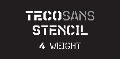 Stencil version of TecoSans.
 - Massel by Intellecta Design,
$26.90victorian family of fonts - Teco Serif by Gaslight,
$20.00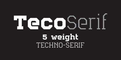 Serif version of TecoSans.
 - Flourishes A by Wiescher Design,
$39.50 FlorishesA are a set of flourishes, that serves well for frames and other elegant embellishments, they are beginning of last century American. Your I-found-them-somewhere type-designer, Gert Wiescher
 - Monkey Was Here by Intellecta Design,
$22.90 A collection of fonts by the type foundry Intellecta Design. Distressed and antique, use these fonts in display purposes for a stylized type design. Contains a limited amount of letter designs.
 - Mystery Writer JNL by Jeff Levine,
$29.00 Mystery Writer JNL is based on the hand lettered title from the cover of a 1947 issue of “Ellery Queen’s Mystery Magazine”, and is available in both regular and oblique versions.
 - JT Symington by JAM Type Design,
$15.00 JT Symington was inspired by the classic serif typefaces of the 20th century. Its well defined serifs make it well suited to headlines as well as large chunks of body copy.
 - Pitkin JNL by Jeff Levine,
$29.00Borrowing from the 1940s, and inspired by printed text found in an old catalog, the slightly imperfect letterforms of Pitkin JNL emulate the hand-lettered look of signs and show cards. - Cookogram by Jure Kožuh,
$19.00 Cookogram is a package of 50 pictograms which have been drawn in two styles - outline & solid. The pictogram set consists of cooking and eating utensils, pots, pans, glasses, bottles and crockery.
 - Souttia by Sakha Design,
$10.00 Souttia is a slim and exquisite handwritten font. Stylish, graceful, and flowing, this font will definitely elevate the look of any of your beautiful creations while keeping them grounded and natural.
 - Little Japan by Okaycat,
$19.50Okaycat proudly presents Little Japan, our new dingbats font full of traditional Japanese icons. See the sights of Japan - beautiful Mount Fuji, geisha, sushi, sumo, shiriken, geta and so much more. - BoldAyres by Wiescher Design,
$39.50 BoldAyres is the heavy version of my Ayres Royal that was inspired by famous calligrapher Ayres and a little bit by a Bavarian King. Your lover of Blackletter typefaces, Gert Wiescher
 - Harleyquin by Letterara,
$12.00 Sweet, charming and full of authenticity: Harleyquin is a one-of-a-kind typeface with a personal feel. Use titling to give different letter effects, making your project even more elegant!
 - Print Partners JNL by Jeff Levine,
$29.00 The vast variety of vintage letterpress illustrations representing many different eras and art styles allows for yet another volume of cartoons, embellishments, ornaments and stock cuts contained within Print Partners JNL.
 - Helgis Black by Oleg Stepanov,
$15.00 Helgis Black is a hand crafted font, inspired by album covers of progressive and psychedelic rock bands of 70's. It is perfectly suited for covers (books, albums), posters and games.
 - Masherbrum Slab by Juraj Chrastina,
$29.00 Subtle slab serifs and distinctive hooks of this square ultra light type face will add a bit of elegant feeling to your sweet designs. Masherbrum Slab looks better in larger sizes.
 - Late Breaking News JNL by Jeff Levine,
$29.00 Re-drawn from a screen capture of a vintage newspaper front page, Late Breaking News JNL is a traditional sans serif that's perfect for headlines, titling and other forms of announcements.
 - Winsome Autumn by Seemly Fonts,
$12.00 Winsome Autumn is a cute and quirky handwritten font. Add it to each of your party invitations, gathering, or pretty much any design that requires a touch of youth and joy.
 - Nicholas by Shinntype,
$39.00 Nicholas is a headline version of Goodchild , Shinntype’s version of Jenson . It has been specially modified with very fine details and an ultra-tight fit for headlines that really get noticed.
 - Stoica by Stefano Giliberti,
$15.00 Stoica is a font family for communication to the point. It supports 114 languages, features a total of 508 glyphs and includes an italicized version for each of the 5 weights.
 - Dabi by tafleh,
$10.00 Dabi is a bold sans serif type family of three weights plus matching italics. It is suitable for logos, titles, posters, etc. Made from a compilation of all his design projects.
 - On Hangers by Funk King,
$5.00 The On Hangers family is a collection of fonts consisting of font-bats on hangers. Upper-case are on hangers and lower-case are not. Mix and match and have fun.
 - Secret Diary by Hanoded,
$15.00 Secret Diary is a nice bit of uncomplicated handwriting: it is rounded, feminine, legible and above all - natural in appearance. Secret Diary comes with some ligatures and an overdose of diacritics.
 - Simple Fact by Bogstav,
$10.00 Simple Fact is a family of 4 fonts and 2 sets of drawings. All fonts and drawing was made with the same inky pen, leaving a slightly blurred and rugged look


