10,000 search results
(0.019 seconds)
- Pinel Pro by URW Type Foundry,
$39.99 The characteristic ‘French face’ was originally made in 1899 under the supervision of Joseph Pinel. Thus, what was originally French 10 pt. Nº 2, got its present name. The Frenchman Joseph Pinel called himself a "typographical engineer", but was at the time employed as a type draughtsman at the Linotype Works in Altrincham. It appears that this and some other faces that he supervised, were, except for use on the Linotype, also meant for manufacturing matrices for the Dyotype. This composing machine was an invention of Pinel. The Dyotype was a rather complicated machine and consisted, like the Monotype, of two separate contraptions, a keyboard which produced a perforated paper ribbon and a casting machine which produced justified lines of movable type. Unlike the Monotype which has a square matrix carrier, the Dyotype had the matrices on a drum (in fact two drums, hence the name of the machine). A Pinel Diotype company was founded in Paris and a machine was built with the help of the printing press manufacturer Jules Derriey. As is often the case, a lack of sufficient capital prevented the commercializing of this ingenious composing machine. Coen Hofmann digitized the font from a batch of very incomplete, damaged and musty drawings, which he dug up in Altrincham. He redrew all characters, bringing up the hairstrokes somewhat in the process. The result is a roman and italic, while the roman font also includes Small Caps
 - Golden Clouds by Anastasia Kuznetsova,
$22.00 Say hello to Golden Clouds :) A charming and cute font duo with handwritten letters and doodles!! Bring some irresistible fun to your design with Golden Clouds Font Duo! This playful font duo consists of a fast-flowing signature font and a charming font with small capital letters as the perfect companion. But that's not all - the set also includes a bonus Doodle font containing hand-drawn drawings designed to give your "Golden Clouds" fonts the appeal of handmade. Golden Clouds Script • A clean, smooth handwritten signature font containing uppercase and lowercase characters, numbers and a wide range of punctuation marks. Golden Clouds SmallCaps • Clean, charming handwritten font with capital letters. Golden Clouds Doodles • A set of hand-drawn drawings designed in combination with Script and Small Caps fonts. Just set it as your own font and enter any character to create each drawing. "Golden Clouds" is ideal for everyday use in greeting cards, illustrations, quotes, original branding, book covers, children's books, packaging and much more :) Font Features: A-Z; a-z character set; 1 language (English); numbers and punctuation marks, symbols. Fonts can be opened and used in any software that can read standard fonts, even in MS Word. No special software is required to get started. It is recommended to use it in Adobe Illustrator or Adobe Photoshop. Made with love and magic ♡ Thank you for reading it, and do not hesitate to send me a message if you have any questions! ~ Anastasia
 - Machi by MendozaVergara,
$14.00 Machi is a font, clean, mystic and contemporary geometric sans for titling. The uppercase is simple and clean, but in the lowercase have ornamental characters. It is perfect for headlines, apparel, fashion, album artwork, posters and logos. Photos by Claudio Sepulveda.
 - Polotan by Look Minus Today,
$16.00 Introducing Polotan, the ultimate futuristic and modern sans-serif font. With its sleek and streamlined design, Polotan is perfect for creating a cutting-edge, high-tech look that's perfect for a variety of design applications. Featuring strong lines that convey a sense of power and confidence, Polotan is perfect for headlines, titles, and branding materials. But what sets it apart is its unique alternates, which give you the flexibility to create custom designs that stand out from the crowd. And with its alternates, you can take your designs even further and truly make them your own. Its clean and minimalist design makes it easy to read, while its sharp angles and unique letterforms create a sense of energy and movement!. Whether you're designing a high-tech website, a sleek user interface, or a modern brand identity, Polotan will help you make a bold and unforgettable impression. So why settle for a boring and outdated font when you can make a statement with Polotan sans-serif? Try it today and see how it can take your designs to the next level. And please message me if you want your language included or if there are any features or glyph requests, feel free to send me a message.
 - Nalieta by Fridaytype,
$17.00 Nalieta - Clean Display Sans Nalieta is a clean display sans font with simple, clean, and beautiful ligatures. Specially designed for elegant-themed projects, perfectly suitable for creating simple, clean, lifestyle design such as logos, title, and magazine and more. This Beautiful font perfect for branding projects, logo, wedding designs, social media posts, advertisements, product packaging, product designs, label, photography, watermark, invitation, stationery, and any projects. What's Included: - Character set A-Z - Uppercase & Lowercase - Numerals & Punctuation - Multilingual - Ligature - Simple Installations - Works on PC & Mac - PUA Encoded Characters - Accessible in the Adobe Illustrator, Adobe Photoshop, Microsoft Word even work on Canva Drop any message if you any question, thanks Fridaytype
 - Mayfield by Typadelic,
$19.00Mayfield could be anybody's handwriting. Very clean and legible. - Nagato by Ezequiel Filoni,
$10.00 Nagato, simple, clean and elegant sans serif, pseudo-stencil.
 - Font Thography by Alcode,
$23.00 Thography font is a new decorative typeface. This font has a very beautiful and elegant opentype feature, so that it can make users happy and can increase creativity or productivity, you can use this font very easily.
 - Addlethorpe by Typodermic,
$11.95 Introducing Addlethorpe, the sleek and sophisticated three-layer metal typeface that will elevate your designs to the next level. With its unique combination of foreground, fill, and background layers, Addlethorpe offers endless possibilities for customization and creativity. Whether you’re designing for print or digital, Addlethorpe has you covered. The foreground layer, Addlethorpe 1, is perfect for use on light backgrounds, offering intricate detail that will catch the eye and draw the viewer in. But why stop there? Addlethorpe 2 is the perfect fill layer, allowing you to add color and depth to your elevated letters. And don’t forget about Addlethorpe 3, the rectangular background layer that fills in the blanks and ties your design together. With its clean lines and bold presence, Addlethorpe 3 is the perfect finishing touch. But Addlethorpe is more than just a pretty face. OpenType-aware programs allow for the use of lining or old-style numerals, while letter pair ligatures break up the monotony of repeated letters. And with Addlethorpe Web, you can enjoy all of this beauty and versatility with faster load times and simpler forms. So what are you waiting for? Give your designs the edge they deserve with Addlethorpe. Just be patient with your application – with all this detail and customization, it’s worth taking the time to get it right. Some Latin-based European writing systems are supported, including the following languages. Afaan Oromo, Afar, Afrikaans, Albanian, Alsatian, Aymara, Basque, Bemba, Bikol, Breton, Cape Verdean, Creole, Catalan, Cebuano, Chamorro, Chavacano, Danish, Dawan, Dholuo, Dutch, English, Estonian, Faroese, Fijian, Filipino, Finnish, French, Frisian, Friulian, Galician, Genoese, German, Guadeloupean Creole, Haitian Creole, Hiligaynon, Icelandic, Ilocano, Indonesian, Irish, Italian, Jamaican, Kaqchikel, Kikongo, Kinyarwanda, Kirundi, Lombard, Low Saxon, Luxembourgish, Makhuwa, Malay, Ndebele, Neapolitan, Norwegian, Novial, Occitan, Papiamento, Piedmontese, Portuguese, Quechua, Rarotongan, Romansh, Sango, Saramaccan, Sardinian, Scottish Gaelic, Shona, Sicilian, Silesian, Slovak, Slovenian, Somali, Sotho, Spanish, Swahili, Swazi, Swedish, Tagalog, Tetum, Tshiluba, Tsonga, Tswana, Tumbuka, Uzbek (Latin), Venetian, Võro, Walloon, Waray-Waray, Wayuu, Xhosa, Yapese, Zapotec Zulu and Zuni.
 - Delvey Modern Serif Font by BeckMcCormick,
$16.00 Delvey is best for: – logos + branding, especially cosmetics, fashion, & clothing brands – website design + website accents – think travel blogs, fashion blogs, & more – clean print design, like magazines + flyers – header elements that need a clean, modern look – quote graphics for social media – chic graphic tees
 - Bageo by 160 Std,
$20.00 Bageo is a versatile font with it's clean and sleek build. geometric lowercase emphasize the modern and clean feel. The overall typeface is geometric to bring order and alignment in between the letters It is best used as logo, headline, and title.
 - Fishmonger by Suitcase Type Foundry,
$39.00Fishmonger originated from a commission of two fonts for the corporate identity of a fishmonger shop. When sketching the elementary principles for the lettering, the idea for a modern, extensive font family with a large number of styles was born. The first step consisted of defining the range of widths and weights. Then the master design Medium Regular was completed. The next step was adjusting the Extra Condensed Thin, the Extra Condensed Bold, The Extra Extended Thin and the Extra Extended Bold weights, as they are the vertices of an imaginary square map of the face. This meant that, in order to achieve a harmonious result, the x and y axis needed to be defined. From top to bottom, from the widest to the most condensed cut, the proportions are linear. However, from light to black, the line curves gently, allowing lesser difference between the light cuts, and a dramatic one between the heavier cuts. To ensure the original parameters were respected each position on the vertex was checked against the Medium Regular. After sorting out the ideal set-up, the remaining characters of each of the weights were drawn, and the remaining cuts were interpolated according to the principles above. Fishmonger is a functional, clean design, free of any buoyant, ornamental shapes, almost minimalist. Maybe this is what lends the type family its unique appearance. - Nomad by Coniglio Type,
$20.02 NOMAD —Regular is a stand alone font. Nomad -Regular is a clean, interesting revival font. It is a Display font. Nomad, now exclusively in OpenType .oft by Joseph V Coniglio of Coniglio Type. It is a narrow boldfaced font. Its analog source was comprised of an extremely limited die cut, truly generic, craft, peel-and-stick vinyl set of capital letters of ascenders and numbers. It was purchased at a five & dime stores, hardware department from the 1970's. My father owned an original set of characters: Nomad-Regular is nicely expanded to meet the needs of OpenType. The original adhesive labels adhered to the bows of that small boats so fisherman wouldn't get turned away at the Canadian border for not having their vessels tagged and listed with the appropriate license name and numbers, recorded by customs. It was a required serialization of letters and numbers marked on the side of their vessels. On the other hand, most beer and whisky drinking fishers, card players and bait casters would rather not deal with it, but the boat could not cross over the border without them. (Once part of Market LTD from the 1990's, a collection of limited faces, mostly alpha-numeric and some just plain numeric, used primarily in retail and display situations and titling.) Designer: Joseph V Coniglio Author: Coniglio Type
 - Mr Palker by Letterhead Studio-YG,
$35.00 A slab serif Mr Palker and grotesque Mr Palkerson build one superfamily together. These are blank types. In a way even the display ones. Typefaces for newspapers, announcements, cheap advertising and police posters. Mr Palker and Mr Palkerson will turn every language into a fence. And due to six types of faces one can choose what material should the fence be made from — from Thin steel rods to the Black stone blocks. In their simplest appearance Mrs P&P are intended for the solid blank composition in victorian or industrial style. They are quite decent, a bit old-fashioned slab serif and grotesque with closed aperture. All my types have layers. Walker and Palkerson also do. Besides the standard set of symbols, they have 4 add-ons. 1. Alternate glyphs, including unicase ones. 2. Ligatures with A letter. 3. Extra tall small caps. 4. Two-storey ligatures. All this options are intended for the complex composition. The additional letters are rather eccentric as their main function here is to imitate the victorian oddities. Imitate, parody, just not repeat. There are lower-case As and Es in the set in height of small caps and uppercases. They can turn every writing into the unicase. The lower-case A (as well as uppercase and small caps version of it) has deliberately by my taste grown a ludicrous tail. To compensate it I’ve built all the possible ligatures - ад, ал, ая. There are 35 of this ligatures all together. Take a closer look at the Russian letters D, L, K, Ya from the main set as well as their alternates. The additional glyphs are one more comic than the other — on purpose to imitate (not to repeat!) the victorian set. This sets have lowercase numbers. And small caps numbers as well. What a modern typeface without them. They also have an У-letter with a generously curvy tail. As if before the WWI. The Latin of course has alternates as well. It has letters to make the perfect French sound more like the russian provincial version of it. The tails of Js and Ts can be made a little bit more open — or a little bit closed. My favorite feature here, an invention of a kind - extra tall small caps. It allows to compose logos with the small caped uppercases directly from the keyboard. The small caps of this typefaces are usually much taller than the customary ones. This is the kind of small caps that Palker and Palkerson have. More to that, the strokes’ weight and the letters width are corresponded to the uppercases. Just a ready set for making a logo a la 1913 style. With a unicase, one has to mind! One more trick with the tall small caps is a possibility to make them work like lower uppercases. Their height is just in between of lower- and uppercases. Isn’t it great to have an additional set of uppercase working ponies in stock for the case of emergency. And finally — the trademark of Palkers family, two-storey ligatures. They are made in the height of uppercases and turn every writing into an ornament or a puzzle of a kind, while at the same time making them much shorter. Each face has 90 of them. Mainly those are twins: CC, BB, DD and so on. ll this things are for the unhasty compositing, even for lettering. Which means that for the things which are not there you always should have Command+Option+O and some patience. Also — among the two storey ligatures one also can find some belvedere villas. All my types are glasses from the one kaleidoscope. The P&Ps family was preliminary part of the victorian set, which already has 1 Cents and Clarendorf - optionally one can add Costro, Gordoni, Handy, Guardy, Surplus, Red Ring, Red Square, Babaev to the list. And also Sklad, Odessa, Dreamland, Romb, Platinum - here, at Letterhead’s, every second one is victorian. All together our typefaces can allow one to set advertisement of any kind, even the trickiest one, and compose everything, from the coffee place’s menu to the antiquarian magazine.
 - Mr Palkerson by Letterhead Studio-YG,
$35.00 A grotesque Mr Palkerson and slab serif Mr Palker build one superfamily together. These are blank types. In a way even the display ones. Typefaces for newspapers, announcements, cheap advertising and police posters. Mr Palker and Mr Palkerson will turn every language into a fence. And due to six types of faces one can choose what material should the fence be made from — from Thin steel rods to the Black stone blocks. In their simplest appearance Mrs P&P are intended for the solid blank composition in victorian or industrial style. They are quite decent, a bit old-fashioned slab serif and grotesque with closed aperture. All my types have layers. Walker and Palkerson also do. Besides the standard set of symbols, they have 4 add-ons. 1. Alternate glyphs, including unicase ones. 2. Ligatures with A letter. 3. Extra tall small caps. 4. Two-storey ligatures. All this options are intended for the complex composition. The additional letters are rather eccentric as their main function here is to imitate the victorian oddities. Imitate, parody, just not repeat. There are lower-case As and Es in the set in height of small caps and uppercases. They can turn every writing into the unicase. The lower-case A (as well as uppercase and small caps version of it) has deliberately by my taste grown a ludicrous tail. To compensate it I’ve built all the possible ligatures - ад, ал, ая. There are 35 of this ligatures all together. Take a closer look at the Russian letters D, L, K, Ya from the main set as well as their alternates. The additional glyphs are one more comic than the other — on purpose to imitate (not to repeat!) the victorian set. This sets have lowercase numbers. And small caps numbers as well. What a modern typeface without them. They also have an У-letter with a generously curvy tail. As if before the WWI. The Latin of course has alternates as well. It has letters to make the perfect French sound more like the russian provincial version of it. The tails of Js and Ts can be made a little bit more open — or a little bit closed. My favorite feature here, an invention of a kind - extra tall small caps. It allows to compose logos with the small caped uppercases directly from the keyboard. The small caps of this typefaces are usually much taller than the customary ones. This is the kind of small caps that Palker and Palkerson have. More to that, the strokes’ weight and the letters width are corresponded to the uppercases. Just a ready set for making a logo a la 1913 style. With a unicase, one has to mind! One more trick with the tall small caps is a possibility to make them work like lower uppercases. Their height is just in between of lower- and uppercases. Isn’t it great to have an additional set of uppercase working ponies in stock for the case of emergency. And finally — the trademark of Palkerson family, two-storey ligatures. They are made in the height of uppercases and turn every writing into an ornament or a puzzle of a kind, while at the same time making them much shorter. Each face has 90 of them. Mainly those are twins: CC, BB, DD and so on. ll this things are for the unhasty compositing, even for lettering. Which means that for the things which are not there you always should have Command+Option+O and some patience. Also — among the two storey ligatures one also can find some belvedere villas. All my types are glasses from the one kaleidoscope. The P&Ps family was preliminary part of the victorian set, which already has 21 Cents and Clarendorf - optionally one can add Costro, Gordoni, Handy, Guardy, Surplus, Red Ring, Red Square, Babaev to the list. And also Sklad, Odessa, Dreamland, Romb, Platinum - here, at Letterhead’s, every second one is victorian. All together our typefaces can allow one to set advertisement of any kind, even the trickiest one, and compose everything, from the coffee place’s menu to the antiquarian magazine.
 - Serenata Vantages by Fikryal,
$23.00 Serenata Vantages is a sophisticated and elegant sans-serif font that exudes modernity and refinement. With its clean lines and well-proportioned letters, this font is perfect for a wide range of design projects, from branding and advertising to editorial and web design. The font features a range of weights, from thin to bold, giving you the flexibility to create both delicate and bold designs. The characters are beautifully crafted with subtle curves and angles, creating a sense of fluidity and balance. Serenata Vantages is perfect for designs that require a touch of class and sophistication, such as luxury branding, high-end fashion, and editorial publications. It is also ideal for websites and digital interfaces that need a modern and clean look. Overall, Serenata Vantages is an elegant and versatile font that can elevate your designs to new heights, making it a must-have for any designer’s toolkit. Features : Serenata Vantages Light Serenata Vantages Regular Serenata Vantages Bold Multilingual Support If you have any questions please don’t hesitate to contact me follow my Instagram: @fkryall Thank you
 - Hinnual by Jipatype,
$27.00 Hinnual เป็นฟอนต์ที่ผสมผสานระหว่างรูปทรงสี่เหลี่ยมและทรงกลมเพื่อสร้างสไตล์ที่ไม่เหมือนใคร ชื่อมาจากคำไทย 2 คำ คือ Hin แปลว่า หิน และ Nual แปลว่า อ่อน ผสมผสานองค์ประกอบที่แข็งและอ่อนนี้สะท้อนให้เห็นในแบบอักษร ซึ่งมีเส้นที่สะอาดตาและเส้นคมซึ่งถูกทำให้อ่อนลงด้วยมุมโค้งมน ฟอนต์มีให้เลือกถึง 18 แบบ มีตัวเลือกหลากหลายให้คุณได้เลือกใช้ Hinnual เหมาะอย่างยิ่งสำหรับใช้ในพาดหัวและพาดหัวย่อย ซึ่งลักษณะที่โดดเด่นสามารถช่วยดึงดูดความสนใจของผู้อ่านได้ เส้นสายที่สะอาดตาและสไตล์ที่เป็นเอกลักษณ์ยังทำให้เป็นตัวเลือกที่ยอดเยี่ยมสำหรับแบรนด์ โลโก้ และงานออกแบบอื่นๆ ที่ต้องการภาพลักษณ์ที่น่าจดจำ โดยรวมแล้ว Hinnual เป็นฟอนต์อเนกประสงค์และสะดุดตาที่ผสมผสานองค์ประกอบทั้งความแข็งแกร่งและความนุ่มนวล การออกแบบที่เป็นเอกลักษณ์ทำให้เป็นตัวเลือกที่ยอดเยี่ยมสำหรับนักออกแบบที่ต้องการสร้างผลงานที่น่าจดจำ Hinnual is a font that combines the square and rounded shapes to create a unique visual style. Its name comes from two Thai words - Hin, which means stone, and Nual, which means soft. This juxtaposition of hard and soft elements is reflected in the font's design, which features clean, sharp lines softened by rounded corners. The font comes in 18 styles, providing a range of options for designers to choose from. Hinnual is particularly well-suited for use in headlines and sub-headlines, where its bold and distinctive appearance can help to grab the reader's attention. Its clean lines and unique style also make it a great choice for branding projects, logos, and other design elements that require a memorable. Overall, Hinnual is a versatile and eye-catching font that combines elements of both strength and softness. Its unique design make it an excellent choice for designers looking to create impactful visual content.
 - Manual Marquee by Mix Fonts,
$13.00 When you need a handpainted sign, this is the one to use. Manual Marquee is inspired by handpainted signs, retro ticket stubs, coffee shop menu boards, and flea market price tags. The font has multilingual support, including not just basic letters and punctuation but also a whole slew of accented glyphs to accommodate all languages. It’s a clean handwritten sans serif that teeters the line between clean technical digital and rough handpainted letterforms. Whether you want a more rough and authentic look, or a cleaner and more polished one, Manual Marquee has got you covered. Plus, it’s easy to use in any design software, making it the perfect choice for both professional designers and hobbyists alike. So why settle for a plain and generic font when you can add a touch of personality and vintage charm to your designs with Manual Marquee. Get your hands on this one-of-a-kind font today and elevate your designs to the next level! Manual Marquee includes the following characters: ABCDEFGHIJKLMNOPQRSTUVWXYZ abcdefghijklmnopqrstuvwxyz 0123456789 !@#$%^&*()`~♥✿•· ÷×+−±≈=≠≥≤[]<>:;'”,.\|/?{}“”‘’-–—_ ‚„©®™‹›«»°¹²³¡¿₱¢€£¥¶§†´`ˆˇ˜¨˙˚˘¯˝˛¸- ÁÀÂÄȦÃÅĂĀĄÆĆĈČĊÇÐĐÉÈÊËĖĒĘḞǴĜǦḠĠĤȞḦḢIÍÌÎÏĪĮĴḰǨŁḾṀŃÑŇ ÓÒÔÖÕŌŐØŒṔṖŔŘṘŚŜŠŞȘŤṪȚÚÙÛÜŨŮŬŪŰŲẂẀŴẄẆÝŶŸŹẐŽŻƵ áàâäȧãåăāąæćĉčċçðđéèêëėēęḟǵĝǧḡġĥȟḧḣıíìîïīįĵḱǩłḿṁńñň óòôöõōőøœṕṗŕřṙśŝšşșťṫțúùûüũůŭūűųẃẁŵẅẇýŷÿźẑžżƶ
 - Vinery by RagamKata,
$16.00 Vinery Sans serif Introducing Vinery - our latest sans serif font that combines modern design with unique swash alternates. This font is perfect for any design project that requires a clean and sleek look. With its minimalist and elegant design, it's ideal for branding, packaging, editorial, or web design. Vinery comes with a range of swash alternates that are carefully crafted to add an extra level of creativity to your designs. Whether you're looking for a simple or elaborate swash, this font has got you covered. The alternates are easily accessible, so you can switch them up to create different styles within your design. This font features a modern and sophisticated look with its clean lines and geometric shapes. It's easy to read and versatile, making it suitable for both headlines and body text. Vinery is perfect for creating a contemporary and professional look that stands out. With its unique swash alternates, it's sure to add a touch of creativity to any project. Try it out today and take your designs to the next level!
 - Svemir by Wirtu,
$120.00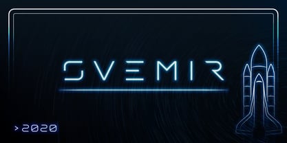 Svemir is display font. Modern, digital, futuristic, clean and simple.
 - Maza by Gaslight,
$25.00 Clean, modern san-serif font for display and text application.
 - Nabuco by Omine Type,
$24.00Nabuco is a simple and clean non-connecting script typeface. - Quest by Red Rooster Collection,
$45.00Loosely based on Dorsey, an English typeface by Alan Dempsey. - Mati by Sudtipos,
$19.00 Father's Day, or June 17 of this year, is in the middle of Argentinian winter. And like people do on wintery Sunday mornings, I was bundled up in bed with too many covers, pillows and comforters. Feeling good and not thinking about anything in particular, Father's Day was nowhere in the vicinity of my mind. My eleven year old son, Matías, came into the room with a handmade present for me. Up to this point, my Father's Day gift history was nothing unusual. Books, socks, hand-painted wooden spoons, the kind of thing any father would expect from his pre-teen son. So you can understand when I say I was bracing myself to fake excitement at my son's present. But this Father's Day was special. I didn't have to fake excitement. I was in fact excited beyond my own belief. Matí's handmade present was a complete alphabet drawn on an A4 paper. Grungy, childish, and sweeter than a ton of honey. He'd spent days making it, three-dimensioning the letters, wiggle-shadowing them. Incredible. A common annoyance for graphic designers is explaining to people, even those close to them, what they do for a living. You have to somehow make it understandable that you are a visual communicator, not an artist. Part of the problem is the fact that "graphic designer" and "visual communicator" are just not in the dictionary of standard professions out there. If you're a plumber, you can wrap all the duties of your job with 3.5 words: I'm a plumber. If you're a graphic designer, no wrapper, 3.5 or 300 words, will ever cover it. I've spent many hours throughout the years explaining to my own family and friends what I do for a living, but most of them still come back and ask what it is exactly that I do for dough. When you're a type designer, that problem magnifies itself considerably. When someone asks you what you do for a living, you start looking for the nearest exit, but none of the ones you can find is any good. All the one-line descriptions are vague, and every single one of them queues a long, one-sided conversation that usually ends with someone getting too drunk listening, or too tired of talking. Now imagine being a type designer, with a curious eleven year old son. The kid is curious as to why daddy keeps writing huge letters on the computer screen. Let's go play some ball, dad. As soon as I finish working, son. He looks over my shoulder and sees a big twirly H on the screen. To him it looks like a game, like I'm not working. And I have to explain it to him again. This Father's Day, my son gave me the one present that tells me he finally understands what I do for a living. Perhaps he is even comfortable with it, or curious enough about that he wants to try it out himself. Either way, it was the happiest Father's Day I've ever had, and I'm prouder of my son than of everything else I've done in my life. This is Matí's font. I hope you find it useful.
 - Odisean SC - Personal use only

- Borris Romance by Zamjump,
$13.00 Borris Romance a modern sans with simple, clean, and elegance, inspired by the cooperplate pen with tail. Specially designed for elegant-themed projects, perfectly suitable for creating simple, clean, lifestyle design such as logos, title, and magazine and more. The font features standard ligatures.
 - Ever Looser by Azetype,
$12.00 Presenting Ever Looser! A Wild Brush Font with a distinct texture. You can type by Mix & Match to get a unique combination. It looks original and can be used for all your project needs. Each glyph has its own uniqueness and when meeting with others will provide dynamic and pleasing proximity. This font can be used at any time and any project. As you can see in the presentation pictures above, Ever Looser looks 'wild' on design projects. So, Ever Looser can't wait to give its touch to all your design projects such as environmental campaigns, quotes, poster design, book cover design, promotional materials, t-shirt, hoodie, product packaging, simply as a text overlay to any background image, etc. Besides that, Ever Looser also has some ligature that gives a surprise when you type certain characters combinations. The ligatures are TT, LL, ll, oo, and rr. What's Included? 1. Ever Looser • Comes with uppercase, lowercase (small caps), ligatures, numeral, punctuation, symbols, and multilingual support (Afrikaans, Albanian, Catalan, Danish, Dutch, Estonian, English, Finnish, German, Icelandic, Indonesian, Italian, Malay, Norwegian, Portuguese, Spanish, Swedish, Zulu, and Many More). 2. Ever Looser Untextured • It's a clean version and comes with uppercase, lowercase (small caps), ligatures, numeral, punctuation, symbols, and multilingual support (Afrikaans, Albanian, Catalan, Danish, Dutch, Estonian, English, Finnish, German, Icelandic, Indonesian, Italian, Malay, Norwegian, Portuguese, Spanish, Swedish, Zulu, and Many More). 3. Extra Swashes • 7 'wild' swashes (every version) that make your design looks natural. Just type S_1 S_2 S_3 S_4 S_5 S_6 S_7 to feature it. We really hope you enjoy it!
 - ITC Tyfa by ITC,
$29.99 Some words from the designer, Frantisek Storm... Designed by Josef Tyfa in 1959, digitalized by F. Storm in 1996. This Roman and Italic are well-known perhaps to all Czech graphic artists and typographers ever since their release. Although this type face in some details is under the sway of the period of its rise, its importance is timeless, in contradistinction to other famous types dating from the turn of the sixties which were found, after some time, to be trite. The italics live their own life, only their upper-case letters have the same expression as the basic design. Thin and fragile, they work excellently, emphasizing certain parts in the text by their perfect contrast of expression. When seen from a distance they are a little bit darker than the Roman face. Tyfa Roman was released in 1960 by Grafotechna in Prague for hot setting. Later on, Berthold produced letter matrices - "rulers" for Staromat devices, used for manual photosetting of display alphabets. In the eighties it was available on dry transfers of Transotype and today it is offered also by ITC. The meticulously executed designs of the individual letters in the 288 point size are arranged into a set of signs on a cardboard of about B2 in size. The yellowed paper reveals retouches by white paint on the ink. Blue lines mark the baseline, the capital line, the ascender and descender lines and the central verticals of the letters. With regard to the format of the flat scanner, the designs had to be reduced, with the use of a camera, to the format A4, i.e. to the upper-case letter height of about 30 mm. These were then scanned in 600 dpi resolution and read as a bitmap template to the FontStudio programme. The newly created bold type faces derive from Tyfa's designs of the letters "a", "n", "p", the darkness of which was increased further, approximately by 3%, to enhance their emphasizing function. The text designs have hairstrokes thickened by one third; the contrast between thin and thick strokes has been modified, in order to improve legibility, in sizes under 12 points. We have used electronic interpolation to produce the semi-bold designs. Josef Tyfa himself recommends to choose a somewhat darker design than the basic one for printing of books.
 - TT Nooks by TypeType,
$39.00 TT Nooks useful links: Specimen | Graphic presentation | Customization options TT Nooks is an experimental font family that includes a high contrast serif, TT Nooks, and an upright italic, TT Nooks Script. Despite the difference in style, both subfamilies get along well, which is partially thanks to their similar proportions. Each of the subfamilies includes 4 weights: Light, Regular, Bold and Black. The main subfamily is TT Nooks—a stylish high-contrast serif with a light touch of self-centeredness. If TT Nooks were a person, it would be an elegant lady with an independent and firm personality. In the original sketches of TT Nooks there were traces of a broad pen, but in the course of further evolution the typeface moved away from this style, retaining only the high contrast of strokes. In addition, in the process of design searches TT Nooks has obtained a touch of geometricity. The serifs in TT Nooks stand out especially visibly thanks to their geometric shape that resembles slippers. In addition to their peculiarity, such serifs add stability to the font and allow better compensation of the black and white ratio within the letters. TT Nooks has small capitals for Latin and Cyrillic alphabets, as well as a set of stylistic alternates (including some figures) that makes the typeface a bit more geometric. In addition, we have drawn more than 25 ligatures, including ligatures for capital letters, slashed zero and many other useful OpenType features. TT Nooks Script is a complementary family designed to harmoniously extend the main family and expand its scope. The forms of the characters in bold and light fonts of TT Nooks Script are quite different. For example, Black & Bold have high contrast strokes and an open aperture, and in Regular & Light the aperture of the characters is closed. TT Nooks also has small capitals for Latin and Cyrillic alphabets, ligatures, oldstyle figures and other OpenType features. In light faces, TT Nooks Script is more humanist and has artifacts inherent to the continuous movement of a flat pen. In bold faces, TT Nooks Script has a very dense and dynamic typing rhythm, and the shape of the letters begins to geometrize. We had had the difficult task of preserving the continuity of forms between bold and light faces, and we have managed to solve it thanks to the found rhythm, which united different fonts, and proximate stylistic solutions.
 - Aire by Lián Types,
$37.00 Aire is what Sproviero would call a < big display family >. We recommend seeing its user’s guide. After his success with Reina, Sproviero comes out with this big family of 7 members: Each of them loaded with lots of sophisticated ligatures, alternates and the entire cyrillic alphabet. The overall impression that the font gives is lightness and delicateness; that’s the reason the designer chose to call it Aire, or Air, in English. "Aire was somehow having a rest from my fat face Reina [...] It started as a really thin style of Reina, but it rapidly migrated from it and grew up alone. And how it grew..." The inspiration came from his own past creations: “The heavy strokes of Reina were shouting for a more delicate thing. Something more feminine. More fragile. Something which had a lot of elegance and fresh air inside”. Aire responds to this: Sproviero found that many of the typefaces of nowadays which are used for headlines (best known as display fonts) have almost always just one, maybe two weight styles. This was his opportunity to try something new. Aire makes it easier for the user to generate different levels/layers of communication thanks to its variety of styles. With this font you can solve entire decorative pieces of design with just one font, and that was the aim of it. Aire was designed to be playful yet formal: While none of its alternates are activated it can be useful for short to medium length texts; and when the user chooses to make use of its open-type decorative glyphs, it can be useful for headlines with dazzling results. On March of 2012, Aire was chosen to be part of the most important exhibition of typography in Latinoamerica: Tipos Latinos 2012. TECHNICAL Aire is a family with many members. In total, the user can choose between almost 6,000 (!) glyphs (1,000 per style). Each member has variants inside, which are open-type programmed: The user decides which glyph to alternate, equalizing the amount of decoration wanted. Every decorative glyph has its weight adjusted to the style it belongs to. Exclusively for decoration, Aire Fleurons Pro is an open-type programmed set of ornaments. And last but not least, remember Aire is delicate. What’s my point? It is not recommended to activate all the alternates at the same time. It is typo-scientifically proved: A maximum of 3 or 4 alternates per word would be more than enough.
 - Tecna Light Square BNF V1.2 by Descarflex,
$30.00 The Tecn@ Square family were designed to head, enumerate, point out or highlight a point in a writing or plan. In this sense and for this reason, the characters are available only in capital letters and some signs or symbols that could serve such purposes. Among other applications, these characters are used in the personalization of plans, highlighting or indicating parts of the design that facilitate the Descriptive Memory of the plan or the development of a Manual or Installation Instructions.
 - Tecna Dark Square BNF V1.2 by Descarflex,
$30.00 The Tecn@ Square family were designed to head, enumerate, point out or highlight a point in a writing or plan. In this sense and for this reason, the characters are available only in capital letters and some signs or symbols that could serve such purposes. Among other applications, these characters are used in the personalization of plans, highlighting or indicating parts of the design that facilitate the Descriptive Memory of the plan or the development of a Manual or Installation Instructions.
 - Roseborough by BeckMcCormick,
$14.00Roseborough is best for: - logos + branding, especially cosmetics, fashion, & clothing brands - website design + website accents - think feminine websites, creative professionals, travel blogs, fashion blogs, & more - clean print design, like magazines + flyers - header elements that need a clean, modern look - quote graphics for social media - chic graphic tees - Radiogram by Device,
$29.00 Radiogram, pure digital bakelite, can be layered - the solid variant can be placed under the striped version to create two-tone effects.
 - Indice by Oporto Design,
$34.90 An innovative font from Oporto Design, Indice is clean, modern and urban.
 - Dellena by DM Studio,
$20.00 The Dellena Handwritten Font is a captivating and versatile typeface that combines the charm of natural handwriting with a contemporary aesthetic. With its flowing letterforms and clean, legible design, this font offers a wide range of creative possibilities for your projects, from branding and invitations to social media graphics and more. Features: Handwritten Elegance: Dellena Handwritten Font exudes the elegance and authenticity of a handwritten script. Its graceful letterforms offer a personal and human touch to your designs, making it ideal for projects that require a blend of elegance and approachability. Clean and Legible Design: Despite its handwritten style, this font maintains excellent legibility. Each character is carefully crafted to ensure readability at various sizes. Whether it's in print or on a digital screen, your text will remain clear and accessible. Versatile Application: This font is incredibly versatile and well-suited for a variety of design projects. Use it for branding, invitations, social media posts, blog headlines, and more. Its adaptability makes it suitable for both personal and professional use. Uppercase and Lowercase Letters: The font includes both uppercase and lowercase letters, providing creative flexibility for your designs. You can mix and match cases to create visually appealing typography that suits your project's needs. Punctuation and Symbols: In addition to the alphabet, Dellena Handwritten Font includes a comprehensive set of punctuation marks, numerals, and common symbols. This ensures consistency and ease of use when incorporating the font into your design projects. Easy to Install and Use: Installing and utilizing the Dellena Handwritten Font is straightforward. It is compatible with both Windows and Mac operating systems and can be easily integrated into popular design software, including Adobe Photoshop, Illustrator, and InDesign. Elevate your designs with the elegance and versatility of the Dellena Handwritten Font. Let its flowing letterforms and clean design add a touch of personal and human connection to your projects. Whether you're crafting branding materials, invitations, or digital content, this font offers a stylish and readable solution for your typographic needs.
 - The D3 Labyrinthism katakana font, created by Kat Rakos, stands as a unique and mesmerizing addition to the typographic landscape. Its design is heavily influenced by the intricate and complex pathwa...
- Brafteng by Alcode,
$12.00 Brafteng is a new decorative font family. This font has a very beautiful and elegant opentype feature, so it can make users happy and can increase creativity or productivity, you can use this font very easily. Includes: Multiligual Support Special Ligatures Try Brafteng, enjoy the richness of OpenType features and let her fun and elegant excitement make you happy and enhance your creativity! You can use this font very easily.
 - Mesquite by Adobe,
$29.00Mesquite is a narrow Tuscan-style typeface designed at Adobe in 1990. Like older Tuscans from the 19th Century, Mesquite has elaborate, creative serif treatments-although the serifs are so unique that it is difficult to call them serifs anymore, they are more like pointy finials. A convex-concave-convex ornamental feature appears on the middle of each vertical and diagonal stroke. Together with the serifs" at the tops and bottoms of each stroke, this feature creates a "tri-band" pattern over text set in Mesquite. Mesquite is not a text face. Aside from its narrowness and decorative qualities, Mesquite has no lowercase. The font's uppercase glyphs have been directly copied and placed in the lowercase range." - Seconda XtraSoft by Durotype,
$49.00 Seconda XtraSoft is the extra soft companion of Seconda and Seconda Soft. Friendlier, easier on the eye, more informal, more fashionable — but still the refined and reliable Seconda. Seconda XtraSoft’s extra softness comes from the moderate rounding of both the edges and the inner corners of its characters. Seconda XtraSoft has sixteen styles, extensive language support, eight different kinds of figures, sophisticated OpenType features — so it’s ready for advanced typographic projects. For text and display use. When using Seconda XtraSoft in small text sizes, it will be a reliable and legible text face. When using it in big display sizes, it will show its interesting details. For more information about Seconda XtraSoft, download the PDF Specimen Manual.
