10,000 search results
(0.018 seconds)
- Ryno Slab by Philatype,
$32.00 Ryno Slab is a superslab that was born out of a need for an aggressive, heavy, geometric display face that did not appear clunky. Its serifs are so thick, you could create reasonably legible word shapes by using all caps and masking the words out. Ryno Slab’s tough geometric exterior and squarish forms make it suitable for tight setting in posters, t-shirts, and artwork. Also, an extended character set with support for European languages make Ryno Slab a good fit for magazine headlines.
 - Rasane by Locomotype,
$20.00 Rasane font has a distinct personality where the curved geometric shapes give a friendly face to various uses. At the same time, the pointed end of the stem gives a dynamic feel. This font comes with over 400 characters, making it possible to use fonts in many different languages. The family consists of 14 fonts of 7 weights plus matching italics. Rasane font works well on display and small sizes. Rasane is the perfect choice for headlines, packaging, posters, logotypes, signs, websites, brands and more!
 - ITC Zinzinnati by ITC,
$29.99ITC Zinzinnati is based on a font called Ohio, released in 1924 by Die Schriftguss A.G. Typical of the Plakatstil letterforms of the time, the original font had a rough outline, as if drawn with a brush. Nick Curtis has smoothed the rough edges, which enhances the design's playful curves and engaging charm. As for the name: it's the punchline to an old vaudeville routine that starts with the question, Name a city in Ohio that begins with a 'Z.'" Pie in the face, comin' atcha!" - Starlight Lovers by Hanoded,
$15.00 I have always loved gazing at the stars. Too bad that you don’t get to see a true starry night these days - mostly because of light pollution. Starlight Lovers is a messy serif. It is hand painted, using a brush and Chinese ink, so the edges may be a bit rough. In my opinion, this adds to the font’s character! Starlight Lovers is an ideal font for (Christmas) cards, book covers, posters and product packaging. Comes with a milky way of diacritics as well!
 - Ascetic 2D by 2D Typo,
$28.00 This decorative font is based on Cyrillic Vyaz of XV-XVI centuries. This type of letters were used as display faces in sacred texts. In Vyaz, the letters are characteristically fitted to each other so the letter sequences look as one solid ornamental frieze. The font is rich in discretionary ligatures which help to accentuate the style of Vyaz. In addition to letters and standard characters there is a number of monograms and Christian symbols. These and other features are available in OTF format.
 - Hachura by Outras Fontes,
$24.00 Hachura is a sketchy typeface designed by Ricardo Esteves. Its general proportions are based on the garalde models, with traditional roman serifs. It was initially made by hand using a drawing technique to create a font that simulates the unfinished aspect of a work in constant progress. This textured face is useful for display sizes, making a very visible presence. Because of its basic dimensions and careful distribution of black and white, it still also very readable in text sizes like 10 or 8 points.
 - dT Delicatta by dooType,
$40.00 Easy to use, but hard to miss. That’s dT Delicatta. An elegant script face that adds a special touch to any message. Script typefaces usually come packed with endless features and, more often then not, all those possibilities take their toll on the designer or art director. With usability in mind, we kept dT Delicatta simple and straightforward to use while delivering refined shapes that enhance your or your client’s communication. dT Delicatta is a revised, improved and virtually new font of our old classic Delicatta
 - Sekhmet by Three Islands Press,
$29.00Stylish, elegant, and alluring, Sekhmet got its name from the lion-headed war goddess of ancient Egypt. And the typeface does possess a kind of feline, forward-directed energy - a result of its calligraphic detailing combined with a very slight slope in the roman. Sekhmet is essentially a display face; still, it's as carefully crafted as any of the designer's text fonts and so also works well in reasonably large text blocks, especially at larger point sizes. Comes with a book-weight roman and calligraphic italic. - Lubok by Linotype,
$29.99Moscow-based designer Julia Borisovna Balasheva created her Lubok face as a pictogram-based font. The term "lubok" refers to a popular style of Russian folk art printing, which dates back to the 18th Century. In Lubok, Bakasheva has digitised several whimsical characters and animals, which were common in these prints. She suggests that you use Lubok's symbols to illustrate fairy tales; we suggest that you use Lubok to decorate everything: from your next office party invitation to comic books of your own design! - SF Change by Sultan Fonts,
$19.00 Change is An Arabic text typeface for desktop applications. Change is freestyle Ruqah and a winner in Horouf Bilingual Typefaces Design Competition. The design is open, calligraphic, and very dynamic. This makes it suitable for large display sizes, especially in the area of advertising, while still functioning well as a text face. The font includes a matching Latin design and support for Arabic, Persian, and Urdu. It also includes proportional and tabular numerals for the supported languages. Change typeface comes with many opentype features.
 - Plasma by Corradine Fonts,
$19.95 Plasma is a contemporary font family, characterized by its clean and geometric appeareance. As a square based style, Plasma has a technological and futuristic feeling, so is suitable for a very wide range of uses, such as editorial, corporate, packaging, posters and web design. Plasma Family consists in 21 fonts, which comes in seven weights, and three different wides. Each font has 516 characters, and can be managed by using its Open Type features, and supports Western European, Central/Eastern European, Baltic, Turkish and Romanian Languages.
 - Epitet by Tour De Force,
$25.00 Epitet, a subtle compact type family with a modern mixture of geometrical and simple shapes, comes in 6 weights, from Thin to Bold. It is a clean elegant sans serif typeface, with a small x-height. Epitet is highly legible in all sizes. Very versatile and easy to use, Epitet can be used in a wide range of corporate and editorial applications. I'm sure Epitet could get even more epitets, but the appropriate use of Epitet would be the biggest one it could get.
 - Bailey Rogles by RCKY Studio,
$15.00 Bailey Rogles is a retro signage font, bold and clean. There are so many variations on each character. You can create so many different typographic layouts easily and quickly. Bailey Rogles is very versatile and very interesting. You have lots of options to customize it and that makes it perfect for logos, packages, t-shirts, signage, logos, headlines, branding, packaging, and titles. Bailey Rogles features an alternate character. Includes initial and terminal letters, alternates, ornaments, swashes, ligatures and multiple language support. Thank you for your purchase!
 - Fairweather by Dharma Type,
$19.99 Fairweather is a fresh air. Clear, transparent, and lucid as if it is the spring and autumn sky. By designed condensed, legible and perspicuous, Fairweather is perfect for titles and captions. But "Title and Captions" are the just examples. Very neutral and plain letter forms make the font versatile. The condensed forms can be very effective for body text in narrow space and the clean and clear letterform doesn't intrude your art works. Consists of nine weights and their matching italics. Supporting almost all latin languages.
 - Amstirdam PS by pentagonistudio,
$17.00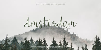 Amstirdam Is Clean Script Font Inspired By Handwriting Characters. SOFTWARE REQUIREMENTS : Fonts and alternate : No special software required they may be used in any basic program /website apps that allows standard fonts That's it folks! You can go ahead and get cracking :) Follow My Shop For Upcoming Updates Including Additional Glyphs And Language Support. And Please Message Me If You Want Your Language Included or If There Are Any Features or Glyph Requests, Feel Free to Send me A Message. Have a Good Day !
 - Blue Bronx by Putracetol,
$24.00 Blue Bronx - Bold Vintage Scipt Font. Blue Bronx is a bold vintage script font. Blue Bronx is font we combine vintage with luxury script font. Blue Bronx can be used in various projects with retro or vintage and luxury themes. Such as logos, branding, posters, packaging, book covers, clothes/apparel, quotes, titles and others. Blue Bronx come with clean and rough font version. Come with Opentype feature with a lot of alternates, its help you to make great lettering. This font is also support multi language.
 - Gallardo by Motokiwo,
$23.00 Gallardo is custom brush lettering font with tons of alternates. It's clean, strong, and elegant script that very useful for various projects. It's great for urban style and also for vintage. You can easily customize your words with Gallardo because this font has been PUA Encoded and also support special characters for multilingual. You will also get the Prototype Version, a rough version of Gallardo. Features: Stylistic Alternates Stylistic Sets (ss01, ss02, ss03, ss04, ss05, ss06, ss07, ss08, ss09, ss10) Swash Access All Alternates PUA Encoded
 - Upscale JNL by Jeff Levine,
$29.00 A page from an "ideas booklet" that was copyrighted in 1939 by the Sanford Ink Company displayed a hand lettered variation on the counter-less [or solid] alphabet that so typified the Art Deco style of the times. Bold, brash and beautiful, Upscale JNL evokes high-end department stores, fine millinery shops, cafeterias, night clubs and other business establishments from the Streamline era. This type of lettering style was a workhorse, and could (and still can) tackle any message with strength, clean lines and class.
 - Familia Script by Letrasupply Typefoundry,
$28.00 It's a beautiful, elegant, clean and unique typeface you need to have! Contains over 1000 glyphs, it has many alternate characters so you can make a beautiful decorative type easily. Familia Script is truly a perfect script for any project that needs a delicate typeface such as custom name, greeting card, create logos, etc. A handy font for tattoo designers and artsy creative people! How to get access alternate glyphs from open type fonts: http://adobe.ly/1m1fn4Y USER GUIDE: https://www.youtube.com/watch?v=kwYVZznG4Bo
 - Promotional Copy JNL by Jeff Levine,
$29.00 The typeface which inspired Promotional Copy JNL can be found on hundreds of 45 rpm records from the 50s through the 80s, as well as in headlines from articles found in one of the music industry’s leading publications throughout their older issues – it was a favorite and a workhorse. Now’s your chance to create a facsimile of the record label you always wanted to have with your garage band… or at the very least, utilize this font for some clean and crisp text or headline projects.
 - Dyer - Unknown license

- MCapitals - 100% free

- Topaz - Unknown license

- Barchowsky Fluent Hand by Swansbury,
$24.00Swansbury, Inc. provides handwriting instruction to all ages, accompanied by two exemplar fonts, Barchowsky Fluent Hand.otf and Barchowsky Dot.otf. The basis for the design of the characters is the italic of the Renaissance. With the advantage of contextual alternates, Barchowsky Fluent Hand automatically joins lowercase letters so it can be used in any venue where a clean and elegant appearance of handwriting is desired. The fonts allow maximum instructional flexibility. Aside from their use in lesson plans, educators can customize pages for specific student interests, studies and needs. Included are all math symbols that one typically encounters in school curricula. Nan Jay Barchowsky, designer of this font, believes that children should hone their handwriting skills as they learn all subjects, reading, math, history and foreign languages. Both fonts support all Western European languages and Turkish. Barchowsky Dot is for young children or others who need remediation. The letterforms are identical to those in Barchowsky Fluent Hand. Used at a large point size open dots appear within the lines that form the characters indicating where one should start each stroke in a letter or number. Once formations are learned Barchowsky Fluent Hand can be used with the contextual alternates turned off until students are ready to write in the joined-up manner of a true cursive. Specifications: The technology for fonts that automatically join letters, or allow them to be unjoined is relatively new. At present, both fonts work on Windows XP with Service Pack 1 or later (or Vista), using AbiWord, a free word processor (go to abisource.com). They also work well with InDesign 2. Currently there is an unknown factor in later versions of InDesign for Windows that disallows joining. Macs completely support the fonts using InDesign 2 and later, PhotoshopCS and IllustratorCS. If you do not have these applications, there is an inexpensive word processor for Macs. - Barchowsky Dot by Swansbury,
$17.00Swansbury, Inc. provides handwriting instruction to all ages, accompanied by two exemplar fonts, Barchowsky Fluent Hand.otf and Barchowsky Dot.otf. The basis for the design of the characters is the italic of the Renaissance. With the advantage of contextual alternates, Barchowsky Fluent Hand automatically joins lowercase letters so it can be used in any venue where a clean and elegant appearance of handwriting is desired. The fonts allow maximum instructional flexibility. Aside from their use in lesson plans, educators can customize pages for specific student interests, studies and needs. Included are all math symbols that one typically encounters in school curricula. Nan Jay Barchowsky, designer of this font, believes that children should hone their handwriting skills as they learn all subjects, reading, math, history and foreign languages. Both fonts support all Western European languages and Turkish. Barchowsky Dot is for young children or others who need remediation. The letterforms are identical to those in Barchowsky Fluent Hand. Used at a large point size open dots appear within the lines that form the characters indicating where one should start each stroke in a letter or number. Once formations are learned Barchowsky Fluent Hand can be used with the contextual alternates turned off until students are ready to write in the joined-up manner of a true cursive. Specifications: The technology for fonts that automatically join letters, or allow them to be unjoined is relatively new. At present, both fonts work on Windows XP with Service Pack 1 or later (or Vista), using AbiWord, a free word processor (go to abisource.com). They also work well with InDesign 2. Currently there is an unknown factor in later versions of InDesign for Windows that disallows joining. Macs completely support the fonts using InDesign 2 and later, PhotoshopCS and IllustratorCS. If you do not have these applications, there is an inexpensive word processor for Macs. - Figgins Antique by HiH,
$12.00 “Hey, look at me!” cried the new advertising typefaces. With the nineteenth century and the industrial revolution came an esthetic revolution in type design. Brash, loud, fat display faces elbowed their way into the crowd of book faces, demanding attention. Those who admired traditional book types harumphed and complained. Robert Thorne had fired the opening round with his Fatface. With the cutting of Figgins Antique, the battle was well and truly joined. Job printing came into its own and it seemed like everything changed. The world of printing had been turned upside down and the gentile book-type aficionados recoiled in horror much as the rural landed gentry recoiled at the upstart middle class shopkeepers and manufacturers. William Savage, approvingly quoted by Daniel Berkeley Updike over a hundred years later, described the new display faces as “a barbarous extreme.” These were exciting times. According to Geoffrey Dowding in his An Introduction To The History Of Printing Types, “The types which we know by the name of Egyptian were first shown by Vincent Figgins in his specimen book of 1815, under the name Antique.” Of course, dating the design is not quite as simple as that. Nicolete Gray points out that Figgins used the same “1815” title page on his specimen books from 1815 to 1821, adding pages as needed without regard to archival issues. As a result, there are different versions of the 1815 specimen book. In those copies that include the new Antique, that specific specimen is printed on paper with an 1817 watermark. The design is dated by the 1817 watermark rather than the 1815 title page. Figgins Antique ML is an all-cap font. This typeface is for bold statements. Don't waste it on wimpy whispers of hesitant whimsies. And please don't use it for extended text -- it will only give someone a headache. Think boldly. Use it boldly. Set it tight. Go ahead and run the serifs together. Solid and stolid, this face is very, very English. FIGGINS ANTIQIE ML represents a major extension of the original release, with the following changes: 1. Added glyphs for the 1250 Central Europe, the 1252 Turkish and the 1257 Baltic Code Pages. Added glyphs to complete standard 1252 Western Europe Code Page. Special glyphs relocated and assigned Unicode codepoints, some in Private Use area. Total of 331 glyphs. 2. Added OpenType GSUB layout features: liga and pnum. 3. Added 86 kerning pairs. 4. Revised vertical metrics for improved cross-platform line spacing. 5. Redesigned mathamatical operators. 6. Included of both tabular (standard) & proportional numbers (optional). 7. Refined various glyph outlines.
 - HV Harietta by Harmonais Visual,
$12.00 Harietta - a semi-geometric, clean sans serif with a retro, humanist and elegant touch.. Specially designed for simple, clean, humanist projects. The font is perfectly suitable for creating elegant, clean, retro design such as logo, packaging, social media, and more.
 - Valmera by Arterfak Project,
$13.00 Valmera is an elegant serif font, designed with modern-classy style. Valmera has a high contrast of the strokes that gives the minimalist looks, the serif crafted minimal to makes the letterform more classy. Also, the letter spacing is set wide that looks so clean. It is versatile and luxury! Available in 3 weights that you can use it for a headline, sub-headline, and body text. Valmera is a great choice for a minimalist design such as book cover, magazine, cards, packaging, quotes, editorial needs, advertising, traveling needs, logos & branding. Valmera is complete with alternates and swashes on the uppercase letter that possible you can make a typographic text. Font Features: Uppercase Lowercase Numbers Symbols Punctuation Stylistic alternates Swashes Accents (28 Languages) Thank you for visiting and watching, have a nice day!
 - Simpline by Trim Studio,
$15.00 **Simpline** a beautifully crafted handwritten font that exudes simplicity and elegance. With its smooth flow and clean lines, this font is perfect for a wide range of design projects. Its simple and minimalistic style makes it ideal for use in various applications, from logos to social media graphics, invitations, and more. The effortless flow of each character adds a individual touch to your design, making it stand out from the rest. Whether you need a font for individual or commercial use, Simpline is a versatile and timeless choice that you can rely on for any project. Try it out today and see how it can elevate your design! Thank you for let us be your design partner, If you have any questions please don't hesitate to drop me a message
 - Modern Prestige by Letterhend,
$19.00 Modern Prestige is a unique serif which is combined with copperplate script letterform with all the swashes! This typeface has many alternates with swashes that can make your lettering / logotype become more interesting. The clean and neat of a serif combined with the swirl swashes makes this font one of a kind! This font perfectly made to be applied especially in logo, and the other various formal forms such as invitations, labels, logos, magazines, books, greeting / wedding cards, packaging, fashion, make up, stationery, novels, labels or any type of advertising purpose. Features : uppercase & lowercase numbers and punctuation multilingual ligatures alternates swashes PUA encoded We highly recommend using a program that supports OpenType features and Glyphs panels like many of Adobe apps and Corel Draw, so you can see and access all Glyph variations.
 - Montana Typeface by Alex Couture,
$15.00 INTRODUCING...! Montana Clean & Rough Style Montana is a brush typeface with personality. You can use it as a logo, badge, insignia, packaging, headline, poster, t-shirt/apparel, greeting card, and wedding invitation. The flowing characters are ideal to make an attractive messages, mix and match Montana with a bunch of alternative characters to fit your project. The alternative characters in this font were divided into several OpenType features such as Stylistic Alternates, Stylistic Sets, and Ligature. The OpenType features can be accessed by using OpenType program such as Adobe Illustrator, Adobe Photoshop, and Adobe InDesign. That’s it! I really hope you enjoy it - please do let me know what you think. More importantly, please don't hesitate to drop me a message if you have any issues or queries. Mail support : alexcouture740@gmail.com Thank you!
 - Devin by Linotype,
$29.99Devin is designed mainly for the benefit of the advertising industry, and it surely is a nice typeface for headings, isn't it? And you should see what a nice body type it makes! I had no other typeface in mind when working with it, but I can now find several typefaces it is related to. It reminds of the egyptienne group, but I did't really plan that. The name Devin is taken from my birth region. There is a castle with that name on the northern Adriatic coast (known even from Rilke's Duino elegies - Duino is another name of the same castle). A castle ruin called Devin, too, can be found on a height above the Danube in Slovakia, not far away from its capital Bratislava. Devin was released in 1994. - Luce Stilren by Objectype,
$20.00 Luce Stilren is a serif font with a modern and geometric design from Objectype Studio. With clean lines and bold shapes, this font adds a professional and contemporary touch to any design project. The main feature of this font is its flexibility. Whether you’re working on a branding project, logo design, magazine headlines, or wedding invitations, Luce Stilren is the perfect choice. This font is designed to provide reading comfort, making it a great choice for both print and digital publications. Luce Stilren supports various languages and includes various typographic features such as ligatures, old-style numbers, and letter-style variations. With these possibilities, you can customize the font according to your needs. With Luce Stilren, you can take your designs to the next level. Get it now and start creating!
 - Golden Stanbury by HansCo,
$15.00 Golden Stanbury is an elegant and classy font duo with a modern touch. The signature ballpoint style gives you a sleek, elegant look for your logos, business card, wedding invitations, quotes, advertisements, and more. I made this Golden Stanbury Font Duo for the needs of the logo and branding market where fonts that are combined with modern and clean concepts are still very rare and hard to find. Hopefully Golden Standbury can provide choices for designers. Highly recommended to use it in OpenType capable software - there are plenty out there nowadays as technology catches up with design. The OpenType features can be accessed by using programs such as Adobe Illustrator, Adobe InDesign, Adobe Photoshop Corel Draw X version, Afinity and more. Let's create something beautiful today with Golden Stanbury. Enjoy!
 - Glaciar by TripleHely,
$16.00 Glaciar is a script typeface based on brush handwriting and inspired by old-style bas-reliefs. All contours were carefully cleaned of brush roughness, but at the same time, minor imperfections were left to create the unique character of this font Glaciar has a built-in auto replacement for lowercase letters without connecting strokes (in the case of word ends) and for ligatures (in the case of letter pairs that do not fit well together). In addition, there are alternates glyphs with starting and ending swashes - the last ones can be used with any OpenType software. And finally, the font has wide multilingual support and can be used in texts in 195 languages Glaciar is a good choice for branding and design projects as well as a cute text overlay to any background image
 - Migura Sans by Andrey Sharonov,
$15.00 Migura Sans Serif Family Migura is a high contrast Sans Serif family inspired by fashion and beauty world. Geometrically clean letterforms give elegant and luxury look when creating designs. There is different font styles from Light to Bold (+Italic version) what give enable wide use. In addition, Migura has several alternative characters, ligatures and more decorative Titling Alternates. You can see many examples how this font can be used. Migura is very good looking in Big Tittles, Magazine design, Branding, Logotypes, Posters, Wedding invitations, Romantic cards and others. Multilingual Support Migura support Western European characters and works with following languages: English, Danish, Dutch, Estonian, Faroese, Filipino, Finnish, French, German, Hungarian, Icelandic, Irish, Italian, Norwegian, Polish, Portuguese, Spanish, Swedish, Turkish. Opentype features doesn't work in Microsoft Word. Recommended to use in Adobe Illustratior or Photoshop.
 - Karatone by Letterhend,
$19.00 Introducing, Karatone, An Elegant Serif. This typeface has many alternates with swashes that can make your lettering / logotype become more interesting. The clean and neat of a serif combined with the swirl swashes makes this font one of a kind! This font perfectly made to be applied especially in logo, and the other various formal forms such as invitations, labels, logos, magazines, books, greeting / wedding cards, packaging, fashion, make up, stationery, novels, labels or any type of advertising purpose. Features : uppercase & lowercase numbers and punctuation multilingual ligatures alternates swashes PUA encoded We highly recommend using a program that supports OpenType features and Glyphs panels like many of Adobe apps and Corel Draw, so you can see and access all Glyph variations. Email us to letterhend@gmail.com if you need something! Happy Designing!
 - Fs Ornaments by Cuda Wianki,
$20.00 Fs ornaments are unique modular sets of ornaments that are based on ancient patterns and medieval woodcuts. They work very well on modern layouts as well. What is more You can use them not only as ornaments but also as borders. This complexity gives you a carefully planned tool with high decorative qualities. All this depends only on your imagination! With it you can add a genuine touch of distinction to every sophisticated layout but use them carefully. The basic set is Fs ornament 1 while Fs ornament 2 is a distorted version of it. Fs ornament 3 is a woodcut underlying that could be applied underneath ornaments or without them. The usage is very simple-You type them as you normally type letters but instead you get those great decoration! Easy isn't it?
 - Lipa Agate by TypeTogether,
$49.00 Lipa is the name of the Slovenian national tree 'Linden'. The typeface Lipa Agate by Croatian designer Ermin Međedović, is part of a bigger type collection, comprising various type groups into one coherent system which Ermin developed over the past 10 years. Lipa Agate is the first to be released; a sans serif designed and engineered to be used in the smallest text sizes, best under 10pt, and in very bad printing conditions. It is perfect for phone books, classified ads, directories or any other job requiring economy without jeopardising legibility. To achieve this, Lipa Agate employs a range of tools, such as deep ink-traps, narrow proportions and a tall x-height. Contemporary editorial design requires a high amount of flexibility to respond to various design situations in a consistent fashion. Lipa Agate — with its 3 levels of condensation, 4 weights and 2 sets of different x-heights, 'High' and 'Low', which share the same width — fulfils these requirements wonderfully. That's a total of 24 fonts! To make this clean and honest workhorse face complete, its large character set also includes small caps, arrows, info-numerals and much more.
 - Social Gothic by Canada Type,
$29.95When Social Gothic first launched in 2007 as a basic single font, it became an instant branding and advertising favourite. It was used widely by a few major fashion outlets and department stores, then soared to new heights of exposure when it became the billboard-cause standard face for a few charity outfits and political organizations throughout Canada’s major urban centres. Social Gothic is a unicase font that combines standard sans serif elements with some distinct “wooden” shapes and oval lowercase components, to make for a totality that achieves a handmade look while maintaining a clean, legible, understated and easy message delivery. It is a gothic with quite a few humanist leanings, something seldom found in the sans serif genre. This retail Social Gothic family is the re-conceptualized, refined and optimized redux of the many bespoke versions that were commissioned and customized for various proprietary brands and projects over the years. The remastered set consists of four multi-script weights, rough and soft variations, and a very unique stencil treatment. Each of the Social Gothic fonts contains over 550 glyphs and support for Latin, Greek and Cyrillic languages.


