10,000 search results
(0.013 seconds)
- Roemisch by Linotype,
$29.99The Roemisch type family is a historic hot metal face with left slanted weights that is used for the german cartographic map production. There are also special typefaces required like the Venus type family and Topografische Zahlentafel type family." - Monotype Grotesque by Monotype,
$40.99 This updating of Berthold’s Ideal Grotesque was supervised at Monotype in 1926 by F.H. Pierpont. With some of the eccentricities in the borrowed original reduced, this series retains enough character to have become one of the world’s great sanserifs.
 - M Zuo Hei HK by Monotype HK,
$523.99 M Zuo Hei HK is a graphic style Traditional Chinese typeface. Graphic font designs have strong personalities and visual impact. Graphic style Traditional Chinese fonts feature decorative elements and pronounced graphics characteristics, suitable for catching attention in display applications.
 - Single Tyne by Jonahfonts,
$35.00 A single top serif creates a modern look between serifs and a single weight font. SingleTyne contains short ascenders and descenders for tight line spacing designed as a display face that also works well for short sentences and paragraphs.
 - Mas dAzil Symbol by ParaType,
$25.00 A set of symbols was designed for ParaType in 2002 by Dmitry Kirsanov as a part of PT Mas d`Azil™ family. Based on the images on stones discovered in a prehistoric cave of Mas-d`Azil, France.
 - King Kirby by ziggytim,
$10.00 Hail to the king baby! Inspired by the greatest comics artist of all time, these fonts will have you lettering pages like a New God! Both feature a seamless center squiggle and the deluxe font feature awesome Kirby crackle!
 - Hattan Antique by Solotype,
$19.95This font is a somewhat modified version of the original issued by the Manhattan Type Foundry in the 1880s. This New York foundry was in business for less than five years, so its fonts are not too well known. - M Bitmap Square HK by Monotype HK,
$523.99 M Bitmap Square HK is a graphic style Traditional Chinese typeface. Graphic font designs have strong personalities and visual impact. Graphic style Traditional Chinese fonts feature decorative elements and pronounced graphics characteristics, suitable for catching attention in display applications.
 - M J Ngai PRC by Monotype HK,
$523.99 M J Ngai PRC is a graphic style Simplified Chinese typeface. Graphic font designs have strong personalities and visual impact. Graphic style Simplified Chinese fonts feature decorative elements and pronounced graphics characteristics, suitable for catching attention in display applications.
 - RaveParty Offset by the creative foundry Three Mile Island is a font that captures the electric energy and dynamic spirit of the rave culture and underground parties that have captivated the hearts o...
- Miedinger by Canada Type,
$24.95 Helvetica’s 50-year anniversary celebrations in 2007 were overwhelming and contagious. We saw the movie. Twice. We bought the shirts and the buttons. We dug out the homage books and re-read the hate articles. We mourned the fading non-color of an old black shirt proudly exclaiming that “HELVETICA IS NOT AN ADOBE FONT”. We took part in long conversations discussing the merits of the Swiss classic, that most sacred of typographic dreamboats, outlasting its builder and tenants to go on alone and saturate the world with the fundamental truth of its perfect logarithm. We swooned again over its subtleties (“Ah, that mermaid of an R!”). We rehashed decades-old debates about “Hakzidenz,” “improvement in mind” and “less is more.” We dutifully cursed every single one of Helvetica’s knockoffs. We breathed deeply and closed our eyes on perfect Shakti Gawain-style visualizations of David Carson hack'n'slashing Arial — using a Swiss Army knife, no less — with all the infernal post-brutality of his creative disturbance and disturbed creativity. We then sailed without hesitation into the absurdities of analyzing Helvetica’s role in globalization and upcoming world blandness (China beware! Helvetica will invade you as silently and transparently as a sheet of rice paper!). And at the end of a perfect celebratory day, we positively affirmed à la Shakti, and solemnly whispered the energy of our affirmation unto the universal mind: “We appreciate Helvetica for getting us this far. We are now ready for release and await the arrival of the next head snatcher.” The great hype of Swisspalooza '07 prompted a look at Max Miedinger, the designer of Neue Haas Grotesk (later renamed to Helvetica). Surprisingly, what little biographical information available about Miedinger indicates that he was a typography consultant and type sales rep for the Haas foundry until 1956, after which time he was a freelance graphic designer — rather than the full-time type designer most Helvetica enthusiasts presume him to have been. It was under that freelance capacity that he was commissioned to design the regular and bold weights of Neue Haas Grotesk typeface. His role in designing Helvetica was never really trumpeted until long after the typeface attained global popularity. And, again surprisingly, Miedinger designed two more typefaces that seem to have been lost to the dust of film type history. One is called Pro Arte (1954), a very condensed Playbill-like slab serif that is similar to many of its genre. The other, made in 1964, is much more interesting. Its original name was Horizontal. Here it is, lest it becomes a Haas-been, presented to you in digital form by Canada Type under the name of its original designer, Miedinger, the Helvetica King. The original film face was a simple set of bold, panoramically wide caps and figures that give off a first impression of being an ultra wide Gothic incarnation of Microgramma. Upon a second look, they are clearly more than that. This face is a quirky, very non-Akzidental take on the vernacular, mostly an exercise in geometric modularity, but also includes some unconventional solutions to typical problems (like thinning the midline strokes across the board to minimize clogging in three-storey forms). This digital version introduces four new weights, ranging from Thin to Medium, alongside the bold original. The Miedinger package comes in all popular font formats, and supports Western, Central and Eastern European languages, as well as Esperanto, Maltese, Turkish and Celtic/Welsh. A few counter-less alternates are included in the fonts.
 - TT Firs Neue by TypeType,
$39.00 TT Firs Neue useful links: Specimen | Graphic presentation | Customization options TT Firs Neue is reborn! We have rethought the font to introduce the next-generation typeface. After analyzing each contour and graphic element, we rebuilt the font, preserving its best features while making any necessary adjustments. We have created a flawless and modern sans serif using the new technical capabilities of the studio. TT Firs Neue is a Scandinavian sans serif that combines expressive graphic elements with the versatility of use. In the latest 2023 edition, the font's display elements have become even more attractive, while the overall font balance has also been improved. This is the result of the visual research we did before working on the update. Here is what has changed. The visual elements of the font are now logically coherent. We got rid of the ones that did not suit the font's concept and kept the most attractive ones. The changes affected letters with diagonal strokes "M, N, И", and figures "2, 3, 6, 9". All round characters' shapes have been standardized for all font styles. In the previous version, all glyphs looked different: more square or oval, depending on the font's weight. We made the shapes consistent for the font to feel more integral. Glyphs containing bowls have also changed. We have worked on the balance, altering the height and shape of the bowls. Like rounded ones, we aspired to make the glyphs more balanced for all font styles. The shapes of the letters "J, M, N, S, W, З, И" and Black font style characters have changed. The individuality of these glyphs was slightly different from the whole set, which became apparent in larger sizes. We have improved the shapes and made them more suitable for the font's style. Letters with diagonal strokes and triangular glyphs, such as "A, V, Y, D". We have brought the characters to a consistent logic in their shapes by refining the angles and weight of diagonals in different font styles. The glyphs' terminals follow the same logic in the new version. We have preserved and perfected the old shapes. Ligatures and stylistic sets have been updated entirely and expanded. We have researched Scandinavian languages and designed ligatures and diacritical sets that would definitely be useful for designers. We have redesigned diacritical marks, figures, and punctuation marks. Now all characters follow the same logic and contribute to a well-balanced impression of the font. The character set in each font style has been increased from 934 to 1719, and the number of OpenType features—from 24 to 40. The new font includes 23 font styles: 11 roman, 11 italic, and 1 variable font. The variable font has also become a significant technological advancement for TT Firs Neue. We retained a warm sentiment towards TT Firs Neue's previous success while redesigning the font and implementing substantial alterations. The 2023 font has been developed according to new technical standards that have become significantly higher in the past 5 years. TT Firs Neue is a font well-suited for a wide range of contexts. It can be used for headings, text fragments, visual merchandising and building decoration, and the web. The font is visually aesthetic on podcast and video covers and is an ideal choice for packaging design and brand identity. TT Firs Neue OpenType features: aalt, ccmp, locl, subs, sinf, sups, numr, dnom, frac, ordn, tnum, onum, lnum, pnum, case, dlig, liga, c2sc, smcp, ss01, ss02, ss03, ss04, ss05, ss06, ss07, ss08, ss09, ss10, ss11, ss12, ss13, ss14, ss15, ss16, ss17, ss18, ss19, ss20, calt. TT Firs Neue language support: English, Albanian, Basque, Catalan, Croatian, Czech, Danish, Dutch, Estonian, Finnish, French, German, Hungarian, Icelandic, Irish, Italian, Latvian, Lithuanian, Luxembourgish, Maltese, Moldavian (lat), Montenegrin (lat), Norwegian, Polish, Portuguese, Romanian, Serbian (lat), Slovak, Slovenian, Spanish, Swedish, Swiss German, Valencian, Azerbaijani, Kazakh (lat), Turkish, Uzbek (lat), Acehnese, Banjar, Betawi, Bislama, Boholano, Cebuano, Chamorro, Fijian, Filipino, Hiri Motu, Ilocano, Indonesian, Javanese, Khasi, Malay, Marshallese, Minangkabau, Nauruan, Nias, Palauan, Rohingya, Salar, Samoan, Sasak, Sundanese, Tagalog, Tahitian, Tetum, Tok Pisin, Tongan, Uyghur, Afar, Asu, Aymara, Bemba, Bena, Chichewa, Chiga, Embu, Gikuyu, Gusii, Jola-Fonyi, Kabuverdianu, Kalenjin, Kamba, Kikuyu, Kinyarwanda, Kirundi, Kongo, Luba-Kasai, Luganda, Luo, Luyia, Machame, Makhuwa-Meetto, Makonde, Malagasy, Mauritian Creole, Meru, Morisyen, Ndebele, Nyankole, Oromo, Rombo, Rundi, Rwa, Samburu, Sango, Sangu, Sena, Seychellois Creole, Shambala, Shona, Soga, Somali, Sotho, Swahili, Swazi, Taita, Teso, Tsonga, Tswana, Vunjo, Wolof, Xhosa, Zulu, Ganda, Maori, Alsatian, Aragonese, Arumanian, Asturian, Belarusian (lat), Bosnian (lat), Breton, Bulgarian (lat), Colognian, Cornish, Corsican, Esperanto, Faroese, Frisian, Friulian, Gaelic, Gagauz (lat), Galician, Interlingua, Judaeo-Spanish, Karaim (lat), Kashubian, Ladin, Leonese, Manx, Occitan, Rheto-Romance, Romansh, Scots, Silesian, Sorbian, Vastese, Volapük, Võro, Walloon, Walser, Welsh, Karakalpak (lat), Kurdish (lat), Talysh (lat), Tsakhur (Azerbaijan), Turkmen (lat), Zaza, Aleut (lat), Cree, Haitian Creole, Hawaiian, Innu-aimun, Lakota, Karachay-Balkar (lat), Karelian, Livvi-Karelian, Ludic, Tatar, Vepsian, Guarani, Nahuatl, Quechua, Russian, Belarusian (cyr), Bosnian (cyr), Bulgarian (cyr), Macedonian, Serbian (cyr), Ukrainian, Kazakh (cyr), Kirghiz, Tadzhik, Turkmen (cyr), Uzbek (cyr), Lezgian, Abazin, Agul, Archi, Avar, Dargwa, Ingush, Kabardian, Kabardino-Cherkess, Karachay-Balkar (cyr), Khvarshi, Kumyk, Lak, Nogai, Rutul, Tabasaran, Tsakhur, Buryat, Komi-Permyak, Komi-Zyrian, Siberian Tatar, Tofalar, Touva, Bashkir, Chechen (cyr), Chuvash, Erzya, Kryashen Tatar, Mordvin-moksha, Tatar Volgaic, Udmurt, Uighur, Rusyn, Montenegrin (cyr), Romani (cyr), Dungan, Karakalpak (cyr), Shughni, Mongolian, Adyghe, Kalmyk.
 - Schmalfette Fraktur - Personal use only

- TypographerGotisch D - Personal use only

- TypographerGotisch Schmal - Unknown license

- Werbedeutsch - Personal use only

- Victim - Unknown license

- TypographerGotisch Schmuck - Unknown license

- Brown Now by Studio Fat Cat,
$15.00 Brown Now is a handwritten font family that is designed directly on paper so that it provides a unique experience when you type using it, this font also has alternative characters that also have a different feel when using it.
 - Puffball by Open Window,
$- Puffball is a fat face with cartoonish features. It also wouldn't look out of place in an ancient Celtic engraving. What makes Puffball so intriguing to look at is that it seems to walk a thin line of buffoonery and ornamentation.
 - Editorial Comment JNL by Jeff Levine,
$29.00Editorial Comment JNL is another wood type in the Grotesk (also spelled Grotesque) style of sans serif faces. Popular in newspaper headlines as well as posters, the slightly irregular stroke widths add an old-fashioned charm to any print project. - Shabby Brush by Pavel Boog,
$14.00 Shabby brush - creating this font Pavel was inspired by the past and visualized a good future. Erasing lines of letters, like memories that have passed through years. The long-lasting brush continues to create and inspire with all its strength
 - Faust Text by Solotype,
$19.95Barnhart Bros. and Spindler called this Faust Text when they introduced it in 1898. A quarter of a century later, they brought back a number of obsolete faces and renamed them. This one became Missal Text in their 1923 catalog. - Vacant by Reserves,
$39.99 Vacant is a precisely drawn, contemporary stencil face built with attention towards retaining pure underlying geometric forms and visual balance between letterforms. Stylistically, Vacant exudes a strong sense of clarity and sophistication which contrasts the unrefined nature of stencil typefaces.
 - Odeon by Scriptorium,
$12.00Odeon is the kind of font you would have seen on theatre or concert posters around the turn of the twentieth century. It is based on Art Nouveau sign lettering and has a heavy, playful look that's hard to miss. - Athabasca by Greater Albion Typefounders,
$16.00 Athabasca is "Wild West" Tuscan on steroids. Remember those stylised tall and narrow typefaces that used to appear in Wild West comics, Western movies, "Wanted" posters and so forth? Well, here’s a new, 2017 released take on the idea. Have fun!
 - Analfabeto by Type-Ø-Tones,
$40.00 The Brazilian illustrator, Flavio Morais, devised this amusing display alphabet to have his own font for his former website. We helped to digitalize it and encouraged him to complete it with a series of “chiringuito” drawings. More about his work here.
 - Ginko by Monotype,
$29.99Ginko is a capitals only display font with an obvious Asian influence. The characters are formed with short tapered strokes, reminiscent of those produced by a broad pen. An ideal face for signage, menus, advertising, wherever an Asian feel is required. - Invoice by MADType,
$21.00 Mixing the vertical to horizontal stroke weight ratio of a sans-serif font while adding serifs is the idea that inspired this face. The result is a typeface with unique display features that is also quite readable at text sizes.
 - Amore by ParaType,
$30.00 Based on informal handwriting. The face resembles sophisticated but naive childish hand and brings associations of summer vacation and meadows spread with daisies. It may be useful in designing of invitations, picture-cards, posters, funny headers and certainly in advertising.
 - Darkness by BaronWNM,
$14.00 Blackletters have a long history and appeal to the world of lettering. "Darkness" is a blackletter font, but with a contemporary style with a simple form. Darkness is very suitable for use on product labels, logos, ads, brochures, invitations, etc.
 - Skelett Antiken NF by Nick's Fonts,
$10.00 You can pack a lot of letters into a single line with this face, originally released as Clarendon XX Condensed in 1859. Both versions of this font support the Latin 1262, Central European 1250, Turkish 1254 and Baltic 1257 codepages.
 - Torino by URW Type Foundry,
$35.99 The Torino font family was designed by Alessandro Butti in 1908 for the Nebiolo foundry in Turin. Torino is a narrow face in the Bold weight; the condensed weight is so narrow that it should be used in over 14pt.
 - Hoxie JNL by Jeff Levine,
$29.00Hoxie JNL is based on an example found in an old sign painter's design book from the early 1900s and has been translated to digital form by Jeff Levine. All of the quirks and charm of hand lettering have remained. - Inflex by Monotype,
$29.99 Released by the Monotype Corporation around 1932, Inflex Bold is a Scotch Roman fat face design similar to many others popular in the nineteenth century. A high-contrast bold roman, Inflex Bold is good for informal display work when used sparingly.
 - Scary Vampire by Sronstudio,
$12.00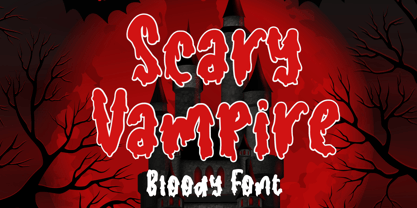 Scary Vampire a bloody font that perfect for you any spooky project. Scary Vampire comes with uppercase and lowercase letters, multilingual symbols, numerals, punctuation. If you have any questions please don't hesitate to drop me a message :) Thank You, Sronstudio
 - Jiminy by Just My Type,
$35.00 Come on... You want Jiminy, don’t you? It’s FUN! And carefree! It will turn any project into something enjoyable. You really must have it! But don’t just listen to me, Mr. Cat and Mr. Fox. Let your conscience be your guide...
 - PlainPensle by Ingrimayne Type,
$14.95 As its name suggests, PlainPensle is a handwriting font that emulates printing and writing with a pencil or ballpoint pen. The plain and bold styles have hand printing that is ordinary and nondescript. The italics and bolditalics contain simple handwritten cursive.
 - Ovoda by Alive Fonts,
$40.00 Whether summer, winter or fall, Ovoda is posed to add a youthful yet refined touch to any design. Use Ovoda’s three weights to pucker up your latest packaging or liven up your layouts. Ovoda is a must have for your clubhouse!
 - Spottydotty by Ilse Joubert,
$7.00 My font is a playful, quirky handwritten font with child-like qualities. It is meant to be slightly imperfect in appearance and for even more fun, I have included a few mini icons, as an add-on to this font.


