10,000 search results
(0.042 seconds)
- Jasmine Century by Timurtype,
$14.00 Introduced by Timurtype Studio! Jasmine Century is a Handbrushed Font This fonts are a beautiful and artistic type of font that mimics the look of letters created by hand using a brush or paint. Each character in a handbrushed font is carefully crafted with fluid brush strokes, resulting in a unique and natural handwritten appearance. These fonts add a touch of authenticity, creativity, and a sense of personalization to any design project. Whether used for logos, branding, invitations, or social media graphics, handbrushed fonts bring a charming and organic feel that can convey a wide range of styles, from casual and playful to elegant and sophisticated. With their versatility and ability to evoke emotions, handbrushed fonts have become a popular choice for designers looking to add a touch of artistic expression to their artwork. Jasmine Century Font also supports multilingualism. Enhance your designs with our original fonts, feel free to comment or provide feedback, Enjoy the fonts 😊 Thank You
 - PR Scrolls 04 by PR Fonts,
$15.50 Inspired by food labels, signs and coats of arms, PR-Scrolls is a collection of images which can be used for framing text in contexts where antiquity, craftsmanship, or traditional quality are conveyed. There are several sets of glyphs which work together to make a variety of shapes, or banners of custom length. Most of the glyphs are presented in a range of four or more widths.
 - Hullabaloo by Solotype,
$19.95We saw a few letters of this in a catalog, and liked it so well we drew it up and made it as a film font for photolettering. Due to a surplus of interesting types in our shop this one never made it into our catalog, so we can¹t tell you anything about its popularity. - Cutie Pie by The Arborie,
$11.00 This is the cutest font in the galaxy. It's neat yet adorable! Use it for posters, note-taking, or even cute logo designs. Your imagination is the limit.
 - Grosen by Hurufatfont,
$23.00 Grosen Typeface Family is designed by Oğuzhan Cengiz in the years 2017-2019. It has a grotesque structure that contains humanistic effect. Although it is designed upon the basic geometric structure, it shows own style with expansion that makes a reference to serif at start and finish of round letters. Grosen Typeface Family has fourteen styles with seven weights and theirs real italics. These have advanced OpenType features; like small capitals, case sensitive signs and math symbols, alternative characters (a, g, M, J, &), automated fractions, oldstyle figures, tabular linings, proportional numbers...
 - Apex Brush by Hanoded,
$15.00 I like playing around with brushes and Chinese ink. I always have some kind of idea of what the final design should look like, but once it’s done, it never ever looks like what I had in mind. Apex Brush is one of those designs: it started off as a few brush strokes, but before I knew it, I had a really nice set of matching brush fonts! Use it for any design that needs a bit of rough, a splash of ink and a pinch of rebel.
 - AM Siola by URW Type Foundry,
$39.99 AM Siola is designed as a pure display font. The starting point for this type design was a customized logotype. Logotypes usually just need the design of some characters to form a harmonious, individual lettering. Obviously, it is much more difficult to create a complete font on the basis of just a few characters. The semi-serifs partly running in the opposite direction form the basic idea for this font. AM Siola can well be used for packaging design, logo design and individual headlines for anything from advertising to posters.
 - Laca Text by Nova Type Foundry,
$21.99 Laca Text is a sans-serif version of Laca. It was designed starting from the shapes of Laca. It is a cleaner version of Laca. Laca Text has characteristics like a bigger x-height, open counters, and smaller ascenders. It works better in smaller text than Laca because it keeps the structure without the stylistic features of Laca. Laca Text has more straight lines and follows the round shapes of Laca. Laca Text, as the name says, is more proper for long text but also for identity and branding.
 - Italian Gothic by Celebrity Fontz,
$24.99The Italian Gothic font is a full set of decorative initials inspired by 16th-century Italian Calligrapher Giovanni Battista Palatino, containing beautiful loops, flourshes, and parallel calligraphic strokes. This lovely calligraphic font includes one set of A-Z ornamental initials conveniently assigned to both the upper- and lower-case alphabet characters, as well as many foreign language accented characters. It is ideal for starting off the beginning of paragraphs in artistic publications, storybooks, fairy tales, religious publications, and any written work conveying the calligraphic style of the 1500s. - Triole 21 by KaiserType,
$40.00 "Triole 21" is the name of a gothic script font designed by Bertram Kaiser. The forms of this so called "Rotunda" script are based on the manuscripts of italian calligraphers of the late 14th century. Inspiration for this project also comes from the calligrapher Lisa Beck. The glyphs were first written with a broad-nib and then digitized. The Open-Type font is equiped with multilingual (Latin-based) alternates, ligatures and oldstyle figures for various typographical purposes. It can be used for headlines and also stays legible in smaller textsizes for longer textpassages.
 - TT Octosquares by TypeType,
$35.00 TT Octosquares useful links: Specimen | Graphic presentation | Customization options TT Octosquares is a fresh, revised, expanded, and significantly improved version of our first commercial typeface TT Squares and its narrow version TT Squares Condensed. With all our love for the original font family, it felt there was a lack of functionality, character composition, features, and design freshness, which prompted us to the idea of a complete restart. Now TT Octosquares can be safely called a superfamily consisting of 4 widths (Compressed, Condensed, Standard, Expanded), 72 faces (18 in each width), and 1 incredible variable font in which variability works jointly on three axes. In addition to working on the contours themselves and their design, we completely revised the composition of the typeface. First, we added two completely new widths: Compressed and Expanded. Secondly, we increased the number of weights in each of the subfamilies—while in the old versions there were 5 weights, now in each of the subfamilies there are 9 weights. At the stage of working with the contours of characters, we revised the roundings, changed the forms of shoulder and stem crossings, added noticeable shelves at the letters, removed the sharpness from the triangular characters and cut off all sharp endings. From the very beginning of work on TT Octosquares, we planned to make a variable 3-axis version of it sewn into 1 font file. This means that by installing just one variable font file, you get access to three axial adjustment of the font: by thickness, width and inclination. Thanks to this flexibility in settings, you can always choose a custom combination of thickness, width or inclination that best suits your tasks. Due to the increased language support and the appearance of a bunch of useful OpenType features, the number of glyphs in the typeface has increased from 480 to 825 in each style. Now you can use stylistic alternates, standard and discretionary ligatures, or use old-style figures, numbers in circles and even slashed zeros in your design. Full list of features: aalt, mark, mkmk, ccmp, subs, sinf, sups, numr, dnom, frac, ordn, lnum, pnum, tnum, onum, case, zero, dlig, liga, salt, ss01, ss02, ss03, ss04, ss05, ss06, ss07, ss08, ss09, ss10, ss11, ss12, calt, locl. To use the variable font with three variable axes on Mac you will need MacOS 10.14 or higher. For other software and browsers, you can check the support status here: v-fonts.com/support/.
 - Hilleria by Keristyper Studio,
$12.00 Hilleria is a calligraphy script font that comes with exquisite change characters, a kind of classic decorative script with a modern twist, designed with great detail to bring out a stylish elegance. This font is good for logo design, Social media, Movie Titles, Books Titles, short text even long text letters, and good for your secondary text font with sans or serif. Featured: Standard Uppercase & Lowercase Numeral & Punctuation Multilingual : ä ö ü Ä Ö Ü ß ¿ ¡ Alternate & Ligature PUA encoded We recommend programs that support the OpenType feature and the Glyphs panel such as Adobe applications or Corel Draw. so you can use all the variations of the glyphs. Hope you enjoy our fonts!
 - Draghord by Alit Design,
$19.00 Introducing Draghord, a bold and dynamic typeface that embodies the essence of superheroic power and adventure. This font is a visual journey into the realm of fire, swords, skulls, and wings, capturing the spirit of mighty heroes and formidable villains alike. Characteristics: Flaming Elements: Each letter of Draghord is adorned with fiery accents, reminiscent of a blazing inferno. The flames dance around the characters, conveying a sense of untamed power and intensity. Sword-Inspired Strokes: The letterforms draw inspiration from the sleek and sharp edges of legendary swords. The angular and precise strokes give the font a cutting-edge aesthetic, symbolizing strength and precision. Skull Motifs: Intricately integrated skull motifs within the font add an element of danger and mystery. The skulls serve as a visual reminder of the challenges faced by our superheroic characters, embodying both mortality and defiance. Dynamic Winged Elements: The font incorporates dynamic winged elements that soar across certain letters, emphasizing the theme of flight and freedom. These wings symbolize the superhero's ability to rise above adversity and transcend limitations. Usage Scenarios: Comic Books: Draghord is perfect for comic book titles, captions, and speech bubbles, adding a dramatic and visually striking element to the narrative. Movie Posters: Use Draghord to create attention-grabbing titles and taglines for superhero movies. Its bold and adventurous design will set the tone for epic storytelling. Gaming Graphics: Ideal for in-game text, Draghord adds a heroic touch to video game interfaces, especially in fantasy or superhero-themed games. Event Promotion: For superhero-themed events, Draghord can be utilized in promotional materials, posters, and banners to convey a sense of excitement and power. In Conclusion: Draghord is not just a font; it's a visual experience that transports you into the heart of superheroic tales. With its fiery, sword-inspired design, skull motifs, and dynamic wings, Draghord is the perfect typographic companion for any project seeking to channel the thrilling energy of the superhero genre. Unleash the power of Draghord and let your words ignite the imagination!
 - Gueton by Twinletter,
$17.00 Introducing Gueton, the retro condensed font that adds a classic touch to your designs. This font features a timeless and stylish retro look and comes with 20 alternate characters and 25 ligatures that beautifully complement its unique design. Whether you’re working on a vintage-inspired project or just want to add some nostalgic charm to your work, Gueton is a perfect choice. Not only does Gueton offer stunning design features, but it also supports multiple languages, making it a versatile font for a wide range of projects. Whether you’re designing a logo, poster, or website, Gueton’s classic and modern blend will give your work a standout and professional look. Check out our collection now and elevate your designs with this elegant and sophisticated font. What’s Included : - File font - All glyphs Iso Latin 1 - Alternate, Ligature - Simple installations - We highly recommend using a program that supports OpenType features and Glyphs panels like many Adobe apps and Corel Draw so that you can see and access all Glyph variations. - PUA Encoded Characters – Fully accessible without additional design software. - Fonts include Multilingual support
 - Valentia Nit by Eurotypo,
$59.00 “Valentia Nit” is a copperplate typeface enriched with swashes and extensions in alternate characters. Its main feature is the intense contrast between thick and thin strokes that gives you clarity of reading while providing a delicate and subtle texture in the text. Another feature is the spontaneity of its stems, the agile and casual ties, which in fact, these combinations can offer the designer a variety of possibilities to structure a logo or headline in sophisticated lettering style. “Valentia Nit” was designed to combine with our previous font “Valentia” in order to obtain the necessary hierarchy of texts using changing thicknesses.
 - Renois by Craft Supply Co,
$20.00 Introducing Renois – Display Sans Serif Powerful Impact, Bold and Condensed Renois – Display Sans Serif is more than just a font; it’s a meticulously designed tool for achieving a commanding presence in a variety of display applications. Command Attention Instantly Furthermore, Renois is purpose-built to command attention instantly. Its bold and condensed design ensures that your message takes center stage and captures the viewer’s gaze right away, making it perfect for headlines and displays that demand immediate attention. Clarity in Boldness Remarkably, despite its boldness, Renois prioritizes clarity. Each character is thoughtfully crafted for optimal readability, guaranteeing that your message is not only impactful but also effectively communicated, even at larger sizes. Versatile for Diverse Displays Moreover, Renois’s versatility shines in various display applications, whether it’s for posters, banners, or promotional materials. This typeface seamlessly adapts to your design needs, making a bold and impactful statement in any context. In Conclusion In summary, Renois – Display Sans Serif is the font of choice when you need to make a powerful and clear statement in your displays. Elevate your designs with Renois, ensuring your message rises above the noise, leaving an indelible and memorable impact on your audience.
 - Playful Garden by Yumna Type,
$25.00 Playful Garden is a display font inspired by garden plants, such as flowers, leaves, and other plants. The letters are round and organic portraying natural shapes of garden views. This font’s unique characteristic is that all of the letters are in capitals to show dramatic, prominent displays. Such big letter sizes help emphasize the messages delivered. Furthermore, such a garden-themed display font is able to create calm, quiet situations to apply for nature designs or organic and eco-friendly products. Overall, it is the right option for you to show unique, interesting displays. Moreover, Playful Garden provides a clipart in accordance with the font theme as a bonus and features you can enjoy. Features: Multilingual Supports PUA Encoded Numerals and Punctuations Playful Garden fits best for various design projects, such as brandings, headings, magazine covers, quotes, printed products, merchandise, social media, etc. Find out more ways to use this font by taking a look at the font preview. Thanks for purchasing our fonts. Hopefully, you have a great time using our font. Feel free to contact us anytime for further information or when you have trouble with the font. Thanks a lot and happy designing.
 - Baedar by Craft Supply Co,
$20.00 Introducing Baedar – Bold Rounded Sans Serif Font Baedar – Bold Rounded Sans Serif, a font designed to captivate your attention, is both inviting and approachable. Its rounded corners create a warm and friendly vibe that instantly draws in readers. Eye-Catching Appeal Baedar’s boldness immediately grabs your eye, making it perfect for headlines and attention-grabbing text. Whether it’s a poster, website, or marketing material, this font ensures your message unequivocally stands out. Versatile Usage Furthermore, with its rounded edges, Baedar exudes friendliness. Consequently, it suits a wide range of projects, from branding to social media posts, adding a touch of approachability to your content. Readability and Impact Moreover, Baedar combines readability with visual impact, making it ideal for conveying important messages with flair. Its boldness ensures crystal-clear clarity, while the rounded corners gently soften the overall look. In Conclusion Baedar – Bold Rounded Sans Serif Font strikes the perfect balance between eye-catching design and friendliness, making it an excellent choice for various creative endeavors. Therefore, seize your audience’s attention and convey your message effectively with this versatile font.
 - Black Sansa Pro by Authentype,
$14.00 Black Sansa - Retro display font with a full set of uppercase and lowercase letters, multilingual symbols, numbers, punctuation, stylistic set, and ligatures. Black Sansa retro display font style for retro poster, magazine, retro beauty branding design in vintage style suitable for your retro design concept. Features: Simple installations, accessible in Adobe Illustrator, Adobe Photoshop, Adobe InDesign, even work on Microsoft Word. PUA Encoded Characters – Fully accessible without additional design software. Fonts include multilingual support for; ä ö ü Ä Ö Ü ß ¿ ¡ ____ PLEASE NOTE Most of the fonts require advanced graphic software that supports Open Type Features like Adobe (Illustrator, InDesign, Photoshop), Affinity (Photo, Designer, Publisher), Corel Draw, or similar software. Image used: All photographs/pictures/logo/vector used in the preview are not included, they are intended for illustration purposes only. Thank you Hope you enjoy our font!
 - Burge by Craft Supply Co,
$20.00 Introducing Burge – Cute Serif Font Meet Burge Cute Serif Font, the adorable serif font with round serifs that adds a charming touch to your designs. Playful and Cute Design Burge features soft, round serifs that give it a playful and cute appearance. Its letterforms are carefully crafted to evoke a sense of charm and friendliness. This font is perfect for creating eye-catching titles that capture attention. Versatile Usage Burge’s versatility shines in a variety of design projects. Whether it’s used in posters, invitations, or social media graphics, this font adds a delightful flair. Its rounded serifs ensure legibility even at smaller sizes. Whimsical Appeal Burge’s whimsical charm appeals to a wide audience. It avoids complex details, making it user-friendly for designers of all levels. This font brings a touch of cuteness to your creative endeavors, making your titles stand out.
 - Rigkult by Keristyper Studio,
$14.00 Rigkult font is a versatile typeface that combines industrial elements with modern aesthetics. The font features strong and bold characters, making it perfect for logos, headlines, and other display purposes. With its edgy and unique design, Rigkult font is sure to make your designs stand out and grab attention. Featured: Standard, Uppercase & Lowercase Numeral & Punctuation Multilingual : ä ö ü Ä Ö Ü ß ¿ ¡ Alternate & Ligature PUA encoded We recommend programs that support the OpenType feature and the Glyphs panel such as Adobe applications or Corel Draw, so you can use all the variations of the glyphs. Hope you enjoy our fonts!
 - Motiva Sans by Plau,
$20.00 Motiva Sans is the chosen typeface for Valve’s Steam OS, a 125.000.000+ users gaming platform. With 7 weights and matching italics (a total of 14 fonts), it comes with essential OpenType features such as small caps, caps to small caps, tabular, lining, oldstyle figures, fractions as well as extended language support and alternate characters in the italic weights. It performs well in printed and digital environments. The italics are more cursive than the average sans serif design and provide very good contrast to the their roman counterparts. Motiva Sans pairs beautifully with our high-contrast didone serif Tenez or with our cute vertically connected script Primot.
 - Aquene by Craft Supply Co,
$20.00 Introducing Aquene – Display Serif Font Are you in search of a unique serif font with a captivating flow for your display requirements? Look no further than Aquene – Display Serif. This meticulously crafted font is designed to make your text stand out and captivate your audience. Unique Flow for Captivating Text Aquene – Display Serif font boasts a distinctive flow that sets it apart. Firstly, its elegant curves and graceful lines lend a touch of sophistication. Secondly, it’s perfect for eye-catching headlines and titles that leave a lasting impression. Versatile Usage for Various Design Needs Moreover, Aquene is remarkably versatile. It’s suitable for posters, banners, or website headers, making it ideal for different design contexts. Whether you’re working on a promotional campaign, crafting a logo, or designing social media graphics, Aquene’s adaptability shines.
 - Pershal by insigne,
$29.00 Pershal is something of an oddball, and that's the point. Dynamic and fast, Pershal attracts interest. Its architecture evokes growth and progress. Inspired by the futuristic styles of the 1990s, Pershal started on an aircraft ride as a sketch on a napkin. I set the concept aside for almost a decade before I went back to play with the typeface. Pershal is planned to complement applications in consumer finance, technology firms or biotechnology. As such, it has a complete set of both tabular and proportional figures. For the lowercase, Pershal features a distinctive shape that emphasizes its x-height. Its horizontal movement is highlighted by some of its other features, such as its crossbars. To emphasize growth, acceleration and inventiveness, crossbars and other elements are cut at a dynamic angle. It's a sans serif without a lot of contrast. Another unique feature of this typeface is the vast number of OpenType alternates. If you prefer a more conventional appearance to your sans, with stylistic alternates, you have that option. Altogether, there are more than seven separate sets of stylistic alternates and about 250 alternates for characters. This enables you to mix-and-match and create your own personal typeface. For branding, this makes it very useful. For your next project that requires a dynamic and technological appearance, give Pershal a shot.
 - Bloomilife by Timurtype,
$14.00 Introducing by Timur type Proudly Present, Bloomilife Bloomilife A Handwritten Script Font Bloomilife is perfect for product packaging, branding project, megazine, social media, wedding, or just used to express words above the background. Bloomilife also multilingual support. Embelish your designs with our original fonts. Enjoy the font 😉 Thank you!
 - Golden Estella by Timurtype,
$14.00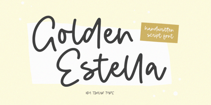 Introducing by Timur type Proudly Present, Golden Estella Golden Estella A Handwritten Script Font Golden Estella is perfect for product packaging, branding project, megazine, social media, wedding, or just used to express words above the background. Golden Estella multilingual support. Embelish your designs with our original fonts.Enjoy the font,Thank you!
 - Merry Snowmen by Greater Albion Typefounders,
$5.00 Merry Snowmen is a piece of winter fun-is a set of hand-drawn snowwmen figures, ideal for Christmas or any other time when cold and snow are about. It complements our Merry Fleurons and Christmas Fleurons faces, and is ideal for all your cards, gift labels, invitations, posters and banners.
 - Cyan by Wilton Foundry,
$29.00The design of Cyan was inspired by features found in classic Roman and styles like Trajan and Bodebeck. It shows the designer's personal preference for geometric Roman proportions while incorporating open centers (B,P,R) and compact serifs. Unlike Trajan, Cyan has lowercase characters in the regular version. The characters stay true to the same features as the capitals, resulting in an unusually distinctive style. The Regular Capitals version contains Roman numerals. Cyan's weight is similar to Trajan's but the horizontal strokes are slightly bolder resulting in better legibility for small sizes, especially for lowercase characters. There are many subtle details in Cyan that become more interesting in larger sizes, for instance the subtle curves in the serifs and the overall smoothness as a result of the mostly rounded angles. Cyan is a robust font that will exceed expectations in areas never explored before. The name is inspired by the Greek word cyan, meaning "blue". The color cyan can have many different variations. One definition is a color made by mixing equal amounts of green and blue light (it also is a pure spectral color). As such, cyan is the complement of red: cyan pigments absorb red light. Cyan is sometimes called blue-green or turquoise and often goes undistinguished from light blue. Obviously the Cyan family is a perfect companion to the Cyan Sans family. - Carousel by ITC,
$40.99Carousel is a fat faces display type designed by Gary Gillot in 1966. Fat faces were offshoots of the modern, or Didone, typefaces that were de rigueur during the early 1800s. These fat faces were among the first typefaces to be used solely for advertising purposes. Naturally, they were always used in larger point sizes, in display functions. Carousel could be called an optimization of these old advertising typefaces. With high x-heights, ultra contrast between thick and thin strokes, and perfectly engineered drawing techniques, Carousel is a highly crafted typeface. Give it a spin in your next advertising campaign! Carousel's fine thin strokes are very graceful in their appearance, and lend a strong, yet soft, feminine feeling to anything they touch.If you like Carousel check out wearing Annlie, another fat face from 1966." - Woolwich by Hanoded,
$15.00 Woolwich is a jolly fine display font, named after a district in south-east London. Woolwich, somewhat inspired by Futura condensed, was completely made by hand and comes in a clean and an eroded version. It is highly legible and will certainly make your designs stand out. Woolwich speaks a lot of languages, including the language of doodles.
 - Breda Two by Eurotypo,
$24.00 Breda Two is the condensed version of the Breda family, but it is presented as an independent family of fonts because they can work as a single face in your design. As a Breda font, this style is austere, functional and clear, emerged from straight lines and primary shapes. Breda Two is released in four weights with two italics.
 - Trailmap by Atlantic Fonts,
$26.00 Whether you're comfortable in your hiking boots or booting up your computer, Trailmap gets you where you want to go with an engaging mix of lower and uppercase or all caps. For double letters, or anywhere that needs it, add extra variation by combining lower and uppercase letters. Trailmap coordinates naturally with Trailmap Pictures, a fantastically fun collection of wilderness icons from rainclouds to raccoons.
 - Wonder Brush by Canada Type,
$29.95 Wonder Brush is a display typographer's guilty pleasure. It's one of very few fonts ever made that can take intense abuse and still look natural. Partly based on a 1969 Friedrich Poppl design called Poppl Stretto, but considerably fused with ideas found in interwar magazine ad lettering and signage, Wonder Brush caters to the idea that most graphic designers would rather use design elements they can enjoy. When you spend your days being "challenged" and "creatively tested" and "communicating the message," you can definitely use a little bit of playtime. And this font gives you just that, playtime on the job. Wonder Brush appears to be a straightforward narrow upright brush script. But it really is made of malleable rubber. Take it into a program like Adobe Illustrator, set something, stretch or squeeze, shear or warp, slant or transform… just play with it like they used to do in the 70s and 80s. You will soon discover that this font really is a big old top hat, and it's up to you and your mischief to pull rabbits or geese out of it. A single font that allows you to emphasize content or manage space mechanically without affecting the integrity of the type setting. And if your playtime includes fiddling with OpenType features, you're in for a bonus treat: Wonder Brush comes with over 800 characters, including a lot of alternates and extended language support. So tweak away until your eyes cry with joy. The only rules are the ones you set, and even those are meant to be broken.
 - Mati by Sudtipos,
$19.00 Father's Day, or June 17 of this year, is in the middle of Argentinian winter. And like people do on wintery Sunday mornings, I was bundled up in bed with too many covers, pillows and comforters. Feeling good and not thinking about anything in particular, Father's Day was nowhere in the vicinity of my mind. My eleven year old son, Matías, came into the room with a handmade present for me. Up to this point, my Father's Day gift history was nothing unusual. Books, socks, hand-painted wooden spoons, the kind of thing any father would expect from his pre-teen son. So you can understand when I say I was bracing myself to fake excitement at my son's present. But this Father's Day was special. I didn't have to fake excitement. I was in fact excited beyond my own belief. Matí's handmade present was a complete alphabet drawn on an A4 paper. Grungy, childish, and sweeter than a ton of honey. He'd spent days making it, three-dimensioning the letters, wiggle-shadowing them. Incredible. A common annoyance for graphic designers is explaining to people, even those close to them, what they do for a living. You have to somehow make it understandable that you are a visual communicator, not an artist. Part of the problem is the fact that "graphic designer" and "visual communicator" are just not in the dictionary of standard professions out there. If you're a plumber, you can wrap all the duties of your job with 3.5 words: I'm a plumber. If you're a graphic designer, no wrapper, 3.5 or 300 words, will ever cover it. I've spent many hours throughout the years explaining to my own family and friends what I do for a living, but most of them still come back and ask what it is exactly that I do for dough. When you're a type designer, that problem magnifies itself considerably. When someone asks you what you do for a living, you start looking for the nearest exit, but none of the ones you can find is any good. All the one-line descriptions are vague, and every single one of them queues a long, one-sided conversation that usually ends with someone getting too drunk listening, or too tired of talking. Now imagine being a type designer, with a curious eleven year old son. The kid is curious as to why daddy keeps writing huge letters on the computer screen. Let's go play some ball, dad. As soon as I finish working, son. He looks over my shoulder and sees a big twirly H on the screen. To him it looks like a game, like I'm not working. And I have to explain it to him again. This Father's Day, my son gave me the one present that tells me he finally understands what I do for a living. Perhaps he is even comfortable with it, or curious enough about that he wants to try it out himself. Either way, it was the happiest Father's Day I've ever had, and I'm prouder of my son than of everything else I've done in my life. This is Matí's font. I hope you find it useful.
 - Gladolia by Ahmad Jamaludin,
$17.00 Get ready to rock your designs with the brand new Chunky Groovy Font, GLADOLIA! 🎉 Gladolia is a chunky typeface with a unique retro style that is sure to make your designs stand out. With 2 different style fonts, regular and oblique, plus an extra Extruded Font version for each style, you can easily create eye-catching designs without any extra effort. This font is perfect for a retro 80s theme and can be used for cover magazines, brochures, logos, headlines or quotes, stand-alone displays, and short paragraphs or content. Each font in the family is dynamic and authoritative on its own, making it perfect for any display project. So what are you waiting for? Elevate your designs with the cool and groovy vibes of Gladolia! 🤘 Similar Item: Sugar Peachy : LINK HERE Gyoza : LINK HERE Gunydrops : LINK HERE Swipe: LINK HERE Replay : LINK HERE Bright : LINK HERE Margin : LINK HERE Nighty : LINK HERE What you get? Gladolia Regular Gladolia Italic Gladolia Shadow Regular Gladolia Shadow Italic Features : Alternates and Ligatures Instructions ( Access special characters, even in circuit design ) Letters, numbers, symbols, and punctuation No special software is required to use this typeface even work in Canva Multilingual Support Give your design projects that fun, playful edge with GLADOLIA! Thank you, Dharmas Studio
 - CA BND Trash by Cape Arcona Type Foundry,
$39.00 Based upon CA BND (the clean version) CA BND Trash is a rough and dirty version of our favorite DIN-like font. We recommend it for use in zombie movies title design, headlines for ads of a soft-drink manufacturer (who hopes to be cooler, if he uses rough typefaces), or for emocore, hardcore, softcore or "whatever-core" bands. Uhhh, its the time for the living dead.
 - Sagittarius by Hoefler & Co.,
$51.99 A typeface with lightly-worn futurism, Sagittarius is equally at home among the beauty and wellness aisles, or the coils of the warp core. The Sagittarius typeface was designed by Jonathan Hoefler in 2021. A decorative adaptation of Hoefler’s Peristyle typeface (2017), Sagittarius’s rounded corners and streamlined shapes recall the digital aesthetic of the first alphabets designed for machine reading, a style that survives as a cheeky Space Age invocation of futurism. Sagittarius was created for The Historical Dictionary of Science Fiction, where it first appeared in 2021. From the desk of the designer: Typeface designers spend a lot of time chasing down strange valences. We try to figure out what’s producing that whiff of Art Deco, or that vaguely militaristic air, or what’s making a once solemn typeface suddenly feel tongue-in-cheek. If we can identify the source of these qualities, we can cultivate them, and change the direction of the design; more often, we just extinguish them without mercy. Sometimes, we get the chance to follow a third path, which is how we arrived at Sagittarius. During the development of Peristyle, our family of compact, high-contrast sans serifs, I often found myself unwittingly humming space-age pop songs. Nothing about Peristyle’s chic and elegant letterforms suggested the deadpan romp of “The Planet Plan” by United Future Organization, let alone “Music To Watch Space Girls By” from the ill-advised (but delicious) Leonard Nimoy Presents Mr. Spock’s Music from Outer Space, but there they were. Something in the fonts was provoking an afterimage of the otherworldly, as if the typeface was sliding in and out of a parallel universe of high-tech spycraft and low-tech brawls with rubber-masked aliens. It might have had something to do with a new eyeglass prescription. But I liked the effect, and started thinking about creating an alternate, space-age version of the typeface, one with a little more funk, and a lot more fun. I wondered if softer edges, a measured dose of seventies retrofuturism, and some proper draftsmanship might produce a typeface not only suitable for sci-fi potboilers, but for more serious projects, too: why not a line of skin care products, a fitness system, a high-end digital camera, or a music festival? I put a pin in the idea, wondering if there’d ever be a project that called for equal parts sobriety and fantasy. And almost immediately, exactly such a project appeared. The Historical Dictionary of Science Fiction Jesse Sheidlower is a lexicographer, a former Editor at Large for the Oxford English Dictionary, and a longtime friend. He’s someone who takes equal pleasure in the words ‘usufructuary’ and ‘megaboss,’ and therefore a welcome collaborator for the typeface designer whose love of the Flemish baroque is matched by a fondness for alphabets made of logs. Jesse was preparing to launch The Historical Dictionary of Science Fiction, a comprehensive online resource dedicated to the terminology of the genre, whose combination of scholarship and joy was a perfect fit for the typeface I imagined. For linguists, there’d be well-researched citations to explain how the hitherto uninvented ‘force field’ and ‘warp speed’ came to enter the lexicon. For science fiction fans, there’d be definitive (and sometimes surprising) histories of the argot of Stars both Trek and Wars. And for everyone, there’d be the pleasure of discovering science fiction’s less enduring contributions, from ‘saucerman’ to ‘braintape,’ each ripe for a comeback. A moderated, crowdsourced project, the dictionary is now online and growing every day. You’ll find it dressed in three font families from H&Co: Whitney ScreenSmart for its text, Decimal for its navigational icons, and Sagittarius for its headlines — with some of the font’s more fantastical alternate characters turned on. The New Typeface Sagittarius is a typeface whose rounded corners and streamlined forms give it a romantically scientific voice. In the interest of versatility, its letterforms make only oblique references to specific technologies, helping the typeface remain open to interpretation. But for projects that need the full-throated voice of science fiction, a few sets of digital accessories are included, which designers can introduce at their own discretion. There are alternate letters with futuristic pedigrees, from the barless A popularized by Danne & Blackburn’s 1975 ‘worm’ logo for NASA, to a disconnected K recalling the 1968 RCA logo by Lippincott & Margulies. A collection of digitally-inspired symbols are included for decorative use, from the evocative MICR symbols of electronic banking, to the obligatory barcodes that forever haunt human–machine interactions. More widely applicable are the font’s arrows and manicules, and the automatic substitutions that resolve thirty-four awkward combinations of letters with streamlined ligatures. About the Name Sagittarius is one of thirteen constellations of the zodiac, and home to some of astronomy’s most inspiring discoveries. In 1977, a powerful radio signal originating in the Sagittarius constellation was considered by many to be the most compelling recorded evidence of extraterrestrial life. Thanks to an astronomer’s enthusiastically penned comment, the 72-second transmission became known as the Wow! signal, and it galvanized support for one of science’s most affecting projects, the Search for Extraterrestrial Intelligence (SETI). More recently, Sagittarius has been identified as the location of a staggering celestial discovery: a supermassive black hole, some 44 million kilometers in diameter, in the Galactic Center of the Milky Way. <
 - Scrubby by Typodermic,
$11.95 Welcome to the nostalgic ’70s with Scrubby, the typeface that will take you on a trip down memory lane! If you’re looking for a font that exudes softness, look no further than Scrubby. This typeface is inspired by the Bookman Italic, a font that was popular in the 1970s and remains iconic today. Scrubby is a typeface that embodies the spirit of the ’70s with its wild swashes and alternate versions of letters. The best part is that these are automatically substituted based on context, thanks to your application’s standard ligatures capability. So, whether you’re starting a word with “A” or ending it with lowercase letters like “k”, “h”, “m”, “n”, “r”, “v”, “w”, or “y”, you’ll get a fantastic curl on the left or a charming curl on the right respectively, adding a touch of softness to your text. If you’re worried about tail collisions or if you simply want more control over the swash effects, you can manually activate or deactivate them using your application’s OpenType swash or stylistic alternate settings. So, what are you waiting for? Relive the ’70s with Scrubby, and add a soft, friendly touch to your graphic design projects! You can easily access all the alternate characters by using your system’s character map or glyph panel. Most Latin-based European writing systems are supported, including the following languages. Afaan Oromo, Afar, Afrikaans, Albanian, Alsatian, Aromanian, Aymara, Bashkir (Latin), Basque, Belarusian (Latin), Bemba, Bikol, Bosnian, Breton, Cape Verdean, Creole, Catalan, Cebuano, Chamorro, Chavacano, Chichewa, Crimean Tatar (Latin), Croatian, Czech, Danish, Dawan, Dholuo, Dutch, English, Estonian, Faroese, Fijian, Filipino, Finnish, French, Frisian, Friulian, Gagauz (Latin), Galician, Ganda, Genoese, German, Greenlandic, Guadeloupean Creole, Haitian Creole, Hawaiian, Hiligaynon, Hungarian, Icelandic, Ilocano, Indonesian, Irish, Italian, Jamaican, Kaqchikel, Karakalpak (Latin), Kashubian, Kikongo, Kinyarwanda, Kirundi, Kurdish (Latin), Latvian, Lithuanian, Lombard, Low Saxon, Luxembourgish, Maasai, Makhuwa, Malay, Maltese, Māori, Moldovan, Montenegrin, Ndebele, Neapolitan, Norwegian, Novial, Occitan, Ossetian (Latin), Papiamento, Piedmontese, Polish, Portuguese, Quechua, Rarotongan, Romanian, Romansh, Sami, Sango, Saramaccan, Sardinian, Scottish Gaelic, Serbian (Latin), Shona, Sicilian, Silesian, Slovak, Slovenian, Somali, Sorbian, Sotho, Spanish, Swahili, Swazi, Swedish, Tagalog, Tahitian, Tetum, Tongan, Tshiluba, Tsonga, Tswana, Tumbuka, Turkish, Turkmen (Latin), Tuvaluan, Uzbek (Latin), Venetian, Vepsian, Võro, Walloon, Waray-Waray, Wayuu, Welsh, Wolof, Xhosa, Yapese, Zapotec Zulu and Zuni.
 - Colossal Love by Create Big Supply,
$17.00 Experience the beauty and authenticity of Colossal Love, a mesmerizing handwritten font that will captivate your audience. With its natural feel and resemblance to real handwriting, Colossal Love adds a personal touch to your designs. Whether you're creating wedding invitations, stationery art, or eye-catching social media posts, this font will infuse your projects with elegance and charm. Colossal Love features a comprehensive set of uppercase and lowercase letters, allowing you to create versatile typography that suits your creative vision. The font also includes numbers and punctuation, ensuring seamless integration into your designs. Its multilingual support allows you to communicate your message effectively across different languages, making it accessible to a global audience. What sets Colossal Love apart is its extensive collection of ligatures. These ligatures enhance the natural flow of the font, creating seamless connections between letters and giving your text a handcrafted appearance. The result is a unique and authentic look that captures the essence of handwritten elegance. With PUA encoding, accessing the amazing glyphs and ligatures of Colossal Love is effortless. This feature ensures that you can fully explore the font's potential and unlock its hidden treasures with ease. Let your creativity soar as you experiment with different combinations and give your designs a personal and heartfelt touch. Discover the beauty of Colossal Love and bring a touch of handwritten elegance to your projects. Add a personal and intimate feel to your designs and make a lasting impression on your audience.
 - Harjita by Mantra Naga Studio,
$20.00 Harjita is a Retro Groovy Font inspired by the retro pop style of the 80s-90s by combining a thick serif style and rounded corners so it looks friendly and easy to read. This font is perfect for brand identity needs or other graphic media. This font is also PUA encoded, which means you can easily access all glyphs and opentype features easily. 376 Glyphs 4 Opentype features 9 Ligatures set Support Multilingual for 89 languages We highly recommend using a program that supports the OpenType feature and the Glyphs pane like many Adobe and Corel Draw applications, so that you can view and access all variations of Glyphs. Thanks for your support of our product and using it in your project.