10,000 search results
(0.025 seconds)
- Flanela Monicha by Essentials Studio,
$16.00 Flanela Monicha Is a Modern Script Font Flanela Monicha is perfect for product packaging, branding project, megazine, social media, wedding, or just used to express words above the background. Enjoy the font, feel free to comment or feedback, send me PM or email
 - Launsela by Prioritype,
$15.00 This elegant, minimalist and beautiful handwritten font can be applied in various print or digital media such as creative posts, business cards, wedding invitations, crafts, photographer watermarks, logos and much more. For reference, see preview. Features: -Uppercase -Lowercase -Numeral -Punctuation -Multilingual Thanks.
 - Mourning by FallenGraphic,
$19.00 Mourning is perfect for many different projects such as logos & branding, invitation, stationery, wedding designs, social media posts, advertisements, product packaging, product designs, label, photography, watermark, special events, or anything. what’s inside : Accents (Multilingual Characters) PUA encoded Numerals and Punctuations (OpenType Standard) ligature
 - Alissian by Ditatype,
$29.00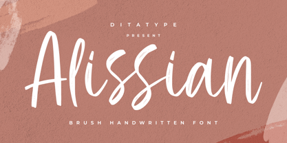 Alissian is a modern handwritten font. With a classy and natural handwritten style, it brings a classy and chic typeface. Alissian is best used for weddings, branding, logotype, and quotes. Includes: - Alissian (OTF) Features: - Beautiful Ligatures - PUA Encoded - Multilingual Support - Numerals and Punctuation
 - Modern Abstract by Cultivated Mind,
$19.00 Introducing Modern Abstract by Cultivated Mind. Modern Abstract is a bold serif font with a retro vibe. Modern Abstract comes in a regular and a bold weight. Try using Modern Abstract for branding, headline use, film, magazines, websites, packaging, invitations and weddings.
 - Sanger phet by Zaki Creative,
$10.00 Sanger Phet is a soft and sweet calligraphic typeface, with characters dancing along the baseline. It has a casual and elegant touch. Can be used for various purposes such as logos, wedding invitations, headings, t-shirts, letterheads, signage, labels, news, posters, badges etc.
 - Catthy Wellingten by Stringlabs Creative Studio,
$29.00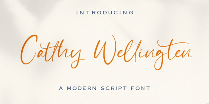 The Catthy Wellingten is a modern script font. It has a playful and feminine look, which is great for wedding invitations and anniversaries, blogs and logos. Catthy Wellingten is a handwritten font, described by an elegant touch, perfect for your favorite projects.
 - Perisland by Ditatype,
$29.00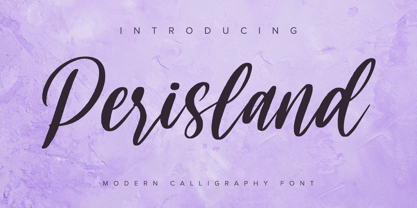 Perisland is a modern handwritten font. With a classy and natural handwritten style, it brings a classy and chic typeface. Perisland is best used for weddings, branding, logotype, and quotes. Includes: Perisland (OTF) Features: Beautiful Ligatures PUA Encoded Multilingual Support Numerals and Punctuation
 - Analogue Photography by sizimon,
$25.00 Analogue Photography is a handwritten signature font with fashionable themes. The Analogue Photography matches apply in some designs such as the logotype, quotes, wedding invitation, business card, packaging, branding, and more custom design. If you have any questions, please contact us info@sizimon.com
 - Pejuang Cinta by Stringlabs Creative Studio,
$25.00 Pejuang Cinta is a Script Font with Handwritten Style. The Pejuang Cinta font made with digital brush pen strokes that making this font look authentic. This font is perfect for fashion brand, wedding invitation, business card, logo brand, signature, and then calligraphy.
 - Christmas Heart by Letterafandi Studio,
$14.00 Christmas Heart feels incredibly elegant and flowing. It looks stunning on wedding invitations, thank you cards, quotes, greeting cards, logos, business cards and every other design which needs a handwritten touch. It features a varying baseline, smooth lines, gorgeous glyphs and stunning alternates.
 - Vermilion by Hanoded,
$15.00 Vermilion is one of those colors that are neither/nor. It's an ancient hue, in between red and orange and I kind of like the name. Vermilion font is a hand written, narrow and tall typeface which comes with extensive language support.
 - Vandal Zoy Graffiti by Sipanji21,
$18.00 Vandal Zoy is a Thick font with a graffiti style and bubble looks. It will elevate a wide range of design projects to the highest level, be it branding, headings, wedding designs, invitations, signatures, logotype, wall art illustration, apparel, labels, and much more!
 - Macarons by Latinotype,
$35.00 The Macarons font family consists of a monoline version, regular and bold weights, and a set of gestural catchwords, which reflects the use of the ruling pen as a freestyle tool. Ornaments and dingbats are also included. Macarons is a display type based on the classic Garamond typeface. It’s inspired by the foodie culture and the slow food movement, which began as a rebellion against fast food and has now grown to a global scale. Every day, thousands of people around the world take pictures of their food, look for new recipes to try and recover old ones, enjoy wine-pairing, and value locally produced food. Macarons is a fresh and spontaneous looking typeface that has been designed by Coto Mendoza, who also has developed a hand-made product line (Ride my Bike, Ride my Bike Serif, Four Seasons, D.I.Y. Time, Dans le Cuisine and In a Jar). This font is not constructed out of modules: each character is drawn by hand. Macarons is ideal for cookbooks, menus, liquor bottle labels, food packaging, wedding invitations, greeting cards, tea boxes, food blogs, small shops, cupcake bakeries and so on. Try! A freshly-baked homemade macaron!
 - Festive by TypeSETit,
$49.95 It's Festive! But don't let the name fool you... It's a fun script font (plus a Roman) accompanied by an assortment of exciting ornamental dingbats. In fact, it's the ornamentals that make this font so much fun! At first glance, Festive appears to be suited only for the Christmas holiday season. But wait… you can use the ornamental dingbats for any occasion where festivities abound— New Years, Valentines, St. Patty's Day, Back to School, Graduation, Baby & Wedding Showers, Halloween, Thanksgiving, and much more— even Sports. The base font works well with bodies of copy, while the alternate fonts can be used to swap out individual characters to give a custom, hand written look. Be sure to scroll thru to see all 14 fonts in this package—especially the fun ornamental dingbats. Festive Regular is included with all the alternate fonts (Festive One thru Ten) which are sold as two font sets. The PRO version contains all the glyphs of the family plus OpenType programming to easily access alternates. The Festive family of fonts are PUA encoded, so you can access them easily. So, get in the mood and have FESTIVE fun!
 - Unchain My Heart by Harald Geisler,
$68.34 Unchain My Heart is Font that renders hearts on a string with a capital letter in the middle. All hearts are designed to align to a perfect string by remaining the handmade look. Lowercase letters produce a heart with outline. Uppercase letters produce a filled heart. Type in a parenthesis and a loose string end will be rendered either on the right or left side. Look in the full character set to find out more about the special decoration. Ideal for individualized mailings and greeting cards. Unchain My Heart is a part of the Light Hearted Font Collection that is inspired by a recording of Jean Baudrillard with the title, "Die Macht der Verführung" (The Power of Seduction) from 2006. Further inspiration came from the article, "The shape of the heart: I'm all yours". The heart represents sacred and secular love: a bloodless sacrifice. by British writer Louisa Young printed in EYE magazine (#43) London, 2002.
 - ITC Japanese Garden Ornaments by ITC,
$29.99ITC Japanese Garden Ornaments is a symbol font designed by Akira Kobayashi (before Kobayashi became Linotype's Type Director in 2001, he worked as an independent typeface designer in Tokyo). The images in Japanese Garden are, as the name suggests, mostly floral or herbaceous, derived from designs used in Japanese indigo stencil dyeing. In Japanese Garden," Kobayashi says, "I tried to create a set of type fleurons that are very familiar to a Japanese eye, but not too exotic to people in other countries." Several of the designs fit together seamlessly in repeating patterns; others work either together or as isolated ornaments, a flexibility that also characterizes traditional Western type fleurons. "The original illustrations," notes Kobayashi, "were mostly cut from white paper squares, about two by two inches in size, and were simply scanned and traced. That is why there are few smooth curves and perfectly straight lines in the illustrations. I simply liked the ragged textures of them."" - Garlic Salt by Adam Ladd,
$19.00 Garlic Salt is a flavorful, hand drawn, serif font family. Drawn with a single marker pen, it has a monoline appearance giving it a distinct mix of whimsical and modern qualities. The semi-condensed propositions are sturdy and space-saving for your layouts. Choose from either the regular weight or a slightly thicker line in the bold weight to suit your needs. It works great set large as a display font to show off the hand drawn texture, but it also is pleasantly readable set in smaller point sizes because of the carefully drawn letterforms. BONUS: Garlic Salt also comes with a free Extras font of matching ornaments and dingbats to complement your designs! Special features include stylistic alternates and swashes to enhance the type to your liking. Those glyphs are also PUA-encoded to make them accessible in software that is not OpenType-savvy. This font has extensive Latin language support.
 - Automove by Din Studio,
$25.00 Need some help to finish your designs? There are a lot of considerations when selecting a font type for an important project either for your own company or a daily used font. Therefore, Automove, a display font in the racing theme capital letters, is carefully and accurately created to meet your design needs. This font is available in two versions, regular and italic. Automove, which seems to be a long lasting font amid other typographies owing to its unique styles and shapes, is generally applicable to large-sized texts in titles instead of the contents of the texts due to its readability in such large-sized letters. In addition, this font provides interesting features to help designers improve their design products. Features: Multilingual Supports PUA Encoded Numerals and Punctuations Automove is perfectly suitable for doing design projects such as posters, logos, book covers, headings, printed products, merchandise, social media, etc. Find out more ways to use this font by taking a look at the font preview.
 - FS Rufus by Fontsmith,
$80.00 Ligatures FS Rufus is an outgoing, likable sort of font with an eccentric streak. Wide letterforms and curious ink-traps make for an engaging personality, and a set of discretionary ligatures make FS Rufus irresistible to designers wanting to play. Not a small set, either: there are some 80 different options available. Wide The decision was made early on to make the letterforms of FS Rufus luxuriously wide. This generates a distinctive visual texture when the font is used for text. With other weights available for headlines, FS Rufus brings a curiously engaging look to editorial, magazine covers and advertising. Just look at my ink traps Ink traps are normally the preserve of fonts intended for printing at small sizes, in newspapers or directories – extra notches necessary to prevent ink from pooling. FS Rufus turns the ink trap into a beautiful eccentricity, flaunting it in both its lowercase and capitals. Take a look at the “h”, “a” and “k”, and the “B” and “N”. Attention-seeking? Moi?
 - Indipia by Aah Yes,
$11.95 Indipia is a caps-only misprinted font, ideal for display, titles, and headlines. It has alternative characters for all double-letter combinations aa-zz and AA-ZZ to avoid having two identical degraded letters together (You can see this by typing/copying words like mirror BASSOONS into the text box above, with Ligatures on); different characters for upper/lower case letters; and of course all the expected accented characters for European languages. There’s also Stylistic Alternates for some common letters and punctuation which will give a third version of the letter and/or add some random ink-misprints if selected. There are 2 styles -- Regular has small areas misprinted within the letter itself like little bits that haven't been inked, the Solid version doesn't, and the Solid one is on the grey gallery poster image. The zips contain both OTF and TTF versions - install either OTF or TTF, not both (to avoid incompatibility issues).
 - Egyptian Slate by Monotype,
$34.99 Just as the camera adds weight to human faces, serifs can add weight to typographic faces. Rod McDonald trimmed and adjusted his new Egyptian Slate design as it emerged from its sans serif predecessor, the Slate typeface family. Slate is a great sans serif design, and the addition of his Egyptian Slate to your typeface library will make it even more versatile. Egyptian Slate is a solid and stylish slab serif design that will look superb in the spotlight of your choosing. Available in six weights – from a svelte light to a commanding black – each upright member of the Egyptian Slate family has a complementary italic. Egyptian Slate fonts are available as either OpenType Std or OpenType Pro fonts; the later options offers an extended character set that supports most Central European and many Eastern European languages. Egyptian Slate™ font field guide including best practices, font pairings and alternatives. Featured in: Best Fonts for Logos, Best Fonts for Websites
 - D.I.Y. Time by Latinotype,
$19.00 D.I.Y. Time is a hand drawn type system designed by Luciano and Coto inspired by the DIY philosophy which has been transformed into a whole global counterculture movement, identifying the new generations that reprice the handwork, paying attention to quality, processes and materials used in the manufacture of goods and objects, food, clothing, furniture etc. This beautiful philosophy inspires us every day. Is present in our homes, in our lifestyle and this time we have given him way through a typeface family that mixes different styles but integrates them through language handmade. The result is a typeface based on hand lettering drawing with different brushes and pens on paper. With versions ranging from organic proposals as DIY time hand to other based on the classic proportions of Gill as DIY time sans. To accompany a set of compound words designed on the needs of small farmers and a set of ornaments illustrated, everything you need to begin to make your own.
 - Framealot by Ingrimayne Type,
$14.95 Framealot is a frame or border or page divider construction kit. By choosing and mixing various elements, a wide variety of different geometric borders or frames or dividers are possible. The largest set is on the upper-case keys. There are two other sets on the lower case keys (plus the comma and period.) The characters above the number keys (the whole top row with shift, plus {}| keys are another set. And there are a couple of other small sets. Not all the sets allow vertical dividers. Outlined versions are available on the outline style, and the filled style either inverts the pattern or removes white interior sections for the outline version (and has some other differences compared to the other two versions). Use a character map to find all the parts of a set, type them out on your document, and then copy and paste to construct your border or frame. Have fun with it!
 - Deus by Renegade Fonts,
$22.00 Deus is when type design is brought to extreme. It tries to answer the question whether you can design all glyphs in one axis of stress. It does not try to be all purpose, useful at all sizes, legible or readable and most of all it does not try to be neutral. It has its own style you either accept or not. But if you do so, it has many great stuff inside. Every glyph has the same width across four masters, so you can change the style in one title or even make an animation out of that. It also has some cool animated emojis, so make sure you take all four styles! Deus has two sets of styles. "Deus" that has an expanded glyph set, and "Deus Basic" that comes with a limited glyph set. You can play around with "Deus Basic" since you get it for free, then fall in love with this font family and go for the full version.
 - Valiety by Din Studio,
$25.00 Valiety is a serif font family to better charm your designing experiences. It consists of eight different levels to add elegant, modern touches to your designs. Valiety has a continuity aspect produced from each small stroke in order to help the eyes smoothly move from one letter to another. Besides, the thickness differences are unnoticeable so that it leaves stable, legible impressions. With such flexibility, you can use it in either bigger- or smaller-sized texts. Include 8 different weight fonts : Valiety Hairline Valiety Thin Valiety Extra Light Valiety Light Valiety Regular Valiety Medium Valiety Semi Bold Valiety Bold Features: Multilingual Supports PUA Encoded Numerals and Punctuation Valiety is best for any design projects, such as posters, banners, logos, book covers, invitations, quotes, headings, printed products, merchandise, social media, etc. Find out more ways to use this font by taking a look at the font preview. Thank you for purchasing our font and happy designing.
 - Writable Story by Din Studio,
$29.00 Have you ever dreamed of belonging to an eye-catching design happily enjoyed by customers? Well, it is time to make your dream come true. Writable Story is a modern, handmade, aesthetic calligraphy font to fascinate your customers and increase your brandings. It is more than just a handwriting because each stroke expresses luxury and beauty. In addition to being visually esthetic, Writable Story is arranged to be eligible either in its bigger-sized or smaller-sized texts. Features: Ligatures Stylistic Set PUA Encoded Numerals and Punctuation Use Writable Story for various designs, such as posters, banners, logos, book covers, headings, printed products, merchandise, social media, and more. Find out more ways to use this font by taking a look at the font preview. Enjoy your experience with this font and feel free to contact us for further product information or trouble complaints. Thank you and wish you good luck with your designs.
 - Beatrix Antiqua by Zetafonts,
$39.00 Beatrix Antiqua is a humanist sans-serif typeface designed by Francesco Canovaro. Beatrix Antiqua is part of the Beatrix Family that takes its inspiration from the classic Roman monumental capital model: its capitals are directly derived from the stone carvings in Florence Santa Croce Cathedral - where the serifs are often removed while keeping the variable width strokes. So, even if it’s basically a sans-serif, Beatrix keeps a subtle swelling at the terminals suggesting a glyphic serif - in the same vein as Herman Zapf classic Optima typeface. In the lowercase design, Beatrix references early humanist typefaces, keeping small calligraphic details (as the prolongation of the e nose) that are especially visible in the italics. While Beatrix Antiqua, the companion typeface to Florentia , slightly exaggerates its antique stylistical features, Florentia tries to mix those influence with a more robust & digital age ready design, featuring bigger X-height and an extended character set that covers over forty languages using the latin alphabet, as well as Greek and Russian Cyrillic.
 - Chilead by Groteskly Yours,
$12.00 Chilead is reminiscent of the early days of magazine publishing. Its elegant curves, high contrast and all-round heartwarming feel are perfect for art projects and typography across all mediums. Chilead is a sans serif font that looks great in titles, when used in larger sizes – but is not out of the place in a text either, which makes it a perfect choice for artists and designers who pursue not only the aesthetic qualities of the font, but also its functionality. Originally designed in 2019 and fully updated and expanded in 2022, Chilead offers users a large set of ligatures (both standard and discretionary) and a number of alternative forms for letters (such as a, v, w, y, etc). Chilead comes equipped with 600+ glyphs, which covers most of Latin-based scripts. Carefully kerned, Chilead is ready to be used in any project that requires a typeface that combines unique and stylish letterforms with a modern feel.
 - MFC Heathcliff Monogram by Monogram Fonts Co.,
$19.00 The source of inspiration for MFC Heathcliff Monogram is a crudely hand drawn vintage monogram transfer depicting a wider format diamond monogram. We revised numerous letters for better clarity and a more vintage industrial vibe. MFC Heathcliff Monogram is capable of traditional two and three letter format monograms, as well as gapped and hugging framing options for each. Numerals 1-9 and 0 on the keyboard for the 2 letter framing options typed before the letters, and use the shift key on the numerals for the 3 letter framing options type before the letters. It's just that easy. Looking for an MC in one of the letter slots? Just type mc on either side of MC in the middle to get it. Otherwise, just type a lowercase, a Capital, and then a lowercase to build your monogram. As one of the most popular shape based formats for monogramming since the beginning, it must be true that diamonds are forever.
 - Burger by Lián Types,
$25.00 Inspired in the world of the fast-food, my aim with Burger was to achieve a sexy slab serif font. Since it's not very common to see slabs with swashes I consider this project as an experiment with interesting results. In order to mantain an even weight on the written word, all the glyphs including the swashy ones had to look like compact blocks: This makes the font work much better used with almost no leading, as seen in posters above. Despite the formal look of its genre, this slab serif is also very playful and unique. (Maybe unhealthy food deserves better fonts already, right?) Taste Burger, come on, give it a try! On a more personal note: Why I made this font? Some months ago I started the gym and with it, an strict diet to see some results faster... Maybe my temptation is being, in Lacanian terms, "sublimated" by making delicious and unhealthy fonts.
 - Sibre by 38-lineart,
$80.00 We present "Sibre," a flexible and dependable serif family font that is ideal for any design project. This font family offers a wide range of possibilities for headers, subheaders, body text, captions, and displays. A total of 16 fonts are available, including 7 regular weights, 7 italics. 1 regular varible and 1 italic variable The font "Sibre" has a flexible appearance and a distinctive, quirky, and memorable name. It can be either feminine or masculine, glamorous or elegant, or anything in between, depending on your design. A variety of uses are considered in the design of Soulkind. It works perfectly for both contemporary digital designs and classic print media like books and newspapers. Furthermore, this font family is multilingual and supports a variety of languages in Latin. All in all, the Sibre font family is adaptable, authoritative, and created to make your content stand out. It doesn't matter if you're designing a website, a brand identity, or anything else—Soulkind is the best option.
 - Front Desk by Aah Yes,
$12.00Front Desk is designed to be easily readable, its increased legibility coming from the slightly enlarged lower case letters (a greater x-height) which make it easy on the eye. Also it is slightly slanted (but a lot less than a normal italic angle) to give it a more informal and modern look than a perfectly upright font would be, which is also intended to contribute extra dynamism while reading. Five available weights give adequate variation, and there are some Condensed and Expanded varieties in the complete set. A primary feature of this font is that the serif bases and tops are not indented or concave, which gives clear straight edges to the serifs, and the removal of this complexity adds to the clean lines and crispness of the font. The package contains both OTF and TTF versions - install either OTF or TTF, not both versions of a font on the same machine. - Jabberwub by Sentinel Type,
$30.00A fresh new decorative display face bubbling with life & spontaneity, Jabberwub belongs to a rare genus of creature fonts that time forgotócasual animated. A fun & bouncy eye-catcher that crosses into the land of the zany, dancing a whacky line between discord & rhyme, Jabberwub packs tons of fun into a state-of-the-art OpenType font loaded with 270 extra glyphs, including stylistic alternates, discretionary ligatures, word ligatures and capitalized ligatures, allowing creative typographers to achieve a custom hand-lettered look without all the mess & spilt glue of a manual paste-up job. Just like using rub-down type but it never cracks or splits, and it never runs out. The moment you start using Jabberwub you'll be laffing! Jabberwub is ideal for whatever zany stuff springs to mind. It takes an outline with no problem-o, and you can squish & squoosh it as the occasion takes your fancy. Optimal results are achieved by hand setting each individual glyph. Available in OpenType only. - Ah, the Abysmal Gaze font - a creation that seems to hail from the depths of an artist's most intriguing nightmares, or perhaps, their most whimsical dreams. Crafted by the hands and imaginative geni...
- Good Karma by Positype,
$15.00 Good Karma (its namesake) will be extended to you as you use this new relaxed script family. Produced from hand and sumi brush of Neil Summerour, Good Karma is a natural brush textured font family. Good Karma is filled with a lot of heart, reliable and genuine movements, and a wide range of letter options to befit any project needing an honest hand-lettered look. Each typeface comes with an additional set of stylistic alternates (upper AND lowercase) that harmonize wonderfully when you have the Opentype Ligature feature active. Additionally, special double-letter ligatures have been produced for specific combinations in need of more expressive flair, as well as a few swashes that work with the economical strokes originally produced from the sumi brush. To further expand the usefulnesss of this peaceful script, a separate Caps/Small Caps font has been added that provides the simple contrast needed to bring the script fonts forward. Rather than limit the personality of this script, various styles have been produced to complement the original Regular—Upright, Wide, Wide Upright, and the aforementioned Caps fonts are included in hopes of helping you find the perfect variation needed for your composition. Good Karma is the first release of the Positype Relaxed Script Collection of typefaces—all focused on fluid, effortless script fonts for simple use.
 - Koufiya by Linotype,
$187.99 Koufiya is designed by Nadine Chahine in 2003 as part of her MA project at the University of Reading, UK and later released by Linotype in 2007. It is the first typeface to include a matching Arabic and Latin designed by the same designer at the same time with the intention of creating a harmonious balance between the two scripts. The Arabic part is based on the Early Kufi style popular in the 7th to 10th century AD. It is characterized by a strong horizontal baseline, horizontal stacking order, clear and open counters, and a general open feeling. Though based on the earliest styles on Arabic manuscript, the design paradoxically appears quite modern and fresh. The Latin part of Koufiya recalls a Dutch influence in its shallow top arches and rather squarish proportions. Both Arabic and Latin parts have been carefully designed to maintain the same optical size, weight, and rhythm. However, no sacrifices were made to make them appear closer to each other. They are designed so that they work well together on the printed page, and to make sure that the two scripts are harmonious when they are mixed together even if within the same paragraph. The font includes support for Arabic, Persian, and Urdu. It also includes proportional and tabular numerals for the supported languages.
 - FS Silas Slab by Fontsmith,
$80.00 Slab-like sibling Why stop at sans? Rather than leave FS Silas Sans as an only child, the team wanted to extend the family, and create a complete system for brands and editorial. Unsure what the result would be, the team started experimenting with a slab serif version. ‘We didn’t know how it would turn out, but we really liked it and wanted to take it further. A fresh angle ‘We stuck with the angular theme of the sans by drawing angled slab serifs,’ says Phil Garnham, ‘as opposed to the square serifs that slab fonts usually have. That created an inner dynamism in words and sentences on the page, and a very distinctive, crafted character, like a Victorian soul in a contemporary body.’ These crafted touches include details such as the angled ascenders on the ‘i’ and ‘l’, while characters such as the ‘y’, with its abruptly-ending descender, add a mark of distinction. A perfect pair Silas Slab, like its sibling, offers a clear-cut range of five weights, from the elegant Thin to the monumental ExtraBold. Put it together with Silas Sans and you have the full complement, capable of performing the full range of tasks, above the line and below, in headlines, body copy and logotypes, B2B and B2C. Keep them together; they don’t like it when they’re apart.
 - Quirky by Fine Fonts,
$29.00 The origin of Quirky lay in the Duke Ellington number It don't mean a thing if it ain't got that swing. For some time I had wanted to create a font from expanded stroked lines. I wanted to produce a light-hearted font, but with some classic touches. One day, whilst doodling in Adobe Illustrator, Quirky’s letterforms just appeared on screen as if from nowhere. First I drew the test word ‘hamburgefonts’ and then just kept going, unable to stop. Character after character appeared as if by magic. From the start, Quirky had a life of its own. The letterforms are rather more sophisticated than merely outlined stroked lines. Subtle adjustments to compensate for optical effects have been been incorporated. For example, horizontal stems have thicknesses slightly less than vertical stems and where stems join together, the thickening effect has been reduced by cutting into the joint. Being almost monoline, Quirky works well reversed out of a solid background and for TV credits. The Quirky fonts are fun fonts, so set, laugh and enjoy! I hope Quirky will give you as much pleasure in using it as I got in creating it! Shortly after the roman version was born, an italic version and then a thin version were created to form a family of three fonts.
 - Carter Sans by ITC,
$40.99 Carter Sans: a wonderfully accomplished humanist sans serif with a beautiful twist Matthew Carter has been involved in designing typefaces since before many of us were in diapers. With dozens of great typefaces to his name, he has finally put his name to one. His newest typeface, Carter Sans™, brings together those decades of wisdom, experience, and technical expertise. The result is a humanist sans with flared strokes and terminals, a feature that has more in common with the chisel rather than the broad nib pen. Subtle detail, elegant curves, and graceful proportions make for an exceptional and distinctive sans serif typeface, that Carter himself describes as a 'humanist stressed sans.' This imbues the letterforms with a dynamism sometimes lacking in humanist sans serifs. Use it to striking effect in all-caps settings, or for extended texts. Carter Sans was recently used to great effect by Michael Bierut and Joe Marianek of Pentagram, in their work for the Art Directors Club.Carter Sans italics are unfussy, with the only remnants of cursiveness in letters like e and f. It sets beautifully with the roman. Award winning type designer Dan Reynolds (Malabar™ et al.) collaborated with Carter to produce a type that looks just magnificent in print; it would also make a fine choice for that letterpress project! Certainly a welcome addition to anyone's type library.