10,000 search results
(0.023 seconds)
- CA Saygon by Cape Arcona Type Foundry,
$40.00 CA Saygon was originally conceived for a large corporate design project, but as this was never implemented, the way was free to make a public font. As a striking corporate typeface, it transports the fractions of a society after the post-modernist phase. After hundreds of sketches a bunch full of letters were selected, some of them quite twisted, others rather conventional. The combination of these letters reflects a rebellion of individuality but also leads to a coherent typeface. Additionally there are alternative letterforms in the Stylistic Sets or in the glyphs palette, which keeps the font always exciting to the designer. Thanks to the Cyrillic and Latin Extended character sets, a huge language area is covered that even extends to Vietnam! Numerous OpenType features make life easier for the professional typographer: There are fractions, superscript and subscript numbers, as well as proportional and tabular numbers.
 - Clarks by PintassilgoPrints,
$45.00 Clarks is a modular typeface built from a work by Lygia Clark, one of the giants of Brazilian postwar art. Packed in a font equipped with clever OpenType programming, there are at least 7 different designs for each letter, thus allowing, or rather, proposing, boldly unconventional compositions. The font is programmed to cycle all these different lettershapes, avoiding repetition. The user can also manually pick up preferred forms in a glyph palette. There are choices to both keep and to defy readability and it's almost hypnotic to play with these. Lygia Clark used to invite viewers to touch her works and so we did with her 'Planes in Modulated Surface no. 4', from 1957: we fragment it and turned and inverted and recombined it. Now we return it as audacious typography and invite you to put it to work in your designs. Keep it bold and have fun! Cheers!
 - Entestats by Typephases,
$25.00 Nearly a hundred human heads, in three dingbat files. The whole series comes from the sketchbook: the original ink drawings were then digitized and refined to create vector outlines. Rather than perfectly smooth, geometrical shapes, the Entestats, like their close relatives in the Capsbats series, the Entestats retain a handmade look and feel. The Entestats are ready-made illustrations, though of course they will appreciate being enriched with colours, textures, an imaginative layout... and use them for a variety of projects. Use them small, as spot illustrations or as big as a whole page or page spread. The Entestats and their kin, the Capsbats, are a terrific resource for presentations, packaging, logos, brochures and advertisements, to name a few applications. The book 1000 Heads is a compendium of the drawings featured in the Capsbats and Entestats and it gives a glimpse of the limitless applications of this collection.
 - Hansplatz Grotesk by Heypentype,
$20.00 Hansplatz Grotesk is a sans serif type family of nine weight. Influenced by Akzidens Grotesk, Hansplatz typeface bring a new approach to this utilitarian style of grotesk. With more square proportions rather than geometric style, Hansplatz grotesk aimed to ease typesetting job when arranging a words or paragraph easily. A wide range of weight gives flexibility to every design project, hansplatz fit nicely to grid-system because of proportions. Furthermore Hansplatz Grotesk supplied with smart Opentype scripting to assist typesetter and designer very easily to Hansplatz feature. Hansplatz Grotesk truly a utilitarian, workhorse, neutral, and of course faceless. But, it makes the work done quickly. For display use, Hansplatz Grotesk Black to Semi-Bold is recommended, for paragraph heavy design, use regular and light weight. To spice up, adding Hairline or extra-light weight will make a design execution looks great and catchy but not intimidating.
 - Metalista by Suitcase Type Foundry,
$39.00 The Metalista font was created as a sign of undying admiration for the persistence of heavy metal culture. The angled font of almost fixed width proportions combines capitals with small letters for more variety and better definition of individual letters. Stressing the horizontal strokes subdued the historical Gothic character and emphasized a more modern signature, which is far different from the majority of current attempts at a modern adaptation of Fraktur fonts. We offer Metalista in three styles, or rather widths to be exact: Speed is inspired by the whiplash pace of 70s and 80s speed metal, and can tell and perform a lot even in a very small space; uncompromising Death balances on the fine line between expression and readability; and Metalista Black is the universal go-to, whether as megalomaniacal titles sprawled across the entire LP cover or as tiny texts for glam rock CD booklets.
 - Structorator by Furiosum,
$15.00 Structorator is a grid-based, experimental display font. This typeface emerged from experiments with generative type design. It evolved from a piece of code into a fully usable opentype font. The two main features are its rigid but playful design and a multitude of alternate glyphs. These features make it possible to create interesting lettering when using the default spacing. The glyphs are constructed from a limited set of patterns which are arranged within a predefined grid. The line thickness corresponds to the different cuts. Due to the rather complex shape this font will look best in larger sizes and resolutions. Its best suited for headline, display or illustrative work. - 3 weights: light, medium and heavy - 5 character sets - 3 number sets - Basic punctuation - Seperate diacrits - Ornamental glyphs - Access via stylistic sets *OT feature - Random access from the whole range of chars *OT feature - Total of 1062 Glyps
 - Bostonbay by Balpirick,
$15.00 Bostonbay is a Modern Handwritten Font. Bostonbay is a unique and elegant handwritten font. It looks beautiful on a variety of designs requiring a personalized style, such as wedding invitations, thank you cards, weddings, greeting cards, logos and so on. Bostonbay also multilingual support.
 - Fatimah by Goodigital13,
$20.00 feel and use it to create gorgeous wedding invitations, beautiful stationary art, eye-catching social media posts, and cute greeting cards perfectly macth for desgign with valentine theme, any product like book cover, t-shirt, branding, promotion, social media post, quotes, wedding, photography and more.
 - Ayulinda by Patria Ari,
$17.00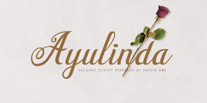 Ayulinda is a luxurious wedding script typeface with its own beautiful alternate glyphs that you can experiment with. Ayulinda is perfect for branding projects, wedding invitation, branding, logo, social media posts, advertisements, product packaging, product designs, label,poster, and any projects that you work on.
 - SPORT RELIEF - Personal use only

- MFC Semicirculus Monogram by Monogram Fonts Co.,
$19.95 The inspiration source for Semicirculus Monogram is a stylish sans serif letterset from a vintage embroidery publication which combines to create a semi-circular form monogram. Originally intended to adorn handkerchiefs, it has so many other possibilities. Ornaments from numerous antique specimen books were combined with the letter set to accent and complete its form. This is one of many monogram designs for the early 1900s which fall into a two letter format that is either adorned or interwoven with ornamentation. Download and view the MFC Semicirculus Monogram Guidebook if you would like to learn a little more.
 - JesusLovesYouAll by LucasFonts,
$19.00 Almost every type designer feels the need, from time to time, to interrupt his or her serious work on complex text type systems for something more playful. In Luc(as)'s case this has often meant designing more typefaces. In the early 1990s, while working on Thesis, Luc(as) drew several display faces which were based on the shapes of TheSans but were either de(con)structive versions or experimental variations. Jesus Loves You All is a heretic thorny typeface vaguely based on the outlines of TheSans. Jesus Loves You was given a remarkable three-dimensional treatment in Abbott Miller's Dimensional Type project.
 - Gobbler by Chank,
$49.00Gobble gobble gobble! The Gobbler font was drawn with a leaky pen on a napkin at the Modern Cafe in Northeast Minneapolis while the designer, Mister Chank Diesel, was waiting for some pot roast. “Apple cobbler drippings on the napkin add more character to the strokes of each letter,” says Chank. This font was originally named Modern Napkin, a free font released in 1997. Chank completed the character set, fixed some curves, and cleaned up some of the apple cobbler to make a more elegant font in 1999. Gobbler works great for either text or display purposes. - PIXymbols DecoGlass by Page Studio Graphics,
$25.00The PIXymbols™DecoGlass font is designed to create black (or single color), and two-color titles, initials as well as decorative characters. It is available in a choice of two weights. Each package includes a document showing the character sets and key codes for the fonts. The font packages include both TrueType and PostScript versions, and are available in either PC/Win or Macintosh format. In order to avoid serious problems, be sure not to install the same fonts in both TrueType and PostScript on the same computer. The font offers opportunities for various color treatments in your application programs. - Nibbles by Typogama,
$19.00 Nibbles is a linear dingbat typeface inspired by the theme of food and food trucks. With symbols ranging from burgers, pancakes, or desserts, to food trucks and toilet signs, this font aims to cover all your hungry design needs! To help with its application, each pictogram can either be found through its glyph placement or by simply typing out the name of the food item. Type burger and presto, your burger pictogram will appear! With its simple application and extensive symbols, Nibbles can be used for branding, menus, editorial layouts, posters, and any food related projects.
 - Sassoon Felt by Sassoon-Williams,
$48.00 Sassoon Felt’s more casual letterforms can be used either as informal text or for the teaching of reading and handwriting; having the letterforms most taught in UK schools. These fonts are an educators alternative to Comic Sans (from Microsoft) and Chalkboard (from Apple), which are more appropriate for ‘Print’ style writing in United States Elementary schools and may also be appropriate for parts of Australia, which can be identified usually by crucifix t, diagonal y downstroke, short f, two-stroke and there may be more. Free to download resources: How to access Stylistic Sets of alternative letters in these fonts
 - Air Circus JNL by Jeff Levine,
$29.00 A 1930s advertising poster for the Inman Brothers Flying Circus offered up an interesting hand lettered Art Deco design that’s a cross between both squared and rounded character shapes. Because of it's 'futuristic look', the resulting type style can also lend itself to 1970s and 1980s retro projects as well as those from the 1930s and 1940s. Now a digital font, Air Circus JNL is available in both regular and oblique versions. A “Flying Circus” is a troupe of ‘barnstormers’ (stunt pilots) who performed aerial tricks either individually or as a team along with selling airplane rides to the general public.
 - POLIGRA by Borutta Group,
$39.00 POLIGRA is an experimental typefamily and a homage to traditional printing of the pre-war era in Poland. Most of the typefaces based on traditional printing are either clean, geometric typefaces or completely distressed lettering. The POLIGRA project explored everything in between. The letters, cleaned up, redesigned where necessary, and defined in their entirety, have a friendly and warm character, as if taken out of the press. The selection of typefaces was based on theater and sports posters. All of them have blocky and geometric character, each of them is an all-caps typeface. The POLIGRA family includes 13 typefaces.
 - Two Race by Alit Design,
$10.00 Introducing Two Race Typeface 🏁The Two Race font 🏁 is inspired by the sporty racing display font. This bold, italic and strong font with an impression of speed is perfect for making sports racing themed designs. Can be used for making logo designs, car stickers, racing event titles and so on with sport race themes. In addition to the regular Two Race, there is also an italic version which makes it look faster and cooler. Apart from that this font is very easy to use in both design and non-design programs because all alternates and glyphs are supported by Unicode (PUA).
 - MFC Fantasie Monogram by Monogram Fonts Co.,
$169.00 The inspiration source for Fantasie Monogram is another hand-drawn design from a vintage embroidery publication which relies on rigid geometric letterforms on a dynamic slant stepping downwards. This monogram, which evokes visions of it embossed or printed on antique cookie tins, was originally intended to adorn handkerchiefs, but the possibilities of its use are up to your imagination. This is one of many monogram designs from the early 1900’s which fall into a two letter format that is either adorned or interwoven decorative elements. Download and view the MFC Fantasie Guidebook if you would like to learn a little more.
 - Xotor by Typogama,
$19.00 Xotor is a double styled typeface family destined for use in titling and headlines. The main style, the Triline weight, is a modular typeface composed of three strokes and is best used in large sizes. For smaller bodies of text, the second Regular style is based on the same letter construction but in a simple, solid stroke. Both weights can either be used individually or combined to add extra effect to any layout. With an extended Latin language support, Xotor covers most Latin based scripts and equally features a range of Opentype features, from ligatures, alternative letters or different styles of numerals.
 - Tough Talk by Comicraft,
$29.00 What's that, bub? Looking for a whole train full of whupass? A six pack of adamantium shred? Listen, are you talking to me or chewing a brick? Either way you're gonna get all your teeth broken. And if you think that's all just Tough Talk, make your move, bub. (Our new font, ToughTalk, put the words in Wolverine's mouth in the pages of Steve Skroce's WOLVERINE: BLOOD DEBT, but don't tell the short Canadian over there, he's likely to get upset at the mere suggestion that people put words in his --) What? No, I didn't, uh, say you were -- ulp -- short...
 - Skarpa by Aga Silva,
$23.99 This is long awaited thorough revision to Skarpa family. The revision has inculded both another look at letter shapes as well as kerning and metrics of the files. The shapes encapsulated in this font stem from old time architectural drawings hand executed at drawing board with tracing paper and rapidographs. Think of lettering stencils sliding across the tracing paper and craftily exectuted drawing descriptions. The font is based on geometric forms devoid of excessive flourishing. Would suit modern designs either in fashion, technology or laboratory setting. Would look good on door plaques in pharmacy or simple drawer plaques - especially Medium or Bold specimen.
 - Conglomerate by Typetanic Fonts,
$39.00 Sans or serif? Square or rounded? Calligraphic or geometric? Conglomerate is both all and none of these things — a subtle yet unorthodox blend of typographic traits resulting in a clean, unique, and versatile font family with large, open counters for legibility in text yet crisp, sharp details that sparkle at display sizes. Conglomerate is sturdy but never stiff, crisp but never stark — perfect for projects that require a more contemporary feel than either a traditional serif or geometric sans might bring. Conglomerate received a PRINT Magazine Best in Class award, and was one of Typographica’s Favorite Typefaces of 2016.
 - CA Segundo by Cape Arcona Type Foundry,
$29.00 The inspiration for this font came from a wall-writing in Cuba. At first glance we thought: "There is something wrong with the wall-writing." But a closer look revealed, that it just mixed up different stroke-styles. That "feature" became the designing principle behind CA Segundo: Round characters like O, U or C are available either with a fat or a thin stroke, whereas other characters with orthogonal lines come in two different styles – uppercase characters emphasize the vertical strokes, while lower cases emphasize the horizontal strokes. This gives you the opportunity to design just while you type.
 - Duc de Berry by Linotype,
$29.99Duc de Berry is a part of the 1990 program Type before Gutenberg, which included the work of twelve contemporary font designers and represented styles from across the ages. Linotype offers a package including all these fonts on its web page, www.fonts.de. The design of Duc de Berry was influenced by those of typefaces created between the 13th and 16th centuries. The font was named after Duc de Berry, whose beautiful missals inspired typefaces of the 15th century. The capital letters are especially elegant and can be used either as initials or as contrast to the much more reserved lower case letters. - PR Vanaheim by PR Fonts,
$10.00 This is a perfect font for historical or fantasy titles. It is influenced by ancient Nordic runes. the strokes flare slightly, to a concave terminal for a finely carved appearance. There are two sets of capitals in PR-Vanaheim-DC (Dual Capitals); one set of narrow letters, more closely related to Runic forms, and one set which includes wider and circular letters, which can be freely combined with the narrow letters for the variety associated with hand lettering. There is one version with dots placed in the centre of large counters and one version without the dots. The broad caps character set includes characters which allow for tight spacing; a dropped L, and a tall T. There are also two different lowercase sets, one modern, and one archaic, all of which can be freely mixed to fine tune the appearance of your text. Here is the brief description of the available faces: PR-Vanaheim-Med-DC-01 Duplex Caps PR-Vanaheim-Med-DC-02 Duplex Caps, Dotted counters and dot space PR-Vanaheim-Med-DC-03 Duplex Caps, Dotted counters PR-Vanaheim-Med-LC-04 Broad Caps, with modern style lower case. PR-Vanaheim-Med-LC-05 Narrow Caps, with modern style lower case. PR-Vanaheim-Med-LC-06 Broad Caps, with archaic lower case. PR-Vanaheim-Med-LC-07 Narrow Caps, with archaic lower case.
 - Powlina Theater by Attype Studio,
$16.00 Powlina Theater is a Modern Calligraphy Font. Perfect font for your wedding ceremony. Combine Powlina Theater stylistic set to create amazing script font for wedding! Fall in love with its incredibly versatile style and use it to create spectacular designs! Powlina Theater is perfect for branding, logo, invitation, quotes, wedding invitation, cricut font, silhouette font, product packaging, merchandise, game titles, cute style design, Book/Cover Title and more. What's Included : - Ligatures - Multilingual Support Hope you enjoy with our font! Attype Studio
 - Bride Style by Just Font You,
$18.00 Bride Style, A sweet beautiful delicate script font. Inspired from the wedding modern calligraphy style but presented in a fashion editorial way. Perfectly fit for branding, logo, wedding things, greeting cards, fashion, lookbook, moodboard, presentation, imagine the luxury, beautiful, stylish, and casual in the same time.
 - Monogram by Yoga Letter,
$20.00 "Christmas Holiday Monogram" is a beautiful and natural monogram font. This font is equipped with a floral decorative monogram, so it is very suitable for Christmas, Valentine's, winter, wedding invitations, weddings, engagements and others. Equipped with uppercase letters, lowercase letters, numerals, punctuations, monograms and multilingual support.
 - Carolline by Cititype,
$19.00 Carolline is a romantic and stylish handwritten font. It features a varying baseline, smooth lines, gorgeous glyphs and stunning alternates. Carolline looks beautiful on a variety of designs requiring a personalized style, such as wedding invitations, thank you cards, weddings, greeting cards, logos and so on.
 - Hadoar MF by Masterfont,
$59.00 Inspired by hand written letters on a street sign in Tel Aviv
 - Materniva by Rillatype,
$15.00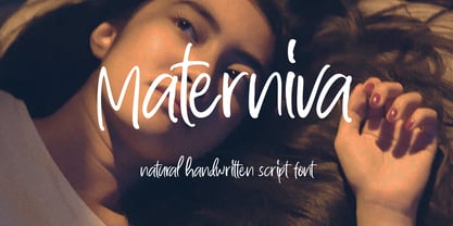 introducing, Materniva. a natural handwritten font with a feminine feel. this font is designed to fit your needs to a beautiful natural handwritten font. this font is perfect for branding, packaging, wedding invitation, logo, magazine, book, wedding card, etc. Features : uppercase & lowercase numbers and punctuation multilingual ligatures PUA encoded
 - Paulend by Balevgraph Studio,
$12.00 Paulend is a unique and elegant handwritten font. It looks beautiful on a variety of designs requiring a personalized style, such as wedding invitations, thank you cards, weddings, greeting cards, logos and so on. What's Included? Uppercase, Lowercase, Numerals & Punctuations Ligature, Alternate & Swashes Simple installations Multilingual support PUA encoded
 - Tomate - Unknown license

- Zamenhof by CastleType,
$59.00 Zamenhof is a family of five fonts that can be used singly or in combination to create a variety of bold, yet elegant, display styles. Inspired by Russian hand-lettering that appears to have been based on Jakob Erbar’s Phosphor, Zamenhof is essentially a Latin interpretation (with Cyrillic and Greek) of a Cyrillic interpretation of a Latin type design, with many changes along the way. (For example, all the Latin-only letters are quite different between the two designs: D, F, G, J, K, N, Q, R, S, U, V, W, Y, Z.) The Inline and Inverse styles of Zamenhof are the basic fonts and can be used effectively on their own. The Plain and Outline fonts — which I recommend using only in combination with the main designs — were created specifically to be combined with Inline and Inverse, as underlay and overlay layers, respectively. (You will need an application that supports layers, such as Adobe InDesign or Photoshop.) Zamenhof supports most European languages as well as modern Greek, and of course, Russian and other languages that use the Cyrillic alphabet. Needless to say, as Zamenhof is named after the father of Esperanto, it also supports Esperanto (as do all fonts from CastleType).
 - Peleguer by Tipo Pèpel,
$22.00 Peleguer typeface is the reinterpretation of the characters that the valencias goldsmiths Peleguer Manuel, father and son had opened and merged between 1779 and 1783 on behalf of the Royal Economic Society of Friends of the Land of Valencia “in order to create a Factory letters. Then during that time, reached 6 degrees of open letters (small pica, pica, gross pica, text, great primer and double pica). It appears that the letters never were done, and were themselves Manuel Peleguer who kept the punches and dies, leading to create a foundry-printing which only came out 5 or 6 books or documents for the single year of 1784 . One of these books, “Praise in the solemn funeral service …” made with the degree of “gross pica” samples were selected to take the characters for subsequent drawings on the following parameters for the unity and a contemporary look to the source: Keep the proportions of the original source (but unifying the shapes of the serifs, as these were different according to repose at baseline or in descending order). Match the counterforms and match the fallen traces from the cursive. En short, “catch” the formal essence of the source and following update current typographic design criteria to achieve a source with good legibility and subtle personality.
 - PF Bague Round Pro by Parachute,
$79.00 Bague Round is a soft contemporary geometric typeface which blends distinct minimalist characteristics with mainstream details. It originates from Bague Universal, a superfamily with a warm well-balanced texture and a distinct personality. Usually, round sans letterforms tend to look rather organic and playful at heavier weights. This problem was avoided in Bague Round by applying all necessary optical corrections at the rounded corners in order to retain its robust qualities. Mechanical replacement of the stem endings with standard arcs was not implemented and each round form of the horizontal, vertical and diagonal strokes was treated differently from the other. Whilst the rounded endings at heavier weights become gradually more flat at acute corners, the round stems in letters such as A, b, m, p, s are perfectly matched with sharp diagonals in letters such as M, N, w, v, in a very distinct manner. A remarkable feature of Bague Round is its vast array of uppercase alternates and ligatures which truly shine when set at display sizes. Make your selection from 6 distinct groups of alternates as well as a rich set of discretionary ligatures and watch it transform into a flexible, charming and stylish typeface with strong modern aesthetics. This typeface offers enormous possibilities and variations for editorial design, branding and corporate identity. The Bague Round type family includes 14 weights from Thin to Ultra Black and matching true-italics with a consistent and well-refined structure. Each style consists of 1017 glyphs with more that 280 alternates and ligatures and an extended set of characters which supports Latin, Cyrillic and Greek. PDF Specimen Bague Round on Behance
 - Camy by Scholtz Fonts,
$9.50 I wanted to create a "handwriting" font which could be used professionally. I have often needed such a font with a variety of weights and styles for a particular project and have had to resort to mixing fonts, creating a rather messy, amateur job. Camy is named for a little village in South West France where I did much of the initial work on this font. Camy is ideal for contemporary display work, comes in ten styles, and has a contemporary appeal with its casual, easy to read letters. Camy was designed as a total professional package for designers looking for a handwritten font suitable for all kinds of contemporary display work: the idea being that once you have the Camy Professional Pack you don't have to waste time searching for other handwritten fonts. The Family: LIGHT -- NARROW - light weight, condensed width, delicate line -- MEDIUM - light weight, delicate line -- WIDE - light weight, expanded width, delicate line NORMAL WEIGHT -- NARROW - of medium weight and condensed width - perfect for limited space -- MEDIUM - of medium weight -- WIDE - of medium weight and expanded width BLACK - for best readability -- NARROW - condensed width for bolder statements in small areas without losing legibility -- MEDIUM - for bolder statements -- WIDE - expanded width for bolder statements FAT -- WIDE - for maximum impact Use a combination of styles for product branding, book covers, invitations, greeting cards. The Camy combination works well for both headings and body text. Camy contains over 250 characters - (upper and lower case characters, punctuation, numerals, symbols and accented characters are present). It has all the accented characters used in the major European languages.
 - taller evolution - Personal use only


