10,000 search results
(0.07 seconds)
- Kyhota by Ingrimayne Type,
$14.95 The six typefaces of the Kyhota group all have an “Old West” look to them. KyhotaOne has very thick slab serifs compared to KyhotaTwo. KyhotaBarbed is more condensed than either and has little barbs on the verticals, something that was a feature of a number of nineteenth century typefaces in this style. KyhotaFezdaz is condensed, without barbs, and with the slab serifs replaced with a flare serif. KyhotaBigBottom and KyhotaBigTop play with the weighting of the serifs, with one (either top or bottom) very thin and the other very thick.
 - LazyMeow - Personal use only

- Tevegraphy - Personal use only

- Pinda - Personal use only

- Folk Solid - 100% free

- Hexenhammer by Hanoded,
$15.00 The ‘Hammer of Witches’, ‘Malleus Maleficarum’ or ‘Hexenhammer’ in German is the best know and most important treatise on witchcraft. It was composed by Heinrich Kramer in 1487. I thought it was a rather apt name for my latest fairytale font! Hexenhammer is a rough, handwritten typeface with an attitude. It can be used for book covers, posters and even spells. Comes with a bunch of end ligatures and a pandemonium of diacritics.
 - Baskerville No. 2 by Bitstream,
$29.99This redesign is made from proofs, rather than the metal, and so is heavier, with particular attention to the Harris and the Monotype revision, which was made from proofs of Baskerville’s Great Primer (16pt). - Mushmellow by Ingrimayne Type,
$10.95 An informal, rather bold typeface without serifs, Mushmellow looks like it might have been written with a marker pen. In addition to the plain and bold weights, it comes with outline and “cactus” variants.
 - Suicide - Unknown license

- Nerdish Hex by Ingrimayne Type,
$5.95 NerdishHex is a hexagonal distortion of NewNerdish that I thought was rather interesting.
 - Gator by Canada Type,
$24.95 Cooper Black's second coming to American design in the mid-sixties, after almost four decades of slumber, can arguably be credited with (or, depending on design ideology, blamed for) the domino effect that triggered the whole art nouveau pop poster jam of the 1960s and 1970s. By the early 1970s, though Cooper Black still held its popular status (and, for better or for worse, still does), countless so-called hippie and funk faces were competing for packaging and paper space. The American evolution of the genre would trip deeper into psychedelia, drawing on a rich history of flared, flourished and rounded design until it all dwindled and came to a halt a few years into the 1980s. But the European (particularly German) response to that whole display type trend remained for the most part cool and reserved, drawing more on traditional art nouveau and art deco sources rather than the bottomless jug of new ideas being poured on the other side of the pond. One of the humorous responses to the "hamburgering" of typography was Friedrich Poppl's Poppl Heavy, done in 1972, when Cooper Black was celebrating its 50th anniversary. It is presented here in a fresh digitization under the name Gator (a tongue-in-cheek reference to Ray Kroc, the father of the fast food chain). To borrow the title of a classic rock album, Gator is meaty, beaty, big and bouncy. It is one of the finest examples of how expressively animated a thick brush can be, and one of the better substitutes to the much overused Cooper Black. Gator comes in all popular font formats, and sports an extended character set covering the majority of Latin-based languages. Many alternates and ligatures are included in the font.
 - Erehwon Roman NF by Nick's Fonts,
$10.00This charming font, with its hints of the exotic, originally carried the rather prosaic name of Show Card Roman. It appeared in the book "Art Alphabets and Lettering: an encyclopedia of lettering including the most important standard alphabets and such classics as are in most demand for the use of engravers, designers, and all lovers of art" by the evidently rather verbose J. M. Bergling (1866-1933). As a nod to its exotic overtones, the font is named after the 1872 utopian novel of the same name by Samuel Butler. - Grand Rapids NF by Nick's Fonts,
$10.00This disarming beauty is based on a typeface named "Archer" from the 1905 specimen book from Barnhart Brothers & Spindler. The original was a rather light face; this beefed-up version highlights the face’s charming quirks quite nicely. Both versions of the font include 1252 Latin, 1250 CE (with localization for Romanian and Moldovan). - LHF Welo Thin by Letterhead Fonts,
$42.00 A classic Art Deco period style inspired by Samuel Welo, circa 1930. Letters are widely spaced to allow the subtle beauty of the letters to shine. Includes over 30 bonus alternates and two sets of small caps which are designed to be used at the cap height rather than sit on the baseline.
 - LP Harmonia by URW Type Foundry,
$35.99 LP Harmonia arose from its designer’s private life. As a type designer, Peter Langpeter was often asked by friends or relatives to write a greeting on a birthday card or create a good looking invitation. Over the years, he used ink and a soft feather to form his personal handwriting: LP Harmonia.
 - Katigert by Oleg Gert,
$20.00 Katigert – is a rather friendly italic with a touch of measured severity, combines very sharp angles and bold shapes. The font works best for display. The font includes extended Cyrillic and Latin alphabets, punctuation marks and currencies.
 - Grange Text by Device,
$39.00 Grange Text is optimised for smaller text sizes, having more open character shapes and spacing. Use the non-text version of Grange for larger sizes and headlines, which has tighter spacing and detailing. Grange is the Device interpretation of the classic “Grot” thick/thin sans style. Unlike the traditional models on which it is based, Grange takes a rational, consistent approach across wide range of weights and widths for contemporary use. The font includes alternative curved and straighter versions of key characters, most obviously the lower-case ‘g' and capital ‘R', allowing the font to take on either a sharper or warmer, more playful appearance. These can be toggled on or off using the ‘Alts' feature in Illustrator, or ‘Stylistc Sets’ in Indesign. Contains proportional, lining and tabular numerals.
 - Greztro by Yoga Letter,
$17.00 "Greztro" is a unique display font. This font is equipped with uppercase, lowercase, numerals, punctuation, and multilingual support. It is suitable for Cinco de Mayo, Father's Day, Halloween, Christmas, stickers, posters, banners, branding, and others.
 - Trump Deutsch by RMU,
$25.00 This rather modern versions of a Gothic style blackletter were originally drawn by Georg Trump in 1936 and 1937 respectively. To access all ligatures, I recommend to activate both OT features, standard and discretionary ligatures.
 - Bulkr by Hackberry Font Foundry,
$24.95 Over the years, I've used Impact a lot. But, not because I liked it—rather because it was the only font I could find with the bulk I needed for a given title or whatever. I finally decided to make my own. It was originally built off Librum Sans Bold, but I quickly made a mask of Impact for the widths, bumped the x-height way up, made the horizontals much heavier, and on and on. You know how it is when you start designing. The result is a black sans with the bulk of Impact and much more interesting character shapes. I suspect I'll use it a lot. My hope is that you like it as much as I do. Have fun!
 - Dream Glory by Ergibi Studio,
$19.00 INTRODUCING, Dream Glory, A Stylish Font Duo, these fonts are of two types serif and script. This typeface has been made carefully to make sure its premium quality and luxury feel. The ligatures on serif makes this typeface unique and stands out rather than the regular serif font, perfectly for headlines, logos, posters, packaging, T-shirts,coffee shops, restaurants, magazine's headers, signs or gift/post cards,cafe's and weddings or any type of advertising purpose. Best Regards Ergibi Studio
 - Dogfight by Tigade Std,
$8.00 Dogfight is a hand-crafted brush font which created from scratch by using a brush pen on a paper. It is not too sharp with sharp edges, but rather with a softer rounded shape. It is suitable as a display font for printed or digital products. Mainly as an advertisement or video production. It comes with Regular and Italic Multilingual characters AllCaps Ligatures Alternate characters
 - Jumbo Mumbo NF by Nick's Fonts,
$10.00This rather quirky typeface is based on a design by Collette and Dufour, originally called "Independant", for the Maison Plantin foundry of Belgium. Ultramodern (by 1930s standards, at least) and ultrabold, it takes up a lot of real estate, and commands a lot of attention while doing so. Both versions of this font include the complete Unicode Latin 1252 and Central European 1250 character sets. - Arzachel by CAST,
$45.00 Arzachel is a humanistic sanserif with a big x-height and a specific organic look. Its design is scientifically sharp and efficient in small type sizes as well as rugged and dramatic in headlines. Arzachel’s essential feeling comes from several features: all the letters are slightly sloped, stem terminations are flared at the top, and the terminals in letters a, c, e, f… are widening with the inside parts completely flat. The stroke contrast is low in the regular weight while it increases in the black; finally the capitals have an inscriptional flavor. Despite being a sanserif (thus a product of recent typography) Arzachel’s roots stretch back to the Renaissance tradition: Olocco took inspiration from some of the early and rather weird types cut in Venice in the 15th century. Arzachel was conceived during Olocco’s MA in Reading to provide a companion for his Zenon for use in small type sizes. But instead of expanding the Zenon family with optical sizes, the designer decided on a sans with its own personality rather than a sanserif version of Zenon with chopped-off serifs.
 - Tough Dude by Celebrity Fontz,
$24.99The Tough Dude font is a confident, devil-may-care, tough-guy font with attitude that screams "I don't need no stinkin' penmanship." It conveys a self-assuredness that does not preoccupy itself with trying to be necessarily legible or easy on the eyes but rather pragmatic, fast-flowing, and interested in scribbling the message out fast and moving on to the next task. We're confident you will enjoy it. - Antique Typewriter JNL by Jeff Levine,
$29.00 “Victoria Underwood” was found within the pages of the 1923 American Type Founders specimen book. It was one of many printing fonts faithfully replicating those used on various makes and models of actual typewriters. The purpose of such type was to allow mass production of letters or notices that could appear personalized rather than shop printed. Antique Typewriter JNL is the digital version of this design, and is available in both regular and oblique versions.
 - Deliscript by Alphabet Soup,
$29.00 Although initially inspired by the neon sign in front of Canter’s Delicatessen in Los Angeles, the design of Deliscript Upright and Deliscript Slant soon took on a life of its own–and its own distinctive look. Like its sibling Metroscript, Deliscript has many features that expand its usability such as the the variable length tails which can be accessed in 6 different styles, and the never before seen crossbars which can be extended outward in either direction from the lower case “t”. Throw in the special “WordLogos”, tons of ligatures and foreign accented characters, and you have a recipe for typesetting that approaches the look of hand-lettering. For a better understanding of its unique features please download The Deliscript User Manual—available in the Gallery section.
 - Kubera Serif by Gunjan,
$42.00 Kubera was designed to be a display and text face. It has six weights with same height. Kubera Serif is modernized letterform. It has square serif, high contrast stress, with large x height. Serifs are given soft corners, rather than pointy ones. Kubera Serif font family is designed by Gunjan Panchal based in India.
 - Fearsome by Hanoded,
$10.00 I watched the movie Red Dragon a while ago and it inspired me to make this rather spooky font. I was going to call it Dolarhyde (after the antagonist), but settled on the more unsettling Fearsome. Fearsome is a handmade script font with a ‘psychopath’ feel to it. Comes with a gruesome amount of diacritics.
 - Toyprint JNL by Jeff Levine,
$29.00Toyprint JNL is based on scanned print samples of a toy rubber stamp set imported from Japan circa the 1930s. No kerning and a very limited character set, but fun and nostalgic nonetheless. NOTE: Large size rendering of the type will give the appearance of cut paper rather than rubber stamp impressions due to the nature of the scans for this font. - Ardalos by Dhan Studio,
$19.99 Ardalos is a modern brush font, a contemporary approach to design, rather having a slight texture on the edges of the letters and this font also has an underline that makes your design more attractive. Suitable for use in title designs such as clothing, invitations, booklets, stationery designs, quotes, branding, logos, greeting cards, t-shirts, packaging designs, posters and more.
 - FS Rosa by Monotype,
$52.99 FS Rosa is a free-spirited and optimistic serif typeface – reminiscent of those used on fanzines, film sequences and book covers of the 1970s, such as Cooper and Windsor, it has a laid-back nature with a touch of rebellion. It also reminds of type used in colourful protest graphics by nun-turned-designer Corita Kent, and its personality is akin with brands like Whole Foods - positive rather than preachy. While unconventional, it’s sensible enough to work perfectly for socially conscious brands, magazines, websites and campaigns that want a fairer and more responsible world. Hand-drawn digitally, FS Rosa is warm and open-minded – its irregular letterforms are rounded, with soft terminals, a large x-height and wide apertures. But it is also quirky and eclectic, with irregular shapes – its short ascenders and descenders have slanted serifs, its uppercase forms have unusually low crossbars and the letters are filled with oddities and surprises. The typeface looks to stand out against a sea of homogenous, geometric sans serifs, and celebrates beauty through imperfection. It comes in five weights of Thin, Light, Regular, Bold and Black. The heavier weights make an impact and are great for loud, headline statements. The Regular weight is functional, balanced and robust for text, and the lighter weights have an elegance and contemporary beauty. FS Rosa is eclectic yet with its soft roundness, also positive and progressive. Its name, inspired by the phrase “rose-tinted glasses”, reflects its optimism.
 - All Is Quiet by Kitchen Table Type Foundry,
$15.00 The year 2022 went and 2023 came. I can honestly say that last year was a horrible year and I am happy it ended a couple of days ago. The first week after New Year’s Eve always fills my head with the U2 song ‘New Year’s Day’ - so I named this font after a line from the lyrics. I also happened to watch a fantastic movie called ‘Im Westen Nights Neues’, directed by Edward Berger, but based on a book by Erich Maria Remarque, which, in English, was published as ‘All Quiet On The Western Front’. So there you have it: naming a font in 2 easy steps! ;-) All Is Quiet is a lovely brush font, which I created using my father in law’s Chinese pencil and ink. I can suggest some uses here, but I am convinced you can come up with that yourself.
 - CA Slalom Condensed by Cape Arcona Type Foundry,
$40.00 The starting point for CA Slalom was the aspiration to create a contemporary interpretation of classics like Gill and Antique Olive in terms of aesthetics, flexibility and usefulness. The outstanding S soon became the visual hook and starting from the extra bold extended weight, CA Slalom evolved into a huge family with four widths. It’s rather round instead of squarely with stroke-ends pulled deep and a relatively low x-height. This gives CA Slalom a taste of its own, and although it is clearly contemporary, it has the potential to become a classic.
 - CA Slalom Extended by Cape Arcona Type Foundry,
$40.00 The starting point for CA Slalom was the aspiration to create a contemporary interpretation of classics like Gill and Antique Olive in terms of aesthetics, flexibility and usefulness. The outstanding S soon became the visual hook and starting from the extra bold extended weight, CA Slalom evolved into a huge family with four widths. It’s rather round instead of squarely with stroke-ends pulled deep and a relatively low x-height. This gives CA Slalom a taste of its own, and although it is clearly contemporary, it has the potential to become a classic.
 - CA Slalom by Cape Arcona Type Foundry,
$40.00 The starting point for CA Slalom was the aspiration to create a contemporary interpretation of classics like Gill and Antique Olive in terms of aesthetics, flexibility and usefulness. The outstanding S soon became the visual hook and starting from the extra bold extended weight, CA Slalom evolved into a huge family with four widths. It’s rather round instead of squarely with stroke-ends pulled deep and a relatively low x-height. This gives CA Slalom a taste of its own, and although it is clearly contemporary, it has the potential to become a classic.
 - CA Slalom Compressed by Cape Arcona Type Foundry,
$40.00 The starting point for CA Slalom was the aspiration to create a contemporary interpretation of classics like Gill and Antique Olive in terms of aesthetics, flexibility and usefulness. The outstanding S soon became the visual hook and starting from the extra bold extended weight, CA Slalom evolved into a huge family with four widths. It’s rather round instead of squarely with stroke-ends pulled deep and a relatively low x-height. This gives CA Slalom a taste of its own, and although it is clearly contemporary, it has the potential to become a classic.
 - Klaf MF by Masterfont,
$59.00 Gentle feather strokes make this font an elegant companion for whatever need the traditional touch.
 - Summer Landscape by Selvia Design,
$15.00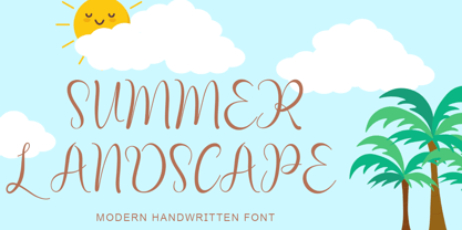 "Summer Landscape" is a beautiful and unique handwritten font. This font is equipped with uppercase, lowercase, numerals, punctuation, signatures, and multilingual support. It is suitable for summer, holidays, vacations, traveling, Father's Day, graduation, the 4th of July, and others.
 - Order Form JNL by Jeff Levine,
$29.00 In the MacKellar, Smiths & Jordan type specimen book of 1892 are examples of Lining Gothic Extended, a wide sans serif typeface. A lining font has the numerals aligned with the capital letter height, rather than following the “Old Style” method of smaller figures that could also descend below the baseline. Order Form JNL is the digital version of this design, and is available in both regular and oblique versions.


