10,000 search results
(0.06 seconds)
- Teen Years JNL by Jeff Levine,
$29.00 Teen Years JNL was inspired by the hand lettered name for the Joyce Records label (circa 1956) which first recorded the New York doo-wop group The Crests (of “16 Candles” fame). The type design is a block sans serif, and is available in both regular and oblique versions.
 - Leon by Hafontia,
$99.00 Leon is a modern wide sans serif type family in Hebrew and Latin. It comes in four styles to match any design need - Headers in Black or Thin to long text in regular and Bold. Includes full Hebrew support including punctuation. Designed in Tel Aviv by Ben Nathan, 2021.
 - Harvey by ITC,
$29.99Harvey is a work of American graphic designer Dale R. Kramer. It is an all capital sans serif typeface which features a distinctive, light-hearted look and includes both conventional and unusual letter forms. Alternate letters give Harvey even more flexibility, making it a great typeface for any headline. - Social Club JNL by Jeff Levine,
$29.00 The movie poster for the 1934 comedy/crime drama “Jimmy the Gent” (starring James Cagney) featured the title hand lettered in an ultra-bold Art Deco sans serif style. This type design has been turned into Social Club JNL, and is available in both regular and oblique versions.
 - Cairoline by Muksal Creatives,
$17.00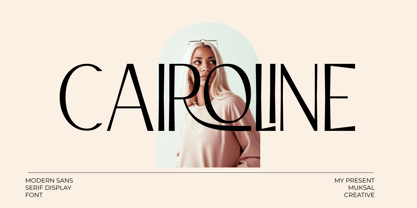 Caroline Modern Display sans serif Font, special glyphs, ornament and multilingual support. It's a very versatile font that works great in large and small sizes. Perfect for editorial projects, Logo design, Clothing Branding, product packaging, magazine headers, or simply as a stylish text overlay to any background image.
 - Enviro by ITC,
$29.00Enviro is the work of American graphic designer F. Scott Garland. A lighthearted sans serif, Enviro evokes the style of the movie industry from the 1920s and 30s. Some forms are mildly abstract, but they remain legible nonetheless. Enviro attracts attention and gives any headline a unique look. - Arbordale by Aerotype,
$49.00 OpenType users benefit from an array of alternate glyphs for lowercase characters including non-connecting contextual alternates for word endings. Other features include crossbar ligatures for common letter pairings, case-sensitive quotes and smart apostrophes. Arbordale Pro extends the character set to support Eastern European and Baltic languages.
 - Refanea by Muksal Creatives,
$15.00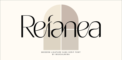 Rafanea Modern ligature sans serif font, special glyphs, ornament and multilingual support. It's a very versatile font that works great in large and small sizes. Perfect for editorial projects, Logo design, Clothing Branding, product packaging, magazine headers, or simply as a stylish text overlay to any background image.
 - Commentary JNL by Jeff Levine,
$29.00Commentary JNL is a serif treatment of Jeff Levine's popular Stylor JNL sans serif font. Offered in two weights—regular and light—Commentary is a perfect alternative to formal text fonts and has just a touch of hand-made design to make for a more casual reading experience. - Donau by Renzler Design,
$12.00 The font Donau is named after the german name for the river Danube. It is an art nouveau inspired sans and slab serif typeface, sharing proportions and widths across two weights. It is intended for any kind of display use as well as short amounts of text. Enjoy!
 - Hiylard by Muksal Creatives,
$16.00 Hiylard Modern Display sans serif Font, special glyphs, ornament and multilingual support. It's a very versatile font that works great in large and small sizes. Perfect for editorial projects, Logo design, Clothing Branding, product packaging, magazine headers, or simply as a stylish text overlay to any background image.
 - April Blossom by Angele Kamp,
$22.00 April Blossom is a sweet, brush font with a playful character. This fun will look gorgeous on all your branding materials, cards, quotes, and any other lovely projects you are working on.
 - Dark Garden - 100% free

- Merciful by Create Big Supply,
$17.00 Introducing Merciful, a charming and playful sans serif font that brings a touch of fun and uniqueness to your designs. With its cute and lively style, Merciful adds a playful and vibrant element to any project. Whether you're designing greeting cards, children's books, party invitations, or any other creative work, Merciful is sure to capture attention and spread joy. This font features both uppercase and lowercase letters, making it versatile for various design purposes. It also includes numbers and punctuations, allowing you to create engaging typography and eye-catching headlines. Merciful supports multilingual characters, enabling you to express your creativity in different languages. With the added convenience of PUA encoding, accessing all the font's glyphs and swashes is effortless. You can unlock a world of creative possibilities by exploring the various ligatures and alternate characters available in Merciful.
 - Elpy by Wordshape,
$25.00 Elpy is a friendly rounded sans serif workhorse family inspired by all things music! Spanning 22 Condensed and Regular weights with true italics, Elpy will fit right in with your record collection and your font collection! The Elpy family includes language support for Western and Eastern European languages, Greek and Cyrillic. Ian Lynam dreamt up Elpy one day when he visited a record pressing plant outside Tokyo, watching vinyl pellets being melted down and a fresh batch of 7-inch records get pressed. Despite the smell, a seed was planted that would be extruded into Elpy's rounded forms half a year later... Elpy Light and Regular function as highly readable text typefaces, while the bolder and lighter weights are perfect for display work. Elpy's rounded terminals make the family perfect for screen-based work, as well as for print conditions of any resolution—from offset to Risograph.
 - Monologue Rounded by Halfmoon Type,
$20.00 INTRODUCING MONOLOGUE ROUNDED! A softer, more humane, and funnier version of MONOLGUE. MONOLOGUE itself is a simple, condensed sans serif font with bold and complex personality. It was purposely crafted to be used in large point sizes, although it doesn't lose it's magic in small point sizes. With this rounded version, you can be even more expressive in your design projects. FEATURES: Basic latin characters, numerals, punctuations and symbols. Extensive language support, including slavic languages with cyrillic alphabet. Stylistic Alternates Stylistic Sets (ss01–ss06) 100+ Discretionary Ligatures Ordinals Preconstructed fractions Fractions Superscript and Superscript Numerals Kerned, spaced, and hinted If you have any questions, please don't hesitate to contact me via email at muhtadi.yusril@gmail.com. Check out my other works, such as font design, lettering, and type exploration on Instagram @yusril.muhtadi (https://www.instagram.com/yusril.muhtadi) Thank you for visiting and have a great, great day! Yusril Muhtadi
 - CA Spy Royal by Cape Arcona Type Foundry,
$19.00 Spy Royal is a junctionless script typeface and comes in 6 styles. It’s a hybrid between script and so called streamline fonts. The origins are based on an advertising by Japan Airlines, dated around 1954, offering flights to San Francisco, Honolulu and Okinawa in the new DC-6B “Pacific Courier” airplane. Only the letters for the words “JAPAN AIR LINES” were used, so that the creative part was to reimagine a full font out of just a handful of uppercase letters. Originally released in 2004, Spy Royal was now undergoing a major rework and is now republished with additional styles like shadow-lines and 3D-shadow. Its charm is manifold, we think everything related to cars, racing, hot rod, vintage, cocktails, retro, restaurants, gasoline and of course airlines will look great in Spy Royal. Spy Royal includes alternate characters, ligatures and West European diacritics.
 - Dungeon by Red Rooster Collection,
$45.00 Dungeon is a glyphic font family that combines elements of both sans serif and spur serif typefaces. It was designed exclusively for the Red Rooster Collection in 1998 by Steve Jackaman (ITF). The family is loosely based on Dick Jensen’s famous design “Serpentine,” which was created for the Visual Graphics Corporation (VGC) in 1972. Dungeon is available in four weights, each of which is optimized for legibility at any size. The family’s masculine feel has helped it to turn up in a variety of projects, ranging from brand identity to advertising.
 - Shell Shock by Characters Font Foundry,
$17.50 Shell Shock was inspired by stencil typefaces used on military tanks and ammunition boxes. It can be enhanced with a separate set of bombs and warning signs for the typographer in power. Shell Shock Cloak is the ultimate add-on for Shell Shock. This 3-layered 'Cloaking Device' enhances the existing Shell Shock. Put the 3 Cloak layers on top of Shell Shock and suddenly it's camouflaged and you will hardly be able to find it. Use only one extra Cloak layer to give Shell Shock that cool distorted look, like those damaged warsigns on military vehicles. If you only use the Cloak layers you can create background patterns and structures. Try using different color combinations and you'll be surprised by the possibilities of Shell Shock Cloak. It's preferably seen on clothing, skateboards, party flyers, posters or other daring design.
 - Novera by René Bieder,
$29.00 The Novera family is a sharp geometric sans in ten weights plus matching italics, available in two versions – Modern and Classic. It has a contemporary, approachable and multifunctional yet characteristic design, that comes with an extensive glyphs set of 1000+ glyphs per font, meeting all typographic demands. The Design Vertical terminals, circular shapes and angular apexes – Novera truely breathes geometry! But the concept goes beyond the application of rational geometry. The intension was to create a highly legible family suitable for every day usage inspired by the work of Paul Renner, Eric Gill or Jakob Erbar, combining the geometric with the human and the functional with the unconventional. Although Novera is inspired by the past, its appearance is unmistakingly modern. Modern vs Classic Novera is available in two versions - Modern and Classic - born from the same source file but with different characters set as default. This creates subtle but effective distinctions such as the double-storey a (Novera Modern) which is optimized for legibility in longer text paragraphs, as opposed to the single-storey a (Novera Classic) which allows a purely geometric appearance. Another distinguishing feature are the ascenders on Novera Mondern, which extend above the cap height for an elegant presence, compared to the ascenders on Novera Classic, ending at the cap height, for a compact and helvetica-flavored look. Novera Modern was intended for usage in body copy, whereas Novera Classic was planned for headlines, short paragraphs or logos, but both versions can be used vice versa too, of course. Alternate Characters To maintain neutrality and a modern appearance, the standard character set largely dispenses with idiosyncratic forms. This is in contrast to the alternative forms with the gill-like lowercase letters g and t as well as a traditional shape of S and the German ligature t/z, which traces back to old German spellings. Also inspired by German poster designs from the early 20th century are the elongated i-dots and dieresis-dots that can create eye-catchers in headlines or logos. By the way, both versions, Novera Modern and Classic, can be created via stylistic set 1, 17 and 18. Opentype Features and Symbols The family comes with many opentype features to support modern typesetting. This includes ligatures, different number sets or alternative shapes for texts set in all caps. If you like arrows and other shapes, you will love Novera! The family has a built-in extensive symbols-set including 48 different arrows and various geometric shapes or icons. Weights With its 40 styles and 1000+ glyphs per font, the Novera family covers all thinkable design scenarios from branding to web, app or editorial usage. It blends in perfectly in text heavy paragraphs with its mid-weights like Light, Regular, Medium or Bold or stands out like a monument in headlines and posters with its extreme weights like Thin, ExtraLight, Black or Ultra. Testfonts If you like to test the fonts before buying the full version, please follow the link below. Please note, all test fonts are available for evaluation purposes only and contain a limited character set! A commercial license for the full version must be purchased separately. Please send a mail to contact@renebieder.com for more information. Download the test fonts here: https://www.renebieder.com/test-fonts
 - Doric by Linotype,
$29.99Originally released by the Stephenson Blake foundry in England, Doric is modeled on one of the sans serifs of William Caslon IV, who was the first to interpret sans serif letterforms into a typeface (1816). Doric Bold has large, heavy capitals with uniform letter widths. It is often used for classified advertising in newspapers because these qualities coupled with a large x-height allow greater legibility at small point sizes. - Hickory by FontMesa,
$25.00Hickory is the revival of an old unnamed font dating back to 1852 and was sold through a few different type foundries including Bruce, MacKellar Smiths & Jordan and James Conner's Sons. By the year 1900 this font disappeared from the major type foundries, now with the digital age of type we're proud to revive this old classic font that hasn't been used in over one hundred years. The original font was only available as an uppercase with punctuation and an ampersand. Today the character set has been updated to include a new lowercase, numbers and accented characters for Eastern, Central and Western European countries. Three fill fonts have been created for the Hickory font making it easier for you to add different colors, textures and patterns to the letters. You will need an application that works in layers such as Adobe Photoshop or Illustrator in order to use the fill fonts, some fill fonts may look good as a stand alone font, the Hickory fill fonts however do not look good used apart from the Hickory main font. I hope you enjoy this old font as much as I did making it. - The Glory by FunType,
$14.00 The Glory is a sans serif font designed by Funtype in 2023. The Glory is made to fit for various reading purposes. The Glory is fit for non-industrial themes, yet it can also be used for various designed needs.
 - ITC New Esprit by ITC,
$29.99Originally drawn in 1985, Jovica Veljović had intended to add a few kerning pairs and make some minor refinements to the letterforms. However, his work lead him to take a fresh look at the family. Veljović recalls, … I soon realized that some characters could benefit by more refined shapes and proportions. By the time I was done, I had worked on just about every character in the original design." In fact the end result is two systems: one optimized for extended texts; the other for display settings. The original elegance of the design is not lost, but the new design brings with it letterforms that are altogether more harmonious and balanced. The roman is dynamic and spirited, just oozing character. The italic by contrast is a little more restrained, but nonetheless an elegant and fitting accompaniment. The text-optimized fonts come with a generous x-height, and slightly less contrast; though its marginally wider proportions let in the light, making it very legible even at small sizes. ITC New Esprit ® is a versatile family, brought to you in four weights from regular to black. OpenType features like small caps, alternates, and a broad character set make this a welcome addition to everyone's font library. Whether you want elegant and legible text, or dynamic and personable headlines, then you'll want to click through to see more of ITC New Esprit. " - AE Prosperity by Altered Ego,
$50.00 Well suited for headlines, packaging and display applications, AE Prosperity will be a robust and versatile addition to your script library. It’s purposefully designed to infer the visual connections of letters for a hand-lettered feel. Some characters will connect, and others will guide your eye to the next letter from, making it highly legible. In 1779, the schooner Prosperity sailed the high seas. Commissioned by a young continental congress, with 6 guns & at twenty tons, she sailed under a Letter of Marque for patriotism and profit. Look lively, because with contextual and alternate glyph sets (contextual glyphs, alternate lower case glyphs and an extended set of alternate capitals), this robust typeface is as inspiring as her namesake and adapts to whatever winds may blow. Prosperity is designed as a free-flowing script, for a spontaneous and historic aesthetic. Contextual glyphs include variations on tt (short and longbar), t longbar, ll, cc and other characters. Contextual features change ascender heights and descender styles. Alternate glyphs (set 1) include variations on b,d,f,g,h,l,o,p,r,s,t,y. Alternate capitals (set 2) include a complete set of alternate upper case letters. Most useful with Adobe® InDesign®, multiple variations of letter combinations can be achieved by selecting Contextual glyphs, and/or set 1 and set 2 from the Character Palette: OpenType: Stylistic Sets menu. Alternate glyphs and contextual characters will be available based on the OpenType support of your application. AE Prosperity™ is available exclusively in OpenType format.
 - But by Nicole Fally,
$40.00 Bold, black and square. But was first drawn as a logotype for the magazine "BUT – Bilder und Texte" (pictures and texts) which was published by an experimentally-oriented non-commercial initiative. In consideration of the unusual dimensions of the magazine (6 x 14 cm / 2,4 x 5,5 inch), I decided to fill as much space as possible with the body of type. This formal idea refers to the meaning of the title by blurring the border between legible letters and abstract shapes. Because of its origin, But is ideal for short messages in headline point size. Despite its blocky shapes, But creates a friendly atmosphere. The details are as playful as the restrictions that are given by the concept allow them to be. Punctuation marks and other special characters contrast the boldness of the design since they are matching the thin parts of upper- and lowercase letters. This also avoids gaps when longer texts are set. But is available in open type format and has an extended character set (Latin extended A). Two sets of numerals, one matching the x-height and another one matching the cap-height, are provided.
 - Fontella by Canada Type,
$24.95 Italian type design master Aldo Novarese was not famous for making calligraphic designs, nor had he any interest in them. He is much better known for his text faces, and quite innovative sans serif and decorative designs which became the definition of what we now know as techno and modern. But in 1968, Novarese surprised everyone with a fantastic flowing deco script entitled Elite. Novarese's formula of simple soft curves and toned-down swashes makes for one of the most unique alphabets ever seen, not to mention one of the best flowing and most legible scripts. This is now its digital incarnation, named Fontella. Fontella's applications are virtually limitless. This is the sort of script that can feel at home pretty much anywhere; a sign, a fridge magnet, a bumper sticker, a greeting card, a movie poster, a book cover, music artwork, magazine ads, newsletter headlines, etc. Digitized from original specimen and expanded with a few built-in alternates and ligatures by Rebecca Alaccari, the font was named after the famed jazz singer Fontella Bass. These letters are just so sweet they had to be called Fontella.
 - Hollyhock by Angie Makes,
$32.00 Meet Hollyhock, a modern and messy calligraphy font with wild, tall letterforms that refuse to be tamed. Inspired by calligraphy the breaks the rules and hollyhocks that grow rebelliously where they please. This font includes two full sets of capital letters… a set that is tall, energetic, and wild as well as a set a bit more tame and subdued. Open type features in this font include contextual alternates, fractions, ordinals, discretionary ligatures, and swashes. Use contextual alternates to add subtle swashes to the beginnings and ends of your letters. Use your open type swashes panel to use the many and various doodles, swirls, and swashes to manually add flare and flavor to your text. Or, install the separate Hollyhock Ornaments font to access the swashes and doodles more easily. Most Diacritics included for various language support. Message me if there’s one you're not sure is included. This font works best in OpenType aware software (ie. Adobe Applications) so that you can take advantage of its many features. Comes as two .otf (OpenType font) files. See this tutorial for more on how to add the various swashes and doodles to this font! http://angiemakes.com/add-swashes-fonts-photoshop/
 - Fair Play JNL by Jeff Levine,
$29.00 Inspired by hand lettering on a 1939 World’s Fair Poster, Fair Play JNL is a bold, condensed design with spurred serifs and some flared characters… and is available in both regular and oblique versions.
 - M Young HK by Monotype HK,
$523.99 M Young is a humanistic script design characterised by its modern, lively and youngster-like style. M Young incorporates features of the writings of felt-tip writing pen, its entry and finial points of strokes are rounded, parallel without flare. Contrast is low and the text is visible and eye-catching. It is best suited for casual and lively text, illustrations, set upright (non-slanted), non-condensed.
 - Meticula by KushJain,
$- Meticula is a sans-serif font family meticulously crafted with geometric shapes and inspired by modern sans typefaces. Comes with 8 uprights and an outline font with italic counterparts. It’s aesthetic, minimal design and diverse font styles cater to all kinds of typography and graphic design work. Supports major Latin based languages, advanced open type features, full set of ligatures, punctuation and major currency symbols.
 - M Young PRC by Monotype HK,
$523.99 M Young is a humanistic script design characterised by its modern, lively and youngster-like style. M Young incorporates features of the writings of felt-tip writing pen, its entry and finial points of strokes are rounded, parallel without flare. Contrast is low and the text is visible and eye-catching. It is best suited for casual and lively text, illustrations, set upright (non-slanted), non-condensed.
 - Nektar by More Etc,
$18.00 Nektar is a soft & smooth sans serif typeface with spirit, personality and distinction. This bold, semi-condensed and human sans serif is inspired by the "perfect imperfection" of old prints. The typeface is lively and eye-catching, ideal for where and when you want to make a positive and human impression. The font has over 650 glyphs. It has Multilingual support (including Cyrillic script).
 - Benn Beckman by Factory738,
$15.00 Beckman is a modern and minimalist sans-serif font family. The combination of minimal and geometric elements renders a modern design. Beckman includes 6 fonts, clean and modern caps, thereby creating more variability. This is irreproachable sans serif to diversify your headlines, branding visual identity, poster, logo, magazines and etc. Six weights Alternate glyphs Latin alphabets Thanks for looking, and I hope you enjoy it.
 - Linoma by FlehaType,
$21.99 Linoma is a handmade font duo consisting of a sans and a stencil version. Its rough and textured appearance derives from the linocutting technique. Use Linoma Stencil as headline or display font and Linoma Sans when you need text settings in smaller sizes. Linoma is suitable for packaging, books, magazines, products and branding projects. It supports most of Central European and Easter European languages.
 - Bastia by Jen Wagner Co.,
$17.00 Bastia is a classy, bold upper and lowercase typeface that looks incredible in both large and small settings. Best used as a display for headings and logos, Bastia's clean lines and smooth curves give any project an extra touch of class. See how it looks when used for body text in the 11th sample image above. I also love combining Bastia and clean sans serifs for minimal logos (see the "Lucky Finch" sample logo). This download also includes a special outline version of the serif, so you can layer text or add some flair to your logos and display type. There are also alternates available for "k" and "s" that give each letter some extra curves (available via the special characters panel One thing to note about Bastia is the letter spacing. It was intentionally spaced for clean reading if you wanted to use it for body type, so I recommend setting the spacing a little tighter for display use (around -10 to -20 should do!). Includes: Bastia Bold (uppercase & lowercase) Bastia Bold Outline (uppercase & lowercase) Numbers & punctuation Foreign language support Alternates for "k" and "s" – available via the special characters panel
 - LHF Asylum by Letterhead Fonts,
$43.00 A ragged jagged experiment that's sure to fit the needs of any mad scientist or extreme skier dude (you know the type). Features two sets of variations: one set on the uppercase keys and a different set on the lowercase keys. Mix and match them for best effect. No twisted or mangled points in this font. All paths guaranteed technically sound.
 - LetterTrain by Ingrimayne Type,
$14.95 This set of four fonts, organized as a font family, consists of toy train cars with letters on them. Upper and lower cases have different typefaces on them, so there are eight different type styles available. Some of the letters on the cars are from Salloon, TiredOfCourier, Glitzy, Qwatick, and PhederFrack. To add variety using more cars without letters, use the XLaserTrain font.
 - Action Hero by Wing's Art Studio,
$10.00 Action Hero - A grungy, textured brush font for action packed movie posters and titles. Action Hero is a hand-drawn brush font inspired by action movie posters of the 1980s and 90s. Does your movie feature a hostage situation on a speeding bus or train? Try Action Hero. How about a one man army tasked with rescuing stranded POWs? Try Action Hero! Maybe a post-apocalyptic race across the desert, or did they dare to kill your favourite second cousin? Big mistake - Get Action Hero!!! The Action Hero font family collects four all-cap variants featuring a complete set of uppercase and lowercase characters, along with numerals, punctuation, language support and underlines. With so many creative options you'll never have to repeat characters (a personal bugbear with hand-drawn fonts) and achieve authentic hand-drawn looking title designs. Check out the visuals for ideas and tips on how to use this font on posters, movie titles, product packaging, broadcast and advertising. With countless creative options and a design that explodes off the screen, this is the last action hero font you'll ever need!
 - Contentor by erzaehlzeichen,
$15.00 Contentor is a display type originated in the habour and made for long journeys. Inspired by the industrial lettering on containers, hardcases and boxes, Contentor and Contentor Stencil are a condensed and bold typeface fit for any voyage.
