10,000 search results
(0.09 seconds)
- Grotica by Runsell Type,
$24.99 Grotica is a versatile geometric sans serif contains 7 weights from Thin to Bold. IIt's inspired by the beautiful logotype on old labels and by exploring the Retroica font we've created in 2020. This font is suitable for movies, TV, advertising, packaging, logos, posters, music, branding, posters and so on with a modern design style. With over 600 glyphs per style, Grotica supports around 150 languages in Latin and Cyrillic script. Grotica OpenType Features including alternate glyphs, fractions, contextual alternates, oldstyle and lining (proportional and tabular) numerals, numerators/denominators, superiors/inferiors, and a variety of symbols.
 - Avaline Script by Kimmy Design,
$20.00 Avaline is a super smart script font that was 100% handmade. Inspired by hand lettering doodles, the font family combines a mischievous spirit and cheerful style. Its playful letterforms come in Light, Regular, Bold and Sketch, and it comes with tons of language support and fun alternatives. Packed with OpenType features, Avaline comes together to make a truly authentic hand script family package. Its imperfect hand-drawn style is utilized by contextual alternatives – giving each character 3 subtle variations as well as special styles that appear automatically based on where they appear in a line of text. Stylistic alternatives offer completely different styles for all capital and some lowercase letters. Swashes provide numerous flourish options for ascending & descending letters as well as characters that start or end text lines. Small caps and titling alternatives provide great secondary text options, converting the script letterforms to more proportional small cap ones. Avaline also comes with a massive set of extras, including catchwords, swashes & flourishes, arrows, borders, line breaks, laurels and frames. Together they make for a truly organic script font bundle. Avaline seriously comes with hundreds of alternative options, to see everything you can do with the family and to learn how to access them, please visit http://tinyurl.com/htwhetr
 - Robecha Daniera by Ronny Studio,
$19.00 Robecha Daniera is a luxurious and elegant Serif font. This font is impressive and features a clean and elegant font, professionally shaped, and as a result, it will easily match a variety of creations that require a different touch. Add it with confidence to your projects, and you'll love the results. This typeface is perfect for elegant logos, branding, travel promotions, layout magazines, beauty products, product packaging, quotes, or simply as a stylish text overlay onto any background image. Robecha Daniera Features: - Uppercase - Lowercase - Numbers & Punctuation - Alternate - Ligature - Multilingual Support - Simple installation All features and special characters of this font are included in one file. So that it is easily accessible by using a program or software that supports opentype such as Adobe Illustrator, Adobe Photoshop, and Adobe Indesign). This font is also very easy to use as it is compatible for all supported software even for non-opentype. Please comment us if you have any questions Thank you and have a nice day. Thank You
 - XXII Geom Slab by Doubletwo Studios,
$- XXII GeomSlab are the additional slab-serif styles to the geometric sans-serif XXII Geom. XXII Geom and XXII Geom Slab are modern geometric type systems designed with focus on functionality & legibility and with an eye on the old masters. Their well balanced low contrast letter shapes come with a tall x-height. With its range of Opentype features it is designed to fulfill the needs your content deserves (Smallcaps, Case Sensitives, Ligatures…) as well as serving your individual taste (Stylistic alternates & Sets). More information on Behance.
 - Ordinary Boys by Putracetol,
$26.00 Ordinary Boys - Elegant Font Duo is a delightful and versatile font combination that consists of a modern sans-serif font and a playful handwriting font. With a perfect blend of modern elegance and fun, this font duo offers creative possibilities for various design themes. The sans-serif font exudes sophistication and is ideal for modern and elegant projects, while the handwriting font adds a playful and enjoyable touch, perfect for fun and lighthearted designs. Whether you're creating logos, headlines, titles, invitations, greeting cards, printing materials, or designs for children, Ordinary Boys will bring charm and character to your projects. The modern and playful style of Ordinary Boys is what sets it apart. The sans-serif font showcases clean lines and a sleek design, conveying a sense of elegance and professionalism. On the other hand, the handwriting font injects a fun and whimsical vibe, adding a touch of enjoyment and personality to your text. The versatility of this font duo allows you to seamlessly switch between elegant and playful designs, making it suitable for a wide range of projects. Ordinary Boys - Elegant Font Duo brings the best of both worlds to your design projects. Its unique combination of modern elegance and playful fun allows you to create a diverse range of designs, catering to different themes and styles. Whether you're designing for sophisticated brands or playful children's themes, Ordinary Boys will elevate your designs with its charming and delightful touch, making your projects truly stand out with its versatility and character.
 - Nouveau Theme JNL by Jeff Levine,
$29.00 As long as there’s been movie theaters, those establishments became the perfect hideaway for couples who wanted to kiss, hug and snuggle without the watchful eyes of disapproving parents or the pesky attention of younger siblings. Such was evident in the [13 word] title of the 1919 composition “Take Your Girlie to the Movies (If You Can’t Make Love at Home)”. On the sheet music for this song, it is hand lettered in the Art Nouveau fashion of the time by a round nib pen, and made a perfect candidate to be redrawn as a digital typeface. The end result is Nouveau Theme JNL, which is available in both regular and oblique versions.
 - Hogar by Latinotype,
$39.00 This font is the result of merging my architecture background and my love for typography, which inspired me to create a system of fonts based on interior architecture design, furniture design and, especially, the love I feel for my home. The system comes with a monolinear style in sans and script versions, each including 5 weights, that share similar proportions, weight interpolation and details. Hogar is basically a sans with script gestures and a script with sans shapes. In order to make the system more complete, I included an italic version, also in 5 weights, which represents a transition between both main styles. Additionally, I developed a set of monolinear dingbats including some furniture designs by well-known architects.. The family supports more than 200 Latin derived languages.
 - Sandstone by Cititype,
$16.00 'Sandstone' is a signature font. This font deserves to be used as a signature font collection because a natural type signature like this one is very unique and is perfect for modern branding. Perfectly used on website logos, electronic signatures, portfolios and prints for clothes, crafts and other media. The constant, flat strokes of the letters symbolized assertiveness, plus an 'end-swash' to add a sense of absolute and confident judgment. This font is equipped with ligatures to add a natural feel and supports multiple languages
 - Youth Hidalea by Jinan Studio,
$10.00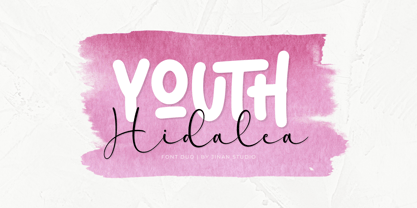 Youth Hidalea! is a fantastic font duo (sans serif & script), offering a modernity, playful, and artistic flair. Suitable for your design project needs, such as; logotype, wedding, packaging, social media posts, quotes, overlays on images, posters, and more. Features Uppercase and lowercase glyphs Number, symbol, punctuation, and multilingual support Some alternates and ligatures Thank you for buying and using this font for your projects. Enjoy this font and happy creating! Jinan Studio
 - Jingle by Supfonts,
$15.00 This font was inspired by the game with different signature styles! The result is a light and nice, mono linear font that looks completely handdrawn. Jingle will look beautiful on Christmas and holiday invitations, wedding invites and stationery, logos, and more. I love using it for emphasis words and pairing it with sans serifs Includes: - Ligatures - Uppercase and lowercase - Numbers and punctuation - Foreign language support Check out my blog: - www.instagram.com/dmitriychirkov - pinterest.com/dmitriychirkov7
 - 99 Names of ALLAH Random by Islamic Calligraphy75,
$12.00 We have transformed the “99 names of ALLAH” into a font. That means each key on your keyboard represents 1 of the 99 names of ALLAH Aaza Wajal. The fonts work with both the English and Arabic Keyboards. We call this Calligraphy "Random" because we don't follow any one principle to write the names, some overlap some don't, some letters are big and some are small. All the letters, harakat, decorative letters and symbols may differ from one name to another.(in the zip file you will find a pdf file explaining the differences in the "harakat", pronunciation and spelling according to the Holy Quran). Decorative symbols are at a minimum. Decorative letters used in this calligraphy: "Mim, Aain, Sin, HHe, He, Kaf". Purpose & use: - Writers: Highlight the names in your texts in beautiful Islamic calligraphy. - Editors: Use with kinetic typography templates (AE) & editing software. - Designers: The very small details in the names does not affect the quality. Rest assured it is flawless. The MOST IMPORTANT THING about this list is that all the names are 100% ERROR FREE, and you can USE THEM WITH YOUR EYES CLOSED. All the “Tachkilat” are 100% ERROR FREE, all the "Spelling" is 100% ERROR FREE, and they all have been written in accordance with the Holy Quran. No names are missing and no names are duplicated. The list is complete "99 names +1". The +1 is the name “ALLAH” 'Aza wajal. Another important thing is how we use the decorative letters. In every font you will see small decorative letters, these letters are used only in accordance with their respective letters to indicate pronunciation & we don't include them randomly. That means "mim" on top or below the letter "mim", "sin" on top or below the letter "sin", and so on and so forth. Included: Pdf file telling you which key is associated with which name. In that same file we have included the transliteration and explication of all 99 names. Pdf file explaining the differences in the harakat and pronunciation according to the Holy Quran. Here is a link to all the extra files you will need: https://drive.google.com/drive/folders/1Xj2Q8hhmfKD7stY6RILhKPiPfePpI9U4?usp=sharing
 - Sunrise Till Sunset by Comicraft,
$19.00 Between twilight and daybreak it is said that the dark side of the human psyche eclipses the sun that shines from the depths of our souls. Certainty turns to doubt, clarity becomes confusion, man turns into wolf, the dead wake, vampires seduce the young are restless and milk boils over on the stove. Those that seek only to bathe in the light of a romantic new moon often end their tragic lives soaked in nothing other than their own blood, and the milk spilt on the stovetop has no one left to cry over it. There are fifty shades of grey during those hours after sunset and I think just as many in my porridge this morning. Yes, okay, I admit it, I spoiled the milk! This porridge tastes like it was left in a graveyard overnight. Death warmed over. Gothic and lumpy. Just like the Buried weights of this font.
 - Black Blocker by Sign Studio,
$10.00 This is Black Blocker, a font that can make contrast to the text. Having a corner of the box on the inside that becomes unique. It is suitable for posters, titles,banding, tags, quotes and more. Developed from the sans-syerif family makes it easy to apply to designs. Reach many languages with Adobe CE standards (over 331 characters). Take it to make your design be different.
 - Peppermill JNL by Jeff Levine,
$29.00 A bold sans serif with occasional rule-breaking vertical serifs on some characters was found within page examples from the book "100 Alphabets Publicitaires" ("100 Advertising Alphabets"). Although a few of those vertical serifs extended above the cap height in the hand lettering, they were made more uniform to keep a consistency in the digital version known as Peppermill JNL. Available in both regular and oblique versions.
 - ITC Officina Display by ITC,
$29.99When ITC Officina was first released in 1990, as a paired family of serif and sans serif faces in two weights with italics, it was intended as a workhorse typeface for business correspondence. But the typeface proved popular in many more areas than correspondence. Erik Spiekermann, ITC Officina's designer: Once ITC Officina got picked up by the trendsetters to denote 'coolness,' it had lost its innocence. No pretending anymore that it only needed two weights for office correspondence. As a face used in magazines and advertising, it needed proper headline weights and one more weight in between the original Book and Bold."" To add the new weights and small caps, Spiekermann collaborated with Ole Schaefer, director of typography and type design at MetaDesign. The extended ITC Officina family now includes Medium, Extra Bold, and Black weights with matching italics-all in both Sans and Serif -- as well as new small caps fonts for the original Book and Bold weights. - ITC Officina Serif by ITC,
$40.99 When ITC Officina was first released in 1990, as a paired family of serif and sans serif faces in two weights with italics, it was intended as a workhorse typeface for business correspondence. But the typeface proved popular in many more areas than correspondence. Erik Spiekermann, ITC Officina's designer: Once ITC Officina got picked up by the trendsetters to denote 'coolness,' it had lost its innocence. No pretending anymore that it only needed two weights for office correspondence. As a face used in magazines and advertising, it needed proper headline weights and one more weight in between the original Book and Bold." To add the new weights and small caps, Spiekermann collaborated with Ole Schaefer, director of typography and type design at MetaDesign. The extended ITC Officina family now includes Medium, Extra Bold, and Black weights with matching italics-all in both Sans and Serif -- as well as new small caps fonts for the original Book and Bold weights."
 - Iskra by TypeTogether,
$49.00 A practical sans serif need not appear dry, constructed, or derivative. It can excel in its sensible role and yet possess a distinct flair. Iskra (spark or flash) is a new sans serif designed by Tom Grace. It was conceived to challenge the limits between utilitarian and decorative. Sporting a low-contrast profile, it is a study of bridled energy in the Cyrillic and Latin scripts. Its eye-catching forms are an oblique tribute to the less-predictable style of brush lettering, and contain daring, elegant curves, economical proportions, and a slight top-heavy asymmetry. Its warmth comes from the subtle emphasis on the structures and details of individual letterforms, whereas its solidity is demonstrated through its balanced rhythm over long spans of text. Each font supports over 75 languages and is hand-tuned for a pleasing legibility and aesthetic both in print and on screen. This type family makes an excellent choice for presentations, articles, branding, and advertising. Available in 14 styles, Iskra represents a fresh, stimulating, forward-looking perspective on how we see both the vitality of the particular letter and the overall harmony of text. Iskra is available in three different character repertoires: Iskra, complete set — Iskra CYR, Cyrillic-based subset with a Latin supplement — Iskra Cyr, Latin-based subset. Both the LAT and CYR series conform to most standard codepages used by typical software covering their respective scripts. All three series have similar OpenType functionality."
 - Arabetics Latte by Arabetics,
$59.00 Arabetics Latte is a Latin Serif typeface with a comprehensive support for the Arabetic scripts, including Quranic texts. While its seemingly-idiosyncratic Latin design eliminates the excessive usage of serifs and offsets the visual effects of several geometrically-intense glyphs, its Times Romanesque proportions gives a full nod to the beginnings of Latin types and produces an overall stable look-and-feel of a classical Serif style, making it suitable for both text and display applications. Liberal spacing is maintained throughout to match that of the Arabic text and is further supplemented by a careful implementation of a typical Latin kerning. The overall design of this font, including metrics and dimensions, was intended to make its Latin harmonize well with most other Arabetics foundry fonts. Arabetics Latte fully supports MS 1252 Western and 1256 Arabic code pages, in addition to all the transliteration characters required by the ALA-LC Romanization tables. Users can either select an accented character directly or form it by keying the desired combining diacritic mark following an unaccented character. For Arabic, it fully supports Unicode 6.1, and the latest Arabic Supplement and Extended-A Unicode blocks. The Arabic design of this font family follows the Mutamathil Taqlidi design style with connected glyphs, emphasizing vertical strokes to bring added harmony, and utilizing slightly varying x-heights to match that found in Latin. The Mutamathil Taqlidi type style uses one glyph for every basic Arabic Unicode character or letter, as defined by the Unicode Standards, and one additional final form glyph, for each freely-connecting letter of the Arabic cursive text. Arabetics Latte includes the required Lam-Alif ligatures in addition to all vowel diacritic ligatures. Soft-vowel diacritic marks (harakat) are selectively positioned with most of them appearing on similar high and low levels—top left corner—, to clearly distinguish them from the letters. Tatweel is a zero-width glyph. Keying the tatweel key (shft-j) before Alif-Lam-Lam-Ha will display the Allah ligature. Arabetics Latte includes both Arabic and Arabic-Indic numerals, in addition to generous number of punctuation and mathematical symbols. Available in both OpenType and TrueType formats, it includes two weights, regular and bold, each has normal, Italic, and left-slanted styles.
 - Are You Shaw NF by Nick's Fonts,
$10.00This decorative delight is based on a typeface discovered within the pages of "Schriftatlas: Alphabete von A bis Z," and originally named Pygmalion. The swash caps and plain caps in the lowercase positions allow for wide-ranging creativity in the composition of dramatic headlines. Both versions include the complete Latin 1252, Central European 1250 and Turkish 1254 character sets, as well as localization for Moldovan and Romanian. - Rude ExtraWide by DSType,
$50.00 Rude was designed as a dichotomy between the Grotesque and Humanistic typographic shapes: a no-nonsense Sans and a very muscular Slab Serif companion. Showing the historically demanded consistency for such kind of typefaces, this is one of DSType's most wide-ranging and flexible type systems, introducing seven weights across seven widths, from Thin to Black and ExtraCondensed to ExtraWide, along with a wonderful set of Icons.
 - Rude Condensed by DSType,
$50.00 Rude was designed as a dichotomy between the Grotesque and Humanistic typographic shapes: a no-nonsense Sans and a very muscular Slab Serif companion. Showing the historically demanded consistency for such kind of typefaces, this is one of DSType's most wide-ranging and flexible type systems, introducing seven weights across seven widths, from Thin to Black and ExtraCondensed to ExtraWide, along with a wonderful set of Icons.
 - Rude Slab by DSType,
$50.00 Rude was designed as a dichotomy between the Grotesque and Humanistic typographic shapes: a no-nonsense Sans and a very muscular Slab Serif companion. Showing the historically demanded consistency for such kind of typefaces, this is one of DSType's most wide-ranging and flexible type systems, introducing seven weights across seven widths, from Thin to Black and ExtraCondensed to ExtraWide, along with a wonderful set of Icons.
 - Rude Slab ExtraWide by DSType,
$50.00 Rude was designed as a dichotomy between the Grotesque and Humanistic typographic shapes: a no-nonsense Sans and a very muscular Slab Serif companion. Showing the historically demanded consistency for such kind of typefaces, this is one of DSType's most wide-ranging and flexible type systems, introducing seven weights across seven widths, from Thin to Black and ExtraCondensed to ExtraWide, along with a wonderful set of Icons.
 - Rude Slab SemiCondensed by DSType,
$50.00 Rude was designed as a dichotomy between the Grotesque and Humanistic typographic shapes: a no-nonsense Sans and a very muscular Slab Serif companion. Showing the historically demanded consistency for such kind of typefaces, this is one of DSType's most wide-ranging and flexible type systems, introducing seven weights across seven widths, from Thin to Black and ExtraCondensed to ExtraWide, along with a wonderful set of Icons.
 - Rude Wide by DSType,
$50.00 Rude was designed as a dichotomy between the Grotesque and Humanistic typographic shapes: a no-nonsense Sans and a very muscular Slab Serif companion. Showing the historically demanded consistency for such kind of typefaces, this is one of DSType's most wide-ranging and flexible type systems, introducing seven weights across seven widths, from Thin to Black and ExtraCondensed to ExtraWide, along with a wonderful set of Icons.
 - Rude by DSType,
$50.00 Rude was designed as a dichotomy between the Grotesque and Humanistic typographic shapes: a no-nonsense Sans and a very muscular Slab Serif companion. Showing the historically demanded consistency for such kind of typefaces, this is one of DSType's most wide-ranging and flexible type systems, introducing seven weights across seven widths, from Thin to Black and ExtraCondensed to ExtraWide, along with a wonderful set of Icons.
 - Rude Slab Condensed by DSType,
$50.00 Rude was designed as a dichotomy between the Grotesque and Humanistic typographic shapes: a no-nonsense Sans and a very muscular Slab Serif companion. Showing the historically demanded consistency for such kind of typefaces, this is one of DSType's most wide-ranging and flexible type systems, introducing seven weights across seven widths, from Thin to Black and ExtraCondensed to ExtraWide, along with a wonderful set of Icons.
 - Phonema by Fontop,
$10.00 Warm welcome to my new sans serif typeface PHONEMA. Six stylish and modern fonts are included into this type family. Looks great as headlines on posters, text in magazines, presentations. Also can be used in logos and blog posts. Will reinforce your creative work with eye catching and bold message. Each font has Latin multilingual support as well as uppercase letters, lowercase letters, numbers and basic punctuations.
 - Rude Slab ExtraCondensed by DSType,
$50.00 Rude was designed as a dichotomy between the Grotesque and Humanistic typographic shapes: a no-nonsense Sans and a very muscular Slab Serif companion. Showing the historically demanded consistency for such kind of typefaces, this is one of DSType's most wide-ranging and flexible type systems, introducing seven weights across seven widths, from Thin to Black and ExtraCondensed to ExtraWide, along with a wonderful set of Icons.
 - Knicknack by Great Scott,
$12.00 It's here! Lumbering down the grassy slope towards us, the lovable round sans serif of KNICKNACK. It's warm, it's smooth, it's round and it's fuzzy. It's perfect for display use, print, posters, branding, packaging or kids friendly apps and web! KNICKNACK is a typeface that will put a smile on your face. It features 2 styles, regular and fuzzy and comes in at least 5 weights.
 - Rude ExtraCondensed by DSType,
$50.00 Rude was designed as a dichotomy between the Grotesque and Humanistic typographic shapes: a no-nonsense Sans and a very muscular Slab Serif companion. Showing the historically demanded consistency for such kind of typefaces, this is one of DSType's most wide-ranging and flexible type systems, introducing seven weights across seven widths, from Thin to Black and ExtraCondensed to ExtraWide, along with a wonderful set of Icons.
 - Something Sweet Duo by Ghuroba Studio,
$13.00 Something Sweet is a beautiful and modern duo font. It combines a cute script with a great sans serif. Combining these two fonts on your next design will give a versatile and outstanding feel. This font is PUA encoded which means you can access all of the cute glyphs and swashes with ease! It also features a wealth of special features including alternate glyphs and ligatures.
 - Rude Icons by DSType,
$50.00 Rude was designed as a dichotomy between the Grotesque and Humanistic typographic shapes: a no-nonsense Sans and a very muscular Slab Serif companion. Showing the historically demanded consistency for such kind of typefaces, this is one of DSType's most wide-ranging and flexible type systems, introducing seven weights across seven widths, from Thin to Black and ExtraCondensed to ExtraWide, along with a wonderful set of Icons.
 - Rude SemiCondensed by DSType,
$50.00 Rude was designed as a dichotomy between the Grotesque and Humanistic typographic shapes: a no-nonsense Sans and a very muscular Slab Serif companion. Showing the historically demanded consistency for such kind of typefaces, this is one of DSType's most wide-ranging and flexible type systems, introducing seven weights across seven widths, from Thin to Black and ExtraCondensed to ExtraWide, along with a wonderful set of Icons.
 - Bo Diddlioni Stencil NF by Nick's Fonts,
$10.00A new take on the classic font Bodoni, revealing the structural elements of the font, and adding a little sparkle with a pseudo-stencil treatment. The font is named in honor of its original designer and also the undisputed king of the two-chord song. Both versions of the font include the 1252 Latin and 1250 CE character sets (with localization for Romanian and Moldovan). - Sentic Display by HeadFirst,
$19.90 Designed by Morice Kastoun Sentic Display, s a san-serif font based on geometric patterns with humanist elements. Sentic Display incorporates rounded intersecting forms. The font exploits the common affective patterns associated with natural language, and the patterns associated with text and speech. The name sentic was instigated and named by Austrian neuroscientist Manfred Clynes. Which is the study of waveforms of touch, emotion, and music.
 - Rude Slab SemiWide by DSType,
$50.00 Rude was designed as a dichotomy between the Grotesque and Humanistic typographic shapes: a no-nonsense Sans and a very muscular Slab Serif companion. Showing the historically demanded consistency for such kind of typefaces, this is one of DSType's most wide-ranging and flexible type systems, introducing seven weights across seven widths, from Thin to Black and ExtraCondensed to ExtraWide, along with a wonderful set of Icons.
 - Rude SemiWide by DSType,
$50.00 Rude was designed as a dichotomy between the Grotesque and Humanistic typographic shapes: a no-nonsense Sans and a very muscular Slab Serif companion. Showing the historically demanded consistency for such kind of typefaces, this is one of DSType's most wide-ranging and flexible type systems, introducing seven weights across seven widths, from Thin to Black and ExtraCondensed to ExtraWide, along with a wonderful set of Icons.
 - Rude Slab Wide by DSType,
$50.00 Rude was designed as a dichotomy between the Grotesque and Humanistic typographic shapes: a no-nonsense Sans and a very muscular Slab Serif companion. Showing the historically demanded consistency for such kind of typefaces, this is one of DSType's most wide-ranging and flexible type systems, introducing seven weights across seven widths, from Thin to Black and ExtraCondensed to ExtraWide, along with a wonderful set of Icons.
 - Ayumi Pro by Positype,
$9.00 Ayumi is one of those precocious sans. At first glance, I wanted it to look simple...basic characters, moderate modulation, common structure...but at closer inspection, it is filled with all kinds of fun and expressive details. The italics are...well, fun. They're curvy and expressive and truly compliments the face. The new Pro version includes a tightened character set, Central European glyphs, and remastered kerning.