10,000 search results
(0.073 seconds)
- Tahoma by Microsoft Corporation,
$49.00Tahoma™ Family is one of Microsoft's most popular sans serif typeface families. The original Tahoma™ Family consisted of two Windows TrueType fonts (regular and bold), and was created to address the challenges of on-screen display, particularly at small sizes in dialog boxes and menus. In 2010 Ascender Corporation added italics, so now the Tahoma font family contains 4 fonts in total: Tahoma regular, italic, bold and bold italic. The Latin, Greek and Cyrillic characters were designed by world renowned type designer Matthew Carter, and hand-instructed by leading hinting expert, Tom Rickner. The Tahoma fonts set new standards in system font design. Tahoma is ideal for use in User Interface scenarios and other situations requiring the presentation of information on the screen. Character Set: Latin-1, WGL Pan-European (Eastern Europe, Cyrillic, Greek and Turkish). - MVB Verdigris Pro by MVB,
$79.00 Garalde: the word itself sounds antique and arcane to anyone who isn’t fresh out of design school, but the sort of typeface it describes is actually quite familiar to all of us. Despite its age—born fairly early in printing’s history—the style has fared well; Garaldes are still the typefaces of choice for books and other long reading. And so we continue to see text set in old favorites—Garamond, Sabon®, and their Venetian predecessor, Bembo®. Yet many new books don’t feel as handsome and readable as older books printed in the original, metal type. The problem is that digital type revivals are typically facsimiles of their metal predecessors, merely duplicating the letterforms rather than capturing the impression—both physical and emotional—that the typefaces once left on the page. MVB Verdigris is a Garalde text face for the digital age. Inspired by the work of 16th-century punchcutters Robert Granjon (roman) and Pierre Haultin (italic), Verdigris celebrates tradition but is not beholden to it. Created specifically to deliver good typographic color as text, Mark van Bronkhorst’s design meets the needs of today’s designer using today’s paper and press. And now, as a full-featured OpenType release, it’s optimized for the latest typesetting technologies too. With MVB Verdigris Pro Text, Van Bronkhorst has revisited the family, adding small caps to all weights and styles, extensive language support, and other typographic refinements. Among the features: • Support for most Latin-based languages, including those of Central and Eastern Europe. • Precision spacing and kerning by type editor Linnea Lundquist. The fonts practically set beautiful text by themselves. • Proportional and tabular figure sets, each with oldstyle and lining forms with currency symbols to match. • Ligatures to maintain even spacing while accommodating Verdigris’ elegant, sweeping glyphs. • Numerators and denominators for automatic fractions of any denomination. • Useful, straightforward dingbats including arrows, checkboxes, and square and round bullets in three sizes. • Alternative ‘zero’ and ‘one’ oldstyle figures for those who prefer more contemporary versions over the traditional forms. • An alternative uppercase Q with a more reserved tail. • An optional, roman “Caps” font providing mid-caps, useful for titling settings, and for those situations when caps seem too big and small caps seem too small. __________ Sabon is a trademark of Linotype Corp. Bembo is a trademark of the Monotype Corporation.
 - Mandrel by insigne,
$39.99 From the realm of insigne, a new family has risen. By name, Mandrel. Courtly in character and elegant in appearance, the face finds great favor among those with whom it seeks audience. With confident air, Mandrel carries itself gracefully before each pair of eyes, never faltering or stumbling in its refined step. But while dressed with gentility, this elegant family is not faint of heart when challenged. Crafted well for high-impact resistance, Mandrel steps boldly and prominently into the arena of the reader’s eye, boasting its tall x-heights, high contrast, confident bends, and sharp serifs. Skillfully, it wields its sharp serif endings, cutting swiftly through opponents’ crude clutter, which fights for the reader’s attention. From Thin to Black, nine weights and their matching italics make up this noble family. Mandrel furthermore includes an abundant treasury of OpenType variables to adorn your text. Ligatures, old-style figures, and stylistic sets are available to accompany the family’s 500 glyphs and its support for more than 70 languages. Raise your cup to this new Mandrel! With strong serifs and high contrast, you’ll find this champion ready to take up your challenge in many a test ahead.
 - Lumend by Craft Supply Co,
$20.00 Lumend Modern Sans Serif Font Sleek and Contemporary Design Introducing Lumend, a modern sans serif font with a unique grotesque twist. Its minimalist aesthetic is defined by clean lines and unadorned forms, offering a fresh, contemporary look. Versatility in Application Remarkably versatile, Lumend Modern Sans Serif Font is adept in both text and title settings. Its legibility in lengthy paragraphs is impressive, while its boldness in headlines commands attention, making it ideal for a variety of design projects. Optimized for All Mediums Crafted for both digital and print use, Lumend’s clarity excels on screens and maintains crispness in print. This adaptability makes it suitable for web design, printed materials, and everything in between.
 - Prosa GT by Gartype Studio,
$20.00 Introducing Prosa GT is a condensed sans serif which has styles from thin to black to make your design more variative and unique. Good for bold branding, titling and headline who has come to be seriously and fun. This typeface can be so serious, fun, and bold it depends on for what purpose.
 - Got Milk by Just My Type,
$20.00 Working on a parody of the “got milk?” ads and loved the challenge of creating a whole font (family) from 8 glyphs. Quite condensed, clean, jaunty san serif Usage recommendations Advertising, announcements, logos
 - Penumbra Half Serif by Adobe,
$29.00Penumbra is a capitals only design. Based on inscriptional capitals, the style progresses from a sans serif to a serifed design. The Penumbra font family is useful for posters, book jackets and labels. - Penumbra Flare by Adobe,
$29.00Penumbra is a capitals only design. Based on inscriptional capitals, the style progresses from a sans serif to a serifed design. The Penumbra font family is useful for posters, book jackets and labels. - Penumbra Serif by Adobe,
$29.00Penumbra is a capitals only design. Based on inscriptional capitals, the style progresses from a sans serif to a serifed design. The Penumbra font family is useful for posters, book jackets and labels. - Vataga by ParaType,
$25.00Non-alphabetic typeface based on Yana Kutyina drawings. It includes 82 images of human faces as well as several typical interjections. Designed by Yana Kutyina and Andrey Belonogov. Released by ParaType in 2008. - Bromawo by Alit Design,
$22.00 Presenting the BROMAWO typeface from alitdesign. BROMAWO font is designed by combining an elegant script font with a simple and charming serif font style. This font has a modern sans serif style combined with elegant script-style letters that make the BROMAWO font look different and unique from the fonts you have on your computer collection. BROMAWO is perfect for magazine cover designs, brochures, flyers. Instagram ads, Canva Design and so on with unique and modern concepts. besides that this font is very easy to use both in design and non-design programs because everything changes and glyphs are supported by Unicode (PUA). The "MOREDYA"contains 668 glyphs with many unique and interesting alternative options. Language Support : Latin, Basic, Western European, Central European, South European,Vietnamese. In order to use the beautiful swashes, you need a program that supports OpenType features such as Adobe Illustrator CS, Adobe Photoshop CC, Adobe Indesign and Corel Draw. but if your software doesn't have Glyphs panel, you can install additional swashes font files.
 - "Black Metal Logos" isn't a specific font you'll find pre-made in font libraries, but rather it encapsulates a unique and intense style of typographic design deeply rooted in the black metal music sc...
- Korde by Alit Design,
$14.00 Introducing Korde Typeface Korde font is designed with a retro style concept that has a unique and cool shape. It is suitable for header text fonts, book covers and designs that have a retro elegant concept, besides that Korde font is also very good when used for body text. Korde font has 26 families from Thin to Heavy and Condensed. Sans Serif typefaces such as “Korde typeface” are very easy to apply to any design, especially those with an retro and classic concept, besides that this font is very easy to use both in design and non-design programs because everything changes and glyphs are supported by Unicode (PUA). The Korde typeface contains 549 glyphs with many unique and interesting alternative options. Plus, there's a cool sans serif font family for header and description text from thin to heavy and thin condensed to heavy condensed. In the poster preview all the letters are in the Korde typeface.
 - Peach Daisy (Duplicate) by Nathatype,
$29.00 Ready to make your branding spark? If you need to create a big, bold logo for your business, work on a poster for an event, or whatever your project may be-then this is the perfect font for you. Peach Daisy-A Sans Serif Font Peach Daisy is a new modern sans serif font. This font was carefully crafted and inspired by luxury fashion in the world. It creates a luxurious, rich, exclusive and elegant look in design. It’s thin brush strokes and imperfect baseline give it a fun and stylish. So beautiful on invitation like greeting cards, branding materials, business cards, quotes, posters, lettering and more. Features: Ligatures Alternates Swashes PUA Encoded Numerals and Punctuation Thank you for downloading premium fonts from Natha Studio
 - Peach Daisy by Nathatype,
$29.00Ready to make your branding spark? If you need to create a big, bold logo for your business, work on a poster for an event, or whatever your project may be-then this is the perfect font for you. Peach Daisy-A Sans Serif Font Peach Daisy is a new modern sans serif font. This font was carefully crafted and inspired by luxury fashion in the world. It creates a luxurious, rich, exclusive and elegant look in design. It’s thin brush strokes and imperfect baseline give it a fun and stylish. So beautiful on invitation like greeting cards, branding materials, business cards, quotes, posters, lettering and more. Features: Ligatures Alternates Swashes PUA Encoded Numerals and Punctuation Thank you for downloading premium fonts from Natha Studio - Halewyn by Hanoded,
$15.00 Heer Halewijn (The Song of Lord Halewijn) is a 13th century Dutch folk tale which survives in folk ballad. The story tells of a man called Halewijn, who lives in the woods and who lures pretty women with his songs (whom he then kills). One day a princess visits Halewijn, but when he wants to kill her, she requests he remove his robe, so as not to stain it with her blood. He obliges and when he is undressing, the princess seizes his sword and chops off his head. Halewyn is a handmade font, which was loosely based on my Languedoc font and Garamond. Use it for product packaging, books and posters. Comes in 4 weights (with italics) and a ballad full of diacritics.
 - Luminaire by Muksal Creatives,
$17.00 Luminaire is an intriguing and modern sans serif font. With its clean and minimalist characteristics, Luminaire exudes a professional and contemporary impression when used in designs. One of the captivating features of Luminaire is its alternate style, specifically the display style. This unique feature allows users to combine two different styles within a single word, creating a distinct and eye-catching visual appearance. In display mode, Luminaire offers experimental and striking variations of letterforms. Certain characters exhibit alternative shapes with artistic touches, such as curved lines or changes in the basic structure of the letters. This grants greater design flexibility and makes words written in Luminaire font stand out. Luminaire also maintains the essential aspects of clarity and legibility expected from a sans serif font. When used in longer texts or paragraphs, this font remains easy to read and provides a professional and well-organized appearance.Overall, Luminaire is an appealing sans serif font with a modern style and a unique alternate style feature. It can add artistic touches and uniqueness to your designs while preserving the important aspects of clarity and legibility.
 - ALS Dereza by Art. Lebedev Studio,
$63.00 Dereza is a grotesque typeface designed specially for display use in children’s books and magazines. Books for little ones are usually set in grotesques, and a vigorous font would make a nice addition to the main face. Playful and lively, Dereza is great for any non-grown-up design such as games and toy boxes, cookie jars and cereal packs, clothing labels and other things meant for kids. It looks super in speech bubbles. The Dereza family includes four fonts, from light to bold, with ligatures, lowercase figures and accented characters.
 - Orleen Arabic by Zaza type,
$24.00 Orleen is an Arabic typeface from Lina type family, with an elegant and modern feeling. It's luxurious, strong, legible, Clear, Simple, and contemporary. With a handful set of OpenType features and alternatives. The design is inspired by the Kufic calligraphic style and influenced by the Naskh style. Lina type family consists of Lina soft, Lina sans, Lina round. and Orleen. Orleen has a wide range of use possibilities headlines, logotypes, branding, books, magazines, motion graphics, and use on the web and Tv. Orleen consists of 7-weight versions from thin to bold.
 - Guildford Pro by Red Rooster Collection,
$60.00 Our Guildford is based on the Stephenson Blake typeface, Guildford Sans. Guildford Sans is identical to Elegant Grotesque, the 1928-29 design by Hans Möhring. Guildford contains all the high-end features expected in a quality OpenType Pro font.
 - Tall Skinny Condensed by Outside the Line,
$19.00 This is the tallest, skinniest, most condensed, non serif font I know of. I designed this because I felt a serious need for that one big, thin word to fit in a narrow space. It is great for ‘SALE!’ in a one column ad. Also is a life saver for several long words in a narrow space like Merry Christmas... If you need a full character set take a look at the new Ultra Condensed 3 font family. Ultra Condensed was based on Tall Skinny Condensed with some changes and a full character set. Ultra Condensed Lettered is a hand lettered version and Ultra Condensed Line is a lighter hand drawn version
 - Rhein by BeJota,
$21.00 Rhein is named after the German river that runs through the western border valley. Rhein is a sans-serif typeface family for titles, editorials and graphic design pieces with high impact needs. Rhein was not only conceived as a font design with rounded corners, but its intersection points have been also smoothed. In addition, the wide range of 8 weights that vary from Thin to Black allow relatively long continuous reading (Regular, Medium, Semibold), and short reading designs (Black, Bold, Thin). On the other hand, the "Inline" variant is extremely provocative to fit into any branding project. To add dynamism and to expand the typeface range of use, it was designed as a family of alternatives. Together, the 18 styles of "Rhein" provide a range of options that adjust to the needs and current design and advertising trends.
 - Stickwithu by Redy Studio,
$19.00 the name Stickwithu was inspired by the title song Stickwitu sung by The Pussycat Dolls which was very popular in the early 2000s. Stickwithu has been designed to make any project look like it was handwritten by hand. a simple yet modern handwritten typeface that’s perfect for adding personality to your typographic design. With its intersecting lines and decorative shapes, Stickwithu gives you the perfect look for use in logos, branding, wedding invitations and stationery, social media posts, and even handwritten quotes. That’s what we’ve done with Stickwithu and want to share with you. We hope you find something unique that will add personality and character to your designs. Feel free to give me a message if you have a problem or question. Thank you so much for taking the time to look at one of our products. ~Redy
 - Reba Samuels by Samuelstype,
$24.00 Reba Samuels is based on the 2007 release Rebecca Samuels. While Rebecca was largely intended for text use Reba aims to be more versatile with an extended weight scope and added cut varieties. While Rebecca’s slab character is developed in the Reba serif, the ’seriffed’ italic of Rebecca is abandoned in favor of a simple italic sans, better matching the serif in plain text. The weight extremes are very useful for headlines while the middles do better in text. The robust and angular shapes of the serif matches the straightforward sans. The extreme contrast between the thin and the black cuts opens up great opportunities in any design project.
 - Mercado by MADType,
$24.00 Mercado is a versatile stencil font family with 3 styles and 3 weights of each style. I was inspired by local boutique supermarkets to create a stencil font family with both upper and lowercase as well as a large international characterset. Mercado Regular can be used at small point sizes without the stencil gaps filling in. It also makes a bold statement when used large. Mercado Display with it's precision slices is best used large, or in any design solution where the tight gaps will not become filled in. Mercado Sans is a quirky and strong sans serif based on the bones of the stencil version.
 - Orenji by Hanoded,
$15.00 Orenji is the Japanese word for Orange: it is a phonetic translation of the English word. I was actually looking for a certain shade of orange (the color), when I stumbled upon this fun word. I already toyed with the idea of creating a font loosely based on my son Sam's handwriting and I figured Orenji would be a good name for it. Orenji is a fun, cute and extravagant font. It has some uniquely shaped glyphs, comes with a giggle and a hug and more diacritics than you can throw a banana at.
 - Goudy Text by Monotype,
$29.99The word Text" in Goudy Text™ is short for Textura, and textura is the style of blackletter or gothic writing developed in Northern Europe in the middle ages. The use of space in blackletter is quite different from what we know about Roman letterforms. Lowercase forms in blackletter writing and typefaces must be evenly textured with black and white elements, like the texture of weaving or fabric. Capital letters can provide either an integration of the even texture (by the use of decoration in their construction) or, if they are wide and open and filled with white, they provide bright spots of visual emphasis. Goudy, despite being an American in the twentieth century, understood well the fundamental texture of medieval blackletter and the importance of both density and light. He designed Goudy Text in 1928 for Lanston Monotype after studying the type in Gutenberg's 42-line bible; still one of the best models for designers of blackletter typefaces. The lowercase of Goudy Text has impact and medieval authenticity. The standard caps have some Victorian eccentricities but are mostly well drawn. The alternate, or "Lombardic" caps are spectacular - they set beautifully with the lowercase letters, providing the proverbial shafts of light through the Gothic cathedral's stained glass windows. Use this potent font in sizes 14 point or larger, for Christmas greetings, certificates, wedding invitations, advertising, or music collateral pieces." - Dunhill Script by Lipton Letter Design,
$29.00 A bit of happenstance and accident are always full of possibility — Richard Lipton’s Dunhill Script is based on observations of the work of his left-handed calligraphy students and then from a small detail generated by his own freehand sketching. Like his other script typefaces, Dunhill was born from the desire to achieve a certain visual drama. Many details show the pen at work, like the terminal shapes and the caps and ascenders. Dunhill also has a range of alternate stylistic glyphs and contextual features that can transform it into a connected script. It’s a great choice for editorial display or advertising and branding settings on its own or paired with a Roman sans or serif.
 - Remora Camilla by Grezline Studio,
$20.00 Remora Camilla is a display script and unique sans font pair with a charming retro personality. They also have strong and bold characteristics. This font will be an appealing asset to your fonts’ library, as they have the potential to enhance any design project. Remora Camilla is perfect for headings, covers, posters, logos, quotes, product packaging, merchandise, social media and much more! Combine them to make your creation more spectacular! Feature : - A lot of Alternates ( With a Total of 700+ Glyphs ) - Multilingual Language - Works on PC & Mac - Simple installations - Accessible in the Adobe Illustrator, Adobe Photoshop, Adobe InDesign, even works on Microsoft Word.
 - Eugusto by Typetemp Studio,
$18.00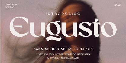 Eugusto - Sans Serif Display is a stylish font It has modern look. Comes with alternatives and ligatures, helps to create stunning logos, quotes, posts, blog posts. branding projects, magazine imagery, wedding invitations, and much more. Unique Letterforms Works on PC & Mac Simple Installations Accessible in the Adobe Illustrator, Adobe Photoshop, Microsoft Word even work on Canva! Fully accessible without additional design software. I really hope you'll get pleasure using Eugusto font and it will be perfect addition to your font collection! Contact me with an inbox message If you have any question. Thank you! Happy Creating.
 - Santa Mensch by Vic Fieger,
$1.99Let's say a San Francisco punk group used letters from a theatre marquee to create a flyer in 1979 for one of their shows. Then the flyer showed up in the background of a newspaper photograph, and the photo, twenty-five years later, was enlarged and the lettering on the flyer was turned into a font. Santa Mensch has arrived. - Springsteel by Paragraph,
$21.00 Introducing Springsteel, a new display sans serif with an unusual construction: curved lines on the outside with only a few straight lines on the inside. The resulting typeface shows a great deal of tension and dynamics. Preferably, it should be used at larger sizes, at smaller sizes only for special effects. It was spaced and kerned by Igino Marini/iKern.
 - BD Gitalona Moxa by Balibilly Design,
$19.00 This is an Experimental typeface, a direct descendant of the BD Gitalona font family, which has a supermassive family with Variable technology. However, this version is more on the aesthetic aspect, which is experimental and exploratory. It complements the beauty of the primary typeface that we released separately. If you are a fan of Effectiveness and flexibility, please learn more about BD Gitalona and BD Gitalona Variable! Inspiration The world of entertainment moves non-stop. One by one, figures appeared and left. We expect to create something to entertain previous trends with packaging more relevant to the present. More specifically, we admire and are inspired by some of the world's leading and top singers with a segmented nature. We imagine so many figures that can affect every viewer. However, each artist or singer has a segment because almost all of them have characteristics. The Design The basic design of this typeface begins with a transitional serif shape with sharp, shapeless corners. Then in the middle of the invention, there was an opportunity to explore it further from the readability side by adding an optical variable that can adjust the serif thickness when used together between large, medium to paragraph text sizes for editorials. The shift from serif to sans-serif with the contrast initiated by the shift of the serif family form as a different variable also makes this font richer in terms of the features it contains. Parts are expected to add to the user satisfaction with the complexity of this font. The Features BD Gitalona consists of one sub-family intended for body text with nine weights from Thin(100) to Black(900) and four other display sub-families such as Display serif, Flick, Harmony Sans and Contrast Sans. Each consists of four weights Thin(100), Regular Weight(400), Bold(700), and Black(900). And again, there are also retailed separately; the BD Gitalona Variable font, which is designed to accommodate all Subfamily in 1 font file, and BD Gitalona Moxa, an experimental typeface. A total of 700+ glyphs in each style. Advanced OpenType features functionally and aesthetically, such as Case-sensitive forms, small caps, standard and discretionary ligatures, stylistic alternates, ordinals, fractions, numerator, denominator, superscript, subscript, circled number, slashed zero, old-style figure, tabular and lining figure. Supports multi-languages including Western Europe, Central Europe, Southeast Europe, South America, and Oceania.
 - Mangaba Pro by Eliezer Grawe,
$9.00 Mangaba is a condensed font designed to create a hand-drawn feel for texts in small spaces. It is great for packaging and labels as well as titles and other short texts. It has low contrast and high x-height. Blend well with other hand drawn, cursive and san serif fonts. Includes Latin characters, punctuation, diacritics and old-style numbers. It is a font inspired by the Brazilian cerrado, a region similar to the savannah, with low trees, with twisted trunks and exotic fruits, such as Mangaba. ?Mangaba Pro is perfect for bringing a natural and exotic touch to logos, packaging and even texts on social networks.
 - Combinado by My Creative Land,
$20.00 Please welcome a new Combinado Font Family that has it all: elegant display sans serif and serif fonts in three weights each; a modern calligraphy script that looks beautiful next to them; a sans serif font designed specifically for the best on-screen reading experience, which comes in two weights (for now! more to come); and the last but not least - Design Elements font that has more than 70 elements to compliment your designs. This font family is very universal and you can use it everywhere: websites, instagram ads, magazines, books, cards and invitation designs, as well as in all possible personal design project that do not fit in any of the listed categories! Enjoy!
 - Textus Receptus by Lascaris,
$60.00 Textus Receptus is a historical revival based on the Roman and Greek types used by Johann Bebel (and later also Michael Isengrin) in Basel in the 1520s. The Roman is a low-contrast medium-to-heavy Venetian reminiscent of Jenson or Golden Type. The unusual polytonic Greek, not previously digitized, is lighter in weight and supplied with all the ligatures and variants of the original. Yet when used without historial forms the Greek has a surprisingly contemporary feel: it’s quirky and playful as a display face, but still easily legible in running text. Bebel’s Greek extended and refined the one used for the first printed Greek New Testament, Desiderius Erasmus’ Novum Instrumentum Omne, published in Basel in 1516 by Johann Froben. The name of the font was chosen in honor of this edition, which was so influential that it was later called the Textus Receptus (the “received text”), serving as the basis for Luther’s German Bible in 1522 and much subsequent scholarship for over 300 years. Following 16th century practice, Textus Receptus contains 130 ligatures and stylistic alternates for Greek, accessible either with OpenType features or with five stylistic sets. The Greek capitals, often printed bare in early editions, have been equipped with accents and breathings for proper polytonic or monotonic typesetting. The Roman includes both standard and historical ligatures along with the abbreviations and diacritics typically employed in early printed Latin. For expanded language coverage it has the entire unicode Latin Extended‑A range and part of Latin Extended-B. The capital A is surmounted by a horizontal stroke, as in some 16th century Italian designs, and the hyphen and question mark have both modern and historical form variants. Mark-to-base positioning correctly renders fifty combining diacritics, and with mark-to-mark positioning the most common diacritics may be stacked, permitting, for example, accents and breathings on top of length-marked vowels. Numerals include old-style, proportional lining and tabular lining. For further details, please download the 31-page Textus Receptus User Guide.
 - Waikiki Doodles by Outside the Line,
$19.00 Take a little trip to the land of sun and sand with Waikiki Doodles. 30 resort drawings that can be used for Waikiki and other warm weather destinations. From generic tourist icons like palm trees and a camera to the specific like Diamond Head and hula dancer. 29 drawings and the word Aloha lettered in script.
 - Sunwind by Wiescher Design,
$39.50 Sunwind is not really made to write long copy. It is a font for shopsigns and short sentences that need that hot, sunny and windy touch. And that is how I got around to designing it: I saw some letters on a shopsign in Cannes when driving into town. I shouted at my son Julius: "Quick take a picture of that sign, the blue one." That's what he did, only he used the macro setting, so I had a very small sign but lots of nice background. Anyway I got the basic idea! Then I made a lot of sketches and this is what came out. I added a smallcaps set and I also made some initials as a rough version, so they look like written with a brush on heavygrain paper. Swinging that brush is yours truly Gert Wiescher
 - Cuckoo by Very Good Fonts,
$19.00Cuckoo was first seen in 1988 when I painted it on a record shop's window. Since then this hand lettered font has been there and done that. Cuckoo is strong, classic and informal display font designed to work well on any job. - Weekday Mornings by Bogstav,
$17.00 "Weekday Mornings" are the 2 first words from the song "Nancy" by Prefab Sprout. Just like the song, the font has a romantic theme and could be considered as "easy listening". Well, I've added 7 slightly different versions of each letter, enough to make the font look like the real handwriting which was the base of the font. Fun fact: I had this song on repeat when finishing the font. I still do love that song! :)