9,062 search results
(0.018 seconds)
- Hunky Chunk by Just My Type,
$25.00 Way back in the 1990s, the fatter the fast food generation got, the more condensed letters became. I figured when the taste in fonts started to mirror the contemporary bodily norm, Hunky Chunk should be there. Here it is.
 - Sometype Mono by Dharma Type,
$- Sometype Mono is a free monospaced font family for coding and tabular layout which can be used for commercial purpose for free. So far, Sometype Mono consists of 6 style. Regular, Italic, Medium, Medium Italic, Bold and Bold Italic.
 - Handion by AF Type,
$10.00 Handion is a modern calligraphy font with today's handwriting style, this font is perfect for branding, wedding invitations, magazines, mugs, business cards, quotes, posters, and more, you can try it first if you want to buy this font. Handion is equipped with 400 glyphs. and by having many of these glyphs, you will be able to choose letters according to your liking, lots of variations and options for each letter, so you can adjust to your design choices. To use various kinds of glyphs, you need a program that supports OpenType features such as Adobe Photoshop Cs/Adobe Photoshop CC, Adobe Illustrator CS/Adobe Illustrator CC, Adobe Indesign and Corel Draw and many more programs that support OpenType. If you don't have a program that supports OpenType, you can access all the alternative glyphs using Font Book (Mac) or Character Map (Windows). Thanks and happy designing :-) Thank you for buying!
 - Tanger Serif by Typolar,
$72.00 Inspired by New Transitional and Egyptian fonts, Tanger Serif has elements of a sturdy work-horse text face and finely detailed headline font. A wide variety of widths and weights support many text sizes. Typically Narrow is used in headlines, Medium in body and Wide in smaller print. Nothing is predefined, though. By combining the right widths with the right weights this traditional approach can easily be challenged. Let’s take an oversized (over 10 pt) body copy for instance. In conjunction with using a bigger size to enhance readability, a narrow and slightly lighter weight will save space and brighten text color. Tanger Serif Narrow is a slim normal rather than a condensed face. As an Open Type “Pro” font each weight includes an expanded character set, small caps, old style figures, tabular figures, ligatures, fractions etc. All these are easily accessible through OpenType features.
 - Robofan by César Puertas,
$12.00 Robofan is a vintage Open Type font based on the logo of reconfigurable robots (toys and characters) from the mid 1980s. The typeface was conceived when looking at the author’s own collection of Transformers, he noticed many basic drawing and spacing problems, missing characters, incorrect accent shapes and a lack of proper rhythm in the typeface used in the newest toy’s packaging, mistakes that didn't happen in the toys back in the 80s. These mistakes were so evident that the author decided to look back at the original lettering from the 80s to capture the original spirit of the Transformers. Robofan contains true small caps and has full support for Cyrillic scripts and Central European languages. The full character set consists of more than 700 glyphs. Robofan is ideal for computer & video games, merchandising and all kinds of products related to science fiction, robots, cyborgs, aliens and everything else.
 - Mother VP by VP Creative Shop,
$20.00 Introducing Mother Serif Typeface - 5 fonts Mother is named after all the moms and children left behind. This typeface is feminine, fragile typeface with 5 fonts loaded with ligature glyphs, alternates and multilingual support to enchant your next project. Very versatile fonts that works great in large and small sizes. Mother is perfect for branding projects, home-ware designs, product packaging, magazine headers - or simply as a stylish text overlay to any background image. Uppercase, lowercase, numeral, punctuation & Symbol Light Regular Medium Bold Black ligature glyphs ab ac ad ae ag ai al am an ap ar as at au ba be bi bl bo br ca cc ce ch ci cl co cr cs ct cu da de di do dr ea ec ed ee ei el em en eo ep er es et eu fa fb ffb fh ffh fj fk ffk ft fft ga gi gl gn go gr ha he hi ho hy ic id ie il im in io ip ir is it iv ka ke la le li ll lo lu ma me mi mo mp na nc nd ni no nt oc od ol om op or os ot ou pa pe pi po ra rc rd re ri ro sh si sm sp su ta te th ti to tr ts tt ul um un ur us ut ff fi fl ffi ffl st alternates Multilingual support How to access alternate glyphs? To access alternate glyphs in Adobe InDesign or Illustrator, choose Window Type & Tables Glyphs In Photoshop, choose Window Glyphs. In the panel that opens, click the Show menu and choose Alternates for Selection. Double-click an alternate's thumbnail to swap them out. Feel free to contact me if you have any questions! Mock ups and backgrounds used are not included. Thank you! Enjoy!
 - Aeroko Variable by Monotype,
$279.99 Meet Aeroko, a slick variable typeface that evokes grit and speed, a dynamic play, a future–present competitive edge that evokes motorsport and all progressive brand design. This is a robust type system that creates memorable brand headlines. Powered by four display weights and three widths. Turbo-charged by a two-axes variable font. High performance brands can expect Aeroko to out-pace in every graphic condition. Aeroko is bold and assertive, it moves fast in headlines, it flexes when and where you need it. The forms are boxed and solid from Condensed to Wide, and they provide a distinct contrast when paired with rounder text fonts. Aeroko’s secondary power unit is harnessed from the ever adaptable variable font format. Variable font technology enables vast levels of typographic scale and expression, furthermore it allows Aeroko to react instantly in any digital space to maximize results. Aeroko evokes confidence, this is a typeface that actively encourages you to be courageous and daring with type in your own way. Brands demand distinct and robust typography, much in the same way that drivers demand pace. Aeroko meets these demands with ease, delivering assurance and weight across a valiant aesthetic. Aeroko is designed by Krista Radoeva and the Monotype Studio.
 - Ribbons by Positype,
$20.00 Ribbon type. Holy grail of complex-lettering-turned typeface or an elusive Loch Ness monster that is often teased, possibly seen in the wild, but never confirmed? From the amazing lettering artist and author Martina Flor and masterful type designer Neil Summerour, comes the aptly named Ribbons. Ribbons is a sincere and well-conceived approach to providing a reliable solution to ribbon and ribbon-styled type for creative professionals when a lettering artist just isn’t available. Ribbons provides both flat and ‘folded’ options with the Regular and Fold styles, but then raises the bar with separate layer styles that will allow you to easily create the elegant back and forth movements produced with ribbon-style lettering we have all come to appreciate. These layer options are provided in both ‘smooth’ and ‘pleated’ connected styles. Flor and Summerour didn’t stop there. Each typeface was expanded with a number of stylistic alternates, additional swashed and flourished letters, ligatures, and even more in order to provide as many decorative options as possible to the creative. To round out the nine fonts available in the typeface and to ‘put a bow on it’, they’ve added a separate Shadow style and two different color fonts (available exclusively with family purchases).
 - DINfun Pro Plain by CheapProFonts,
$10.00 This is my version of the classic DIN 1451 Mittelschrift, complete with a large multilingual character set. I have made it primarily because I want to have a bit of fun with it by experimenting with giving it some very different expressions - far removed from its serious and no-nonsense roots. Time to spice up that DIN profile! Check out the "Buying choices" tab for all the themed variants! :) ALL fonts from CheapProFonts have very extensive language support: They contain some unusual diacritic letters (some of which are contained in the Latin Extended-B Unicode block) supporting: Cornish, Filipino (Tagalog), Guarani, Luxembourgian, Malagasy, Romanian, Ulithian and Welsh. They also contain all glyphs in the Latin Extended-A Unicode block (which among others cover the Central European and Baltic areas) supporting: Afrikaans, Belarusian (Lacinka), Bosnian, Catalan, Chichewa, Croatian, Czech, Dutch, Esperanto, Greenlandic, Hungarian, Kashubian, Kurdish (Kurmanji), Latvian, Lithuanian, Maltese, Maori, Polish, Saami (Inari), Saami (North), Serbian (latin), Slovak(ian), Slovene, Sorbian (Lower), Sorbian (Upper), Turkish and Turkmen. And they of course contain all the usual “western” glyphs supporting: Albanian, Basque, Breton, Chamorro, Danish, Estonian, Faroese, Finnish, French, Frisian, Galican, German, Icelandic, Indonesian, Irish (Gaelic), Italian, Northern Sotho, Norwegian, Occitan, Portuguese, Rhaeto-Romance, Sami (Lule), Sami (South), Scots (Gaelic), Spanish, Swedish, Tswana, Walloon and Yapese.
 - Zapf Essentials by Linotype,
$29.99Linotype Zapf Essentials is the modernized version of Zapf Dingbats and was also designed by Hermann Zapf himself. Over 372 characters and symbols are included within six fonts and make life a little more communicative, a little more informative, and a lot more interesting. The fonts contain symbols for both professional and everyday uses. With their markers, ornaments and arrows they are informative as well as versatile, timeless and lively. An interesting note to the story of Zapf Essentials: in 1977, Hermann Zapf created about 1000 sketches of signs and symbols. ITC chose those which became known around the world as Zapf Dingbats. For a typesetter, dingbats are the characters in the corner of the type box which can be used for just about anything. The last decade has seen the appearance of new symbols for e-mail, fax, mobile phones and other developments. These are now part of Linotype Zapf Essentials, just as they are now a part of everyday life. For a quick overview of the different Linotype Essentials variations, see the keyboard layout PDF in the Gallery section. It shows the keyboard layout of each font. A helpful hint from Hermann Zapf: Linotype Zapf Essentials should be used sparingly so that the characters retain their emphasis. - Aeroko by Monotype,
$49.99 Meet Aeroko, a slick variable typeface that evokes grit and speed, a dynamic play, a future–present competitive edge that evokes motorsport and all progressive brand design. This is a robust type system that creates memorable brand headlines. Powered by four display weights and three widths. Turbo-charged by a two-axes variable font. High performance brands can expect Aeroko to out-pace in every graphic condition. Aeroko is bold and assertive, it moves fast in headlines, it flexes when and where you need it. The forms are boxed and solid from Condensed to Wide, and they provide a distinct contrast when paired with rounder text fonts. Aeroko’s secondary power unit is harnessed from the ever adaptable variable font format. Variable font technology enables vast levels of typographic scale and expression, furthermore it allows Aeroko to react instantly in any digital space to maximize results. Aeroko evokes confidence, this is a typeface that actively encourages you to be courageous and daring with type in your own way. Brands demand distinct and robust typography, much in the same way that drivers demand pace. Aeroko meets these demands with ease, delivering assurance and weight across a valiant aesthetic. Aeroko is designed by Krista Radoeva and the Monotype Studio.
 - FF Attribute Mono by FontFont,
$69.00 FF Attribute™ Mono is a monospaced design with an industrial strength, minimalist vibe, making it perfect for attention getting, theme-based headlines, posters, banners and navigational links. And, because it is such a robust family, FF Attribute can also be used for branding of blogs, games, web sites and tech products. FF Attribute comes in two families; Mono and Text. The Mono is a fixed width (monospace) design, while the Text is a proportional design. FF Attribute was, in fact, initially designed for the use in code editor software. Its seven roman and italic monospaced weights and extended character set supporting many languages also make it a powerful communications tool. But this is only the tip of the iceberg. In addition to the monospaced version, where all characters share a fixed width, there is also a proportional, “faux monospaced” version: FF Attribute Text. The Text family keeps the visual character of a monospaced typeface, but wide letters are given more space while narrow characters have been drawn with correct proportions and spacing. FF Attribute Text looks monospaced – but it’s not. Drawn by Viktor Nübel, FF Attribute Mono’s 14 designs, huge character set, including box-drawing characters and user-interface icons, make it the Swiss Army Knife® of monospaced fonts.
 - Epica Pro by Sudtipos,
$49.00 Epica is a contemporary interpretation of the Venetian Renaissance types. A humanist type family with a contemporary design. This family encompasses different typographic scenarios with emphasis in style and functional equilibrium. Its letterforms show the visual richness of Epica that includes some calligraphic reminiscences perfectly legible in small and display sizes. Its strong personality makes it distinguish, because it perfectly combines the elegance of antique typographies and the forcefulness of contemporary ones. This family has been designed in two different moments. Epica Serif, which have a more classical design, was finished 5 years ago in its first version. The first sketches were drew 8 years ago during the Master of Type Design at the University of Buenos Aires. Through the years was re design in several times to the point of reaching its current version. On the other hand, Epica Sans was completed in 2020 and is the counterpart of Epica Serif. A complementary system designed to enrich the serif version and give new options for hierarchy and composition. This is a versatile type family perfectly fit for books, editorial, and usage in print and on screens. It possesses great legibility in body texts, which makes it ideal for extended reading and supports a variety of languages.
 - Nautilus Text by Linotype,
$29.99Hellmut G. Bomm first released his Linotype Nautilus typeface in 1999. Ten years later, he updated and expanded the design. Now users have two additional families at their disposal: Nautilus Text and Nautilus Monoline. Nautilus Text bears more similarities to the original Linotype Nautilus. The letters shows a high degree of contrast in their stroke modulation. Bomm's intention was to create a clear, highly legible face. While the even strokes of most sans serif types eventually tire the eyes in long texts, the marked stroke contrast of Nautilus Text lends the face its legibility. The characters were drawn with a broad tipped pen. Like serif typefaces, the forms of Nautilus Text display a variety of elements. Its characters are narrow, with relatively large spaces between them. This helps create an overall open appearance, and allows a large quantity of text to fit into a small space. Nautilus Monoline's letters share the same overall proportions as Nautilus Text's. But as their name implies, they are monolinear. Their strokes do not have the calligraphic modulation that Nautilus Text features. This allows them to set another sort of headline, making Nautilus Monoline a refreshing display type choice to pair with body text set in Nautilus Text. - Eurotypo Bodoni by Eurotypo,
$48.00 Talking about the numerous types that today bear the name of Giambattista Bodoni are a kind of tribute as much to his reputation as a printer as to his ability as designer and engraver. In fact, all of them tent to be more in the way or style of Bodoni than simply copy of his letterforms. Like many other type designers, we’ve been seduced also to develop our own point of view of his work, nowadays enriched by some features of OpenType format that allows a variety of combinations: standard ligatures, discretional ligatures, stylistic alternates and old styles figures. Whereas the Bodoni serif in the capitals was of the same weight as the thin stroke but joined with a very slight fillet (Bracket) and the lowercase serif were like his French rivals, the Didots, featured straight- edged serifs that were unbracketed. The ascenders and descenders of this new Bodoni are shorter, giving in this way, more space for enlarge x high. Specially designed for editorial design and advertising, can be used in magazines, annual reports and all kind of fine print materials or web pages. The beauty of his letterforms can enrich headlines; this font can also be used as body text for its good legibility and accurate kerning.
 - Nautilus Monoline by Linotype,
$29.99Hellmut G. Bomm first released his Linotype Nautilus typeface in 1999. Ten years later, he updated and expanded the design. Now users have two additional families at their disposal: Nautilus Text and Nautilus Monoline. Nautilus Text bears more similarities to the original Linotype Nautilus. The letters shows a high degree of contrast in their stroke modulation. Bomm's intention was to create a clear, highly legible face. While the even strokes of most sans serif types eventually tire the eyes in long texts, the marked stroke contrast of Nautilus Text lends the face its legibility. The characters were drawn with a broad tipped pen. Like serif typefaces, the forms of Nautilus Text display a variety of elements. Its characters are narrow, with relatively large spaces between them. This helps create an overall open appearance, and allows a large quantity of text to fit into a small space. Nautilus Monoline's letters share the same overall proportions as Nautilus Text's. But as their name implies, they are monolinear. Their strokes do not have the calligraphic modulation that Nautilus Text features. This allows them to set another sort of headline, making Nautilus Monoline a refreshing display type choice to pair with body text set in Nautilus Text. - TT Squares Condensed by TypeType,
$29.00 You are on the page of the old display version of the TT Squares Condensed typeface. In 2020, we released an entirely new, completely redesigned, and significantly expanded version of the typeface called TT Octosquares. In addition to 73 styles, TT Octosquares has 3-axis variable version, stylistic alternates, ligatures, old-style figures and many other useful OpenType features. Before you buy the old display version of the font, we suggest that you pay attention to the new superfamily TT Octosquares and study it in more detail. - We've expanded the TT Squares font family and created a narrow version of the typeface. Just as its older brother, TT Squares Condensed fits perfectly for any engineering, military, and technological theme. The family is ideal for implementation in interior design, packaging design, creation of uniforms with inscriptions, and for logos and headlines. Fonts belonging to the TT Squares font family look manly and have a strong character that instantly tunes in the spectators and makes them perceive the information seriously. If we were to compare fonts to people’s professions, TT Squares Condensed would most definitely be a first-class technical engineer whose talented hands are adorned with calluses and machinery oil spots. TT Squares Condensed is optimized or web and mobile applications.
 - 360 by Wilton Foundry,
$29.00Distorted fonts are great but are mostly not very practical - 360 is an attempt to create a simple distorted font that can be used far beyond a few logos or headlines. Each 360 character averages roughly half the number of sharp angles of a regular sans serif. This gives it an unusually fresh and timeless appeal and creates a dynamic presence across body text that is very legible and compact without looking overly condensed. 360 was chosen as a name because it can be used as an everyday font, all year round, and because 360 has so many unusual angles that don't conform to normal font conventions. 360 also happens to be a cool number: 360 makes a highly composite number. 360 is also a superior highly composite number and a colossally abundant number. A circle is divided into 360 degrees for the purpose of angular measurement. 360° is also called round angle. 360 is a convenient standard since, 360 being highly composite, it allows a circle to be divided into equal segments with each segment measured in integer degrees rather than fractional degrees. 360 is the sum of a twin prime (179 + 181). A year is roughly calculated as 360 days. - ‘DragonForcE’ - 100% free

- Illustrator - Unknown license

- SquircleCirquare - Unknown license

- Batmeton by Aqeela Studio,
$20.00 Batmeton Script is a free-flowing script font created for packaging products, invitation cards, flyers, mockups, event posters, and anything else that requires high-quality vibes. It has a beautiful and balanced character, that fits well with the large design pool.
 - The Glamz by Just Font You,
$16.00 Meet The Glamz, a brand new auto-chic font. Designed to fulfil your trend-catching things with the edgy style and undeniable artsy look. Perfectly fit for your fashion branding stuff, handwriting logo, inspirational quote poster, oh well you name it.
 - PR Swirlies 08 by PR Fonts,
$10.80 This font is a collection of simple calligraphic ornaments suitable for invitations, gift tags, and anything that can benifit from a "spoonful of sugar" visually. This font includes fewer line fillers, and more "ferns and fans" than our previous swirlies.
 - Magnivera by Eko Bimantara,
$24.00 Magnivera is a display serif font family. inspired from oldstyle serif with a high contrast letterforms, the characteristic of the typeface is flamboyant and fit for fashion theme. Magnivera consist of 4 styles from regular to heavy with matching italics.
 - Columna by Linotype,
$29.99Columna is an all-caps, Classical Roman-inspired typeface designed by the renowned Swiss typographer Max Caflisch (interesting fact: Columna is Caflisch's only typeface). Caflisch's Columna adds a stately elegance to any application, and is best used in large sizes. - Arroyo by Gajana Aslanjan,
$45.00 Arroyo is based on water flow. Little creeks on the surface of the earth formed by the action of fast-flowing water, this phenomenon inspired me to create this font. The little gaps/creeks form the letters of the font.
 - Jiminy by Just My Type,
$35.00 Come on... You want Jiminy, don’t you? It’s FUN! And carefree! It will turn any project into something enjoyable. You really must have it! But don’t just listen to me, Mr. Cat and Mr. Fox. Let your conscience be your guide...
 - Seleniak by Crestaco,
$19.00 Seleniak's outlines are based on the logo of the eponymous MSX video game, also created by its designer. Thus, all ratios are multiples of the typical 8x8 px video character unit, giving the typeface a characteristic appearance and interesting fitting properties.
 - Aquatype Signature by Krakenbox Studio,
$15.00 Aquatype Signature is a free-flowing script font created for packaging products, invitation cards, flyers, mockups, event posters, and anything else that requires high-quality vibes. It has a beautiful and balanced character, that fits well with the large design pool.
 - Ambie Skratch by Amber Phillips,
$15.00Ambie Skratch was inspired by grudge fonts, as well as rock music, and deconstructed art work. It was made by shacking a sharpie marker in a fast angled motion. Then these images were scanned and altered further on the computer. - Movie Ad Deco JNL by Jeff Levine,
$29.00 An extra-bold, hand lettered type design with a casual feel was used for the 1942 movie poster “Tortilla Flat”. This served as the inspirational model for Movie Ad Deco JNL, and is available in both regular and oblique versions.
 - Bill Smith by Ghuroba Studio,
$20.00 Bill Smith is a fast writing brush script with textures and swashes. This will make your design or project look perfect with authentic characteristics. It's perfect for branding, marriage invitations, poster designs, business cards, bulletins, stationery, logos, packaging, design and more.
 - Stay Gold by Decade Typefoundry,
$35.00 Stay Gold Script is a highly usable, powerful typeface. Perfect for everything from street wear brand to wedding invitations, sports team logos to band logos. Use it however you see fit. Just one thing - it’s not designed for all-caps settings.
 - ITC Wild West by ITC,
$29.99Janet Murphy designed ITC Wild West Pi in 1997. A symbol font containing all of the cowboy-like pictograms one could ever need, ITC Wild West Pi includes such symbols as a ten-gallon hat, horseshoes, revolvers, and steer skulls. - Floris by LucasFonts,
$39.00 Floris was developed on a four-dimensional grid of several axes or parameters: weight, width, x-height and ascender/descender height. This makes it possible to allow for fast customization – i.e., the design of Floris versions made according to customers’ specifications.
 - Quorfid JNL by Jeff Levine,
$29.00 Quorfid JNL is Jeff Levine's version of an old classic- Orplid. Especially popular in the 1950s, this cast shadow outline font has a decidedly hand-made look to it. From headlines to point-of-sale signage, it fits into all applications.
 - Adelaide Sky by Omaikraf Studio,
$14.00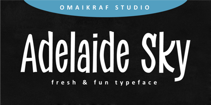 Adelaide Sky is a fun and relaxed display font. Casual and versatile, this font fits a wide range of designs, such as branding, product packaging, invitation, quote, t-shirt, label, poster, logo or any other idea that you wish to develop.
 - Bush Market by Paramajan,
$12.00 Bush Market is a handwriting script typeface designed to give off a bouncing, fast writing vibe, and informal. It can be used as a handwritten header display or as a stylish text for magazine, blog, branding, packaging, wedding invitation project, etc.
 - Deviandra by Diyastudio,
$10.00 Deviandra is a free-flowing script font created for packaging products, invitation cards, flyers, mockups, event posters, and anything else that requires high-quality vibes. It has a beautiful and balanced character, that fits well with the large design pool.


