10,000 search results
(0.016 seconds)
- Hypertension - Personal use only

- Army Beans - Unknown license

- Rozza by Serebryakov,
$49.00 Rozza is a single weight stencil cursive fat face font for extremal display use. Looking at this font the story of beauty and the beast comes to mind. That is how I would describe it. On the one hand prickly and dangerous, and on the other - pulsating beauty and passion. Try to combine Rozza together with Displace — great pair!
 - Klop by Invasi Studio,
$19.00 Klop is a display typeface with a bloated and fat appearance. Combining this with round corners and a natural shape, Klop has a quirky and endearing appearance. You can use alternative glyphs to create a different appearance for your design. The Klop font is ideal for branding projects or packaging that need a modern and playful feel.
 - NorB Chalk by NorFonts,
$28.00 NorB Chalk is a handwritten text font with an angled fat chalk style. You can use this font with any word processing program for text and display use, print and web projects, apps and ePub, comic books, graphic identities, branding, editorial, advertising, scrapbooking, cards and invitations and any casual lettering purpose… or even just for fun!
 - Journey Unicorn by Allouse Studio,
$16.00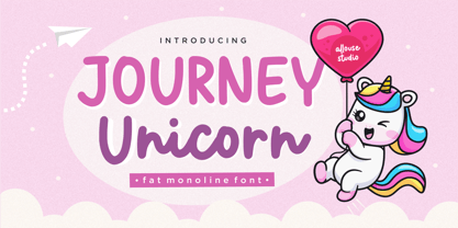 Proudly Present, Journey Unicorn A Fat Monoline Font Journey Unicorn is perfect for any titles, logo, product packaging, branding project, megazine, social media, wedding, or just used to express words above the background. Journey Unicorn also come with Multi-Lingual Support. Enjoy the font, feel free to comment or feedback, send me PM or email. Thank You!
 - Lunisolar by Hanoded,
$15.00 Lunisolar, according to the dictionary, means “of or caused by both the sun and the moon”. I liked the name, therefore I used it! Lunisolar is quite an interesting font: it is fat(tish) and rough, very neat and legible. It could be used for product packaging, book covers and starships. Comes with an abundance of diacritics.
 - Muscleman by Big Typephoon,
$20.00A strong, heavy font that really packs a punch. Muscleman is there when your design needs a little extra lift. Originally created for a poster project, the font juiced up and grew quickly into the large fat size it is today. It works well for logos, posters, and t-shirt designs and has a slight deco look. - Keepon Truckin NF by Nick's Fonts,
$10.00Baby Fat, designed by Milton Glaser in 1964, saw a lot of action during the psychedelic poster phase. This little dumpling is based on that workhorse, and takes its name from a phrase that also got around a lot in the 60s. Both versions of the font include 1252 Latin, 1250 CE (with localization for Romanian and Moldovan). - Doll by FaceType,
$30.00 Who needs counters? Although this typeface is bold as hell, it is still absolutely legible. If You are looking for fat curves, this is may be Your choice! There are also extra letters (A, V, v) to let You make better logos and headlines. Please take also a look at Dollbats for suitable Arrows, Symbols and Numbers.
 - Kharon Ultra NF by Nick's Fonts,
$10.00A fine, fat Deco face named Ludlow Stygian provided the basis for this delightful typeface. Although generally formal in character, the font shows a hint of playfulness in the distinctive “humpback” h and n characters. This font contains the complete Latin language character set (Unicode 1252) plus support for Central European (Unicode 1250) languages as well. - Carta Marina by insigne,
$21.99 Carta Marina is based on the titling found on the famous map drawn by Olaus Magnus in 1539. The map of northern Europe took 12 years to complete, and the total size is a huge 1.7 meters tall by 1.25 meters wide. More information about the map, as well as the high resolution reference document used to create the typeface and illustration set can be found at the James Ford Bell Library, University of Minnesota. The titling is slightly aged, very sturdy and elegant. Carta Marina includes a full set of OpenType alternates for every character in the English alphabet, oldstyle figures, historical forms, small caps and 64 discretionary ligatures. These ligatures are used to alter the appearance of the type so that the printing appears realistic and without any duplicate letters to detract from the antique appearance. The Carta Marina family also includes some of the unique illustrations that gave the map its character. It includes depictions of fanciful sea creatures, land animals and some of the inhabitants of the lands pictured.
 - ITC Astro by ITC,
$29.99ITC Astro is the typeface that proves you can get your work done while watching cartoons. “It all started as a series of doodles while I was watching The Jetsons,” recalls Sasa Petricic. “The show's impossibly simplistic vision of the twenty-first century cried out for a font that fit into that world -- a world where everyday objects can carry far more fun and personality than they should.” ITC Astro is the first commercial typeface design from Petricic, whose “day job” is working as a reporter for the Canadian Broadcasting Corporation. Petricic has filed stories from across Canada and around the world for CBC's flagship evening newscast, The National. His reports have also appeared on CNN and BBC Television. Petricic's work as a correspondent and video journalist have taken him to six continents, covering everything from famine and genocide in Africa to the war in Iraq. With such serious matters filling the hours of Petricic's day as a journalist, it's not hard to see why he conceived Astro as a welcome blast of whimsy. “As I began to draw the design,” he says, “I decided that every part of Astro should be a cartoon character unto itself.” Each character has its own baseline shadow (or coaster, or circular antigravity generator, depending on how you look at things). The angular caps dance jauntily, rocking from left to right, while a suite of companion small caps provide backup. The end result is a design quite unlike any other, with surprising charm and versatility. ITC Astro comes in a two-weight family of White and Black. - Lentzers by Ingrimayne Type,
$9.95 The upper-case letters of Lentzers fit into the shape of a convex lens and the lower-case letters fit into the shape of a concave lens. The typeface was designed to have concave shapes alternate with convex shapes so the letters snuggle together. The OpenType contextual alternatives (calt) feature will automatically make this happen if your word processor supports it. (To get only concave or convex shapes, one must turn off the contextual alternatives feature. With only concave shapes the spaces between letters form thin convex lenses and with only convex shapes the spaces between letters form thin concave lenses. The name of the family was inspired by these lens shapes and also by the name of distant ancestors.) Lentzers is caps only. It comes in three weights: light, regular, and bold. It is eye-catching for posters and titles and poorly suited for text.
 - JHand - Unknown license

- Melee - Unknown license

- Slabic by Tour De Force,
$30.00 Slabic is modern slab serif font family available in 12 styles. It’s main characteristics are gently rounded edges, unique serifs and ink traps. Looks and feels compact, harmonized and visually balanced, so readers flow don’t get interrupted during reading. Slabic recommends itself for editorial use or main body webfont, for logos, package design and posters. Slabic contains Small Caps, Fractions, Tabular and Old Style Numerals as Open Type features. Supports extended Latin character map.
 - Sidro by Tour De Force,
$30.00 Condensed sans family Sidro comes in 9 weights – from extreme light Thin to dark Heavy. Compact, solid and still new and recognizable, Sidro is designed with purpose to serve in every project. It is tightly spaced family which is ideal for space saving in variety projects – from posters, packages and branding in general, to websites, editorial usage and applications. Sidro comes with Small Caps, Fractions and one Stylistic Set in extended Latin character map.
 - Dog Days by Fenotype,
$45.00 Dog Days is an American hand lettering style brush script family. Dog Days is swift, strong and full of bursting energy. Due to its clean features it’s legible even in small sizes. Dog Days is great for any display use -from poster to packaging and logo to t-shirt. Dog Days is also great for lettering works. Dog Days Brush boasts with more than 700 glyphs and plenty of OpenType features: Keep Standard Ligatures on - it adds variety in hand lettering style and keeps the flow steady. If you need more action try turning on Swash, Stylistic or Titling Alternates in any OpenType savvy software. Dog Days Brush is also equipped with Old Style Numerals if you need your numbers to fit more into text. Dog Days Brush uppercase letters are designed to work as initials so if you need to write all caps you might want to use Dog Days Caps or Dog Days Small Caps. Dog Days Caps can also be used as uppercase letters for the script. Dog Days Extras is a set of badges, swashes and swirls designed to play with the font. Dog Days is inspired by a hand lettering sample in a vintage American swimsuit advertisement.
 - Abiscuos - Unknown license

- Duckie by Eclectotype,
$40.00 Eclectotype's continuing battle against whitespace continues full cream ahead with Duckie, and fat-bottomed script that packs a whole lotta weight into the softest of punches. The forms feel familiar, like they're straight from funky disco album covers, but this is a 100% original face. Don't let its retro charm dissuade you from taking it for a spin in more contemporary settings; it might just surprise you! Now for the features bit: OpenType features include ligatures, swashes, contextual alternates and stylistic sets. The stylistic sets are 1. swap the script r swap to a normal r, 2. swap the script upper case i to a more familiar seriffed version, 3. the number four changes to an open form, and lastly, 4. loopy ascenders in the lower case close in and lose the hole. You should not use this in all caps settings. Pretty please.
 - SPIDER-MAN:ECLIPSE - Personal use only

- Tusque by Eclectotype,
$40.00 Tusque is a layered chromatic type family with a Tuscan flavor. Regular, Circus and Tooled can stand alone, while Highlight and Deco are purely for layering up multicolored gorgeousness. Tusque lends itself to fairy tales, wine labels and boutique logos, and makes some particularly delectable drop caps. Although it’s all caps, the lower case slots are all different from the upper case so you can mix and match to your heart’s content. There are also a bevy of swash alternates and ligatures at your disposal. The contextual alternates feature cleverly substitutes alternate versions of more triangular glyphs like A and V to give a better fit. The ordinal feature changes ‘a’ and ‘o’ to the feminine and masculine ordinals for Spanish etc. but also changes ‘c’ and ‘ac’ to superscript lowercase versions for names like McBride and MacDonald.
 - Ramphox by Atom,
$15.00 RAMPHOX strong display font. With extra attention to fast and straightforward streaks, RAMPHOX is guaranteed to deliver hard and fast messages for logos, clothing, quotes, product packaging, or anything that requires a turbo typographic boost.
 - Diane Script by GroupType,
$27.00 In 1995, FontHaus came upon a rare opportunity to create a revival of Aries, a little known and previously unavailable typeface by the legendary Eric Gill. Discovering a lost typeface by one of the major designers of the 20th Century, was the discovery of a buried treasure, and being the first type company to release it was an honor. Thirteen years later, FontHaus came across another little known typeface treasure: Diane. Designed by the legendary French designer Roger Excoffon in 1956, this remarkable script has never been faithfully recreated until now. In close collaboration with Mark Simonson, FontHaus and Mr. Simonson painstakingly researched rare type books, publications, European metal type services, and period showings from the United States, England, Germany and from the University of Groningen in the Netherlands. Finding full specimens of the font turned out to be quite a challenge. In most cases, only the caps and lowercase were shown. Furthermore, the more we researched Diane, many curious facts came to light. The caps in earlier specimens of Diane are completely different from specimens published later, suggesting that the face was redesigned at some point, perhaps in the mid-1960s. So we are left with two different sets of caps. The original had very elaborate, swirly strokes, very characteristic of Excoffon¹s gestural designs for posters and logos. Later on, these appear to have been replaced by a set of simpler, more traditional script caps. The original caps are criticized in one source Mark found (Practical Handbook on Display Typefaces, 1959) as being "exquisite" but "not highly legible". Perhaps this is what led to the simpler caps being introduced. Nevertheless, FontHaus's release includes not only both sets of caps, but a range of alternates and a number of new characters not originally available such as the Euro, and a magnificent alternate Ampersand to name a few.
 - Poster Paint by Canada Type,
$24.95 Poster Paint is a fun shocard alphabet which came about from Jim Rimmer’s admiration of Goudy Stout, a design he liked in spite of the fact that Goudy himself claimed to detest it. Extremely eye-catching and humourous to a fault, Poster Paint is an ideal fit for fun environments like theme parks, concession stands, cofee and juice bars, and in print design for children books and fun food packaging. Poster Paint was updated and remastered for the latest technologies in 2012. It comes with a glyphset of over 375 characters, and supports the majority of Latin-based languges. 20% of this font’s revenues will be donated to a GDC scholarship fund, supporting higher typography education in Canada.
 - Yearling by Chank,
$99.00 The Yearling fonts are inspired by old propaganda poster letter forms of the 20th century. However, they're also intended to work well in modern communications as well. Yearling was originally created to look good via fax (LOL!), and because it's based on a very rigid grid (like pixels on your screen), this font family also works well on smartphones and modern tablets, too. Short on curves and diagonals, these letterforms are a celebration of horizontal and vertical. But most importantly, this font is simple and clean and clear and direct. Nothing fancy here, just the facts, as modern as can be. Recently updated with extra language support for many voices across the world.
 - Rapido Racers by Putracetol,
$22.00 Introducing “Rapido Racers” - a Quirky Display Speed Font that encapsulates the essence of speed, agility, and dynamism. Crafted meticulously to resonate with the fast-paced world of racing and e-sports, this font is a harmonious blend of pixel perfection and artistic craftsmanship. With 13 unique variations, each tailored to fit the theme of speed and sportiness, Rapido Racers is versatile yet specific in its application. Whether you’re designing logos that stand testament to the electrifying world of racing or branding materials that echo the swift movements of e-sports athletes, this font is your companion. Its strong display characteristics make it ideal for crafting eye-catching titles on posters or headings on web pages.
 - Alternate Gothic by Linotype,
$20.99 Alternate Gothic was designed by Morris Fuller Benton for American Typefounders Company in 1903. All three weights of Alternate Gothic are bold and narrow. In fact, this face is essentially a condensed version of Benton’s other well-known sans serif types, Franklin Gothic and News Gothic. In the early twentieth century, the modern concept of type “families” had not yet been formed — and though Benton designed these sans serifs to harmonize with each other, the foundry gave them different names. Robust, dark, and coolly competent, Alternate Gothic is a good choice when strong typographic statements must fit into tight spaces. As a modern usage, it is currently the font of YouTube’s homepage logo.
 - Argyle Rough by Type Associates,
$24.95 Argyle Rough was originally developed for a packaging campaign in the late 80s in my studio and sat around in various stages of completion until I decided to autotrace my original drawings. I liked the quirky roughness and decided that it did not detract from the charm of the original, in fact it improved it and saved me a whole lot of work. The original campaign called for a few additional alternate characters for use at either end and double in the middle of words, ee, ff, ll, ss etc and a stylized Th, always useful. I hope you enjoy Argyle Rough, named after the world’s largest diamond mine – a rough diamond, get it?
 - Congenial by Laura Worthington,
$19.00 I wanted to design my own sans-serif typeface for my web site to complement the rest of my type library; I designed Congenial as an understated, highly legible complement to my more decorative display faces. Of course, I’m never far from my calligraphic roots, so Congenial retains some hand-drawn elements, visible particularly in the heavier weights of this generous 10-face family. As befits its name, Congenial is a friendly and inviting face with a generous x-height and highly differentiated characters. See what’s included! http://bit.ly/1Agnkio These fonts have been specially coded for access of all the swashes, alternates and ornaments without the need for professional design software! Info and instructions here: http://lauraworthingtontype.com/faqs/
 - Actium by Type Mafia,
$45.00 Actium is a contemporary multilingual sans serif typeface developed to help perfect typography automatically. Type Mafia has focussed on words with odd combinations of capital letters and numbers, such as product names and postal codes such as WD40 and H1N5, jump out of the text. They sit awkwardly together as the numerals have been designed to work with the lowercase, not the uppercase letters – affecting readability.To fix this Type Mafia invented Smart Capo™. Smart Capo™ Smart Capo is a feature that automatically activates once you type an uppercase letter together with a number. When a capital letter is sat next to a numeral, Smart Capo converts the letter to a mid-cap — a contemporary alternative to small caps — and the default old-style numeral to a lining numeral. Actium’s mid-caps and lining numerals have been designed with the same height (between cap and x-height) so they sit comfortably next to each other and fit more harmoniously into text. Smart Capo applies equal attention to capitalised words without any numbers, such as NAVO and USA, and are also automatically set into mid-capitals. Working on its own, Smart Capo saves time and money for the typographer — taking the pain out of text formatting — and makes it a more pleasurable experience for the reader. This feature is made possible by the use of ‘contextual alternates’, an OpenType feature used in modern font software, working with a set of characters specially designed at mid-cap height. By default these changes automatically take place so it doesn't need to be switched on, it will just work. Actium Actium’s design has an unusual diagonal contrast — much more common in a serifed face than in a sans serif — giving it more bite. The typeface looks elegant when set in large sizes and remains very legible when shown in small sizes. The family consists of six weights in two styles, making a dozen fonts. Weights range from light to black in roman and true italic. All fonts are fully loaded with functional elements. Actium boasts an extended Latin character set and with Greek. This means a wide range of Western languages are supported: perfect for use in bilingual publications and packaging. For numerals, each font includes old-style and lining figures in both proportional and tabular widths, with superiors and inferiors. These allow you to select the right set of numbers for the right task.
 - Vibertus by Cercurius,
$19.95 A revival of “Gras Vibert”, a French fat face originally cast by the Didot typefoundry in Paris. It was cut in 1840 by Vibert, an engraver employed by the foundry. The capitals are heavier than the lowercase letters, and the characters g, k, y and & are rather peculiarly shaped, exaggerating the vertical stress. The font is designed for large sizes.
 - Quegos by ZetDesign,
$15.00 Quegos is a display font with a sleek yet bold look. make a strong impression. comes in the iconic bubble style with strong outlines and fat strokes. very suitable to create a big, bold logo for your business, work on a poster for an event, or whatever your project, and Perfect to create amazing headings, logos, menus, social media graphics, and many more.
 - Big Ballpen by Simonkoba,
$18.00 Big Ballpen is a modern, slightly naive handwriting typeface, which has the feel of graffiti with its rough lines. The font lines are basically fat and the thickness is not regular from letter to letter. Some numbers are inspired from Tony Buzan concept of picture-number. For example, the number 2 resembles a swan. Some special characters like €$*#@&{Ç~• are available.
 - PAG Auto by Prop-a-ganda,
$19.99Prop-a-ganda offers retro-flavored fonts inspired by lettering on retro propaganda posters, retro advertising posters, retro packages all the world over. This is perfect font for your retrospective project. PAG Auto is an ultra black font, but it is readable. A fat typefaces, but is is boorish. It is recommended for use as all kinds of display typography. - Ricotta Script by Sudtipos,
$49.00 Another unmistakable Koziupa/Paul production, Ricotta has very little baby fat for a sturdy brush script. What movement it shows is effective and integral to its expression, which is at once compact, lush and eye-catching. Ricotta, and its subtle details in just the right places, should feel at home among the bright and cheerful colors of dairy product and pizza packaging.
 - Angels Cookie by Balpirick,
$15.00 Angels Cookie is a Modern Fat Handbrushed Font. Angels Cookie is a fun and sweet brushed handwritten font. Whether you’re looking for fonts for Instagram or calligraphy scripts for DIY projects, this font will turn any creative idea into a true piece of art! Angels Cookie also multilingual support. Enjoy the font, feel free to comment or feedback, send me PM or email.
 - Grafiker by Hanoded,
$15.00 Grafiker means 'Graphic Designer' in German. This fat, colored, uneven font with a 1001 uses was loosely based on the work of designers Oskar Kokoschka (1886 - 1980) and Jean Carlu (1900 - 1997). The glyphs were hand-drawn with a 0.5 roller ball and colored in with Chinese ink, using a stiff brush. The result is a lively, rather unusual font.
 - FaxFont by Emboss,
$19.95Designed after receiving a bearly legible fax.


