10,000 search results
(0.088 seconds)
- Hermann by W Type Foundry,
$29.00 Hermann is one of our most readable typefaces so far. Since last year, the W Design team had been examining closely the possibility of developing a text font. Thus, we dug into concepts within some of our favorite novels, such as The Steppenwolf and Brave New World, written by Hermann Hesse and Aldous Huxley respectively. Ideas like duality, surrealism, and wildness mainly appeared. With these concepts in mind, we analyzed carefully the typefaces used in both Hesse’s and Huxley’s creations; Sabon and Garamond showed up catching our attention and, of course, awakening our admiration. Consequently, the challenge was to combine the key features of these fonts with the concepts already identified. At first, we made a text font which was suitable to compose long texts. However, we realized that we needed to refine some characteristics to convey all the ideas. A full set of capital discretionary ligatures was designed, which convert Hermann in a display font when is required. We also designed swashes (from A-Z) and final forms (in letters h, k, m, n, r and x in romans, and in letters a, d, e, h, i, l, m, n, r, t, u, x and z in italics), conveying more dynamism and versatility when it comes to composing visually. Hermann was designed not only to be accurate in terms of legibility but also to be wild and bold. That is why we took a big leap and designed from the beginning a font that is inspired by the world of 20th-century novels, using the name of one of its greatest exponents, Hermann Hesse.
 - Arlette by TypeTogether,
$49.00 Pilar and Ferran based Arlette on the fast stroke of one letter from a Roger Excoffon family, but along the way they abandoned that starting point in favour of experimentation. Many sans serifs are like a svelte black dress: functional, beautiful, and the unfussy outfit for a nice evening get together. The Arlette family isn’t like this. It’s a stunner — an incandescent reimagining of what defines a sans and how it can look. Arlette explores the boundaries of the sans serif landscape and returns with forms developed from gestural vigour. Thinking of it as “painterly” may at first seem to fit, but it underestimates Arlette’s ability to master an unseen world of countless emotions and physical applications: magazines, branding, editorial, teen and young adult works, book covers, and a host of products and packaging whose content will be amplified with Arlette’s voice. Not only does Arlette use its eight weights plus italics to speak in Latin-based scripts, it is also fluent in Thai and has six weights (hairline through bold) with which it meets that challenge, whether in text or display. Arlette Thai’s modern nature is seen in two features for the script. One is the decorative Thai characters that are based on original palm leaf manuscripts. Another is a version of the Latin numerals adapted to the height of the script due to their wide use in Thailand. Arlette Thai has been meticulously developed, including contextual kerning to avoid mark clashes. Arlette’s OpenType capabilities include mathematic and scientific figures, positional forms, pointers, arrows, and oldstyle, lining, and tabular lining numerals. In addition to all this, it’s packed with swashes and swash ligatures in both scripts for enthusiastic typesetting. Because it pushes experimentation without compromising readability, both Arlette Thai and Latin are surprisingly legible in small sizes and arrestingly beautiful when their details can be seen.
 - Lush Script by Positype,
$59.00 Lush was a formal script until it had a few too many drinks and, as a result, loosened up a little bit. Harkening back to the handlettering of the 40s and 50s, Lush has evolved into a casual, but well-dressed script that maintains a rather aggressive rhythm. Transitions often whip back quickly, forcing the letters to reel from the movement and resolve efficiently. It is not as warm as some scripts, intentionally so, so as to distinguish it from its predecessors. Type and lettering fans will revel in the options afforded to each character—in some cases there are up to 15 different variations with multiple glyph recipes available to produce the most unique and fluid lettering combinations possible. An often overlooked segment of contemporary script fonts, the uppercase letters have at least 3 options to work with that mesh well with the 36 ornamental flourishes to add even further embellishment. In total, there are over 1,650 glyphs in the typeface that includes these OpenType options: Stylistic Alternates, Contextual Alternates, Swashes, Titling, Historical Forms, Initial Forms, Oldstyle Numerals and 3 additional Stylistic Sets. With this release, I have tried to provide as much flexibility and 'forgiveness' within the typeface so the lettering enthusiast can have fun and explore thousands of iterations… and it's pretty easy math to figure this out: with over 970 alternates and 270 ligatures, I intended this typeface to be one that keeps on giving. One important fact to note… this marks the first release of a smooth, non-brushed, non-textured script from me—but it won't be the last. That said, I will have to admit that the brush has influenced many of the characters and their construction. Enjoy :)
 - Univers Next by Linotype,
$53.99 Linotype Univers is a completely reworked version of the original Univers typeface family designed by Adrian Frutiger in 1957. After a long process of painstakingly detailed revision, Frutiger and the design staff at Linotype completed this large joint project in 1997. The result: a brilliant and cohesive font family of 63 weights and styles including the 4 monospaced typewriter weights. All the existing weights were completely redrawn, with careful attention paid to making the proportions more consistent with each other and improving fine details such as curves and thick-to-thin stroke ratios. The family was expanded from 27 to 63 weights, providing a much larger framework to graphic designers for choosing just the right style. The bold and condensed weights were reworked for improved legibility and on-screen application. The stroke weights were revised for consistency within each face as well as in relationship to the other weights. By following Frutiger's original designs, the humanist character of the sans serif Univers now comes through more distinctly. T he systemized numbering system has also been updated. With its sturdy, clean forms Univers can facilitate an expression of cool elegance and rational competence. In fact, the strong familial relationships between all the styles and weights make it a serviceable choice for large graphic design projects that require versatility with consistency. Frutiger was successful in staying true to his initial aims; the new Linotype Univers does indeed work in longer texts as well as for display settings. In 2010 the typeface family was extended and renamed into a more logical naming of "Univers Next" to fit better in the Platinum Collection naming. Univers Next Variable are font files which are featuring two axis and have a preset instance from Light to Heavy and Condensed to Extended. Univers® Next font field guide including best practices, font pairings and alternatives.
 - Swank by ITC,
$29.99Jill Bell's typefaces are energetic, highly decorative, and refreshingly unpredictable. Some are friendly and childlike, while others are rough and nervous. Her latest creation is ITC Swank, a connected script whose shabby-chic" sophistication communicates a worn elegance. Bell begins the design process "with black stuff on white paper," she explains, preferring to draw letters before she digitizes them. Often the inspiration for her typefaces comes from a piece of hand-lettering. "Bruno began as a reminder to buy cat food," she says, "and ITC Swank started out as a small bit of lettering for Wurlitzer Pianos." Bell finds that working with blocks of lettering is a good start for script typefaces. "If I'm drawing a script typeface, I have to write out sentences in the letters first," she explains. "Drawing each letter separately doesn't establish the flow and spontaneity that scripts deserve." Bell's newest design is ITC Swank. It's a somewhat tattered formal script with definite links to early copperplate scripts. Though probably not for wedding invitations, Swank's elegant underpinnings are evident, with its slightly narrow proportions and a baseline that can best be called "bouncy." Graphic designers will appreciate the abundance of swash letters, making it easy to create distinctive headlines and short blocks of copy. Bell has a fondness for the "open, genuine" quality of Chinese and Japanese calligraphy. "Eastern styles incorporate the natural flow of the hand," she says. "Natural, human qualities shine through. Mistakes are accepted, not scorned as in the 'white-out' Western culture." This philosophy is evident in Bell's own designs. Whether it's ITC Clover 's carefree spirit, the slightly spooky Hollyweird, Caribbean 's< rustic charm or the weathered elegance of ITC Swank, there is a natural honesty in her work." - Kake by Eclectotype,
$30.00 Kake’s upper case letters are inspired by a hand-painted sign outside a temple in Ubud, Bali. The rest of the font is made to fit the style. The hand-made aesthetic is increased by the implementation of contextual alternates, which automatically swap glyphs to alternate forms to avoid the monotony of repeating letters. The amount of variations for each glyph is dependent on letter frequency in English; there are more a’s and e’s than q’s and j’s. Even with only two variations of some glyphs, the programming makes sure that no two matching glyphs are ever next to eachother, and for the most part they will rarely be even two letters apart. This all makes for type that looks like it isn't type. The glyphs bounce and subtly change weight with willful abandon. Some of the letters on that original sign are somewhat quirky. If you're not a fan you can engage stylistic alternates or stylistic sets to change the C, G, S, Y, c, s and y glyphs to a less idiosyncratic form. These variations still have variations themselves, so with contextual alternates on, they will look as random as all the rest. Case sensitive forms and automatic fractions are included, as are 98 ornaments, ranging from the useful to the (let’s just say) esoteric. These can be accessed from the glyph palette. I know you've probably never realized you need an anchor, a fuel pump, skull and crossbones and chess symbols in the same font before, but that doesn't mean you don't! Kake is full on display typography. It’s legible for small blocks of copy but don't go setting essays in it. Unless you really want to... in which case, go for it.
 - Aeroboost by Mevstory Studio,
$30.00 Aeroboost is a sporty look with a strong and sporty feel, perfect for your titles, logos, typography, flyers and various design needs, making your designs more modern and professional. Aeroboost comes with these all caps making them look strong and bold, giving them a bold and modern feel, so enjoy creating any project that will showcase your main idea!
 - Silver Crown by Linecreative,
$16.00 Silver Crown is an Ultra Condensend display font with minimalist characters. It's perfect for logos, name cards, magazine layouts, headers, or even large scale artwork. Silver Crown, a clean sans serif, offers you: 1. Upper and Lowercase characters (All Caps) 2. Ligatures (121 characters) and Stylistic alternates (9 Characters) 3. Multilingual Support (Latin Western Europe), Numbers and Punctuation
 - Nuovo Deco by Ben Burford Fonts,
$20.00 Following from the continued popularity of the original MB Deco, here is Nuovo Deco, its new and improved big brother. Nuovo Deco comes in three weights, Light, Regular and Bold. A full character set of Caps and lower case letters, alternate characters, plus some very nice Ligatures to give some added art deco style and a much wider scope.
 - Tape Font by Vladimir & vladimir,
$- Although this condensed type is ideal for titles and headlines, it has small caps and letters with diacritical marks included as well. It keeps readability at mind, while trying to be as much "done-by-hand" as it can. It has unique tears on each edge of each letter and tilting on certain "slices of tape".
 - Ventoux by Wiescher Design,
$39.50 The highest and windiest mountain of Provençe is the Mont Ventoux. That is where I saw a pretty windy signpost in a very windy typeface that inspired me to design Ventoux. I recently added a Small-Caps style to it and overhauled the font a little bit without destroying its shaky appearance. Your not so windy Gert Wiescher
 - Kinera by Zamjump,
$17.00 Kinera is a display elegant serif . It seduces your eyes with its curves yet still looks serene and classy. Perfect for any kind of creativity you are about to start :). with a binder in it will add a very memorable impression to the writing you want. Note : Ligature can be active in CAPSLOCK File Included : - All Caps - Ligature
 - Record Store Stencil by Ian Farnam,
$10.00 Record Store Stencil is based on classic stencil lettering from the first half of the 20th century. The font features Upper and lowercase, small caps, in upright, italic, and backslant. The font's multipart letterforms are ideal for color application. Available are two color variations, Black with Red accents and Blue with Red accents, with cycling activated through contextual alternates.
 - Organon Sans by G-Type,
$60.00 The six weight Organon Sans typeface is a stylish and feature-laden OpenType family which complements its sister Organon Serif, both components working in tandem to create an elegant, legible and thoughtfully designed suite of fonts which share similar cap & x heights, stem widths and ascender/descender values. Tapered stems give the Organon Sans fonts an attractively robust appearance.
 - Five And Dime NF by Nick's Fonts,
$10.00A font with a strong architectural feel, inspired by those great commercial emporiums of a bygone era. To cap the crossbars, use [brackets] to enclose uppercase letters, {braces} to enclose lowercase letters, and the upright bar | between upper- and lowercase letters. Both versions of the font include 1252 Latin, 1250 CE (with localization for Romanian and Moldovan). - Insans by Gassstype,
$23.00 Hello Everyone, introduce our new product Insans - Bold Handmade Carefully All Caps Display, inspired by the title of the sports poster and We make it very energetically. Insans font with strong and challenging nuances. very suitable for the title, typography, Poster, magazines, brochures, packaging,Websites and much more for your design needs, making your designs more modern and professional.
 - Scottsdale Text NF by Nick's Fonts,
$10.00This elegant semicursive face is based on the works of J. M. Bergling from his 1914 classic Art Alphabets and Lettering. Suitable for announcements, awards and invitations, or for distinctive and unusual drop caps. Both versions of this font contain the Unicode 1252 (Latin) and Unicode 1250 (Central European) character sets, with localization for Romanian and Moldovan. - Hypercrack by Invasi Studio,
$19.00 Introduction of our new collection of playful doodle font styles. The Hypercrack Handwritten all-caps Font with scribbles styles font. Also, Hypercrack has a unique stylistic alternates character. So you can create a combination of whatever you want! This font is perfect for your display project for headlines, quotes, editorial design, print posters, and much more.
 - Chocolatier by Milan Pleva,
$18.00 Chocolatier is an all caps display serif typeface with soft edges. Includes ligatures, special alternative glyphs and old style figures. Chocolatier is ideal for headlines, headers, logos, labels, packaging, postcards, presentations, magazines, invitations, etc. Features: Basic latin alphabet A-Z 36 Ligatures & Alternates 56 Accented characters Numbers, Punctuation, Currency, Symbols, Math symbols & Diacritics Old style figures Enjoy Chocolatier!
 - MVB Magnesium by MVB,
$39.00Mark van Bronkhorst's MVB Magnesium is based on his impressions of a style of lettering often seen on early 20th century hand-painted signage. With its thick-thin strokes and angled terminals, MVB Magnesium is a warmer, less common alternative whenever one might use a sans serif in all-caps. It is available in two widths. - Arch Creek JNL by Jeff Levine,
$29.00Arch Creek JNL is Jeff Levine's all-caps re-interpretation of a classic typeface of the past; Beton. Clean lines and slab serifs make this design a wonderful display face for attention-getting headlines. The beautiful watercolor print used in the font flag is by a good friend of Jeff's - Miami artist Michael George, and is used by permission. - Chancellor by PintassilgoPrints,
$24.00 Chancellor is a robust hand-drawn sans serif display typeface. Its sturdy letterforms takes inspiration from Plakatstil era posters, while bringing up also cool adornments to flourish your lettering designs. This all caps typeface has two versions for each letter, amplifying your composition choices. It's positively a great tool for a wide range of creative display uses.
 - UNY by TEKNIKE,
$45.00 UNY is a display slab serif font. UNY is a distinct all caps geometric typeface inspired by varsity, college and university sports as well as the military. The UNY name was derived as a new styled acronym from the word university. UNY is great for sports, sports teams, schools, fantasy, display work, invitations, writing, quotes, posters, acronyms and headings.
 - Spandau by Hanoded,
$15.00 Spandau is one of the 12 boroughs of Berlin and, if you add Ballet, a New Romantic British band. It is also a very nice all caps art deco font. Not too soft, not too angular, just about right! Some upper case letters differ from their lower case kin. Comes with all the diacritics you'll need.
 - Douceur by Hanoded,
$15.00 Douceur (pleasantness in French) is an all caps, serif typeface with a flourish. It was created by hand in one go: no sketches, no try-outs. The font comes in two styles: regular (outlined) and black. Due to style naming issues, the black version will show up as a different font. Douceur comes with all diacritics.
 - SavoryPaste by insigne,
$14.95SavoryPaste is a grungy sans serif from insigne. SavoryPaste includes 64 discretionary ligatures of the most common letter pairs for a more natural look without distracting repeating characters. The typeface family also includes OpenType small caps, old style figures and alternates without filled counters. The SavoryPaste family also includes a completely interchangeable and more restrained alternate. - Afternoon Tea by Rocket Type,
$19.95 Afternoon Tea is inspired by a lettering specimen featured in Letters and Lettering by Paul Carlyle and Guy Oring published in 1938. The striking features are the elegant balance between thick and thin strokes (demonstrating its obvious ink pen influence) while maintaining a sturdy presence which is ideal for titles and headings. Afternoon Tea is caps only.
 - Brocken by RMU,
$35.00 Good ideas never will die. Based on the concepts of former Leipzig student Volker Küster in the mid-1960s, I redrew and digitized the basics and extended them into a complete multilingual caps-only poster font which I named “Brocken”. Its letter-forms strongly remind me of the mighty rocks covering the highest peak, Brocken, in Northern Germany.
 - Amike by Letradora,
$15.00 Amike is a natural handwritten font, simulating a very neat, clean handwriting. It works well both as mixed case and all caps. It includes alternates for most characters, that can be used for a random mix using the Contextual Alternates Opentype feature to create a natural written look. It supports a wide character set, including most European languages & Vietnamese.
 - Petroles by Punch,
$9.50 Petroles was designed to transform from an elegant lightweight into a funky heavyweight to create a more casual attitude, giving it the ability to perform in all sorts of designs, coming with several OTF features to adjust it to your likings. Each weight has a complimenting set of almost monoweight small caps to easily bring contrast & variation.
 - Arequipa by Alan Meeks,
$45.00 Arequipa is a Latin font with serifs generally top left. The style is influenced by Aztec and Inca designs the Bold weight is excellant for Headline and the lighter weights work well in limited text. The geometric shape of the serifs, ij dots, full point, comma and cap Q give the font an unusual and distinctive look.
 - Blue Fires by Ana's Fonts,
$14.00 Blue Fires is a quick and easy handwritten font, with lots of ligatures and a bonus set of swashes, circles, arrows and ornaments. It is a versatile font that looks great in both short bursts and longer texts, in lower case and all caps. Use Blue Fires in logos, quotes and social media posts, branding and packaging, and merchandise.
 - Satisfaction Pro by E-phemera,
$20.00Satisfaction Pro is the vastly expanded and improved version of the popular font Satisfaction, inspired by cigarette ads from the 1930s. This new OpenType version has over 600 glyphs, including a full set of small caps, lining and oldstyle numbers, and numerous discretionary ligatures and contextual alternates to help create the look and feel of real handwriting. - Emporia OT by Bean & Morris,
$42.00 Emporia OT Roman and Italic, a classic, elegant font with upper and lower case, swash alternatives lining and old style figures, ligatures and small caps. Includes more than 500 glyphs supporting more than 80 latin-based languages. Suitable for both display and text settings it will enhance and preserve Roman history with sheer elegance, grace and style.
 - Hai Brush by Sabrcreative,
$30.00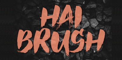 Unleash your creativity with the all-caps captivating Hai Brush Font. This unique typeface effortlessly combines the raw energy of hand brush strokes with a touch of elegance, making it an exceptional choice for a variety of design endeavors. Whether you're crafting logos, posters, or branding materials, Hai Brush Font adds an authentic, artistic flair to your projects.
 - Soapy Feelings by PizzaDude.dk,
$18.00 Soapy Feelings is my slightly rough-edged handmade fantasy (or perhaps even fairytale) font. I've added several swashes, which can be used for both starting and endings of words. I've also added 4 slightly different versions of each letter (and they automatically cycle as you type!) and lastly, of course Soapy Feelings has multilingual support! Caps Only Fonts
 - Handmade Font by Ingrimayne Type,
$14.95 In Handmade Font the letters are made of hands or handprints, something children sometimes do when they are set free with paint. It is caps only but the letters on the lower-case keys differ from those on the upper-case keys. It comes with a large assortment of accented letters to support most European languages.
 - Ramen Sans by Nina Belikova,
$20.00 Ramen Sans is a friendly grotesque type family with the warmth of serif types and a little bit of the edginess of geometric sans! Designed with body text in mind, it offers 5 weights (and their italics), small caps, tabular figures, fractions, numerators, denominators, and supports the Adobe Latin 3 character set (most western and central European languages).
 - BROKEN STORM by Aminmario Studio,
$30.00 This is a supercharged font, with natural brush, quick strokes and sharp details. Contains ALL CAPS, numbers, some punctuation and ligature. Perfect for challenging jobs, titles, movie,logos, apparel, t-shirts, hoodies, quotes, product packaging, or anything that needs a typographic turbo-boost and a typographic unique style. Thanks for checking out this font. I hope you enjoy it!
 - BLACK PRANK by Aminmario Studio,
$20.00 This is a supercharged font, with natural brush, quick strokes and sharp details. Contains ALL CAPS, numbers, some punctuation and ligature. Perfect for challenging jobs, titles, movie,logos, apparel, t-shirts, hoodies, quotes, product packaging, or anything that needs a typographic turbo-boost and a typographic unique style. Thanks for checking out this font. I hope you enjoy it!