10,000 search results
(0.029 seconds)
- Spinat by Bogstav,
$16.00 Spinat is spinach in danish. I like all kinds of things with spinach: salads, lasagne, fish, burgers and even with spinach! Yes, I love spinach so much I can eat it without anything else! :) I hope you too like spinach or even Spinat - it has 5 different versions of each letter and multilingual support.
 - Diogenes Decorative by Ludwig Type,
$45.00 Diogenes Decorative is the swashy sister of Diogenes, an elegant and crisp text typeface. It comes in 5 weights, each containing 7 different fonts with lots of swash characters, alternates and separate swashes which fit on different characters. Diogenes Decorative can be used independently or in combination with Diogenes, e.g. for initials or headlines.
 - Knopa by Larin Type Co,
$10.00 KNOPA This is a fun and playful font family, which will perfectly fit into children's projects or funny modern designs and logos, with it you can make playful designs by changing styles and combining them with each other. This font has three weights ( light, regular, and bold ) and an outline style for each weight.
 - Baby Story by Sulthan Studio,
$12.00 Baby Story The script font with a handwritten style inspired by a very cute baby story fits well with this beautiful handwriting with a heart that can be connected or a heart on each end of the letter or also a middle letter that rises up or down. Baby Story comes with 567 glyphs.
 - Blauer by Larin Type Co,
$15.00 Blauer is a versatile, multi-purpose font that is perfect for vintage and modern design. It will perfectly fit into any project, with its help you can create beautiful logos, inscriptions, templates, signs, highlight text, use for outdoor advertising. Blauer contains alternates, ligatures and swashes that will help you make your design even more attractive.
 - Orion by Linotype,
$29.99 Hermann Zapf made his first scetches for Orion in 1963. Zapf's aim was to create a neutral textface which can be ideally used as a newspaper face. Its strokethickness and open letterforms also fits well for book and magazine production. The final two weights of Orion were released in 1974 for the Linofilm photocomposing machine.
 - Park Lane by Alan Meeks,
$45.00 A Classic italic Roman with a set of alternative swash caps and a number of original swash lower case characters that can create a number of unusual ligatures.
 - Linguine by Fenotype,
$19.95 Linguine is a flowing script family with plenty of automatic ligatures, Swash initials, Small caps and Ornaments. You can easily access these features in any Opentype savvy program.
 - Majesty by Monotype,
$25.99 Majesty is a refined and elegant incised serif typeface designed to convey a sense of drama with any implementation of it. However, Majesty’s austerity is softened by the inherent familiarity of its letterforms. Having being inspired by classic engraved type, it has the echoes of familiar stone inscriptions over the centuries embodied within this 7-font type family. Majesty has a branding and titling focus, this is most apparent in the all cap letter combinations that are incorporated. Just activate Discretionary Ligatures and watch your type shape-shift on the fly to create interesting and appealing typography. There are a select number of Swash/Stylistic Alternates included that can also help you embellish your designs. Other features include Proportional, Tabular, and Old Style Figures, as well as Small Caps and Petite Caps, with the latter harmonising perfectly with the lowercase glyphs so that you can create unicase-style typography. You can find out more at majesty-font.com . Key features: • 5 text weights – Light to Black, plus Display and Poster weights • Small Caps, Petite Caps, Ligatures and Discretionary Ligatures • European Character Set – Latin Only • 840 glyphs per font.
 - Flirt by Canada Type,
$25.00It's a very happy day when we stumble upon beautiful alphabets that were never digitized. It is even a happier day when the beautiful alphabet finds its way to us through friends and people who like our work. Some two months ago, the forms of this gorgeous font were pointed to us by a friend who saw it in an old Dover Publications specimen book showcasing historical alphabets. It was there under the name Vanessa, with nothing else to go by. We looked and researched for further information but found nothing else. So this gem comes to you like a coal that winked its way out of the ashes because it wanted to shine again. Flirt is very authentic art deco with a noticeable element of artistic pride, swashy delicate majuscules and very aristocratic, fashionable and flirty minuscules. The majuscules can be used as every other capitals usually are, or as initial caps. The minuscules can very nicely stand on their own quite independently from the caps whenever desired. These letters are quite similar to the hand lettering used on of the kind of theater posters, specifically burlesque and opera entertainment, which are now considered very retro-chic and fashionable to see hanging on walls in home or office. The initial specimen we worked from showed a single basic art deco alphabet with numerals which seemed as they belonged to another font. That alphabet became the base Flirt font, the numerals were redrawn to fit much better with the minuscules, and the character set was greatly expanded to include punctuation, accented characters, and many many alternates, especially for the majuscules. Majuscules with a descending right vertical stroke were a common artistic touch in the high days of theater posters, so we thought they would be great additions to the character set. These alternates can be found all over the font. So to maximize the design fun, have a character map or glyphs palette handy when you use Flirt. After the base font was finished, we thought it would be a good idea to give it a bold treatment unlike anything seen out there, and the farthest thing from the mechanical bolds seen everywhere now. This bolding treatment consisted of thickening the lowercase's vertical strokes inwards, but leaving the horizontal stroke weight as is, and thickening only the thicker vertical strokes of the uppercase. The result is quite the visual feat. We encourage you to test both the regular and bold weights and see for yourself. - Track drift by Scratch Design,
$14.00 Track Drift is a strong font with a race theme. This font has speed, strong, sharp, fast, powerful, and modern characters. Track Drift will be suitable for racing or game themes of design, such as logos, headlines, posters, sports or race events, automotive posters, magazines, product design, packaging, labels, and other creative projects that need speed and strong font. What you'll get : All caps font in two styles Numbers & punctuation Multilingual support Ligatures Thank you for your purchase! Hope you enjoy our font!
 - Roline by HansCo,
$17.00 INTRODUCING ROLINE – Modern Display typeface! ROLINE is a modern lined font with unique style that will make your design looks modern and sophisticated. You can use this font for any purpose, especially to make logotype like a technology logo brand. This typeface is comes in ALL CAPS also support multilingual in ALL CAPS only. Enjoy!
 - Liquid Pickle - Unknown license

- Ekamai by Eclectotype,
$40.00 This is Ekamai, named after the district of Bangkok I lived in. It is based on Quinella, and was supposed to be a quick and easy reworking of that font into a "tight-not-touching" (rather than overlapping) version. As is often the case with quick and easy things, it turned out to be neither, and the vast majority of glyphs needed to be completely overhauled to fit the new system. This face is deliciously plump face, with lovingly rendered curves and just the right amount of cuteness; perfect for food packaging (of the sweeter variety probably!), logos, magazine headlines and the like. It performs admirably in all caps settings. The numerals are expressive hybrid figures (somewhere between lining and oldstyle). The overall feel is friendly and soft, without being overtly saccharine. Ekamai is equipped with subtle contextual alternates (which I'd recommend leaving on) to help with the tight fit, a handful of discretionary ligatures if that's your thing, and a case feature for all caps settings. The stylistic alternates and stylistic set 1 features simply change the # glyph to an attractive numero. Automatic fractions are included along with wide-ranging language support.
 - Boncaire Titling by insigne,
$22.00 Inspired by the type elements of 17th century Dutch mapmaking, Boncaire Titling provides you with a historic yet adventurous look for your library. This addition from insigne found its muse in a map of Curacao by Dutch cartographer Gerard Van Keulen, a member of the prosperous Van Keulen family from Amsterdam, who were engaged in the manufacture of maps for seafaring. Much thanks on this project goes to The Norman B. Leventhal Map Center, housed at the Boston Public Library. Through the centers kindness, I was able to view a number of period maps in person and to meet with curators, who explained more about the Van Keulen family and the way maps of the period were created. While I studied the maps, I narrowed in on some of the original types unique idiosyncrasies. For instance, the long, exaggerated serifs, which give the forms a sense of stability, aid in the faces legibility--largely a byproduct of the engraving method that was used to create the metal plates for manufacturing these maps. In creating Boncaire Titling, I decided to capture these unique idiosyncrasies, embracing the character of the engravings rather than removing them entirely through over-refining the forms. The result is an elegant family with far more than seafaring potential. This font has a full range of six weights, from thin to black. It also includes a wide variety of OpenType alternates. All insigne fonts are fully loaded with OpenType features. Boncaire Titling is also equipped for complex professional typography, including alternates, smaller titling caps and plenty of alts, including normalized capitals and lowercase letters. There are over 30 autoreplacing ligatures, and the face includes a number of numeral sets, including fractions, old-style and lining figures with superiors and inferiors. OpenType capable applications such as Quark or the Adobe suite can take full advantage of automatically replacing ligatures and alternates. You can find these features demonstrated in the .pdf brochure. Boncaire Titling also includes the glyphs to support a wide range of languages, including Central, Eastern and Western European languages. In all, Boncaire Titling supports over 40 languages that use the extended Latin script, making the new addition a great choice for multi-lingual publications and packaging. Maps are fascinating; they come with the promise of treasure to be uncovered. Examining the map itself, too, you can find great wealth in the details so artfully condensed to that single piece of paper--details carried over into this new insigne font. For your next project, explore the imagination potential in Boncaire Titling.
 - Quiller by Canada Type,
$24.95Quiller is another catch from the hot metal days, another one that managed to slip through the fingers of both the photo-typers and digitizers of last 4 decades. JJ Sierke’s Privat design from 1966 is now resurrected and heavily extended to be used by computer users everywhere. The original design was revived, and two whole new fonts were added to it - one with very unique swash caps and alternates, and one with many many ligatures and letter-combination ornaments. Quiller is a cross between brush calligraphy and very casual fast handwriting. It even has a slight Arabic simulation to it. Given such traits, the addition of a swash font and a multitude of ligatures comes in very handy to keep the natural flow of the font and maintain the elegance of its spirit. Those who like the auto-magic of OpenType’s intelligent substitution should like the fact that the OTF version is a single font with all the bells and whistles ready to go in the swash and discretionary ligatures features. If you use the latest versions of Adobe programs, the OTF version of Quiller is highly recommended. - LeadSheet Pen by NorFonts,
$29.95 LeadSheet Pen font is my handwriting emulation of an Engraving font style. It is a handwritten text font witch can be used with any word processing program for text and display use, print and web projects, CAD, Headlines, apps and ePub, comic books, graphic identities, branding, editorial, advertising, scrapbooking, cards and invitations and any casual lettering purpose… or even just for fun! The set comes with 12 weights in Light, Normal, Heavy Small-Caps and Expanded each with Italic version.
 - Kingfisher by Fenotype,
$25.00 Kingfisher is a bold brush family with Script, casual Caps and Extras. Kingfisher is divided into three styles -regular, distressed and one with stylised cuts that emphasize the brush stroke. Kingfisher is packed with several OpenType features: Contextual Alternates and Standard Ligatures are automatically on to keep the flow. For flashier characters, try Swash or Titling Alternates. Font is PUA encoded so you can access extras from character map in most design software. For the best price, purchase the complete pack!
 - TT Fors by TypeType,
$39.00 TT Fors useful links: Specimen | Graphic presentation | Customization options TT Fors is a modern geometric sans serif with characters and shapes contrasting in width, as close as possible to the basic geometric shapes (circle, square, triangle). TT Fors is a great addition to TypeType's line of functional sans serifs, which already includes such fonts as TT Norms Pro, TT Commons, TT Hoves and TT Interphases. The main inspiration for the creation of TT Fors was the study of geometric grotesques of the early to mid-20th century (Futura, Neuzeit Grotesk, Twentieth Century, Avantgarde Gothic, etc.), and the analysis of the contribution they made to the visual environment of that time. We gave ourselves the task to create the most versatile functional typeface that draws inspiration from the visual environment of the early to mid-20th century, but at the same time is aimed at uninterrupted use in all modern media, from branding and packaging design to work in interfaces and applications. This versatility is reflected in the title TT Fors (for), a typeface for a wide range of uses. The rounded characters in the font family tend to be shaped as the correct circle as much as possible, while the rest of the characters have narrower proportions. For more functionality, the typeface has rather high lowercase characters. Thanks to the correct and precisely selected geometric shapes and uniform construction rules, TT Fors works great both in the format of large headings and in very small text sizes used in book printing and in web design. In addition, the TT Fors family has a display subfamily TT Fors Display, which is a trendy pair for the text fonts. The main feature of the display subfamily is high contrast in horizontal or vertical strokes. When choosing a contrasting stroke, we paid attention that the shape of the letter would not go into reverse contrast and become a stressed sans serif. The subtle strokes in TT Fors Display have added sufficient display vibe to give the font a vibrant character, while remaining intelligent and serious. In total, TT Fors family includes 34 fonts: 9 weights and 9 italic styles in the text subfamily, 6 weights and 6 italic styles in the display subfamily, 2 outline styles and 2 variable fonts for both subfamilies. TT Fors has stylistic alternatives, ligatures, small caps (text family only), numbers in circles, arrows and a set of alternative round full stops and punctuation marks (text family only), slashed zero, and other useful features. More details about all OpenType features can be found in the font specimen. And, by good tradition, TT Fors has two variable fonts, for each of the subfamilies. Each variable font supports two axes of variability—thickness and slant. An important clarification—not all programs support variable technologies yet, you can check the support status here: https://v-fonts.com/support/. To use the variable font with two variable axes on Mac you will need MacOS 10.14 or higher. TT Fors supports more than 180+ languages, such as: Acehnese, Afar, Albanian+, Aleut (lat), Alsatian, Aragonese, Arumanian+, Asu, Aymara, Azerbaijani+, Banjar, Basque+, Belarusian (lat), Bemba, Bena, Betawi, Bislama+, Boholano+, Bosnian (lat), Breton+, Catalan+, Cebuano+, Chamorro+, Chichewa, Chiga, Colognian+, Cornish, Corsican+, Cree, Croatian, Czech+, Danish, Dutch+, Embu, English+, Esperanto, Estonian+, Faroese+, Fijian, Filipino+, Finnish, French, Frisian, Friulian+, Gaelic, Gagauz (lat), Galician+, Ganda, German+, Gusii, Haitian Creole, Hawaiian, Hiri Motu, Hungarian+, Icelandic+, Ilocano, Indonesian+, Innu-aimun, Interlingua, Irish, Italian+, Javanese, Jola-Fonyi, Judaeo-Spanish, Kabuverdianu, Kalenjin, Karachay-Balkar (lat), Karaim (lat), Karakalpak (lat), Karelian, Kashubian, Kazakh (lat), Khasi, Kinyarwanda, Kirundi, Kongo, Kurdish (lat), Ladin, Latvian, Leonese, Lithuanian, Livvi-Karelian, Luba-Kasai, Ludic, Luganda+, Luo, Luxembourgish+, Luyia, Machame, Makhuwa-Meetto, Makonde, Malagasy, Malay+, Maltese, Manx, Maori, Marshallese, Mauritian Creole, Minangkabau+, Moldavian (lat), Montenegrin (lat), Morisyen, Nahuatl, Nauruan, Ndebele, Nias, Norwegian, Nyankole, Occitan, Oromo, Palauan, Polish+, Portuguese+, Quechua+, Rheto-Romance, Rohingya, Romanian +, Romansh+, Rombo, Rundi, Rwa, Salar, Samburu, Samoan, Sango, Sangu, Sasak, Scots, Sena, Serbian (lat)+, Seychellois Creole, Shambala, Shona, Silesian, Slovak+, Slovenian+, Soga, Somali, Sorbian, Sotho+, Spanish+, Sundanese, Swahili, Swazi, Swedish+, Swiss German+, Tagalog+, Tahitian, Taita, Talysh (lat), Tatar+, Teso, Tetum, Tok Pisin, Tongan+, Tsakhur (Azerbaijan), Tsonga, Tswana+, Turkish+, Turkmen (lat), Uyghur, Valencian+, Vastese, Vepsian, Volapük, Võro, Vunjo, Walloon, Welsh+, Wolof, Xhosa, Zaza, Zulu+, Belarusian (cyr), Bosnian (cyr), Bulgarian (not localization), Erzya, Karachay-Balkar (cyr), Khvarshi, Kumyk, Macedonian, Montenegrin (cyr), Mordvin-moksha, Nogai, Russian+, Rusyn, Serbian (cyr)+, Ukrainian
 - Weekly by Los Andes,
$29.00 Weekly: a slab serif that wants to be a sans. The font was created under the premise that it can be used as a sans: a fresh design without that retro feel typical of slab fonts. As a result, we developed an Egyptienne font—more simple compared to others of its kind, a feature that gives it its unique personality. Weekly was based on fonts with humanist proportions, such as ‘Oficina’ and ‘Caecilia’, both created in the ’90s. Typefaces like these give designers the possibility to use them in books or magazines, in contrast to geometric slab fonts or early 20th century fat faces, which are mainly used for advertising or display text. Another feature that reminds us of humanist sans fonts is the small difference between x-height and cap-height. Some characters in Weekly like ‘a’ or ‘g’ lack serifs and some like ‘c’ or ’s’ have short serifs, giving it a semi-serif air. Weekly comes in both light and heavy weights. The heavier ones bear resemblance to Egyptienne slab serif typefaces with strong personality. These variants are ideal for use in posters and big, powerful headings.
 - Hypertension - Personal use only

- Army Beans - Unknown license

- Rozza by Serebryakov,
$49.00 Rozza is a single weight stencil cursive fat face font for extremal display use. Looking at this font the story of beauty and the beast comes to mind. That is how I would describe it. On the one hand prickly and dangerous, and on the other - pulsating beauty and passion. Try to combine Rozza together with Displace — great pair!
 - Journey Unicorn by Allouse Studio,
$16.00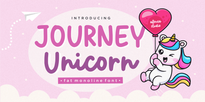 Proudly Present, Journey Unicorn A Fat Monoline Font Journey Unicorn is perfect for any titles, logo, product packaging, branding project, megazine, social media, wedding, or just used to express words above the background. Journey Unicorn also come with Multi-Lingual Support. Enjoy the font, feel free to comment or feedback, send me PM or email. Thank You!
 - Lunisolar by Hanoded,
$15.00 Lunisolar, according to the dictionary, means “of or caused by both the sun and the moon”. I liked the name, therefore I used it! Lunisolar is quite an interesting font: it is fat(tish) and rough, very neat and legible. It could be used for product packaging, book covers and starships. Comes with an abundance of diacritics.
 - Muscleman by Big Typephoon,
$20.00A strong, heavy font that really packs a punch. Muscleman is there when your design needs a little extra lift. Originally created for a poster project, the font juiced up and grew quickly into the large fat size it is today. It works well for logos, posters, and t-shirt designs and has a slight deco look. - Keepon Truckin NF by Nick's Fonts,
$10.00Baby Fat, designed by Milton Glaser in 1964, saw a lot of action during the psychedelic poster phase. This little dumpling is based on that workhorse, and takes its name from a phrase that also got around a lot in the 60s. Both versions of the font include 1252 Latin, 1250 CE (with localization for Romanian and Moldovan). - Doll by FaceType,
$30.00 Who needs counters? Although this typeface is bold as hell, it is still absolutely legible. If You are looking for fat curves, this is may be Your choice! There are also extra letters (A, V, v) to let You make better logos and headlines. Please take also a look at Dollbats for suitable Arrows, Symbols and Numbers.
 - Kharon Ultra NF by Nick's Fonts,
$10.00A fine, fat Deco face named Ludlow Stygian provided the basis for this delightful typeface. Although generally formal in character, the font shows a hint of playfulness in the distinctive “humpback” h and n characters. This font contains the complete Latin language character set (Unicode 1252) plus support for Central European (Unicode 1250) languages as well. - Vintage Lander by Din Studio,
$25.00 Have you thought about how you can add that touch of magic to your branding and projects? Want to travel your audience to a world of gorgeous, versatile, but still have the retro touch? Then, here we go. Introducing Vintage Lander- A RetroScript Font This vintage font features thick and angular letters. With its strong outlines and fat strokes, this is the font you need when you want to create that classic bubble font look. This font becomes more special with extruding version option. This font can be used for a host of different content needs and projects. Create gorgeous printed quotes, standout packaging, or beautiful t-shirts! You can even use it to create amazing headings, logos, menus, and social media graphics. Our font always includes Multilingual Support to make your branding reach a global audience. Features: Ligatures Stylistic Set Swashes Multilingual Support PUA Encoded Numerals and Punctuation Thank you for downloading premium fonts from Din Studio
 - Senohraby by Spurnej Type Foundry,
$19.00 Senohraby is an uppercase display typeface inspired by the old sign at Senohraby train station that is now slowly chipping away. Senohraby is available in three interconnected styles that freely various ages of the sign. “Paint” is a more or less preserved font written with a flat brush and featuring slight scratches and errors. The other styles, “Dirt” and “Trash”, follow up on this style and are increasingly marked by age, damage and erosion... In each style one can use simple alternation with lowercase letters, context-based alternation to eliminate repetition of adjacent characters, and a broad range of language support. As a result, each letter offers six variations that can be combined. These can be used as another alternation within a single word or as different bold weights. As a bonus, a fourth, additional style named “Crap” is freely available and as the name implies, it contains a wide array of various impurities.
 - Thankmom by Stefani Letter,
$12.00 Thankmom is a stylish font that incredibly exudes elegance and class. Incredibly versatile, this font fits a wide pool of designs, elevating them to the highest levels. Thankmom comes with alternate, titling, swashes, and ligatures for fully customizable designs. This font is PUA encoded which means you can access all of the glyphs and swashes with ease!
 - Brisella by Letterara,
$14.00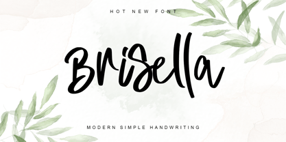 Brisella is a simple modern handwritten font with a wonderful choice of bold and elegant to choose from. Its natural and unique style makes it incredibly fitting to a large pool of designs. The only limit is your imagination! This font is PUA encoded which means you can access the available glyphs and ligature with ease!
 - Fleurons Initials by Wiescher Design,
$39.50Fleurons Initials is a set of elegantly decorated blocked initials, reminiscent of old Jazz and Circus Posters. I have added one set of flat underlays and one of blocked underlays, so you can easily add a little colorful touch here and there. Easy because those underlays have the the same spacing! Have fun. Your elegant designer, Gert Wiescher - Retro Blanche by Pista Mova,
$9.00 Blanche is a hand-drawn, retro script font. This font is perfect for all your fun designs! Use Blanche to create logos, branding, stickers, shirts, signs, posters, quotes, instagram posts, procreation designs and more! Includes shadow/extrude versions that are perfectly sized to fit Blanche Regular - so you can layer both fonts easily! Blanche Regular Blanche Extrude Thank You!
 - Abel Pro by MADType,
$39.00 Abel is a modern interpretation of the condensed flat-sided sans serif. Originally used for newspaper headlines and posters, this style can also be used for text on the web. Its angled terminals and spiked stems give it enough style to be unique at display sizes, while its mono-weight still works well at smaller text sizes.
 - Mawoot by Brainware Graphic,
$12.00 Mawoot is a geometric display font. This design has a strong technological feel and modern playful shapes, it will suit any project you can think of. Mawoot comes with many OpenType features, and with broad multilingual support covering many Latin-based languages. Mawoot is a nice fit for many design projects, for example logo, branding, posters, etc.
 - Nebulon by Letterhend,
$14.00 Nebulon is a newdisplay font with classic letterform. You can playaround to fit the form using alternate & ligatures. This font perfectly made to be applied especially in logo, and the other various formal forms such as invitations, labels, logos, or any type of advertising purpose. Features : Uppercase & lowercase Numbers and punctuation Alternates & Ligatures Multilingual PUA encoded
 - Bastinado by Elemeno,
$25.00Big, thick and chunky, Bastinado is imposing, but the bat-like, scalloped edges give it a sinister presence. Bastinado is an ancient Asian method of torture in which the bottoms of the victim's feet are beaten until he can no longer walk. This font looks like it wants to catch other fonts in a dark alley. - Soft Lime by PizzaDude.dk,
$10.00 Soft Lime is my simple, yet powerful typeface. It definitely fits in the comic department, but is very useful for posters, postcards (do anybody use these anymore?!) greeting cards and anything that needs a legible handmade typeface. It comes in several versions, that can be mixed for great results - and of course they all have multilingual support!


