10,000 search results
(0.102 seconds)
- Radon by Sensatype Studio,
$15.00 A Classy Elegant Display Font that we created special for elegant and Fashion branding needs that we created special for elegant branding needs, with extra ligature and alternates in unique shape will be ready to add value of your brand. It so nice to leverage designer or product owner that need solutions to make their design look more classy and modern. And specially for this font, We prepared any ligatures, and any alternate characters to help you create unlimited variations for your creative needs. Radon Display font ready with: Any options to get creative variations (combination of Alternate and Ligatures) Preview as a inspirations that you can do with Radon font Ready with Lowercase and Uppercase characters Wish you enjoy our font. :)
 - Simple Stamp by Oleg Stepanov,
$20.00 Simple Stamp is the hand-drawn font. It is good for games, cartoons, posters, chidlren's books, and for any other places, where loud and funky headlines are needed.
 - Birdland by Gatype,
$14.00 Birdland is a sweet and romantic handwritten font featuring a unique up and down flow. Use it for wall displays, product packaging, wedding invitations, social media post logos, and any project that requires impressive typography. It will add a splash of luxury to any design project you want to make! This font is PUA encoded which means you can access all the amazing glyphs and binders easily!
 - Bomb Da Gone by Prioritype,
$69.00 Start creating new moves. Make cool designs in urban graffiti style. You can apply them to your designs such as t-shirt designs, skateboards, album covers, merchandise, tote bags, landing pages, social media posts, posters, stickers, events etc. See some of the previews above for reference. Features: -Uppercase -Numeral -Punctuation -Multilingual -PUA Encoded -Opentype Features Note: To access the Opentype feature, it would be better if you use a program that supports it and is available with a glyph panel so you can see various alternative characters. Examples of programs such as Adobe Illustrator, Corel Draw or Inkscape. Thanks.
 - Pompeian Cursive by Wordshape,
$30.00 Pompeian Cursive is a calligraphically-inspired display typeface featuring a limited number of alternate characters and a handful of graceful ligatures. A lively set of non-lining numerals accompanies, as well as a few calligraphically-inspired flourishes for ornament. The history of this typeface: Oswald Cooper’s relationship with the Barnhart Brothers & Spindler foundry was one instigated under the auspices of creating new styles of type in lieu of following stylistic trends. In 1927, BB&S requested that Cooper create a script-like cursive typeface design in step with Lucien Bernhard’s Schoenschrift and ATF’s similarly-styled Liberty typeface. In response to BB&S’s desire to emulate instead of innovate, Cooper wrote to Mcarthur, “I am desolated to see Barnhart’s hoist the black flag. Your own efforts through the years to boost the foundry into a place in the sun as an originator seem wasted.” Still, Cooper took up the task at hand, creating a delicate, sophisticated type design which he named Pompeian Cursive. The typeface featured a limited number of alternate characters and a handful of graceful ligatures. A lively set of non-lining numerals accompanied, as well as a few calligraphically-inspired flourishes for ornamenting the end of lines of type accompanied the typeface, as well. By reviewing the few remaining original drawings for the type, as well as copious samples of Pompeian Cursive from both Cooper & BB&S' proofing process and period-specific type specimens, Wordshape presents the first digital version of this classic hybrid script/sans typeface, complete with all original alternate characters and ornaments. Pompeian Cursive has been intensively spaced and kerned for the finest setting for weddings, announcements, and general display work. - What was the inspiration for designing the font? While researching a biographic essay for Japan’s IDEA Magazine, I came across the original proofs and drawings for Pompeian Cursive. While a number of foundries have released interpretations of Cooper’s assorted typefaces, they stray from the original rather dramatically in parts. Cooper is without a doubt my favorite type and lettering designer, and to bring a refined return to his original intentions is an immense gift. - What are its main characteristics and features? Pompeian Cursive is a typeface which functions as both a display face and a limited text face. It features classy, thoughtful, and delicate swash capitals and rugged lowercase characters with a low x-height and gracefully long ascenders and descenders. - Usage recommendations: Display type or text-setting. Perfect for newspaper work, editorial design, materials intended to invoke an "old-timey" flavor, or just about anything in need of personality.
 - Le Havre Rough by insigne,
$19.00 Le Havre Rough. It’s high-resolution, hand-crafted letterpress to the core. Based on insigne’s popular Le Havre typeface, this new heat-treated, weathered face of all caps joins the realism and appeal of the top-quality Le Havre family. Rough’s eroded, printed look is extremely customizable, offering eleven distressed choices that appear fantastic even at large output sizes. Go ahead. Try it on, say, a billboard. Maybe even Times Square. The font includes hand-printed texture and distinctive shadow choices, too. Options include three inline versions, two shadow layers, and a clean primary version. Combine and match the options easily as you need, layering normal and shadow variations to alter appearance and texture. You can activate Art Deco alternates by using OpenType contextual alternates. Rough has an extra-large character set for many languages. Additionally, the typeface offers 62 extra ornaments like arrows, emblems, numbers & lines. Use its full texture and grit to capture the classic, genuine print feel that you need in your project. A few suggestions for use: - In Photoshop, jigger with various 'anti-aliasing' options for best outcomes. Smooth or strong is generally best. - In Illustrator, the shadow layer occasionally doesn't align when using the regular layer. To fix the alignment, open the type drop-down menu and choose Area Type Options > Em Box Height. Learn more about the using layered type styles on this informative video.
 - P22 Vale by IHOF,
$24.95 The Vale Press was a contemporary of Willam Morris's Kelmscott Press. The types used by the Vale Press were designed by artist Charles Ricketts, who also supervised the design and printing of Vale Press books. The main type used, Vale, was based on the Jenson 15th century roman type style. The King's Fount was an experimental semi-uncial font based on the Vale type. The King's Fount was designed in 1903 for the Vale edition of the 15h century poem "The Kingis Quair". This semi-uncial font evokes old English and Anglo-Saxon lettering. P22 Vale Pro combines the two fonts P22 Vale Roman and P22 Vale King's Fount into one "Pro" font. This pro font also includes a Central European character set, old style figures, fractions, ornaments and a special faux "Middle English" feature to make "anee text appeer Olde." This feature is not known to exist in any other font.
 - Touch Me by Latinotype,
$69.00 Touch Me is a Script hand-drawn style typeface—designed by Coto Mendoza—resulting from polyrhythmic exploration, sign deconstruction and altered calligraphic contrast plays with watercolour brush. Coto has been using these experimental calligraphy techniques when creating the catchwords for Macarons, the Boho Family, Bikini Season Script and Matcha Script and so forth. Touch Me was inspired by a character in a story written by Coto while attending a literary workshop with Ina Groovie in Santiago de Chile. The character is a tribal girl who lives on an island in the Caribbean. She is heir of ancestral knowledge and possesses wild beauty, very passionate and sensual: intense, strong and free. These features are reflected in the polyrhythm of the typeface's curves: an irregular baseline, variable x-height, different lengths of initial and terminal strokes (that sometimes expand and sometimes shrink) and amount of brush pressure that generates changes in contrast within the characters. This way, when composing, signs with stroke contrast randomly alternate with monolinear ones and with signs of altered contrast, thanks to the typeface's OpenType programming. The family, with more than 3,000 glyphs, provides a number of alternative characters, swashes, ligatures, initial and terminal forms, in short, a vast ocean of choices! Touch Me is a spontaneous typeface with a fresh and unique personality. It is the perfect choice for short text in both print and digital formats. The family comes with a Script Regular version and a seductive Script Drop that you will enjoy a lot! The Extras set includes some catchwords, dingbats and ornaments that allows for endless composition options. The family also comes with a Caps version —designed by Luciano Vergara—in 2 styles: a funny and big-headed condensed Sans Grotesk display of inverted vertical proportion plus a Grotesk, neutral and slightly expressive Petite. Both versions, available in 6 weights, have been especially designed to create hierarchies when composing. This allows for balance between strokes of different weight when it comes to the Sans and Script fonts. Come and dare yourself! Touch Me! Thanks Alisa for sharing your amazing and beautiful picture with us.
 - Sarasori by Typodermic,
$11.95 Introducing Sarasori, a typeface that effortlessly blends modern architecture and high-tech industrial design to bring you a unique and unconventional style. With its rectilinear display and technical serifs, this typeface is perfect for anyone looking to add a touch of precision and surrealism to their message. The machinelike feel of Sarasori is a testament to its precise and clean design. The unconventional letterforms and obscure vector logic come together to create a unique and mesmerizing effect that is sure to captivate your audience. Whether you’re designing a logo, a poster, or any other form of visual communication, Sarasori will help you deliver your message with a voice that is both modern and industrial. Sarasori is available in three different weights and italics, making it a versatile typeface that can be used for a variety of projects. Its sleek and polished appearance is sure to make a lasting impression, and its technical serifs add an extra layer of sophistication to your designs. So why wait? Embrace the boxy mechanical feel of Sarasori and take your designs to the next level with this unique and modern typeface. Order now and discover the surreal and precise voice that Sarasori can bring to your work. Most Latin-based European writing systems are supported, including the following languages. Afaan Oromo, Afar, Afrikaans, Albanian, Alsatian, Aromanian, Aymara, Bashkir (Latin), Basque, Belarusian (Latin), Bemba, Bikol, Bosnian, Breton, Cape Verdean, Creole, Catalan, Cebuano, Chamorro, Chavacano, Chichewa, Crimean Tatar (Latin), Croatian, Czech, Danish, Dawan, Dholuo, Dutch, English, Estonian, Faroese, Fijian, Filipino, Finnish, French, Frisian, Friulian, Gagauz (Latin), Galician, Ganda, Genoese, German, Greenlandic, Guadeloupean Creole, Haitian Creole, Hawaiian, Hiligaynon, Hungarian, Icelandic, Ilocano, Indonesian, Irish, Italian, Jamaican, Kaqchikel, Karakalpak (Latin), Kashubian, Kikongo, Kinyarwanda, Kirundi, Kurdish (Latin), Latvian, Lithuanian, Lombard, Low Saxon, Luxembourgish, Maasai, Makhuwa, Malay, Maltese, Māori, Moldovan, Montenegrin, Ndebele, Neapolitan, Norwegian, Novial, Occitan, Ossetian (Latin), Papiamento, Piedmontese, Polish, Portuguese, Quechua, Rarotongan, Romanian, Romansh, Sami, Sango, Saramaccan, Sardinian, Scottish Gaelic, Serbian (Latin), Shona, Sicilian, Silesian, Slovak, Slovenian, Somali, Sorbian, Sotho, Spanish, Swahili, Swazi, Swedish, Tagalog, Tahitian, Tetum, Tongan, Tshiluba, Tsonga, Tswana, Tumbuka, Turkish, Turkmen (Latin), Tuvaluan, Uzbek (Latin), Venetian, Vepsian, Võro, Walloon, Waray-Waray, Wayuu, Welsh, Wolof, Xhosa, Yapese, Zapotec Zulu and Zuni.
 - Zalika by Cititype,
$19.00 Zalika is an exquisite italic calligraphy handwritten font that exudes a classic and timeless appeal. The font is inspired by the traditional italic style of calligraphy, bringing back the nostalgic memories of this beautiful writing art form. Zalika offers two options for a more versatile design: Regular and Rough. The Regular option is sleek and smooth, while the Rough option provides a more textured and hand-drawn appearance. This variety in options allows designers to choose the perfect look for their project. The font also features beautiful flourish alternates that add a touch of elegance and sophistication to any design. These alternate characters offer an array of choices for the perfect flourish and allow designers to personalize their creations with a touch of uniqueness. Overall, Zalika is an exceptional font that blends the classic beauty of italic calligraphy with a contemporary style. Its elegant curves and beautiful alternates make it perfect for invitations, wedding stationary, logos, and any project that demands a touch of sophistication and charm.
 - Lilette by Elyas Beria,
$5.00 This elegant typeface came out of a quick, back-of-the-napkin, sketch I did for a different typeface. After toiling on that typeface I looked back at the sketch and realized that I had lost some of the elegance and playful character of my original sketch. So, it was back to the drawing board and Lilette was born. Lilette is fun but also serious. Playful but elegant. Personal yet also industrial. That’s the power of a slab serif. Perfect for magazine headlines, wedding invitations, signs, posters, slides, promotions, product design, branding, logos, and so much more. Make this versatile typeface with 10 styles yours.
 - Picastro by URW Type Foundry,
$39.99 Marit Otto about Picastro: The revolutionary typeface. Picastro is a fusion of Picasso and Castro. Don’t be alarmed by the second name! It is no political statement. Both characters represent different qualities in the typeface. The Picasso influence is the artistic, freestyle and frolic part. The Castro influence is the firm, square, perseverant look with a hint of propaganda to it. To combine two opposite inspirational sources (innovative versus persistent) makes the shape a bit edged. This typeface is very suitable for all kinds of graphic design (flyer, posters, CD covers and artworks) but also casual enough for (non academic) letter and text writing.
 - Soerina by IbraCreative,
$17.00 Soerina, a versatile serif typeface, embodies a harmonious blend of classic elegance and contemporary functionality. With its meticulously crafted letterforms, Soerina strikes a balance between sophistication and readability, making it suitable for a diverse range of design applications. The typeface exhibits a timeless aesthetic, featuring subtly modulated serifs that lend a touch of refinement to each character. Whether used for editorial design, branding, or digital interfaces, Soerina exudes a versatile charm, adapting seamlessly to various contexts while maintaining a distinct personality. Its balanced proportions and thoughtful details make it an excellent choice for conveying a sense of professionalism and aesthetic nuance across a spectrum of visual communication projects.
 - Tassista by MAC Rhino Fonts,
$59.00 Tassista means taxi in Italian. It suits this typeface well as the source of inspiration is the closing credits from the film Taxi driver, directed by Martin Scorsese in 1976. The typeface is designed to perform especially well in smaller sizes and makes it suitable for various credit copy, footnotes etcetera, nearly always presented in minor sizes. During the designs process it seemed more logical to make small caps instead of traditional lowercases.
 - Adimlara by Queenop Studio,
$12.00 Adimlara is attractive because it is sleek, clean, feminine, sensual, glamorous, simple and very easy to read, thanks to its many luxurious letter joints. I also offer a number of viable alternative styles for all letters. Classic style is very suitable to be applied in various formal forms such as invitations, labels, restaurant menus, logos, fashion, make up, stationery, novels, magazines, books, greeting cards/weddings, packaging, labels or all kinds of advertisements. for your purposes.
 - Bright Grotesk by Andrew Paglinawan,
$40.00 Bright Grotesk is inspired by grotesque & humanist typefaces suggesting a serious yet friendly personality. It is designed to be legible in small sizes yet charmingly attractive in large settings. Bright Grotesk is a neutral design with a subtle touch of flair. It feels old but looks new, warm yet active, symmetrical yet organic, classic yet modern. Bright Grotesk has great details that reveals in display sizes and can be felt in small sizes as well.
 - Balogent by Doeltype,
$20.00 Balogent is a elegant script with a new lovely stylish, a perfection style of the letters you want to use, modern handwriting with many alternatives. Now this is an opentype! It's smart and in line with your wishes! You are welcome to use it, suitable for various purposes: logo, signatures, corporate symbol, wedding invitation, title, creative, t-shirt, business card, letterhead, nameplate, headings, label, poster, news, badge, letterhead, cutting, hot stamping, quotation, etc. Thanks !
 - Akon by Ahmet Altun,
$19.00 Akon Font Family comes in 2 weights; Regular and Bold. It is completely hand-drawn. The Akon Font Family has a few ornaments and stylistic alternates, ligatures, small capitals, Scientific Inferiors and so. This font family would fit in your mobile application designs magnificently and is a great choise for poster design. With this font family, you can create eye-pleasing and nice works such as posters, printings, t-shirts, adds, magazines etc.
 - Calisia by Sensatype Studio,
$15.00 A serif that we created special for elegant branding needs, with extra ligature and alternates in unique shape will be ready to add value of your brand. It so nice to leverage designer or product owner that need solutions to make their design look more classy and modern. And specially for Calista font, We prepared any ligatures, and any alternate characters to help you create unlimited variations for your creative needs. Calisia sans serif font ready with: Any options to get creative variations (combination of Alternate and Ligatures) Ready 3 Weights (Light, Regular, and Bold) Preview as a inspirations that you can do with Calisia font Ready with Lowercase and Uppercase characters Wish you enjoy our font. :)
 - Friem by Holis.Mjd,
$10.00 Friem is a hand drawn font inspired by fonts that are usually used for children’s book titles that have a bold, messy and funny impression. Available in two clean and textured styles, this font is suitable for use for logos, book titles, movie posters, YouTube content, quotes, and more. There are ligatures that add features to this font, only in uppercase characters.
 - Longhai by Realtype,
$16.00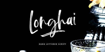 Longhai is a textured, natural and handcrafted brush font with an underline swash. This font is perfect for modern projects, headers, blogs, logos, websites, branding, and more! Longhai Swash include 26 hand drawn strokes to underline Longhai text. This as a separate font, choose it from your font menu and type in any A-Z character to create a swash.
 - Hannah Style by Sensatype Studio,
$15.00 A new Serif font that we created special for logo and branding needs, with extra unique shape that will add your brand value. I. And specially for Hannah font, We prepared any alternate characters to help you create unlimited variations for your creative needs specially for logotype or wordmark. Hannah Cute Serif font ready with: Any options to get creative variations Preview as a inspirations that you can do with Hannah font Ready with Lowercase and Uppercase characters Wish you enjoy our font. :)
 - Annotate by Ignace De Keyser,
$9.95 Annotate is a handwritten, monospace blockletter font complete with letters, numbers, & extended punctuation. The font is based on the handwritten annotation architects and engineer make on plans and sketches. By using a gridbased spacing and blocklettering, engineers can rely on an easily-readable and copy 'n print friendly annotations on techninical drawings to prevent any possible mistakes in the production process that are a consequence of misreading text. The clarity and uniformity allow to add a hand-written touch to any project without having to make concessions on the readability. Annotate will distinguish your text from the rest, ideal in logos, printed quotes, product packaging design, headers and many more usecases. Designer: Ignace De Keyser
 - Bravely by Craft Supply Co,
$20.00 Bravely- Handwritten Font is an handwritten script font based on the expression of real handwriting, lets you transform type into an exciting and beautiful piece of work. The irregular, hand-lettered look adds a real human touch to things and comes along with a lot of loving details. Combine all font-styles the way you want, add some ornamental swashes or banners and even a single word becomes magnificent.
 - Diotima Classic by Linotype,
$29.99Diotima Classic is a total upheaval for the 21st century of Gudrun Zapf von Hesse's mid-20th-century Diotima, one of the most beautiful types ever cast in metal. Its roots lay in a calligraphic sheet written by Gudrun Zapf von Hesse. The text was the Hyperion to Diotima" by Friedrich Hölderlin; Diotima is the name of a Greek priestess in Plato's dialogue about love. In the philosopher's imagination, she should appear slim and beautiful. In 1948, Gudrun Zapf von Hesse finished the typeface's Roman. The Diotima family was released as a metal typeface for hand setting by D. Stempel AG in 1951-53. This original Diotima is a festive design particularly suited to invitations, programs, and poems. The delicate Italic drew attention to text passages that should be emphasized. Linotype's previous digital Diotima only had one weight, which looked great in display sizes, but was too thin for text setting. Diotima Classic has four weights. The new Regular has more robust serifs and thicker hairlines, making it more appropriate for text sizes. The Diotima variation with finer serif remains under the name Light. Gudrun Zapf von Hesse also took the opportunity in 2008 to add an extremely heavy weight to the family. In comparison to the old Diotima, letterforms of the Diotima Classic are more harmonious and balanced. The rhythm of the Italic letters in Diotima Classic is more consistent. The lining figures of the Diotima Classic align with caps, and the letter spacing of the tabular lining figures in Diotima Classic is significantly better. The forms of the figures have been improved as well." - Sun-kissed by Krafted,
$10.00 “Live in the sunshine. Swim in the sea. Drink the wild air.” ― Ralph Waldo Emerson Hey there sun-kissed beauties! Are you looking for a gorgeous handwritten font that’ll captivate your viewers and make your branding shine as bright as the sun? Introducing Sun-kissed - A Handwritten Font. With every hand-drawn stroke and curve, Sun-kissed will delight and add brightness, modernity, and fun to wherever it’s placed. Impress your party guests with gorgeous invitations, make a statement on your social media banners, and add a little bit of sunshine to your corporate identity. This stylish Handwritten font is also can be used for headings, logos, business cards, printed quotes, cards, packaging, and presentations. What you’ll get: Multilingual & Ligature Support Full sets of Punctuation and Numerals Compatible with: Adobe Suite Microsoft Office KeyNote Pages Software Requirements: The fonts that you’ll receive in the pack are widely supported by most software. In order to get the full functionality of the selection of standard ligatures (custom created letters) in the script font, any software that can read OpenType fonts will work. We hope you enjoy this font and that it makes your branding sparkle! Feel free to reach out to us if you’d like more information or if you have any concerns.
 - Maguare Style by Sensatype Studio,
$15.00 A Modern Stylish Serif Font that we created special for elegant and Fashion branding needs that we created special for elegant branding needs, with extra ligature and alternates in unique shape will be ready to add value of your brand. It so nice to leverage designer or product owner that need solutions to make their design look more classy and modern. And specially for this font, We prepared any ligatures, and any alternate characters to help you create unlimited variations for your creative needs. Maguare Modern Stylish Serif Font ready with: Lowercase and Uppercase characters Numbers and Punctuations Preview as a inspirations that you can do with Foghe font Available for PC and Mac Wish you enjoy our font.
 - Merry Script by Letterara,
$14.00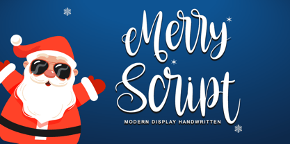 Merry script font that is simple and unique looking. Its beautiful charm makes it appear wonderfully down-to-earth, readable, and, ultimately, incredibly versatile. This will add a fun and friendly touch to any of your projects! This font is PUA encoded which means you can access all glyphs and sweeps easily.
 - Anglina Farmhouse by Letterara,
$14.00 A simple Anglina Farmhouse font looks unique and classy. Its beautiful charm makes it look absolutely stunning, easy to read, and, ultimately, incredibly versatile. This will add a fun and friendly touch to any of your projects. This font is PUA encoded which means you can access all the glyphs and sweeps easily.
 - Christmas Script by Letterara,
$16.00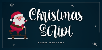 Christmas script font that is simple and unique looking. Its beautiful charm makes it appear wonderfully down-to-earth, readable, and, ultimately, incredibly versatile. This will add a fun and friendly touch to any of your projects! This font is PUA encoded which means you can access all glyphs and sweeps easily.
 - Northgate by Stringlabs Creative Studio,
$25.00 Northgate delivers an incredibly bold and unique font experience. This script will make a great addition to any crafter’s toolbox. Northgate Path is a flowing and elegant handwritten font, created with the help of a brush pen. Get inspired by its unique and beautiful style and add it to your favorite designs!
 - Petulante by PintassilgoPrints,
$20.00 Petulante is a striking and creative hand-drawn face with a scribbled feel. It's an all-caps font and brings two options for each letter and numeral for a more organic and natural look. There are yet a few ornaments to add an extra something here and there. Petulante is ideal for book covers, packaging, apparel, album art, posters, or any situation where you want a stylish and uncommon hand-crafted look. And let's not forget to mention the broad language coverage: Petulante speaks more than 208 languages, including Russian and Greek. Yes, just take it everywhere!
 - Bocahe by IbraCreative,
$13.00 Bocahe, a delightful and whimsical doodle kids font, captures the essence of youthful imagination and playful charm. Each letter in Bocahe is carefully crafted with endearing doodles, resembling the spontaneous drawings of children at play. The font exudes a carefree spirit, making it perfect for projects geared toward a younger audience. Bocahe’s adorable characters bring a sense of innocence to any design, from playful invitations to colorful educational materials. The font’s hand-drawn aesthetic and vibrant personality make it an enchanting choice for conveying joy, creativity, and the boundless wonder of childhood in typographic form.
 - Neoland by Edignwn Type,
$18.00 The font collection is called "Neoland", it is a display font for logotype and badge. These collections contain script and serif font. This script font includes alternates and ligatures. The Neoland matches apply in some designs such as the logo, poster, label, badge, packaging, t-shirt, branding, quotes and more custom design. Neoland features : Uppercase, lowercase, numeral, symbol, punctuation, alternate (ss01-ss07), swash and ligature in script font All-caps, numeral, symbol and punctuation in serif font Multilingual PUA Encoded Neoland includes : 3 fonts (script, serif and dingbat) 12 hand-drawn illustrations in dingbat If you have any questions, please contact : edignwn11@gmail.com
 - Faber Gotic by Ingo,
$21.00 A ”modern“ Gothic – designed according to principles of modern form in three variations Faber Gotik is a reminiscence of Gutenberg’s first script from around 1450. The heavily broken forms allow further development in the direction of a modern, strongly geometric and less formal type. It should be possible to push the principle of design so far to the limit that a type is created which, from the very start, extinguishes reminders of a dark past. The characters are composed of squares which are lined up straight or in a more or less slanted manner. The resulting corners similar to serifs were removed so that a sans serif type in the true sense without up and down strokes was created. The principle of ”breaking“ was applied according to the historical model. Even the form of the characters is based on the model from the Middle Ages. Only the characters which cannot be created with the principle described were modeled on today's forms. Faber Gotik includes three variations: - Faber Gotik Text — most similar to the historical model - Faber Gotik Gothic — pushes the applied principle of form the furthest - Faber Gotik Capitals —; a Gothic upper case font, contrary to tradition. 555 years after Gutenberg, interest in black-letter typefaces is nearly extinct. They are especially looked down upon in German-speaking countries because they are still associated with ”Nazi“ scripts. But yet, the very forms of blackletter, Gothic, Schwabacher and especially cursive have enormous potential with regard to the development of new advanced font forms.
 - Duos Pro by Underware,
$50.00 Duos Pro, a script for illusionists, comes in 10 styles. Whatever style you pick: apply this speedy monolinear handwriting font in large sizes, because it is made for catching the attention. Take Duos Sharp, which comes with speedy strokes and sharp endings in light, regular and black weights. Or pick Duos Round, and its 3 styles with a softer voice and round endings. Some people call those endings “funky ball noses“, an odd but appropriate description. Round styles look more like round tip speedball lettering, but contrary to most speedball letterings they're written with a very high speed. Especially Duos Round Black is more cuddlesome than its sharper counterpart. For an even more intuitive feel, we added two more sets: Duos Brush & Duos Paint. Duos Brush combines monoline strokes with brush beginnings and endings, for that graphical, freshly lettered touch. A closer look will reveal how its brushed tails vary all the time. Duos Paint is made up out of rough & artistic painted strokes, with all its accompanying shortcomings. In contradiction to the finesses of lighter weights, Duos Paint Black scores in being the most nonchalant and impressionistic. Poésie brutale! As well as having the option to choose between (or mix) these 10 styles, Duos Pro has additional hidden functionalities. For example, every style has many alternate lettershapes and ligatures, offering various different results and lengths to display every single word. Or manually add one of the swashes for more emphasis. A bonus font, Duos Tools, includes tool icons, strokes and banners. If that ain’t enough, throw in some polysemic letters for smart, ambiguous communication if you like. Want to become a signpainter? Then be a signpainter. Always wanted to be an artist? This is your chance! Duos Pro boosts your look. Make your visual vocabulary as grandiose, dramatic, sensitive or picturesque as you want. But whatever you do, don't hesitate to apply Duos Pro “short & big”!
 - Qara by Gholib Tammami,
$15.00 Qara is a breathtaking Didot font that exudes elegance, luxury, and an unparalleled sense of fashion. With its sleek and refined design, Qara captures attention and adds a touch of sophistication to any project.
 - Parma by Monotype,
$29.99Giambattista Bodoni (1740-1813) was called the King of Printers; he was a prolific type designer, a masterful engraver of punches and the most widely admired printer of his time. His books and typefaces were created during the 45 years he was the director of the fine press and publishing house of the Duke of Parma in Italy. He produced the best of what are known as modern" style types, basing them on the finest writing of his time. Modern types represented the ultimate typographic development of the late eighteenth and early nineteenth centuries. They have characteristics quite different from the types that preceded them; such as extreme vertical stress, fine hairlines contrasted by bold main strokes, and very subtle, almost non-existent bracketing of sharply defined hairline serifs. Bodoni saw this style as beautiful and harmonious-the natural result of writing done with a well-cut pen, and the look was fashionable and admired. Other punchcutters, such as the Didot family (1689-1853) in France, and J. E. Walbaum (1768-1839) in Germany made their own versions of the modern faces. Even though some nineteenth century critics turned up their noses and called such types shattering and chilly, today the Bodoni moderns are seen in much the same light as they were in his own time. When used with care, the Bodoni types are both romantic and elegant, with a presence that adds tasteful sparkle to headlines and advertising. Parma was designed by the monotype Design Team after studying Bodoni's steel punches at the Museo Bodoniana in Parma, Italy. They also referred to specimens from the "Manuale Tipografico," a monumental collection of Bodoni's work published by his widow in 1818. - Arrieta by W Type Foundry,
$35.00 Arrieta is a versatile typeface family designed to serve various design purposes. It combines the traditional mechanical typography process of punch cutting with the expressive strokes of a nib pen, resulting in a reliable, angled typeface.
 - Lyra by Canada Type,
$39.95 Lyra is an Italian Renaissance script that might have developed if metal type had not broken the evolution of broad pen calligraphy. It lies in the area between the humanist bookhand and the chancery cursive, combining the fullness and articulation of the Roman letters with a moderate italic slant and condensation. A steep pen-angle allows use of a broader pen relative to the x-height, giving the letters more contrast with light verticals and heavy curves. Lyra embodies the Renaissance spirit of refining technical advances of the late middle ages with reintroduction of ancient classical principles. Based on the moving penstroke with constantly changing pen-angle, it brings the vitality of handwriting to the ordered legibility of type. Lyra is a formal italic, too slow for copying books. By eliminating the element of speed, digital technology opens up a new level of calligraphy, bringing it into the sphere of typography as would naturally have happened if metalworkers had not controlled the process. If classical Western traditions are respected, digital calligraphy has the potential to recapture the work of the past and restart its stalled evolution. There is of course no substitute for the charm of actual writing, with each letter made for its space; but the tradeoff is for the formal harmony of classical calligraphy as every curve resonates in tune with every other. This three-weight font family marks Philip Bouwsma's much-requested return from a three year hiatus. It also reminds us of his solid vision in regards to how calligraphy, typography and technology can interact to produce digital beauty and vesatility. Each of the three Lyra fonts contains almost three character sets in a single file. Aside from the usual wealth of alternates normally built into Bouwsma's work, Lyra offers two unique features for the user who appreciates the availability of handy solutions to subtle design space issues: At least three (and as many as six) length variations on ascending and descending forms, and 65 snap-on swashes which can be attached to either end of the majuscules or minuscules. The series also offers 24 dividers and ornaments built into each weight, and a stand-alone font containing 90 stars/snowflakes/flowers, symmetric contstructs for building frames or separators, masking, watermarking, or just good old psychedelia.