10,000 search results
(0.075 seconds)
- Putteri Script by Alpha Bento,
$15.00 Putteri Script This type is a soft typefaces. bold, elegant & fun vintage script font. Can be used for various purposes.such as logos, wedding invitation, t-shirt, letterhead, signage, news, posters, badges etc. Putteri Script Font features alternate characters, ligatures, swash and multiple language support. To enable the OpenType Stylistic alternates, you need a program that supports OpenType features such as Adobe Illustrator CS, Adobe Indesign & CorelDraw X6-X7. How to get access alternate glyphs from open type fonts: - http://youtu.be/iptSFA7feQ0 There are additional ways to access alternates/swashes, using Character Map (Windows), Nexus Font (Windows), Font Book (Mac) or a software program such as PopChar (for Windows and Mac). How to access all alternative characters, using Windows Character Map with Photoshop: - https://www.youtube.com/watch?v=Go9vacoYmBw Thank you, Alpha Bento
 - FF Meta Variable by FontFont,
$344.99The FF Meta® design is a sans serif, humanist-style typeface that was designed by Erik Spiekermann for the West German Post Office (Deutsche Bundespost). It was subsequently released in 1991 by Spiekermann's company FontFont The FF Meta family, initially released as a commercial font in 1991, now comprises over sixty fonts. The FF Meta 2 family was released in 1992, the FF Meta Plus family in 1993, and in 1998 a facelift of the complete font family reclassified the FF Meta series and combined them into family-sets named FF Meta Normal, FF Meta Book, FF Meta Medium, FF Meta Bold and FF Meta Black. These are all available in Roman, italic, small caps and italic small caps. Between 1998 and 2005, further light stroke weights and a condensed family were introduced by Tagir Safayev and Olga Chayeva and were named: FF Meta Light and FF Meta Hairline. The last addition to the growing FF Meta font family is FF Meta Serif released by FSI in 2007. FF Meta Variable Roman is a single font file that features two axes: Weight and Width. For your convenience, the Weight and Width axes have preset instances. The Weight axis has a range from Hairline to Black. The Width axis provides a range of condensed values. This Roman (upright) font is provided as an option to customers who do not need Italics, and want to keep file sizes to a minimum. FF Meta Variable Italic is a single font file that features an italic design with two axes: Weight and Width. For your convenience, the Weight and Width axes have preset instances. The Weight axis has a range from Hairline to Black. The Width axis provides a range of condensed values. This Italic font is provided as an option to customers who do not need Roman (uprights), and want to keep file sizes to a minimum. FF Meta Variable Set is a single font file that features three axes: Weight, Width and Italic. For your convenience, the Weight and Width axes have preset instances. The Weight axis has a range from Hairline to Black. The Width axis provides a range of condensed values. The Italic axis is a switch between upright and italic - 1420 Gothic Script by GLC,
$38.00 This script font was inspired by the type most commonly used during the period 1300s to 1500s. It is a compromise between historic truth and contemporary use. We particularly thank very much the Paris Sorbonne University professor who gave us freely and patiently numerous and valuable advice and criticism for this work. This font includes “long s”, naturally, as typically medieval, a lot of ligatures as “ff, ffi, fi, ft, sd, pp...”, some special glyphs frequently used as abbreviation in Latin texts during the medieval era for replacing letter groups such as “qui, qua, que, quia, quam, per, pri, pre...”, but also a few final and initial characters and final addable loops. Instructions for use, added, helps to identify them on keyboard. It can be used for web-site titles, posters and fliers design, editing ancient texts or greeting cards, all various sorts of presentations, as a very decorative, elegant and luxurious font... This font remains clear and easy to read over a wide range of sizes. Its original medieval size is about 18/24 points.
 - Mintely by Din Studio,
$29.00 Mintely is a sophisticated and versatile serif font family designed to elevate your typography to new heights of elegance and legibility. With its 6 style variations and 8 weight options, this font offers an extensive array of choices to suit a wide range of design projects. This family combines classic and modern elements, resulting in a timeless design that can adapt to various design contexts. The 6 style variations in this serif provide you with a variety of typographic options, allowing you to experiment with different looks and moods. Whether you need a sleek and minimalistic appearance or a more decorative and ornate style, Mintely has you covered. Additionally, the 8 weight options in Mintely offer a wide range of possibilities in terms of contrast and emphasis. From thin and elegant weights to bold and impactful variations, this font family ensures that you can effortlessly find the perfect weight for your specific design needs. Because of its legibility you can use this font in a variation of text sizes. Enjoy the available features here. Features: Multilingual Supports PUA Encoded Numerals and Punctuations Mintely fits in headlines, logos, posters, flyers, invitations, branding materials, print media, editorial layouts, headers, and any many more. Find out more ways to use this font by taking a look at the font preview. Thanks for purchasing our fonts. Hopefully, you have a great time using our font. Feel free to contact us anytime for further information or when you have trouble with the font. Thanks a lot and happy designing.
 - Blessed Dreams by Yumna Type,
$15.00 It could be such frustrating work to find an attractive display font in accordance with your design project. Moreover, a wrong display font will only result in the failure of your design leaving your customers uninterested. However, you should feel no worry as we have the best answer to your problems. Blessed Dreams is a visually attractive display font with soft, gentle nuances caused by the swinging end of the wipes and curves. Each of the letters is interconnected as in the cursive font and the proportions are relatively similar for a legibility reason. Furthermore, you can apply this font, which also provides you with a clipart as a bonus, for big text sizes to be legible. In addition, you may make use of the available features here. Features: Multilingual Supports PUA Encoded Numerals and Punctuations Blessed Dreams fits best for various design projects, such as brandings, posters, banners, headings, magazine covers, quotes, printed products, merchandise, social media, etc. Find out more ways to use this font by taking a look at the font preview. Thanks for purchasing our fonts. Hopefully, you have a great time using our font. Feel free to contact us anytime for further information or when you have trouble with the font. Thanks a lot and happy designing.
 - HK Kelie by HK Studio,
$25.00 HK Kelie is a light to medium-contrast typeface with swashy, medium bracketed serifs, and terminals in the appropriate places, as well as bracketed junctions in various letterforms. The main feature of the typeface is the disconnection between the bowls and the stems. However, the bowl is very close to the stem, creating the illusion of connection. HK Kelie is calm, attractive, and legible — but above all, it is sophisticated.
 - Silk Serif by SilkType,
$47.50 Silk Serif is a high-contrast typeface with thin, pointy, heavily bracketed serifs, and ball terminals in the appropriate places, as well as bracketed junctions in various letterforms. The main feature of the typeface is the disconnection between the bowls and the stems. However, the bowl is very close to the stem, creating the illusion of connection. Silk is delicate and legible — but above all, it is sophisticated.
 - Harvest Script by DonyaDesign,
$14.00 Harvest Script is a soft and sweet calligraphic typeface, with characters dancing along the baseline. It has a casual and elegant touch. Can be used for various purposes such as logos, wedding invitations, headings, t-shirts, letterheads, signage, labels, news, posters, badges etc. OpenType features with alternative styles, ligatures, and multiple language support. Need help? If you need help or advice, please contact me by email. Thank you!
 - Rough Hearts by Nathatype,
$29.00 Do you want a handwriting style font in consistent, professional displays? Well, finding such fonts can be tough and time-consuming work. Therefore, Rough Hearts is here for your perfect choice. Rough Hearts is a font in a handwriting style with different, more natural shapes looking like spontaneously written letters. Each letter detail is made in swinging styles and this font also has high letter contrast, which means the thickness and thinness differences of the lines on each letter can be clearly seen. This font produces personal and creative impressions resulting in its legibility and attractiveness to apply for simply interesting design projects. You can use this font for big text sizes to be greatly legible and also enjoy the available features here. Features: Alternates Ligatures Stylistic Sets Multilingual Supports PUA Encoded Numerals and Punctuations Rough Hearts fits best for various design projects, such as brandings, headings, magazine covers, quotes, printed products, invitations, greeting cards, name cards, merchandise, social media, etc. Find out more ways to use this font by taking a look at the font preview. Thanks for purchasing our fonts. Hopefully, you have a great time using our font. Feel free to contact us anytime for further information or when you have trouble with the font. Thanks a lot and happy designing.
 - Hoosier Daddy by Parkinson,
$20.00 Hoosier Daddy is based on Foundry Type samples from various mid-19th century specimen books. This shaded slab serif was made by conforming several different cuts of the styles, filling out the character set, and adding a few contemporary touches for freshness. This is a display face. Use it big.
 - Giulietta by GRIN3 (Nowak),
$26.00 Giulietta is a handwritten, fully connected script with ligatures and contextual alternates to help with flow and readability. It can be used for invitations, greeting cards, posters, advertising, weddings, books, menus etc. Giulietta pro is the most complete style, it contains over 830 glyphs, 7 stylistic sets, contextual alternates and ligatures. Every lowercase letter has seven variations (uppercase letter has three). To get the alternate glyphs choose various stylistic sets or just add "*1", "*2", "*3", "*4", "*5","*6" or "*7" before the letter in any OpenType savvy application or manually select the characters from Glyph Palette. Giulietta A, Giulietta B and Giulietta C have less glyphs than the Pro one, they only contain some selected alternates and ligatures. Language support includes Western, Central and Eastern European character sets, as well as Baltic and Turkish languages.
 - CT Ausetan by Cosmos Type,
$27.00 CT Ausetan is a typeface designed for perfect reading in continuous text. With humanist proportions and calligraphic details but actual, both in appearance and in function. Its asymmetric serifs and slightly curved stems recall the warmth, dynamism and character of the first humanist typefaces built according to the logic of the flat pen. It has a high x-height and its moderate contrast make reading in small bodies comfortable. The many OpenType features make it a versatile typeface that fits into any publishing project. To cover present-day needs, CT Ausetan consists of six weights and their corresponding italics. Each font includes small caps, ligatures, old-style, lining, proportional and tabular figures, superscript, subscript, numerators, denominators, and fractions as well as various geometric figures and stylistic sets. With an extensive Latin character set, CT Ausetan covers a large number of Latin-based languages. Initially designed for small texts, below 14 pt, its calligraphic details accentuate its personality when used in larger bodies such as headlines.
 - England Script by Max.co Studio,
$12.00 England Script is a romantic typeface, which is elegant, fun and vintage. It can be used for various purposes such as logos, wedding invitation, t-shirt, letterhead, signage, news, posters, badges etc. England Script features 500+ glyphs and extruded font, alternate characters, ligatures, swash and multiple language support: ŠÀÁÂÃÄÅÆÇÈÉÊËÌÍÎÏŸŽÐÑÒÓÔÕÖØÙÚÛÜÝßàáâãäåæçèéêëìíîïñòóôõöøùúûêýÿŒœšž To enable the OpenType Stylistic alternates, you need a program that supports OpenType features such as Adobe Illustrator CS, Adobe Indesign & CorelDraw X6-X7. How to get access alternate glyphs from open type fonts: http://youtu.be/iptSFA7feQ0 There are additional ways to access alternates/swashes, using Character Map (Windows), Nexus Font (Windows), Font Book (Mac) or a software program such as PopChar (for Windows and Mac). How to access all alternative characters, using Windows Character Map with Photoshop: https://www.youtube.com/watch?v=Go9vacoYmBw Need help? If you need help or advice, please contact me. Thank you!
 - Billy The Gang by Motokiwo,
$17.00 Billy The Gang is a stylish handmade font. Inspired by my logotype project I made this font to be suitable for various design projects. Billy The Gang has 582 glyphs include a lot of alternates and swashes, also has 27 languages support. Features: - Uppercase & Lowercase - Numerals & Punctuation - Ligatures - Stylistic alternates for all uppercase and lowercase - Swashes for all uppercase and lowercase - Contextual Alternates for all lowercase - Stylistic sets (SS01 and SS02) for all lowercase - PUA Encoded Characters : If you don't have programs that support OpenType Features, don't worry you can access the alternate glyph via Font Book (Mac user) or Windows Character Map (Windows user) - Multilingual Support Supported Languages: Afrikaans, Albanian, Catalan, Croatian, Czech, Danish, Dutch, English, Estonian, Finnish, French, German, Hungarian, Icelandic, Italian, Latvian, Lithuanian, Maltese, Norwegian, Polish, Portugese, Slovak, Slovenian, Spanish, Swedish, Turkish, Zulu.
 - Rougon by VanderKeur,
$30.00 The reason for Nicolien van der Keur to design the Rougon font was the translation of twenty novels written by Emile Zola, a French writer, and translated by Martine Delfos. It follows the lives of the members of the two titular branches of a fictional family living during the Second French Empire (1852–1870) and is one of the most prominent works of the French naturalism literary movement. This series deserved a font with French roots and corresponded to the period in which Zola’s books were written and published, the period between 1870 and 1893, the end of the nineteenth century. Extensive research into French historical typefaces has led to a type specimen from the French type foundry Deberny et Cie in Paris around 1907. It turned out to be good and helpful source as it contained a sample of a typeface that reflected the content and style of the novels, but also represented the period in which the books were written in France. A large part of the novels are about the generations of Rougon, so it seemed a natural choice to give the font that name. It is available in one weight and contains stylized portraits of Emile Zola and the French Marianne. This font also contains various ornaments.
 - Pedroc by Craft Supply Co,
$20.00 Introducing Pedroc – Display Typeface Future-Inspired Geometric Blocks Pedroc is a Future-Inspired Display Typeface, a captivating Display Typeface, is born from the inspiration of future technology, thus infusing an industrial touch into its design. Sleek and Futuristic Aesthetics Pedroc’s design is a testament to sleek and futuristic aesthetics. This makes it a standout choice for modern and tech-inspired projects. Versatility for Contemporary Design This font’s adaptability shines in various contemporary design contexts. As a result, it’s suitable for a range of creative endeavors, from branding to posters. Engaging and High-Tech Future-Inspired Display Typeface guarantees your content remains engaging and high-tech. Consequently, it captivates your audience with its modern industrial charm, ensuring your message resonates. In Conclusion In summary, Pedroc – Display Typeface is the font for those seeking a futuristic, industrial touch. Its sleek and versatile design ensures it fits seamlessly into contemporary creative projects. Whether it’s for tech-inspired branding, posters, or other modern designs, Pedroc is the font that keeps your content engaging and high-tech, appealing to a diverse audience with its modern industrial charm.
 - Optimisti by Juliasys,
$26.00 Optimisti is Finnish for optimist – and it’s an optimistic, light-hearted feeling that this trio of handwriting fonts transfuses into all kinds messages and identities. Casual, playful and character-strong as they are, the three of them make a perfect team for headlines, slogans, teaser texts and brand naming. Besides the two original fonts – “Optimisti Smooth” and “Optimisti Sparkling” differing in outline structure and texture – “Optimisti Decor” now joined the game. Optimisti Decor is loaded with a multitude of artful elements that can convey a very festive atmosphere – or, on the contrary, ironically make fun of it. Its features are is especially striking when used in all-caps setting. Use the Optimists separately or together to make a humorous – or serious but always cordial impression in print, on the web, on packaging or even on your shopping bag … All Optimisti fonts have a Western European, a Central European and an Extended Cyrillic character set. They support approximately 100 languages.
 - Normatica by CarnokyType,
$42.00 Normatica is a neutral typeface inspired by advertising letters used as letterings on shop windows during period of Normalization (the 60s–90s) in former Czechoslovakia. The complete font family consist of 24 styles in 6 weights (Thin–Black) with matching Italics where every style is followed by his Display counterpart. The difference between default and display styles is tighter spacing in Display fonts and different design of punctuation and diacritics accents. Beside the complete set of Latin, Normatica includes Cyrillic characters as well. Each font contains of alternative variation of some characters (j, t, y, Q) and includes a wide range of the Opentype features (for more details see pdf Specimen in Gallery section). Mixture of Normatica and Normatica Display can be effectively used for both text and display usage. It can be used in advertising, signage, corporate identities and various situations of editorial design. You can try two Demo styles in Medium weight fully for free.
 - MN Grissee by Mantra Naga Studio,
$20.00 MN Grissee - a Sans Serif Super Family Font. This typeface has many alternatives with swashes that can make your lettering/logotype more attractive. This font is suitable for logos and various other formal forms, such as invitations, labels, logos, magazines, books, greeting/wedding cards, packaging, fashion, makeup, stationery, novels, labels, or advertising. This font is PUA encoded, which means you can access all of the glyphs and swashes with ease! 436 Glyphs 9 Opentype features 10 Ligatures, Stylistic Set and Swash 3 Widths (Condensed, Normal, Expanded) 8 Weights (Thin, Extra Light, Light, Regular, Medium, Semibold, Bold, Extrabold) 2 Styles (Regular & Italic) Support Multilingual for 89 languages We highly recommend using a program that supports the OpenType feature and the Glyphs pane like many Adobe and Corel Draw applications, so that you can view and access all variations of Glyphs. Thanks for your support of our product and using it in your project.
 - FF Mark Paneuropean by FontFont,
$79.00Geometric sans fonts in the Bauhaus tradition were the inspiration for the design of FF Mark®, for example the Universal font by Herbert Bayer, Erbar® Grotesk, Kabel®, Neuzeit Grotesk and of course Paul Renner's Futura®. From an aesthetic point of view, FF Mark is a descendant of these classics of German typeface design that intends to meet the needs of modern communication. Hannes von Döhren and Christoph Koeberlin had the support of the entire FontFont Type Department in the design of FF Mark, including Erik Spiekermann, who took over the artistic direction of the project. The teamwork resulted in carefully planned, balanced forms, which are responsible for the harmonious overall impression of the font. The capitals are not based on Roman square capitals; rather, they have a uniformly wide letter form in a comfortable ratio to the x-height. Thanks to the x-height, which is significantly larger compared to the historical models, FF Mark is also very legible in small sizes. This makes it a very flexible font in terms of its range of applications. A contrast in the stroke width is barely noticeable. At the same time, light modulation supports readability, especially in the bold styles in small sizes. The uniform line ends are obvious for a contemporary sans family nowadays (unlike some of the historical precedents, which evolved over years). Other details from the predecessors are consciously maintained and provide for added individuality in FF Mark. For example, the limbs in the uppercase "K" and "R" are offset slightly from the stem. Alternative characters with crossbars are available for the numbers "0", "1", "7" and the uppercase "Z" and the lowercase "a" also has an alternative with an open form. German typesetters have the option of uppercase umlauts with points that are set lower, as well as a long "s" from the Fraktur. And last but not least, FF Mark has the very characteristic ft-ligature of Futura. FF Mark is available in ten finely tuned weights ranging from Hairline to Black. A Book style for text setting further emphasizes the well-rounded features of this contemporary typeface. When the font was published, it also included ten carefully designed cursives for all weights. Users also have the option of various numeral sets with old-style and uppercase numbers as well as small capitals. FF Mark also has some geometric shapes and arrows based on the features of Futura. FF Mark is a modern, full-featured, geometric sans serif that you can use without hesitation for large projects in headlines as well as in texts. FF Mark's design is a nod to the historical models and transports their charm, elegance and in some cases unusual design applications into a modern font family equipped with the most current typographical features. NEW: the new FF Mark W1G versions features a pan-European character set for international communications. The W1G character set supports almost all the popular languages/writing systems in western, eastern, and central Europe based on the Latin alphabet and also several based on Cyrillic and Greek alphabets. - Gravesend Sans by Device,
$39.00 Smart, legible and elegant, Gravesend Sans is a based on the unique typeface used for the iconic grass-green signage for the Southern Railway. In existence from 1923 to 1948, when the network was nationalised, the Southern Railway linked London with the Channel ports, South West England, the South coast resorts and Kent. The same design was also used for the ‘hawkeye’ signs on the London, Midland and Scottish Railway, differentiated by black letters on a yellow background. Reference for each letter was taken from vintage ‘target’ station nameplates and other platform signage. The rarest letters were the Q, seen in Queens Road Battersea, the X, seen in East Brixton, and the Z, used in Maze Hill, site of an infamous train crash in 1958. Being hand-made, the letters often differ in width and thickness. There was no lower case. The Bluebell Railway, a heritage steam line, runs over part of the old Southern Railway network and uses a very similar type. The design of the numbers differed considerably, but here have been taken from the Device 112 Hours font Smokebox. As well identifying platforms, they were used on the front of the steam engine’s smokebox, hence the name, and stylistically are more in keeping with the letters than some of the squarer versions that can be seen in old photographs. William Caslon IV is credited with the first Latin sans-serif type, shown in a 1816 Caslon specimen book. ‘Two Lines English Egyptian’, as it was called, was caps-only, and there are several other correlations between that type design and this one. Includes a selection of authentic arrows and manicules, plus abbreviated ligatures such as ‘St.’ (Saint or Street) ‘Rd.’ (Road) and ‘Jn.’ (Junction). The Cameo version includes many graphic banner elements that can be freely combined.
 - Type Tile by Konst.ru,
$19.00 The fastest and easiest way to create original images. It is necessary to take any text and use it with Type Tile. Create pictures, patterns and backgrounds from real texts. Font can be used in various encodings and you can type texts in many languages. Type Tile supports Central European languages that use Latin script, (Polish, Czech, Slovak, Hungarian, Slovene, Serbian, Croatian, Romanian and Albanian), Cyrillic alphabets, Western languages, Greek, Turkish, Hebrew, Arabic, Baltic languages, Vietnamese, Thai and Japanese. You can make the background from the original text for the page on which can print the translated text. This symbiosis can create a feeling of presence in the original text. Decorate the packaging in which the text is written in the form of ornament. Several layers of the texts with Type Tile shows an incredible pictures. Use a pair of letters can give a regular pattern. Type Tile provides endless and fantastic opportunities for design on any surfaces and for different purposes in publish, fashion, textiles, industry, animation, Internet and so on.
 - Macklin by Monotype,
$50.99 Designed by Malou Verlomme of the Monotype Studio, Macklin is a superfamily, which brings together several attention-grabbing styles. Macklin is an elegant, high contrast typeface that demands its own attention and has been designed purposely to enable brands to appeal more emotionally to modern consumers. Macklin comprises four sub-families —Sans, Slab, Text and Display— as well as a variable. The full superfamily includes 54 fonts with 9 weights ranging from hairline to black. The concept for Macklin began with research on historical material from Britain and Europe in the beginning of the 19th century, specifically the work of Vincent Figgins. This was a period of intense social change--the beginning of the industrial revolution. A time when manufacturers and advertisers were suddenly replacing traditional handwriting or calligraphy models and demanding bold, attention-grabbing typography. Typographers experimented with innovative new styles, like fat faces and Italians, and developed many styles that brands and designers continue to use today, such as slabs, serifs, and sans serifs. Verlomme pays respect to Figgins’s work with Macklin, but pushes the family to a more contemporary place. Each sub family has been designed from the same skeleton, giving designers a broad palette for visual representation and the ability to create with contrast without worrying about awkward pairings. With Macklin, Verlomme shows us it’s possible to create a superfamily that allows for complete visual expression without compromising fluidity. Macklin™ font field guide including best practices, font pairings and alternatives. Featured in: Best Fonts for Websites
 - Serena by Canada Type,
$24.95The story of Serena is a unique one among revivals. Serena was neither a metal face nor a film one. In fact it never went anywhere beyond Stefan Schlesinger’s 1940-41 initial sketches (which he called Saranna). A year later, while working with Dick Dooijes on the Rondo typeface, Schlesinger was sent to a concentration camp where he died, along with any material prospects for the gorgeous letters he'd drawn. The only sketches left of Schlesinger’s Saranna work are found in the archives of the Drukkerij Trio (the owner of which was Schlesinger’s brother-in-law). The sketches were done in pencil and ink over pencil on four sheets of paper. And now Hans van Maanen revives Schlesinger’s spirit as closely as the drawings permit, and elaborately expands the work to cover a multitude of codepages and languages. It took more than 65 years for Schlesinger’s drawings to see the light, so van Maanen made sure to bring them to life stylishly and respectfully. Serena embodies the peace and calm rarely ever found in mainstream calligraphy or other genres of display type. With upright elegance and a slight Eastern touch, this typeface expertly bridges the gracefully casual with the deeply spiritual. The light and soft letter forms add a pleasant, breezy element to anything they touch. When used sparingly in titling or display, Serena is like a sigh of desire, rare but quite memorable and very appreciated. - Hello Velantinos by IM Studio,
$12.00 Hello Velantinos is modern calligraphy. a bold, elegant & fun vintage script font. It can be used for various purposes such as logos, wedding invitations, t-shirts, letterheads, signage, news, posters, badges etc. Hello Velantinos features 453 glyphs and 222 alternate characters, ligatures, washes and multiple language support. To enable the OpenType Stylistic alternative, you need a program that supports OpenType features such as Adobe Illustrator CS, Adobe Indesign & CorelDraw X6-X7. How to get alternative glyph access from open type fonts: http://youtu.be/iptSFA7feQ0 There are additional ways to access alternatives/swashes, using Character Map (Windows), Nexus Font (Windows), Font Book (Mac) or a software program such as PopChar (for Windows and Mac). How to access all alternative characters, using Windows Character Map with Photoshop: https://www.youtube.com/watch?v=Go9vacoYmBw Need help? If you need help or advice, please contact me.
 - Benthura Script by Assami Studio,
$12.00 Benthura Script is a modern calligraphy. bold, elegant & fun vintage script font. Can be used for various purposes.such as logos, wedding invitation, t-shirt, letterhead, signage, news, posters, badges etc. Benthura Script features 510 glyphs and 279 alternate characters, ligatures, swash and multiple language support. To enable the OpenType Stylistic alternates, you need a program that supports OpenType features such as Adobe Illustrator CS, Adobe Indesign & CorelDraw X6-X7. How to get access alternate glyphs from open type fonts: http://youtu.be/iptSFA7feQ0 There are additional ways to access alternates/swashes, using Character Map (Windows), Nexus Font (Windows), Font Book (Mac) or a software program such as PopChar (for Windows and Mac). How to access all alternative characters, using Windows Character Map with Photoshop: https://www.youtube.com/watch?v=Go9vacoYmBw Need help? If you need help or advice, please contact me.
 - The Nightfall by Skinny Type,
$14.00 The Nightfall is a romantic typefaces. bold, elegant & fun vintage script font. Can be used for various purposes.such as logos, wedding invitation, t-shirt, letterhead, signage, news, posters, badges etc. The Nightfall features 300+ glyphs and 100+ alternate characters, ligatures, swash and multiple language support. View all glyphs here: http://s28.postimg.org/7osts7ezx/All_Glyphs.jpg To enable the OpenType Stylistic alternates, you need a program that supports OpenType features such as Adobe Illustrator CS, Adobe Indesign & CorelDraw X6-X7. How to get access alternate glyphs from open type fonts: http://youtu.be/iptSFA7feQ0 There are additional ways to access alternates/swashes, using Character Map (Windows), Nexus Font (Windows), Font Book (Mac) or a software program such as PopChar (for Windows and Mac). How to access all alternative characters, using Windows Character Map with Photoshop: https://www.youtube.com/watch?v=Go9vacoYmBw
 - Daito by insigne,
$29.99 It’s alive! Insigne’s new creation, Daito, is now functional, built to process your logos, business cards, magazine layouts, packaging and more without the slightest glitch. But this new slab serif is no heartless churn of the same factory nuts and bolts. Daito is designed to greet your reader with a friendly face. Inspired by types from the era of the Space Race, this new take on some old faces brings a contemporized, unique set of serif forms to the font race. Daito comes complete with a variety of weights to help you find the best settings for your current needs or moods. Need soft and playful? Daito light communicates its message gently with softened serif. Need a different feel with more authority? With the touch of a few buttons, engage the powerful Black or striking Bold. Additional features with Daito include stylistic alternates, ligatures, titling capitals and small caps among other typographic features. Please note: use magical OpenType-savvy applications such as Adobe Creative Suite, QuarkXPress, etc to keep your font from malfunctioning, shorting, attacking people, or attempting a world takeover. Daito also speaks Western, Eastern, and Central European languages. However, Japanese is not available for this edition. It’s not every day you find a top-of-the-line font like Daito. This machine can handle most anything on your list, short of folding your laundry (though it may make your laundry look nicer). Don’t wait. Order yours today while supplies last.
 - Smooth Buggaloo by URW Type Foundry,
$39.99 Just like my previous typefaces, my new one, Smooth Buggaloo, also finds its roots in music. The Boogaloo was a popular music style in the 60s, a mixture of Latin and Rock and Roll music. Later Salsa took over this genre. Latin music represents a vibrant, lively and an uncontrollable need to move. In Smooth Buggaloo, you will recognize a swing, flair and a hint of seduction. But despite its vibrancy it can also be understood as a serious, simple and clean typeface. The characters vary between a handwritten and a designed look. Smooth Buggaloo is very suitable for any graphic purpose, like logo- and poster design and it can also be used for longer texts.
 - 1557 Italique by GLC,
$38.00 Italic type was invented by Aldus Manutius in 1499 or 1501, first, before to be a style name, it was a plain font familly name. This Italique style font was inspired from these who was used by Jean de Tournes in Lyon (France) to print La mÈtamorphose d'Ovide figurÈe, a splendid book with numerous gothic style wood carved pictures. The original font contains almost all modern usual characters except accented ones, no longer in use on that time. They have been added, with some others, with respect for the original design. . A render sheet, enclosed in file, help to identify various others unusual letters on keyboard. It is used as successfuly as web-site titles, posters and fliers design, editing ancien texts or greeting cards, invitations, gastronomic menus... and much more, as a very decorative and elegant font... It supports easily as enlargement as small size, remaining clear and easy to read from 8 or 9 points to 72 and more, particularly on prints.
 - Tichy by NoCommenType,
$20.00 The "Tichy" typeface is intended for use in titles, headlines and in short text blocks, like citates. However, the typeface is legible even in larger text blocks. It's strong appeal allows the typeface's usage mixed with other graphic elements of the layout without compromising it's readability and it's presence. The typeface's simple initial module (double braked at 135 degrees straight line), the strict rules of forming the letters lead to an unique typeface - masculine, strong and still legible. The Cyrillic glyphs are influenced by the work of the great Bulgarian typographers Boris Angelushev, Vassil Yonchev and Alexander Poplilov, who developed Cyrillic further in 60-s and 70-s of the XX century. Western, East European, Cyrillic, Baltic and Turkish codepages are supported. The font file contains all the basic ligatures, alternate glyphs and kern pairs. It can be used both on Windows and MacOS based computers. The history of "Tichy" typeface began many years ago with a project for logotype design for a small company. It was a kind of designer's game to try making some letters just using one single module. Development of the other glyphs of the latin alphabet was for many years a mandatory exercise for the young colleagues in our studio. Suddenly we realized that this project matured and creation of a new typeface started.
 - FS Kitty by Fontsmith,
$50.00 Cute FS Kitty is the type equivalent of Bagpuss: plump, cute, cuddly and not fond of exercise. So don’t go giving it a run-out on body copy; FS Kitty is an all-caps font made for showing off in posters and headlines, and on products, point-of sale and especially sweets. Blubber Kitty had been quietly curled up in Phil Garnham’s sketchbook for a year before he brought it out to be brushed up. “It was in the mix as a basic form when I started thinking about FS Lola. It was a twisted, bubbly beauty – quite squishable and huggable. The working file was called Blubber. “At that time it was a basic construction of strokes. I created the ‘A’ first, purely as a shape to play with, not as type. I flipped it for ‘V’, and copied that for a ‘W’. I flipped the ‘W’ for an ‘M’... I thought, ‘This looks a bit wacky, but I like it,’ and just carried on. The most tricky characters were the ‘B’ ‘P’ and ‘R’. I must have drawn about 20 kinds of B for this, just to get it to fit.” Variety “When the regular weight of Kitty had been designed,” says Jason Smith, “it just felt like a natural progression to go on and explore how far we could go with it: Light, Solid, Headline, Shadow.” Phil Garnham thinks there’s still more to come. “There are some really individual characters in this font that I think have yet to be exploited: the Greek Omega symbol, the strange face in the ampersand. Like Bagpuss, Kitty has kept a low profile so far. “We know people are using Kitty. In fact, it was the first of any of our fonts that we sold on the day it was released. But I still haven’t seen it out there in the wild. It’s going to be a exciting moment.”
 - FS Kitty Variable by Fontsmith,
$199.99Cute FS Kitty is the type equivalent of Bagpuss: plump, cute, cuddly and not fond of exercise. So don’t go giving it a run-out on body copy; FS Kitty is an all-caps font made for showing off in posters and headlines, and on products, point-of sale and especially sweets. Blubber Kitty had been quietly curled up in Phil Garnham’s sketchbook for a year before he brought it out to be brushed up. “It was in the mix as a basic form when I started thinking about FS Lola. It was a twisted, bubbly beauty – quite squishable and huggable. The working file was called Blubber. “At that time it was a basic construction of strokes. I created the ‘A’ first, purely as a shape to play with, not as type. I flipped it for ‘V’, and copied that for a ‘W’. I flipped the ‘W’ for an ‘M’... I thought, ‘This looks a bit wacky, but I like it,’ and just carried on. The most tricky characters were the ‘B’ ‘P’ and ‘R’. I must have drawn about 20 kinds of B for this, just to get it to fit.” Variety “When the regular weight of Kitty had been designed,” says Jason Smith, “it just felt like a natural progression to go on and explore how far we could go with it: Light, Solid, Headline, Shadow.” Phil Garnham thinks there’s still more to come. “There are some really individual characters in this font that I think have yet to be exploited: the Greek Omega symbol, the strange face in the ampersand. Like Bagpuss, Kitty has kept a low profile so far. “We know people are using Kitty. In fact, it was the first of any of our fonts that we sold on the day it was released. But I still haven’t seen it out there in the wild. It’s going to be a exciting moment.” - Stayland by Letterfreshstudio,
$14.00 Stayland is a modern script typeface. It contains a complete set of lowercase, uppercase, alternative, ligatures, punctuation, numbers, and multilingual support. Works in harmony with other fonts to make calligraphy creations. Stayland is suitable for various purposes: logos, wedding invitations, titles, signatures, t-shirts, letterheads, signboards, labels, posters etc. How to access all alternative characters, using Windows Character Map with Photoshop: https://www.youtube.com/watch?v=Go9vacoYmBw How to access all alternative characters using Adobe Illustrator: https://www.youtube.com/watch?v=XzwjMkbB-wQ
 - Au Revoir by Hanoded,
$20.00 Au Revoir - saying goodbye is one of the hardest things in life, but in a sense it is also beautiful: there is a promise of seeing each other again, as 'Au revoir' literally means: 'to the next time we see one another'. Au Revoir font is slightly cursive, elegant without being posh, simple and legible. You could write a poem or a farewell letter with it, but I guess its simplicity lets you use it in various other, less dramatic, designs.
 - Budgeta Script by Letterfreshstudio,
$14.00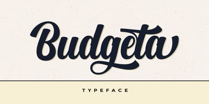 Budgeta is a modern script typeface. It contains a complete set of lowercase, uppercase, alternative, ligatures, punctuation, numbers, and multilingual support. Works in harmony with other fonts to make calligraphy creations. Budgeta is suitable for various purposes: logos, wedding invitations, titles, signatures, t-shirts, letterheads, signboards, labels, posters etc. How to access all alternative characters, using Windows Character Map with Photoshop: https://www.youtube.com/watch?v=Go9vacoYmBw How to access all alternative characters using Adobe Illustrator: https://www.youtube.com/watch?v=XzwjMkbB-wQ
 - FS Sinclair by Fontsmith,
$80.00 ZX Spectrum In 1982, a home computer came on the market that would launch the UK IT industry. The ZX Spectrum sold five million units and spawned thousands of software titles. It was the must-have gadget for every teen. FS Sinclair is inspired by the memory of Sir Clive Sinclair’s greatest creation: the experience of entering its clunky command codes and reading its simple, grid-placed type. Smart, switched-on, great in text and display, FS Sinclair is a modern grid-based font, drawn with the Spectrum in mind and brought to life by well thought-out design. Formula Having completed the font for Channel 4’s brand update, the Fontsmith team defined the formula for its next font: the creative essence of the C4 work but with more structural discipline, more rigid form and a little more seriousness. The new font wouldn’t look self-consciously retro but it would reference the past and, it was hoped, influence the future. Readability Like the ZX Spectrum, it took a while for the new font to do exactly what it was meant to do. Many of the early concepts by Phil Garnham and Jason Smith were too jagged – the result of an awareness of getting too close to existing fonts of the same ilk, such as Wim Crouwel’s Gridnik. Eventually, FS Sinclair evolved into a more readable, functional grid-based type design that answered Phil and Jason’s original, self-set brief. Idiosyncratic There’s a technological, systems feel to FS Sinclair but ultimately, humans are in charge. The lowercase “a”, “n”, “m” and “r” have clean-cut “ears”, and the square-ish design is softened by round joins on the inside of the letterforms. The idiosyncratic design of letters such as “g”, “j”, “k”, “v”, “w” and “y” bring the design up to date. This is a modular font with character, and a range of weights that allow varied application.
 - PF Bague Inline Pro by Parachute,
$79.00 Bague Inline Pro is the inline version of Bague Universal a contemporary geometric typeface family which blends distinct minimalist characteristics with mainstream details. Despite its inspiration from Herbert Bayer’s drawings of the 1920s, it diverts from the constructivist rigidity and display structure of early geometric typefaces by incorporating humanist characteristics as well as classic letterform shapes which balance out the extremity of the minimal shapes. Bague Inline is a typeface that stays true to its urban nature and heritage. A very interesting feature of Bague Inline is its vast array of uppercase alternates and ligatures which truly shine when set at display sizes. Make your selection from 4 groups of alternates as well as a rich set of discretionary ligatures and watch it transform into a flexible, charming and stylish typeface with strong modern aesthetics. This typeface offers enormous possibilities and variations for editorial design and branding. Bague Inline is the only commercially available inline typeface that comes in 4 weights for uppercase and lowercase letters. Each style consists of 775 glyphs with more that 128 alternates and ligatures and an extended set of characters which supports simultaneously Latin, Cyrillic and Greek. PDF Specimen Bague Inline on Behance
 - Guaruja Grotesk by Tipogra Fio,
$- Guaruja Grotesk is the first Tipogra Fio family for headlines & body copy. The grotesque form factor is much inspired in the Modernism movement from the mid of 20th Century but the Italic weight is a great cursive contrast aside the Roman ones so you can make very brutalist layouts or craft humanist projects, without losing the communication between all the family. Do not be afraid to type words with uppercase I and lowercase L because this last one has its own personality so do others glyphs like Italic lowercase G, Y and K and the straight corners in the Roman uppercase A, K, V, W, X, Y and Z. The same curves and corners are transferred to the numbers, symbols and so on. If your text is in a latin alphabet even though has lots of diacritcs, Guaruja may get it done! If you’re making a mathematical equation, it also can make it. If there’s a signaling project with lots of destinations, trust the arrows to help with together with the whole family.
 - PF Centro Slab Press by Parachute,
$75.00 Centro Slab Press: Specimen Manual PDF Ever since its first release, Centro Slab has been particularly popular with corporate applications, branding and print media. The new Centro Slab Press version was redesigned with narrower proportions which are better suited for publications such as magazines and newspapers as well as web applications. Centro Slab Press is a very clean and legible typeface even at heavier weights, a characteristic which is not often seen among slab typefaces. This is part due to the fact that Centro Slab Press is not overpowered by clumsy serifs. Instead it incorporates semi-slabs which provide comfortable reading without compromising its modern profile. The italics are narrower than the romans and incorporate beautiful cursive characteristics. Each style consists of 659 glyphs with several opentype features and an extended set of characters which support more that 100 languages such as those based on the Latin, Greek and Cyrillic alphabet. The family is composed of 16 styles from ExtraThin to UltraBlack along with their italics. All weights were meticulously hinted for excellent display performance on the web.