10,000 search results
(0.24 seconds)
- Bogue by Melvastype,
$29.00 Bogue is a soft serif type family of 8 weights and matching italics. The soft forms gives it a friendly and approachable character with a hint of retro feeling. Bogue comes with a lots of stylistic alternates that makes it very versatile in various uses like logos, editorial design, branding, web design, package design and much more. You can use it to create short powerful phrases and headlines and also use it in longer text like lead paragraphs and body texts. So if you are looking for a versatile soft serif font with a friendly character you have found it!
 - Mainlux by Digitype Studio,
$20.00 MAINLUX is an elegant typeface family with a unique touch to each character.It comes in 12 weights, 6 straights & italics. MAINLUX was designed to give a luxurious impression to your artwork, products, web business cards and various other needs. Each weight includes extended language support and standard ligature.
 - Signboard JNL by Jeff Levine,
$29.00Signboard JNL is based on die-cut cardboard display lettering once made by the Duro Decal Company (now Duro Art Industries) of Chicago, Illinois. Available in various sizes, these letters and numbers could be affixed to a number of different surfaces to make affordable signs, displays and show cards. - Protofo by Lafontype,
$19.00 Protofo is a modern-humanist sans-serif with characters that features various geometric shapes — from square, round and triangle. Protofo comes in 16 styles — upright and italic — from thin to black with each equipped with features such as localized, ligature, fraction, ordinal, superscript, numerator, nominator, subscript, proportional and tabular numerals. Protofo is also equipped with extended latin letters which can represent multi languages so making it perfect for any kind of project (display, editorial, web, interface, app, etc).
 - Historical by Runsell Type,
$9.00 Introducing Historical - Hand Drawn Script Historical consists of clean and textured feature as well as an aesthetic for premium logotypes. The family includes various script styles. Every single letter contains beautiful alternates characters (ss01 - ss10) and features ligatures. Historical can be applied in designs such as logotypes, brand, packaging, branding, quotes, business cards and more custom design. It features uppercase, lowercase, numeral, punctuation & symbol, ligatures, stylistic alternates, multilingual support, PUA encoded (fully accessible without additional design software).
 - Syntax Next by Linotype,
$50.99 Syntax was designed by Swiss typographer Hans Eduard Meier, and issued in 1968 by the D. Stempel AG type foundry as their last hot metal type family. Meier used an unusual rationale in the design of this sans serif typeface; it has the shapes of humanist letters or oldstyle types (such as Sabon), but with a modified monoline treatment. The original drawings were done in 1954; first by writing the letters with a brush, then redrawing their essential linear forms, and finally adding balanced amounts of weight to the skeletons to produce optically monoline letterforms. Meier wanted to subtly express the rhythmical dynamism of written letters and at the same time produce a legible sans serif typeface. This theme was supported by using a very slight slope in the roman, tall ascenders, terminals at right angles to stroke direction, caps with classical proportions, and the humanist style a and g. The original foundry metal type was digitized in 1989 to make this family of four romans and one italic. Meier completely reworked Syntax in 2000, completing an expanded and improved font family that is available exclusively from Linotype GmbH as Linotype Syntax. In 2009 the typeface family was renamed into a more logical naming of "Syntax Next" to fit better in the Platinum Collection naming." Syntax® Next font field guide including best practices, font pairings and alternatives.
 - Pacioli by MADType,
$29.00 This font is based on an alphabet published by Luca Pacioli in his 1509 mathematical treatise De divina proportione. In this book, Pacioli describes how to build the Roman alphabet geometrically using lines, squares and circles. Pacioli was not the first or the last man in his era to describe the building of letters mathematically. Felice Feliciano did this before Pacioli, and Albrecht Dürer further developed these forms years after. According to Pacioli, the thick strokes should be 1/9th of the height, and the thin strokes should have 1/2 the weight of the thick strokes. I felt that this beautiful alphabet needed to be restored to its full geometric glory and set out to construct an accurate replica using Pacioli's instructions. Included in the font you'll find the letters that have the grid overlay and also the letters without the grid. The letters J, W, U, and Z were not included in the book, so I have created my own versions of these characters that fit into Pacioli's grid. Pacioli shows two different Os in the book, so I have included the second O as well as a second J, Q, and Z as OpenType stylistic alternates. Also included in the font are border patterns and a fleuron taken from the cover of the book.
 - Dehors by Letterhend,
$19.00 Dehors is a western display typeface. It is suitable for design needs with a touch of classic western, especially in logo, and the other various formal forms such as invitations, labels, logos, magazines, books, greeting / wedding cards, packaging, fashion, make up, stationery, novels, labels or any type of advertising purpose. Features : numbers and punctuation multilingual PUA encoded We highly recommend using a program that supports OpenType features and Glyphs panels like many of Adobe apps and Corel Draw, so you can see and access all Glyph variations.
 - Whiskey Sour by Fenotype,
$25.00 Whiskey Sour, a robust vintage serif that is as delightful as it is confident. With its soft and warm aesthetic, this typeface effortlessly captures the essence of approachable confidence, making it a tasteful choice for your typographic needs. Whiskey Sour is based on Tomato Ketchup, an earlier release of Fenotype. It has larger and taller uppercase and plenty of differences in lowercase characters, the most significant ones being letters a, h, m and n. Whiskey Sour is an excellent choice for modern graphic design, offering a distinctive touch of familiarity. Whether gracing logos, packaging, restaurant graphics, or any display application, this versatile typeface shines in headlines and shorter texts. Experiment with reduced tracking for a more compact visual impact, or, when using it in small sizes, add a touch of tracking to ensure legibility. Whiskey Sour is naturally equipped with lots of OpenType features: try spicing up your designs with Swash, Stylistic, or Titling Alternates or Discretionary Ligatures. In total Whiskey Sour has 134 Alternate glyphs that can be accessed from OpenType controls or Character Window. See the full selection of Alternates in the specimen posters.
 - Mtwane by Scholtz Fonts,
$9.50 Mtwane is a contemporary font, fusing the vigor of African design with the clean-lined sophistication of the European fonts popular at the turn of the 20th century. In the wake of African Renaissance, European and African cultures are counter-influenced, resulting in an exciting fusion of the two. Mtwane plays on the line between upper and lower case characters, creating a young, powerful, in-your-face effect. Use Mtwane for clear, powerful impact in contemporary design. Mtwane contains over 250 characters - (upper and lower case characters, punctuation, numerals, symbols and accented characters are present). It has all the accented characters used in the major European languages.
 - Retro Magaze by Putracetol,
$20.00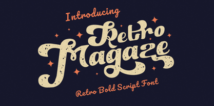 Retro Magaze is a bold vintage script font. In Retro Magaze, I try to combine vintage with luxury/aesthetics. So the Retro Magaze can be used in various projects with retro/vintage and luxury themes. Such as logos, branding, posters, packaging, book covers, clothes/apparel, quotes, titles and others. Retro Magaze come with clean and rough font version. Come with Opentype feature with a lot of alternates, its help you to make great lettering. Retro Magaze is also support multi language. To access the alternate glyphs, you need a program that supports OpenType features such as Adobe Illustrator CS, Adobe Photoshop CC, Adobe Indesign and Corel Draw.
 - 1790 Royal Printing by GLC,
$38.00 From 1702 to 1811 the French "Royal", then "Imperial", Printers, neglected Garamond and Fournier's designs and used only the font called "Romain du Roy", carved (1693 to 1723) by Philippe Grandjean by order of the king Louis XIV. 1790 Royal Printing was inspired by various variants of Romain du Roy that were in use during this period. Our sources were mainly official and legal documents printed in the late royal period, and in the beginning of the French revolution. There was no bold style. The 1790 Royal Printing Caps fonts contain small caps, plus titling caps for headlines as 1790 Royal Printing capitals are intended to be used preferably for text.
 - Royce by Jehoo Creative,
$18.00 Royce is a cute and minimalist designed font family with rounded edges on each character to make a fun and modern impression on your designs. It is very easy to combine this font with other types because it comes with 10 complete weights ranging from thin to extrablack, with a modern impression Royce has many useful features for example Alternate which is more formal in feel and Discretionary Ligature which is very eye-catching so it is ready to be used for various kinds design types such as displays, titles, body text, magazines, cover art, social media, logos, web Ui, clothing, posters, and others. Royce also has multilingual support.
 - Jansina by Twinletter,
$15.00 Jansina is a Japanese-style display typeface with a unique shape that is ideal for making your project stand out in Japanese culture. This typeface will make all of your projects consist of a graphic presentation that fits and is precise, but it is not restricted to that. Logotypes, food banners, branding, brochure, posters, movie titles, book titles, quotes, and more may all benefit from this font. Of course, using this font in your various design projects will make them excellent and outstanding; many viewers are drawn to the striking and unusual graphic display. Start utilizing this typeface in your projects to make them stand out.
 - 1592 GLC Garamond by GLC,
$38.00 This family was inspired by the pure Garamond pattern set of fonts used by Egenolff and Berner, German printers in Frankfurt, at the end of the sixteenth century. All the experts said it was the best and most complete set of the time. The italic style used with it was Granjon’s, as in 1543 Humane Jenson. A few fleurons from the same printers have been added. It can be used variously for web-site titles, posters and flyers design, publishing texts looking like ancient ones, or greeting cards, various sorts of presentations, as a very elegant and legible font... This font supports very large sizes as easily as small sizes, remaining very smart, elegant and fine. Its original cap height is about five millimeters. Decorated letters like 1512 Initials, 1550 Arabesques, 1565 Venetian, 1584 Rinceau from GLC Foundry, can be used with this family without anachronism.
 - Santorio by Skinny Type,
$15.00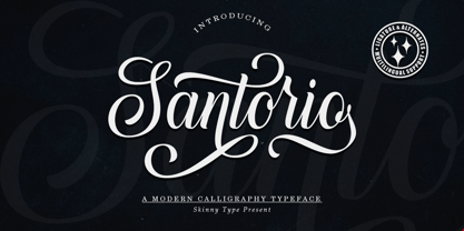 Please welcome our newest script typeface, Santorio Script, a beautiful script typeface with unique alternatives and strokes. This font is very suitable to be applied especially to logos, and various other formal forms such as invitations, labels, logos, magazines, books, greeting / wedding cards, packaging, fashion, make up, stationery, novels, labels or other types of fonts. advertising purposes. Feature : uppercase & lowercase numbers and punctuation multilingual ligature alternative PUA encoded We highly recommend using a program that supports the OpenType feature and the Glyphs panel like many Adobe and Corel Draw applications, so that you can view and access all variations of Glyphs. Email us to skinnyart871@gmail.com if you need anything! Happy Designing! Thank you
 - Beauty Starlight by Ardian Nuvianto,
$23.00 Beauty Starlight is a mesmerizing script font that radiates elegance and grace. With its intricate and flowing letterforms, this font captures the essence of celestial beauty, making it a perfect choice for projects that demand a touch of sophistication and charm. The delicate curves of Beauty Starlight bring a sense of refinement to your designs, making it ideal for wedding invitations, luxury branding, and any creative endeavor that seeks to convey a sense of timeless beauty. The script's versatility allows it to seamlessly blend into various design contexts, offering a touch of glamour and individuality. The effortless strokes of Beauty Starlight evoke a sense of handwritten artistry, providing a personalized and human touch to your projects. Whether you're designing logos, packaging, or social media graphics, this font invites you to infuse your work with a celestial glow. Embrace the celestial beauty of Beauty Starlight script font and watch as your designs shine with an ethereal allure. Elevate your typographic expressions with this font that blends grace with a touch of starlight magic.
 - Smithe Signature by Soft Creative,
$15.00 Introducing the Smithe Signature font. Smithe's Signature Font, is a classic thin font with an italic style. Here you will get beautiful classic fonts. this font is available in several modern swirls that can make your work look elegant, sweet and perfect. With this style, this font would be perfect for logos, branding projects, household designs utensils, product packaging, mugs, quotes, posters, shopping bags, logo, t-shirt, book cover, business card, invitation card, greeting cards, and all your other beautiful projects. Smithe Signature Fonts, including various language support. You can use this font for your work very much easily. Because there are many features in it. Contains a complete set uppercase and lowercase letters, punctuation, numbers and multilingual support. This font also includes several ligatures and alternatives style Set Style For those of you who have capable software OpenType work (Corel Draw / Photoshop / Illustrator / InDesign).
 - Youre Gone by Typodermic,
$11.95 Typography is the art of crafting letters and shaping language, and for designers, selecting the right font is crucial. Every typeface has its unique personality and can evoke different emotions, which is why selecting the right one for your project is essential. With that in mind, we introduce to you the You’re Gone typeface—a true gem in the world of typography. This rounded techno typeface with an industrial vibe from the 1980s is the perfect way to add a unique, technical edge to your message. Its dauntless strokes and mellow, rounded edges create an industrial look with a contemporary twist, making it the ideal choice for designers looking for something fresh and modern. With its distinct, detached letterforms, You’re Gone is perfect for capturing attention and leaving a lasting impression. This typeface is ideal for all kinds of design projects, from branding and packaging to websites and social media graphics. Its bold, techno look is perfect for businesses in the technology, manufacturing, and industrial sectors. You’re Gone is a versatile typeface that can be used in a variety of ways. Its rounded edges and thick strokes create a distinctive and memorable look, while its technical vibe adds a sense of professionalism and expertise to your message. It’s the perfect way to stand out in a crowded marketplace and make a bold statement with your design. Overall, if you’re looking for a typeface that combines industrial vibes with a contemporary twist, then You’re Gone is the perfect choice. With its bold, rounded strokes and detached letterforms, it’s sure to make a lasting impression and give your message the edge it needs to stand out. Most Latin-based European writing systems are supported, including the following languages. Afaan Oromo, Afar, Afrikaans, Albanian, Alsatian, Aromanian, Aymara, Bashkir (Latin), Basque, Belarusian (Latin), Bemba, Bikol, Bosnian, Breton, Cape Verdean, Creole, Catalan, Cebuano, Chamorro, Chavacano, Chichewa, Crimean Tatar (Latin), Croatian, Czech, Danish, Dawan, Dholuo, Dutch, English, Estonian, Faroese, Fijian, Filipino, Finnish, French, Frisian, Friulian, Gagauz (Latin), Galician, Ganda, Genoese, German, Greenlandic, Guadeloupean Creole, Haitian Creole, Hawaiian, Hiligaynon, Hungarian, Icelandic, Ilocano, Indonesian, Irish, Italian, Jamaican, Kaqchikel, Karakalpak (Latin), Kashubian, Kikongo, Kinyarwanda, Kirundi, Kurdish (Latin), Latvian, Lithuanian, Lombard, Low Saxon, Luxembourgish, Maasai, Makhuwa, Malay, Maltese, Māori, Moldovan, Montenegrin, Ndebele, Neapolitan, Norwegian, Novial, Occitan, Ossetian (Latin), Papiamento, Piedmontese, Polish, Portuguese, Quechua, Rarotongan, Romanian, Romansh, Sami, Sango, Saramaccan, Sardinian, Scottish Gaelic, Serbian (Latin), Shona, Sicilian, Silesian, Slovak, Slovenian, Somali, Sorbian, Sotho, Spanish, Swahili, Swazi, Swedish, Tagalog, Tahitian, Tetum, Tongan, Tshiluba, Tsonga, Tswana, Tumbuka, Turkish, Turkmen (Latin), Tuvaluan, Uzbek (Latin), Venetian, Vepsian, Võro, Walloon, Waray-Waray, Wayuu, Welsh, Wolof, Xhosa, Yapese, Zapotec Zulu and Zuni.
 - ZT Gatha by Khaiuns,
$14.00 ZT Gatha is a continuation of the "Gatha Duo font family", which focuses only on more complete variations of sans serif, this font has two variants, one of which is a normal sans font and the other is unique in that it minimizes edges. of each letter produces a unique character with a smoothly curved groove. ZT Gatha features 10 styles covering a complete set of beautiful upper and lower case letters, numbers, and various punctuation marks, providing a clean and realistic sans serif style with great versatility. With a lot of weight, this typeface can be used successfully in Magazines, Posters, Branding, Websites, etc. I hope you have fun using ZT Gatha. Thanks for using this font ~ Khaiuns X zelowtype
 - Brantley Script by Shape Studio,
$12.00 Brantley Script is a romantic and vintage script. It Can be used for various purposes such as logos, wedding invitations, t-shirts, letterhead, signage, news, posters, badges and more. Brantley Script features 300+ glyphs and extruded fonts, alternative characters, binders. To activate the OpenType Stylistic alternative, you need a program that supports OpenType features such as Adobe Illustrator CS, Adobe Indesign & CorelDraw X6-X7. How to get alternative glyphs from open type fonts: http://youtu.be/iptSFA7feQ0 There are additional ways to access alternatives, using Character Map (Windows), Nexus Fonts (Windows), Font Book (Mac) or software programs such as PopChar (for Windows and Mac). How to access all alternative characters, using Windows Character Map with Photoshop: https://www.youtube.com/watch?v=Go9vacoYmBw
 - Rowan by Letterhend,
$19.00 Rowan is a sophisticated serif with unique letterform. This typeface has been made carefully to make sure its premium quality and luxury feel. The letterform makes this typeface unique and stands out rather than the regular serif font. Very suitable for logo, headline, tittle, and the other various formal forms such as invitations, labels, logos, magazines, books, greeting / wedding cards, packaging, fashion, make up, stationery, novels, labels or any type of advertising purpose. Features : numbers and punctuation multilingual ligatures alternates PUA encoded We highly recommend using a program that supports OpenType features and Glyphs panels like many of Adobe apps and Corel Draw, so you can see and access all Glyph variations. How to access opentype feature : letterhend.com/tutorials/using-opentype-feature-in-any-software/ Email us to letterhend@gmail.com if you need something! Happy Designing!
 - Starburst by Resistenza,
$49.00 Starburst is a gestural light script, created initially with an oblique nib for Copperplate and pencil. The idea was to interpret a real expressive energetic and gestural calligraphy, playing with pressures and angles following always a very dynamic flow. Rhythmical and full of grace, Starburst is the best fusion between calligraphy and typography. Every stroke has been sketched first by Giuseppe Salerno.
 - Threepoints North by Type Associates,
$30.00 The Threepoints Series is the result of several years of work that bases three different sans serif type designs on one “shell”. Designed for optimal readability North, with its squarish shapes and rigidity are suggestive of an upright Swiss or Inserat typeface. The East variant takes on the look of another popular condensed grotesk with a softer, more rounded basic shape whilst maintaining the purpose of the original design. With minimal adjustments West leans towards more contemporary European designs. Although these are primarily display typefaces they function extremely well in text sizes in either upper or lowercase composition. Excellent for signage. Each variant comes with matched italic at no additional cost.
 - ITC Deli by ITC,
$29.99Jim Spiece has a taste and a talent for reviving type styles from earlier in this century. ITC Deli Supreme is a “futuristic retro” face that would be at home as a logo on a car or a roadside diner from the 1940s or '50s; the lowercase nearly joins, in script style, thanks to the long extenders stretching out from the bottom-right corner of most letters, while the caps have beginning strokes leading in from the top left. ITC Deli Supreme, like ITC Deli Deluxe, features slightly rounded corners on all the letters, for a soft, streamlined look despite the squareness of the letterforms. - Threepoints West by Type Associates,
$30.00 The Threepoints Series is the result of several years of work that bases three different sans serif type designs on one “shell”. Designed for optimal readability North, with its squarish shapes and rigidity are suggestive of an upright Swiss or Inserat typeface. The East variant takes on the look of another popular condensed grotesk with a softer, more rounded basic shape whilst maintaining the purpose of the original design. With minimal adjustments West leans towards more contemporary European designs. Although these are primarily display typefaces they function extremely well in text sizes in either upper or lowercase composition. Excellent for signage. Each variant comes with matched italic at no additional cost.
 - Travel Kit SG by Spiece Graphics,
$39.00 Here’s an intriguing mixture of 1930s deco and modern tech fashion. Travel Kit Medium is a sturdy semi-serif hybrid with one foot in the past and another in the present. It is slightly low-waisted with extended crossbars on the capital A, E, F, H, K, and P. But the capital B, M, R and X are distinctively contemporary with the E and M repeated as unicase letters in the lowercase. Optional retro characters (notably the unicase e and m) have been provided if you prefer a more traditional overall look - and your software allows access to these characters. Simply find and replace the more modern letters with the older ones. In addition, small caps with even more alternate characters have been included for greater flexibility and convenience. Travel Kit Medium with Alternates is now available in the OpenType format. In addition to small caps, lining figures, oldstyle figures, and petite figures, this expanded OpenType version contains additional stylistic alternates and historical forms. These advanced features work in current versions of Adobe Creative Suite InDesign, Creative Suite Illustrator, and Quark XPress. Check for OpenType advanced feature support in other applications as it gradually becomes available with upgrades.
 - HS Alwafa by Hiba Studio,
$50.00 HS Alwafa is an Arabic display typeface. It is useful for book titles and creative graphic projects where a contemporary, streamlined look is desired for digital purposes. The font is based on the simple lines of sequre Kufi calligraphy, that support Arabic, Persian, Urdu and Kurdish. This font was created in the beginning as a digital weight in 2012 for use by an engineering digital company. The company tends to follow the geometrical united and equal shape in both vertical and horizontal dimensions and with a tendency for digital strokes showing digital numbers under the name of base. I followed that with three styles: first, the digital with a solid base, second is a stencil and the third is the regular solid font. By producing this font, we provided the Arabic fonts library with various styles which grant many design purposes.
 - Confitería by Sudtipos,
$39.00 Confitería is the Spanish word for a shop where sweets and chocolates are made and sold, which sometimes has a tea room. And now Confitería is also a font that brings to mind lettering piped on delicate cakes ... sweet but never sickly. This font captures something of that simple and innocent beauty of traditional confiterías, where good manners will never go out of fashion, menus are elegant and time comes to a standstill to make way for life’s little pleasures. A confitería is a perfect place to share sweet tidbits with a friend or date, eavesdrop on the conversation at the next table, read a book, or just people-watch from the window. I celebrated my last birthday at one. There is one iconic confitería in Buenos Aires that I love more than the rest because, some 60 years ago, it put up its marvellous sign and never took it down. Walking by it is sure to bring a smile to your face. It’s big. Very big. And the lettering in its name is written in a timelessly beautiful vertical script – the most attractive I have ever seen. I joined forces with Sol Matas – who worked with me to update the Montserrat font –to design this geometrical connected font with pleasant, even strokes. It is elegant and saccharine-free. And to top it off, it comes in several flavors. Welcome! What can we get you?
 - SUE by Typeskets,
$15.00 SUE is a sans serif category with 18 styles or 9 weights with Oblique, this font is also included in the Variable font, with a minimalist appearance of course you can use it in various designs such as headlines, posters, invitations, labels, logos, to make the body text pretty good. . , and many designs that you can apply with this font. You will feel it when you have it as a font collection on your computer SUE OTF (18Font Style) SUE Variable with Oblique version Latin Extended characters accents
 - Aphrodite Slim by Typesenses,
$57.00 Aphrodite Slim Pro is not just a lighter version of its sister Aphrodite Pro. Aphrodite Slim Pro has duplicated the quantity of characters of its partner, and that means more than 500 new glyphs, reaching a total of more than 1000. More delicate and meticulous, Aphrodite Slim Pro is once more a new typography with deep calligraphic ideals: We immersed ourselves into the world of each calligraphy ductus and each calligraphy masters by studying from decoration to lettering books. This was the key for the logic of Aphrodite Slim’s behavior. The new concept of Aphrodite Slim Pro was to join diverse styles of calligraphy in one in order to achieve an autonomous expressiveness, in fact, this is what calligraphy aims to, and we agreed to bring those ideals to the world of typography: It is justifiable to be inspired in hundred-year-old calligraphies, but it is even better if the results you obtain have a plus. A personal plus. During the creation process we were wondering whether it was possible to mix certain strokes of such rigid styles as uncial, (Li·n’s favourite style), with strokes of the copperplate, (Sav’s favourite style), and also to take and mix cualities of cancelleresca cursiva, formata and moderna; finally giving our creation a roman-transition italic look. So Aphrodite Slim takes ideals and aspects from those formal styles, following its own logic though, and emphasizing the fact of being a decorative typography. Calligraphy masters of our past are who we are in debt with. They are the cause we have lovely letters now. They have been spontaneous at the moment of creation, what differs from the type-designers of nowadays, whose spontaneity is more limited. Digital faces that we are used to see these days are a result of long hours of optical adjustments, grids, macros and inspirations of other existing typography, but without personal contributions. Aphrodite Slim wants to refute this. Its mission is to rescue de spontaneity of the artesanal lettering in order to obtain unique words; those which only calligraphy masters of our past or lettering artists of our present could give us. We have worked hard to achieve this, making Aphrodite the most universal font we could: It was necessary to study the most common words, focalizing more in the ones referring to “sensitivity”, of four of the most spoken languages in the world. Aphrodite Slim has an enormous quantity of decorative characters and special ligatures for phrases and words in English, French, Spanish and German. (See English, Français, Español, Deutsch PDF in the gallery section). We promise there is no existing type that decorates/ligates glyphs and words like Aphrodite Slim does: It is the first time a font like this really considers its purpose. -The way glyphs are ligated is insane- : Aphrodite Slim rescues some ideals of persons like Jan van den Velde (Italian cancilleresca writing of XVI Century) who understands ascenders and descenders as possibilities to beautify the lines of writing with curved strokes that seem to be dancing above and below of the words. This master also creates ascenders and descenders even where they are not necessary, on letters that do not actually need them: Aphrodite Slim takes this ideal. The font counts with a wide range of glyphs that seem not to be satisfied with its more primitive form and prefer to extreme their parts to be decorative. It also existed masters of calligraphy like José de Casanova of XVII Century, who, with a magnificant skill and a really personal mark, had the particularity of ligating words that were actually separated with spaces. This is another innovative feature in Aphrodite Slim. An investigation of the most common beginnings and endings words of the English language was done. Having that feature activated (discretionary ligatures), common words will start to ligate or to be decorated even when they are separated by spaces. Impossible to forget Francesco Periccioli of XVII Century and our experience us designers to face with works of him: His letters, that today are included in the group of cancellerescas modernas, have been a direct inspiration to the oldstyle figures and historical forms variables in Aphrodite Slim. Giovanni Antonio Tagliente (XVI Century) and his particular way of making tails and diagonals longer than usual, qualities that our creation reflects too. Finally, our adventures in Biblioteca Nacional and Barrio San Telmo, Buenos Aires, were essential for us to make Aphrodite Slim more complete and interesting: Sav did an excellent work when studying how the decorative miscellanea and swirls of early XX century were. She also investigated what particularities made those roman titling characters look antique so she could rescue some ideals for the oldstyle figures and historical forms variables. This also leaded her to create the ornaments variable in Aphrodite Slim. We are really proud of presenting Aphrodite Slim Pro, a typography that was the result of days and nights of working hard, because we do love what we do; and we are glad we are living in a present that gives us the possibility to spread this kind of art, because that is the way we consider our job: Aphrodite Slim Pro is Art. Hope you can appreciate the enormous work this type has. Features. Aphrodite Slim Pro is the most complete variable. It includes more than 1000 glyphs. Thanks to the Open-Type programming, it counts with a easy way to change/alternate glyphs if the application in which the font is used supports this. The variables contained in Aphrodite Slim Pro are also offered separately. Aphrodite Slim Text: It is the variable for lines and paragraphs. Thus it is the least ornamental and the most accurate to achieve a satisfying legibility. It has the Standard Ligatures feature in order to improve the possible conflicts some glyphs could have by others. Aphrodite Slim Contextual: It is the one that makes emphasis in decorating. It has the particularity of ligating/decorating words of common use in English, French, Spanish and German. It also has the quality of ligating common beginnings and endings of the common words in English. Aphrodite Slim Stylistic: With similar features of Slim Contextual. It includes a set of decorative numbers for a display use. Aphrodite Slim Swash: This one has special beginnings and endings to decorate words. Aphrodite Slim Endings: It makes words look as a signature. Aphrodite Slim Historical: It adds an antique look to the written word. It also has the special historical ligature function. Aphrodite Slim Titling: This one is the most decorative. Its copperplate inspired ornaments give words a special color, in order to handle the quantity of decoration, it comes with the standard ligature feature, which has the most common ligatures plus others that make decorative swirls not to be conflictive. Aphrodite Slim Ornaments: A set of 52 ornaments. Aphrodite Slim Pro includes all this features plus the Stylistic Set 1; Stylistic Set 2 and the possibility of Slashed Zero. We recommend you to check out the gallery in order to see all these features in action.
 - Scientist Castle by DLetters Studio,
$13.00 Scientist Castle Family Slab Serif Font Is A Great Font For any project! Available in 4 styles that you can use for various purposes, as a combination or separation according to the design style. Complete with OpenType features, which allow you to give a more calligraphic look! There are regular, Italic, Outline, and Outline Italic styles and very easy to use. Scientist Castle Family Slab Serif Font is a great choice for Projects you like branding, design, wedding, photography, Magazine, logo designs, album, covers Book, business cards, quotes, and projects other designs. What’s Included : – S-Alt – Works on Win, Mac – Simple installations – Accessible in Adobe Illustrator, Adobe Photoshop, Adobe InDesign, even work on Microsoft Word. – PUA Encoded Characters – Fully accessible without additional design software. Thanks for your support, please kindly send us a message for any question about our product. Hope you like it.
 - COS Elfish by Cosmope Type,
$17.00 COS Elfish is a typeface with stroke contrast and has a unique shape. It has a structure that is well suited for display purposes. It has small serifs throughout and features curvilinear elements in some letters. It is suitable for use in various media such as unique and individual graphic design or web design.
 - Ellis Greatter by madjack.font,
$16.00 Ellis Greatter is an easy to read script that is designed with a vintage look making it bold, classic and fun. It includes OpenType features and alternative styles. It can be used for various purposes such as posters, t-shirts, signage, logos, news, badges and more. International support for most Western languages is included.
 - Fresh Hansler by Struggle Studio,
$11.00 Fresh Hansler contains a script style, a capitals style as well as a set of extras. They are made with brushes and so they look modern, organic, dynamic, and energetic. This family can be used for various purposes such as titles, signatures, logos, correspondence, wedding invitations, letterhead, signage, labels, bulletins, posters, badges, and more.
 - Vivala bl by Johannes Hoffmann,
$38.00 Vivala bl has a high black ratio that supports a compact typographic style. It is particularly suitable for decorative typesetting, for example, for posters, logos, and book illustrations. Complementing the ornamental style, Black Letter has a narrow style that works well for smaller type sizes. And it is equipped with various contextual alternates and ligatures.
 - EuroMachina BT by Bitstream,
$50.99The boss of extended typefaces, Brian Bonislawsky, has belted out this ultra wide design, EuroMachina, that looks like an odd meld of OCR-A, Microgramma and Bank Gothic. And if that wasn't enough, Brian then felt the need to distort it in various ways, creating Broken, Eroded and OverGreased. A little something for everyone. - Chrome Slab by Ferry Ardana Putra,
$19.00 Introducing Chrome Slab, our brand new aesthetic semi-condensed serif font that embodies a perfect balance of elegance and versatility. With its captivating uppercase characters and exquisite design, this font is set to elevate your design projects to new heights. Chrome Slab boasts up to 45 beautiful ligatures, meticulously crafted to add a touch of sophistication and uniqueness to your typography. These ligatures seamlessly blend letterforms together, creating fluid and visually pleasing connections that enhance the overall aesthetic appeal of your text. *Make user to use capital letters to activate ligature features. In addition to its stunning ligatures, this font supports multilingual language, making it an ideal choice for projects with diverse linguistic requirements. Whether you're working with English, Spanish, French, German, or any other language, Chrome Slab ensures seamless integration and legibility across different typographic needs. The semi-condensed structure of Chrome Slab optimizes space utilization, allowing for efficient and impactful designs without sacrificing readability. Its compact yet elegant proportions make it perfect for a wide range of applications, including editorial designs, branding materials, packaging, and digital displays. With Chrome Slab, you'll have a powerful tool at your disposal, enabling you to create visually striking and professionally polished designs. Its aesthetic appeal, versatile ligatures, and multilingual support make it a must-have font for designers seeking to make a lasting impression. ——— Chrome Slab features: A full set of uppercase Numbers and punctuation Multilingual language support PUA Encoded Characters OpenType Features +279 Total Glyphs Up to 45 Aesthetic Ligatures ——— ⚠️To enable the OpenType Stylistic alternates, you need a program that supports OpenType features such as Adobe Illustrator CS, Adobe InDesign & CorelDraw X6-X7, Microsoft Word 2010 or later versions. There are additional ways to access alternates/swashes, using Character Map (Windows), Nexus Font (Windows), Font Book (Mac) or a software program such as Pop Char (for Windows and Mac). ⚠️For more information about accessing alternative, you can see this link: http://adobe.ly/1m1fn4Y
 - Surfbird by Vintage Voyage Design Supply,
$15.00 Summer vibes are here with Surfbird! • A playful Display family with large variety options. Four styles comes with seven widths & two graphic fonts. The point of this family is getting more modern moods into a classical cowboy-western typographic. The result is a playful western slab which can be used for any design project. Home decor / mugs / t-shirts / stickers / music or podcast covers / menu's / logo's / posters. It can be playful with "western cut" and smooth styles or more serious with the sharp styles. • The Surfbird has two graphic styles. 82 decor graphic elements to add more fancy style to your design. The first one is a contour and the second is a fill for them, to get full color elements.
 - Gray Asphalt by Din Studio,
$29.00 Isn’t it interesting to create a design in a stylish, firm font made of mixture of style and authenticity? This is the Gray Asphalt. Gray Asphalt is a racing-themed script font to give you steady, firm, solid impressions for word or message emphases. Its thick display is suitable to apply on bigger-sized texts. The font features you can enjoy are as follows. Features: Stylistic Sets Ligatures Swashes Multilingual Supports PUA Encoded Numerals and Punctuations Gray Asphalt fits best for various designs, such as posters, banners, logos, book covers, headings, printed products, merchandise, social media, and more. Find out more ways to use this font by taking a look at the font preview. Enjoy your experience with this font and feel free to contact us for further product information or trouble complaints. Thank you and wish you good luck with your designs,