10,000 search results
(0.116 seconds)
- McAnni by Tour De Force,
$30.00 McAnni is single weight display serif font and our 130th release. Heavy, wide and stable, McAnni is fully recognizable font that will bring new values to your design project. Charming design with vintage details ideal for titles, headlines, product names, posters, editorial use and more. Contains standard ligatures.
 - Hello Valentica by Blankids,
$25.00 Introducing of our new product the name is Hello Valentica a Beauty Script Font. Hello Valentica inspired by modern script this font is a fun theme very good for book cover, wedding invitation, t-shirt, quote, logotype, craft and etc. FEATURES : Uppercase Lowercase Number Punctuation Multilingual PUA Encode Opentype
 - Christ Moon by Illushvara,
$14.00 Introducing a new font Christ Moon is a cute, quirky and chunky lettered handwritten font. Fall in love with its incredibly versatile style and use it to create spectacular designs special for Christmas Season! Like a logotype, social media promotion, merchandise, packaging, cut and print sticker, quotes and more.
 - Skeletons by OKSHUtypeCO,
$12.00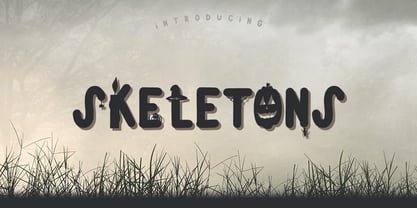 Skeletons - a new fresh handmade calligraphy font. Very suitable for greeting cards, branding materials, business cards, quotes, posters, and more!This font are perfect for wedding postcard. Or you can create perfect and unique design of your logo, blog, stationery, marketing, magazines and more :) MULTILANGUAGE Style uppercase THANK YOU!!!
 - Black Dolphin by Mr. Typeman,
$14.00 Introducing the new and tasteful Black Dolphin Multilingual Font Duo. Black Dolphin is a stunning pair of luxury signature script and a hand-drawn brush font, designed to contrast and complement each other with elegant beauty and contemporary style, making it an excellent fit for projects of all types.
 - The Pursuits by Gassstype,
$27.00 Hello Everyone, introduce our new product Font THE PURSUITS This Is All Caps Sporty Font.This is a Textured Natural Style and classy style with a clear style and dramatic movement. This font THE PURSUITS is great for your next creative project such as logos, printed quotes, and invitations.
 - Vintersjov by Bogstav,
$16.00 Here's my tall and thin and brand new winter font ("Vintersjov is "winter fun" in danish) A super legible and fun font, suitable for things that have got to do with winter. But also spring, summer and fall - in fact mostly anything that needs a lively and handmade look!
 - URLOP by Mikołaj Grabowski,
$9.00 Colour is more fun than black, but multicolour is even better. Let me introduce URLOP, a wide type family suitable for your fancy posters, headlines, covers, illustrations, websites, initials, blackmails, chronicles, signboards, poems and many others. Twelve basic styles, which make the overall construction, give a wide range of opportunities. All of them, being able to mix with each other, vary from a thin INSIDE, through a medium FILL, to a double-stem PLUS styles. And then comes a range of colour fonts, so you don’t have to waste any of your precious time for experiments, because I’ve already done it for you! URLOP is an all-caps display collection consisting of three sub-families of fonts, divided by the usage they are designed for. First of all, there is a wide range of alphabets made in the new OpenType-SVG colour fonts format. This is quite a novelty and a very promising technology at the same time. It allows designers to store colour information inside the font. Due to my experience with layered colour thinking that I explored in my first family - Epilepsja , I decided to make several preset layer combinations in this auspicious format. This sub-group is tagged RGB. Make sure that your field of usage and software support OT-SVG format. However, if you feel a need to experiment in the old-fashioned way, you may buy separate layers under the DIY tag. The last group is very similar to the DIY, but it was optimized to look better when standing without other layers. It’s called PRO*. All styles cover Latin alphabets of Europe, basic Cyrillic and Greek sets. Have fun! Before using the font, read the instructions and specimen attached to font files in the purchased package or download them from the Gallery tab on this site. This will help you avoid making unexpected mistakes when combining layers. *PRO subfamily release planned in 2019.
 - 1756 Dutch by GLC,
$42.00 This family is inspired from the set of two styles, Roman normal and Italic, and the ornaments used by an unknown printer working around East Switzerland, circa 1750's. It is a Dutch style font, slightly bolder than usual Fournier's or Caslon's Roman fonts, with some emphasized serifs and finals parts and special letters as capital "U" for example. A set of initials, fleurons, ornaments and frame elements is joined to the family as a supplement. The two styles, Normal and Italic, are containing standard ligatures, a few alternative characters and titlings (who are more preferable than enlarged capitals). They are "small eye" or "Small x-eight" fonts. The standard characters set is completed with accented or specific characters for Western (Including Celtic) and Central Europe, Baltic, Eastern Europe and Turkish.
 - Decary Sans by Mans Greback,
$49.00 Decary Sans is a new vintage typeface. A sans-serif lettering provided in the styles Light, Regular and Bold, and each weight as Italic. Perfect for a logotype or headline, use this modern retro type to express genuine tradition while keeping the design up-to-date. The font is built with advanced OpenType functionality and has a guaranteed top-notch quality, containing stylistic and contextual alternates, ligatures and more features; all to give you full control and customizability. It has extensive lingual support, covering all Latin-based languages, from Northern Europe to South Africa, from America to South-East Asia. It contains all characters and symbols you'll ever need, including all punctuation and numbers.
 - Frutiger Next Paneuropean by Linotype,
$99.00Frutiger Next is Adrian Frutiger's and Linotype's completely new interpretation of the well known typeface Frutiger released in 2000. For these revised forms, the areas of application are almost limitless. Frutiger Next can be used for anything from office communications to multimedia to complex printed materials. The Frutiger Next family contains small caps, oldstyle figures, and other figure options in every font. Adrian Frutiger's eponymous typeface has been used for decades, everywhere from airport signage to book text to corporate logos to the smallest web graphics. The Italics in the original version of Frutiger were based very closely on the Roman forms; in Frutiger Next, they have been re-designed to be true Italics. - GoGipsy by Latinotype,
$32.00 GoGipsy is a script font based on Coto Mendoza's modern calligraphy works created with the technical assistance of Luciano Vergara. GoGipsy is inspired by a magical journey—full of love, art and nature—through the Mexican Caribbean. GoGipsy tries to capture such incredible blend through gestures and calligraphy strokes, conveying freedom, expressiveness, strength and spontaneity. The family consists of four versions: regular, italic, drop and italic drop plus a set of ornaments based on the visual appealing Mexican textile art and embroidery full of colour and beauty. GoGipsy's baseline emphasises movement and rhythm. Have fun with OpenType features, swashes, ligatures and a wide array of initials. Go Gipsy! Each journey, new inspiration...
 - Linotype Gujarati by Monotype,
$103.99 The Linotype® Gujarati typeface was originally developed in 1983 by the Linotype letter-drawing studio under Fiona Ross’s art direction. This revival was designed by Gunnar Vilhjálmsson and Kalapi Gajjar with Fiona Ross as a consultant. The family has five weights from Light to Black. It is a traditional design, optimized for setting lengthy text copy for print projects or for use on screens. While faithful to the original design, Linotype Gujarati introduces many design improvements, additional weights, and an extended character set. This new Linotype Gujarati is part of a project to refresh the pivotal Linotype Bengali and Linotype Devanagari typefaces and make them available for the first time in the popular OpenType font format.
 - Seebad by Linotype,
$29.99Silvan Kaesar designed Seedbad after observing the unique sign lettering along the shores of Lake Geneva's bathing area. Seebad's four different settings represent the cutting edge new style of Swiss design, which spans the bridge between modern and contemporary. Containing geometrically forms, Seebad has a narrow base. Some characters (the lowercase t", for example) display unicase, even uncial-like tendencies. If you are looking for a face to spice up your layouts with an ultra-modern, cutting-edge flair, while not sacrificing copy length, Seebad is the face for you! The four fonts making up the Seebad family are all included in the Take Type 5 collection, released by Linotype GmbH in 2003." - Reverie OT by District,
$20.00 Reverie is a cheerful band of letters that bounce across the page and get together to create words in four weights. Generous spacing and a modest x-height project an airy typeface that's open but not frail. Quirky without being too whimsical. Use the regular weight for surprisingly readable text or put the light and heavy weights to use for decorative headlines and titles. Reverie OT is the follow-up to the popular Reverie. This version comes loaded with new features: ligatures, small caps, swash caps, a larger numeral set, more language glyphs, and a fourth, heavy weight. This all adds up to a vastly more functional and flexible family of fonts.
 - Alternate Gothic by Linotype,
$20.99 Alternate Gothic was designed by Morris Fuller Benton for American Typefounders Company in 1903. All three weights of Alternate Gothic are bold and narrow. In fact, this face is essentially a condensed version of Benton’s other well-known sans serif types, Franklin Gothic and News Gothic. In the early twentieth century, the modern concept of type “families” had not yet been formed — and though Benton designed these sans serifs to harmonize with each other, the foundry gave them different names. Robust, dark, and coolly competent, Alternate Gothic is a good choice when strong typographic statements must fit into tight spaces. As a modern usage, it is currently the font of YouTube’s homepage logo.
 - Latino Gothic by Latinotype,
$39.00 “Latino Gothic” is the result of two years of hard work by the Latinotype design team under the artistic direction of Alfonso García. We are really proud to present a superfamily with the magnitude and characteristics of "Latino Gothic". A very complete typographic font made up of no less than 90 styles. "Latino Gothic" offers a new interpretation of the original design totally focused on the needs of visual communication of the 21st century. «Latino Gothic» is designed to respond to the most varied communication needs thanks to its 5 widths and 9 weights, with their respective italics. 90 different styles make it the most versatile and complete gothic family on the market!
 - Railhead by FontMesa,
$25.00Railhead is a revival of an 1870s type style that was originally available from both the Bruce foundry in New York and James Conner's Sons type foundry. The Redux version is the original design but only the uppercase and punctuation were ever created the rest of this font design including numbers, accented characters and lowercase are of my own design. Looking at the original font the inside rails reminded me of a railroad so I created a new version by adding horizontal lines in the lower portion of each letter which resemble railroad ties and Railhead seemed to be the most logical name for this old revival. - Stylefinder by Joanne Marie,
$18.00 Stylefinder is a new elegant signature style font which gives any design project that authentic handwritten feel. It’s perfect for logos, branding, headlines, sub-headers and taglines. This type of font is currently extremely popular in the logo design community - Over the years I’ve created many unique logos for new businesses using different styles of hand lettering and calligraphy, so I thought it was time to make something available for you all to use in your own designs. Stylefinder comes with some alternate lowercase glyphs, ligatures and six additional swashes to give that finishing touch. There is also a large amount of multi-lingual support.
 - Hyperdrive by Comicraft,
$19.00 If you're about to make the jump into hyperspace, buckle up and engage your R2 unit with our new font release, HYPERDRIVE! Ten years in the making, we've spent almost as much time developing these characters as George Lucas spent developing his! Co-created by Starkings & Roshell (HYPERDRIVE, not George), this font is guaranteed to keep TIE fighters off your tail and will always come in useful if you get menaced by phantoms or attacked by clones. So sit back, relax and enjoy the flight -- but don't forget; let the Wookiee win! Remastered Hyperdrive includes new letter shapes, 200+ connecting letter combos, improved spacing & kerning and support for Western & Central Europe.
 - Birdman by Yock Mercado,
$9.99 Birdman is a modern blackletter font that merges rebellion and chicano style, elevating them to a new dimension of minimalism and edginess. With its trendy and condensed design, this geometric typeface captivates instantly. Its versatility makes it the perfect companion for impactful headlines, high-flying logos, and groundbreaking advertisements. Birdman challenges typographic conventions with its boldness, attracting all eyes with its simple elegance. With Birdman by your side, words take flight, releasing their rebellious and contemporary essence. Each stroke is a cry of originality, and each letter tells a tale of modernity and authenticity. Feel how this font elevates your designs, soaring toward new typographic horizons.
 - AB Ticena by Andres Briganti,
$20.00 Elegant and idiosyncratic, AB Ticena is a display and extended typeface inspired by the ancient forms of Lombardic capitals. The sometimes quirky and capricious letterforms take their inspiration from medieval forms found in inscriptions and manuscripts where latin Roman capitals were taken to new stylistic and even extreme expressions. The ultra-wide horizontal proportions and its modulated, humanistic strokes gives it a more refined and contemporary edge. AB Ticena works best for logotypes, short and striking headlines, and editorial purposes. A set of ligatures and stylistic alternates is also available for selected characters and pairings.
 - Frygia by Stawix,
$29.00 Frygia is inspired by the astonishing mythology along with a new method and approach of type design. As an example, the construction of the lowercase g; the line structure which is slightly curved helps to aid the optical illusion and the integration of Industrial San Serif style making Frygia extremely compatible and ready for every usage on the layout. Frygia Family consisted of 20 styles and 10 weights, ranging from the thinnest Hairline to the boldest Black and a Semi Rounded corner to suit the concept of the typeface.
 - Carnas by Hoftype,
$49.00 Carnas, a new monoline sans with a light, slender and informal appearance. It is however forceful and strong enough for headlines and signage. Despite the reduction in its shapes, it is pleasantly readable for both shorter and longer text applications. The Carnas family consists of 16 styles and is well suited for ambitious typography. It comes in OpenType format with extended language support. All weights contain ligatures, superior characters, proportional lining figures, tabular lining figures, proportional old style figures, lining old style figures, matching currency symbols, fraction- and scientific numerals and matching arrows.
 - Freak by HiH,
$10.00 Freak was originally released by The Great Western Type Foundry in 1889. According to Maurice Annenberg, Great Western became Barnhart Brothers & Spindler when the Barnhart brothers bought out the Toepfer family in 1868.The plant superintendent, Charles Spindler, became Secretary of the new firm. Specimen books as late as 1899 show the name Great Western alongside the BB&S name. At some point, prior to 1925, Freak was renamed “Bamboo” by BB&S. It was delisted when BB&S was absorbed by ATF in 1929. Listed in McGrew under “Bamboo”.
 - Verge by Type Fleet,
$9.00 Verge exploratory information transmitter Verge type family operates at the very edge of art and technology in the typographic constellation. Its fairing is designed with a new technique that adds better stability to the curvature. It is prepared for all environments and communicates with minimized latency. The letters of this contemporary slab serif are compact, clear and rather simple. It is suitable for branding, longer texts, information graphics and signalization. The typeface’s x-height is a little above 70% of its capitals. The italics are designed at a 7° angle.
 - Magistral by ParaType,
$30.00The first three weights of the family were designed at ParaType (ParaGraph) in 1997 by Dmitry Kirsanov . They were based on the artworks of Moscow graphic designer Andrey Kryukov (1923-1997). The original version was developed by Kryukov at the end of the sixties for Russian railways. The proportions and elements of construction were inspired by Eurostile (1962) by Aldo Novarese. It is intended for use in advertising and display typography. In 2009, Dmitry added the new styles, corrected the old ones, and enhanced them with extended character sets. - Akkordeon Slab by Emtype Foundry,
$69.00 Akkordeon Slab is the next step in a series of ultra display typefaces. The new Slab version shares the same skeleton and spirit as the original Akkordeon, putting the same concepts into a different shape. Akkordeon Slab provides a stronger voice that enriches the whole family, becoming especially suitable for sports, business, fashion or any situation that requires impact headlines. Learn more about the Akkordeon design process at the Emtype's Blog. See also the Akkordeon Slab PDF. Check out Akkordeon which is a great pair for Akkordeon Slab.
 - Civita by Hoftype,
$49.00 Civita is a new 'Modern Type' with a high stroke contrast, distinct formal features, and a strong personality. It has a fluid ductus but nonetheless a solid structure. Civita is well equipped with many OpenType features which make it especially suitable for ambitious typography. The Civita family consists of 12 styles, comes in OpenType format with extended language support for more than 40 languages. All weights contain small caps, proportional lining figures, tabular lining figures, proportional old style figures, lining old style figures, matching currency symbols, fraction- and scientific numerals.
 - Scion by Type Innovations,
$39.00 ‘Scion’ is an original design by Alex Kaczun. The inspiration for the typeface came from the Toyota SCION logo, which bears its name. In Alex’s own words, "I loved the simplicity, proportions and hi-tech look of the logo and decided to create an entire new design series based on its unique look". The fonts come in five flavors: thin, light, regular, bold and black. All the font weights were designed systematically on tabular widths so that the user can make adjustments to overall type color without changing the line length. In addition, Alex Kaczun has provided us with several alternate glyph substitions to further enhance the overall appeal of this contemporary new design. The large Pro font character set, which supports most Central European and many Eastern European languages, makes this typeface series ideally suited for display copy as well as text composition. In the near future, Alex plans to include a narrow, compressed and ultra expanded, along with true-drawn italic variations to further expand the possibilities of this great new display series.
 - Neustadt by URW Type Foundry,
$39.99 The Neustadt font family was originally designed as a corporate font for Sport 2000, one of the leading buying groups in the European Sport Retail Industry. After it has been successfully established, it is now available in a revised version for the general market. The Neustadt family is highly legible both in print and on screen. As part of the URW++ SelecType collection, Neustadt meets very high quality standards and is available in over 30 European languages. The characters have smooth curved spines and little contrast combined with a big x-height. The form is very functional and has no unnecessary details. These characteristics make Neustadt perfectly usable for many type applications like sign posting, headlines, texts and also for branding.
 - Old Trail JNL by Jeff Levine,
$29.00 An image of an antique metal marking stencil [circa late 1890s or early 1900s] reading “Folck’s Roller Mills #196 New Surprise manufactured by Wolfe Brothers, Cumberland, MD” had the words “New Surprise” rendered in a Western/Victorian typeface. Those letters served as the model for Old Trail JNL, which is available in both regular and oblique versions.
 - Arthur Cabinet by SIAS,
$49.90 The Arthur Cabinet font family offers a most particular range of seven fancy ornamental fonts in the spirit of the Art Deco era. These fonts celebrate the age of elegance, stylishness and refinement to its very best. They give you a unique tool for exquisite designs. The fonts of this family are derivatives from the Arthur Sans series, which you may also want to have a look at. Use this unique typefaces for distinctive personal stationary, outstanding headlines, captivating brochures and invitations; for marvellous logotypes, wonderful menus, hotel leaflets, exciting ads … for brillant designs. Each Arthur Cabinet font features the same comprehensive Euro-Latin encoding for full language support. Additionally, every font includes a small supplementary set of fine ornaments. – For an even more comprehensive range of Arthur embellishments check out the font Arthur Sans Regular or Arthur Ornaments! Have also a look at the sister fonts of the gorgeous Arthur Sans Family, which will offer you yet another wonderful scope of fascinating typographic possibilities. ________________________________________________________________________________ Tip: Set Sample text (see below) manually to [ABCDE…] to view effectively the fonts most relevant parts! ________________________________________________________________________________
 - Bree by TypeTogether,
$37.50 The Bree font family is a spry sans serif by Veronika Burian and José Scaglione that delivers a spirited look and feel for branding and headline usage. As an upright italic, Bree shows a pleasant mix of rather unobtrusive capitals with more vivid lowercase letters, giving text a lively appearance. Bree is clearly influenced by handwriting. As such, some of its most characteristic features are the single-story ‘a’, the cursive ‘e’, the outstroke curves of ‘v’ and ‘w’, the flourished ‘Q’, and the fluid shapes of ‘g’, ‘y’, and ‘z’. Alternates of these letters are available when a more neutral look is desired. Bree has a touch of cheekiness, a wide stance for each character, and an extra-large x-height. All this adds up to a big personality, so even when set in small text there is no skimming past the words Bree voices. In 2019, the Bree font family got a huge update. A few shapes were updated or added (the ‘k’ and German capital ‘ß’), two entirely new weights were added (Book and Book Italic), and spacing was perfected. More than that, Vietnamese support was added to Bree Latin, and the Bree Greek and Bree Cyrillic scripts were designed from scratch to parallel the Latin’s tone. Additionally, Bree was designed in variable font format for those who want complete control over the font’s appearance while simultaneously saving digital weight in the form of kilobytes and megabytes. Bree is in the perfect position for the next digital revolution. The complete Bree font family, along with our entire catalogue, has been optimised for today’s varied screen uses. Bree has been chosen for such wide-ranging uses as Breast Cancer Awareness Month in the US, the branding for the country of Peru, and numerous layouts including mobile apps, magazines, newspapers, and books. Awards – Tipos Latinos exhibition 2008 – Several best-of-the-year typeface lists of 2008 MyFonts Top 10 Fonts of 2008 Smashing Magazine: 60 Brilliant Typefaces For Corporate Design https://www.smashingmagazine.com/2008/03/60-brilliant-typefaces-for-corporate-design/ Die besten Schriften 2008 http://www.fontwerk.com/619/die-besten-schriften-2008/ – Selected for Typographica’s Best Typefaces of 2008 – Won Bronze for Original Typeface in the 2009 European Design Awards
 - Sunday Market by Melonaqua,
$12.00 Sunday Market is a casual and playful sans serif font family. It is a family of six that supports multilingual languages. The font family is suited for any project.
 - Grund by SIAS,
$29.90 GRUND is a new fontographic adaption of a remarkable 1920s epigraphical find in the city of Leipsic. This old well-known European trade fair hotspot struggled with a severe shortage of exhibition space around 1920. The solution was to dig deeper into the matter – literally – and 1924 the world’s first underground trade fair exhibition hall was opened right under the city’s central market square. After several changes of use during the past decades the sophisticated Art Deco entrance structure (architect: Otto Droge) was re-opened in December 2013 as a gateway to a new subway rail track. – The original brass lettering of the UNTERGRUNDMESSHALLE MARKT has been retrieved – and served as the inspiration for this new and unique font. If you’d like to see more exceptional Art Deco type, have a look at my Arthur series. __________________________________________________________________________________________
 - BlackHand by JOEBOB graphics,
$39.00 Finally the time has come to publish our new ‘BlackHand’ font. It is a bold and upright handwritten font featuring 150 ligatures, which make for a credible handwritten look and feel. The ligatures will appear quasi random without the user having to search for the right alternate character in a list of glyphs. As you will notice, the font does well in both headers (it even has an ‘instant logo’ quality) and in plain text. The font finds it’s origin in handwritten notes which were done without paying attention to aesthetics. The regular characters and the ligatures were handpicked to form an organic and natural, very readable result. The original writing was done with an Edding 1340 brushpen, giving the font frivolous thick/ thin strokes. We hope you enjoy using the font as much as we did creating it. As an introduction offer, you can get it now at 50% off in the first month after publishing.
 - Rumburak by Juraj Chrastina,
$39.00 This handmade-looking, playful type is inspired by the titles of a few old Czech movies for children. With its irregularity and numerous alternates, Rumburak simulates live handwriting. When the font is used in OpenType-savvy applications, the 4 variants of glyphs are automatically alternated to achieve a random-like effect. The spacing and kerning were carefully fine-tuned by Igino Marini and the kerning table contains kerning pairs for use with the random feature turned on or off. The font includes multi-language support. Enjoy!
 - Heptal by deFharo,
$11.00 - Heptal is a typeface family with five weights including true italics. The geometry of the characters is neo-gothic and the serifs are polygonal concave or inverted Tuscan. - Heptal fonts offer a complete set of lowercase alternatives and advanced open type functions. - The proportions, the metrics and the Kerning are meticulously configured so that the texts are shown fluid and the graphic stain is compensated. - These fonts have a wide table of characters (530 glyphs) with support for all the languages derived from Latin.
 - Square Technocrat by Mans Greback,
$39.00 Square Technocrat is a sharp, geometric font that embodies the essence of structure and modernity. Drawing inspiration from cube-like forms and contemporary architecture, this font family is perfect for designs that require a strong, stable presence. The Square Technocrat font family comes in five weights: Thin, Light, Regular, Bold, and Black, giving you a wide range of options for creating impactful designs that demand attention. The font is built with advanced OpenType functionality and has a guaranteed top-notch quality, containing stylistic and contextual alternates, ligatures, and more features; all to give you full control and customizability. It has extensive lingual support, covering all Latin-based languages, from Northern Europe to South Africa, from America to South-East Asia. It contains all characters and symbols you'll ever need, including all punctuation and numbers.