10,000 search results
(0.063 seconds)
- Gothic Initials Two by Gerald Gallo,
$20.00 Gothic Initials Two was inspired by the beautifully-written gothic scripts of medieval scribes. The font contains the upper case letters A through Z under both the character set and shift+character set. This font is intended for use as initials, monograms, drop caps or wherever fancy letters are desirable.
 - Bondjlo by Muksal Creatives,
$13.00 Bondjlo is font a vintange serif, and Bondjlo features unique and modern serif look and feel.is a fancy and modern serif font will elevate a wide variety of projects, from logos and stationery to magazine covers and social media posts. This typeface will take your designs to the next level!
 - Magic Story by Orenari,
$20.00 Welcome to Magic Story! Magic Story is a beautiful and magical font. It was made inspired by vintage magical story book. This will bring you to the world of fairy tales vibes. Touch your craft and design projects with this fantastic font and create a lovely works you're proud of.
 - Gothic Initials Five by Gerald Gallo,
$20.00 Gothic Initials Five was inspired by the beautifully-written gothic scripts of medieval scribes. The font contains the upper case letters A through Z under both the character set and shift+character set. This font is intended for use as initials, monograms, drop caps or wherever fancy letters are desirable.
 - Gothic Initials Nine by Gerald Gallo,
$20.00 Gothic Initials Nine was inspired by the beautifully-written gothic scripts of medieval scribes. The font contains the upper case letters A through Z under both the character set and shift+character set. This font is intended for use as initials, monograms, drop caps or wherever fancy letters are desirable.
 - Gothic Initials Eight by Gerald Gallo,
$20.00 Gothic Initials Eight was inspired by the beautifully-written gothic scripts of medieval scribes. The font contains the upper case letters A through Z under both the character set and shift+character set. This font is intended for use as initials, monograms, drop caps or wherever fancy letters are desirable.
 - Chivels by Adam Fathony,
$20.00 Chivels : Vintage Chiseled 3D Type System This vintage type family combines chisel effects and pinstripe styling to give it more life. Chivels comes with six fonts that you can combine with each other to get different effects. Starting with a base, you can add more fonts in front to get inner, chisel light, and chisel dark effects. You can also add fonts behind to add outline and shadow effects. Alternate characters are available for every single alphabetical character. In the OTF version, you can select the alternate characters in the Glyphs or Open Type panels. If you're using software that doesn't include Open Type features, you can use the TTF version.
 - Mollis Gothic by Quatype,
$25.00 Mollis Gothic is inspired by medieval gothic calligraphy. The gothic calligraphy is classical and traditional, I want to add something modern to it. So the letters are simplified as lines and without the handwriting feel, just like a sans font. Meanwhile, the gothic calligraphy visual look remained. It expands the usage area because of the modern feel of this font, such as the package, titles, logo, poster design, etc. In September 2021, we created the thin weight. Although Mollis Gothic Thin is from the font family, the kerning set and capital letters’ height are not as same as the regular weight for suiting the thin font’s usage situation.
 - Steinweiss Script by Alphabet Soup,
$59.00 Steinweiss Script began its journey towards daylight when Michael Doret was asked by Taschen Publishing to do cover lettering for the huge commemorative edition they were putting together on the work of Alex Steinweiss—“The Inventor of the Modern Album Cover”. The lettering was to be created to appear similar to the famous “Steinweiss Scrawl” the calligraphy that Steinweiss had used on countless album covers. While designing this piece of lettering, Michael realized that there was great potential for a font that was designed in the spirit of that famous “scrawl”. Through his contacts at Taschen Publishing, he was fortunate enough to be able to contact the Steinweiss family, and get the official Steinweiss approval to proceed with his “Steinweiss Script” project. Michael decided that in addition to giving the font his name as an homage, that he would donate a portion of the proceeds from the sale of this font to the man himself: Alex Steinweiss. Read more about the background of Steinweiss Script in Steven Heller’s article in Imprint. Steinweiss Script is a family of fonts in three weights: Light, Medium, and Bold. Additionally, within each weight there are three variations: Simple, Fancy, and Titling. These variations relate to the size/ratio of the caps to the lowercase, the complexity of those caps, and the size of the ascenders/descenders on the lowercase characters. These variations add usefulness to the font, making it accessible not just for headlines, but for longer passages of text as well. For a better understanding of its unique features please download The Steinweiss Script Users Guide from the Gallery section. PLEASE NOTE: the three Steinweiss Script fonts are cross-platform fonts which depend to some extent on certain advanced OpenType features, therefore they can be used to their full potential only with programs that support those features. When setting Steinweiss Script one should almost ALWAYS select the “Standard Ligatures" and “Contextual Alternates” buttons in your OpenType palette. See the “Read Me First!” file in the Gallery section.
 - ITC Caslon No. 224 by ITC,
$40.99 The Englishman William Caslon (1672-1766) first cut his typeface Caslon in 1725. His major influences were the Dutch designers Christoffel van Dijcks and Dirck Voskens. The Caslon font was long known as the script of kings, although on the other side of the political spectrum, the Americans used it as well for their Declaration of Independence. The characteristics of the earlier Renaissance typefaces are only barely detectable. The serifs are finer and the axis of the curvature is almost or completely vertical. The overall impression which Caslon makes is serious, elegant and linear. Next to Baskerville, Caslon font is known as the embodiment of the English Baroque-Antiqua and has gone through numerous new interpretations, meaning that every Caslon is slightly different. ITC Caslon 224 was designed by Edward Benguiat and appeared with ITC in 1982. It is the text font which expanded upon the title font ITC Caslon 223. The alterations in the proportions of the letters make this Caslon 224 a noticeable departure from the original, but make the font overall more legible.
 - Alone Together Script by Roland Hüse Design,
$20.00 Alone Together Script is a tattoo style typeface created and inspired during quarantine times. It is a variable font with size-variable swashes and OpenType features such as Stylistic Alternates for lowercase letters as well as some Contextual replacements for Final Forms of a c d e f h k l m n o q r t u v w x z and entrance stroke versions for r s and z. As for extra swashes hyphen (-) and underscore (_) have also 2 alternates. There is a font presentation video on youtube OpenType guide is also available for download here This font is a contribution to Covid relief funds and individuals who are in need: 50% of sales goes to this kind of charities. There is a challenge on social media where you can submit your artwork featuring this font with a hashtag #alonetogetherfont at @alonetogetherfont on instagram or facebook! Special thanks to the Photography and Music that is exclusive to this font : Empty streets of New York by Kelly Lockett @kellylockk "Time" soundtrack by Zoltan Valter (STU Recordings) @sturecordings sturecordings.ch
 - Mackenzie by Cooldesignlab,
$15.00 Mackenzie is an elegant new font, made especially for those of you who need a touch of elegance to design your next project with perfect and amazing results. Mackenzie is equipped with lines that are perfect for use for various purposes. Such as titles, signatures, logos, correspondence, wedding invitations, letterhead, sign boards, labels, bulletins, posters, badges, Branding, Greeting Cards, etc. So beautiful on invitations like greeting cards, and more !! Mackenzie includes alternative glyphs and stirs beautifully in fonts including set styles, ligatures etc. The OpenType feature can be accessed by using OpenType savvy programs such as Adobe Illustrator CS, Adobe Indesign & CorelDraw X6-X7 and Microsoft Word. And this font has provided a unicode PUA (special code font). so all alternative characters can be easily accessed in full by craftsmen or designers. If you do not have a program that supports OpenType features such as Adobe Illustrator and CorelDraw X Version, you can access all alternative glyphs using Font Book (Mac) or Character Map (Windows). If you have questions, don't hesitate to contact me via Cooldesignlab@gmail.com Thank you and love to design :-)
 - Abdo Rajab by Abdo Fonts,
$29.50 Abdo Rajab is the second version of the font FS Rajab which was designed by the type designer Abdulsamiea Rajab Salem for Future Soft company fonts. It is a leading company in Arabization field and producing the Arabic and Islamic programs beside the children programs. This font appeared between 1998 and 2000. In this version there were a lot of adjustments to keep the font in its spirit and uniformity between the various characters. Also added some new characters, which gave him another beautiful addition to be used in both title and text designs. Three weights (Regular, light and bold) have been created. Then the font was converted to OpenType to support Arabic, Persian and Urdu to be compatible with the various operation systems and modern software. The combination of modern Kufi and Naskh styles and varying between straight and curved parts made it a beautiful typeface appropriate to the titles and text, and able to meet the desire of the user in the design of ads and modern designs of various types of audio and visual.
 - Bontour by Gilar Studio,
$19.00 " Bontour" AnElegant & Luxury Display Font Style !! Bontour - An Elegant & Luxury Typeface is my new elegant serif font that will bring in your projects a touch of luxury and style. It's perfect match for logotypes, branding, wedding monograms and invitations, blog headlines and much more. Flip through all the previews and get inspired like I was while creating this font. A modern take on a Caslon style typeface, It's got hundreds of characters and ligatures plus all those European letters! Bontour pairs perfectly with a light scripts font or minimal sans serif. What you get? - Letters, Numbers, punctuation - Multilingual support - PUA Encoded Using Bontour definitely make your text stand out.The Bontour comes includes full set of gorgeous uppercase and lowercase letters, multilingual support, punctuation, and ending numerals .Perfect for DIY projects, greeting cards, labels, quotes, posters, wall art, branding, packaging, websites, photos, photo & photography overlays, signs, window art, scrapbooking, tags and so much more! Check my other Font here : https://gilarstudio.com/ Feel Free contact me if u any question.
 - Magarella Script by ijemrockart,
$15.00 Magarella Script - a new fresh & modern script with a calligraphy style, and dancing baseline! So beautiful for usage in invitations, greeting cards, branding materials, business cards, quotes, posters, and more! Magarella Script come with many alternates and ligatures. The alternative characters were divided into several Open Type features such as stylistic sets, stylistic alternates and ligatures. The Open Type features can be accessed by using Open Type savvy programs such as Adobe Illustrator, Adobe InDesign, Adobe Photoshop Corel Draw X version, and Microsoft Word. This font has the PUA unicode (specially coded fonts), so that all the alternate characters can easily be accessed in full by a craftsman or designer! PUA Encode There are additional ways to access alternates, using Character Map (Windows), Nexus Font (Windows), Font Book (Mac) or a software program such as PopChar (for Windows and Mac). For use in office word, you all can read the following article. http://www.magpiepaperworks.com/blog/using-opentype-fonts-in-microsoft-word/If You have any question, don't hesitate to contact me by email ijemrealmad54@gmail.com
 - Kasandra Script by Great Studio,
$15.00 Hello Font Lovers! Introducing my latest font: Kasandra Script Kasandra Script is a modern calligraphy font that features a varying baseline, smooth lines, classic and elegant touch. Can be used for various purposes such as headings, signature, logos, wedding invitation, t-shirt, letterhead, signage, labels, news, posters, badges, and more. Kasandra Script features 460+ glyphs and 244 alternate characters. including initial and terminal letters, alternates, ligatures and multiple language support. To enable the OpenType Stylistic alternates, you need a program that supports OpenType features such as Adobe Illustrator CS, Adobe Indesign & CorelDraw X6-X7, Microsoft Word 2010 or later versions. How to Access Alternate Characters : • https://www.youtube.com/watch?v=xFlMwARHusY • https://www.youtube.com/watch?v=XzwjMkbB-wQ There are additional ways to access alternates/swashes, using Character Map (Windows), Nexus Font (Windows), Font Book (Mac) or a software program such as PopChar (for Windows and Mac). How to access all alternative characters, using Windows Character Map with Photoshop: • https://www.youtube.com/watch?v=Go9vacoYmBw Need help? If you need help or advice, please contact me by e-mail: Greatstudio92@gmail.com
 - Luxe Atelier by PeachCreme,
$19.00 Hey guys! Meet our new font "Luxe Atelier" which is inspired by a bit quirky but still lovely handwriting. When we launched our font "Lolita" in 2019 many liked the way we replaced some uppercase letters with lowercase ones. The response was overwhelmingly positive. The feedback we received inspired us to refine the idea of the lowercase signature style and we created "Luxe Atelier" with a lot more lowercase letters that give an uppercase look. However, some uppercase letters simply cannot be written as lowercase due to their nature: they would just lose their primary sound. For example, when we tried writing lowercase 'e' in the uppercase style it more resembled lowercase 'l' and affected the legibility of the font. Therefore some letters in this font remained as is. When it comes to other letters, we tried maximally to keep the lowercase style. This playful, non-standard signature font with slightly rough edges includes 37 ligatures which will definitely add realistic handwritten character to your designs. It is perfect for branding, signatures, weddings and so much more.
 - Ballet Mechanique by Characters Font Foundry,
$25.00 Ballet Mechanique is a custom designed font for musician Jeroen Borrenbergs, aka Ballet Mechanique. For his upcoming record releases Jeroen asked me to create a special font for him. As co-founder and graphic designer at Stoere Binken Design he creates his own artwork and therefor had very specific wishes. The font should be warm, soft and have soul. He gave me some sketches for his logo that I should use as a starting point. The result is a very narrow, kind of techno, monocased font called "Ballet Mechanique" (what else). After having served his purpose, Jeroen Borrenbergs allowed his font to be sold publicly. Jeroen Borrenberg’s debut work, in 1996, received hugely praising reviews. Muzik Magazine made Evolutionary Entities techno single of the month, Laurent Garnier and Mister C constantly played it in their sets and Morgan Geist just said “I won’t do a review here - let me just encourage all of y’all to listen to and/or pick up the new Eevolute 12″. Beautiful stuff - complex, melodic, soaked in just enough reverb to take it to another room. Check or regret.”
 - Mofista by ToniStudio,
$10.00 Introducing a new retro font, Mofista font, Mofista is a modern serif typeface that honors expressive old style serif typography, the Mofista font comes with alternatives that will make your presentation or logo stand out even more! This font will make your project look retro, chic and neat. Its soft, juicy serif gives the typeface just the right amount of warmth and nostalgia. While hinting at classics like Cooper, the reinterpretation features some unconventional letterforms that make for a very dynamic italic romance. suitable for many projects: invitations, postcards, posters, books, advertisements, websites, blog headers, logos, brands, magazines, fashion, photography, etc. This font is a must-have in your collection and is perfect for your next design project. Mofista Features: Mofista(Regular,Italic) Uppercase And Lowercase Numerals & Punctuation alternatif characters Multilingual Support. While using this product, if you encounter any problem or spot something we may have missed, please don't hesitate to drop us a message. We'd love to hear your feedbacks in order to further fine-tune our products. Thanks and have a wonderful day :)
 - Abdo Salem by Abdo Fonts,
$29.50 Abdo Salem is the second version of the font FS_Salem which was designed by the type designer Abdulsamie Rajab Salem for Future Soft company fonts. It is a leading company in Arabization field and producing the Arabic and Islamic programs beside the children programs. This font appeared between 1998 and 2000. In this version there were a lot of adjustments to keep the font in its spirit and uniformity between the various characters. Also added some new characters, which gave him another beautiful addition to be used in both title and text designs. Three weights (Light, bold and black) have been created. Then the font was converted to OpenType to support Arabic, Persian and Urdu to be compatible with the various operation systems and modern software. The combination of modern Kufi and Naskh styles and varying between straight and curved parts made it a beautiful typeface appropriate to the titles and text, and able to meet the desire of the user in the design of ads and modern designs of various types of audio and visual.
 - DB Flornaments by Illustration Ink,
$3.00Flornaments are decorative font ornaments, with a hint of floral styling. Each Doodlebat corresponds to a letter or number on the keyboard. This downloadable set of dingbat doodles will add a fanciful, formal flair to your scrapbook journaling. - Qailbert by Dicubit,
$9.00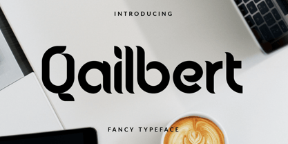 Qailbert is a fancy elegant typeface/font designed with carefully handcrafted. This perfectly made to be applied in logo, stationery, books, packaging, fashion, magazines, t-shirt, greeting or wedding cards, vintage design, novels, labels and many advertising purposes.
 - Murisa Barbara by Murisa Studio,
$10.00 This time we present to you our newest font. Barbara is one of our proud fonts. Barbara is designed with the inspiration of a woman's beauty. Barbara was born with stunning elegance. You can use this font for your daily needs, such as writing a message, quote words, or the name of the recipient of your invitation. You can of course also use this font in your products. Barbara will perfect your product. Elegance, cheerfulness, beauty will be the main attraction for your product. Get it right now.
 - Nefarious by Hanoded,
$15.00 A few fonts ago I mentioned the fact that I like posh English words; words you don’t really use in conversation. As I am busy expanding my ‘halloween’ font collection, I came across the beautiful word Nefarious. It means wicked or evil and when you say the word, it even sounds evil! Fantastic! Nefarious is a halloween/witches font. It looks like my Griezelig font, but it is rougher and spikier. Use Nefarious for your halloween invitations, posters and books about evil geniuses. Comes with all diacritics and a bunch of swashes as well.
 - Ossuary by Wundes,
$13.00Ossuary is a font in which each letter is formed using a uniquely arranged pile of skulls. The font was originally designed to be caps only, but small caps were added for convenience. There is now a character for each typeable letter of the American English keyboard. The font was inspired by images from the Kostnice ossuary in Sedlec, Kutna Hora near Prague. (Google it.) Whether you are fascinated or repulsed, such images have a mystery about them. They demand your attention. That is the feel this font was intended to capture. - Fruitcake Fanatics by Bogstav,
$18.00 I have had the name "Fruitcake Fanatics" in my mind for quite some time now...but I needed a font that suited the name...then one day...actually last Wednesday, I was playing around with some letters (which eventually would turn out to be this font!) and suddenly it struck me: I got the letters for my Fruitcake Fanatics font! Another story could be - what does the name mean?! Well, to tell you the truth, I don't know - but what I do know is that the font is playful and unpredictable and loads of fun!
 - Dragon Fang by astroluxtype,
$20.00 Dragon Fang is a headline display font set. The style suggests Medieval font forms but in a contemporary sense. The font contains uppercase and lowercase letterforms which include a few alternate characters. Look for the swash “B” and “D” to give your design project a special look. Influenced by everything from Rick Griffin and Linotext to tribal tattoo art this font will bring a contemporary edge to your design project. Fantasy book cover art, album covers, even that horror movie will find many uses for astroluxtype’s Dragon Fang.
 - Crima by Gatype,
$12.00 Crima Font Black Serif totality and elegance. One of the newest releases that can only be done now, naturally drawn with pinpoint accuracy. Crima has the perfect signature and subtlety for your next project. It perfectly represents the retro and vintage aesthetic. I recommend this font for your next logo, invitation, and home decor project that needs a succinct alternative combination touch! The Criman font comes with available strong characters: Get inspired by the image above and feel free to share with me what you get by using this font.
 - DT Lythmore by Dragon Tongue Foundry,
$9.00 Lythmore This font is called Lythmore and is inspired by Lithos. Lithos was originally designed for Adobe by Carol Twombly in 1990, based it on the lettering from ancient Greek inscriptions. The Capitals are similar in feel and design, but is totally original and built from scratch. It is designed to be similar intentionally, but it is not a clone or rip off. Lithos is an example of a simple blocky san serif font style, with subtly concave sides, angled ends, and off centred curves. Lythmore is also an example of that same style. But is also different in places where I felt it could be improved. And it has a complete lower case set, which Lithos doesn't. I built Lythmore with 8 different weights. Lythmore can be very effective when used in advertising and general display work, but it can also be used for much more. Although it was never designed to be body copy, when used as such, it is still perfectly readable and adds its own version of sans serif style and flavour. I have included two versions of the Lythmore family. Lythmore A and Lythmore B. In the Lythmore A family, the lighter 4 weights all vary in weight in both the horizontal and vertical axis. The heavier 4 weights all vary in the horizontal axis only. In the Lythmore B family, the transition is even in both directions across the entire family. The result of this difference is that the A and B versions difference is most noticeable between the Regular and Medium weights. While the extreme ends of each family version are virtually identical.
 - Trinidad Neue by Sudaca Type Design Studio,
$40.00 Trinidad Neue™️ is a geohumanistic typeface developed by the Chilean Type Design Studio Sudaca. The origin of this work lies in an exercise of comparing classic Roman proportions (Trajan Columns) with the capital letter set of Futura by Paul Renner. I wanted to create my own Sans Serif interpretation of classic proportions. I started working with letters A, H, N, O, R and S. When I finished the uppercase set, this exercise transformed itself into a project. I started to develop a set of lowercase letters choosing as direct references Futura and Kabel by Rudolph Koch; always having in mind that the objective was to find a balance between the humanist and the rational or geometric. Here is when this group is formed, giving its name and identity to this family: Paul, Rudolph & Alexis. The result is a typeface with an elegant, modern and versatile aspect. Its seven stylistic sets make Trinidad Neue™️ into a Swiss army knife to compose short and medium texts for editorial design, branding, exhibitions, motion graphics, etc. The family consists of nine weight variants and its corresponding oblique versions. It counts with many OpenType characteristics in each variant, including small caps, seven stylistic sets that can be combined, standard ligatures and discretionals ligatures, proportional numerals, tabular numbers, fractions, superscript, subscript, normal punctuation and also aligned to small caps and capital letters, arrows, emojis and more. With more than 1000 glyphs, this typeface has a wide idiomatic range that includes more than 190 Latin languages. Trinidad Neue™ is the new and alternative version of LC Trinidad™.
 - Diotima Classic by Linotype,
$29.99Diotima Classic is a total upheaval for the 21st century of Gudrun Zapf von Hesse's mid-20th-century Diotima, one of the most beautiful types ever cast in metal. Its roots lay in a calligraphic sheet written by Gudrun Zapf von Hesse. The text was the Hyperion to Diotima" by Friedrich Hölderlin; Diotima is the name of a Greek priestess in Plato's dialogue about love. In the philosopher's imagination, she should appear slim and beautiful. In 1948, Gudrun Zapf von Hesse finished the typeface's Roman. The Diotima family was released as a metal typeface for hand setting by D. Stempel AG in 1951-53. This original Diotima is a festive design particularly suited to invitations, programs, and poems. The delicate Italic drew attention to text passages that should be emphasized. Linotype's previous digital Diotima only had one weight, which looked great in display sizes, but was too thin for text setting. Diotima Classic has four weights. The new Regular has more robust serifs and thicker hairlines, making it more appropriate for text sizes. The Diotima variation with finer serif remains under the name Light. Gudrun Zapf von Hesse also took the opportunity in 2008 to add an extremely heavy weight to the family. In comparison to the old Diotima, letterforms of the Diotima Classic are more harmonious and balanced. The rhythm of the Italic letters in Diotima Classic is more consistent. The lining figures of the Diotima Classic align with caps, and the letter spacing of the tabular lining figures in Diotima Classic is significantly better. The forms of the figures have been improved as well." - Solanum by Malgorzata Bartosik,
$19.00 Solanum is cosmic style sans family. It contains Latin and Cyrillic alphabet, Latin with Western, Central and South Eastern European, Vietnamese and Pinyin diacritics. Solanum is perfect for display purposes. This typeface family contains 12 styles from Thin to Regular and from Normal to Ultra Expanded.
 - Scaramouche by Fenotype,
$25.00 Scaramouche is a decorative and playful connected script. Scaramouche family has three weights and matching ornament sets. For the best price, purchase the whole family. Scaramouche has plenty of alternate characters; click on Swash, Contextual or Stylistic alternates in any OpenType savvy program for decorative alternates.
 - Egosta by skillyas studio,
$15.00 EGOSTA is a complete sans serif family. The letterform and sharp variations characterize a bold and playful typeface in a graphic layout, making it perfect for modern and futuristic visual needs, EGOSTA complete family contains 10 styles with two axes; Weight and Width, from Thin to Bold.
 - Craggy by Ingrimayne Type,
$7.95 Craggy has a narrow, spidery, irregular set of letters. Its creepy, Halloween spirit makes it ideal for scary stories and similar uses. The family has three base styles: condensed, regular, and bold. Each comes with an oblique and backslanted version yielding a complete family of nine members.
 - Zimric by Ingrimayne Type,
$5.00 Zimric is a family with 28 styles. It has the look of neat hand printing. It is monoline and sans-serif, friendly and legible. The Zimric family has three widths, each width has four or five weights, and each weight comes in both upright and italic styles.
 - Sacharon by Konstantine Studio,
$19.00 Are you tired of the same old fonts that everyone's using? Add a touch of nostalgia and personality to your designs with Sacharon, a retro pop font! Whether you're working on a vintage-themed project, designing a catchy poster, or simply want to stand out from the crowd, our fonts will give your work the groovy vibe it deserves. Sacharon takes inspiration from the bold and vibrant styles of the '60s and '70s, bringing back the essence of the good old days. From funky disco fonts to psychedelic lettering, we've got the perfect typefaces to transport your audience to an era of fun and excitement. Perfectly fit for logo, branding, advertising, poster, food and beverages, restaurant, book cover, album artwork, decoration, sign painting, and many more. Don't settle for ordinary typography—take a trip down memory lane with Sacharon! Browse our collection now and transform your designs into eye-catching works of art. Get ready to embrace the vibrant, nostalgic spirit of the past in a modern and trendy way. Get it now and let the grooviness begin!
 - Lust Slim by Positype,
$50.00 Check out the new Lust Pro & Lust Pro Didone to see how the series has grown and evolved. Confident and versatile, Lust is an exercise in indulgence—an attempt to create something over the top and vastly useful. If Lust Slim seems both new and familiar, that’s because it is. The series unapologetically channels Herb Lubalin, but produced with a deliberate, contemporary twist. There is an intentional slyness infused in the letterforms—the extreme thick and thin lines flow effortlessly without becoming gratuitous. It’s always just enough, not too much. What makes the type series so appealing? The curves. When asked to describe the letterforms, most people unwittingly allude to the human form, using adjectives usually reserved for describing physical traits… creating all-too-familiar comparisons. Summerour has grown to accept this as unavoidable and reasonable given his acknowledgement of its influences and has provided nuances within the letterforms to accentuate that. Intended to be set large, the typeface has both Standard (Lust, Lust Didone and a single unified Italic) and Display variants making it perfect for editorial use and a flexible solution for any display need.
 - Nassim Latin by Rosetta,
$60.00 Nassim is a contemporary typeface for multilingual text-setting. With its lively texture and balanced rhythm, Nassim is a proven workhorse for a vast array of applications, from literature to the sciences, scholarly publications to contemporary news. Nassim Latin is stout in colour and resolute in its construction, standing up to the demands of long-form reading. But the heartiness that keeps it going is balanced with lively details: the asymmetric serifs and calligraphic modulation allude just enough to broad-nib flourishes to keep the reader alert and looking for what comes next. Nassim has always been ahead of the curve, bridging the distinct typographic traditions of Arabic and Latin without forcing the typographer into compromise. Nassim Latin offers upright and true italic styles across five weights, supporting more than 110 languages, and designed to pair harmoniously in multi-script settings with Nassim Arabic. Beyond that, it is equipped with smart OpenType features like small caps, case-sensitive punctuation, and a full palette of ranging numerals, fractions, and superior and inferior figures ensure that Nassim Latin is up to any task, be it print publications or delivering late-breaking online news.
 - Wasp by NaumType,
$29.00 Wasp is a super-display typeface, which in a few words can be described as well-structured calligraphic humanist sans. It's come to life as an idea to make calligraphy-oriented sans but consciously avoid any horizontal middle strokes. Wasp has a few alternates for each letter, which (despite its unruly nature) allows for finding a good-looking solution in almost any typographic situation.