10,000 search results
(0.028 seconds)
- Beast Energy by Ditatype,
$29.00 Beast Energy is a brush-copying-script font in letter designs having uneven edges as its artistic and organic characteristics. This brush script font can express dramatic, fun impressions through its capital letters making the brush wipe details clearer. The edges will look wider and thicker on certain parts of the letters. The color applications in this brush script font will also give amazing, artistic effects. For example, brighter colors will live up the letters, while darker ones will have dramatic and mysterious effects. Above all, you need to make sure the letters remain legible even in bigger text sizes. Furthermore, you can enjoy the available features here. Features: Multilingual Supports PUA Encoded Numerals and Punctuations Beast Energy fits best for various design projects, such as brandings, quotes, printed products, merchandise, social media, etc. Find out more ways to use this font by taking a look at the font preview. Thanks for purchasing our fonts. Hopefully, you have a great time using our font. Feel free to contact us anytime for further information or when you have trouble with the font. Thanks a lot and happy designing.
 - Letterboard by Sunday Creative Co.,
$12.00 Creatives understand the compulsion to make something of worth. And each creative person has a toolbox they grab from often. Letterboard Lite is the narrow geometric sans that can headline or support whatever project is next on your list — the one unfussy tool you’ll use time and again. With its geometric shapes, Letterboard is a ground-floor sans that stabilizes the foundation upon which everything else will be built. It cements the context unobtrusively without begging to be acknowledged. Pair Letterboard with any script typeface and it will highlight that script’s qualities, whether capricious or elegant. Pair it with a serif or slab serif for an obvious change of tone: With a modern slab, trends will be respected, but it will act more coy with an old-school chunky slab. Letterboard’s geometry is easily subsumed as a partner to a range of serifs, from classics to the latest releases. These qualities and its narrowness make it easy for Letterboard to be used as a large display font in headlines or branding applications. Letterboard comes with 270 characters necessary for setting over 150 Latin-based languages: A–Z with diacritics, lining numerals, and the most common punctuation and symbols.
 - Flece Display by Putracetol,
$26.00 Flece Display - Modern Sans Font is a versatile font that offers the perfect blend of modern style and elegance. It features two distinct styles: calligraphy and sans serif, providing a unique combination that is both luxurious and contemporary. This font is well-suited for various design projects, including logos, titles, book covers, headlines, magazines, products, invitations, and weddings, where a touch of sophistication and visual impact is desired. In addition to its stunning aesthetic, Flece Display also offers a range of features and a comprehensive font package. The font includes both calligraphy and sans serif styles, allowing you to switch seamlessly between the two to achieve the desired look for your design. It provides an extensive collection of characters and glyphs, ensuring versatility and creative possibilities. With its modern and elegant style, Flece Display - Modern Sans Font is the ideal choice for creating impactful and visually stunning designs. Whether you're designing a logo for a high-end brand, crafting attention-grabbing titles, or creating sophisticated invitations, this font will elevate your design projects with its luxurious and contemporary aesthetic. With its versatile features and comprehensive font package, Flece Display offers both convenience and creative flexibility, making it a valuable asset for designers.
 - Frogurt by Missy Meyer,
$14.00 Frogurt is a soft, plump, rounded slab serif font full of fun! Its fat curves make me think of frozen yogurt, and I've always preferred the shorthand "frogurt" to "fro-yo." I was inspired by a 30-year-old hand-carved wooden sign; when I went to try to find a font with a similar look, I couldn't really find anything soft and funky enough! It was a real Goldilocks situation: that one was too thin, that one's corners were too sharp, that one's baseline was too strict. So since I couldn't find something I liked, I made something I liked! I gave Frogurt big pillowy slab serifs, a slightly irregular baseline, and just enough tilt and variation to be fun while still keeping things really clean and readable. The outlines are cleaned up and sharp, so Frogurt will work well for both printing and cutting. Frogurt clocks in with just over 570 glyphs total, including all of the basics (A-Z, a-z, 0-9, and a ton of punctuation), plus over 310 extended Latin characters for language support, and over 50 alternates and ligatures to add some variety and flair. Frogurt is PUA-encoded for easy access to all characters.
 - Zamenhof by CastleType,
$59.00 Zamenhof is a family of five fonts that can be used singly or in combination to create a variety of bold, yet elegant, display styles. Inspired by Russian hand-lettering that appears to have been based on Jakob Erbar’s Phosphor, Zamenhof is essentially a Latin interpretation (with Cyrillic and Greek) of a Cyrillic interpretation of a Latin type design, with many changes along the way. (For example, all the Latin-only letters are quite different between the two designs: D, F, G, J, K, N, Q, R, S, U, V, W, Y, Z.) The Inline and Inverse styles of Zamenhof are the basic fonts and can be used effectively on their own. The Plain and Outline fonts — which I recommend using only in combination with the main designs — were created specifically to be combined with Inline and Inverse, as underlay and overlay layers, respectively. (You will need an application that supports layers, such as Adobe InDesign or Photoshop.) Zamenhof supports most European languages as well as modern Greek, and of course, Russian and other languages that use the Cyrillic alphabet. Needless to say, as Zamenhof is named after the father of Esperanto, it also supports Esperanto (as do all fonts from CastleType).
 - Ribbons by Positype,
$20.00 Ribbon type. Holy grail of complex-lettering-turned typeface or an elusive Loch Ness monster that is often teased, possibly seen in the wild, but never confirmed? From the amazing lettering artist and author Martina Flor and masterful type designer Neil Summerour, comes the aptly named Ribbons. Ribbons is a sincere and well-conceived approach to providing a reliable solution to ribbon and ribbon-styled type for creative professionals when a lettering artist just isn’t available. Ribbons provides both flat and ‘folded’ options with the Regular and Fold styles, but then raises the bar with separate layer styles that will allow you to easily create the elegant back and forth movements produced with ribbon-style lettering we have all come to appreciate. These layer options are provided in both ‘smooth’ and ‘pleated’ connected styles. Flor and Summerour didn’t stop there. Each typeface was expanded with a number of stylistic alternates, additional swashed and flourished letters, ligatures, and even more in order to provide as many decorative options as possible to the creative. To round out the nine fonts available in the typeface and to ‘put a bow on it’, they’ve added a separate Shadow style and two different color fonts (available exclusively with family purchases).
 - Burnt Rose by Krafted,
$10.00 Want to transport your audience to a world of wonder with your branding? Want your headings to spark happiness and engagement? Introducing Burnt Rose - A Modern Calligraphy Font. A modern and elegant handcrafted calligraphy font that’ll make your audience swoon and enhance your branding projects, printed materials, and website design. Every stroke and curve was created to capture the essence of elegance and style. Ideal for social media banners; posts, and ads, printed quotes, t-shirt designs, packaging, or even as a modern text overlay to any background image. Burnt Rose includes Ligature & Stylistic Sets as well as Multilingual Support to make your branding globally acceptable. Get ready to engage and captivate your audience with Burnt Rose. What you’ll get: Multilingual & Ligature Support Full sets of Punctuation and Numerals Compatible with: Adobe Suite Microsoft Office KeyNote Pages Software Requirements: The fonts that you’ll receive in the pack are widely supported by most software. In order to get the full functionality of the selection of standard ligatures (custom created letters) in the script font, any software that can read OpenType fonts will work. We hope you enjoy this font and that it makes your branding sparkle! Feel free to reach out to us if you’d like more information or if you have any concerns.
 - HWT Borders One by Hamilton Wood Type Collection,
$24.95 Wood Type Catalogs of the 19th century often offered tools and accessories alongside alphabets of wood type. Probably the most closely related was wood type borders and ornaments. Decorative Borders were often sold by the foot and accompanied by corner pieces that matched the designs. These borders could be assembled in almost any size dimensions as needed. The digital version uses the same principals of modular assembly to create the exact size border that is needed. Along with the borders, included in this font are a selection of "streamers". These banners would have been made to order with the font designs reversed out along a horizontal banner with decorative end caps. The digital version allows for a modular assembly by selecting choice of end caps and then typing the = as many times as needed to achieve the desired length. 10 styles of 9 piece borders can be created in any size variations as well as 8 styles of streamers in any desired length. Some of the designs can be mixed and matched for unusual contemporary design interpretations of these historic styles. It is recommended that the line height (leading) is set to the same size as the point size setting, this will visually lock all elements together.
 - Hello Eiffel by Yumna Type,
$15.00 Being loyal to your same old font will make your designs plain and dull. You need a prominent font to live up your messages without losing the essence of the content itself. Time to welcome Hello Eiffel, a font to help you deliver your desired messages without omitting the whole design. Hello Eiffel is a display font in simple, yet interesting letter shapes with which you can strengthen your desired messages to deliver without distracting attention on the text content itself. Despite its simplicity, Hello Eiffel remains interesting in modern styles to enhance the design’s aesthetic value. Its letters are legible enough to be flexibly applicable for various text sizes, and it gives you a clipart as a bonus. You can enjoy the available features here as well. Features: Multilingual Supports PUA Encoded Numerals and Punctuations Hello Eiffel fits best for various design projects, such as brandings, posters, banners, headings, magazine covers, quotes, printed products, merchandise, social media, etc. Find out more ways to use this font by taking a look at the font preview. Thanks for purchasing our fonts. Hopefully, you have a great time using our font. Feel free to contact us anytime for further information or when you have trouble with the font. Thanks a lot and happy designing.
 - Senja Mentari by Ahmad Jamaludin,
$15.00 Senja Mentari is elegant modern calligraphy font inspired by delicate inky hand lettering, gorgeous wedding calligraphy and trending minimal branding designs. This beautiful font is for those who are needing of elegance and stylish for their designs and particularly well suited for wedding invitations, cards and feminine branding. I have wanted to create such combination a long time and can’t believe that it is here. I’m super excited and hope you’ll estimate it too. Now all you need for perfect wedding invitation design is in one product. I think this decision will help you to save your time! What's included? More than 100 beautiful swashes in this font Accessible in the Adobe Illustrator, Adobe Photoshop, Adobe InDesign, even work on Microsoft Word. PUA Encoded Characters - Fully accessible without additional design software. Multilingual Support : à á â ã ä å æ ç è é ê ë ì í î ï ñ ò ó ô õ ö ø ù ú û ü ý ÿ š fl fi ž œ ı ç ø š ž æ œ À Á Â Ã Ä Å Æ È É Ê Ë Ì Í Î Ï Ñ Ò Ó Ô Õ Ö Ø Œ Ù Ú Û Ü Ý Ÿ Š Š ŽŁ Ð Ç
 - Carlton by ITC,
$29.99Carlton is based on a typeface designed by Prof. F. H. Ehmcke. In 1908, Ehmcke released his Ehmcke-Antiqua design through the Flinsch typefoundry in Germany. Ehmcke-Antiqua was later distributed by the Bauer typefoundry in Frankfurt am Main. The Caslon Letter Foundry in England discovered the design and released their own typeface based upon the model, which they named Carlton. Carlton entered the Stephenson Blake program after they acquired the Caslon Letter Foundry in the late 1930s. As hot and cold metal typesetting became outdated technologies, Carlton and Ehmcke-Antiqua fell out of general use. In the 1990s, Letraset revived this classic design, distributing it under its English name, Carlton. Carlton's clean and generous capitals, as well as its understated yet detailed lower case, have found popularity again in recent years. The elegance of Carlton is best used for displays with large letter and word spacing. Carlton shows all of the hallmarks of a delicate serif typeface design; its forms capture a distinct moment that was common within Central European type design during the first third of the 20th Century. Carlton is similar to several other expressive typefaces from the early 1900s, including Bernhard Modern, Koch Antiqua, Locarno, and Nicolas Cochin." - Scream Explode by Ditatype,
$29.00 It is crucial to pick a perfect font for your project designs as they should be as great as your fonts to help you deliver your messages and feelings accurately. We would like to introduce you to our display font to help you create dazzling, unique designs. This is the Scream Explode. It is designed in firm characters and unique styles to help you deliver your messages quickly. This capitalized, thick weight font creates a bold, prominent display. Moreover, the uneven edge lines on our display font will give extra creativity touches to show a unique, attractive display. In addition, you can apply this font for big text sizes to be legible and you can enjoy the available features here as well. Features: Alternates Ligatures Multilingual Supports PUA Encoded Numerals and Punctuations Scream Explode fits best for various design projects, such as brandings, posters, banners, headings, magazine covers, quotes, printed products, merchandise, social media, etc. Find out more ways to use this font by taking a look at the font preview. Thanks for purchasing our fonts. Hopefully, you have a great time using our font. Feel free to contact us anytime for further information or when you have trouble with the font. Thanks a lot and happy designing.
 - Baka Expert by Positype,
$25.00 Why Baka Expert? There’s actually a simple answer. The original Baka was done as an experiment of sorts. I wanted to quickly capture a rough, frenetic handwriting style that broke normal conventions. Commercially, it was successful, received some accolades ... but I wasn’t completely satisfied, so I went back to the master art and the lettering explorations and produced Baka Too. This addressed some of the line items I wanted to refine in Baka. I liked it. Each font has been out for a few years now, and I have seen them in use. I’m very critical of my work, and I could still see things—modulations of strokes, angle of the nib, ink swell, and so on—that I wanted to change, refine, and reorder. For me, it is typographic indulgence, but I wanted to take this handwriting ‘font’ and turn it into a robust ‘typeface.’ So I did just that and a bit more by adding back more of my initial flourish concepts; attaining tighter, consistent control of the modulation; optimizing points; adding titling options; and expanding the character language set. Baka and Baka Too had to exist to produce this entirely new re-envisioning of an old friend ... and they all play well together :)
 - Poppy Spoor by Yumna Type,
$15.00 Would you like a legible, professional, prominent font? Well, if that is what you want, you will probably have trouble finding one as it is a time-wasting process and is a hard challenge. Let us introduce you to a perfect font for any project, the Poppy Spoor. Poppy Spoor, unlike the other display fonts, is a display font with rather square letters to show you fun, soft, modern impressions due to the thin line designs in low contrasts. This font type, giving you a clipart as a bonus, is legible and is better applied for big text sizes. You can maximize your designs with Poppy Spoor’s features to remain the best in every design at any time. Features: Alternates Ligatures Multilingual Supports PUA Encoded Numerals and Punctuations Poopy Spoor fits best for various design projects, such as brandings, posters, banners, headings, magazine covers, quotes, invitations, name cards, printed products, merchandise, social media, etc. Find out more ways to use this font by taking a look at the font preview. Thanks for purchasing our fonts. Hopefully, you have a great time using our font. Feel free to contact us anytime for further information or when you have trouble with the font. Thanks a lot and happy designing.
 - Arkaim by Dima Pole,
$22.00 Arkaim is a modern typeface in traditional East-Slavic and GreatRussian style in typography. This style is not like any other style in the world. It combines elegance and brevity, depth and modernity, originality and convenience. This unique font is certainly eye-catching. Arkaim font is named after the ancient Slavic-Aryan city located in the South of Russia, which is a symbol of antiquity, wisdom, as well as the unexplored ancient world. Arkaim is not only a historical place, but also a place of Spiritual power. The font Arkaim has many Opentype features that will help to create interesting and unique compositions. An interesting and non-trivial solution is a kind of mixture of all caps and upper/lowercase characters. Arkaim contains symbols of all Slavic and European languages. There are fractions, superscripts and subscripts, and many others. There is a standard number and the old-style number, also Slavic numbers. There are all the historical characters Of the ancient Slavic script called Bukvitsa, today mistakenly called Cyrillic. In addition, here is a free demo font (only with Russian, Belarusian, Ukrainian, Bulgarian, Macedonian and Serbian characters) without Opentype features and other symbols. You can try it.. and love it.
 - Bion by Type Forward,
$38.00 Bion is a contemporary geometric sans serif with a down-to-earth attitude. It is distinguished by a high x-height, vertically cut terminals, and a minimal stroke contrast, giving it a distinctive, sharp look that is both timeless and universally appealing. Bion comes with 40 weights in a single variable file, ranging from Hairline to Black. We also included Upright, Italic, and Condensed variations to give you a fresh and diverse look for poster and title designs. Whatever message you want to get across, Bion has you covered - with support for 220 languages and 1,220 glyphs in total, as well as Extended Latin, Cyrillic and Greek scripts and an exhaustive list of typographic symbols. Our latest typeface also arrives packed full of OpenType features, including an alternative glyph set that will transform the way your text looks, giving it a more squarish appearance and offering additional visualization options. The Bion type family also includes an extensive set of standard and discretionary ligatures, tabular and small figures, fractions, and language localizations. These features work in static and variable fonts alike, providing a ready-made solution to all your advanced typographic needs. This functional, pragmatic typeface is clean and easily readable, making it an ideal choice for both print and on-screen media.
 - Quarpa by Pasternak,
$9.00 Name: Quarpa Styles: 6 styles Glyphs: 394 Year: 2021 This lofty font features a compact structure as well as a unique combination of rounded corners and square contours. The collection includes six styles: Extra Light, Light, and Semi Light that will ensure elegance; Regular, Medium, Semi Bold and Bold suitable for a solid design. Each of them also has Italic variation. It’s an ideal option for outstanding corporate images, logos, promos, or video presentations. Quarpa has proper kerning, multi-lingual support, and ligatures. Languages: Afrikaans, Albanian, Asu, Basque, Bemba, Bena, Bosnian, Catalan, Cebuano, Chiga, Colognian, Cornish, Corsican, Croatian, Czech, Danish, Embu, English, Esperanto, Estonian, Faroese, Filipino, Finnish, French, Friulian, Galician, German, Gusii, Hungarian, Icelandic, Ido, Indonesian, Interlingua, Irish, Italian, Javanese, Jju, Kabuverdianu, Kalaallisut, Kalenjin, Kamba, Kikuyu, Kinyarwanda, Kurdish, Latvian, Lithuanian, Lojban, Low German, Lower Sorbian, Luo, Luxembourgish, Luyia, Machame, Makhuwa-Meetto, Makonde, Malagasy, Malay, Maltese, Manx, Maori, Meru, Morisyen, North Ndebele, Northern Sotho, Norwegian Bokmål, Norwegian Nynorsk, Nyanja, Nyankole, Occitan, Oromo, Polish, Portuguese, Romanian, Romansh, Rombo, Rundi, Rwa, Samburu, Sango, Sangu, Sardinian, Scottish Gaelic, Sena, Shambala, Shona, Slovak, Slovenian, Soga, Somali, South Ndebele, Southern Sotho, Spanish, Swahili, Swati, Swedish, Swiss German, Taita, Taroko, Teso, Tsonga, Tswana, Turkmen, Upper Sorbian, Vunjo, Walloon, Walser, Xhosa, Zulu
 - Fontoddler by CozyFonts,
$20.00 Fontoddler Font Family, This font was created with the personality, in mind, of my two-and-a-half-year-old granddaughter Chloe Bella. I believe strongly that fonts have personalities that’s why we refer to their members as ‘characters’ or to be more accurate, ‘glyphs’. This font is playful, bold, colorful in form and design, a bit irregular, a bit informal, a bit irreverent, a bit humorous, a bit sassy, and a bit independent just like my little one. When used in color Fontoddler sings. She’ll be writing and creating visual words in just the nick of time. At 2 she started recognizing many colors and identifying people, places, animals, and objects and now she’s recognizing letters. I can’t wait for her to understand that this font was designed and named after her. Fontoddler currently exists in 3 styles, Medium, Heavy, and Heavy Outline. Naturally Heavy and Heavy Outline are congruous, ie. They are fitting together. I hope you enjoy and use this 24th font family from Cozyfonts Foundry. It will fit well with greeting cards, signage, birthday parties, holiday occasions, invites, stationary, headlines, logos, posters, cartoons, animation titles, movie titles and even sports events and sports logos. Have fun with this one. Tom Nikosey
 - Fifth Reign by Mans Greback,
$59.00 Fifth Reign is a decorative medieval typeface. This wonderful typeface of brings us to the golden times of epic knight sagas. Fifth Reign is the typeface of a Royal House, of vikings, kings and queens. Use it for a Middle Ages game, a fantasy headline, or as a logotype for anything of historical theme. With usage in any modern software, the letters will automatically overlap and embrace in an elegant way. To make heraldic symbols, copy these icons: 🐉 🐎 👑 🗡 🦁 🦅 🦌 + ♖ × ✝ ⚓ * ⚔ † ‡ Alternatively write %A %B %C ... etc to create the heraldry. (Download required.) Dragon, Horse, Crown, Sword, Eagle, Deer, Cross, Anchor are some of the logos. The Fifth Reign family consists of three styles: The weights Thin, Bold and Medium, made to balance against each other and allow for usage in any scale. The font is built with advanced OpenType functionality and has a guaranteed top-notch quality, containing stylistic and contextual alternates, ligatures and more features; all to give you full control and customizability. It has extensive lingual support, covering Greek and Cyrillic, as well as all Latin-based languages, from North Europe to South Africa, from America to South-East Asia. It contains all characters and symbols you'll ever need, including all punctuation and numbers.
 - Peridot Devanagari by Foundry5,
$9.00 Mesmerised by the sparkling greenish-yellow mineral called Olivine hidden within the black basalt of Lanzarote's lava fields, we named the gem of our library after this natural beauty. Peridot is not just another typeface – it's a multifaceted sans serif type system crafted with passion and precision by Foundry5. Painstakingly developed through long hours and a keen focus on every minute detail, this typeface boasts a high-quality 10 weight family with matching italics in 6 widths, and the highly versatile variable format. Brimming with character, Peridot invites you to experiment with its various stylistic variants, allowing you to tailor the typographic tone to fit your creative vision perfectly. The diverse range of widths and styles in Peridot offers a dynamic typographic toolbox, ready to inspire and captivate even the most innovative designers. Peridot Devanagari supports Devanagari and Latin and covers over 330 languages. It includes all required localised variants, tabular numerals and currencies, fractions, clever discretionary ligatures and many more features. Peridot performs in varied environments – from branding, display, corporate use, editorial, advertising, poster, web, screen usage etc. Think of any other use case as well, and Peridot will perform. Peridot Devanagari comprises 20 static fonts, family package, and variable support. It is the gem you ought to have in your collection.
 - Walonka by TripleHely,
$18.00 Hello! Let me introduce Walonka – a modern calligraphy font. With its natural, elegant shapes Walonka is the perfect choice for logos, branding, web, blog headlines, invitations, magazine and book design, product packaging – or for any text on postcards and on your favorite photos. Walonka includes: a standard set of characters with wide multilingual support: Western-, Central- and Eastern-European, Baltic, Turkish, Latin-type Africans, and Asian (94 languages in total) two additional character sets: lowercase letters with alternates shapes and lowercase letters without a connection stroke - for the position at the end of a word another two additional lowercase character sets – initial and final swashed forms 75 ligatures for double letters and frequent combinations Walonka has a large number of embedded context-dependent auto-replacement features that give the text a natural, handwritten look and correct inharmonious combinations of letters. These features work well in many apps (even simple ones like Notepad/TextEdit), and if you need to customize their application – you could use programs that support OpenType features (for example, Adobe apps or CorelDraw). All these additional glyphs are PUA-encoded, so if your software does not support OpenType — you could access them through Character Map (Windows) or Font Book (Mac). I hope you will like Walonka and create great designs with it!
 - Paradise Point by Swell Type,
$20.00 Surf's up! Take an unforgettable adventure to the sparkling shores of Paradise Point. Ride our 25 majestic weights, from tranquil tall & thin to thunderous wide & heavy. Expand your horizons with the versatile Variable font to select any spot between. One-of-a-kind activities: Drop in a thrilling Inline weight for stylistic flair. Overlay with the matching Heavy for striking color effects. Discover hidden wonders! Stylistic Alternates will take you to the scenic heights of uppercase in a friendly lowercase style. Or immerse your text in interlocking Discretionary Ligatures for an authentic Tiki Type island experience. Enchanting views: Two versions of each letter and number automatically rotate for a natural, hand-drawn appearance. The Light weights have round ends to simulate a single pen stroke, which matches the center of the Inline weights for a perfect pairing. Explore! If you venture into unknown territory, each weight of Paradise Point contains 775 glyphs for stress-free support of over 200 languages. An all-inclusive getaway: Each weight of Paradise Point includes the features above, and can set readable body text as well as create striking logos and headlines. Use it for restaurant menus, surf and skate brands, or any design project where you want to convey lively, friendly, stress-free fun.
 - Go To Town JNL by Jeff Levine,
$29.00 Vintage sheet music for a song from the 1941 animated feature "Mr. Bug Goes to Town" featured a casual, hand-lettered inline type style on its cover page. Recreated as the digital font Go to Town JNL, this design is presented in all the imperfect glory of pen and ink lettering. Go to Town JNL is available in the regular inline version as well as a solid version. A bit about the cartoon: The project was created by the legendary Fleischer Studios in Miami, Florida (they had relocated from New York City), after they could not obtain the rights to adapt Maurice Maeterlinck's "The Life of the Bee". Beset by the expenses of relocating to Florida, growing production costs on the full-length feature cartoon and other problems; mid-way through the making of "Mr. Bug Goes to Town" the Fleischer brothers were forced to sell their studio to their distributor (Paramount Pictures) in order to continue in operation. It was released on Dec. 5, 1941 - just two days before the Japanese attack on Pearl Harbor. The release [and subsequent re-release by Paramount as "Hoppity Goes to Town"] was a disappointing failure, earning [as late as 1946] only $241,000 of the initial cost of $713,511 it took to make the film.
 - Nortnoh by Alit Design,
$21.00 Introducing the "Northnoh Metal Modern Typeface" – where the raw power of brutalism meets the modern edge of dead metal aesthetics. Unleash the untamed spirit of your designs with this bold and brave font that boasts a prickly character, exuding strength and attitude. Designed for those who dare to be different, this typeface is a true representation of fearless creativity. With 862 meticulously crafted glyphs, the "Northnoh Metal Modern Typeface" ensures a comprehensive arsenal for your typographic adventures. Explore a world of possibilities with included ligatures and alternatives, allowing you to customize and enhance your text with a touch of unique flair. The font's distinctive personality is perfect for projects that demand an unconventional and daring approach. Whether you're working on album covers, posters, branding, or any other design where a fierce statement is required, the "Northnoh Metal Modern Typeface" rises to the occasion. Embrace the rebellious spirit of dead metal while enjoying the ease of use and versatility this typeface offers. Its multilingual support broadens the horizons of your creativity, making it a global tool for expression. Unleash the brutal beauty of "Northnoh Metal Modern Typeface" and let your designs scream with individuality. Elevate your projects to new heights with a font that challenges the norm and breaks free from the conventional boundaries of typography.
 - Nautilus Text by Linotype,
$29.99Hellmut G. Bomm first released his Linotype Nautilus typeface in 1999. Ten years later, he updated and expanded the design. Now users have two additional families at their disposal: Nautilus Text and Nautilus Monoline. Nautilus Text bears more similarities to the original Linotype Nautilus. The letters shows a high degree of contrast in their stroke modulation. Bomm's intention was to create a clear, highly legible face. While the even strokes of most sans serif types eventually tire the eyes in long texts, the marked stroke contrast of Nautilus Text lends the face its legibility. The characters were drawn with a broad tipped pen. Like serif typefaces, the forms of Nautilus Text display a variety of elements. Its characters are narrow, with relatively large spaces between them. This helps create an overall open appearance, and allows a large quantity of text to fit into a small space. Nautilus Monoline's letters share the same overall proportions as Nautilus Text's. But as their name implies, they are monolinear. Their strokes do not have the calligraphic modulation that Nautilus Text features. This allows them to set another sort of headline, making Nautilus Monoline a refreshing display type choice to pair with body text set in Nautilus Text. - Nautilus Monoline by Linotype,
$29.99Hellmut G. Bomm first released his Linotype Nautilus typeface in 1999. Ten years later, he updated and expanded the design. Now users have two additional families at their disposal: Nautilus Text and Nautilus Monoline. Nautilus Text bears more similarities to the original Linotype Nautilus. The letters shows a high degree of contrast in their stroke modulation. Bomm's intention was to create a clear, highly legible face. While the even strokes of most sans serif types eventually tire the eyes in long texts, the marked stroke contrast of Nautilus Text lends the face its legibility. The characters were drawn with a broad tipped pen. Like serif typefaces, the forms of Nautilus Text display a variety of elements. Its characters are narrow, with relatively large spaces between them. This helps create an overall open appearance, and allows a large quantity of text to fit into a small space. Nautilus Monoline's letters share the same overall proportions as Nautilus Text's. But as their name implies, they are monolinear. Their strokes do not have the calligraphic modulation that Nautilus Text features. This allows them to set another sort of headline, making Nautilus Monoline a refreshing display type choice to pair with body text set in Nautilus Text. - Kamber by Studio Buchanan,
$24.00 Kamber is a playful and approachable, neo-grotesque sans-serif with a handful of humanist flourishes. Subtle convex terminals and a curved structure create it's friendly personality and bouncy rhythm. If you're looking for a warm typeface that's affable without straying into cliché, then Kamber is your new best friend – like the labrador of typefaces. Kamber's balanced yet quirky nature makes for a fun and interesting display face, without compromising on legibility at smaller sizes. The lowercase letters have an elevated x-height, sitting at around 70% of the cap height – this means running copy remains clear and readable. Available in 8 weights, each with a corresponding italic, Kamber is a widely functional typeface that can hold it's own, regardless of the use case. It includes all the usual open type features for further adaptation and variation, including small caps, ligatures, stylistic alternates and more. The primary numerals are lining figures, but tabular figures, old style figures, and a combination of both are also included. If you're looking for something to stand out from the sea of overly geometric faces and soulless helvetica variants, then Kamber is ready and waiting. Perfect for editorial design, branding or anywhere you use text – Kamber is the typeface that smiles.
 - In the whimsical world of typography, where letters stretch and contort with the flexibility of a cartoon cat, there lies a font that has donned the cloak of mystery and intrigue – meet Arcanum, brou...
- ATF Franklin Gothic by ATF Collection,
$59.00 ATF Franklin Gothic® A new take on an old favorite Franklin Gothic has been the quintessential American sans for more than a century. Designed by Morris Fuller Benton and released in 1905 by American Type Founders, Franklin Gothic quickly stood out in the crowded field of sans-serif types, gaining an enduring popularity. Benton’s original design was a display face in a single weight. It had a bold, direct solidity, yet conveyed plenty of character. A modern typeface in the tradition of 19th-century grotesques, Franklin Gothic was drawn with a distinctive contrast in stroke weight, giving it a unique personality among the more mono-linear appearance of later geometric and neo-grotesque sans-serif types. Franklin Gothic has been interpreted into a series of weights before, most notably with ITC Franklin Gothic. But as the original type was just a bold display face (later accompanied by a few similarly bold widths and italics), how Benton’s design is expanded to multiple weights and styles as a digital type family can vary significantly. Benton designed several gothic faces that harmonize with one another, including Franklin Gothic, News Gothic, and Monotone Gothic, that can serve as models for new interpretations of his work. With ATF Franklin Gothic, Mark van Bronkhorst looked to Benton’s Monotone Gothic—originally a single typeface in a regular weight, and similar to Franklin Gothic in its forms—as the basis for lighter styles. ATF Franklin Gothic may appear familiar given its heritage, but is a new design offering a fresh take on Benton’s work. The text weights are wider and more open than some previous Franklin Gothic interpretations, and as a result are quite legible as text, at very small sizes, and on screen. ATF Franklin Gothic maintains the warmth and the spirit of a Benton classic while offering a suite of fonts tuned precisely for contemporary appeal and utility. The 18-font family offers nine weights with true italics, a Latin-extended character set, and a suite of OpenType features. Download the PDF specimen for ATF Franklin Gothic.
 - Bakery Goods by Ali Hamidi,
$10.00 Bakery Goods is a cool, vintage styled and adaptable display font. This original look will appeal to a wide range of crafty ideas, from letterheads and titles, to stationery.
 - Murray Slab by Tkachev,
$25.00 Murray Slab is a techno-style typeface with four styles. This font family will be the best solution for posters, signage, magazine, product branding, corporate branding, logos and titles.
 - OCR-A AI by Apply Interactive,
$90.00OCR-A AI Text is the version for normal use when the text will be read by humans. OCR-A AI is the version to use for machine reading. - Elexis by Danielle Eneh,
$12.00 Elexis is a chunky, blocky script that will stand out in your next project. It's perfect for branding, social media posts, advertisements, product packaging, and invitations. Multilingual Support: AÀÁÂÃÄÅCÇDÐEÈÉÊËIÌÍÎÏNÑOØÒÓÔÕÖUÙÜÚÛWYÝŸỲŸÆŒßÞþ
 - The Classic Signature by Rockboys Studio,
$23.00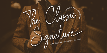 The Classic Signature is a modern signature font which is combining classic calligraphy with a modern style. Its dancing baseline will give your design an elegant and modern touch.
 - Bread Crumbs by Sarid Ezra,
$15.00 Bread Crumbs is a unique hand lettered font. It's also have a delicious taste that will make you project more stunning and give all the attentions for your works!
 - Moonllys by Ronin Design,
$15.00 Moonllys is serif font, designed with elegant and classy style. Moonllys also perfect for title and body text, with featuring ligatures and alternates will makes your design look stunning.
 - FG Noel by YOFF,
$13.95 FG Noel works great at small and large sizes. I can imagine a kids' book with this font and it will be perfect for cute quotations on greeting cards.
 - Haruka by Letterara,
$10.00 Haruka is a unique and bold handwritten font that is inspired by Japanese artistry. It will add an authentic and dynamic touch to a big variety of design projects.
 - Bobila by Rashatype,
$10.00 Bobila is a cool and casual display font. It will look stunning on any poster flyer or print. Use this font for your designs and explore its endless possibilities.
 - Skribler by Cool Fonts,
$24.00 Here’s a scratchy skribly font you can use to make something look grungy or use it reversed and it looks like it was scratched on a wall or something.