10,000 search results
(0.022 seconds)
- Tavern Doors - Unknown license

- cart o grapher - Unknown license

- Ruban Extravaganza - Unknown license

- Stricto Sensu - Unknown license

- Savage Sausage - Unknown license

- Petits Bateaux - Unknown license

- Basic Font - Unknown license

- Couteau Suisse - Unknown license

- Broken Glass - Unknown license

- Halloween Spider - Unknown license

- Kalgellise by SSI.Scraps,
$8.00
- Anthemic by Epiclinez,
$18.00
- Antika by Letterara,
$12.00
- Merry Mob by Typephases,
$5.99
- Storybook Initials NF by Nick's Fonts,
$10.00
- Comic Boys by Stringlabs Creative Studio,
$25.00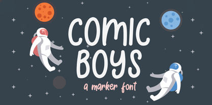
- Wet Pussycat by Celebrity Fontz,
$24.99 - Everything by PizzaDude.dk,
$20.00 - Book Sketch by Ziza Type,
$8.00
- Brutto MF by Masterfont,
$59.00
- Qilgabe by Letterena Studios,
$17.00
- DokterBryce by The Northern Block,
$12.80
- Desttina by Awanstudio,
$18.00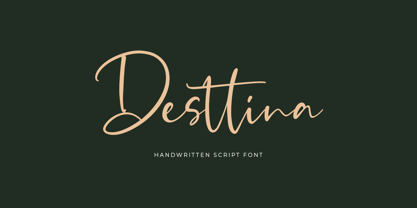
- Athletic Dept by Hustle Supply Co,
$15.00
- FF Softsoul by FontFont,
$41.99 - Isonorm by Linotype,
$29.99 - Blackbarry NF by Nick's Fonts,
$10.00 - Korpus Serif Pro by RMU,
$50.00
- Eurotech Pro by RMU,
$40.00
- Vanilla Cream by Larin Type Co,
$14.00
- WildWords by Comicraft,
$49.00
- Backstage Pass NF by Nick's Fonts,
$10.00 - P22 Cage by P22 Type Foundry,
$24.95
- Boromir by GRIN3 (Nowak),
$19.00
- Jesterday by Jelloween,
$19.00
- Flap Jacks NF by Nick's Fonts,
$10.00 - Centima by TipografiaRamis,
$29.00
- Losta Frida by Creativemedialab,
$20.00
- Helsing by Great Lakes Lettering,
$30.00
- Miyagi by Thinkdust,
$10.00


