10,000 search results
(0.027 seconds)
- Stella Ann by Jukebox Collection,
$32.99 Stella Ann is another great addition to the script fonts of the Jukebox collection. Named after the designer's maternal grandmother, Stella Ann is a beautiful flowing calligraphic style font. It is both bold and strong, yet warm and graceful, just like its namesake. Perfect for wedding invitations, business cards, scrapbooking and much more! Jukebox fonts are available in OpenType format and downloadable packages contain both .otf and .ttf versions of the font. They are compatible on both Mac and Windows. All fonts contain basic OpenType features as well as support for Latin-based and most Eastern European languages.
 - M Comic HK by Monotype HK,
$523.99 M Comic is a humanistic script design characterised by its modern, stiff, free and blocky construction. M Comic incorporates free and irregular characteristics of M Cute. Crossbars (橫) and stems (豎) are straight and slightly slanted. Entry and finial points of strokes are squarish and parallel without flare. Contrast of stroke is low, together with its bold stems (豎), making it suitable for large display text to catch attention. The result is a loosely coupled line of text of free, stiff and blocky glyphs. It is best for casual and humanistic display, illustrations, set upright, non-condensed.
 - Channel B by Just My Type,
$25.00 Channel B was derived from the logo for Channel B, a British entertainment internet channel, anchored by former Soccer AM presenter Tim Lovejoy at www.dailymotion.com/channelbee. I’m not sure what it was in 2008 when I first ran across the logo, but that elegant capital B seemed to cry out for a font to support it. Many of the capitals, numbers and other glyphs of Channel B are split into a top and bottom, but not all. The tall, condensed capitals are contrasted to the rounded lowercase (derived from the bottom half of the B, rotated 180°).
 - Laxory by PizzaDude.dk,
$20.00 My handwriting with a speedmarker turned into a font - well, not really, to be honest! Personally I did do all the writing of letters, but in order for the letters to fit perfectly together, I manipulated them - just a tad! But the result is a hasty set of letters! When I say I wrote all the letters, I mean it literally!!! All letters are unique, meaning all the accented characters are unique! On top of that, Laxory comes with ligatures for both double lowercase letters and numbers! You will need to use OpenType supporting applications to use the autoligatures.
 - Trinetta Leona by Muhammad Alkaf,
$19.00 New Trinetta Leona Modern Serif designed typefaces are here to update your font library! These professional resources are also sophisticated because every font has his own magic design. You can use them for pretty much everything like blog header, posters, wedding elements, t-shirt, apparel, cover books, business cards, greeting cards, branding, invitations and quotes and so on. Features: Uppercase Lowercase Numeral Accent (multilingual characters) Ligature Stylistic Sets How To Access Alternate Characters: https://www.youtube.com/watch?v=Go9vacoYmBw https://www.youtube.com/watch?v=XzwjMkbB-wQ https://www.youtube.com/watch?v=x1A_ilsBsGs https://www.youtube.com/watch?v=xFlMwARHusY https://www.youtube.com/watch?v=NVJlZQ3EZU0 Thanks for your purchase!
 - Double Frames by Putracetol,
$22.00 Introducing Double Frames - Display Font, a font with unique shape. there are two styles – standard and decorative. The modern and powerful display font you've been looking for. Each character is carefully crafted until the result is perfect. A lot of detail is preserved when characters are digitized, so uppercase looks fantastic up close Come with open type feature with a lot of alternates, its help you to make great lettering. best uses for wedding invitation, invitations, signature, typography lettering, branding, label, poster, logos, quotes, product packaging, header, merchandise, social media & greeting cards and many more. Double Frames is also support multi language.
 - M Comic PRC by Monotype HK,
$523.99 M Comic is a humanistic script design characterised by its modern, stiff, free and blocky construction. M Comic incorporates free and irregular characteristics of M Cute. Crossbars (橫) and stems (豎) are straight and slightly slanted. Entry and finial points of strokes are squarish and parallel without flare. Contrast of stroke is low, together with its bold stems (豎), making it suitable for large display text to catch attention. The result is a loosely coupled line of text of free, stiff and blocky glyphs. It is best for casual and humanistic display, illustrations, set upright, non-condensed.
 - Linotype Russisch Brot by Linotype,
$29.00Linotype Russisch Brot is part of the Take Type Library, chosen from the entries of the Linotype-sponsored International Digital Type Design Contests of 1994 and 1997. The inspiration of German designer Markus Remscheid is not hard to see for those who are familiar with the chocolate cookies in the form of letters which are called Russisches Brot. The font is available in six weights. The basic weight is perfectly legible and is good for both headlines and shorter texts and from there the weights become more and more nibbled away, leaving the basic form of the characters and a few crumbs. - Orange Milk by Almarkha Type,
$25.00 Orange Milk is a quirky and fun script full of charm With 2 version Regular and Line . It will take any DIY-project to the next level! Orange Milk is perfect for Craft , product packaging, product designs, label, branding projects, logo, wedding designs, social media posts, advertisements, watermark, invitation, stationery and any projects Simple installationsAccessible in the Adobe Illustrator, Adobe Photoshop, Adobe InDesign, even work on Microsoft Word. PUA Encoded Characters – Fully accessible without additional design software. Fonts include multilingual support Image used : All photographs/pictures/vector used in the preview are not included, they are intended for illustration purpose only. Thank You
 - Organic Thinker by Bogstav,
$19.00 Monospaced fonts can be so dull...they are often only suitable for something like programming and other places where you need the text lined up perfectly. Well, that is not the case with Organic Thinker! Yes, it is monospaced, but it is also handmade and full of vibrant and organic life! Each letter has 5 slightly different versions, and they automatically changes as you type - makes you forget everything about programming, kerning and other dull things! :) Well...you are more than welcome to use Organic Thinker for your next Turbo Pascal text, actually I'd fancy that! :)
 - Quartz by ITC,
$29.99The figures of Quartz font are based on those on digital clocks and LCD displays. All strokes are set at right angles to one another to create abstract characters. Fonts created for electronic displays gained in popularity at the same time as the computer became an everyday object. The standard is still around today and is the model for numerous interpretations. Fonts like Quartz have already won a firm position in trend typography. They embody the spirit of the late 20th century. Quartz font is a good choice whenever a marked contrast to everyday alphabets is the goal. - MY WAY by Posterizer KG,
$18.00 MY WAY belongs to a genre of fonts which contain the “aesthetic of ugly”. This is a font with a good balance of rhythm and contrast. Its aim is casual, wild and anarchic. Because of the spontaneity this font contains, there are plenty of Standard and Discretionary Ligatures to avoid frequent repetition of letters. If you find single repeating glyphs, you can change that by toggling between Stylistic Alternates. There are ligatures created for Cyrillic too. MY WAY is the perfect choice for all dirty, natural and wild, yet authentically beautiful things such as Blues, Jazz, Punk...
 - Bunyan Pro by Canada Type,
$39.95 Bunyan Pro is the synthesis of Bunyan, the last face Eric Gill designed for hand setting in 1934 and Pilgrim, the machine face based on it, issued by British Linotype in the early 1950s — the most popular Gill text face in Britain from its release until well into the 1980s. Gill’s last face doesn't date itself anywhere near as obviously as Gill’s other serif faces, which were all really products of their time, heavily influenced by the richly ornamental and constantly changing aesthetic trends of the interwar period. When compared to Gill’s previous work, Bunyan seems like a revolution in the way he thought and drew. It’s as if he was shrugging off all heavy burden of what was popular, and going back to the basics of older standards. Bunyan had no bells and whistles, doesn't risk functionality with contrasts that are too high or too low, and didn't venture far outside the comfortable oldstyle rhythm Gill grew up with. By interbellum standards, this was utter austerity, a veritable denial of deco excess. Surprisingly, even without all the cloying trivialities, Bunyan still stood indisputably as an aesthetically pleasing, space saving design that could have been made only by Eric Gill. Bunyan Pro comes in three weights and their italics. The main font is intended for use between 8 and 14 points. The medium and the bold are great for emphasis but also have good merit in larger sizes, so can make effective display types as well. All six fonts include small caps, ligatures, alternates, six sets of figures, and three original Gill manicules. We tried to keep the best features of the handset (Bunyan) and machine (Pilgrim) versions while building a text face that can function in today’s immersive reading media. Deciding on which useful letterpress features to preserve for aesthetic importance was hell on our eyeballs — which lead to complex and painstaking ways of ironing out irregularities and inconsistencies related to metal technologies, in order to provide something with authenticity. The result is a unique typeface based on a Gill design that, to a much greater extent than any of his other faces, works well as a text face that can be used for entire books and magazines. For more information on Bunyan Pro’s character set, features, development process and some print tests, please consult the PDF in the gallery section of this page.
 - Valium - Unknown license

- Five And Dime NF by Nick's Fonts,
$10.00A font with a strong architectural feel, inspired by those great commercial emporiums of a bygone era. To cap the crossbars, use [brackets] to enclose uppercase letters, {braces} to enclose lowercase letters, and the upright bar | between upper- and lowercase letters. Both versions of the font include 1252 Latin, 1250 CE (with localization for Romanian and Moldovan). - Rozza by Serebryakov,
$49.00 Rozza is a single weight stencil cursive fat face font for extremal display use. Looking at this font the story of beauty and the beast comes to mind. That is how I would describe it. On the one hand prickly and dangerous, and on the other - pulsating beauty and passion. Try to combine Rozza together with Displace — great pair!
 - Now Showing JNL by Jeff Levine,
$29.00 Inside the pages of the April, 1937 issue of the fan magazine “Hollywood Now” is an unusual bit of hand lettering used for the titles in a number of featured articles. A narrow thick-and-thin Art Deco alphabet with many stylized characters, this type design is now available as Now Showing JNL in both regular and oblique versions.
 - Mo' Funky Fresh by ITC,
$29.99Mo' Funky Fresh is the work of New York designer David Sagorski. It is an all capital typeface which includes a set of alternative capitals, compatible symbols and lively illustrations. Mo' Funky Fresh brings to mind sunny days, tiki bars, surfboards and cool drinks and is a great choice for headlines requiring a vital, energetic look. - Journey Unicorn by Allouse Studio,
$16.00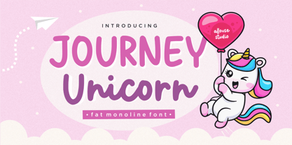 Proudly Present, Journey Unicorn A Fat Monoline Font Journey Unicorn is perfect for any titles, logo, product packaging, branding project, megazine, social media, wedding, or just used to express words above the background. Journey Unicorn also come with Multi-Lingual Support. Enjoy the font, feel free to comment or feedback, send me PM or email. Thank You!
 - Lunisolar by Hanoded,
$15.00 Lunisolar, according to the dictionary, means “of or caused by both the sun and the moon”. I liked the name, therefore I used it! Lunisolar is quite an interesting font: it is fat(tish) and rough, very neat and legible. It could be used for product packaging, book covers and starships. Comes with an abundance of diacritics.
 - Birch Beer JNL by Jeff Levine,
$29.00Birch Beer JNL comes from lettering spotted on a European business sign found in some stock footage that was used for an old black and white film about World War II. The name is derived from a popular root beer-like soda sold by the Royal Castle Restaurants that were popular in Florida from the 1930s through the 1970s. - Keepon Truckin NF by Nick's Fonts,
$10.00Baby Fat, designed by Milton Glaser in 1964, saw a lot of action during the psychedelic poster phase. This little dumpling is based on that workhorse, and takes its name from a phrase that also got around a lot in the 60s. Both versions of the font include 1252 Latin, 1250 CE (with localization for Romanian and Moldovan). - Midtown Tessie NF by Nick's Fonts,
$10.00A sign at the 81st Street (Museum of Natural History) New York subway stop provided the pattern for this mosaic tile face. The font features a full-tile background at the bar position (shift-backslash) and left-and-right pointing fists at the brace positions as well as complete Latin 1252 and Central European 1250 character sets. - Samira by CastleType,
$29.00 I must admit that I am not a big fan of the Art Nouveau style. However, I found this particularly beautiful alphabet and decided to use it as the basis for this new font. Very graceful, elegant, and dare I say, organic. Includes some intertwined ligatures. Complete uppercase, numerals, basic punctuation. Supports most Western European languages.
 - Hibernica by SIAS,
$39.90 Hibernica is a new genuine Irish sans in the classical modern style. With Hibernica it is possible to express Irishness in an up-to-date fashion rather than the traditionalist way. The design of Hibernica is based on my Lapidaria family. With Lapidaria it shares the classic appearance and coolness, stroke pattern, proportions and dimensions. Therefore Hibernica and Lapidaria are a perfect couple for bilingual text editing, e.g. Irish–English (not to forget the Greek parts of Lapidaria!). All fonts contain the full set of dotted ḃ ċ ḋ ḟ ġ ṁ ṗ ṡ ṫ in upper- and lowercase and an additional set of a dozen celtic ornaments. Hibernica also ows its “Minor-Medior” concept to Lapidaria, that is a special uncial-style variant set for lowercase letters. Choose from the six Hibernica fonts which suits your needs best! The Minor fonts are performing elegantly even in longer text bodies, whereas the Medior sorts offer a brillant and entirely new typographic look for headings and captions. Use Hibernica for outstanding designs – for a contemporary Irish understatement in typography. Wether you’re designing menus or shop signs, banners or ads, wether you do textwork upon historic topics or create T-shirts for St Patrick’s day – Hibernica is your new friend! For more new wonderful Irish fonts look at Ardagh and Andron Gaeilge!
 - Frutiger by Linotype,
$42.99 In 1968, Adrian Frutiger was commissioned to develop a sign and directional system for the new Charles de Gaulle Airport in Paris. Though everyone thought he would want to use his successful Univers font family, Frutiger decided instead to make a new sans serif typeface that would be suitable for the specific legibility requirements of airport signage: easy recognition from the distances and angles of driving and walking. The resulting font was in accord with the modern architecture of the airport. In 1976, he expanded and completed the family for D. Stempel AG in conjunction with Linotype, and it was named Frutiger. The Frutiger™ family is neither strictly geometric nor humanistic in construction; its forms are designed so that each individual character is quickly and easily recognized. Such distinctness makes it good for signage and display work. Although it was originally intended for the large scale of an airport, the full family has a warmth and subtlety that have, in recent years, made it popular for the smaller scale of body text in magazines and booklets. The family has 14 weights and 14 companion fonts with Central European characters and accents. Another 14 Cyrillic companion fonts are available as well. See also the new revised version Frutiger Next from the Linotype Platinum Collection. Featured in: Best Fonts for Logos
 - Mr Robot by Hipopotam Studio,
$16.00 Mr Robot is a typeface designed for our next book for children. We wanted to have a colorful, dimensional and edgy looking letters for headlines. There are three ways to use Mr Robot. You can align three text frames with same text but with different colors and font styles (Regular, Shadow 1 or Shadow 3 and Shadow 2) or with ALLinONE font style but select a different OpenType Stylistic Sets (set 1 is like Shadow 1, set 2 like Shadow 2 and set 3 like Shadow 3). This works great but we don’t like to have unnecessary text frames in our layouts so we added a very cool Contextual Alternates OpenType feature. You just need Mr Robot ALLinONE style and only one text frame. First make sure that Contextual Alternates is off. Type every character three times (RRROOOBBBOOOTTT), select colors for each letter (first letter of every three is a side shadow, second is bottom shadow and third is a front of the dimensional letter). When everything is set just turn Contextual Alternates back on. Styles and alignment will be set automatically. Check out the Users Manual for a visual explanation. For web fonts it is better (at least for now) to use the first method (with font styles) as the OpenType features are not supported in older browsers.
 - Restrict by Twinletter,
$12.00 Restrict is a san serif font that we design with a wide selection of beautiful characters and strong characteristics. Having a distinctive shape that is attractive to the eye and easy to read when you make it as a sentence is our main goal in designing this font. Not limited to that, the bold calligraphy font is designed to keep paying attention to the beauty of each letter, there are alternate options for the letters which are certainly easy for you to access, so you can automatically customize the letters you want to enhance the visual appearance of your design project. This charming font also offers the beauty of abstract typography harmony for a wide variety of design projects, including digital natural handwriting for designs, quote designs, for social media business designs, advertisements, trademarks, food and beverage promotion banners, text, posters, a signature, and all designs require handwriting or whatever design you want. What’s Included : File font Web Fonts Standard glyphs Ligature Works on PC & Mac Simple installations Accessible in Adobe Illustrator, Adobe Photoshop, Adobe InDesign, even work on Microsoft Word. PUA Encoded Characters – Fully accessible without additional design software. Fonts include multilingual support for; Afrikaans, Albanian, Croatian, Czech, Danish, Dutch, English, Estonian, Finnish, French, German, Hungarian, Italian, Norwegian, Polish, Portuguese, Slovak, Slovenian, Spanish, Swedish Thank you for your purchase! Hope you enjoy our font!
 - Polyphonic by Monotype,
$31.99 Polyphonic is a highly versatile slab serif typeface comprising 60 fonts across 6 weights and 5 widths. It is a no-nonsense, clear and legible type family whose multiple voices will suit numerous typographic applications. Its overall personality is polite, understated and formal – there are no frills with this typeface, it conveys messages simply and efficiently without hyperbole. Polyphonic’s lighter weights are great for body text and its heavier weights the perfect complement for branding, titles, headings and logotype options. Small Caps are included with each font and available with one click, as are Old Style Figures, there is extensive language support too – European/Latin only. Key features: • 6 Weights in Roman and Italic • 5 Widths – Condensed, Narrow, Regular, Wide, Extended • Small Caps • Old Style Figures • European Language Support (Latin) • 600 glyphs per font. See more detailed examples at the Polyphonic microsite.
 - ITC Photoplay by ITC,
$29.99ITC Photoplay is another gem from Nick Curtis. Unearthed from the 1927 edition of Samuel Welo's Studio Handbook for Artists and Advertisers, the design's original suggested use was for title and caption cards for silent movies. A monoweight design that bridges the gap between turn-of-the-century decorative type and Art Deco, ITC Photoplay is both casual and stylish. And, yes, the cap S" is supposed to look that that. To expand this already handy typeface's versatility, a Black weight has been added to the original design. Curtis has also created an array of alternate characters, a couple of conjunctions, and a handful of "bishop's fingers" to help make your point. ITC Photoplay is eminently suitable for all those occasions when you need to say, "Unhand that fair damsel, you dastardly cad!", and really mean it." - Dracolas by Nathatype,
$29.00 Ready to make your branding spark? If you need to create a big, bold logo for your business, work on a poster for an event, or whatever your project may be-then this is the perfect font for you. Dracolas-A Vintage Font Dracolas is a captive font designed with strong outlines and fat strokes to bring your branding to life and add a touch of retro vibes. This font features thick letters all in uppercase that easy on the eyes and nice to look while it’s also easy to read. Dracolas becomes more special with best bonus. Perfect to create amazing headings, logos, menus, social media graphics, and many more. Our font always includes Multilingual Support to make your branding reach a global audience. Features: Ligatures Alternates Bonus Ornament PUA Encoded Numerals and Punctuation Thank you for downloading premium fonts from Nathatype
 - Mitters by Nathatype,
$29.00 Ready to make your branding spark? If you need to create a big, bold logo for your business, work on a poster for an event, or whatever your project may be-then this is the perfect font for you. Mitters-A Sans Serif Font Mitters is a captive font designed with rounded outlines and fat strokes to bring your branding to life and add a touch of vintage, fun, but still stylish. This font features thick and angular letters that easy on the eyes and nice to look while it’s also easy to read. Perfect to create amazing headings, logos, menus, social media graphics, and many more. Our font always includes Multilingual Support to make your branding reach a global audience. Features: PUA Encoded Numerals and Punctuation Thank you for downloading premium fonts from Natha Studio
 - Stretto by Canada Type,
$29.95 Stretto (Italian for narrow) is a revival, correction and expansive update of an Aldo Novarese reverse-stress font called Sintex, which he did for VGC in 1973. Openly idiosyncratic and playfully rebellious in its design, this alphabet fuses the straights and rounds in an unusual manner, riffing on the idea of hand-made sign and wood type forms while adhering to its odd grid’s parameters. In spite of its counter-stress, its legibility is high and even, helped by its unicase forms and very distinct counters. First released in 2007, it became quite popular with film studios and nostalgia designers (Sintex was the font used for David Bowie’s Hunky Dory album and Life on Mars? single). A dozen years later we revisited it for an update. Stretto now comes with over 660 characters and includes Pan European language support.
 - Double Back by Comicraft,
$19.00 Great Scott, Marty! This font is your density, charged up to 1.21 gigawatts through the Power of Love! Originally created by Comicraft for the official BACK TO THE FUTURE fan club, Remastered DOUBLEBACK has been rebuilt from the ground up, with a new vertical “Curve” weight, six new “Parallel” weights, stylistic alternate letters AMNUWY, and language support for Western & Central Europe and Vietnamese. And if that weren't enough, we've traveled into the future and brought back Solid & Open Variable Fonts which provide precise control of Time and Warp! We cannot be held responsible for any ruptures in the space-time continuum due to use of these fonts. SPECIAL INTRO SALE: from October 21 through November 12, get DoubleBack at half price and we will donate $20.15 of each sale to the Michael J. Fox Foundation for Parkinson's Research. We love ya, Mike.
 - Mostlatest by Nathatype,
$29.00 Ready to make your branding spark? If you need to create a big, bold logo for your business, work on a poster for an event, or whatever your project may be-then this is the perfect font for you. Mostlatest-A Vintage Font Mostlatest is a captive font designed with strong outlines and fat strokes to bring your branding to life and add a touch of retro style. This font is made all in uppercase that easy on the eyes and nice to look while it’s also easy to read. Mostlatest becomes more special with bonus option. Perfect to create amazing headings, logos, menus, social media graphics, and many more. Our font always includes Multilingual Support to make your branding reach a global audience. Features: Ligatures Swashes Alternates Bonus Ornament PUA Encoded Numerals and Punctuation Thank you for downloading premium fonts from Nathatype
 - Kudry by ParaType,
$40.00 Kudry is an elegant and noble typeface for extra large sizes. It looks good in cultural projects and exhibitions, logos, book covers, theater posters, wedding invitations, cosmetic and cake packaging,— basically any case in need of a beautiful typeface. It is a type family that consists of the modern serif and the contrasting sans serif, the weird serif and the stencil type. Both serif and sans have three options for different point sizes: Display for extra large sizes (from 72 pt or 96 px), Headline for large sizes (from 36 pt or 48 px) and Text for medium sizes (from 14 pt or from 24 px). Each style has a variety of alternate characters, swashes and ligatures, linear and old style figures, arrows and case-sensitive punctuation. The typeface supports major all European Latin and Cyrillic-based languages and all European Latin scripts. The authors of the typeface are Isabella Chaeva, Alexandra Korolkova and Nikolay Nedashkovsky. The character design of Kudry, details of the letters and alternates are an original contemporary solution based on the proportions and construction of the sans serif by N. N. Kudryashev. Digital versions of this typeface are Kudryashev and Petersburg, which can work in pair with Kudry in case you need a combination of a text serif and a display typeface. ITC Franklin Gothic, PT Root or Ida suit well as a paired text sans serif.
 - Antoine by Anastasia Kuznetsova,
$19.00 Introducing Antoine — is a vintage retro display typeface. The three font combinations I launched are very compatible if for the victorian classic design concept. As for if the font was worn by itself, without combinations are also brave!! In addition to many get unique character, luxury, brave and elegant. You also have a collection ornament, very suitable if in the gradient. This font is also very easy to use with other design programs or with out design program. Antoine Typeface is perfect for beverage label design project. coffee label. logotype design, badges, classic wedding concept. victorian design concept and so on. gig poster, letterhead, droop cap, titles, and any artworks. Now it’s your time to go crazy and explore the uniqueness of this typeface!! I invite you to familiarize yourself with the preliminary images and hope that you will be imbued with my vision of this creative font, which, I am sure, will be suitable for all the interesting projects you are working on. Fonts can be opened and used in any software that can read standard fonts, even in MS Word. No special software is required to get started. It is recommended to use it in Adobe Illustrator or Adobe Photoshop. Made with love and magic ♡ Thank you for reading it, and do not hesitate to send me a message if you have any questions! ~ Anastasia
 - Berenjena by PampaType,
$40.00 Berenjena is a captivating font family designed by type designer Javier Quintana Godoy in Santiago de Chile. Berenjena has the right combination of comfort in reading and a lyric spirit. This helps keep readers in the delicate atmosphere in which novels and tales can display all their charm. Most typefaces created for books cannot reach this. Either they are too expressive so they tire the eyes of the reader, or they are dull and reading becomes a tedious task. Berenjena was designed for text use bearing in mind this concept of subtle balance. Berenjena (Spanish for aubergine or eggplant) gives your text that spicy environment in which words shapes are easy to read while letterforms maintain their capricious feeling. It comes in roman and cursive declined in four weights: Blanca, Fina, Gris, Negra. All Berenjena character sets include extensive diacritics coverage for more than 200 languages plus the usual contextual features. The Berenjena Pro fonts (available at PampaType.com) include smalls caps, elegant ligatures, cute swashes, every kind of figures, and all contextual sorts. Berenjena will give your design a very individual character. It wears captivating details of calligraphic poetry which link subtlety to vernacular sign painting from Santiago de Chile. See a pdf of Berenjena here http://origin.myfonts.net/s/aw/original/306/0/156716.pdf or visit PampaType.com for more information.
 - Lektorat by TypeTogether,
$35.00 Florian Fecher’s Lektorat font family is one for the books, and for the screens, and for the magazines. While an editorial’s main goals are to entertain, inform, and persuade, more should be considered. For example, clear divisions are necessary, not just from one article to the next, but in how each is positioned as op-ed or fact-based, infographic or table, vilifying or uplifting. From masthead to colophon, Lektorat has six concise text styles and 21 display styles to captivate, educate, and motivate within any editorial purpose. Magazines and related publications are notoriously difficult to brand and then to format accordingly. The research behind Lektorat focused on expression versus communication and what it takes for a great typeface to accomplish both tasks. In the changeover from the 19th to 20th century, German type foundry Schelter & Giesecke published several grotesque families that would become Lektorat’s partial inspiration. Experimentation with concepts from different exemplars gave birth to Lektorat’s manifest character traits: raised shoulders, deep incisions within highly contrasted junctions, and asymmetrical counters in a sans family. After thoroughly analysing magazine publishing and editorial designs, Florian discovered that a concise setup is sufficient for general paragraph text. So Lektorat’s text offering is concentrated into six total styles: regular, semibold, and bold with their obliques. Stylistic sets are equally minimal; an alternate ‘k, K’ and tail-less ‘a’ appear in text only. No fluff, no wasted “good intentions”, just a laser-like suite to focus the reader on the words. The display styles were another matter. They aim to attract attention in banners, as oversized type filling small spaces, photo knockouts, and in subsidiary headings like decks, callouts, sections, and more. For these reasons, three dialed-in widths — Narrow, Condensed, and Compressed — complete the display offerings in seven upright weights each, flaunting 21 headlining fonts in total. If being on font technology’s cutting edge is more your goal, the Lektorat type family is optionally available in three small variable font files for ultimate control and data savings. The Lektorat typeface was forged with a steel spine for pixel and print publishing. It unwaveringly informs, convincingly persuades, and aesthetically entertains when the tone calls for it. Its sans serif forms expand in methodical ways until the heaviest two weights close in, highlighting its irrepressible usefulness to the very end. Lektorat is an example of how much we relish entering into an agreed battle of persuasion — one which both sides actually enjoy.
 - Touvlo by Monotype,
$49.99 New from the Monotype Studio’s Creative Type Director, Emilios Theofanous, Touvlo – meaning brick in Greek – is an homage to London and the view from his studio window. A zestful, modern interpretation of a classic genre, Touvlo skillfully captures the spirit of early British grotesque typefaces through playful terminals and lively curves. Touvlo offers an array of styles, from clean uprights to characterful Italics, and exuberant Backslants. Its regular upright weights are optimized for long text, with prominent and visible vertical contrast, creating rhythm and texture for comfortable reading. The Italics are designed to be visibly distinct, with narrower proportions and calligraphic shapes, offering brightness and emphasis wherever needed. The Backslants are an unexpected and energetic addition, providing an element of surprise while following similar design choices as the Italics, packing a particular punch. With a total of 24 weights in 3 styles across 3 variable fonts, Touvlo’s variety adds flavor in any use case, and can withstand complex typographic layouts or unexpected and peculiar settings. Touvlo’s weights range from Thin to Black, giving it an expressive edge for headlines. Its lyrical Drop caps are the finishing touch, featuring exquisite birds and creatures inspired from ornaments found in type specimen books. Touvlo’s spirit is radiant; becoming more than a voice; a reimagining of a classic genre and a must have for every designer's typographic palette.
