10,000 search results
(0.02 seconds)
- Times Ten by Linotype,
$40.99In 1931, The Times of London commissioned a new text type design from Stanley Morison and the Monotype Corporation, after Morison had written an article criticizing The Times for being badly printed and typographically behind the times. The new design was supervised by Stanley Morison and drawn by Victor Lardent, an artist from the advertising department of The Times. Morison used an older typeface, Plantin, as the basis for his design, but made revisions for legibility and economy of space (always important concerns for newspapers). As the old type used by the newspaper had been called Times Old Roman," Morison's revision became "Times New Roman." The Times of London debuted the new typeface in October 1932, and after one year the design was released for commercial sale. The Linotype version, called simply "Times," was optimized for line-casting technology, though the differences in the basic design are subtle. The typeface was very successful for the Times of London, which used a higher grade of newsprint than most newspapers. The better, whiter paper enhanced the new typeface's high degree of contrast and sharp serifs, and created a sparkling, modern look. In 1972, Walter Tracy designed Times Europa for The Times of London. This was a sturdier version, and it was needed to hold up to the newest demands of newspaper printing: faster presses and cheaper paper. In the United States, the Times font family has enjoyed popularity as a magazine and book type since the 1940s. Times continues to be very popular around the world because of its versatility and readability. And because it is a standard font on most computers and digital printers, it has become universally familiar as the office workhorse. Times™, Times™ Europa, and Times New Roman™ are sure bets for proposals, annual reports, office correspondence, magazines, and newspapers. Linotype offers many versions of this font: Times™ is the universal version of Times, used formerly as the matrices for the Linotype hot metal line-casting machines. The basic four weights of roman, italic, bold and bold italic are standard fonts on most printers. There are also small caps, Old style Figures, phonetic characters, and Central European characters. Times™ Ten is the version specially designed for smaller text (12 point and below); its characters are wider and the hairlines are a little stronger. Times Ten has many weights for Latin typography, as well as several weights for Central European, Cyrillic, and Greek typesetting. Times™ Eighteen is the headline version, ideal for point sizes of 18 and larger. The characters are subtly condensed and the hairlines are finer. Times™ Europa is the Walter Tracy re-design of 1972, its sturdier characters and open counterspaces maintain readability in rougher printing conditions. Times New Roman™ is the historic font version first drawn by Victor Lardent and Stanley Morison for the Monotype hot metal caster." - Times Ten Paneuropean by Linotype,
$92.99In 1931, The Times of London commissioned a new text type design from Stanley Morison and the Monotype Corporation, after Morison had written an article criticizing The Times for being badly printed and typographically behind the times. The new design was supervised by Stanley Morison and drawn by Victor Lardent, an artist from the advertising department of The Times. Morison used an older typeface, Plantin, as the basis for his design, but made revisions for legibility and economy of space (always important concerns for newspapers). As the old type used by the newspaper had been called Times Old Roman," Morison's revision became "Times New Roman." The Times of London debuted the new typeface in October 1932, and after one year the design was released for commercial sale. The Linotype version, called simply "Times," was optimized for line-casting technology, though the differences in the basic design are subtle. The typeface was very successful for the Times of London, which used a higher grade of newsprint than most newspapers. The better, whiter paper enhanced the new typeface's high degree of contrast and sharp serifs, and created a sparkling, modern look. In 1972, Walter Tracy designed Times Europa for The Times of London. This was a sturdier version, and it was needed to hold up to the newest demands of newspaper printing: faster presses and cheaper paper. In the United States, the Times font family has enjoyed popularity as a magazine and book type since the 1940s. Times continues to be very popular around the world because of its versatility and readability. And because it is a standard font on most computers and digital printers, it has become universally familiar as the office workhorse. Times™, Times™ Europa, and Times New Roman™ are sure bets for proposals, annual reports, office correspondence, magazines, and newspapers. Linotype offers many versions of this font: Times™ is the universal version of Times, used formerly as the matrices for the Linotype hot metal line-casting machines. The basic four weights of roman, italic, bold and bold italic are standard fonts on most printers. There are also small caps, Old style Figures, phonetic characters, and Central European characters. Times™ Ten is the version specially designed for smaller text (12 point and below); its characters are wider and the hairlines are a little stronger. Times Ten has many weights for Latin typography, as well as several weights for Central European, Cyrillic, and Greek typesetting. Times™ Eighteen is the headline version, ideal for point sizes of 18 and larger. The characters are subtly condensed and the hairlines are finer. Times™ Europa is the Walter Tracy re-design of 1972, its sturdier characters and open counterspaces maintain readability in rougher printing conditions. Times New Roman™ is the historic font version first drawn by Victor Lardent and Stanley Morison for the Monotype hot metal caster." - Times by Linotype,
$40.99In 1931, The Times of London commissioned a new text type design from Stanley Morison and the Monotype Corporation, after Morison had written an article criticizing The Times for being badly printed and typographically behind the times. The new design was supervised by Stanley Morison and drawn by Victor Lardent, an artist from the advertising department of The Times. Morison used an older typeface, Plantin, as the basis for his design, but made revisions for legibility and economy of space (always important concerns for newspapers). As the old type used by the newspaper had been called Times Old Roman," Morison's revision became "Times New Roman." The Times of London debuted the new typeface in October 1932, and after one year the design was released for commercial sale. The Linotype version, called simply "Times," was optimized for line-casting technology, though the differences in the basic design are subtle. The typeface was very successful for the Times of London, which used a higher grade of newsprint than most newspapers. The better, whiter paper enhanced the new typeface's high degree of contrast and sharp serifs, and created a sparkling, modern look. In 1972, Walter Tracy designed Times Europa for The Times of London. This was a sturdier version, and it was needed to hold up to the newest demands of newspaper printing: faster presses and cheaper paper. In the United States, the Times font family has enjoyed popularity as a magazine and book type since the 1940s. Times continues to be very popular around the world because of its versatility and readability. And because it is a standard font on most computers and digital printers, it has become universally familiar as the office workhorse. Times™, Times™ Europa, and Times New Roman™ are sure bets for proposals, annual reports, office correspondence, magazines, and newspapers. Linotype offers many versions of this font: Times™ is the universal version of Times, used formerly as the matrices for the Linotype hot metal line-casting machines. The basic four weights of roman, italic, bold and bold italic are standard fonts on most printers. There are also small caps, Old style Figures, phonetic characters, and Central European characters. Times™ Ten is the version specially designed for smaller text (12 point and below); its characters are wider and the hairlines are a little stronger. Times Ten has many weights for Latin typography, as well as several weights for Central European, Cyrillic, and Greek typesetting. Times™ Eighteen is the headline version, ideal for point sizes of 18 and larger. The characters are subtly condensed and the hairlines are finer. Times™ Europa is the Walter Tracy re-design of 1972, its sturdier characters and open counterspaces maintain readability in rougher printing conditions. Times New Roman™ is the historic font version first drawn by Victor Lardent and Stanley Morison for the Monotype hot metal caster." - Beautiful Easter by Yoga Letter,
$14.00 "Beautiful Easter" is a quirky and cute handwritten font. This font is decorated with bunny ears in the uppercase. Equipped with uppercase, lowercase, numerals, punctuation, and multilingual support. It is suitable for Easter, spring, wedding moments, and others.
 - Yerk by That That Creative,
$15.00 Yerk is another modern Y2K inspired font. This retro font comes in 3 styles regular italic and slanted. Its bold weight, squared-off letters with slightly rounded corners make it perfect for adding big impact and a bit of personality to your design. It is perfect for logos, branding, magazines, Instagram, and whatever project you are looking for.
 - MGN Ismawan by Morgana Studio,
$17.50 MGN Ismawan. This font was created in 2022 and was inspired by the Helvetica font. With a standard shape and being a bit wide, this font is suitable for writing, but for headlines, we think it's still OK. There are several forms of this font that have a distinctive character, which makes this font suitable for logo writing.
 - Meritoriously by Haksen,
$14.00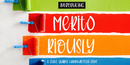 Introduce my New Product "Meritoriously" a cute quirky handwritten font. Very suitable for greeting cards, branding materials, business cards, quotes, posters, and more! These fonts are perfect for all brand :) Features : - UpperCase & Lowercase Numerals & Punctuations - Ligatures Multilingual characters (AÀÁÂÃÄÅCÇDÐEÈÉÊËIÌÍÎÏNÑOØÒÓÔÕÖUÙÜÚÛWYÝŸŸÆßÞàáâãäåæçèéêëìíîïðñòóôõöøùúûüýÿ) PUA ENCODEDZIP INCLUDED: Thanks for visited and Please contact me if you have any questions. My Best, Haksen
 - Easter Bunnytail by Creaditive Design,
$14.00 Easter Bunnytail is a cute and friendly display font, that can easily stand out. Simple but with a strong visual effect, this font will instantly make your creation more appealing than any others. Special Characters are available for uppercase and lowercase letters. Alternate for Uppercase, beginning & end swashes for lowercase can make your design more beautiful.
 - ITC Galliard by ITC,
$41.99 Galliard was originally designed for Mergenthaler Linotype in 1978 as a photocomposition typeface. It is modeled on the work of Robert Granjon, a sixteenth-century punchcutter whose typefaces are renowned for their beauty and legibility. ITC Galliard is a notable typeface for text; the italic is very distinctive in occasional pieces such as invitations and informal announcements.
 - Mostly Bonny by Haksen,
$12.00 Introduce my New Product "Bonny" The new fresh handmade script font. Very suitable for greeting cards, branding materials, business cards, quotes, posters, and more! These fonts are perfect for all brand :) Features : - UpperCase & Lowercase Numerals & Punctuations - Ligatures Multilingual characters (AÀÁÂÃÄÅCÇDÐEÈÉÊËIÌÍÎÏNÑOØÒÓÔÕÖUÙÜÚÛWYÝŸŸÆŒßÞàáâãäåæçèéêëìíîïðñòóôõöøùúûüýÿ) PUA ENCODEDZIP INCLUDED Thanks for visited and Please contact me if you have any questions. My Best, Haksen
 - Briko by Nine Font,
$20.00 Briko is a legible hand-crafted type family that comes in two weights. Its little bit bumpy outline and soft edges give it friendly feelings. There are two versions of Briko Family; Briko and Briko Rough(textured). Perfect for a header for an article, posters or for anything needing a legible and neat hand-written type family.
 - Rolf by MysticalType,
$10.00 Rolf is a modern font of condensed typeface, Rolf is a narrow neutral geometric font designed for headlines and posters. The Italic weights are designed with high-quality compensation for all circles and strokes, made to combine rotalik techniques and details on each slope. Rolf has expanded Latin coverage to be ideal for Western, Central and Eastern European languages.
 - Briztle by Invasi Studio,
$19.00 Are you looking for a strong display font? Introduction a Briztle Font Stylish brushy condensed typeface. With solid stroke brush styles, this typeface has a very fresh, modern, and classy look that's perfect for your display project. This font is perfect for headlines, quotes, magazine covers, editorial design, print posters, signage, window shop design, and much more.
 - RealBook Pen by NorFonts,
$37.50 RealBook Pen are handwritten fonts with a unique lefty bounded shape, and can be used with any word processing program for text and display use, print and web projects, apps and ePub, Comic Books, graphic identities, branding, editorial, advertising, scrapbooking, cards, and invitations … or even just for fun! RealBook Pen can be also used for Comics and Casual lettering.
 - Abu Dhabi by Subectype,
$18.00 Introducing the new "Abu Dhabi" font, a handwritten signature font. For those of you who are needing a touch of clean handwritten signature, chic and modernity for your designs, this font was created for you! Abu Dhabi was built with beautiful ligatures and alternate ending and It has an extensive lingual support, covering all European Latin scripts.
 - Souffle by Eurotypo,
$48.00 Souffle fonts are carefully hand-drawn made, with different letter shapes, full of ligatures, and stylistic alternates that will provide great flexibility for your designs. They come in three versions: Solid, College and Rayé (rough sketched); Including diacritics for CE languages. They fit perfect for logos and packaging design, posters, children books and many other purposes.
 - Jazz Copyist by NorFonts,
$29.95 Jazz Copyist fonts are handwritten fonts with a unique bounded shape, and can be used with any word processing program for text and display use, print and web projects, apps and ePub, Comic Books, graphic identities, branding, editorial, advertising, scrapbooking, cards and invitations … or even just for fun! Jazz Copyist can be used for Comics and Casual lettering.
 - Dealoras Font Duo by Attract Studio,
$17.00 Dealoras is a duo font that is all geometric typeface with simplicity and directness that stands out with its modern minimalist style and clean feel. There are also Dealoras Outline and Dealoras Signature to help you mix and match to match your creative work in harmony. perfect for magazine pictures, for wedding invitations, for branding, poster design and more.
 - Glazed Donuts by DainType,
$15.00 The letters are reminiscent of shiny and tasty glazed donuts. There are three type families, and you can mix them all up to create a decently fun typography. Great for promotional material or package design.
 - Givry by TypeTogether,
$49.00 The bâtarde flamande is a style of writing used predominantly in France and present-day Belgium in the 15th century. The style shares an ancestry with other writing styles traditionally grouped as blackletter— fraktur, textura, rotunda, and schwabacher. It had evolved, however, into an æsthetic far removed from its relatives. While high-contrast in nature, the bâtarde flamande is more delicate and dynamic than the austere and condensed fraktur and textura. Quick curves lack the rigidity of the schwabacher and rotunda. Flair through swashes is thematic, as are the variations in letterforms. The flowing rhythm, achieved through a letterform axis that is overall slightly rightward, is most noticable in the hallmark f and long s. Round forms are fused together for economy of space. It is a writing hand that, with its syncopation and fluidity, produces a vibrance uncharacteristic of other blackletters. Givry has been created in the spirit of the bâtarde flamande. It melds the particular traits compiled from the works of the style’s prominent scribes—Jean Fouquet, Loyset Liédet, and Jean Bourdichon. While suitable as an elegant and energetic display face, Givry was conceived for setting continuous text. The result of many refinements and adjustments is the preservation of the style’s irregular nature, as well as a consistency that continuous-text typography requires. Carefully researched and developed in OpenType format for a wealth of typographic features and support for more than forty languages, Givry is neither derivative nor experimental, but historically accurate. Of the many blackletter digital typefaces available, fraktur and all its connotations have become representative. In contrast, the bâtarde flamande is essentially non-existent in digital form, and has until now been overlooked. Givry provides designers and anyone searching for typographic expression a lively, delicate, and striking side to blackletter.
 - Highand by Craft Supply Co,
$20.00 Highand – Gothic Font A Font of Horror Highand – Gothic Font encapsulates the essence of terror, designed meticulously to send spine-tingling shivers down your spine and evoke chilling emotions. Dreadful Display Furthermore, Highand’s unnerving aesthetics deliver an atmosphere of dread, creating an unforgettable and unsettling experience for your audience. It’s the perfect choice for spine-tingling displays that demand immediate attention. Terrifying Typography With every character, Highand conjures a feeling of impending doom. Its jagged edges and macabre curves create a nightmarish impression that lingers in the mind. Ideal for Horror-themed Projects Highand is tailor-made for horror-themed projects. Whether it’s for spine-chilling horror movie posters, eerie Halloween invitations, or haunting haunted house flyers, this font sets the eerie tone with sinister grace. In Conclusion Highand – Gothic Font is your sinister accomplice in design, evoking fear and suspense with every meticulously crafted letter. Embrace the darkness and plunge your audience into an abyss of fear. Make your displays truly terrifying with Highand’s chilling presence, ensuring an unforgettable and spine-tingling experience that leaves a lasting impression of horror.
 - Diad by Andinistas,
$29.95 Diad was born on 2000 in order to design posters about second World War. The original idea was obtained by breaking, burning and getting wet a bunch of written copies with an old writing machine. Today, Diad is a small typographic system useful for bringing relevance to any content with a grunge look. Each and every detail passed through a strict experimentation process. Its outrageous and unconventional spirit travels from high leveled corrosion, up to a delicate visual neglect. Diad 2 and 3 work for designing words. Diad 1 is ideal for long phrases and titles. Diad dingbats includes 26 illustrations about motocross. In total, adding Diad 1,2 and 3, it has around 260 glyphs. Diad will make your design shine providing different graphic atmospheres, optimizing time and work to its users. Diad is perfect for graphic design on contexts such as death metal, drum and bass, films, war and horror video games. It could work also for logos, words, titles and short texts in covers, tags, clothes, wraps, cards, stickers, toys, bicycles, surf boards, etc.
 - Seizieme by URW Type Foundry,
$49.99 In 1905 the Parisian typefounders Peignot & Cie. issued their Série 16. This clear roman with a large x-height and an italics soon enjoyed a great popularity. Coen Hofmann’s drawings made for the Seizième follow the original Peignot Série 16 as close as possible. The regular font has the original small caps, while all members of the family are enhanced, next to the ranging ones, with old style figures. Also superior and inferior figures are available. The original series did not have a bold version. This was, however, carefully drawn for this digital rendition. The Série 16 and its versions for the composing machines were much used for the type setting of scientific publications. That is why a comprehensive set of mathematical and sundry characters are added to the Seizième fonts. Next to the accented characters for the several West and East European languages the Seizième was also enhanced with a Cyrillic, also available in regular, italic and bold versions.
 - Komet by Jan Fromm,
$45.00 Komet is a sturdy typeface with a calm and upright feel. Although it derives inspiration from classical English sans-serifs, it’s not too closely related to that model. Komet, instead, feels rather more lively and contemporary. Its compact spacing, low stroke contrast and heavy dots and accents give it an almost monolinear quality. The diagonals are slightly curved and the counters of the round letters such as b, o and q are generously wide. The muted, understated middle weights are built for extended body copy, while Komet’s thin and dark weights look brisk and assertive and make for subtly expressive headlines. Komet is an ideal choice for editorial design, branding and corporate design. The Komet family comes in eight weights with matching italics, from Thin to Black. The glyph set of each font contains around 520 glyphs and provides good everyday support for most Latin-based languages. For a wider range of advanced OpenType features, Komet Pro is also available.
 - Kulturista by Suitcase Type Foundry,
$39.00 Kulturista is an unmistakeable linear slab serif typeface with pronounced rectangular serifs. The drawings are based on the sans-serif Nudista typeface, and Kulturista also inherits Nudista’s distinctive narrowed character proportions, range of weights and glyph sets. The italics are inclined sufficiently, and have the same width and colouring as the plain styles. They aren’t just a mechanically-slanted version of the basic styles, as is often the case for typefaces derived from geometrical images — a whole range of characters have their own drawn variants, which greatly strengthens their highlight function. The italics are therefore an equal partner for the roman styles. Kulturista is definitely a good choice for a headline typeface for magazines and book covers. The range of boldness can come in handy when editing sections, headlines and supplements. The typeface understandably proves itself as a healthy foundation for a unified visual style, and holds up at display sizes as well as on shorter texts.
 - Librum Sans by Hackberry Font Foundry,
$24.95 This is the companion sans family to make the Librum serif families work as well as they do. By companion, I do mean stylistically compatible. But mainly, they have the same vertical metrics. So they work very well for run-in heads, inline character styles, and all the rest of the needs in large books with complex formatting. They are designed for use in InDesign, and they work very well in that environment. The fonts use the same OpenType feature files as the rest of the Librum families. The feature files for the italic and bold are more limited—as I have rarely used things like that [over the past 20+ years]. The character shapes are a bit whimsical. The original ancestor of this book design sans was a very playful font I released as Aerle. It’s been calmed down a lot but is still loose and friendly. For a great deal, see Librum Book Design Group , for a package containing all fifteen fonts!
 - ArTarumianBehrensInitialen by Tarumian,
$100.00 Behrens Initialen is based on the type graphics of the German architect and type designer Peter Behrens (1868-1940). The drawing of the original typeface is in tune with the Art Nouveau (Jugendstil) style in which Behrens worked. This is a light, delicate, somewhat theatrical typeface, the forms of which bear at the same time a certain shade of Gothic and modernity, and can be used, in particular, when there is a need to make a reference to medieval graphics while maintaining the modern style of composition. In the proposed version, the original initial graphics are used not only for uppercase letters, but also for Arabic figures, while for lowercase letters and for the base of other characters are used the letters themselves - without decorative framing. This feature can be useful for obtaining various effects when using both lower and upper cases in parallel, including when they are overlaid. The font includes the Latin, Cyrillic and Armenian ranges. Created by Ruben Tarumian in 2020.
 - Horse Pro by Studio Fat Cat,
$14.00 Horse Pro is another popular sans-serif typeface. Horse Pro was designed by Atok Khoirudin and released through the Studio Fat Cat Type foundry. It is characterized by its bold and uppercase letters, giving it a strong and impactful appearance. Horse Pro is perfectly used in various design contexts, such as headlines, posters, logos, and banners, where a bold and modern look is desired. The font family includes different weights and styles, allowing for flexibility in design projects and have become go-to choices for many designers looking for a bold and stylish sans-serif font for their projects.
 - Oldash by Ilhamtaro,
$23.00 OLDASH is a bold, all-caps serif font, perfect for motorcycle and vintage-related designs. A fairly simple font with not much variation from the serifs of the past. With only a thick feature and the hook is a little fat. This font is also suitable for headlines or short texts not for paragraphs. This font is also suitable for modern designs. To enable the OpenType Stylistic alternates, you need a program that supports OpenType features such as Adobe Illustrator CS, Adobe Indesign & CorelDraw X6-X7. Guides to access all alternates glyphs : http://adobe.ly/1m1fn4Y Cheers!
 - Bounesva by Ilhamtaro,
$14.00 BOUNESVA is a bold, all-caps serif font, perfect for motorcycle and vintage-related designs. A fairly simple font with not much variation from the serifs of the past. With only a thick feature and the hook is a little fat. This font is also suitable for headlines or short texts not for paragraphs. In addition to vintage motorcycle designs, this font is also suitable for modern designs. To enable the OpenType Stylistic alternates, you need a program that supports OpenType features such as Adobe Illustrator CS, Adobe Indesign & CorelDraw X6-X7. Guides to access all alternates glyphs : http://adobe.ly/1m1fn4Y Cheers!
 - Beast Maker by Remedy667,
$18.00 Unleash the beast with Beast Maker, the ultimate gritty horror font from Remedy667. Inspired by 1970s Giallo films and perfect for creating a powerful and sinister vibe, Beast Maker is an essential tool for any horror designer. Beast Maker is perfect for spooky posters and flyers, horror-themed video games and movies, or any project that needs an eerie touch. Beast Maker - because fear is always in fashion. Doubles Elimination for letters and numbers gives you a more natural look. All caps font design. Includes a Remedy667 Font Catalog PDF, all your favorite fonts in one handy catalog. Unleash the Beast Maker!
 - Clown by Tereza Smidova,
$20.00 Layering of individual styles forms the basis for the sans typeface Clown. The font family comprises 18 various styles that precisely fit together. Simply cover one style over another to create over 150 original typefaces to freshen up your work. Clown is a striking headline font that would work well for a retro-style café, bar or club and evokes the style of a Wild West saloon. A similarly decorated typeface was popular for decorating posters and advertisements in the early 19th century. The font family contains uppercase letters and diacritics for most Latin languages, figures, arrows and currency symbols.
 - Dacttelyons by Sitintahitam,
$27.00 Dacttelyons is a blackletter typeface inspired by gothic era, and this typeface perfect for people looking for vintage with dark feel. Dacttelyons suitable for any graphic designs such as branding materials, t-shirt, print, logo, poster, packaging .etc ADDITIONAL INFORMATION For upgrading license please contact me. Upgraded licenses are required for apps, books, television, commercial exhibition, film, gaming, print on demand products, etc. simply email me to : hastohst@gmail.com We hope you enjoy the font, please feel free to comment if you have any thoughts or feedback. Thanks for purchasing and have fun! Cheers 🍻
 - Canapa by Serebryakov,
$29.00 Canapa it a simple humanistic sans serif font family. Canapa's 10 styles are good for friendly oriented package design layouts. Try!
 - Newsworthy JNL by Jeff Levine,
$29.00 Newsworthy JNL and its oblique counterpart are variations on the ever-popular condensed type styles used for newspaper and tabloid publications.
 - Ekistra by Dharma Type,
$14.99 Crazy sans for happy, fun time. There are two other fonts designed by in the same concept. -Deluta Black -Xesy -Ekistra
 - Marvin by Canada Type,
$29.95 The objective of this font was to try and find out how far back in the designer's life this obsession with letters began. The challenge was to draw, from memory only, two sets of caps that recall older Looney Tunes and Merrie Melodies lettering. The experiment was a success, which means that the designer's got it bad since he was, like, four! The Marvin set includes three stylistic variations (Regular, Round and Shadow), with extensive multi-script language support covering Western, Central and Eastern European languages, as well as Cyrillic, Greek and Vietnamese. A few extra alternates and interlocking ligatures are also included, all adding up to over 650 characters in each font. And here we are. Marvin is a great cartoon font that can help you build your very own Illudium Q-36 Space Modulator, so you can trigger that earth-shattering kaboom. Then you're on your way to claim this planet in the name of Mars. Isn't it lovely, mm?
 - Sea Cruise JNL by Jeff Levine,
$29.00 Years before the "Jet Age", and way before computers and satellite television turned us into jaded "armchair travelers", the ocean voyage aboard giant steamships to distant ports of call beckoned many to travel the Seven Seas. Far away lands had a magic and mysticism to them, for few Americans knew anything about those places unless they read about them in books or saw travelogs at their local theaters. Many songs were written with themes of romantic South Seas travel, and one vintage piece in particular entitled "Down Where the Trade Winds Blow" offered up the hand lettering which served as a model for Sea Cruise JNL.
 - Range Serif by Eclectotype,
$36.00 Range Serif is a sharp, contemporary, wedge serif typeface with just a hint of fraktur influence. There are five weights from light to black, each with corresponding italics. This is a typeface designed for demanding typographic work; it’s legible at small sizes, but unique at display sizes. There is an abundance of OpenType features in each font, including: Ligatures - all fonts contain standard f-ligatures. Contextual Alternates - Range Serif has been carefully designed to not ‘need’ ligatures. If you choose to deactivate them, the contextual alternates feature will make sure an alternative f is used before certain letters to avoid clashing. Fractions - When activated, numbers separated by a slash will automagically turn into fractions. Numerals - There are many different figure sets. These are Proportional Lining, Tabular Lining, Proportional Oldstyle, Tabular Oldstyle, Superiors and Scientific Inferiors. A slashed zero feature is also included. Small Caps - All styles include small caps, for both small caps and capitals to small caps functions. Ornaments - For convenience, the arrows are grouped in the ornaments feature. Case Sensitive Forms - There are different punctuation and bracket glyphs for all caps usage. Stylistic Alternates / SS01 - The italic fonts contain alternates for the letters A, K, R, U and X. Range Serif is a versatile and fully-featured typeface, ideal for corporate identities, contemporary art catalogs, even t-shirt slogans. The language coverage is impressive (Latin Extended A is fully covered) so Range Serif should prove a useful text and display workhorse for speakers of many different tongues. The typeface includes an array of currency symbols, including the new symbols for Indian Rupee and Turkish Lira. Also check out the accompanying sans serif version, Range Sans.
 - Laughing Gull by Atlantic Fonts,
$26.00 Distinctive with a sense of humor, Laughing Gull is a fun interlocking font that will fill your project with swirling energy, but won’t snatch your lunch. Handsome straight up, or switch on discretionary ligatures to find a fresh array of interlocks. Most of the ligatures are for lower case, some for upper/lower, and a few are for all-caps. Play around by turning some on and others off and feel free to mix up upper/lower whenever you need a laugh. Laughing Gull posters also feature Atlantic Fonts' Digby and Atlantic Doodles.