10,000 search results
(0.035 seconds)
- Malik by Zetafonts,
$39.00 Taking its name from the arabic word for "king", Malik is a flared sans serif typeface family designed in 2020 by Andrea Tartarelli. The designer wanted to find a way to bridge the classical letterforms of Roman Old Style typefaces with the readability of contemporary sans typefaces. This was achieved by using the so-called flared serif that emerges gradually from the stem of the letter, ending in a sharp angle. It's something that also reminds of the peculiar shapes of the Simoncini Method, invented by italian type designer Francesco Simoncini to get a sharper definition of letterforms. To this blend of classical elegance and modernist expertise, Malik adds the calligraphic influence of modern masters like Frederic Goudy or Ed Benguiat, visible in signature details like the reverse contrast uppercase B, or the calligraphic lowercase k. Malik also means "owner", and this font surely wants to rule the page. It manages to be extremely readable when used in body text size, but looks surprising and expressive in display use. The inclusion of the Malik Heavy Display weight, with its black texture balanced by deep inktraps, allows for striking logo design. The weight range of the family is extremely wide, including a Book alternative to the Regular weight for fine-tuning readability, a range of light display weights and a solid choice of bold weights for branding, all coming with matching true italics. The 16 cuts of Malik have been equipped with all the features you need to solve your editorial and design challenges, including a wide language coverage (thanks to over one thousand latin and cyrillic characters) and a complete set of open type features (including small capitals, positional numbers, case sensitive forms). Alternate characters and stylistic sets allow you to fine-tune your editorial and branding design by choosing variant letter shapes. Malik is the typeface for everyone who wants to design like a king...or like he doesn't care who the king is!
 - FF Neuwelt by FontFont,
$50.99 FF Neuwelt™, from Jens Gehlhaar, is open, inviting, highly legible, and strikingly handsome. Combining the straightforward clarity of a geometric sans with a welcoming warmth, FF Neuwelt’s eight display and text weights, vast range of alternates and extended character set, make for a family with few limitations. While grounded in a solid geometric sans serif foundation, Gehlhaar has drawn a large suite of alternate characters that infuses FF Neuwelt with softened, and ultimately easy on the eyes, humanistic shapes and proportions. Alternative cursive italic forms and a choice of round or square punctuation are also available at the click of a mouse. FF Neuwelt is spaced for sizes larger than 16 point, while FF Neuwelt Text has more open letterspacing to set perfectly at sizes smaller than 16 point. In addition, five key lowercase characters were drawn with more legible shapes. The result is that FF Neuwelt adapts from text to larger sizes and one stylistic mien to another with ease and grace. FF Neuwelt is a natural for interactive design, performing well on both large digital displays and small screens. Counters are generous and apertures are open, making them a perfect choice when setting text as microcopy or in short blocks where quick and accurate comprehension is the goal. Even the heaviest weights translate well to on-screen reading. FF Neuwelt also speaks with authority in large sizes on big screens. Equally at home in print environments, FF Neuwelt is a perfect choice for long-form text, captions, editorial, packaging, point-of-purchase design – as well as extensive branding projects. Its many choices of alternative characters make for a design that draws the reader in, without overpowering the message. Although he has drawn typefaces in addition to FF Neuwelt, Gehlhaar is primarily a filmmaker. Directing commercials with style and grace, his work includes spots for Nissan, Apple, Emirates Airlines and Microsoft. As a creative director, Gehlhaar has worked on a broad range of projects for Coca-Cola, MTV, EPSN, Volkswagen and more.
 - Vactic by Typodermic,
$11.95 Introducing Vactic, the typeface that will take you on a journey back in time to the days of ticker tape parades and room-sized computers. Designed with a keen sense of nostalgia, Vactic captures the essence of the classic pixel board with its round, pinpoint pixels that create a stunning visual impact. This unique typeface offers a range of colors and effects to suit all your design needs. For a punch-card impression, try using black on beige, evoking the feeling of a bygone era of technology. To replicate the iconic pixel board lighting, experiment with red on black, adding a touch of retro glamour to your design. Whether you’re creating a design for a retro-themed event or simply looking to add a touch of nostalgia to your branding, Vactic is the perfect typeface for the job. With its round, pinpoint pixels and range of colors and effects, Vactic is a true testament to the timeless appeal of classic design. Most Latin-based European writing systems are supported, including the following languages. Afaan Oromo, Afar, Afrikaans, Albanian, Alsatian, Aromanian, Aymara, Bashkir (Latin), Basque, Belarusian (Latin), Bemba, Bikol, Bosnian, Breton, Cape Verdean, Creole, Catalan, Cebuano, Chamorro, Chavacano, Chichewa, Crimean Tatar (Latin), Croatian, Czech, Danish, Dawan, Dholuo, Dutch, English, Estonian, Faroese, Fijian, Filipino, Finnish, French, Frisian, Friulian, Gagauz (Latin), Galician, Ganda, Genoese, German, Greenlandic, Guadeloupean Creole, Haitian Creole, Hawaiian, Hiligaynon, Hungarian, Icelandic, Ilocano, Indonesian, Irish, Italian, Jamaican, Kaqchikel, Karakalpak (Latin), Kashubian, Kikongo, Kinyarwanda, Kirundi, Kurdish (Latin), Latvian, Lithuanian, Lombard, Low Saxon, Luxembourgish, Maasai, Makhuwa, Malay, Maltese, Māori, Moldovan, Montenegrin, Ndebele, Neapolitan, Norwegian, Novial, Occitan, Ossetian (Latin), Papiamento, Piedmontese, Polish, Portuguese, Quechua, Rarotongan, Romanian, Romansh, Sami, Sango, Saramaccan, Sardinian, Scottish Gaelic, Serbian (Latin), Shona, Sicilian, Silesian, Slovak, Slovenian, Somali, Sorbian, Sotho, Spanish, Swahili, Swazi, Swedish, Tagalog, Tahitian, Tetum, Tongan, Tshiluba, Tsonga, Tswana, Tumbuka, Turkish, Turkmen (Latin), Tuvaluan, Uzbek (Latin), Venetian, Vepsian, Võro, Walloon, Waray-Waray, Wayuu, Welsh, Wolof, Xhosa, Yapese, Zapotec Zulu and Zuni.
 - Roc Grotesk by Kostic,
$40.00 Roc is a sans serif grotesk inspired by American wood types from the end of the 19th century. With nine weights in five widths, this family contains 45 fonts in total. The character set supports Western and Central European languages, as well as Turkish. Roc Grotesk comes in a range of five widths: Compressed, Condensed, Normal, Wide and ExtraWide, in order to cover a wide scope of applications. Although the styles at both ends of each range are made in their most pronounced form in terms of width and weight, they are not taken to such extremes as to become absurd, and are quite usable in display settings. The Normal width keeps all its nine styles in proportionally similar widths. The Compressed width, however, is deliberately made to be disproportionate, so that every style takes the least possible horizontal space. That is why the contrast between Compressed Thin and Compressed Heavy style is substantial. As the weights progress from Thin to Heavy, the stroke contrast becomes more prominent. It is intentionally exaggerated in heavier weights, which is particularly apparent in the uppercase E and R of the Black and Heavy style. Roc has a large x-height and relatively short descenders and ascenders. No uppercase letter descends below the baseline, so the lines of an all-caps text can be packed tightly on a poster or a headline. The Regular style is somewhat generously spaced, as it is most likely to be used for setting longer passages of text. Its Bold counterpart is spaced in such a way that the width of the text column will be similar to the text set in Regular. Tabular figures in these two styles have exact matching widths, so for example, you could emphasize one row of numbers in a data column without visually disrupting the vertical order of the table. The lowercase g and r have alternatives to accommodate what most designers expect from a typical Grotesk typeface. The single-story g and the cut-off r are accessible via the OpenType feature.
 - Monterchi by Zetafonts,
$39.00 In 1459, while visiting his dying mother, Italian painter Piero della Francesca spent seven days creating a fresco of a pregnant madonna in a small country church in the hilltown of Monterchi (Italy). Hailed today as one of the masterpieces of Italian Renaissance, the fresco was given a new branding in 2019 by Art Director Riccardo Falcinelli who asked the Zetafonts team to develop a custom font for the project. The resulting typeface system, designed by Cosimo Lorenzo Pancini together with Andrea Tartarelli and Maria Chiara Fantini as a rework of Francesco Canovaro original Beatrix Antiqua, is a 50-weights ode to the beauty of classical roman letterforms, that pairs elegant alternates and quirky ligatures with an array of design options for clear and effective editorial, signage, logo and wayfinding design. The base display family, Monterchi, allows endless design expressions with a range of six weights from the slender thin to the strong extrabold, all with matching italics and an array of over one hundred discretionary ligatures. A fine-tuned companion Monterchi Text has been developed to excel in body use, with a larger x-height and wider spacing - clear and legible even at small sizes. The use range of the family is enriched by Monterchi Serif and Monterchi Sans that feature different contemporary interpretations of the same classical geometric skeleton, allowing for layered editorial design and variation. All the fifty fonts in the Monterchi Type System feature an extended character set of over 1100 glyphs covering over 200 languages using the Latin alphabet, as well as Greek and Russian Cyrillic. Open Type features include small caps, positional figures, alternate letterforms, stylistic sets and discretionary ligatures. With his elegant, historical aesthetic, Monterchi embodies the spirit of early Renaissance and the humanist obsession with constructed and geometric beauty - still managing to function as a workhorse family, ready to help any designer in need of a timeless classic look, or looking for the right ligature to transform a simple word into a striking wordmark.
 - 13_Roshi - Personal use only

- LIGHT EMITTING DIODES - Personal use only

- Calligraphy Double Pencil - Personal use only

- 13_Fletcher - Personal use only

- akaFrivolity - 100% free

- 13_Ghosts - Unknown license

- 13_Misa - Unknown license

- Ultras Liberi - Unknown license

- Pea Jennifer - Unknown license

- Four More Years - Unknown license

- FZ JAZZY 12 CRACKED - Unknown license

- Zombie Holocaust - Unknown license

- Swily Bright by Jolicia Type,
$19.00 Say Hello to Swily Bright. Trendy, classy & modern style serif font for your fancy projects. Elegant, fashion and classic style on Swily Bright font will be great for any branding project. With 2 style Regular and Italic, alternates and ligatures will help you to create unique letters
 - Bride Style by Just Font You,
$18.00 Bride Style, A sweet beautiful delicate script font. Inspired from the wedding modern calligraphy style but presented in a fashion editorial way. Perfectly fit for branding, logo, wedding things, greeting cards, fashion, lookbook, moodboard, presentation, imagine the luxury, beautiful, stylish, and casual in the same time.
 - Angelin Love by Letterara,
$12.00 Angelin Love is a gorgeous script font, beautiful and romantic. This font looks perfect for Valentine’s Day designs, or for other romantically inclined styles and projects. To stay up to date for my latest job, follow me and let’s be friends because there will be many promos.
 - ITC Newtext by ITC,
$40.99ITC Newtext was designed by Ray Baker, who created a well designed and legible typeface and built into it every design refinement which could optimize its usefulness. The expanded shapes are generous and legible and the economical vertical set results in more lines to the page. - Eccentric by Solotype,
$19.95Here's another old-timer that needed a lowercase, so we drew one. Originally issued as a caps-only type by The American Type Founders Company about 1898, this font found its way into Craftsman period design. It was the inspiration for Galadriel, a dry transfer sheet alphabet. - Scrawlerz by Hanoded,
$15.00 My teacher used to say my writing looked like ‘hanenpoten’ (“rooster legs”). It is a Dutch expression for a scrawly script. When this script emerged, it had ‘scrawl’ written all over it! Scrawlerz is a messy script font with a lot of joie de vivre. Enjoy!
 - Wirey by Joshua Conley,
$22.00 Wirey is an uppercase hand drawn font inspired by bent copper wires. It is designed for headers, titles and posters where fonts need to be big and unique. Wirey is styled in a way that looks hand drawn but also keeps a simple, professional element within it.
 - Norline by ATK Studio,
$15.00 Norline™ is a new bold sans-serif typeface created to be used for bold titles with 3 shapes into a display fonts way to make it legible for contemporary use. This type features a Latin Pro character set, covering multiple languages written with the Latin script.
 - Rustler Barter by Showup! Typefoundry,
$20.00 RustlerBarter is an elegant display font inspired by the Art Deco era. It perfectly represents vintage aesthetics in a modern and minimalist way. The font includes special uppercase letters, alternate characters, and beautiful ligatures. Furthermore, the font is perfect for elegant logo design, packaging or invitation cards.
 - Designer by Artyway,
$12.00 I suggest you to pay attention to the "Design" font. It's bold, with softened corners and some slope for dynamic effect. "Design" font has a unique charm and easy visual readability, so it's perfect for headlines, whether for sports events, automotive posters, logo or monograms designs.
 - Nice Summer by Yoga Letter,
$16.00 "Nice Summer" is a display font with shading on each letter, making this font unique. Equipped with regular and italic letters, uppercase and lowercase numerals, punctuation, and multilingual support. This font can be used for summer moments, holidays, vacations, traveling, graduation, Father's Day, Christmas, and others.
 - RM Opensans by Ray Meadows,
$19.00 This delightful new design has a friendly, open face and will be useful for many display purposes. Due to the modular nature of this design there may be a very slight lack of smoothness to the curves at extremely large point sizes (around 200 pt and above).
 - Foolish Hand by Sipanji21,
$10.00 Foolish Hand is a handwritten font written in original handwriting, this font is good for various graphic designs, such as making children's drawings, coloring book covers, packaging, advertising, movie covers, posters and for any crafting. I hope this font is useful for you, have a nice day.
 - Techno Retro JNL by Jeff Levine,
$29.00 Techno Retro JNL looks like a design straight out of the 1980s, but it actually appeared as hand lettering on a sheet music cover for the circa-1940s edition of the song "To You Sweetheart, Aloha", proving the old saying that "everything old is new again".
 - Goldmint by Fridaytype,
$17.00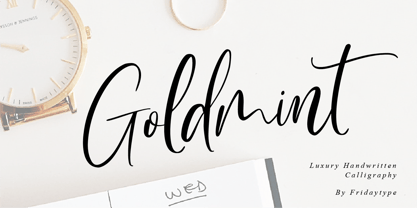 Golmint - Luxury Handwritten Calligraphy Golmint is a stylish modern calligraphy font with a calligraphy flair. This font a luxurious calligraphy font perfect for elegant logos, wedding stationery, photography branding, modern websites, and more! - Uppercase & Lowercase - Numbers & punctuation - Multilingual - Ligature - Swash Thanks and have a wonderful day Fridaytype
 - Ovala SRF by Stella Roberts Fonts,
$25.00 Ovala SRF is one of a number of Ray Larabie designs provided to the Stella Roberts Fonts project and adapted by Jeff Levine. The net profits from my font sales help defer medical expenses for my siblings, who both suffer with Cystic Fibrosis and diabetes. Thank you.
 - RM Slabb by Ray Meadows,
$19.00 This bold display font has considerable strength and will grace any design that requires extra impact. Due to the modular nature of this design there may be a very slight lack of smoothness to the curves at extremely large point sizes (around 100 pt and above).
 - English Script Hand by Autographis,
$39.50 This is the classic English Script. Completely drawn by hand with a classic pen and then scanned and worked over just enough to keep that handmade touch. I didn't want this to look perfect, there are enough versions of this font that are way too slick.
 - Painters Roman NF by Nick's Fonts,
$10.00 It is what it says: a classic woodtype face by the same name from Vanderburg and Wells' 1878 specimen book. What it lacks in refinement, it makes up for in exuberance. Both versions support the Latin 1252, Central European 1250, Turkish 1254 and Baltic 1257 codepages.
 - Sundowners by PintassilgoPrints,
$29.00 Sundowners is a smiley face. It is a simple and versatile font, with a pocketful of cool interlocking glyphs for those days of groovier moods. It also brings a handful of amusing initial and terminal forms and a couple of ornaments. That simple. And that nice.
 - Unboring by PintassilgoPrints,
$20.00 Boring titles? Boring chunk of text? Unbore’em all! This nifty stackable family features two fonts, both with two options for each letter. Pile them up and play with opacities for a killer superposed effect. Or use each alone if you prefer. Unboringness guaranteed either way. Cheers!
 - 1906 Fantasio by GLC,
$38.00 We have created this font inspired from the hatched one used for the inner title and many headlines by the old French popular "cheerful" satirical magazine Fantasio (1906-1948). This family may be used together with 1906 French News, 1906 Titrage, 1906 Fanatasio Auriol and 1890 Notice.
 - Rothe by Konstantine Studio,
$10.00 ROTHE, A luxury vintage lettering style fonts. Inspired by the branding from the vintage classic era with the full decorative feels and complex design but still get the luxury feels right away. Armed with some swash letters to expand the style like the old lettering way.


