5,707 search results
(0.033 seconds)
- Barrington by Letteralle,
$18.00 Say hello to Barrington! A font with relaxed style and carries the impression of luxury. Barrington comes with 64 ligatures to give a natural impression, Uppercase Alternates to give different styles, and also ending swash. To access ending swash you only need to add the number "1" at the and of the word. for example if you want to write "Barrington" with the swash ending, you just have to write "Barrington1", and that's it. Very simple. Barrington is perfect for branding & logo projects, also suitable for Product Packaging, Titles on articles or book covers, Stationary, and much more. Thank You!
 - English Script by Linotype,
$40.99English Script Regular is a typeface made in the manner of English Copperplate, a kind of writing that was very popular in England during the 18th Century. Also referred to as English Round Hand, the style was promulgated by various writing masters, who published copybooks of their handwriting for students to use as guides. The style has remained popular to this day, and almost no sort of font is more readily identifiable with the ideas of formal," "old fashioned," "traditional," or "high society." English Script Regular is the perfect choice for use on wedding invitations and other announcements." - Ermou by TEKNIKE,
$199.00 Ermou is a display monospace font. The typeface has a distinct geometry using sharp angled corners as a tribute to writing and carvings of Ancient Greece. The name is derived from Ermou Street (Οδός Ερμού) or “Street of Hermes” named after the Ancient Greek messenger God and "the bringer of good luck" Hermes (Ἑρμῆς). The famous street was one of the first roads designed in modern Athens, Greece. Today Ermou is Athens’ commercial heart and top ten most expensive retail streets in the world. Ermou is great for team sports, display work, invitations, writing, architecture, fashion, posters, titles and headings.
 - CA Segundo by Cape Arcona Type Foundry,
$29.00 The inspiration for this font came from a wall-writing in Cuba. At first glance we thought: "There is something wrong with the wall-writing." But a closer look revealed, that it just mixed up different stroke-styles. That "feature" became the designing principle behind CA Segundo: Round characters like O, U or C are available either with a fat or a thin stroke, whereas other characters with orthogonal lines come in two different styles – uppercase characters emphasize the vertical strokes, while lower cases emphasize the horizontal strokes. This gives you the opportunity to design just while you type.
 - Dear Penpal Script by Giaimefontz,
$6.00 This is a fully connected script font, not calligraphic, but entirely designed to follow handwritten cursive ligatures rules as teached in schools. In order to correctly visualize it, you have to enable OpenType features (Contextual Alternates, Discretionary Ligatures, Standard Ligatues and Kerning). Trying to write All Capitals will generate Block Letters writings, since cursive style doesn't allow more than the first uppercase per word, however this font is not meant to be a Block Letters font. Using specific type combinations will generate special glyphs. All of these features are intended to reproduce a classic schoolboy or schoolgirl notebook.
 - Brigida by Monotype,
$29.99The Brigida font was influenced by a very common European letter form used in Sweden between 1350-1500. - Diesel Rudolf by Ingo,
$82.00 Write like the inventor of the diesel engine — it’s possible with the Diesel Rudolf Script (patterned after the original handwriting of Rudolf Diesel)... In 2008 the city of Augsburg and the MAN Group celebrated the 150th birthday of Rudolf Diesel, inventor of the diesel engine which was named after him. With the help of a few preserved original letters, it was possible to create a convincing digital version of Rudolf Diesel’s personal handwriting. The engineer and inventor Rudolf Diesel was born in Paris in 1858 and also went to school there. In1870 his family moved to England and Rudolf was sent to relatives in Augsburg where he continued going to school. Later, after completing his studies in Munich, he began working as an engineer in the machine factory Linde. Alone this part of his life makes clear why Rudolf Diesel’s handwriting was so ”jerky,“ hesitant and inconsistent. He learned to write according to the French style, that is, Latin cursive — completely different from the very correct and neat German handwriting taught at that time which he had to learn at 13 years of age. These circumstances explain why his handwriting is ”messy“ (especially for those days) with its mixtures of letter forms within a text, even within individual words. Plus, he obviously did not attach much importance to ”pretty writing.“ Sometimes the characters are wide, then narrow, sometimes large and clear and then again crammed and primitive. The individuality is emphasized with characteristics derived from quill and ink. The diversified images of the font Diesel Rudolf Script make more than 80 ligatures and stylistic alternates possible which can be selected with help from the OpenType functions Ligatures and Discretional Ligatures.
 - Brass by HiH,
$8.00 The Brass Family has a lineage that extends into English history. About five hundred years ago a devout, but anonymous Englishman gave glory to the God he worshipped by designing the capital letters and decorations of these two fonts. Originally recorded in The History Of Mediaeval Alphabets And Devices by Henry Shaw (London 1853), they are described by Alexander Nesbitt in his Decorative Alphabets And Initials (Mineola, NY 1959) as “Initials and stop ornaments from brasses in Westminster Abbey.” I wish I could say I remember seeing them when I was there, but that was forty-two years ago and all I remember was seeing the tomb of Edward the Confessor. One definition of “stop” as a noun is a point of punctuation. I have heard people from the British Isles speak of a “full stop” when referring to a period. Some may remember a 19th century form of communication called a telegram being read aloud in an old movie, with the use of the word “stop” to indicate the end of a sentence or fragment. A full dozen of these stop ornaments are provided. They occupy positions 060, 062, 094, 123, 125, 126, 135, 137, 167, 172, 177 & 190. The Brass Family consists of two fonts: Brass and Brass Too. Both fonts have an identical upper case and ornaments, but paired with different lower cases. Although the typefaces from which the lower cases were drawn are both of modern design, both are interpretations of the textura style of blackletter in use in England when the upper case and ornaments were fashioned for the Abbey. Brass is paired with Morris Gothic, which matches the color of the upper case quite well. Brass Too is paired with Wedding Regular, which is distinctly lighter than the upper case. I find it very interesting how each connects differently. The resulting fonts are unusual and most useful for evoking an historic atmosphere.
 - Navigator by Andrew Footit,
$12.00 The Navigator family is inspired by the early explorers, the early sailors with their old-style tattoos and the cowboys in the old west. I mashed up these to styles to create the Navigator display family. It has a vintage feel with a more modern day approach. Use the regular styles to give your artwork a more clean look and feel or the rough styles to take on the more vintage old-style. This family is great for display use on posters, packaging, editorial and logos. It is created with the designer in mind to have some fun and mix up some great looking Upper / Lower case combinations. The Navigator hand font is an informal, rounded sans-serif that works perfectly with the Navigator display fonts to create beautiful logo and type lockups.
 - Crescent by TrendGFX Design Studios,
$20.00 The most sensational design of the decade is now at large. These high-definition fonts can be used for titles, banners, tattooing, logotypes and many more places. Be it domestic or industrial, formal or informal, it can be used in every field imaginable. It has a sensational, funky style and remarks the current youth's style. Such a font style has never been seen by the world, until today. These designs are 100% original and handmade. I searched a million miles but found this as the most appropriate idea for the world of font types at this time. It's the coolest, funkiest and the best font ever made. It's the era of graffiti and 3D, and we've combined both to give you CRESCENT.. So, use it, love it, buy it!
 - Rip TAPE by TypoGraphicDesign,
$19.00 CONCEPT/CHARACTERISTICS The handmade, dirty and yet modern character of the font was designed with analog tape on paper and later digitized. The motto is sticky, wrinkled and rough APPLICATION AREA The dirty, rough and fancy font „rip TAPE“ would look good at display size for poster, flyer, comics and graphic novel lettering and logos. Headlines in magazines or websites, packaging, music covers or webbanner etc. TECHNICAL SPECIFICATIONS Headline Font | Display Font | Grunge/DIY Font „rip TAPE“ OpenType Font with & 78 glyphs & 2 styles (regular, fixed).
 - Collint Billy by Maulana Creative,
$14.00 Collint Billy is a fancy handwritten script font duo pair with handwritten sans. With medium contrast stroke, fun character with a bit of ligatures and alternates. To give you an extra creative work. Collint Billy font support multilingual more than 100+ language. This font is good for logo design, Social media, Movie Titles, Books Titles, a short text even a long text letter and good for your secondary text font with sans or serif. Make a stunning work with Collint Billy font. Cheers, Maulana Creative
 - Embroi Ghokib by Maulana Creative,
$15.00 Embroi Ghokib Handwritten Script Font Embroi Ghokib is a fancy handwritten script font. With medium contrast stroke, fun character with a bit of ligatures and alternates. To give you an extra creative work. Embroi Ghokib font support multilingual more than 100+ language. This font is good for logo design, Social media, Movie Titles, Books Titles, a short text even a long text letter and good for your secondary text font with sans or serif. Make a stunning work with Embroi Ghokib font. Cheers, Maulana Creative
 - Funky Gloom by Invasi Studio,
$16.00 Introduction Funky Gloom is a Fancy and modern font with a Blackletter style, special for your Display or Body text Design, which puts a bold on your projects and will inspire you to create something unique or modern look design. Funky Gloom will help you to create special and touching typographical designs for your Display or Body text project, it is perfect for headings, flyers, greeting cards, product packaging, book cover, printed quotes, logotype, apparel design, album covers. Funky Gloom Features: Ligatures Alternate Multi-language Punctuation
 - Papillon Woodcuts by Celebrity Fontz,
$24.99 Papillon Woodcuts is a digital revival of an ornate alphabet by French engraver Jean Michel Papillon dating back to 1760, when engraving was very fashionable in France. Each letter is displayed with a different themed background, such as a ship at sea; a fancy table topped with a bounty of fruits; flying birds; a parasol with flowers; playful cherubs; rich textured drapes and tapestries; and many more. These woodcut initials are especially beautiful when used at the beginning of a paragraph as in olden texts.
 - Snugle by pentagonistudio,
$19.00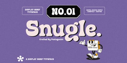 Snugle Is A Fancy Display Character Inspired By Retro and Vintage Style. SOFTWARE REQUIREMENTS : Fonts and alternate : No special software required they may be used in any basic program /website apps that allows standard fonts That's it folks! You can go ahead and get cracking :) Follow My Shop For Upcoming Updates Including Additional Glyphs And Language Support. And Please Message Me If You Want Your Language Included or If There Are Any Features or Glyph Requests, Feel Free to Send me A Message. Have a Good Day !
 - Berlinette NB by No Bodoni,
$39.00 These four typefaces, Berlinette NB, Lyonette NB, Marseillette NB and Parisette NB, were designed from the same basic shape, a fanciful geometric form that avoids strict horizontals and uses more offbeat triangular shapes. Berlinette is the medieval Gutenbergian version of the four. It’s like a weird black letter font from the 1930s. It would work well advertising an obscure brand of German beer on the side of a Zeppelin as it circles the soccer stadium during the last match. In a William Burroughs novel.
 - Patisserie by Thinkdust,
$10.00 Patisserie is exactly the font you might expect to see on chalkboards outside Parisian cafés; tall, elegant and enticing. The lithe, thin and graceful characters of this font compliment the hand-drawn style to create a typeface that is both casual and professional. Excellent for display work and larger sizes, to really show off the slightly rough edges, Patisserie supports over 26 languages with full punctuation and character sets. Step on in for a traditional, hand-made, French fontant, or whatever else you fancy.
 - Trinstam by Azzam Ridhamalik,
$14.00 Trinstam is a fancy modern and classic serif typeface with a clear and bold look. It's a very versatile font that works great in large and small sizes. Perfect for editorial projects, Logo design, Clothing Branding, product packaging, magazine headers, or simply as a stylish text overlay to any background image. This font is PUA encoded and has more than 120 unique alternative glyphs and ligatures that will give your project an unique classic look. FEATURES : Uppercase Lowercase Number Punctuation Multilingual PUA Encode Opentype
 - Freak Funky by Maulana Creative,
$13.00 Freak Funky is a Fancy Brush Script font. With rough brush stroke, slant and fun character with a bit of ligatures and bit of alt lowercase. To give you an extra creative work. Freak Funky font support multilingual more than 100+ language. This font is good for logo design, Social media, Movie Titles, Books Titles, a short text even a long text letter and good for your secondary text font with sans or serif. Make a stunning work with Freak Funky font. Cheers, Maulana Creative
 - Logkey Block by Maulana Creative,
$12.00 Logkey Block is a fancy unique font. With bold square stroke, fun character with a bit of ligatures and has a two files lowercase alternates. To give you an extra creative work. Logkey Block font support multilingual more than 100+ language. This font is good for logo design, Social media, Movie Titles, Books Titles, a short text even a long text letter and good for your secondary text font with sans or serif. Make a stunning work with Logkey Block font. Cheers, Maulana Creative
 - Bowdon by K-Type,
$20.00 Bowdon is a warm, Bodoni-inspired English Modern, influenced by the 1930s lettering of designer Barnett Freedman. Slightly rounded corners give characters a printed-look softness, and hairlines are thickened a little to increase legibility at smaller sizes, reducing the harshness and dazzle that can afflict Didone typefaces. Bowdon is supplied in three widths – Regular, Wide and Narrow – and each width is accompanied by a utilitarian oblique rather than a fancy italic. Each font includes a full Latin Extended-A character set and additional oldstyle numerals.
 - Papercut - Unknown license

- Whiffy - Unknown license

- Anhedonia - Unknown license

- Bootleg - Unknown license

- Memimas by Type-Ø-Tones,
$50.00 The Memimas family was commissioned in 1991 by the publisher Barcanova, for a digital version of their model for learning how to write. Memimas has two ductus versions for the capitals and a complete set of ligatures.
 - Kogare by Prominent and Affluent,
$30.00 Kogare: Where Elegance Meets Timeless Sophistication Meet Kogare, the meticulously designed serif font that effortlessly captures the essence of elegant design. Inspired by the timeless charm of classic serif writing, this font seamlessly blends tradition and modernity.
 - Mano Danielli by Kate Brankin,
$32.00 Mama, are you doing letters? I want to do letters too! Mano Danielli is based on the writing of a 6 year old child. Great for anything that has to do with children - even the inner ones.
 - Allegedly by Ali Hamidi,
$12.00 Allegedly is a lovely handwritten script font. It has a natural writing style and will add a classy touch to your designs. It’s perfect for branding, photography, invitations, quotes, watermarks, advertisements, product designs, labels, and much more!
 - Almarose by S&C Type,
$22.00 Almarose is a geometric sans serif OpenType font designed by Fanny Coulez and published by S&C Type. Functional with a little distinctive touch, Almarose comes with 9 weights with italics, from Thin to ExtraBlack, and was designed for all uses like texts, web or headlines. Merci beaucoup.
 - Pontiac by S&C Type,
$15.00 Pontiac is a sans serif OpenType font designed by Fanny Coulez and Julien Saurin in Paris. Pontiac is a functional font with something more, something warm, geometric but human, something distinctive, something French finally. We also designed an inline Art Deco version of this font, Pontiac Inline. Merci beaucoup!
 - The Dead Hardy font by Dirt2 stands out as an intriguing and bold display typeface, embodying a distinctive fusion of gothic sensibility and modern tattoo artistry. This font draws inspiration from t...
- RAN by URW Type Foundry,
$35.99 RAN Reformed Typeface for Beginners by Georg Salden - a headstrong and courageous approach to an improved handling of handwriting. Diverse and sometimes irreconcilable theories exist about how beginners are supposed to learn writing and reading. This has led to fierce discussions among experts already. We don’t want to pour more oil on the fire, but hope to create a new awareness for this topic, which is important to everyone of us. For beginners the combination of single characters (sounds) to whole words is essential during the acquirement of reading and writing. In this process they develop the skill to recall entire terms from memory. Therefore, after current practice, every word shall be written in a single stroke without lifting the pen in between. Georg Salden contradicts this postulate and warns, that coercively holding the pen down within a word can easily lead to exaggerated loop formations and a general meandering of the written text. The intellectual process in connecting single sounds to words while writing would happen anyway and the prohibition to lift the pen would often lead to tensions. To still support the necessary connections in general and to simplify the connecting, he teaches to write all round letters like a, e, g, o with inclusion of the connecting stroke, so that the spacing and combining with the next character arise by themselves. By settling the stroke at certain points and with a clear and logical writing method, a conscious and careful contact with the various strokes arises. All this automatically leads, together with a certain deceleration, to an increase of beauty and readability in the handwriting. The repeatedly discussed topic »connected or unconnected« appears to be solved in the most comfortable way as, depending on the particular character combination, both solutions are possible.
 - St37k - 100% free

- WeissGotnitials - 100% free

- Impossible - 0 - Unknown license

- Impossible - 050 - Unknown license

- Impossible - 500 - Unknown license

- Slammer tag - 100% free


