10,000 search results
(0.079 seconds)
- Straphang by PizzaDude.dk,
$15.00 Straphand is my idea of what you need for your next greeting card, invitation, poster or whatever needs a fresh and lovely brush! Looks awesome, even when written in ALL CAPS! Comes with extended language support and ligatures for double lettering!
 - Mamut by Totem,
$29.00 Mamut is a display type family of three weights. It has elegant and distinctive letterforms with lots of character. Mamut is your chunky friend, perfect for designing headlines, logos, labels, lettering works, posters and lots of eye-pleasing typographic works.
 - Magisk Time by Bogstav,
$11.00 This is my roughly handprinted typewrite-ish font. It has all the cool and classic moves of the traditional typewriter look, but with a more rough attitude due to the contextual alternates (which offer 6 different versions of each letter!)
 - Schmale Anzeigenfraktur by RMU,
$25.00 The idea of creating this font is based on Koch’s Schmale Deutsche Anzeigenschrift which was released in 1923 by Klingspor in Offenbach, Germany. This font was entirely redrawn and completed with the help of a few basic letters and the numerals.
 - Tamarind Brush by OCSstudio,
$13.00 Introducing the new Tamarind Brush Font! A casual font, with brush letters. Perfect for: using bold, brushed handwritten based designs :) Use it for Branding, Logos, Greeting Cards, Stationery Designs, Invitations, T-shirts, Clothing, Packaging Designs, Posters, Typography Designs and much more!
 - Easter Rabbits by Yoga Letter,
$15.00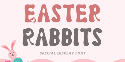 "Easter Rabbits" is a cute and unique display font. This font has bunnies in the letters, making it perfect for Easter occasions. Equipped with uppercase, lowercase, numerals, punctuation, and multilingual support. It is suitable for Easter, spring, summer, and more.
 - Garges by Letterena Studios,
$9.00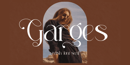 Garges is a modern and classy serif font with its own unique style and modern look. This typeface is perfect for an elegant & luxury logo, book or movie title design, fashion brand, magazine, clothes, lettering, quotes, and so much more.
 - Amsterbold by Yoga Letter,
$16.00 "Amsterdam" is an elegant and modern display font. This font has a unique style and is equipped with upper- and lower-case letters, numerals, punctuation, and multilingual support. It is suitable for logos, business, marketing, mockups, banners, branding, and more.
 - Office Work JNL by Jeff Levine,
$29.00 The 1965 film “Mirage” had its titles and credits hand lettered in a simple, thin sans serif with rounded corners and an overall square design. This is now available digitally as Office Work JNL, in both regular and oblique versions.
 - East Bouvent by Zamjump,
$19.00 East Bouvent is based on references to old luxury lettering, retro, vintage illustrations, and Victorian calligraphy. The retro East Bouvent style is suitable for a number of applications such as product labels, advertising, interiors, and more Including : Alternate Multilingual support
 - Pretzel Dough by Celebrity Fontz,
$19.99 The Pretzel Dough font was inspired by a challenge to make the letters of the alphabet and numbers from the same bowl of pretzel dough. The result is this whimsical and fun typeface. Comes with full set of accented characters.
 - Magisho by Letterena Studios,
$17.00 Magisho is a distinct and classic serif font that has its own unique style & modern look. This typeface is perfect for an elegant & luxury logo, book or movie title design, fashion brand, magazine, clothes, lettering, quotes, and so much more.
 - HWT Brylski by Hamilton Wood Type Collection,
$24.95 HWT Brylski is a typeface by Nick Sherman, named for retired wood type cutter Norb Brylski and designed to be cut as wood type at the Hamilton Wood Type & Printing Museum. This font is the digital counterpart to the wood type made as part of the Hamilton Legacy Project . It incorporates several themes that were common in 19th-century type design, including split tuscan serifs with angled mansard-style sides, heavy weight placement at the top and bottom of letters (traditionally referred to as French or Italian/Italienne, regardless of any actual relation to those countries), and an extended overall width. This digital version contains over 400 glyphs for full European language coverage.
 - Plectrum CP by CounterPoint Type Studio,
$29.95 As the first multi-font family designed for the CounterPoint font library, Plectrum offers designers and font lovers an alternative to the usual display style fonts of CounterPoint with a low key yet elegant sans serif family that can serve a variety of functions. Designed as a humanist style sans serif, the letters have variation in stroke weight. The italic faces have some variation in the letter design making them more of a true italic rather than simple oblique faces. The complete family consist of four weights: Regular, Italic, Bold and Bold Italic which can be purchased separately or as a complete package. The typeface has some unique features which add warmth to the design such as a slanted cross bar on the lowercase e and a large x-height. This is a solid, versatile family. Available in OpenType and contains support for Latin based and Eastern European languages.
 - Glorious Song by Stiggy & Sands,
$24.00 A type from vintage Hollywood to your computer screen. Glorious Song is a display serif typestyle that was inspired by the poster lettering for the 1948 movie "Words and Music". It's an all capitals typeface that has alternate caps in the lowercase slots to convey all of the spunk and visual dance of the original inspiration. See the 5th graphic for a comprehensive character map preview. Glorious Song comes with features for customisation options: - An all capitals typeface with alternate capitals in the lowercase slots - A Ligatures feature that alternates between Capital and Alt Capitals characters. - A SmallCaps feature just to mix things up a little. - A Full set of Inferiors and Superiors for Limitless Fractions - Tabular and Proportional figure sets Approx. 546 Character Glyph Set: Glorious Song comes with a glyphset that includes standard & punctuation, international language support, basic ligatures, alternate numeral styles, subscript and superscript, and Small Cap letters.
 - CA Saygon by Cape Arcona Type Foundry,
$40.00 CA Saygon was originally conceived for a large corporate design project, but as this was never implemented, the way was free to make a public font. As a striking corporate typeface, it transports the fractions of a society after the post-modernist phase. After hundreds of sketches a bunch full of letters were selected, some of them quite twisted, others rather conventional. The combination of these letters reflects a rebellion of individuality but also leads to a coherent typeface. Additionally there are alternative letterforms in the Stylistic Sets or in the glyphs palette, which keeps the font always exciting to the designer. Thanks to the Cyrillic and Latin Extended character sets, a huge language area is covered that even extends to Vietnam! Numerous OpenType features make life easier for the professional typographer: There are fractions, superscript and subscript numbers, as well as proportional and tabular numbers.
 - Tavern by FontMesa,
$25.00 Tavern is a super font family based on our Algerian Mesa design, with Tavern we've greatly expanded the usability by creating light and bold weights plus all new for 2020 with the introduction of extra bold and black weights Tavern is now a five weight family. The addition of the bold weight made it possible to go further with the design by adding open faced shadowed, outline and fill versions. Please note, the fill fonts are aligned to go with the open faced versions, they may work with the outline versions, however you will have to apply them one letter at a time. The Tavern Fill fonts may also be used a stand alone font, however, the spacing is much wider than the regular solid black weights of Tavern. In the old days of printing, fill fonts rarely lined up perfect with the open or outline font, this created a misprinted look that's much in style today. To create that misprinted look using two different colors, try layering the outline fonts offset over the top of the solid black versions. Next we come to the small caps and X versions, for a font that's mostly seen used in all caps we felt a small caps would come in handy. The X in Tavern X stands for higher X-height, we've taken our standard lowercase and raised it for greater visibility in small text and for signage where you want the look of a lowercase but it needs to be readable from the street. In August of 2016 I started the project of expanding this font into more weights after seeing the font in use where someone tried creating a bold version by adding a stroke fill around the letters. The result didn't look very good, the stroke fill also caused the shadow line to merge with the serifs on some letters. This lead me to experiment to see if a new bold weight was possible for this font and I'm pleased to say that it was. After the bold weight was finished I decided to type the regular and bold weights together in a first word thin second word bold combination, however the weight difference between the two wasn't enough contrast. This lead me to wonder if a lighter weight was possible for this font, as you can see yes it was, so now for the first time in the history of this old 1908 type design you can type a first word thin second word bold combination. So why the name change from Algerian to Tavern? Since the original font was designed in England by the Stephenson Blake type foundry I decided to give this font a name that reminded you of the country it came from, however, there were other more technical reasons. During the creation of the bold weight the engraved shadow line was sticking out too far horizontally on the bottom right of the serifs dramatically throwing the whole font off balance. The original font encountered this problem on the uppercase E, L and Z, their solution was a diagonal cut corner which was now needed across any glyph in the new bold weight with a serif on the bottom right side. In order to make the light and regular weights blend well with the bold weight diagonal cut offs were needed and added as well. This changed the look of the font from the original and why I decided to change the name, additional concerns were, if you're designing a period piece where the font needs to be authentic then this font would be too new. Regular vs. Alt version? The alternate version came about after seeing the regular version used as a logo and secondary text on a major product label. I felt that some of the features of the regular version didn't look good as smaller secondary text, this gave me the idea to create an alternate version that would work well for secondary text in an advertising layout. But don't stop there, the alternate version can be used as a logo too and feel free to exchange letters between both regular and alternate versions. Where are the original alternates from Algerian? Original alternates from Algerian are built into the regular versions of Tavern plus new alternates have been created. We're excited to introduce, for the first time, all new swash capitals for this classic font, you're going to love the way they look in your ad layout, sign or logo. The best way to access alternate letters in Tavern is with the glyph map in Adobe Illustrator and Adobe InDesign products, from Adobe Illustrator you can copy and paste into Photoshop as a smart object and take advantage of all the text layer style features Photoshop has to offer. There may be third party character maps available for accessing alternate glyphs but we can't advise you in that area. I know what you're thinking, will there be a Tavern Condensed? It takes a lot of hours to produce a large font family such as this, a future condensed version will depend on how popular this standard version is. If you love Tavern we're happy to introduce the first weathered edge version of this font called Bay Tavern available in February 2020.
 - Chanse Fresh by ArtGarbage,
$10.00 Graffiti is all repetition. Style, like brand logos, makes the repetition more recognizable, but style should never keep you from reading the word. Chanse Fresh was a project to make a handstyle font that wasn't self-concious and overworked - the font is clearly readable and fresh AF. Round is the base font with a thin version to create hierarchy or for longer pieces of text. Both round and thin have a "wet" drippy mop tag version best for key text. The font is all caps with alternates, so you can sub in capitals as needed with repetitive letters to change things up. There's a full latin alphabet so you can type all the words with accent marks natively and a ton of discretionary ligatures and accessory glyphs like arrows, stars, and crowns to make your lettering extra fresh.
 - Buddies by Sudtipos,
$59.00 Buddies, designed by Guille Vizzari, is a script font that was initially born as a piece of lettering. It is the result of an experiment between brush pen and pencil, and in this way, Buddies takes the imprint of the brush, the freshness of sign painting, and some (or a lot) of quirks by the author. The font at times enjoys dancing in titles and short lines of text, pouring rhythm and movements through its lowercase various x-height sets. Buddies also has a vast uppercase set with daring and atypical shapes that surprisingly function beautifully for composing short all-caps texts; messages are brought to life with awesome personality, ideal for packaging, fashion or even editorial. Buddies is a friendly font, a humble invitation to the brush letters universe, but from an unpredictable point of view.
 - Breathing by Din Studio,
$25.00 Hello, awesome people! This time, we have a new font called Breathing, a beautiful brush font created by Din Studio. Breathing, a beautiful brush signature font, is made for any professional project brandings, such as, signature logos, watermarks, wedding invitations, brandings, promotions, product packagings, etc. Every letter has a unique and beautiful touch. This font comes with rough and solid version. Breathing brush font includes a full set of hand-writing uppercase and lowercase letters, numerals, punctuations, and ligatures. This font gives a realistic hand-writing style. See the previews above to get some inspiration on how to use them. Happy designing! Features: 52 Stylistic sets 37 Ligatures Multilingual Supports PUA encoded We really hope you enjoy it. Thank you for downloading our premium fonts. For further details, please feel free to leave us your messages.
 - Broadway Poster by GroupType,
$15.00 Originally designed by Morris Fuller Benton in 1925, FontHaus's 1995 revival is based on a design named "Novelty Broadway". Characters were referenced from "Commercial Art of Show Card Lettering" by James Eisenberg, published by D. Van Nostrand Company in 1945. This Broadway is classic Broadway but with some charming differences such as a slanted lower case "f" a remarkable lower case "g" and a high-waisted upper case case "R", as only a few examples. It was named "Novelty" because the alphabet incorporated a concave design feature in the tops and bottoms of each letter. These differences allow this version to possess much more personality than that of all other Broadway designs on the market. It looks almost hand brushed, has soft edges and is no where near as sterile looking as all the other digital versions. It feels very 1925!
 - Darkness Rising by Hanoded,
$15.00 I was in a bit of a gloomy mood just before I created this font. I had no inspiration whatsoever (which always affects me in a bad way). I was trying to create a font using broken satay skewers, as using those gives the letters a unique look. I broke about 25 skewers and they all broke ‘the wrong way’. Yes, it’s pathetic, I know, but that’s how it is. I decided to go to the gym and do a little workout, hoping my dark mood would pass. When I came back, I broke one more skewer and lo and behold, it broke exactly the right way! I made this font in one go, using that fantastic skewer and lots of Chinese ink. Darkness Rising comes with all the diacritics you’ll need, plus double letter ligatures and some cool underlined alternates.
 - Flying Dutchman by FontMesa,
$25.00 In nautical folklore, the Flying Dutchman is a ship that can never go home and is doomed to sail the seas forever as a ghost ship. The story of the Dutchman appeared in print in the 1820s. With different versions written over the years, some date the legend to the 1640s or the early 1700s. The Flying Dutchman font is a revival of an 1876 font from MacKellar, Smiths & Jordan Co. The Truetype and OpenType formats include a larger extended character set with Central and Eastern European accented letters. Extra characters in this font are left and right pointing hands in place of the less than and greater than keys and a pirate flag is on the bracket keys. New to this style is the distressed version where the letters look like they've been hacked by a cutlass.
 - Stamnaki by Nantia.co,
$16.00 The Stamnaki Greek Font is a 100% hand-drawn decorative font with which you can achieve a handwritten-type lettering feeling. Of course, the fun font supports a full set of Greek characters and an extended Latin character set with diacritics. Therefore, this multilingual font supports all the European languages. In addition, Stamnaki includes over 20 ligatures so you can achieve a hand-lettering aesthetic on the spot. Cleary, this font can cover from “hand-written” quotes to food packaging, merchandise, and branding projects. Also, it can be used on social media content, for poster design, and any other kind of graphic design that requires a hand-crafted feeling. The style of the font is perfect for your modern graphic design needs. Again, if you are into art and crafts, this is a fun font for you!
 - Land of Fear by IKIIKOWRK,
$19.00 Proudly present Land Of Fear - Street Type, created by ikiiko Land of Fear is a hand-drawn street brush font in an urban style that has a gritty and edgy look, conveying the roughness of city streets. The letters have bold characters and appear to be scratched quickly with a strong brush. This font has wild strokes and comes in different widths and angles, giving the letter a sense of spontaneity and vitality. This font has an overall rough and rugged look, but also evokes a style that is young, wild and free. This typeface is perfect for an extreme sport stuff, street vibes, magazine layout, poster, fashion brand, urban style, quotes, or simply as a stylish text overlay to any background image. What's Included? Uppercase & Lowercase Numbers & Punctuation Alternates & Ligature Multilingual Support Works on PC & Mac
 - Excited Alphabets by Harald Geisler,
$50.00 Excited-Alphabets is a lowercase display font. The letterform is sans-serif with a few appendages to give the letters a life-like and cheerful form. Also, each Letter has two poses (i.e. s and S) which makes it easy to design the perfect headline, characters can also be chosen individually from the glyphs menu to get a unique look. Its dynamic or ‘dancing’ look makes it perfect for (short) editorial headlines, celebratory lines, fun branding, social media posts, website headers, posters, ads, products, stationery designs and more. Excited alphabets was born in Frankfurt (Germany) when two ‘almost-neighbours’ met at a coffee shop. Inspired by the illustration of Sumbo Pinheiro, Excited was designed by Harald Geisler and Sumbo Pinheiro. From quirky illustration to font, this was a fun project to work on because each alphabet comes with its own sassy character.
 - Lacosta by Mans Greback,
$59.00 Lacosta is a decorative script typeface, drawn and created by Måns Grebäck during 2020. Perfect for company or product logotypes, or any typographic art that requires that classic custom look. Included in the family is the Lacosta Line typeface, a swash underlined variation of the original font. In addition to being a beautiful, ornamental lettering, it also has a lot of decorative and swash options: Use the symbols [ ] { } _ to create connections, swashes and decorations. Example: Extra[ Sweet] The font contains multiple OpenType functions, and is filled with alternates; stylistic alternates to give extra personality, and contextual alternates to make the letters flow with one another smoothly -- just as a custom logo. Lacosta has a very extensive lingual support, covering all European Latin scripts. The font contains all characters you'll ever need, including all punctuation and numbers.
 - Cherubina by Hanoded,
$15.00 Cherubina means ‘Blessed’. It is a name derived from the Akkadian “karabu / kuribu”, meaning “blessing, blessed”. A cherub is a type of spiritual being mentioned in the Hebrew Bible, often depicted as a baby with wings. This font was based on the hand lettering I found on a 1962 Japanese poster for the movie “Mother Joanna Of The Angels”. The poster was designed by Hiroyoshi Oshima. Cherubina font is an all caps font (upper and lower case differ and can be used together) with a medieval feel to it. I tried to keep the ‘spirit’ of Hiroyoshi Oshima’s lettering, but changed the glyphs and designed most of them myself, as I had nothing but the title of the poster to work with. I have added some ligatures as well. Comes with my blessing and an eternity of diacritics.
 - Blestive Script by Mans Greback,
$59.00 Blestive Script is a cool calligraphy typeface. This marker lettering is provided in Regular, Italic, Bold and Bold Italic. Perfect for a logotype or headline, use this handwritten type to express life and optimism. Use underscore _ anywhere in a word to make a swash underline. Example: Won_der Use # after any word to make a swash letter. Example: Cute# Use multiple underscores after any word to make swashes of different length. Example: Weat___her (Download required.) The font is built with advanced OpenType functionality and has a guaranteed top-notch quality, containing stylistic and contextual alternates, ligatures and more features; all to give you full control and customizability. It has extensive lingual support, covering all Latin-based languages, from Northern Europe to South Africa, from America to South-East Asia. It contains all characters and symbols you'll ever need, including all punctuation and numbers.
 - Houseback by Wacaksara co,
$16.00 Houseback is truly inspired by hand-lettering and vintage style, with the natural flow of hand-lettering this typeface is ready to use for your projects such as logotype, letterhead, posters, apparel design, labels, advertisements, product designs, mural, and more.
 - LHF State Fair by Letterhead Fonts,
$39.00 Reminiscent of lettering used on old stock certificates from the late 1800’s. With its extra wide letters and ornate features, LHF State Fair commands attention. Get over 60 bonus panels and ornaments when you purchase the set (Regular, Lined & Light).
 - Bfrika by Holland Fonts,
$30.00Bfrika is an 'Africa inspired' typeface and a contribution for the typographic issue 'National Typographica' of I-Juici Magazine, in South Africa. This geometrical decorative design represents bold simplicity, directness and rythm. The name evolved from text for the spread in the magazine. The B replaces the A. Africa be free. Bfrika. The concept behind Bfrika is to generate an unpredictable visual rhythm in an attractive decorative presentation. Filling up the white space around the letters accentuates form over function, thus creating an interference of visual impressions with its legibility. This visual rhythm is amplified by its redundancy in a text, only pausing at a break or a word space. Based on the concept of separate printing forms in letterpress, Bfrika Two Tone and Bfribat Two Tone separate the letter from the outside form in two fonts. Placing two text frames exactly on top of each other and assigning each part of these font to a frame in a different color, offers a quick way to add color. Originally Bfrika was designed for I-Jusi magazine #17, National Typografika, South Afrika 2001. Bfribat and both two tone fonts were created for Building Letters, a fund raiser for orphanages in Kenya and Uganda (www.buildingletters.org) and are also available for Mac and PC at www.hollandfonts.com and will be distributed in 2004 through associated foundries. - Decade by Grype,
$16.00 Straying outside of our usual logo driven typestyles, but remaining within typographic styles that have a strong brandable vibe to them comes our Decade font. Spawned from the 1938 book "Letters and Lettering" by Paul Carlyle and Guy Oring, this display style has been fleshed out into a full blown typeface, rich with a personality that evokes Art Deco and Jazz sensibility yet rooted in Russian Avant Garde Constructivism. Decade has a constructivist feel, yet contains letterforms that take take its appeal to album covers, holiday cards, minimalist corporate branding, and beyond. It adopts a sturdy yet approachable style with its geometric forms and curves, creating a straightforward, powerful presence that creates a solid foundation for designers and design trends. Here's what's included with the Decade typeface: - 368 glyphs per style - including All Capitals, Numerals, Punctuation and an extensive character set that covers multilingual support of latin based languages. (see the 5th graphic for a preview of the characters included) Here's why Decade is right for you: - You're in need of geometric typestyle evocative of the Jazz Era - You love that Constructivist look, but are seeking something "different" - You're looking for an Art Deco Showcard style typeface. - You're looking for a typeface with letter minimalist styled geometry. - You just like to collect quality fonts to add to your design arsenal
 - X Ruffian by ThoroughBR&,
$9.00 X RUFFIAN Ruffian was a champion thoroughbred horse who won 10 consecutive races. A feat worth mentioning & repeating. Her tenacity & steadfast approach established the basis for this variable based font. The X represents both the Roman numeral 10, but also the X-factor for creating bespoke works of art. It is quite befitting that this font be named after a legendary champion. Which begs the question...Do you champion variety? X Ruffian's design motif uses a broad tipped chiseled marker that was set at an angle for that extra bit of vigor. Identical letter forms defeat that truly "hand rendered" look that we ultimately strive for. Each uppercase letter offers 10 (X) or more stylistic alternatives, the lowercase and number sets have 3+ options and an over under for those special characters that yield a long bottom or top (see images). Ligatures & bonus characters can add that unique offering to your already individual style & can easily be found via the glyphs panel in any open type program. With a gigantic glyph count of 688, you'll never run out of options. As a right of passage, we felt obliged to include a roman numeral set as the name beckons, which differs from the standard letter form in which you would use to create. This is a variable winner. See you at the races!
 - WILD2 Keetoowah by Fontry West,
$10.00 Keetoowah evolved from a just a few letters in a sketch for a sorority t-shirt design. They loved it and kept asking for more of the same. The only solution was to make a font. These characters were made to be broken up, two toned, rotated, merged and jammed together. But, Keetoowah has a serious side. It has a great Southwestern flavor like smokey BBQ and patterned blankets.
 - Rumo Script by Bean & Morris,
$35.00 Rumo Script is a bright, breezy, free-flowing contemporary script to lighten the load when a change of pace is required to communicate freshness, fun, lifestyle and a general 'good feeling'. Designed so that some letters connect while others don't giving a spontaneous feel at the same time keeping it a 'considered' style. Rumo (pronounced Roo-mo) will enhance your graphics and give them that 'wow' look!
 - Lovato by Philatype,
$35.00 Lovato is a family of five fonts, perfect for branding applications, books, or poster designs that require a clear, sharp, stylish tone. The styles range from an elegant, delicate light weight up to a brazen, commanding black weight. This original Latin-serif family, designed by Kosal Sen, has primarily a geometric construction, with hints of details inspired by inscriptional lettering, all coalescing to fit a contemporary palette.
 - Airy by ParaType,
$25.00Airy is in fact a very light-minded summer font without any serious design concept. It is a collection of hand-drawn letters that with the help of OpenType features allow you to get a lace texture with mutable structure. Together with the font you also get a bonus — a set of naive pictures that you normally draw on the margins of your sketchbook. - Furius by Typogama,
$29.00 Furius is a display typeface inspired by the split serif style of woodcut or chiseled letters found in roman inscriptions and later popularized by the western genre in the United States. Created as a display typeface, Furius combines a host of Opentype features and equally incoporates a full extended latin and cyrillic character set to provide a versatile and complete design solution for titles or display settings.
 - Heroline by Graptail,
$15.00 Introducing Heroline, a retro-inspired font that evokes the 1950s to 90s nostalgia. This font is perfect for creating vintage-themed designs and giving it a touch of nostalgia and personality. Heroline features a soft, solid design with curved corners and a unique letter shape. This font also includes a variety of alternative characters and ligatures, allowing you to create many different looks with the same font.