10,000 search results
(0.042 seconds)
- Combustible by Hanoded,
$15.00 Combustible is a hot, handwritten script font. I don’t really know why I named it Combustible - maybe because I scribbled this one down with near frozen hands. Combustible was made with a medium sized Japanese brush pen. It is a messy script, yet highly legible. Comes with double letter ligatures and a matchbox full of diacritics.
 - Shintosa Script by Picatype,
$12.00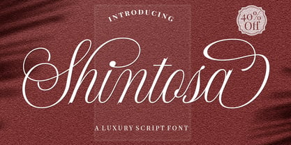 Shintosa Script is a stylish calligraphy font that features a varying baseline, smooth connections, classic and elegant touch. It's a classic decorative copperplate script with a modern twist. There are many stylistic alternatives for many letters. Can be used for various purposes such as headings, signatures, logos, wedding invitations, t-shirts, letterheads, signage, labels, news, posters, badges, and more!
 - Linotype Pine by Linotype,
$40.99A self made bamboo or reed stick nicely cut down to a broad edged nib must have been the tool with which the designer Andrew Weed wrote his letters for the typeface Pine.Its irregular outline is the result of the flowing of the ink. Ideal for a headline or a poster which reflects the personal touch of the tool. - Antiphon by Gustav & Brun,
$18.00 Created to illustrate the frustration of a punk band, the fear of a gigantic Blob in a small Michigan town, Kurt Vile, the scariness of a totally awesome party, your local band at your local pub, the awkwardness of Satan, your voice and some other super rough stuff. All caps. At Least every common letter x 2.
 - Kasuga Brush by insigne,
$21.99 Kasuga Brush is a contemporary script with eastern influence and authentic brush drawn character. The script offers two variants. One is slightly distressed along the character's edges while the other is painted with a dry brush for interesting texture. Sixty-four optional ligatures add a realistic, hand-drawn effect and ensure that no two letters in a word repeat.
 - Drop Dead Gorgeous by Hanoded,
$22.00 Drop Dead Gorgeous is a slightly slanted all caps Brush font. I made it with the last of my Chinese ink (I ordered a new batch, it should arrive tomorrow). Drop Dead Gorgeous is a very legible font, ideal for headlines, posters and book covers. Comes with alternates for lower case letters and a truly breathtaking amount of diacritics.
 - Music Nouveau JNL by Jeff Levine,
$29.00 The interesting hand lettered sans design of Music Nouveau JNL was found as the title of a vintage piece of early 20th Century sheet music for a song written by famed composer Irving Berlin and called "They Were All Out of Step but Jim". Judging by the cover art, it was a novelty song about a soldier.
 - Hachitos by Maulana Creative,
$11.00 Hachitos is a modern casual signature font. Hachitos included opentype features Ligatures and extra swash. Hachitos support multilingual more than 100+ language. This font is good for logo design, Movie Titles, Books Titles, a short text even a long text letter and any awesome project you create. Make a stunning work with Hachitos signature font. Cheers, MaulanaCreative
 - Facility Signage JNL by Jeff Levine,
$29.00 A famous 1971 photo shows boxing champ Muhammad Ali making faces through a window at Joe Frazier at the challenger’s training facility. A small sign sits in the window that says “Joe Frazier Training Headquarters” and is lettered in a simple sans serif condensed typeface. This is now available as Facility Signage JNL in both regular and oblique versions.
 - Harmonics by Deniart Systems,
$20.00 ADD A LITTLE ZIG AND ZAG with Harmonics - a bold and angular font great for short texts and headlines. Create different affects by toggling between lowercase and uppercase letters - use lowercase for top-heavy triangular text, use uppercase for bottom-heavy triangular text, or mix upper & lower for a zig-zag affect. A great addition to any library.
 - Runaround Kid by Hanoded,
$15.00 I was listening to some old Smashing Pumpkins albums when I created this font. The name comes from a song called *** You (An Ode To No One). Runaround Kid is a hand painted typeface. I used Chinese ink and a cheap Chinese brush to create the inky look. Comes with double-letter ligatures and a whole bunch of diacritics.
 - Hullabaloo by Solotype,
$19.95We saw a few letters of this in a catalog, and liked it so well we drew it up and made it as a film font for photolettering. Due to a surplus of interesting types in our shop this one never made it into our catalog, so we can¹t tell you anything about its popularity. - Believe by Haksen,
$19.00 Believe is a versatile font family. Strong capitals and a smooth, open lowercase are effective in a variety of applications. The geometric, near-monoline construction lends a classic durability, tempered by softened edges and vibrant shapes. Version Including : Thin, Regular, also in slant (Italic). Every letter has been redrawn and refined, with improved kerning and expanded language support.
 - Radugo by Twinletter,
$10.00 Radugo is a san serif font family designed with light strokes that make up a vintage style with a rustic touch and a stamp with 2 fonts, as the ribs in your design work, and able to beautify and strengthen your work in the form of logotypes, typography, hand lettering, packaging, t-shirts, labels, and many more.
 - Reading by Atlantic Fonts,
$26.00 Reading is fun; legible with a playful wiggle, a bit of texture, and a lively set of double-letter ligatures. Reading wants to be read aloud and sounded out - lightened by comic relief and sweetened by a bit of style. The upper case is relatively straight, the lower case - slightly jumbled, and Reading’s numbers have excellent curls.
 - Waiting For My Girl by Hanoded,
$15.00 Waiting For My Girl comes from a System of a Down song (Hypnotize). I was listening to it when I created this font and I liked the name! Waiting For My Girl is a script font - it’s quite loose and uneven, just like proper hand writing. It comes with double letter ligatures and a lot of character!
 - Arlequin by TipografiaRamis,
$29.00 Arlequin is a high-contrast sans serif decorative font. The most distinguished characteristic of this typeface is its lowercase letters. Their shapes, a high-contrast clash of bold angular fragments with arched thin counterparts, make for a dramatic impact on entire font visual impression. Arlequin is recommended for use as a headline or short-text font.
 - Rottarity Feminine by Siwox Studios,
$12.00 Rottarity Feminine, connecting script, designed to convey modern, elegance and fashionable. It is slender, feminine and friendly. Rottarity Feminine will work perfectly for fashion, e-commerce brands, trend blogs, or any business that wants to appear classy and chic. This font support accent letters of Central Europa, Western (À Â Æ È Ë ã ä æ è...),
 - Bassun by Twinletter,
$15.00 The new classic Arabic typeface “Bassun” is brought to you by our expert designers. The letters have a beautiful aspect thanks to using a digital flat pen and a gothic font approach. This typeface can be used in a wide range of Middle Eastern-themed projects, including advertising, packaging, posters, invitations, and any other graphic design.
 - Archer Display by SilverStag,
$19.00 Introducing Archer Display – a serif font that bridges the realms of tradition and modernity with effortless finesse. This font carries the weight of a bygone era in its high-contrast design and substantial serifs, but it also boasts a captivating contemporary edge with select letters that have been thoughtfully reimagined for a touch of avant-garde charm.
 - Obscura by Rook Supply,
$17.00 Obscura is a powerful and gritty grunge font that every designer should have in their font arsenal. Each letter has a ton of rough texture, which will add a whole new layer of detail to your design project and give it a bit more of an modern edge. Try it out for everything from album covers to food labels.
 - Winfield Script by Mans Greback,
$59.00 Winfield Script is a classic handwritten typeface. Insprired by mid-century advertisements and logotypes, this font gives any project a happy vibe. The typeface was drawn and created by Måns Grebäck in 2019. It contains a wide range of characters and supports a majority of Latin-based languages. Winfield Script also contain multiple stylistic alternate letters and ligatures.
 - MTF Goodness Gracious by Miss Tiina Fonts,
$12.00 Goodness Gracious, it’s another font by Miss Tiina! This font is extra special with its cute handwritten characters and ligatures. It's perfect for adding a personal touch to your designs, it has a bouncy, playful feel that’s sure to bring a smile to your audience. Have fun mixing & matching upper and lowercase letters for a unique design.
 - Carlhes Browny by sizimon,
$20.00 Carlhes Browny is a bold script. Carlhes Browny a beautiful for logotype, website header, fashion design, advertising design and any more. It contains a full set of lower & uppercase letters, a large range of punctuation, numerals, and multilingual support. Whats Include : PUA encode Multilingual support : (Danish,Finnish,English,,Spanish,Dutch,German,Icelandic,Italian,Norwegian,Portuguese,Indonesian, Swedish)
 - California Poster SG by Spiece Graphics,
$39.00 Known to many eastern artists as the California Poster Letter because it originated in the West, this old 1930s style has reappeared in digital form. Carl Holmes, in his wonderful book on old lettering styles, pays tribute to this uniquely American design. Faintly reminiscent of the lettering of Fred G. Cooper, California Poster Bold is at times wildly exaggerated and boisterous. Letters appear to be inflated and loopy. The design might aptly be described as a kind of rollicking Cooper Black (Oswald Bruce Cooper). An extensive range of alternates and figures has been provided for your convenience. California Poster Bold is now available in the OpenType Std format. Some new characters have been added to this OpenType version as stylistic alternates and historical forms. These advanced features work in current versions of Adobe Creative Suite InDesign, Creative Suite Illustrator, and Quark XPress. Check for OpenType advanced feature support in other applications as it gradually becomes available with upgrades.
 - Longhorn by Belldorado,
$20.00 I saw a cool UT-Ligature on an old (maybe 70's or 80's) Texas Longhorns fan-shirt - it was in 3D and I wanted something like that with my own initials A and B to print it on a baseball hat. I started drawing it and when I was finished, I thought it might be nice to do the same for my officemates. I needed another G, T and K. After finishing that I thought it might be cool to do this for other people as well. Since the source of all the 3D glyphs is found in the regular ones which get moved by a 45 degree angle and then connected with lines , I first draw all the uppercase regular glyphs. The thing that followed was kind of an addiction: after finishing the uppercase letters, I wanted to add lowercase letters, after finishing the 3D letters, I thought it would be nice to have a fill version to layer with the 3D letters. Having a rough, woodcut version of the regular style would be cool, too. And the font is also pretty much suited to make a stencil version. When all this was done, I was interested on how the font would look like without the serifs and curves instead of the 45 degree angles, so I did the Longhorn Sans. Good to use for all sports-related designs, especially retro-style soccer/football shirts. Uppercase characters can be combined to form ligatures or logotypes.
 - Vendetta by Emigre,
$69.00 The famous roman type cut in Venice by Nicolas Jenson, and used in 1470 for his printing of the tract, De Evangelica Praeparatione, Eusebius, has usually been declared the seminal and definitive representative of a class of types known as Venetian Old Style. The Jenson type is thought to have been the primary model for types that immediately followed. Subsequent 15th-century Venetian Old Style types, cut by other punchcutters in Venice and elsewhere in Italy, are also worthy of study, but have been largely neglected by 20th-century type designers. There were many versions of Venetian Old Style types produced in the final quarter of the quattrocento. The exact number is unknown, but numerous printed examples survive, though the actual types, matrices, and punches are long gone. All these types are not, however, conspicuously Jensonian in character. Each shows a liberal amount of individuality, inconsistency, and eccentricity. My fascination with these historical types began in the 1970s and eventually led to the production of my first text typeface, Iowan Old Style (Bitstream, 1991). Sometime in the early 1990s, I started doodling letters for another Venetian typeface. The letters were pieced together from sections of circles and squares. The n, a standard lowercase control character in a text typeface, came first. Its most unusual feature was its head serif, a bisected quadrant of a circle. My aim was to see if its sharp beak would work with blunt, rectangular, foot serifs. Next, I wanted to see if I could construct a set of capital letters by following a similar design system. Rectangular serifs, or what we today call "slab serifs," were common in early roman printing types, particularly text types cut in Italy before 1500. Slab serifs are evident on both lowercase and uppercase characters in roman types of the Incunabula period, but they are seen mainly at the feet of the lowercase letters. The head serifs on lowercase letters of early roman types were usually angled. They were not arched, like mine. Oddly, there seems to be no actual historical precedent for my approach. Another characteristic of my arched serif is that the side opposite the arch is flat, not concave. Arched, concave serifs were used extensively in early italic types, a genre which first appeared more than a quarter century after roman types. Their forms followed humanistic cursive writing, common in Italy since before movable type was used there. Initially, italic characters were all lowercase, set with upright capitals (a practice I much admire and would like to see revived). Sloped italic capitals were not introduced until the middle of the sixteenth century, and they have very little to do with the evolution of humanist scripts. In contrast to the cursive writing on which italic types were based, formal book hands used by humanist scholars to transcribe classical texts served as a source of inspiration for the lowercase letters of the first roman types cut in Italy. While book hands were not as informal as cursive scripts, they still had features which could be said to be more calligraphic than geometric in detail. Over time, though, the copied vestiges of calligraphy virtually disappeared from roman fonts, and type became more rational. This profound change in the way type developed was also due in part to popular interest in the classical inscriptions of Roman antiquity. Imperial Roman letters, or majuscules, became models for the capital letters in nearly all early roman printing types. So it was, that the first letters in my typeface arose from pondering how shapes of lowercase letters and capital letters relate to one another in terms of classical ideals and geometric proportions, two pinnacles in a range of artistic notions which emerged during the Italian Renaissance. Indeed, such ideas are interesting to explore, but in the field of type design they often lead to dead ends. It is generally acknowledged, for instance, that pure geometry, as a strict approach to type design, has limitations. No roman alphabet, based solely on the circle and square, has ever been ideal for continuous reading. This much, I knew from the start. In the course of developing my typeface for text, innumerable compromises were made. Even though the finished letterforms retain a measure of geometric structure, they were modified again and again to improve their performance en masse. Each modification caused further deviation from my original scheme, and gave every font a slightly different direction. In the lower case letters especially, I made countless variations, and diverged significantly from my original plan. For example, not all the arcs remained radial, and they were designed to vary from font to font. Such variety added to the individuality of each style. The counters of many letters are described by intersecting arcs or angled facets, and the bowls are not round. In the capitals, angular bracketing was used practically everywhere stems and serifs meet, accentuating the terseness of the characters. As a result of all my tinkering, the entire family took on a kind of rich, familiar, coarseness - akin to roman types of the late 1400s. In his book, Printing Types D. B. Updike wrote: "Almost all Italian roman fonts in the last half of the fifteenth century had an air of "security" and generous ease extremely agreeable to the eye. Indeed, there is nothing better than fine Italian roman type in the whole history of typography." It does seem a shame that only in the 20th century have revivals of these beautiful types found acceptance in the English language. For four centuries (circa 1500 - circa 1900) Venetian Old Style faces were definitely not in favor in any living language. Recently, though, reinterpretations of early Italian printing types have been returning with a vengeance. The name Vendetta, which as an Italian sound I like, struck me as being a word that could be taken to signifiy a comeback of types designed in the Venetian style. In closing, I should add that a large measure of Vendetta's overall character comes from a synthesis of ideas, old and new. Hallmarks of roman type design from the Incunabula period are blended with contemporary concerns for the optimal display of letterforms on computer screens. Vendetta is thus not a historical revival. It is instead an indirect but personal digital homage to the roman types of punchcutters whose work was influenced by the example Jenson set in 1470. John Downer.
 - Aeterna by Dawnland,
$13.00 Hand drawn, sketchy antiqua that come in two font variants: Regular, Small caps with old style figures. Æterna was revised 2012 and now hold a full character set of basic english/latin letters and west european diacritics!
 - Emotional Expression by Seemly Fonts,
$14.00 Emotional Expression is a cute and simple lettered handwritten font. It can easily be matched to an incredibly large set of projects, so add it to your creative ideas and notice how it makes them stand out!
 - Dizzy Boy by Mchcrafter,
$14.00 Dizzy Boy is a cool and thin lettered display font. It can easily be matched to an incredibly large set of projects, so add it to your creative ideas and notice how it makes them stand out!
 - Song Sheet JNL by Jeff Levine,
$29.00 Sheet music for the 1930s song "Josephine" had its title hand lettered in a simple, bold sans design that is recreated in Song Sheet JNL. This bold sans is perfect for titling wherever strong emphasis is necessary.
 - Arrogant by Ametype,
$5.00 ARROGANT is a geometric monospace, which in use is supposed to resemble an unknown (sci-fi) script. The letters was made in geometric style consist of repetitive modules. Font is available in 8 styles and variable version.
 - Alestha Butterfly by Yoga Letter,
$18.00 "Alestha Butterfly" is a beautiful handwriting font. This font is equipped with capital letters, lowercase, numerals, punctuation, numerals, multilingual support, alternates, swashes, titling, and ligatures. It is suitable for weddings, engagements, Christmas, Valentine's Day, invitations, and others.
 - Lisa's Hand by Matthias Luh,
$15.00 Lisa's Hand is a well-formed handwritten Font. The letters are not connected which combines the style of both handwritten and computer fonts. Lisa's Hand is offered in Regular, Bold, Italic, Bold Italic, Condensed and Condensed Italic.
 - Tropical Drink by Sronstudio,
$23.00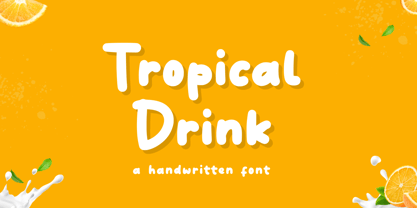 Tropical Drink – Handwritten Font is a fun display Font font, this font Is perfect for product packaging, product designs, label, photography, watermark, special events, or anything. Features: Uppercase and lowercase letters Multilingual, numerals, and punctuation Thank You!
 - FT Digital Kauno by Fenotype,
$19.95 Digital Kauno is a soft geometric script type. It is recommended for headlines and display use. Digital Kauno was originally designed in 2002 and it has now been redesigned with full character set and more distinctive letters.
 - Secret Operation JNL by Jeff Levine,
$29.00 The movie poster for the 1952 bank heist drama “Kansas City Confidential” had its title hand lettered in a condensed serif stencil design. This inspired Secret Operation JNL, which is available in both regular and oblique versions.
 - Wilson wells by Stringlabs Creative Studio,
$25.00 The Wilson Wells is an unique blackletter decorative font. It’s suitable for use in various projects such as gothic lettering, tattoo, headlines, posters, magazines, newspapers, t-shirts, labels, and every other design which needs a striking typeface.
 - Neurotic Roman JNL by Jeff Levine,
$29.00 The free-form, Art Nouveau hand lettering on the cover of the sheet music for 1915's "She Was All That a Pal Ought to Be" inspired Neurotic Roman JNL; available in both regular and oblique versions.
 - Richard Samuels by Letterena Studios,
$17.00 A serif modern and classic typeface that his own unique style & modern look. This typeface is perfect for an elegant & luxury logo, book or movie title design, fashion brand, magazine, clothes, lettering, quotes, and so much more.