10,000 search results
(0.035 seconds)
- Bondan Regular by Great Studio,
$13.00 Bondan is a family of Sans Serif fonts designed with a modern and vintage feel. Strong and dynamic. We set individual letters of medium with medium spacing for perfect typography. Bondan is very versatile. Perfect for brands, magazines, posters, logos, logotype stickers, website titles, packaging, branding, quotes, business cards and more. Bondan is equipped with a full set of uppercase letters, numbers, punctuation and multilingual support. Each font family version is available in the OTF formats for a total of 5 font files. What is included? • Bondan Light • Bondan Regular • Bondan Bold • Bondan Regular Outline • Bondan Bold Outline
 - Origen by Alex Camacho Studio,
$35.00 Origen is a typeface inspired by the illuminated manuscripts whereby the text is accompanied by a decorative capital letter at the start of the text. The family is formed by three different weights (light, regular, bold) and an additional decorative set of capital letters. Each of the four styles has characters to write in all Latin-based languages. It is an Open Type font. The Origen family is a hybrid between Textura and Rotunda fonts, characterized by a dynamic calligraphic flow. Origen is also playful as it can be use in editorial, advertising and packaging designs to capture viewers' attention through refined details.
 - Dezen Stencil 02 by DizajnDesign,
$39.00 Dezen is a contemporary, mechanical grotesque typeface. Its letters were first constructed from individual modules and then optically refined to enhance its rhythm. Its tight letter spacing and narrow proportions make the typeface particularly well suited for display sizes and headlines. When you add spacing, font can be used for shorter amount of text, bigger than 12 points. Dezen type family consists of a wide variety of styles – solid and stencils. Dezen Pro subfamily combines all 4 styles (Solid, Stencil 01, Stencil 02, Stencil 03) in a specific sequence, which originates a “pattern” for the alphabet (or dezen, in Slovak).
 - Wright by Latinotype,
$39.00 Wright is a sans-serif geometric typeface inspired by the lettering found on modernist building plans. An elegant small x-height, tall ascenders and wide capital letters make the font look great in titles and short paragraphs. Wright consists of 4 subfamilies, each in 6 weights plus italics—48 fonts in all. Its wide range of alternates and ligatures make it an ideal workhorse suitable for a variety of projects and give your designs a stylish appearance and unique look. As you would expect from Latinotype, this font comes with a standard set of 800 characters and supports over 200 Latin-based languages.
 - Neubau by TipografiaRamis,
$29.00 Neubau is a condensed geometric display typeface, designed in 2009. The inspiration for this face came from Joost Schmidt lowercase letters developed during 1925-28 in Bauhaus Dessau. Schmidt was one of the proponents of New Typography – a movement advocating the use of only lowercase letters which were constructed strictly geometrically using only ruler and compass. Neubau family consists of two subfamilies - Neubau Sans and Neubau Serif, each of them in three weights - light, regular and bold. Neubau typeface is recommended for use as a display font, and has been generated in a single OpenType format with Western CP1252 character set.
 - Period Piece JNL by Jeff Levine,
$29.00 A period piece is something of or pertaining to a specific era or time. Anything evoking a knowledge or feeling of an era can be labeled as such. The aptly named type font Period Piece JNL reflects the hand lettering found on the cover of early 20th century vintage sheet music entitled "My Baby's Arms" (from the stage production of "Ziegfeld Follies of 1919"). Although strongly akin to the coming Art Deco movement in its lettering style, Period Piece JNL still contains a strong influence of the Art Nouveau era of the 1900s through the 1920s.
 - Dezen Stencil 03 by DizajnDesign,
$39.00 Dezen is a contemporary, mechanical grotesque typeface. Its letters were first constructed from individual modules and then optically refined to enhance its rhythm. Its tight letter spacing and narrow proportions make the typeface particularly well suited for display sizes and headlines. When you add spacing, font can be used for shorter amount of text, bigger than 12 points. Dezen type family consists of a wide variety of styles – solid and stencils. Dezen Pro subfamily combines all 4 styles (Solid, Stencil 01, Stencil 02, Stencil 03) in a specific sequence, which originates a “pattern” for the alphabet (or dezen, in Slovak).
 - Xotor by Typogama,
$19.00 Xotor is a double styled typeface family destined for use in titling and headlines. The main style, the Triline weight, is a modular typeface composed of three strokes and is best used in large sizes. For smaller bodies of text, the second Regular style is based on the same letter construction but in a simple, solid stroke. Both weights can either be used individually or combined to add extra effect to any layout. With an extended Latin language support, Xotor covers most Latin based scripts and equally features a range of Opentype features, from ligatures, alternative letters or different styles of numerals.
 - Marphidy by Mordex Studio,
$15.00 Marphidy Script is a calligraphic script font that features a beautiful changing character, a classic decorative brass script type with a modern touch, designed with high detail to bring the elegance of style. Marphidy Script is attractive as its typography is soft, clean, feminine, sensual, glamorous, simple and very easy to read, because there are many good letter connections. I also offer some vibrant style alternatives for many letters. The classic style is suitable to be applied in various formal forms such as invitations, labels, restaurant menus, logos, fashion, make-up, stationery, novels, magazines, books, greeting / wedding cards, packaging, labels.
 - Stencil Box JNL by Jeff Levine,
$29.00 The lettering for Stencil Box JNL was found on the packaging of a children's toy stencil set circa the 1940s. Popular for years, Pencil Stencils were a series of "connect the line" stencils where a series of dashed lines were traced from the cutouts and the lines connected to complete pictures of animals or other subjects. Although the packaging itself was often updated to reflect the current times during the life of the product, it was this hand-lettered example of stencil-meets-Art Deco from the 40s that proved worthy of saving as a digital typeface.
 - Ritz Slab Serif JNL by Jeff Levine,
$29.00 Ritz Slab Serif JNL is a bold display face which shares a lot of similar design traits to Stymie and other similar metal type of the 1930s and 1940s, but in actuality was modeled from only four letters. On the sheet music for the 1937 song "Sweet Varsity Sue" [from the 20th Century Fox Film "Life Begins in College"], there is a picture of the Ritz Brothers - a popular comedy team from 1925 through the late 1960s. The hand lettered name "Ritz" became the basis for Ritz Slab Serif JNL, which is available in both regular and oblique versions.
 - Vatella by Ws Studio,
$15.00 Vatella is a vintage-inspired calligraphy script font, perfect for the elegant touch needed for logos, wedding invitations, modern websites, greeting cards and more! Included is a full set of uppercase swash letters, as well as a final lowercase swash version, for a more custom branded look. Thank you so much for checking out my shop. Vatella Script Features Complete Set of standard alphabet and punctuation marks Additional set of washed initial capital letters Additional set of brushed lowercase endings Alternate extra styles and fasteners PUA Encoded - no special software required to access additional swashed characters Multilingual Characters (ÁÂÄÀÅÃÆÇÐÉÊËÈÍÎÏÌÑÓÔÖÒØÕŒÞÚÛÜÙẂŴẄẀÝŶŸỲ áâäàåãæçðéêëèíîïìñóôöòøõœþßúûüùẃŵẅẁýŷÿỳŠŽšž€£¥ªº)
 - Go Home JNL by Jeff Levine,
$29.00 Sheet music for another one of those songs from the early part of the 20th Century with a wonderfully wordy hand lettered title was the model for the Art Nouveau flavored Go Home JNL, which is available in both regular and oblique versions. 1908's "I Used to be Afraid to Go Home in the Dark (Now I'm Afraid to Go at All)" is comprised of eighteen words. It may have been a mouthful to request from the local sheet music shop, but the lettering on its cover made it a great candidate for preserving as a digital typeface.
 - Montigny by Eurotypo,
$48.00 Montigny is a contemporary calligraphic font with classical roots, based on an 18th-century roundhand script. It is carefully designed, with a special emphasis on the connection of the letters, with high ascenders to give rise to the ornaments of the different letters. There is a special search for high readability. This font contain 585 glyphs, in addition, a wide selection of alternates and ligatures is included, to preserve the qualities of handwriting, in order to accommodate various design aesthetics. These alternatives are automatically applied through an advanced programming scheme or manually through several OpenType features.
 - Ristogea by Keristyper Studio,
$14.00 Proudly present Ristogea, a script font inspired by tattoo lettering with a swirl curvy. This font is good for logo design, Social media, Movie Titles, Books Titles, short text even long text letters, and good for your secondary text font with the script, sans, or serif. Featured: Standard Uppercase & Lowercase Numeral & Punctuation Multilingual : ä ö ü Ä Ö Ü ß ¿ ¡ Alternate & Ligature PUA encoded We recommend programs that support the OpenType feature and the Glyphs panel such as Adobe applications or Corel Draw. so you can use all the variations of the glyphs. Hope you enjoy our fonts!
 - Back To School by MDF,
$4.00 The Back to School Doodle font is a delightful and imaginative typeface that captures the essence of the back-to-school season with its playful doodles and vibrant charm. Each letter is adorned with whimsical illustrations, reminiscent of a child's doodles on a classroom desk. This font features hand-drawn characters filled with fun and colorful details. From doodled stars, pencils, and books to playful arrows, apples, and globes, every letter is an artwork in itself. The doodles add a sense of excitement and creativity to the font, making it perfect for capturing the spirit of going back to school.
 - SK Parnik by Shriftovik,
$32.00 SK Parnik is a modern display font inspired by the culture of vegetarianism. This font is based on the shape of a bean pod, which gives the symbols a unique playful character, perfect for working with the branding of companies that are aimed at a children's audience, as well as engaged in restaurant activities. The character composition consists of uppercase and lowercase letters and supports extended Cyrillic and Latin letters. This allows you to expand the scope of this font. Despite the pronounced decorative component, thanks to its tools, the font will fit perfectly into the collection of any designer.
 - Dezen Stencil 01 by DizajnDesign,
$39.00 Dezen is a contemporary, mechanical grotesque typeface. Its letters were first constructed from individual modules and then optically refined to enhance its rhythm. Its tight letter spacing and narrow proportions make the typeface particularly well suited for display sizes and headlines. When you add spacing, font can be used for shorter amount of text, bigger than 12 points. Dezen type family consists of a wide variety of styles – solid and stencils. Dezen Pro subfamily combines all 4 styles (Solid, Stencil 01, Stencil 02, Stencil 03) in a specific sequence, which originates a “pattern” for the alphabet (or dezen, in Slovak).
 - Monoicono by astroluxtype,
$40.00 Monoicono is a graphics font which contains various iconography related to environmental, health, weather, emergency, quality control, and synergy. There are a total of sixty-six items which includes a light version in the lowercase letters and a bold version in the uppercase letters as well as various numbers that have additional icons. See the poster examples provided for all the dingbats/icons in the font. Recommended size usage would be approximately 62 points or above in size, although some icons will read fine much smaller. Note parenright and left, braceright and left have additional icons.
 - Alasassy Caps by Leksen Design,
$19.00 Bring some sass to your signage! Alasassy is a font inspired from Sharpie pen drawings, featuring ink ball terminals. The lowercase letters are a mix of uppercase and lowercase letters that share the same cap height and baseline. There are several alternate characters with a mix of high and low crossbars as well as crossbar overhang options and language support for each. This display font will bring some zest to your logo, signage, packaging design or large titles on book covers or advertising. It is a great combination of an organic, hand drawn feel but still clean and crisp enough to look professional.
 - Ragik Sans by Hurufatfont,
$29.00 Ragik; It is a low-contrast sans serif font family with two accents. The letters are designed with a clear and simple elegance, devoid of ornaments. The open terminals of the letters “S, C, G, s, a, c, e” are elegant and legible with their large open areas. It consists of 16 styles, from thin to heavy, with true italics. Ideal for modern typographic posters, packaging and branding designs. It comes with rich OpenType features. Alternating glyphs, elegant and functional ligatures. All number sets (tnum, onum, lnum, numr, denom, sinf, sups etc.) have a rich symbol library with ornaments and arrows.
 - Quadratique by Eurotypo,
$32.00 Quadratique is the first font of a large family that was originated in geometric patterns. We developed a system through a square of 6 modules of side, which are transformed and combined to give up 104 originals glyphs. As a result, each letter is a subfamily that may be combined by overlapping (A, a, a.salt and a.swsh) and thus generate more than 365 glyphs, or thousands if we combine different letters. Quadratique is so easy to use, that user does not need guidance. You just must typeset [aaaa, bbbb, etc.] and start to play, try to make that each module overlapping with others and repeat [(a + A) (a + A) (a + A), etc.] You may create thousands of new patterns and creative frames just combining different modules.
 - YT Moon Latin by Yangtype,
$9.00 Letters have so many rules that it's boring. Even people who handle letters get tired. I wanted to make it very simple and humorous. This letter is like that. It is simple, has ample space, and is easy to understand the meaning of sentences.
 - Charmer JNL by Jeff Levine,
$29.00 Found on the back of some sheet music to promote another song was the hand-lettered title "The Snake Charmer". While not everyone likes snakes, many designers do like the lettering of the Art Deco era, so Charmer JNL is designed from that lettering.
 - Billund by Elster Fonts,
$24.00 Have you ever played with Lego™ and built letters? With Billund Side and Billund Top you can do it again and create colourful headlines on your Mac or PC. Billund is a font-system consisting of the two base-fonts Billund Side Outline and Billund Top Outline, extended by layer-fonts for one or five colours. Use the Outline-fonts alone to get »transparent« letters in one colour, use it with the Fill-fonts to fill the whole letter with one colour, or use the five Colour-fonts to get colourful letters in every colour you want. Billund contains cyrillic and greek glyphs and can be used for nearly a hundred languages. To expand the typographic possibilities, small caps, old style figures, numerals for small caps (c2sc), three stylistic sets, different symbols, forms, standard- and discretionary ligatures have been added, furthermore contextual alternates to avoid colliding letters. Each Billund-font contains 870 glyphs and more than 1600 kerning-pairs. Billund is named after the city of Billund (Denmark), where Lego™ was invented, the Lego™-headquarter still resides and the first Legoland™ theme park was opened in 1968 and still exists today.
 - Linotype Typo American by Linotype,
$29.99Mark Stanczyk designed Linotype Typo American in 1999. The font is an excellent revival of American style typewriter type. As most of us can remember from our childhood years, or through old stories and movies, everyone used to type with typewriters before the invention of computers. Unlike computers, most individual typewriters only had one typestyle, or font, to chose from. To make matters worse, the letters in a typewriter font would wear down with use. Over time, text typed out on a typewriter would look more and more corroded, old, and uneven. Stanczyk has captured exactly these features in this “revival” font! Also like most older typewriter styles, Linotype Typo American’s letters are all mono-spaced, i.e., the letter i is the same width as the letter w. Typewriter letters also all tended to be cast in the same size, around 12 points or so. When using typewriter-style fonts, it is best to keep setting your text in similar sizes. (Of course, you can set really large and fun headlines with Linotype Typo American, too; if anything the unevenness of the design will come even more across in these applications.) - ITC Berranger Hand by ITC,
$29.99Controlled casualness is the watchword in this new handwriting script from the prolific young French designer Éric de Berranger, who also designed the sans serif type family ITC Octone. ITC Berranger Hand has its roots in chancery calligraphy, yet its surface looks like contemporary informal lettering that was written quickly with a felt-tip pen on slightly absorbent paper. The counters of some letters appear to almost fill in from ink spread, yet Berranger Hand is admirably readable at small sizes. The capital letters are restrained, without swashes, so they can be used together in all-caps combinations. - Camelong Brush by Realtype,
$14.00 Camelong Brush is a handwritten font to get the best texture for each letter. Camelong Brush is designed to perfection, each letter character will make your design strong and charming. Each letter and symbol is painted using the finest brushes and ink. Camelong Brush contains upper and lower case characters, numbers and various punctuation marks that are ready for you to use with unique and charming characters. Camelong Brush Font is suitable for any modern design such as for advertising banners, modern cards, invitations, announcements, seasonal designs, social media promotions, web design, branding and logo styling and more.
 - Ancress by Tour De Force,
$25.00 Ancress is modern geometric sans serif family with display elements. Designed in 14 styles with extended Latin character map, Ancress uses simple geometric shapes for achieving all characteristics of modern sans family: wide versatility, full legibility and design recognition. Letter shapes are visually softened with rounded corners and straight endings. Characteristic letters are visible in every word typed with Ancress, so it is not a typeface that differs from others by single letter only, it is graphically well balanced and thymically smooth typeface that should refine any design project – from editorial design, posters, packages, branding to websites, applications and outdoor graphics.
 - Handwritten Note JNL by Jeff Levine,
$29.00 The movie poster promoting the 1962 James Cagney comedy "One, Two Three" had it's text done in free-style hand lettering. Starting with an auto-trace in order to have an isolated version of the black letters separated from the red poster background, the tracing kept the basic forms intact, but with limited accuracy. Cleaning up and digitally reshaping the letters manually to form a more correct version [closer to the original movie poster], additional figures, foreign characters, accents and punctuation were drawn from scratch. This is now available as Handwritten Note JNL in both regular and oblique versions.
 - The Black Sugare by Arterfak Project,
$23.00 Inspired by minimalism and black letter, introducing "The Black Sugare", the combination of a gothic era and geometric shapes. The more simple black letter display font that is suitable for any style, especially modern style. The flow of the letter shapes gives geometric looks also the stem (and the strokes) and is easy to combine once it writes in 2 lines or more. With fewer spurs The Black Sugare is suitable for classy design, and looks minimalist, elegant, and quietly awesome in your design. This font also good to use in body text. There are OpenType features to give more alternative looks.
 - StreetArtist by Graffiti Fonts,
$19.99 This tag font includes full alphabets of uppercase & lowercase letters giving 2 distinct looks as well as interesting substitutions. Street Artist is clean and consistent without sacrificing style. With the StreetArtist font family anyone can easily create their own custom graffiti lettering. This tag style typeface includes 4 styles that can be used alone or in groups to create complex effects that are difficult to render manually. The style is inspired by modern handstyles as written with a chisel-tip marker. The rendering of each glyph is clean and smooth. Well over 200 letters, numbers and symbols are included in each style.
 - Dot To Dot by A New Machine,
$9.00 This font is for parents and educators that want to easily be able to print out the alphabet in order to have their child or student then trace them. This eliminates the need for creating the dotted lines by hand and lets the user type out exactly what letters they need instead of relying on pre-made charts. The font is upper and lowercase letters and numbers only - no punctuation. Comes in Regular and Guides (get both for the same price as one) which draws guidelines with the letters. Best when used at a large point size.
 - Mordis by HansCo,
$15.00 Mordis Font is a lettering retro vintage font. You will get alternate characters such as swash on some characters. Equipped with all complete characters ranging from uppercase letters, lowercase letters, numbers, punctuation marks and multi-lingual support, this font is ready to be used in any project. Very suitable for logotype, Stickers, Packaging design, Cricut Project, Headlines, Brand identity, T shirt or Apparel industry, Posters, Magazines, Books, YouTube, Instagram, Websites, Canva, Corjl or any of your creative design projects. Use this Mordis font to add that special modern retro touch to any design idea you can think of! Enjoy!
 - Hocklyn by HansCo,
$15.00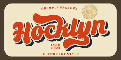 Hocklyn Font is a lettering retro vintage font. You will get alternate characters such as swash on some characters. Equipped with all complete characters ranging from uppercase letters, lowercase letters, numbers, punctuation marks and multi-lingual support, this font is ready to be used in any project. Very suitable for logotype, Stickers, Packaging design, Cricut Project, Headlines, Brand identity, T shirt or Apparel industry, Posters, Magazines, Books, YouTube, Instagram, Websites, Canva, Corjl or any of your creative design projects. Use this Hocklyn Font to add that special modern retro touch to any design idea you can think of! Enjoy!
 - Rushton by HansCo,
$15.00 Rushton is a lettering retro vintage font. You will get alternate characters such as swash on some characters. Equipped with all complete characters ranging from uppercase letters, lowercase letters, numbers, punctuation marks and multi-lingual support, this font is ready to be used in any project. Very suitable for logotype, Stickers, Packaging design, Cricut Project, Headlines, Brand identity, T shirt or Apparel industry, Posters, Magazines, Books, YouTube, Instagram, Websites, Canva, Corjl or any of your creative design projects. Use this Rushton font to add that special modern retro touch to any design idea you can think of! Enjoy!
 - Poster Brush by Fenotype,
$18.00Poster Brush is a hand drawn font pair with lots of character. Poster Brush is packed with OpenType features - Contextual Alternates changes prevents identical double letters from being next to each other. With Stylistic Alternates you can manually change the letters. When you turn on Discretionary Ligatures you’ll get interlocking ligatures when typing with caps. Poster Brush Script is equipped with Standard Ligatures and Contextual Alternates to keep the flow smooth. It also has Swash alternates for certain letters. Poster Brush & Poster Brush Script work great together or as themselves. For the best price purchase the whole family. - Nordic Tale by Struvictory.art,
$14.00 We would like to introduce our new Christmas typeface Nordic Tale. The font is created with love for the Scandinavian aesthetics, it is decorated with Nordic patterns. Every letter of the folkart font is a separate cultural story. The typeface includes Decorative, Blank and Symbol versions. The font is easy to use in various design programs or without any program. Nordic Tale font is suitable for lettering posters and cards, tourist brochures, photo overlays, Christmas and cozy winter design. The font works great both for printing clothes and interior decoration. Also use individual letters and symbols to create logos and monograms.
 - Telegramo by Volcano Type,
$35.00 Telegramo is modeled on a historic telegraph from Belgrade to Vienna 1914. The original archetypal character set consists of lowercase letters and numerals only. Uppercase letters and special characters were added after careful research. Contact pressure variations of the rudimentary type writing machine are directly imitated in the three weights: the regular weights edges are sharp, medium edges are rounded and the bold letters can nearly be called soft. Since the original typeface did not seem perfectly suitable for modern desktop publishing purposes, two additional stylistic sets were created for each weight, improving certain issues in rhythm, legibility and quirkiness.
 - ITC Peter's Miro by ITC,
$29.99ITC Peter's Miro is the work of New York designer John Peter. It was inspired by the letters used by Joan Miro in his paintings. No one used letterforms more frequently in his work than Joan Miro," says Peter. For his typeface, however, "considerable liberty has been taken with his [Miro's] original letters and missing characters have been added." The letters are a simple script, irregularly and almost crudely written, but bursting with energy. To give designers free rein with their creativity, Peter designed two complete versions of the alphabet in both upper- and lowercase, Peter's Miro and Peter's Miro Too."