10,000 search results
(0.173 seconds)
- Summertime Stories by Set Sail Studios,
$16.00 Create lasting memories with the Summertime Stories font, a charming uppercase script and doodle set. Crafted by hand with real pen on paper, Summertime Stories naturally replicates the fluidity and imperfections of messy handwriting. This achieved by providing an alternate set of each letter, along with 43 unique ligatures (double letter combinations), designed to create natural pen-stroke connections between handwritten letters. Along with the script font, a separate ‘Doodles’ font is also included, containing 52 arrows, containers, underlines, scribbles, icons and sketches. These are designed to perfectly compliment the Summertimes Stories letterforms, allowing you to add an extra personal touch to your designs. Language Support • English, French, Italian, Spanish, Portuguese, German, Swedish, Norwegian, Danish, Dutch, Finnish, Indonesian, Malay, Hungarian, Polish, Croatian, Turkish, Romanian, Czech, Latvian, Lithuanian, Slovak, Slovenian.
 - Easy Mind by Putracetol,
$22.00 Easy Mind - Retro Script Font is a captivating retro script typeface designed to transport your designs to a bold and vintage world. Its distinctive style showcases the perfect blend of boldness and retro aesthetics, making it an ideal choice for various creative applications. This font comes with an extensive set of alternative characters, each offering a multitude of unique shapes and swashes, adding versatility and flair to your designs. Perfect for logos, packaging, invitations, greeting cards, posters, magazines, titles, business branding, and all projects with a retro or vintage theme, Easy Mind infuses your designs with a sense of nostalgia and timeless charm. With its bold and retro style, this font allows you to effortlessly channel the spirit of the past into your creative projects, giving them a distinctive and classic touch.
 - Englewood by Lipton Letter Design,
$19.00 Richard Lipton’s inspiration for Englewood came from the calligraphic hand of Philip Grushkin. Lipton has always admired his somewhat loose but disciplined hand and felt that it was worthy of keeping this style alive in a typeface that could be a somewhat accurate emulation of the warmth and life found in these letterforms. Spontaneity is a challenge to capture in a type treatment but with Englewood, Lipton hopes to honor Mr. Grushkin with a design that works especially well for an invitation, a menu, or in any display setting that calls for an informal calligraphic hand. This single weight display script includes small caps — somewhat of a rarity for a handwritten script — for flexible typesetting, along with 42 alternates that include 18 contextual ligatures to simulate the appearance of spontaneous writing.
 - Banana by Dharma Type,
$19.99 This font is a modern urban script. Very impressive because of its heavy and rounded shape. Upright stems and wide width of their shape gives easy and slow impression. There is one more script designed by in the same concept. -Nothing -Banana
 - Prestly Signature by Letterhend,
$14.00 Signature Script, Monoline Script, Monoline Signature, Wedding Font, Ballpoint Font, Wedding Font, Wedding Invitation, Romantic Font, Feminine Font, Signature Font, Beautiful Font, Pretty Font, Stylish Font, Modern Font, Chic Font, Feminine Font, Wedding Font, Romantic Font, Romance Font, Handwriting Font, Hand Written Font,
 - AngloAngkor by Parquillian Design,
$39.00 AngloAngkor is a display face of Western characters inspired by the elegant “round script” style of the Khmer alphabet of Cambodia. It is the first of a projected series inspired by some of the beautiful lesser-known native scripts of Southeast Asia.
 - Bully Gatte by Natural Ink,
$17.00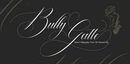 Bully Gatte is a calligraphy design, including Regular. This font is casual and beautiful with swash. Can be used for various purposes. such as logos, product packaging, wedding invitations, branding, headlines, signage, labels, signatures, book covers, posters, quotes, and more. Bully Gatte Script includes a change in the OpenType language style, binding and international support for most Western languages. To activate the OpenType Stylistic alternative, you need a program that supports OpenType features such as Adobe Illustrator CS, Adobe Indesign & CorelDraw X6-X7, Microsoft Word 2010 or newer versions. How to access all alternative characters using Adobe Illustrator: https://www.youtube.com/watch?v=XzwjMkbB-wQ Bully Gatte Script is coded with PUA Unicode, which allows full access to all additional characters without having to design special software. Mac users can use the Font Book, and Windows users can use Character Map to view and copy one of the additional characters to insert into your favorite text editor / application. How to access all alternative characters, using Windows Character Map with Photoshop: https://www.youtube.com/watch?v=Go9vacoYmBw If you need help or have questions, please let me know. I am happy to help :) Thank you & Congratulations on Designing!
 - Albertya by Gatype,
$12.00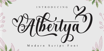 Albertya is a modern calligraphy font. This font is casual and pretty with a stroke. Can be used for various purposes. such as logos, product packaging, wedding invitations, branding, headlines, signage, labels, signatures, book covers, posters, quotes and others. Albertya Script featuring OpenType style alternatives, ligatures, and International support for most Western Languages is included. To enable the OpenType Stylistic alternative, you need a program that supports OpenType features such as Adobe Illustrator CS, Adobe Indesign & CorelDraw X6-X7, Microsoft Word 2010 or a later version. How to access all alternative characters using Adobe Illustrator: https://www.youtube.com/watch?v=XzwjMkbB-wQ Albertya Script is encoded with PUA Unicode, which allows full access to all additional characters without having to design special software. Mac users can use Font Book , and Windows users can use Character Map to view and copy any additional characters to paste into your favorite text editor/application. How to access all alternative characters, using the Windows Character Map with Photoshop: https://www.youtube.com/watch?v=Go9vacoYmBw If you need help or have any questions, let me know. I'm happy to help. Thank you
 - Helena Luis by Romie Creative,
$13.00 Helena Luis is a modern and elegant calligraphic script font that comes with beautiful character changes, a kind of classic decorative copper script with a modern touch, designed with high detail to bring stylish elegance. Helena Luis is smooth, clean, feminine, sensual, glamorous, simple and very easy to read, because there are many fancy and simple letter connections. I also offer several alternative styles suitable for many letters. This font style is perfect for various designs of your work, such as invitations, labels, restaurant menus, logos, fashion, makeup, stationery, novels, magazines, books, greeting / wedding cards, packaging, labels and others. Helena Luis contains 385 characters and alternatives, including various language options. With OpenType features with alternative styles and elegant ties. The OpenType feature does not use manuals, but you can access it manually and for the best results needed for your creativity in this variation of glyphs. The Open Type feature can be accessed using Open Type savvy programs such as Adobe Illustrator, Adobe In Design, Adobe Photoshop Version of Corel Draw X, and Microsoft Word. And this font has provided unicode PUA (special code font). All alternative characters can be easily accessed by craftsmen or designers.
 - Samarra by madjack.font,
$13.00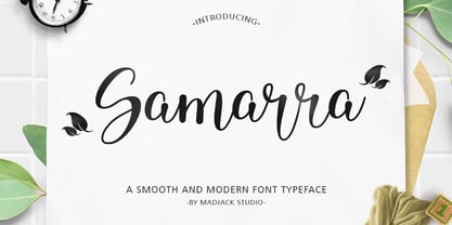 Samarra is a modern script. This font is casual and beautiful with exceptional swashes. It can be used for various purposes, such as logos, product packaging, wedding invitations, branding, headlines, signage, labels, signatures, book covers, posters, quotes, and more. Samarra includes a change of the OpenType language style, binding and international support for most Western languages. To activate the OpenType Stylistic alternative, you need a program that supports OpenType features such as Adobe Illustrator CS, Adobe Indesign & CorelDraw X6-X7, Microsoft Word 2010 or newer versions. How to access all alternative characters using Adobe Illustrator: https://www.youtube.com/watch?v=XzwjMkbB-wQ Samarra script is coded with PUA Unicode, which allows full access to all additional characters without having to design special software. Mac users can use the Font Book, and Windows users can use Character Map to view and copy one of the additional characters to insert into your favorite text editor / application. How to access all alternative characters, using Windows Character Map with Photoshop: https://www.youtube.com/watch?v=Go9vacoYmBw If you need help or have questions, please let me know. I am happy to help :) Thank you & Congratulations on Designing.
 - Asley Bethany by Jamalodin,
$18.00 Asley Bethany is a beautiful modern calligraphy script font that is suitable for branding, wedding invitations, greeting cards, posters, name card, quotes, blog header, logo, fashion, apparel, letter, stationery and other projects. Asley Bethany come with 600+ glyphs. The alternative characters were divided into several Open Type features such as Swash, Stylistic Sets, Stylistic Alternates, Contextual Alternates. The Open Type features can be accessed by using Open Type programs such as Adobe Illustrator, Adobe InDesign, Adobe Photoshop Corel Draw X version, And Microsoft Word. And this Font has given PUA unicode (specially coded fonts). so that all the alternate characters can easily be accessed in full by a craftsman or designer. Asley Bethany Script : Uppercase ( Two style ) & Lowercase International Language & Symbols Support Punctuation & Number PUA Unicode Range Standard Stylistic Alternates Stylistic Set 1-20 Character Variant Contextual. If you don't have a program that supports OpenType features such as Adobe Illustrator and CorelDraw X Versions, you can access all the alternate glyphs using Font Book (Mac) or Character Map (Windows). If you have any question, don't hesitate to contact me. Thanks for your visit.
 - Hazle Gelia by Jamalodin,
$19.00 Hazle Gelia is a beautiful modern calligraphy script font that is suitable for branding, wedding invitations, greeting cards, posters, name card, quotes, blog header, logo, fashion, apparel, letter, stationery and other projects. Hazle Gelia come with 800+ glyphs. The alternative characters were divided into several Open Type features such as Swash, Stylistic Sets, Stylistic Alternates, Contextual Alternates. The Open Type features can be accessed by using Open Type programs such as Adobe Illustrator, Adobe InDesign, Adobe Photoshop Corel Draw X version, And Microsoft Word. And this Font has given PUA unicode (specially coded fonts). so that all the alternate characters can easily be accessed in full by a craftsman or designer. Hazle Gelia Script : Uppercase ( Two style ) & Lowercase International Language & Symbols Support Punctuation & Number PUA Unicode Range Standard Stylistic Alternates Stylistic Set 1-30 Character Variant Contextual. If you don't have a program that supports OpenType features such as Adobe Illustrator and CorelDraw X Versions, you can access all the alternate glyphs using Font Book (Mac) or Character Map (Windows). If you have any question, don't hesitate to contact me. Thanks for your visit.
 - Hello Molydia by Mega Type,
$14.00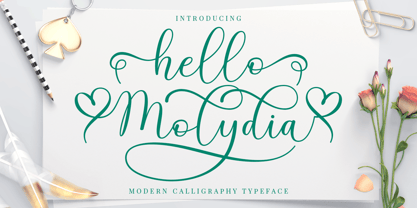 Hello Molydia is a sweet modern calligraphy font. This font is casual and elegant with swashes. Hello Molydia can be used for various purposes such as logos, product packaging, wedding invitations, branding, headlines, signage, labels, signatures, book covers, posters, quotes and more. Hello Molydia Script features OpenType stylistic alternates, and ligatures. International support for most Western Languages is included. To enable the OpenType Stylistic alternates, you need a program that supports OpenType features such as Adobe Illustrator CS, Adobe Indesign & CorelDraw X6-X7, Microsoft Word 2010 or later versions. How to access all alternative characters using Adobe Illustrator: https://www.youtube.com/watch?v=XzwjMkbB-wQ Hello Molydia Script is coded with PUA Unicode, which allows full access to all the extra characters without having special designing software. Mac users can use Font Book , and Windows users can use Character Map to view and copy any of the extra characters to paste into your favourite text editor/app. How to access all alternative characters, using Windows Character Map with Photoshop: https://www.youtube.com/watch?v=Go9vacoYmBw If you need help or have any questions, please let me know. I'm happy to help. Thanks and Happy Designing!
 - Helenia Sweetness by Gian Studio,
$12.00 Introducing Helenia Sweetness Helenia Sweetness is modern calligraphy script font, every single letters has been carefully crafted to make your text looks beautiful. With modern script style this font will perfect for many different project, example: invitations, greeting cards, posters, name card, quotes, blog header, branding, logo, fashion, apparel, letter, stationery and more! Helenia Sweetness come with glyphs. The alternative characters were divided into several Open Type features such as Stylistic Alternates, Contextual Alternates. The Open Type features can be accessed by using Open Type savvy programs such as Adobe Illustrator, Adobe InDesign, Adobe Photoshop Corel Draw X version, And Microsoft Word. And this Font has given PUA unicode (specially coded fonts). so that all the alternate characters can easily be accessed in full by a craftsman or designer. Helenia Sweetness: Uppercase & Lowercase International Language & Symbols Support Punctuation & Number PUA Unicode Range Standard Stylistic Alternates Stylistic Character Variant of ligatures. If you don't have a program that supports OpenType features such as Adobe Illustrator and CorelDraw X Versions, you can access all the alternate glyphs using Font Book (Mac) or Character Map (Windows). If you have any question, don't hesitate to contact me. Thanks for your visit.
 - Visine FF by Koral Creative,
$32.00 Visine FF is a typeface that aims to question the geographical borders that in so many ways can define people's lives. It was developed with the experience of advertising and commercial use in mind. The name Visine can be translated most simply as HEIGHTS. Visine FF was developed out of the necessity to make the most of the space on the visual format. With the tall arches and narrow bodies with exceptional, easy-to-read features, Visine FF aims to complement visual languages in many linguistic regions. Visine FF was developed in the Balkans, where Cyrillic, Latin and Glagolitic were the three historical writing systems used in the former Yugoslavia to denote cultural, ethnic, religious and political identities. Today, the languages of the Western Balkans are so similar that they can easily be called dialects, although they are written in different scripts. This is the result of their coexistence and parallel evolutions, which gave a rise to the common traits. This font family celebrates all the languages and scripts of the Western Balkans and is a labour of love. Love of design, love of language and the human need to communicate across borders, cultures and identities.
 - Anger & Wrath by Omaikraf Studio,
$10.00 Introducing "Anger Style": Unleash the Power of Emotion Are you ready to harness the raw energy of emotions and bring them to life in your designs? Look no further than "Anger Style," an electrifying and dynamic font that will leave a lasting impact on your audience. Designed by our team of expert font designers, "Anger Style" is a captivating blend of intensity, power, and expressiveness. Possible Design Uses: "Anger Style" is a font that excels in making a bold statement. Its commanding presence and fiery nature make it perfect for various design applications, including: Headlines and Titles: Grab your audience's attention and make a lasting impression with powerful headlines that demand to be noticed. Logos and Branding: Infuse your brand identity with passion and intensity, creating a memorable and distinct visual presence. Posters and Flyers: Advertise events, concerts, or special promotions with eye-catching designs that embody rebelliousness and energy. Book Covers: Create striking covers that captivate readers and convey the emotional depth of your story or message. Apparel and Merchandise: Add an edgy touch to your clothing designs, making a statement that resonates with your target audience. Unique Qualities: What sets "Anger Style" apart from other fonts is its ability to evoke a wide range of emotions, not just anger. It transcends its name, allowing you to express passion, determination, and rebellion through your designs. Its versatility lies in its bold strokes and sharp edges, which convey a sense of intensity and power. By choosing "Anger Style," you gain access to a font that embodies the very essence of raw human emotion. Font Pairing: "Anger Style" pairs exceptionally well with other fonts that complement its intensity and create harmonious combinations. Consider combining it with: "Bold Sans Serifs": The clean lines and strong presence of a bold sans serif font can enhance the impact of "Anger Style," creating a balanced and eye-catching composition. "Elegant Script Fonts": To add a touch of contrast and sophistication, pairing "Anger Style" with an elegant script font can create a visually engaging and dynamic design. Functional Aspects: "Anger Style" offers a range of functional aspects designed to enhance your creative possibilities: Styles: "Anger Style" is available in bold and regular styles, allowing you to emphasize different levels of intensity within your designs. Character Sets: The font includes an extensive character set, covering uppercase and lowercase letters, numbers, punctuation marks, and special characters. This ensures versatility and legibility across various design projects. Special Features: "Anger Style" includes stylistic alternates and ligatures, providing you with additional design options and allowing you to create a truly customized and unique look.
 - Laro Soft by Larin Type Co,
$15.00 Laro Soft this is a modern sans-serif font that includes nine weights from thin to black and nine weights in Italic style. This multi-purpose font captures a huge range for the design and creation of your project. Laro will perfectly cope with a variety of tasks and he will always look stylish and modern. With it, you can create logos, labels, use in advertising, packaging, branding, book covers and magazines, cosmetics, banners, posters, headings, descriptions and much more. This font is easy to use has OpenType features.
 - Laro by Larin Type Co,
$15.00 Laro this is a modern sans-serif font that includes nine weights from thin to black and nine weights in Italic style. This multi-purpose font captures a huge range for the design and creation of your project. Laro will perfectly cope with a variety of tasks and he will always look stylish and modern. With it, you can create logos, labels, use in advertising, packaging, branding, book covers and magazines, cosmetics, banners, posters, headings, descriptions and much more. This font is easy to use has OpenType features.
 - Geakosa by Kulokale,
$25.00 Geakosa is an condensed sans serif display font, and with a style that is very different from the others. This font comes in two styles, Regular and Outline Version. Geakosa is well-suited for posters, social media, headlines, magazine titles, clothing, large print formats - and wherever you want to be seen. Inspired by the style of design that is currently popular, and this is the answer to all the needs of every idea that you will pour in this modern era. We highly recommend using a program that supports OpenType features and Glyphs panels such as Adobe Illustrator, Adobe Photoshop CC, Adobe InDesign, or CorelDraw, so you can see and access all Glyph variations. This font is encoded with Unicode PUA, which allows full access to all additional characters without having special design software. Mac users can use Font Book, and Windows users can use Character Map to view and copy one of the extra characters to paste into your favorite text editor / application. We hope you enjoy the font. Thanks for purchasing and have fun!
 - Classical Calligraphy by HKL Studio,
$19.00 Classical Calligraphy Script With Ornament Is a calligraphy Vintage script font that comes with beautiful alternate characters. copper plate mix calligraphy with handlettering style. to show its performance. Classical Calligraphy is attractive as a typeface that is smooth, clean, feminine, sensual, glamorous, simple and very easy to read. Classical Calligraphy Script comes with a Clean and Aged version, beautifully binding upper and lower case, binding and loved by many finishes. It has Multilingual support (Western European characters) and works with the following languages: English, Danish, Dutch, Estonian, Finnish, French, German, Hungarian, Icelandic, Norwegian, Polish, Portuguese, Spanish, Swedish. In my example I show how this script can be used. It's perfect for logos, wedding invitations, alcohol labels, romantic cards, and more. Products include: Classical Calligraphy Script, Classical Calligraphy Extras Ornament Alternate Upper & Lower Case Style Binding, as well as a touch of ornament make this font look elegant. Recommended for use in Adobe Illustrator or Photoshop. Special features don't work in Microsoft Word. How to access all alternative characters using Adobe Illustrator: https://www.youtube.com/watch?v=XzwjMkbB-wQ How to use font style set in Microsoft Word 2010 or later version: https://www.youtube.com/watch?v=NVJlZQ3EZU0 There are additional ways to access the alternative/swash, using the Character Map (Windows), Nexus Font (Windows) Font Book (Mac) or a software program such as PopChar (for Windows and Mac). How to access all alternative characters, using Windows Character Map with Photoshop: https://www.youtube.com/watch?v=Go9vacoYmBw If you need any help or suggestions please contact me via email: creativescaleup@gmail.com
 - Gidget by Gatype,
$12.00 Gidget is an elegant script with a contemporary atmosphere and impeccable form, inspired by timeless classic calligraphy. Not too thin and not too thick, balanced and varied, born to luxury and beauty. Hand-drawn design elements allow you to create many beautiful typographic designs in an instant such as branding, web and editorial design, prints, crafts, quotes, It's great for logos, wedding invitations, romantic cards, labels, packaging, name spelling and more. Gidget includes an alternative to OpenType styles, ligatures, and International support for most Western Languages. To enable the OpenType Stylistic alternative, you need a program that supports Adobe Illustrator CS, Adobe Indesign & CorelDraw X6-X7, Microsoft Word 2010 or a later version. How to access all alternative characters using Adobe Illustrator: https://www.youtube.com/watch?v=XzwjMkbB-wQ Gidget is coded with a Unicode PUA, which allows full access to all additional characters without having to design any special software. Mac users can use Font Book, and Windows users can use Character Map to view and copy any additional characters for pasting into your favorite text editor / application. How to access all alternative characters, using the Windows Character Map with Photoshop: https://www.youtube.com/watch?v=Go9vacoYmBw Designer: khaidir
 - TT Backwards by TypeType,
$29.00 TT Backwards useful links: Specimen | Graphic presentation | Customization options About TT Backwards: TT Backwards is an experimental font project inspired by the USSR typography and fonts of the late 70s and early 80s. Shop signs, posters, and book design—this is where we drew the inspiration for our project. TT Backwards consists of two complementary font subfamilies, a Script and a Grotesque, each of them includes 5 typefaces in 5 different weights (Thin, Light, Regular, Bold, Black). TT Backwards Script is a noncontrast almost monolinear solid script inspired by shop signs, poster and book design of the USSR. TT Backwards Script features a large number of Latin and Cyrillic ligatures (more than 70 items), which allows to make the script versatile and sophisticated to the max. And thanks to the implementation of a huge number of context alternates, all lowercase letters are joined softly and without breaks, and they meet the uppercase letters beautifully and correctly. TT Backwards Script supports the following OpenType features: liga, case, ordn, frac, sups, sinf, numr, dnom, tnum, onum, pnum. TT Backwards Sans is a narrow grotesque, which takes us back to the book design of late 70s and early 80s with its ductile characters. It is created considering its use in the small text size. TT Backwards Sans has a number of pronounced peculiarities: high x-height, exaggerated extenders, and big visual compensators and ink traps. Apart from the basic visual solution, TT Backwards Sans contains two experimental stylistic sets, which markedly change the overall visual perception of the text. SS01 alters high-frequency symbols of the Cyrillic alphabet, and SS02 significantly changes the high-frequency symbols of the Latin alphabet. FOLLOW US: Instagram | Facebook | Website TT Backwards OpenType features: case, ordn, frac, sups, sinf, numr, dnom, tnum, pnum, liga, zero, salt, ss01, ss02. TT Backwards language support: Acehnese, Afar, Albanian, Alsatian, Aragonese, Arumanian, Asu, Aymara, Banjar, Basque, Belarusian (cyr), Bemba, Bena, Betawi, Bislama, Boholano, Bosnian (cyr), Bosnian (lat), Breton, Bulgarian (cyr), Cebuano, Chamorro, Chiga, Colognian, Cornish, Corsican, Cree, Croatian, Czech, Danish, Embu, English, Erzya, Estonian, Faroese, Fijian, Filipino, Finnish, French, Friulian, Gaelic, Gagauz (lat), Galician, German, Gusii, Haitian Creole, Hawaiian, Hiri Motu, Hungarian, Icelandic, Ilocano, Indonesian, Innu-aimun, Interlingua, Irish, Italian, Javanese, Judaeo-Spanish, Judaeo-Spanish, Kalenjin, Karachay-Balkar (lat), Karaim (lat), Karakalpak (lat), Kashubian, Khasi, Khvarshi, Kinyarwanda, Kirundi, Kongo, Kumyk, Kurdish (lat), Ladin, Latvian, Laz, Leonese, Lithuanian, Luganda, Luo, Luxembourgish, Luyia, Macedonian, Machame, Makhuwa-Meetto, Makonde, Malay, Manx, Maori, Mauritian Creole, Minangkabau, Moldavian (lat), Montenegrin (lat), Mordvin-moksha, Morisyen, Nahuatl, Nauruan, Ndebele, Nias, Nogai, Norwegian, Nyankole, Occitan, Oromo, Palauan, Polish, Portuguese, Quechua, Rheto-Romance, Rohingya, Romanian, Romansh, Rombo, Rundi, Russian, Rusyn, Rwa, Salar, Samburu, Samoan, Sango, Sangu, Scots, Sena, Serbian (cyr), Serbian (lat), Seychellois Creole, Shambala, Shona, Slovak, Slovenian, Soga, Somali, Sorbian, Sotho, Spanish, Sundanese, Swahili, Swazi, Swedish, Swiss German, Swiss German, Tagalog, Tahitian, Taita, Tatar, Tetum, Tok Pisin, Tongan, Tsonga, Tswana, Turkish, Turkmen (lat), Ukrainian, Uyghur, Vepsian, Volapük, Võro, Vunjo, Xhosa, Zaza, Zulu.
 - Odelina by Josstype,
$10.00 Odelina Script, Hand Lettered Calligraphy Font with beautiful waves and natural flow. has a unique letter style, with natural handdrawn, and has a softer and smoother character subtly connect all the characters. They have a simple elegant swashes in separate letters, you can use graphic design software to access the alternate letter. Odelina Script is perfect for weddings, invitations, greeting cards, quotations, posters, branding, business cards, stationary, title design, header blog, excerpts of art, the art of typography, letter envelopes modern or design books, occurred styles such as design handdrawn, title , letter marriage, pop vintage design, or purpose to make the project / art design we look beautiful and trendy. If you have any questions, please feel free to contact me via email: joelpopon@gmail.com
 - Angeletta by Monotype,
$50.99 Despite being drawn digitally, Angeletta is a typeface in the hand-lettering tradition. It draws on designer Rob Leuschke's three decades of experience with pen and ink, including his time creating scripts for Hallmark Cards. Spontaneous and energetic, Angeletta is satisfyingly inky – with strokes almost spilling into one another. Its quirky personality and titling version makes it a good choice for packaging and social expression, while its distinctive character could work well in branding, perhaps paired with a more sedate sans serif. The Angeletta typeface is a calligraphic script designed by Robert E. Leuschke exclusively for Monotype. It is available in OpenType OTF and TTF fonts formats. Angeletta has 900 glyphs with OpenType typographic features like contextual and stylistic alternatives, swashes, ligatures and fractions.
 - Marilatte by BBA Key,
$29.00 Marilatte Script is a new fresh & modern style with handmade calligraphy, decorative characters and dancing lineage! So wonderful are invitations like greeting cards, branding material, business cards, quotes, posters, and more!! Marilatte Script The comes with 883 glyphs. Alternate characters are divided into several Open Type features such as Swash, Stylistic Sets, Stylistic Alternate, Contextual Alternate. Open Type features are accessible by using Open Type savvy programs such as Adobe Illustrator, Adobe InDesign, Adobe Photoshop Corel Draw X versions, and Microsoft Word. And this font has code PUA unicode (font with special code). So that all alternative characters can be easily accessed by craftsmen or designers. Uppercase & lowercase International signature & symbol Punctuation Support & PUA number Unicode Style Style Alternative Style Style Range 1-26 Contextual Character Variations.
 - Paper Tiger by Fenotype,
$35.00 Paper Tiger is a splendid display font package by Fenotype. It’s a Victorian Script accompanied by a condensed flared serif in two weights and a chunky sans serif. Together they make a powerful set for creating logotypes, posters, packaging design, headlines or any display use online or offline. Paper Tiger fonts are available as normal clean versions, as well as “Print” versions that have rugged outlines and eroded texture inside. Paper Tiger suits great for book covers, restaurant menus, food products, craft ale labels, organic teas, sport teams logos and any such. Paper Tiger Script is equipped with Contextual Alternates and Standard Ligatures that keep the connections smooth. Both features are automatically on. In addition it has Swash, Stylistic and Titling Alternates for some extra flair.
 - Sweet Lullaby by Ardian Nuvianto,
$15.00 Sweet Lullaby is consisting of a fashionable handwritten-style script make looks stylish. This font was created to look as close to a natural handwritten script as possible by including standard ligatures and stylistic alternates. Sweet Lullaby is perfect for branding projects, logo, wedding designs, social media posts, advertisements, product packaging, product designs, label, photography, watermark, invitation, stationery and anything that you want. More than 200 of glyphs Standard Ligatures Stylistic alternates Works on PC & Mac Simple installations Accessible in the Adobe Illustrator, Adobe Photoshop, Adobe InDesign, even work on Microsoft Word. PUA Encoded Characters – Fully accessible without additional design software. Drop me message if you have any questions. Or you can mail me at damarkurung8@gmail.com Hope you enjoy it Thanks
 - Dustyland by Letterhend,
$19.00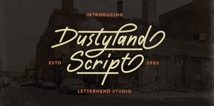 Dustyland Script is a monoline script with a touch of vintage look and feel. This type of font perfectly made to be applied especially in logo, headline, signage and the other various formal forms such as invitations, labels, logos, magazines, books, greeting / wedding cards, packaging, fashion, make up, stationery, novels, labels or any type of advertising purpose. Features : uppercase & lowercase numbers and punctuation multilingual alternates / swashes and ligatures PUA encoded We highly recommend using a program that supports OpenType features and Glyphs panels like many of Adobe apps and Corel Draw, so you can see and access all Glyph variations. How to access opentype feature : letterhend.com/tutorials/using-opentype-feature-in-any-software/ Email us to letterhend@gmail.com if you need something! Happy Designing!
 - Vintage Reclame by Putracetol,
$32.00 Vintage Reclame is a vintage script font. As the name suggests, this font is inspired by classic billboards/boards. Besides that, I also combine it with a script style and it's a little irregular in its shape / bouncy style. I strengthen the vintage/retro impression with the character ligatures, there are 140 ligatures in this font. But if you want to use this font with a neater impression, you can disable this ligature feature. This font is perfect for projects with vintage/retro and classic themes. But this font is also suitable for logos, branding, greeting cards, invitation cards, advertisements, titles, healines, book titles, stickers, packaging, quotes, posters, t-shirts/apparel, billboards and others. This font is also support multi language.
 - Midgrow Font Duo by Letterhend,
$17.00 Midgrow is a font duo package contain a monoline script and serif which looks great to be paired especially for vintage and adventure theme! This font duo is purposely made for headline, display or logotype, and signature which need a standout appearing. This font is also suitable to be applied especially in logo, and the other various formal forms such as invitations, labels, logos, magazines, books, greeting / wedding cards, packaging, fashion, make up, stationery, novels, labels or any type of advertising purpose. Features : Regular & Script uppercase & lowercase numbers and punctuation multilingual alternates & ligatures PUA encoded We highly recommend using a program that supports OpenType features and Glyphs panels like many of Adobe apps and Corel Draw, so you can see and access all Glyph variations.
 - Shirataki by Fenotype,
$30.00 Shirataki is a soft pen script with clear round letter shapes and large display capitals. Shirataki has really low contrast -it’s almost monolinear. Shirataki is a clear and friendly display script ideal for logo, signature, packaging, poster or headline purposes. Shirataki uses Contextual Alternates to keep the connections smooth and it has Swash alternates for every standard letter. There’s even more alternates in glyph palette. There’s also a set of swash endings coded in Titling Alternates and set in lowercase letters. In addition there’s a selection of strokes set in uppercase A-H. Shirataki is PUA encoded so you can access extras in most graphic design softwares even without OpenType support. In case you were wondering Shirataki are Japanese yam noodles. Enjoy!
 - Intro Rust by Fontfabric,
$25.00 Intro Rust is one of the biggest packages on the market, including 214 fonts. The font family is a rough version of the famous Intro. Intro Rust includes 4 sub-families - Intro Rust, Intro Script, Intro Head and Intro Goodies. It can be used to create almost all types of design projects like print materials and web design. Just use your imagination and your project will become more alive and vivid than ever with one of the Intro Rust fonts. You want to make a greeting card or a package design, or even a brand identity? Feel free to play with all the patterns and shapes, scripts or those cool fonts with the dots and that will lead you to your next successful project.
 - Rumble King by Putracetol,
$20.00 Rumble King is a vintage script font. As the name suggests, Rumble King is inspired by classic poster or vintage magazine. Besides that, I also combine it with a script style and it’s a little irregular in its shape style. I strengthen the vintage/retro impression with the character ligatures, there are 140 ligatures in Rumble King. But if you want to use Rumble King Font with a neater impression, you can disable this ligature feature. Rumble King is perfect for projects with vintage/retro and classic themes. But Rumble King is also suitable for logos, branding, greeting cards, invitation cards, advertisements, titles, healines, book titles, stickers, packaging, quotes, posters, t-shirts/apparel, billboards and others. Rumble King is also support multi language.
 - Alone Forever by BBA Key,
$15.00 Alone Forever script is a new and fresh modern font built with handmade calligraphy, decorative characters and dancing lineage! Great for invitations like greeting cards, branding material, business cards, quotes, posters, and more! Alone forever Script comes with 612 glyphs. Alternate characters are divided into several Open Type features such as Swash, Stylistic Sets, Stylistic Alternate, Contextual Alternate. Open Type features are accessible by using Open Type savvy programs such as Adobe Illustrator, Adobe InDesign, Adobe Photoshop Corel Draw X versions, and Microsoft Word. And this font has code PUA unicode (font with special code). So that all alternative characters can be easily accessed by craftsmen or designers. Features: - Uppercase & lowercase - International signature & symbol - Punctuation - PUA Unicode - Alternative Style Range 1-15 - Contextual Character Variation
 - Yamada by BBA Key,
$13.00 Yamada Script, a new fresh & modern font with handmade calligraphy, decorative characters and dancing lineage! So wonderful for invitations like greeting cards, branding material, business cards, quotes, posters, and more !! Yamada Script The comes with 647 glyphs. Alternate characters are divided into several Open Type features such as Swash, Stylistic Sets, Stylistic Alternate, Contextual Alternate. Open Type features are accessible by using Open Type savvy programs such as Adobe Illustrator, Adobe InDesign, Adobe Photoshop Corel Draw X versions, and Microsoft Word. This font has PUA unicode so that all alternative characters can be easily accessed by craftsmen or designers. Yamada Uppercase & lowercase International signature & symbol Punctuation Support & PUA number Unicode Style Style Alternative Style Style Range 1-16 Contextual Character Variations.
 - Nono by Wiescher Design,
$39.50 Nono is the nickname of my oldest son, Konstantin. His little brother could not really speak yet, but he was always looking for him and said something to the tune of, "wea is a nono". From that time on I call Konstantin Nono. I designed a handwritten script with his real name, that i named Konstantin. Now I made this slick version of that script – hence – Nono! I made three basic sets of characters plus a smallcaps version. To top things off, I designed a set of endletters that I throw in for free. Everything can be mixed! I sell single cuts but the best deal would be the entire packet, it goes for a very fair price. Your generous typedesigner, Gert Wiescher
 - Nandola by Alit Design,
$18.00 Introducing Nandola Typeface Nandola typeface Inspired by ancient manuscripts in the European area. Carefully designed to work together in harmony making it perfect for wedding favors, book covers, greeting cards, logos, branding, business cards and certificates, even for any design work that requires classic, formal or extravagant. Attempt calligraphy Desired, delight in those riches from claiming OpenType features and tell its exquisite fun and fervor make you euphoric What's more support your creativity! you might utilize this font precise undoubtedly. Elegant script “Nandola Typeface” are very easy to apply to any design, especially those with an elegant and smooth concept, apart from that this font is very easy to use in both design and non-design programs because all alternates and glyphs are supported by Unicode (PUA). order to use the beautiful swashes, you need a program that supports OpenType features such as Adobe Illustrator CS, Adobe Photoshop CC, Adobe Indesign and Corel Draw. but if your software doesn't have Glyphs panel, you can install additional swashes font files.
 - Grava by Positype,
$35.00 Grava is Neil Summerour’s injection of warmth within the geometric sans font category. Historically, geometric sans families have been based on primal shapes — triangle, circle, square — and the more closely they held to those rigid rules, the more internal inconsistencies they showed. Angles won’t match up correctly, letters will lean, overshoots complicate clean typesetting, and idealized circles become grotesque and unwieldy in some weights. Because of issues like these, geometric sans fonts have a reputation of being cold, austere, even a bit “off”. Grava was made to hold a T-square and triangle in one hand while giving a welcoming handshake with the other. The Grava font family comes in two styles (a normal and a Display), each with 20 weights (Thin to Ultra) and paired with italics. Its design allowed the three scripts of Latin, Cyrillic, and Greek to emerge seamlessly, ensuring Grava will find its home in multilingual publications. Even better, each character in the three scripts is spaced with every other character for a beautifully matched fit, and it’s a buy-one-get-all-three deal since they are all packaged together. The normal style’s large x-height won’t let you down in paragraphs, headings, and any call-out text. And have you seen the angles on those numerals? Pairing Grava’s numerals on a jersey is sure to catch some eyes, just sayin'. Grava Display is purposefully quirky and sharp, and made for poster sizes, book and album covers, and those websites with a well-defined character — somewhere between playfully self-aware and overtly vintage. Flat edges are abandoned to make way for sharp points and conspicuousness, for geometrical attitude and respectful expressiveness. Corporate reports use Grava Display to take on a professional and current look. The optional ligatures (N–T, L–L, G–A, C–O, almost anywhere an ‘A’ is placed, and more) in both the normal and Display styles invoke a midcentury modernist and high art feel. Now that introductions are done, you can let go of Grava’s hand and put it to work for you.
 - Tsa - Unknown license

- Neue Kurier by RMU,
$35.00 Typoart's popular script font in a new, completely remastered version.
