10,000 search results
(0.988 seconds)
- Satellite PT by Puckertype,
$19.00Satellite PT started out as an experiment. Wanting to explore the geometry of using angles instead of curves, I started sketching out the face using grid paper. I had seen similar fonts that tended to be completely symmetrical. My exploration tended to include what I humorously call 'faux humanist' elements, such as asymmetrical bowls, tapers and 'flare-serifs' (for lack of a better word) for select terminals. The result was a quirky and interesting face at display sizes. However, at small sizes, as ink bleed starts to take over, the angles disappear in favor of the overall forms (rounded bowls, etc.) and the 'faux-humanist' effects start to mimic modulation found in more traditional, modulated text faces. While it is hardly a true text face, the result is surprising legibility at text sizes. - Kosumi by Thinkdust,
$10.00 Kosumi is an experimental display typeface. Its juxtaposition of thick and thin catches that gleam in your eye, and leads you by the hand out of your comfort zone with such ease that you'll never look back. Kosumi is comfortable in any of a thousand different places, looking brilliant on posters, and reigning supreme within magazine spreads. All you need to do is let is whisk you away. The eye-catching differences between thick and thin lines serve to capitalise your attention, ensuring your nicely laid out headline is truly the star of the show!
 - Hatmaker by ITC,
$29.99Jean Evans' interest in type design dates back to her third-grade fascination with fancy script writing. Years later, work at a sign-painting school she found in the Yellow Pages® cemented her relationship with letterforms. Evans went on to study with master calligraphers and type designers, including the likes of Donald Jackson, Hermann Zapf and Matthew Carter. Evans' designs have been exhibited and collected around the globe, and her distinctive calligraphic style has been lauded by leading trade organizations, annuals and publications. Hatmaker, one of Evans' more popular typefaces, was originally developed for the Boston-based broadcast design firm of the same name. Inspiration for the design came from Ben Shahn's famous hand-constructed alphabet. Shahn's alphabet, however, was limited to capital letters. Daunted by the idea of designing a lowercase that would measure up to Shahn's capitals, I developed a second set of caps-simple, quirky, yet almost classic-to work as 'lowercase' with the Shahn-like caps," explains Evans. Mixing the two in Hatmaker, creates a lively interplay of light and dark." - Micaroline by Martype co,
$19.00 MICAROLINE The Classic Art Deco Font with Alternates & Ligatures Micaroline is a family Sans Serif font designed with carefully handcrafted. Also suitable for branding, T-shirt, Wedding Invitation, Classic Design, Logotype, and any project. Comes with a tons of ligature make your life more than comfortable, easier to design and adjust frustrating space in font. All Caps Fonts. You can access the stars by typing (S+1) and then put it anywhere you want.
 - Between The Lines BF by Bomparte's Fonts,
$29.00 The famous Catalan architect, Antoni Gaudí, used to say “there are no straight lines or sharp corners in nature…” However, with Between The Lines that’s exactly what you’ll find: straight lines, parallel and perpendicular, all in a glorious display of Art Deco style. Here the verticals and horizontals dominate while the diagonals “sit this one out”. Curvilinear lines also run free here: they serve as refreshing counterpoints to prominent straights. These forms suggest a somewhat expressive script-like characteristic, (especially in lowercase) wherever the font’s many initials, terminals and contextual alternates are employed. Between The Lines offers many options for alternate letterforms (ligatures, stylistic alternates, contextual alternates, etc.). When these OpenType features are used judiciously and selectively, your typography will be greatly heightened. You’ll find BTL right at home in a number of environments: music album covers, snack food packaging, magazine headlines, cosmetics, signage and more. PLEASE NOTE: due to its very tall ascenders, Between The Lines benefits from generous leading (line spacing). Multilingual support included.
 - Gothica by Type Innovations,
$39.00 Say hello to Gothica. It’s a display geometric sans designed with Stencil-like elements and letter cutouts specifically created for visual impact—ideal for logo, branding and advertising purposes. The font includes capitals and capital alternatives in the lower case keystroke positions—it’s like having 2 display fonts in one. In addition, Gothica includes various opentype features that allow graphic designers to tailor the type for custom needs. The development of Gothica started in 1997, inspired by Alex Kaczun’s best selling grotesque font family called Contax Pro. An experimental design, Gothica is specifically introduced as a bold weight, but Alex plans to expand the design to include many weights, styles and alternative design treatments. Stay tuned! If you like Gothica—check out similar gothic alternates like Decrypt 01, Decrypt 02, Decrypt H1 and all of Type Innovations fonts from Alex Kaczun.
 - Zauberer by Scriptorium,
$24.00The Scriptorium got its start in the early days of personal computers with a few font designs for the Commodore 64, and the very first font which we did back then in the early 1980s was a gothic calligraphy font. That style of fonts - the medieval, gothic and black letter genre - has always been the backbone of our collection, but with recent releases we've stayed away from them to introduce a bit more variety. Well, with our new Zauberer font the antique, medieval and gothic look is back with a vengeance. Zauberer isn't a true medieval calligraphy style. It's based on early printed type from Germany which combines calligraphic elements with decorative embellishments from the woodcut printing era. The result is decorative and antique looking and rather appealing. The name comes from the German word for a magician or illusionist. - Spoonbill by Scriptorium,
$12.00In 1916 the Prang company - still famous for their excellent pens and pencils - commissioned Thomas Woods Stevens to hire the best calligraphers of the era to hand letter sample pages with different Prang pens and in a variety of styles. The resulting book is a font maker's dream, a collection of period lettering samples perfect for making new fonts. One of the sample pages shows off the look of the Spoonbill pen with a set of classic art deco style letters by Charles Earley. This sample is the basis for our Spoonbill font, which includes a full character set, plus character variations for nesting and overlapping, and a small selection of decorative border characters in the art deco style. - Art Project JNL by Jeff Levine,
$29.00 A 1930s WPA (Works Projects Administration) poster advertising a play entitled “Abraham Lincoln, The Great Commoner” had the play’s name done in a hand-lettered Art Deco sans. This is the basis for Art Project JNL. According to Wikipedia, “the Works Progress Administration (renamed in 1939 as the Work Projects Administration; WPA) was the largest and most ambitious American New Deal agency, employing millions of unemployed people (mostly unskilled men) to carry out public works projects, including the construction of public buildings and roads. In a much smaller but more famous project, Federal Project Number One, the WPA employed musicians, artists, writers, actors and directors in large arts, drama, media, and literacy projects.”
 - Mikhael Handwritten by Letterara,
$16.00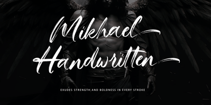 Introducing Mikhael Handwritten, an authentic brush script font that brings a raw and energetic vibe to your designs. With its dynamic strokes and natural brush texture, this font is crafted to make a bold statement in logos, posters, packaging, and various design projects. Its striking appearance and smooth flow make it an ideal choice for conveying a strong and stylish impression. PUA encoding ensures effortless access to all the expressive glyphs. Elevate your projects with Mikhael Handwritten, a font that effortlessly infuses vigor and character into your creative endeavors.
 - Dog Eared by Andy Babb,
$19.20 Each character of Dog Eared began its life as a half-inch wide strip of paper, folded and Scotch-taped into formation, and then scanned and recreated digitally. Dog Eared is distinguished from other folded paper style typefaces by its robustness and versatility: each numeral and upper- and lowercase letter has a stylistic alternate. Dog Eared Striped is a traditional single color font, while Dog Eared Solid is a chromatic variant that can be used for a two-toned effect. Layer and multiply Dog Eared Striped and Dog Eared Solid together to achieve even more color variety.
 - Smart by Falling Angel,
$9.00 The Smart family started out as an idea for a smart design and kids magazine, games, etc.
 - Italian Gothic by Celebrity Fontz,
$24.99The Italian Gothic font is a full set of decorative initials inspired by 16th-century Italian Calligrapher Giovanni Battista Palatino, containing beautiful loops, flourshes, and parallel calligraphic strokes. This lovely calligraphic font includes one set of A-Z ornamental initials conveniently assigned to both the upper- and lower-case alphabet characters, as well as many foreign language accented characters. It is ideal for starting off the beginning of paragraphs in artistic publications, storybooks, fairy tales, religious publications, and any written work conveying the calligraphic style of the 1500s. - Farfa by Eurotypo,
$44.00 The Farfa fonts were designed for institutional use, commissioned by the City of Fara in Sabina, Italy. This project started from the study of the manuscripts found in the Abbey of Farfa, penned in a variant of the lower case of “Carolingian” typical style of that area. The Capital, ligatures and Small Caps, however, are based on the uncial writing that often appears in those codes and manuscripts. Farfa Abbey is a territorial abbey in northern Lazio, central Italy. It is one of the most famous abbeys of Europe. It belongs to the Benedictine Order and is located about 60 km from Rome, in the commune of Fara Sabina The origin of the Abbey is still unknown. Archaeological discoveries seem to prove that the first monastic establishment was built on the ruins of a pagan temple. The Vandals destroyed the first monastery in the fifth century. Only a few documents from the sixth-century prove the early presence of the monastic community. It had the heritage of Charlemagne (S VIII), the Lombard chiefs, and later the Carolingians, succeeded in withdrawing Farfa from obedience to the Bishops of Rieti, and in securing many immunities and privileges for the monastery. Farfa was at this period the most important monastery in Italy both from the point of view of worldly possession and ecclesiastical dignity.
 - Montello by Hanoded,
$15.00 Montello started out as an Illustrator exercise (a skill I am still learning). I made a couple of glyphs for fun, then realised it would make a nice font. The result is Montello. Montello is a classic connected script font, very neat and (in my humble opinion) not an eye-sore either. Montello comes with a whole bunch of ligatures for letters that just won’t connect nicely.
 - Badora by Twinletter,
$15.00 BADORA, a display font with a Japanese flair, is now available. We created this typeface using natural handwriting that has been modified in visual form so that it may be used in a variety of applications. This font will enhance any of your projects, particularly those with a casual and fun theme. Logotypes, food banners, branding, brochure, posters, movie titles, book titles, quotes, and more may all benefit from this font. Of course, using this font in your various design projects will make them excellent and outstanding; many viewers are drawn to the striking and unusual graphic display. Start utilizing this typeface in your projects to make them stand out.
 - Jazz Trumpeter JNL by Jeff Levine,
$29.00 Jazz Trumpeter JNL is an unusual type design modeled after the title card for the 1945 movie comedy “The Horn Blows at Midnight” starring Jack Benny and is available in both regular and oblique versions. This Art Deco sans serif font has the distinction of being somewhat calligraphic, yet futuristic in its visual appearance… and even has some subtle hints of Blackletter influences.
 - Varvara by TeGeType,
$19.00 Varvara is a new display typefaces family create as a tribute to the work of Barbara Stepanova (1894-1958). Varvara family has light, medium and bold weights in 6 differents versions (normal, rough, screen, inline, shadow and star), all with alternates letters. All versions are provided in latin, cyrillic and greek alphabets. It can be use for text as for titling applications.
 - AM Sans One by URW Type Foundry,
$39.99 When designing AM Sans One, it was a great challenge for me to develop a modern sans serif, which despite the large number of existing fonts in this sector has its own unique character. Starting point for the design concept was the cap O, designed as a rectangle with rounded corners, and not as usual as a circle or oval. The O should form the basis for the whole alphabet. Another feature are the characters with oblique starting and end strokes such as "A, V, W". These have not exactly straight, diagonal lines, but have a slight curvature. Thus, these letters do not look too geometric. Also the cap K deviates slightly from the usual shape which makes AM Sans One different from other already existing fonts. I could well imagine applying this font for areas such as engineering or architecture.
 - Larissa by Graphicxell,
$19.00 Larissa Serif Typeface inspired by the famous minimalist logo perfect for the purposes of designing templates, brochures, videos, advertising branding, logos and more. What's Included : + Standard glyphs + Web Font + Ligatures + International Accent + Works on PC & Mac + Simple installations Accessible in the Adobe Illustrator, Adobe Photoshop, Adobe InDesign, even work on Microsoft Word. PUA Encoded Characters - Fully accessible without additional design software. Fonts include multilingual support Image used : All photographs/pictures/vector used in the preview are not included, they are intended for illustration purpose only. Thank You
 - Levaus by Graphicxell,
$19.00 Levaus Ligature Serif Typeface inspired by the famous minimalist logo perfect for the purposes of designing templates, brochures, videos, advertising branding, logos and more. What's Included : + Standard glyph + Ligatures + International Accent + Works on PC & Mac + Simple installations Accessible in the Adobe Illustrator, Adobe Photoshop, Adobe InDesign, even work on Microsoft Word. PUA Encoded Characters - Fully accessible without additional design software. Fonts include multilingual support Image used : All photographs/pictures/vector used in the preview are not included, they are intended for illustration purpose only. Thank You
 - Magistic by Graphicxell,
$19.00 Magistic Serif Typeface inspired by the famous minimalist logo perfect for the purposes of designing templates, brochures, videos, advertising branding, logos and more. What's Included : + Standard glyphs + Web Font + Ligatures + International Accent + Works on PC & Mac + Simple installations Accessible in the Adobe Illustrator, Adobe Photoshop, Adobe InDesign, even work on Microsoft Word. PUA Encoded Characters - Fully accessible without additional design software. Fonts include multilingual support Image used : All photographs/pictures/vector used in the preview are not included, they are intended for illustration purpose only. Thank You
 - Erbar by URW Type Foundry,
$49.99Erbar or Erbar Grotesk, designed by Jakob Erbar (Ludwig & Mayer) in the early 1920s, is a truly key design from a historical viewpoint. None other than Paul Renner studied Erbar and used this knowledge in the design of his famous Futura. Erbar is a beautiful constructive Grotesk perfectly mirroring the Zeitgeist of the 1920s. The newly expanded Erbar family of URW++ comes in nine styles, of which seven have been digitally remastered recently in URW's design studio (light, book, medium, bold, italic, bold italic). - VLNL Irish Stew by VetteLetters,
$35.00 Obviously the Irish Stew font finds its origin in Ireland. During a vacation in West Ireland Donald® fell in love with the famous local dish. In fact, he loved Irish stew so much he couldn't wait to create a font dedicated to the stew from Ballymaloe. He found the inspiration for this font on an old shop front sign somewhere in Dublin. The sign only contained a few characters, but the stew had given him more than enough energy and inspiration to complete the whole alphabet!
 - Jasmin by Vincenzo Crisafulli,
$29.00 Jasmin is a tribute to the ancient stories of The Thousand and One Nights, in which a main story serves as a connection for a series of other stories, just like all the other glyphs are derived from one of Jasmin's letters or from a sign. A graphic path in which we tried to combine the calligraphy designed with a quill with geometric research. Among the glyphs there is one referring to a letter from a famous font by Paul Renner, made by Fonderia Bauer in 1927.
 - Sticky Love by Bogstav,
$17.00 The name "Sticky Love" is taken from a song by Kate Bush. Perhaps not one of Kate Bush' most famous songs, but nevertheless, the song is about love (Which I think is what Kate Bush sings a lot about!) The Sticky Love font is also about love - that kind of love you just can't control. In this case, the love is about wacky letters! :) Sticky Love is handmade and just a tiny bit cleaned up. Not much though. The font has kept the handmade love!
 - Angina Display by Masa Type,
$17.00 Introducing, Angina Display - a modern sans with ligatures and alternates! Angina Display is a modern sans with a bunch of ligatures and alternates that will make your poster, cover or logo even more stunning and stand out! You can use this font as a stand alone font for any project such as logo, headline or branding. Also comes with the right arrow and star! This fonts support Multi Language. Feature UPPERCASE lowercase Number & Symbol International Glyphs Ligatures Thanks You.
 - Toscography by Misprinted Type,
$25.00 Toscography is inspired by vernacular and naive hand-painted walls and signs from Brazil. It feels organic, spontaneous and fresh and it has a light texture on its characters that makes it feel like it is starting to decay.
 - Jonesy by Ksenia Belobrova,
$39.00 Jonesy is a funny modern looking script with a touch of vintage. It’s based on calligraphy and pretends to look like real lettering having almost 700 alternates and ligatures, organic forms and realistic connections. Jonesy is good for menu, packaging, posters and as a starting point for lettering and logos. All contextual alternates are built into the “Liga” feature that is turned on by default. However, when your work with the typeface, please make sure that “Liga” is turned on.
 - Happy Christmas Party by Putracetol,
$28.00 Happy Christmas Party is a playful and quirky display font. I made this font especially for Christmas and holidays. This font has 5 decoration versions: regular, decor, deer, snow and star. These decorations are related to Christmas decorations, making this font the perfect fit for any Christmas-themed activity / project. Happy Christmas Party perfect for crafter, gift, tshirt, card event, anniversary, birthday,greeting cards, logotype, branding, poster, packaging, stationery, website, and any other projects requiring a handwritten and luxurious touch. This font is also support multi language.
 - Marie Clarie by Putracetol,
$28.00 Marie Clarie - Monoline Script Font is a stunning font with a script style characterized by thin monoline strokes. Its vintage retro charm and classic script lettering make it a perfect choice for various design applications. Whether you're creating logos, lettering, branding materials, coffee-related designs, food and beverage branding, invitations, or cards, this font will add a touch of elegance and sophistication to your projects. The monoline script style of Marie Clarie features thin and consistent strokes, giving it a sleek and modern look. Its vintage retro undertones bring a sense of nostalgia and timelessness to your designs. The classic script lettering adds an elegant and sophisticated touch, making it ideal for creating a refined and stylish visual impression. Whether you're designing a logo for a boutique coffee shop, creating elegant lettering for a special invitation, or crafting a vintage-inspired food and beverage brand, Marie Clarie - Monoline Script Font offers versatility and charm that will elevate your designs to the next level.
 - Xagetif by Twinletter,
$18.00 Grab our new font, Xagetif Groovy font, and start creating your own custom project. Use it to add a little flair to your editorial work or use it for branding or product packaging with a bold and fun character. Time to add some oomph to your next project with this font. This retro-inspired typeface features a psychedelic, bold and fun character ideal for branding and product packaging. This elegant typography is simple and contemporary but with a touch of simplicity that gives it a modern feel. To create your own custom project, start using this font now!
 - Lemon - Unknown license

- Rigel by Supremat,
$15.99 Rigel was inspired by one poster by American artist and illustrator Katherine Milhous. It was a poster promoting the Ephrata Cloister in 1936. The letters from the Ephrata title on this poster are very concise and expressive, reminiscent of blackletter, but have a simplified look, which looks quite fresh even today. It was very inspiring to bring this font to life. In the process of redrawing and redesigning, the font has been slightly modified, but retained the character of those six letters from the reference poster. This is a header font consisting only of uppercase letters. It contains 6 styles from Light to ExtraBold. Despite the fact that the font has the character of blackletter, due to simplified forms, increased contrast and sharp lines, the font looks like a modern rethinking of Gothic script and it has found a new life. The name Rigel is taken for a reason. Rigel is a star, an blue supergiant in the constellation of Orion, and the Ancient Egyptians associated Rigel with the Sah - king of stars and patron of the dead. The human body after mummification was also seen as the embodiment of the soul. Of course, there is no direct connection between the font and Egyptian mythology, but indirectly in this way I wanted to emphasize even more the idea of incarnation, rebirth. Rigel is good for posters, large headlines, logos and any other large font compositions.
 - Bodoni Classic by Wiescher Design,
$55.00 I became interested in designing Bodoni Classic because of a lazy graphic designer at Jacques Damase publishing house. He had to change a single letter on a bookcover about J. B. BODONI. The French call him Jean Baptiste instead of Giambattista! And that unknown graphic designer just took any old “J” from some newly cut Bodoni. All the new Bodoni cuts have square serifs, whereas the originals had rounded serifs and slightly concave feet. The single letter “J” with the squared off serif was for me like a road sign to start redesigning the entire Bodoni family. That’s exactly what I started in 1993 and a dozen years later I am finished. Okay, I am still adding new Bodoni Classics, but those are my personal additions. Recently I designed a family of seven »Bodonian Script« fonts, that can be mixed with most of my Bodonis. Yours very retro, Gert Wiescher
 - Clearface Gothic by Linotype,
$29.99 Clearface Gothic first appeared in 1910, designed by Morris Fuller Benton, the world-famously prolific typeface artist. In addition to Clearface Gothic, Benton also designed classics like Franklin Gothic, Century Expanded, and many other types. Clearface Gothic is a sans serif face with light forms displaying the Zeitgeist of the turn of the 20th century. Distinguishing characteristics are the open forms of the a" and "c," the arched "k," and the upward-tilting horizontal stroke of the "e." The relatively narrow typeface, with its open inner white spaces, is extremely legible even in small point sizes. There is no accompanying italic. This digital version of Clearface Gothic was made in 1984 by the Linotype Design Studio."
 - Eisley by Rocket Type,
$20.00 Eisley started as an experiment with creating brushes in illustrator. I began by drawing each letter and tweaking until each one balanced next to one another. I painted over 50 paint brush strokes to give a variety of different looks to the final characters. Strategically crafted to look as real and as spontaneous as a sign painter might paint up (although possibly running a bit dry on paint giving the end result a vintage and grungy effect). Eisley is perfect for use in any design branding that requires vintage or distressed display lettering. Eisley is perfect for use in any design branding that requires vintage or distressed display text. Great fun to use AND personalize with your own flair.
 - ITC Dartangnon by ITC,
$29.99ITC Dartangnon is a work of English designer Nick Cooke and began with the thought, It's a long shot but it might just work as a font." It started as a doodle with a chunky pencil. "So many script fonts look too stylized so I thought I'd try to produce one that looks more like handwriting." He scanned the doodles and used Fontographer to draw a set of monoline letters. "Working quickly I soon drew the whole alphabet, and without being too pedantic about the characters joining exactly, I arrived at this script." ITC Dartangnon is an energetic font which remains legible even in small point sizes. And, Cooke adds, "It is supposed to be used as upper and lowercase only, NEVER just caps."" - Predy by Eurotypo,
$55.00 In the era of digital types, the round handmade cursive continues to intrigue many type designers, probably by their beautiful and graceful calligraphic origins. However, what is certainly true, is that all good traditional pen-formed script may be suitable for a wide range of fine graphic works. The Predy typeface is based on the famous style of the 19th Century: The English handwriting made by pen. It is a connected cursive in the tradition of the “ronde”. This typeface is constructed upon their vigorous ascenders with loops, two times the lengths of the descenders with an extremely short x-high. The uppercase is a classical modern roman typeface (Didona) that are accompanying with a set of accurate flourished capitals as alternates of the calligraphic style. Predy font comes with a set of decorative glyphs including old style figures, terminal letters, ligatures, alternates and swashes. This font will lend elegance and sophistication to a wide variety of design projects like wedding, invitations cards, logotypes, packaging and posters.
 - Plumcake by PintassilgoPrints,
$20.00 A bittersweet hand-drawn face, pleasing and assertive. Available in two weights, both all caps, with alternates for each letter. Comes with some ligatures and handy swash alternates to sweeten things up every now and again. Starting… Now!
