10,000 search results
(0.711 seconds)
- Salty by Fenotype,
$40.00 Salty - not fat just big boned. Salty is a hearty brush family that’s great for any kind of display use from packaging to poster & logos to headlines. Salty has bold and clear basic letterforms and lots of alternates for more customised look. Salty family consists of Script, Caps and Extras and two weights of each. Salty script is equipped with plenty of OpenType features: Keep Automatic Ligatures on to keep the flow and click Swash, Stylistic or Titling Alternates for extra goodies or manually select from even more alternates from Glyph Palette. Salty Caps is a vivid set of casual caps that play well with the script but can also be used on their own. Salty Extras is a set of ornaments and swashes designed to support the script. Some of the Extras are designed so that they can be used to customise the letters - to create your own Alternates.
 - Breeder by Scratch Design,
$9.00 Introducing Breeder Font Duo it's a handwritten script. Enjoy this playful font in your designs with Breeder Script & Breeder Small Caps! This playful font consists of a natural handwritten and signature style, so this font is perfect for logos, menu design, social media posts, packaging, poster, name card, birthday card, etc. Breeder Script has a natural flow handwritten signature containing upper & lowercase characters, numerals, and punctuation. This font also has a ligature, stylistic alternate, swashes, multi-languages support, and doodles art for the bonus of this font. Breeder Small Caps comes with a natural & simple handwritten all-caps font. Complete with a-z letters, very charming handwritten font, and perfect for combining with Breeder Script. This font also includes multi-language support. Thank you for checking and visiting our store, and feel free to drop me a message if you had any questions! Visit our Instagram :) www.instagram.com/scratchdesignbali
 - Chorettan by OCSstudio,
$12.00 Chorettan is a hand-written script. This is perfect for branding, wedding invitations, cards, social media, or maybe for your logo products, and also websites.
 - New Year Deco by Wing's Art Studio,
$9.00 New Year Deco: An Art Deco Font for Festive Celebrations! Raise a glass to the New Year with this elegant, vintage inspired Art Deco header font. This first edition of New Year Deco is the introduction to an experimental design that I hope will evolve into the ultimate in Art Deco fonts. Starting with 4 alternative styles with varying degrees of decorative flourish, this all-caps design is tailor-made for invitations, award ceremonies, elegant title designs and logos. It includes unique uppercase and lowercase characters, along with numerals, punctuation and language support. And also includes a variety of illustrated symbols, underlines and icons for an extra graphic touch. See the visuals for more. For the future development of this font I encourage my customers to contact me with suggestions and requests. If you would like to see a bolder, thinner, fatter, taller or wider version, contact me and I’ll add it to the next update!
 - Imperio by Juan I. Siwak,
$40.00 Imperio is a font inspired by old posters, especially those related to constructivism and futurism. It reflects both the rationalism of Bauhaus as a propagandist and revolutionary spirit of an era. On the other hand it is not nostalgic, but instead looks for its own way to get diagonals where there was rigidity. The poster itself is the language of graphic design, and geometry is its ally. This font aims for that goal. It has two variants that derive from its source. Imperio Giga Black attempts to be a negative typography, starting with the black and then searching for small windows in which they begin to uncover the morph. This is an extreme and modern font. Imperio West is a metamorphosis of the original one, with decorative details which transform it into a typeface of wood and saloon font. In all cases we recommend its use in large sizes (up to 20pt) and main titles. Imperio UltraBlack can work in smaller sizes than Imperio Regular.
 - Swashington by CounterPoint Type Studio,
$29.99 Inspired by a few letters in a hand-drawn logotype, Swashington is a serif font with both an early 20th Century feel and yet is evocative of the swash fonts of the 1970s as well. The real meat of this typeface comes with using all the swash and ligature variants allowing for an enormous amount of typographic flair. Starting with the original logo, Jason Walcott was moved to develop these interesting letterforms into a full typeface with all the swashy might he could muster. In addition to a comprehensive set of Swash and Alternate letters, there are also over 270 Discretionary Ligatures that can be used to create different possibilities by mixing and matching. Included with the downloaded fonts are two .pdf files showing all the swashes and ligatures, that can be printed and used for easy reference. All of the alternates are available via the Glyph Palette or with OpenType features. The font includes support for all Latin based and Eastern European languages.
 - Comforter by TypeSETit,
$49.95 Comforter promises to be a favorite among professional designers and people who love quality hand lettered forms. It’s a bouncy, upright brush style script. It’s look is appealing for many various usages. It’s contemporary, and non- traditional. It’s sophisticated, yet fun and funky. The Brush style of Comforter adds another touch to its “brushy” look. Comforter Pro versions come complete with multiple language options including Rob’s interpretation of a script style of Cyrillic. Unlike a “cursive” style, the script Cyrillic uses both traditional and cursive forms. In addition, the PRO versions are programmed with numerous OpenType features plus a few ornamental and word art glyphs not found in the Regular flavors. The regular versions are properly kerned, but contain none of the OpenType features found in the PRO versions. The Alternate flavors contain a few of the alternate forms found in the PRO versions of the typeface, including Cyrillic.
 - Wingardium by Fromletterel,
$12.00 Wingardium is a stylish and delicatw script font, it is suitable for any project such as logo, branding, label, photigraohy, watermark, special events and all kind of project that needs natural writing vibe.
 - Brushcrazy by Hanoded,
$15.00 Brushcrazy is a crazy brush font. Yes, you read that right! It comes with a lot of attitude, serious brush strokes, nice detail and a handful of alternate glyphs and ligatures as well!
 - Oyange by Stringlabs Creative Studio,
$29.00 Oyange results out of a stunning pairing of a brush pen that makes it look incredibly endearing and authentic. Use this gorgeous and unique script font to bring any DIY project to life!
 - Maritha by MJB Letters,
$17.00 Maritha is a classy handwritten script, it has beautiful beginning and ending swashes, this font is perfect for branding design, packaging, logo design, watermark, fashion design, wedding invites, and more. this font includes the full set of lowercase and uppercase letters, numeral, punctuation, multilanguage support, titling, and ending swashes.
 - Roselyn by Calamar,
$20.00 Roselyn Script is an elegant calligraphic font that will look awesome on wedding and event stationery, logos and branding materials, cards and so on. Roselyn Script includes Uppercase and Lowercase Latin Basic Characters, Numbers and Punctuation. Also the font contains ligatures and stylistic alternates to perfectly re-create natural calligraphy.
 - Vendetta by Emigre,
$69.00 The famous roman type cut in Venice by Nicolas Jenson, and used in 1470 for his printing of the tract, De Evangelica Praeparatione, Eusebius, has usually been declared the seminal and definitive representative of a class of types known as Venetian Old Style. The Jenson type is thought to have been the primary model for types that immediately followed. Subsequent 15th-century Venetian Old Style types, cut by other punchcutters in Venice and elsewhere in Italy, are also worthy of study, but have been largely neglected by 20th-century type designers. There were many versions of Venetian Old Style types produced in the final quarter of the quattrocento. The exact number is unknown, but numerous printed examples survive, though the actual types, matrices, and punches are long gone. All these types are not, however, conspicuously Jensonian in character. Each shows a liberal amount of individuality, inconsistency, and eccentricity. My fascination with these historical types began in the 1970s and eventually led to the production of my first text typeface, Iowan Old Style (Bitstream, 1991). Sometime in the early 1990s, I started doodling letters for another Venetian typeface. The letters were pieced together from sections of circles and squares. The n, a standard lowercase control character in a text typeface, came first. Its most unusual feature was its head serif, a bisected quadrant of a circle. My aim was to see if its sharp beak would work with blunt, rectangular, foot serifs. Next, I wanted to see if I could construct a set of capital letters by following a similar design system. Rectangular serifs, or what we today call "slab serifs," were common in early roman printing types, particularly text types cut in Italy before 1500. Slab serifs are evident on both lowercase and uppercase characters in roman types of the Incunabula period, but they are seen mainly at the feet of the lowercase letters. The head serifs on lowercase letters of early roman types were usually angled. They were not arched, like mine. Oddly, there seems to be no actual historical precedent for my approach. Another characteristic of my arched serif is that the side opposite the arch is flat, not concave. Arched, concave serifs were used extensively in early italic types, a genre which first appeared more than a quarter century after roman types. Their forms followed humanistic cursive writing, common in Italy since before movable type was used there. Initially, italic characters were all lowercase, set with upright capitals (a practice I much admire and would like to see revived). Sloped italic capitals were not introduced until the middle of the sixteenth century, and they have very little to do with the evolution of humanist scripts. In contrast to the cursive writing on which italic types were based, formal book hands used by humanist scholars to transcribe classical texts served as a source of inspiration for the lowercase letters of the first roman types cut in Italy. While book hands were not as informal as cursive scripts, they still had features which could be said to be more calligraphic than geometric in detail. Over time, though, the copied vestiges of calligraphy virtually disappeared from roman fonts, and type became more rational. This profound change in the way type developed was also due in part to popular interest in the classical inscriptions of Roman antiquity. Imperial Roman letters, or majuscules, became models for the capital letters in nearly all early roman printing types. So it was, that the first letters in my typeface arose from pondering how shapes of lowercase letters and capital letters relate to one another in terms of classical ideals and geometric proportions, two pinnacles in a range of artistic notions which emerged during the Italian Renaissance. Indeed, such ideas are interesting to explore, but in the field of type design they often lead to dead ends. It is generally acknowledged, for instance, that pure geometry, as a strict approach to type design, has limitations. No roman alphabet, based solely on the circle and square, has ever been ideal for continuous reading. This much, I knew from the start. In the course of developing my typeface for text, innumerable compromises were made. Even though the finished letterforms retain a measure of geometric structure, they were modified again and again to improve their performance en masse. Each modification caused further deviation from my original scheme, and gave every font a slightly different direction. In the lower case letters especially, I made countless variations, and diverged significantly from my original plan. For example, not all the arcs remained radial, and they were designed to vary from font to font. Such variety added to the individuality of each style. The counters of many letters are described by intersecting arcs or angled facets, and the bowls are not round. In the capitals, angular bracketing was used practically everywhere stems and serifs meet, accentuating the terseness of the characters. As a result of all my tinkering, the entire family took on a kind of rich, familiar, coarseness - akin to roman types of the late 1400s. In his book, Printing Types D. B. Updike wrote: "Almost all Italian roman fonts in the last half of the fifteenth century had an air of "security" and generous ease extremely agreeable to the eye. Indeed, there is nothing better than fine Italian roman type in the whole history of typography." It does seem a shame that only in the 20th century have revivals of these beautiful types found acceptance in the English language. For four centuries (circa 1500 - circa 1900) Venetian Old Style faces were definitely not in favor in any living language. Recently, though, reinterpretations of early Italian printing types have been returning with a vengeance. The name Vendetta, which as an Italian sound I like, struck me as being a word that could be taken to signifiy a comeback of types designed in the Venetian style. In closing, I should add that a large measure of Vendetta's overall character comes from a synthesis of ideas, old and new. Hallmarks of roman type design from the Incunabula period are blended with contemporary concerns for the optimal display of letterforms on computer screens. Vendetta is thus not a historical revival. It is instead an indirect but personal digital homage to the roman types of punchcutters whose work was influenced by the example Jenson set in 1470. John Downer.
 - Occam by Veil of Perception,
$20.00 Occam is an informal calligraphic script face. The letter forms were drawn and constructed rather than penned or brushed but reflect a definite flat pen influence. The ascenders and descenders incorporate an abstract implied loop form. Some curves that would normally be round are pointed and some transitions that would normally be sharp and pointed have been made round. A few exit strokes curve back instead of moving up and out for a little different look. This font could be put to good use as a contrasting style combined with sans and serif faces in applications such as newsletters, brochures, invitations and annual reports. It could be used for heads, subheads, pull quotes, drop caps and as a title font for covers.
 - Koni by Anastasia Kuznetsova,
$17.00 Get to know the beautiful natural and neat font "Koni"! This beautiful neat retro sans-serif font with imperfect ink edges and a little sloppy shading is inspired by nature. This is a textured font in vintage style with capital letters. The letters here are clearly distinguishable, and interesting touches give it uniqueness. Eco-friendly fashion takes into account the health of consumers, the health of the planet. The font "Koni" is perfectly combined with any stylized graphics, watercolors, and also looks great on its own as part of a minimalist design. Play with letters to get different effects. Great for branding, invitation design, packaging design, quotes, label design and more. Font features: - A-Z; character set a-z; - 1 language (English); - numbers and punctuation marks, symbols. Fonts can be opened and used in any software that can read standard fonts, even in MS Word. No special software is required, and to get started. It is recommended to use it in Adobe Illustrator or Adobe Photoshop Made with love and magic ♡ Thank you for checking this out and feel free to write me a message if you have any questions! ~ Anastasia
 - OC Blimp by OtherwhereCollective,
$99.00The inflatable font you never knew you always wanted! With its two axes you can literally blow this variable display font up and watch it float away… Uppercase display font built on OC Format Sans Print Bd Support for 84 languages 6 preset static Inflate styles gradually inflate and stay on the baseline. 6 preset static Float styles gradually inflate and rise from the baseline. Baseline punctuation and certain symbols don’t float to provide a grounded context. Various un-inflatable symbols carry over from Format Print Bd because they might come in handy as is. With a complete alternate set and double number ligatures years and zip codes don’t look repetitive (think 1991 – 10022 that sort of thing) Double letter ligatures prevent visual repetition in words like “balloon” and “coffee”. - Sharung by Twinletter,
$14.00 Sharung, our newest font family, is now available! This font family is opulent and one-of-a-kind. This collection includes 18 various styles, making it ideal for a wide range of projects. Each style was built from the ground up to optimize beauty and personality. This font was created specifically for a wide range of display design and branding requirements. Sharung has everything you’ll need to create stunning graphics, including titles, texts, banners, posters, and more. Get a unique design look with this font right now! of course, your various design projects will be perfect and extraordinary if you use this font because this font is equipped with a font family, both for titles and subtitles and sentence text, start using our fonts for your extraordinary projects.
 - Brifa by Twinletter,
$10.00 Introducing our newest font called Brifa. Fonts that have unique letters create a distinctive impression when applied to words or text. We designed this san serif family font by paying attention to the combination of each letter to create an elegant impression and appearance making it easier for you to use it according to what you need, both formal and non-formal needs. This font is perfect for a wide variety of design projects, sporting events, branding, banners, posters, movie titles, food and beverage, technology, quotes, clothing, logotypes, and more. Of course, your various design projects will be perfect and amazing if you use this font because this font comes with a font family, both for titles and subtitles and sentence text, start using our fonts for your amazing projects.
 - Hella Instegra by Skypia,
$17.00 Start good day for new font! present to you, Hella Instegra! Hella Instegra is a stylish font It has both modern and retro look - clear, modern and fun. Helps to create layout design in 60s or 70s design projects. This font have more than 150 unique alternate and 59 ligature that to give your logo,business card and another project to a unique vintage look. It has Italic and Outline version too so what a perfect vintage font! Hella Instegra is also included full set of: uppercase and lowercase letters multilingual symbols numerals punctuation Alternates PUA Encoded Unique letterforms I really hope you'll get pleasure using Hella Instegra font and it will be perfect addition to your font collection! If you have some questions, please write me a letter! Thank You Skypia.
 - Easy Breezy Type by Hipfonts,
$17.00 Introducing Easy Breezy, a font that effortlessly transports you to a bygone era of carefree charm and nostalgic beauty. Inspired by the retro styles of the past, this vintage gem captures the essence of a relaxed and laid-back vibe. Its flowing letterforms and playful curves breathe life into your designs, exuding a sense of whimsy and joy. With Easy Breezy, your projects will radiate a delightful vintage aura, whether you're designing invitations, branding materials, or signage. Let this font whisk you away to a world of sunny days, gentle breezes, and endless possibilities. Embrace the effortless beauty of Easy Breezy and create designs that capture the heart with their timeless appeal. Experience the nostalgia, embrace the freedom, and let your creativity soar with Easy Breezy at your fingertips.
 - Amberlight by Get Studio,
$25.00 Introducing Amberlight Script - a new fresh & modern script with a sweet calligraphy style, decorative characters, and a dancing baseline! So beautiful on invitations like greeting cards, branding materials, business cards, quotes, posters, and more!
 - Yoshinta by Suza Studio,
$15.00 Yoshinta Script Font Duo is a new modern script font with an irregular base line. Trendy and feminine style. Yoshinta Script looks beautiful in wedding invitations, thank you cards, quotes, greeting cards, logos, business cards, and more. Perfect for use in ink or watercolours. Including beginning and end letters, alternatives and support for many languages. To enable the OpenType Stylistic alternative, you need a program that supports OpenType features such as Adobe Illustrator CS, Adobe Indesign & CorelDraw X6-X7, Microsoft Word 2010 or newer versions. There are several additional ways to access alternatives / swashes, using Character Maps (Windows), Nexus Fonts (Windows), Font Books (Mac) or software programs such as PopChar (for Windows and Mac).
 - Sante Pro by Stiggy & Sands,
$39.00 Our Sante Pro is a script of vintage origins with modern flair. This script embodies holiday and special event celebrations in its styling while exuding a confidence and carefree attitude. It makes a bold statement in any design. This script is loaded with extra features - truly giving Sante Pro lots to celebrate! Opentype features include: - Swash Capitals - Initial and Final forms of Lowercase letters via Contextual Swash Alternates. - Full set of Inferiors and Superiors for limitless fractions. - Oldstyle figures. - Ordinals. - Borders & Flourishing Ornaments. But there's still more! The Sante Initials font uses specially designed flourishes to follow the forms of Swash capitals to create a unique and fanciful look. See the PDF guidebook for Sante Initials for more information.
 - Falstaff MT by Monotype,
$29.99 Falstaff first appeared with Monotype in 1931, an alphabet in the style of a wide, bold antiqua that was especially popular in the first third of the 19th century. Such typefaces distinguished themselves through their consistent basis in the transitional antiqua style. They are characterized by their extremely fine unflexed serifs with no curve connecting them to the thick strokes. The numerals with their generous curves and ball-like stroke endings and beginnings are particularly decorative. The vertical strokes are dominant and give lines of this typeface a column-like and therefore static look. Falstaff is today often used for book titling, especially for mystery novels. It is best used sparingly in middle and larger point sizes.
 - Mochest Romantic by Ergibi Studio,
$20.00 Mochest Romantic, these fonts are of two types serif and script. This typeface has been made carefully to make sure its premium quality and luxury feel. The ligatures on script makes this typeface unique and stands out rather than the regular serif font, perfectly for headlines, logos, posters, packaging, T-shirts,coffee shops, restaurants, magazine’s headers, signs or gift/post cards,cafe’s and weddings or any type of advertising purpose. What's Included Mochest Romantic Script Mochest Romantic Serif Mochest Romantic include, numbers, punctuation,alternates, and it also supports other languages Mochest Romantic it also supports multilingual If there is a problem, question, or anything about my fonts, don't hesitate to ask! Ergibi Studio
 - Road Monsta by Sipanji21,
$17.00 "Road Monsta" is a basic graffiti font that's perfect for a variety of powerful design projects. With expressive letter characters and bold, striking lines, this font adds an urban and bold touch to your typography. Whether used for posters, logos, or designs that require a strong graffiti aesthetic, "Road Monsta" ensures that your message appears bold and full of energy.
 - Barrage by RagamKata,
$14.00 Barrage Display Font Barrage presents a modern take on typeface design, merging cheerful boldness with artistic touches. Each letter is meticulously shaped, striking a balance between confidence and elegance. The box-like lines provide a sturdy foundation, while the subtle curves add a delightful creative flair. With its lively boldness and delicate lines, Barrage conveys courage and a positive personality.
 - Naomi by Autographis,
$39.50 Naomi is a rough script with extremely long ascenders and descenders that make it elegant despite the roughness. The script is based on my script Nana but it cannot be mixed because Nana is not rough-edged.
 - Marujo by PintassilgoPrints,
$15.00 Marujo is a highly decorative typeface inspired by painted pieces of Arthur Bispo do Rosário, a striking Brazilian artist who lived for 50 years in a psychiatric institution. Besides its spirited Regular and Light cuts, Marujo family brings nifty eye-catching variations adorned with dots and stripes. It also brings complementary fonts to spice things up even more: there are 2 shadow options and yet a picture font packed with doodles, mostly on nautical subjects (which are strongly present on Bispo do Rosário, a former seaman apprentice.) Bispo do Rosário's works employs a multitude of materials and are often very intricate. Words are everywhere, painted or embroidered at most. He produced a vast amount of works, and is now - posthumously - widely recognized in Brazilian art scene. The psychiatric institution in which he lived is now a museum dedicated exclusively to his work. Marujo draws inspiration not only from Bispo's works, but also from this man's potency, a persistent man who produced amazing art locked in such a tough environment for a life-long. Marujo fonts are positively adventurous and will safely navigate through a sea of feelings, reaching free spirits everywhere. To navigate is precise...
 - Sugako by Gatype,
$12.00 Sugako is a modern calligraphic typeface with several alternative ligatures. This font is created in a modern style with a very beautiful, elegant, very casual start and finish and fits your various design needs Perfect for logos, branding, titles, social media posts, advertisements, product packaging, product design, labels, photography, events specialty, magazines, web design, etc. You need a program that supports Adobe Illustrator CS, Adobe Indesign & CorelDraw X6-X7, Microsoft Word 2010 or a later version. How to access all alternative characters using Adobe Illustrator: https://www.youtube.com/watch?v=XzwjMkbB-wQ Sugako is coded with PUA Unicode, which allows full access to all additional characters without having to design any special software. Mac users can use Font Book, and Windows users can use Character Map to view and copy any additional characters for pasting into your favorite text editor / application. How to access all alternative characters, using the Windows Character Map with Photoshop: https://www.youtube.com/watch?v=Go9vacoYmBw
 - The Bringhton by Straight.Co,
$20.00 The Bringhton Script This is a Vintage calligraphy script font that comes with beautiful alternative characters. copper plate mixed calligraphy with handttering style. Designed to convey stylish elegance. The Bringhton Script has a smooth, clean, feminine, sensual, glamorous, simple, and easy to read typeface. The Bringhton Script comes with a Clean and Aged version, beautiful upper and lower case, binding and favored by many finishes. It has Multilingual support (West European characters) and works with the following languages: English, Danish, Dutch, Estonian, Finnish, French, German, Hungarian, Icelandic, Italian, Norwegian, Polish, Portuguese, Spanish, Swedish. In my example I show how this script can be used. It's perfect for logos, wedding invitations, alcohol labels, romantic cards and more. Recommended for use in Adobe Illustrator or Photoshop. Custom features don't work in Microsoft Word.
 - Mochary by Mans Greback,
$59.00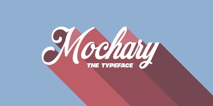 A beautiful and high-quality script font with contextual and stylistic alternates and ligatures.
 - Christmas Memories by Ake,
$12.00 Christmas Memories is a beautiful, well balanced and stylish script font. It is defined by smooth curves and is perfect for fashion branding or editorial designs. Add it confidently to your projects, and you will love the results.
 - Respektable by PizzaDude.dk,
$15.00 Respektable is random and funky ant the same time, and even though all letters are super legible, the font has this unpredictable feeling to it. Each letter has 5 different versions that vary in width and stroke weight.
 - Electrasonic by Device,
$29.00 Electrasonic is a neon linking script in fine, X fine and XX fine weights that whispers slyly of louche backstreet glamour and medicinally strong day-glo cocktails. Use with a cosmopolitan to hand and Suede on the ipod.
 - Coffee Matcha by Awan Senja,
$14.00 Coffee Matcha is a Lovely script font. It features a modern and elegant style that will take your designs to the next level. Whether you�re looking for fonts for Instagram or calligraphy scripts for DIY projects, Coffee Matcha will turn any creative idea into a true piece of art!
 - Cyan by Wilton Foundry,
$29.00The design of Cyan was inspired by features found in classic Roman and styles like Trajan and Bodebeck. It shows the designer's personal preference for geometric Roman proportions while incorporating open centers (B,P,R) and compact serifs. Unlike Trajan, Cyan has lowercase characters in the regular version. The characters stay true to the same features as the capitals, resulting in an unusually distinctive style. The Regular Capitals version contains Roman numerals. Cyan's weight is similar to Trajan's but the horizontal strokes are slightly bolder resulting in better legibility for small sizes, especially for lowercase characters. There are many subtle details in Cyan that become more interesting in larger sizes, for instance the subtle curves in the serifs and the overall smoothness as a result of the mostly rounded angles. Cyan is a robust font that will exceed expectations in areas never explored before. The name is inspired by the Greek word cyan, meaning "blue". The color cyan can have many different variations. One definition is a color made by mixing equal amounts of green and blue light (it also is a pure spectral color). As such, cyan is the complement of red: cyan pigments absorb red light. Cyan is sometimes called blue-green or turquoise and often goes undistinguished from light blue. Obviously the Cyan family is a perfect companion to the Cyan Sans family. - Luba by Linotype,
$41.99 Luba is a multi-script text family designed by Hendrik Moeller. The family includes four weights: Light, Regular, Medium, and Bold. Each of these fonts may be purchased with both Latin and Cyrillic script coverage, or with support for just the Latin script. Moeller initially developed Luba to assist speakers of languages using the Latin script who are just embarking upon learning a language that uses the Cyrillic script, i.e., French, Germans, or Italians who are learning Russian or Ukrainian. Luba's letters place significant emphasis on their identifying elements; clear forms and a relaxed style help familiarize the reader with the foreign glyphs. The typeface makes clear distinctions between Latin and Cyrillic letters, without covering up their shared heritage.
 - Herbarium by Gustav & Brun,
$16.00 A colorful floral book that I found at a flea market inspired me to make the font Herbarium. What started as floral letter illustrations in 2009 has now developed into a writable font. My main intention was to make each letter like a little artwork so that they all could fit as a drop cap. Herbarium is also a good choice for headlines.
 - Okay Cotton by Okaycat,
$29.95 Okay Cotton is soft & gentle -- specially made for situations where a pointy hard-edged font just isn't up to the job. This font is extra-soft but stays true to form -- delivering your message with clarity. The small details make Okay Cotton friendly & inviting. Okay Cotton is extended, containing West European diacritics & ligatures, making it suitable for multilingual environments & publications.