10,000 search results
(0.04 seconds)
- Panther Hunter by Zeenesia Studio,
$16.00 Panther Hunter is a hand lettered script font. It has an elegant and smooth style and is perfect for making any design stand out. Best suitable for branding, logotype, packaging, print titles, tshirt design, food design, and similar projects. I created more than 70 stylistic alternates and some natural ligatures to make this font very classy and look so classy.
 - The overthinkers by Joanne Marie,
$26.00 The overthinkers is a semi script hand lettering font for all of your hand lettering designs! With two sets of uppercase glyphs, three sets of lowercase and over 230 ligatures no two words will be same! So your designs will truly look hand lettered. With so much choice be careful not to overthink your designs ;). This font is perfect on it’s own or you may like to use it with your existing hand lettering fonts. Go ahead and try it out - it’ll compliment any design! It’s perfect for merchandise and food packaging, book designs, logos and much more.
 - Leronine by Wildan Type,
$15.00 Leronine is an elegant, modern and contrast sans-serif font. It includes upright and Oblique style. This is perfect for any project, it is contrasted, modern and easy to read. With it, you can create logos, use in advertising, packaging, book covers and magazines, headings, descriptions and much more. Leronine includes stylistic alternates and ligature. with them, you can change the style of your project and add personality to it and make it more stylized.
 - Kowalski2 by GRIN3 (Nowak),
$28.00 Kowalski2 is a decorative, serif, hand-drawn font. It can be used for invitations, greeting cards, posters, advertising, weddings, books, menus etc. The inspiration came from the beautiful font Desire designed by Charles Borges de Oliveira. Kowalski2 Pro is the most complete style, it contains all the alternates and ligatures. To get the alternate glyph just add "+“, ”=" or "*" before the letter in any OpenType savvy application or manually select the characters from Glyph Palette. Kowalski2 Basic has the basic character set with 345 glyphs and no alternates. Kowalski2 A, Kowalski2 B and Kowalski2 C have less glyphs than the Pro one, they only contain some selected alternates and ligatures. Language support includes Western, Central and Eastern European character sets, as well as Baltic and Turkish languages.
 - MFC Patisserie Monogram by Monogram Fonts Co.,
$19.95 The source of inspiration for MFC Patisserie Monogram is a letter set from the book, "Letters and Lettering" by Paul Carlyle & Guy Oring, published in 1938. This elegant decorative style was shown as Capitals & Numerals only, but we've expanded it out to include Capitals, Smallcaps, Numerals, an Ampersand, and ornamental parenthesis, brackets, and braces. MFC Patisserie Monogram can create one, two, or three letter monograms as well as basic headline and titling settings. It is a refined look that is as darling as it is delicate. The numeral set and bullet dividers allow for more detailed and personalized monograms. If you want an even more customized look, you can add any of a handful of brackets, braces, or parenthesis to surround your monograms in a complimenting style.
 - Tenement JNL by Jeff Levine,
$29.00 A 1916 book entitled “Lettering” by Thomas Woods Stevens features a number of hand lettered alphabets; some plain, others unique. One of the more novel examples was designed by Harry Lawrence Gage and featured letters and numbers with a crude, wavy style described in the book as “adapted to wood block and linoleum cutting”. To keep the design as close to the original as possible, the image from the book page was auto-traced, with each character given just enough of a clean-up as to retain its own quirkiness while smoothing out any jagged lines and fixing some curves. From there, other necessary characters were created for the digital font, and the end result is Tenement JNL, which is available in both regular and oblique versions.
 - Calisia by Sensatype Studio,
$15.00 A serif that we created special for elegant branding needs, with extra ligature and alternates in unique shape will be ready to add value of your brand. It so nice to leverage designer or product owner that need solutions to make their design look more classy and modern. And specially for Calista font, We prepared any ligatures, and any alternate characters to help you create unlimited variations for your creative needs. Calisia sans serif font ready with: Any options to get creative variations (combination of Alternate and Ligatures) Ready 3 Weights (Light, Regular, and Bold) Preview as a inspirations that you can do with Calisia font Ready with Lowercase and Uppercase characters Wish you enjoy our font. :)
 - Longevity by Fikryal,
$22.00 Introducing the stunning Longevity Bold Script Font, a true masterpiece of typography that will bring elegance and sophistication to any design project. Crafted with the utmost attention to detail, this font boasts an exquisite hand-lettered script style, complete with bold strokes and delicate flourishes that add a touch of luxury to any text. Its timeless design ensures that it will remain a classic for years to come, while its versatility allows it to adapt to any design concept, from wedding invitations to product packaging. The Longevity Bold Script Font is perfect for designers looking to make a bold statement, whether it’s on a website, brochure, or social media post. Its bold and confident appearance exudes a sense of strength and power, making it ideal for branding projects, logos, and headlines. With its sleek and stylish aesthetic, this font is sure to impress your clients and elevate your design work to new heights. So why settle for ordinary when you can have extraordinary? Choose the Longevity Bold Script Font and create designs that will stand the test of time. Feature : Longevity alternates multilingual support If you have any questions please don’t hesitate to contact me Thank you best regards, Fikryal Studio
 - Agustus Signature by IbraCreative,
$14.00 Agustus Signature is a sophisticated and stylish font that embodies elegance and refinement. Drawing inspiration from the grace and poise of a personalized signature, Agustus Signature delivers a timeless and luxurious feel to any design. Each letter is meticulously crafted with intricate curves and fine details, mirroring the fluid strokes of a genuine signature. This font is perfect for high-end branding, luxury products, and exclusive invitations, adding a touch of prestige and class to any project. With its versatile nature, Agustus Signature seamlessly adapts to a wide range of creative applications, showcasing its impeccable style and leaving a lasting impression of sophistication and distinction
 - Resita by Andfonts,
$17.00 Introducing Resita, a sophisticated and elegant Serif font perfect for adding a touch of luxury to your design projects. Resita's thin strokes and delicate curves create a refined and modern look that is perfect for luxury branding, editorial design, and high-end fashion projects. With its unique and distinctive letterforms, Resita stands out from other Serif fonts and adds an air of sophistication and refinement to any design. Its legibility and versatility make it a great choice for a wide range of design applications, from elegant wedding invitations to stylish fashion magazines. Resita is also versatile and easy to work with, making it a great choice for both print and digital projects. Whether you're creating a logo, designing a website, or working on a branding project, Resita's timeless elegance and sophistication will help you create stunning designs that stand out from the crowd. Choose Resita for your next design project and experience the benefits of this luxurious and refined Serif font.
 - Final Parade by Putracetol,
$24.00 The Final Parade - Luxury And Elegant Font Duo is a harmonious combination of two fonts that complement each other beautifully. The first font is a luxurious serif font with strong and commanding characters, while the second font is an elegant signature font with long swashes at the end of each letter, adding an extra touch of sophistication. These fonts can be used individually for distinct purposes or together as a duo, offering versatility for various design needs. Ideal for quotes, logos, product packaging, business names, wedding materials, invitations, greeting cards, posters, and magazines, this font duo adds a touch of luxury and elegance to any project.
 - Firehell by Zamjump,
$21.00 Introducing Fire Hell – a fiery font inspired by the intensity of death metal. With flames dancing within each letter, this font is tailor-made for death metal, black metal, gothic, horror, and other heavy music genres. The sharp, angular design adds a touch of darkness, making it the perfect visual companion for bands seeking a fierce and impactful typographic identity. Unleash the power of Fire Hell to set your artwork ablaze and embody the relentless spirit of heavy music. Ignite the darkness with this visually striking font! Fire Hell features: Allcaps Beginning Uppercase alternate Ending Uppercase alternate Numbers and punctuation PUA Encoded Characters OpenType Features
 - John Sans by Storm Type Foundry,
$49.00 The idea of a brand-new grotesk is certainly rather foolish – there are already lots of these typefaces in the world and, quite simply, nothing is more beautiful than the original Gill. The sans-serif chapter of typography is now closed by hundreds of technically perfect imitations of Syntax and Frutiger, which are, however, for the most part based on the cool din-aesthetics. The only chance, when looking for inspiration, is to go very far... A grotesk does not afford such a variety as a serif typeface, it is dull and can soon tire the eye. This is why books are not set in sans serif faces. A grotesk is, however, always welcome for expressing different degrees of emphasis, for headings, marginal notes, captions, registers, in short for any service accompaniment of a book, including its titlings. We also often come across a text in which we want to distinguish the individual speaking or writing persons by the use of different typefaces. The condition is that such grotesk should blend in perfectly with the proportions, colour and above all with the expression of the basic, serif typeface. In the area of non-fiction typography, what we appreciate in sans-serif typefaces is that they are clamorous in inscriptions and economic in the setting. John Sans is to be a modest servant and at the same time an original loudspeaker; it wishes to inhabit libraries of educated persons and to shout from billboards. A year ago we completed the transcription of the typefaces of John Baskerville, whose heritage still stands out vividly in our memory. Baskerville cleverly incorporated certain constructional elements in the design of the individual letters of his typeface. These elements include above all the alternation of softand sharp stroke endings. The frequency of these endings in the text and their rhythm produce a balanced impression. The anchoring of the letters on the surface varies and they do not look monotonous when they are read. We attempted to use these tricks also in the creation of a sans-serif typeface. Except that, if we wished to create a genuine “Baroque grotesk”, all the decorativeness of the original would have to be repeated, which would result in a parody. On the contrary, to achieve a mere contrast with the soft Baskerville it is sufficient to choose any other hard grotesk and not to take a great deal of time over designing a new one. Between these two extremes, we chose a path starting with the construction of an almost monolinear skeleton, to which the elements of Baskerville were carefully attached. After many tests of the text, however, some of the flourishes had to be removed again. Anything that is superfluous or ornamental is against the substance of a grotesk typeface. The monolinear character can be impinged upon in those places where any consistency would become a burden. The fine shading and softening is for the benefit of both legibility and aesthetics. The more marked incisions of all crotches are a characteristic feature of this typeface, especially in the bold designs. The colour of the Text, Medium and Bold designs is commensurate with their serif counterparts. The White and X-Black designs already exceed the framework of book graphics and are suitable for use in advertisements and magazines. The original concept of the italics copying faithfully Baskerville’s morphology turned out to be a blind alley. This design would restrict the independent use of the grotesk typeface. We, therefore, began to model the new italics only after the completion of the upright designs. The features which these new italics and Baskerville have in common are the angle of the slope and the softened sloped strokes of the lower case letters. There are also certain reminiscences in the details (K, k). More complicated are the signs & and @, in the case of which regard is paid to distinguishing, in the design, the upright, sloped @ small caps forms. The one-storey lower-case g and the absence of a descender in the lower-case f contributes to the open and simple expression of the design. Also the inclusion of non-aligning figures in the basic designs and of aligning figures in small caps serves the purpose of harmonization of the sans-serif families with the serif families. Non-aligning figures link up better with lower-case letters in the text. If John Sans looks like many other modern typefaces, it is just as well. It certainly is not to the detriment of a Latin typeface as a means of communication, if different typographers in different places of the world arrive in different ways at a similar result.
 - Gathenbury by Viswell,
$14.00 Gathenbury is a playful and fancy script font with a serious vibe. Use it to add an authentic charm to any design project!
 - Laudiea by Nissa Nana,
$19.00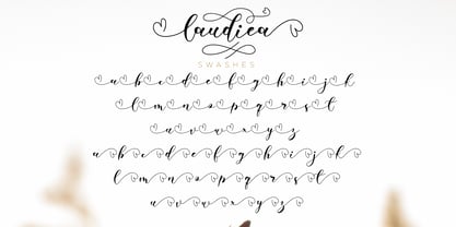 Laudiea is a beautiful script font with a classy, elegant, and modern look. It will add a handwritten touch to any design project!
 - Lambola by ARToni,
$12.00 Lambola is a casual and smooth handwritten font with a playful vibe. Us it to add a personal touch to any design idea!
 - Falange by Vozzy,
$10.00 Introducing a hand-drawn bone-style label font named "Falange". Typeface includes five styles and contains a huge additional and multilingual characters. This font will good viewed on any retro design like poster, t-shirt, label, logo etc.
 - Chive Turkey JNL by Jeff Levine,
$29.00Chive Turkey JNL is a solid version of Jeff Levine's inline font, Toucan Tango JNL. This bold and sassy sans serif has the great retro look of hand lettering and can really add some punch to ad copy. - Jimbatz NF by Nick's Fonts,
$10.00Frantic, man, and solid, Jackson! This crazy-quilt collection of dingbats inspired by the works of famed album-cover artist Jim Flora will add spice, zing and a certain je ne sais quoi to any project they grace. - Spooky Adventure by AEN Creative Studio,
$15.00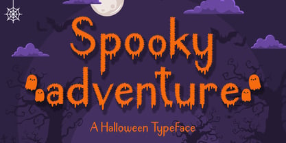 Spooky Adventure is a cool-lettered and spooky decorative font. It is perfectly suitable for any Halloween-related project or crafty idea. Add it confidently to your favorite creations and let yourself be amazed by the outcome generated!
 - Blagak by Twinletter,
$18.00 Add imagination and spice to your next design project with the Blagak font. This elegant font can be used in any project. With a wide variety of fasteners and alternatives, Blagak brings a bit of vintage charm to any design project. Take a trip down memory lane with the Blagak font. This elegant font combines vintage appeal with contemporary design sensibilities to create a whimsical yet professional look. Use this font in any design project to add your own sense of nostalgia.
 - Cool Cat by Fox7,
$10.00 Cool Cat is a fun and comfortable handwritten font that is easy to read. You can use it for various projects, such as blog posts, logos, branding, ads, invitations, greeting cards, planners, photo albums, decorations, and much more. Add it to any of your designs, and enjoy the results!
 - Fondy Script by Mans Greback,
$59.00 Fondy Script is a hand-drawn brush typeface, created by Måns Grebäck during 2018. It is a bold, sporty font in high quality, with soft and rounded characteristics. The font support hundreds of languages and contains contextual and stylistic alternates. Use ¤ after any word for a decorative swash.
 - Trick or Bite by Sipanji21,
$16.00 Trick or Bite is an incredibly unique horror display font, with bite and spider webs in any characters. Add this font to your favorite Halloween themed ideas and notice how it makes them come alive. Trick or bite is perfect for posters, packaging, banners, advertising, apparel, and more.
 - Black Apostle by Chekart,
$17.00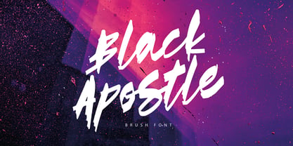 Black Apostle is a hand drawn brush font. It comes with uppercase and lowercase characters, set of punctuation glyphs, numerals, Cyrillic characters, some Cyrillic ligatures and multilingual support. Perfect for logos, quotes, posters, branding projects, product packaging, t-shirt, book cover, greeting cards and applicable for any graphic design.
 - Patternistic by Joanne Marie,
$10.00 Follow me on Instagram for weekly FREEBIES @joannemarie_cm PATTERNISTIC is a cute and fun, all caps font for any hand lettering style projects. There are 2 fonts included in this family and the uppercase are different to the lowercase (one is solid and one is outline). Have Fun!
 - Curmudgeon by Tower of Babel,
$10.00 Contrary to its name, Curmudgeon is a fun and whimsical typeface that's perfect for children's books, holiday announcements or anything that needs a charmingly playful touch. Its naive and bouncy personality will add interest to any project, whether it be a logo, packaging, or any other project that needs some quirky character.
 - Areplos by Storm Type Foundry,
$53.00To design a text typeface "at the top with, at the bottom without" serifs was an idea which crossed my mind at the end of the sixties. I started from the fact that what one reads in the Latin alphabet is mainly the upper half of the letters, where good distinguishableness of the individual signs, and therefore, also good legibility, is aided by serifs. The first tests of the design, by which I checked up whether the basic principle could be used also for the then current technology of setting - for double-sign matrices -, were carried out in 1970. During the first half of the seventies I created first the basic design, then also the slanted Roman and the medium types. These drawings were not very successful. My greatest concern during this initial phase was the upper case A. I had to design it in such a way that the basic principle should be adhered to and the new alphabet, at the same time, should not look too complicated. The necessary prerequisite for a design of a new alphabet for double-sign matrices, i.e. to draw each letter of all the three fonts to the same width, did not agree with this typeface. What came to the greatest harm were the two styles used for emphasis: the italics even more than the medium type. That is why I fundamentally remodelled the basic design in 1980. In the course of this work I tried to forget about the previous technological limitations and to respect only the requirements then placed on typefaces intended for photosetting. As a matter of fact, this was not very difficult; this typeface was from the very beginning conceived in such a way as to have a large x-height of lower-case letters and upper serifs that could be joined without any problems in condensed setting. I gave much more thought to the proportional relations of the individual letters, the continuity of their outer and inner silhouettes, than to the requirements of their production. The greatest number of problems arose in the colour balancing of the individual signs, as it was necessary to achieve that the upper half of each letter should have a visual counterbalance in its lower, simpler half. Specifically, this meant to find the correct shape and degree of thickening of the lower parts of the letters. These had to counterbalance the upper parts of the letters emphasized by serifs, yet they should not look too romantic or decorative, for otherwise the typeface might lose its sober character. Also the shape, length and thickness of the upper serifs had to be resolved differently than in the previous design. In the seventies and at the beginning of the eighties a typeface conceived in this way, let alone one intended for setting of common texts in magazines and books, was to all intents and purposes an experiment with an uncertain end. At this time, before typographic postmodernism, it was not the custom to abandon in such typefaces the clear-cut formal categories, let alone to attempt to combine the serif and sans serif principles in a single design. I had already designed the basic, starting, alphabets of lower case and upper case letters with the intention to derive further styles from them, differing in colour and proportions. These fonts were not to serve merely for emphasis in the context of the basic design, but were to function, especially the bold versions, also as independent display alphabets. At this stage of my work it was, for a change, the upper case L that presented the greatest problem. Its lower left part had to counterbalance the symmetrical two-sided serif in the upper half of the letter. The ITC Company submitted this design to text tests, which, in their view, were successful. The director of this company Aaron Burns then invited me to add further styles, in order to create an entire, extensive typeface family. At that time, without the possibility to use a computer and given my other considerable workload, this was a task I could not manage. I tried to come back to this, by then already very large project, several times, but every time some other, at the moment very urgent, work diverted me from it. At the beginning of the nineties several alphabets appeared which were based on the same principle. It seemed to me that to continue working on my semi-finished designs was pointless. They were, therefore, abandoned until the spring of 2005, when František Štorm digitalized the basic design. František gave the typeface the working title Areplos and this name stuck. Then he made me add small capitals and the entire bold type, inducing me at the same time to consider what to do with the italics in order that they might be at least a little italic in character, and not merely slanted Roman alphabets, as was my original intention. In the course of the subsequent summer holidays, when the weather was bad, we met in his little cottage in South Bohemia, between two ponds, and resuscitated this more than twenty-five-years-old typeface. It was like this: We were drinking good tea, František worked on the computer, added accents and some remaining signs, inclined and interpolated, while I was looking over his shoulder. There is hardly any typeface that originated in a more harmonious setting. Solpera, summer 2005 I first encountered this typeface at the exhibition of Contemporary Czech Type Design in 1982. It was there, in the Portheim Summer Palace in Prague, that I, at the age of sixteen, decided to become a typographer. Having no knowledge about the technologies, the rules of construction of an alphabet or about cultural connections, I perceived Jan Solpera's typeface as the acme of excellence. Now, many years after, replete with experience of revitalization of typefaces of both living and deceased Czech type designers, I am able to compare their differing approaches. Jan Solpera put up a fight against the digital technology and exerted creative pressure to counteract my rather loose approach. Jan prepared dozens of fresh pencil drawings on thin sketching paper in which he elaborated in detail all the style-creating elements of the alphabet. I can say with full responsibility that I have never worked on anything as meticulous as the design of the Areplos typeface. I did not invent this name; it is the name of Jan Solpera's miniature publishing house, in which he issued for example an enchanting series of memoirs of a certain shopkeeper of Jindrichuv Hradec. The idea that the publishing house and the typeface might have the same name crossed my mind instinctively as a symbol of the original designation of Areplos - to serve for text setting. What you can see here originated in Trebon and in a cottage outside the village of Domanín - I even wanted to rename my firm to The Trebon Type Foundry. When mists enfold the pond and gloom pervades one's soul, the so-called typographic weather sets in - the time to sit, peer at the monitor and click the mouse, as also our students who were present would attest. Areplos is reminiscent of the essential inspirational period of a whole generation of Czech type designers - of the seventies and eighties, which were, however, at the same time the incubation period of my generation. I believe that this typeface will be received favourably, for it represents the better aspect of the eighties. Today, at the time when the infection by ITC typefaces has not been quite cured yet, it does absolutely no harm to remind ourselves of the high quality and timeless typefaces designed then in this country.In technical terms, this family consists of two times four OpenType designs, with five types of figures, ligatures and small capitals as well as an extensive assortment of both eastern and western diacritics. I can see as a basic text typeface of smaller periodicals and informative job-prints, a typeface usable for posters and programmes of various events, but also for corporate identity. Štorm, summer 2005 - Bright Dream by Supersemarletter,
$11.00 Bright Dream is a cute and quirky handwritten font. It will add an incredibly sweet and joyful touch to your designs. Add this beautiful font to each of your creative ideas and notice how it makes them stand out! Honestly it's works perfectly for headlines, logos, posters, packaging, T-shirts and much more. Font Features : Regular Version Character set A-Z in Uppercase and Lowercase Numerals and Punctuation Accented Characters Multiple Languange Supported Format File OTF Recomended to use in Adobe Illustrator or Adobe Photoshop with opentype feature. If you have any questions, just send me a message and I'm glad to help.
 - Chaman by Cubo Fonts,
$29.00 Chaman is a “hybrid” font. On the one hand serifless, temperate and readable, and on the other hand quick and livily as a manual script, thanks to many unexpected ligatures. Letter design is plain and functional, punctuated by dynamic elements, mostly in ligatures and contextual glyphs, generated at the beginning and end of the word, thanks to your software’s OpenType features. It draws inspiration from the Tibetan alphabet, originally close to our own latin alphabet, as it stems from Bhram handwriting, itself derived from Phoenician alphabet. This alternation of stright vertical lines and regular bows makes Chaman’s design stand out.
 - Amber Lemon by Supfonts,
$18.00 Amber Lemon is a cute handwritten signature font with heart and regular swashes. Perfect for greeting cards, wedding stationery, photographer watermarks logos, modern websites, apparel design and more. Amber Lemon features handwritten ligatures, beginning and end swashes for lowercase letters and heart connections Thanks so much for checking out my shop, and please get in touch if you have any questions! Amber Lemon Font Features: Full Set of standard alphabet and punctuation Extra set of beginning and ending swashed lowercase Extra set of heart connections handwritten ligatures PUA Encoded - no special software needed to access extra characters Multilingual Characters AÁĂÂÄÀĀĄÅÃÆBCĆČÇĊDÐĎĐEÉĚÊËĖÈĒĘẼFGĞĢĠḠHĦIIJÍÎÏİÌĪĮĨJKĶLĹĽĻŁMNŃŇŅÑ OÓÔÖÒŐŌØÕŒPÞQRŔŘŖSŚŠŞȘẞTŤŢȚUÚÛÜÙŰŪŲŮŨVWẂŴẄẀXYÝŶŸỲỸZŹŽŻ aáăâäàāąåãæbcćčçċdðďđeéěêëėèēęẽfgğģġḡhħiıíîïìijīįĩjȷkķlĺľļłmnńňņñoóôöòőōøõœpþ qrŕřŗsśšşșßtťţțuúûüùűūųůũvwẃŵẅẁxyýŷÿỳỹzźžż
 - Cherile by Flawlessandco,
$9.00 Introducing "Cherile" - a lively and playful handwritten font that injects a sense of fun and joy into your designs. With its whimsical letterforms and energetic strokes, Cherile adds a delightful and carefree vibe to any project. There's some connected letters and some alternates that suitable for any graphic designs such as branding materials, t-shirt, print, business cards, logo, poster, t-shirt, photography, quotes .etc This font support for some multilingual. Also contains uppercase A-Z and lowercase a-z, alternate character, numbers 0-9, and some punctuation. If you need help, just write me! Thanks so much for checking out my shop!
 - Eve Adam by HIRO.std,
$16.00 Eve Adam is a lovely script font. This font describes about elegant, classy, dynamic, stylish, catchy, feminist, easy to use and will bring a good harmony when the letters are connected and paired each other. FEATURES - Support Opentype Features - Support Ligatures - Uppercase beginning swash - Lowercase beginning and ending swash - Numbering and Punctuations - PUA Encoded Characters - Connecting heart - Multilingual Support - Works on PC or Mac USE Delissa Beauty works great in any wedding invitations, branding, logotype, quotes and any projects that need lovely script taste.
 - Hello Snow Swash by Stefani Letter,
$14.00 Hello Snow is a sweet and snowy display font with a magical feel. Each of its letters is covered in snow, making it the ideal font for any Winter-project! It embodies playfulness and authenticity and is the perfect choice for any children's activity, Christmas, thanksgiving, poster, logo, packaging, or school project. Fall in love with its incredibly adaptable style and use it to create amazing designs! Add this beautiful display font to each of your creative ideas and notice how it makes them stand out!
 - Sandstone by Cititype,
$16.00 'Sandstone' is a signature font. This font deserves to be used as a signature font collection because a natural type signature like this one is very unique and is perfect for modern branding. Perfectly used on website logos, electronic signatures, portfolios and prints for clothes, crafts and other media. The constant, flat strokes of the letters symbolized assertiveness, plus an 'end-swash' to add a sense of absolute and confident judgment. This font is equipped with ligatures to add a natural feel and supports multiple languages
 - Fragille by Silverdav,
$18.00 Fragille – Modern serif typeface This font is great for designing elegant logos, quotes, magazine covers, wedding cards, invitations, and brands. Its highly contrasting lines are best used in headlines and projects of a large type. Fragille adds timeless beauty, heavenly curves, and a classic look to any project. It is recommended to use Adobe Illustrator or Adobe Photoshop. Hope you enjoy our fonts and if you have any questions feel free to send a message & I’m happy to help
 - Anthemis by Blankids,
$17.00 Introducing Anthemis, the bold script font inspired by Bold hand lettering style. Anthemis is good for branding logotype, Packaging, poster, headline, book cover, Flyer, t-shirt design and any more. Anthemis has many alternative character and have opentype features like a stylistic alternatives, stylistic set, ligature and swash so you can mix and match like a you want.
 - Vabi Dasabi by Chekart,
$20.00 Vabi Dasabi is a unique japanese hand drawn brush font. It comes with uppercase and lowercase characters, set of punctuation marks, numbers, alternative set of latin characters and numbers, Cyrillic characters, ligatures and multilingual support. Perfect for logos, quotes, posters, branding projects, product packaging, t-shirt, book cover, greeting cards and applicable for any graphic design.
 - Chigliak by 066.FONT,
$9.99 Chigliak is a display font with a playful and extravagant style. With its daring and ornate letterforms, Chigliak attracts attention and adds a touch of nonchalance to any project. This font is perfect for creative projects such as posters, invitations or branding materials, where a lively and distinctive text finish that catches the eye is desirable. Remastered in 2022.
 - Finito by 066.FONT,
$9.99 Finito is a display font with a playful and extravagant style. With its daring and ornate letterforms, Finito attracts attention and adds a touch of nonchalance to any project. This font is perfect for creative projects such as posters, invitations or branding materials, where a lively and distinctive text finish that catches the eye is desirable. Remastered in 2022.