10,000 search results
(0.037 seconds)
- Falansia by Crowntype Studio,
$14.00 Falansia is a modern Calligraphy font created in an elegant and professional style with alternate characters. perfect font for creating signature logos and watermarks for photography studios or personal photography logos, best for initial logos or brand signatures. Falansia includes a full set of beautiful handwritten upper and lower case letters, numbers, assorted punctuation marks. All lowercase letters include starting and ending strokes, providing a realistic handwriting style.
 - Bestiario by Intellecta Design,
$27.50 John Seddon (1644-1700), was a famous english writing master, the leading calligrapher of his time, and master of Sir John Johnson’s Free Writing School in Priest’s Court, Foster Lane. His portrait was drawn by William Faithorne and was engraved by John Sturt as the frontispiece for his copy-books, such as ‘The Ingenious youth’s companion’ of c.1690 and 'The pen-man’s paradise' of c.1695. These were engraved after his work by others. Your extra-rare book - "The Pen-mans Paradise Both pleasent & Profitable OR Examples of all ye usuall hands of this Kingdome. Adorn'd with variety of ffigures an Flourishes done by Command of hand. Each ffigure being one continued & entire Track of the pen most where of may be struck as well Reverse (or to answer bothwayes) as Forward", London (1965). - YES (that is the title of the book) was the starting point to these new extra accurated works of Iza W, a series of revivals of the penmanship Seddon’s artworks, animal and human kingdon inspired penmanship forms in the Bestiario font. On the other hand, his highly ornamented animal kingdon inspired capitals and alphabets in the Seddon Penmans Paradise Capitals typeface. The “SeddonsFleurons” completes the collection. Fantastic choice to elaborated barocque/renaissance inspired and historical accurated layouts.
 - Hexore by Almarkha Type,
$29.00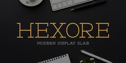 ntroducing Hexore – Modern Display Slab inspired by the famous minimalist logo, perfect for the purposes of designing templates, brochures, videos, advertising branding, logos and more.
 - Modesfa by Almarkha Type,
$33.00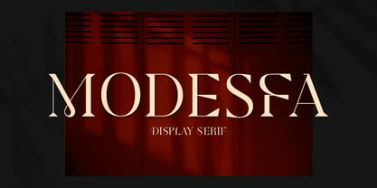 Introducing Modesfa – Modern Display Serif inspired by the famous minimalist logo perfect for the purposes of designing templates, brochures, videos, advertising branding, logos and more.
 - Quinger by Almarkha Type,
$33.00 Introducing Quinger - Unique Sans Display inspired by the famous minimalist logo perfect for the purposes of designing templates, brochures, videos, advertising branding, logos and more.
 - Luxoorea by Almarkha Type,
$25.00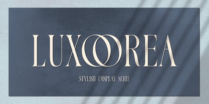 Introducing Luxoorea – Stylish Display Serif inspired by the famous minimalist logo perfect for the purposes of designing templates, brochures, videos, advertising branding, logos and more.
 - Delaproza by Almarkha Type,
$29.00 Introducing Delaproza – Modern Serif font inspired by the famous minimalist logo perfect for the purposes of designing templates, brochures, videos, advertising branding, logos and more.
 - Sangira by Almarkha Type,
$29.00 Introducing Sangira - Modern Ligature Serif inspired by the famous minimalist logo, perfect for the purposes of designing templates, brochures, videos, advertising branding, logos and more.
 - Glamorez by Almarkha Type,
$35.00 Introducing Glamorez - Luxury Display Serif inspired by the famous minimalist logo perfect for the purposes of designing templates, brochures, videos, advertising branding, logos and more.
 - Lifetime Font - Personal use only

- SPIDER-MAN:ECLIPSE - Personal use only

- MythBusters - Personal use only

- Hunky Chunk by Just My Type,
$25.00 Way back in the 1990s, the fatter the fast food generation got, the more condensed letters became. I figured when the taste in fonts started to mirror the contemporary bodily norm, Hunky Chunk should be there. Here it is.
 - Bommer Slab by dooType,
$15.00 Bommer project started in January of 2014 and I am happy to announce the first family - Bommer Slab - is now ready for release. This family includes 14 weights - being seven uprights and seven italics. This font has a strong personality, that makes it perfect for use in headline sizes but means it also works gracefully within text blocks.
 - Roncial by Fontron,
$35.00Roncial is an Ultra Bold font with a hint of serif. This is one of the fonts originally designed before the advent of digital and started out being a bolder, slightly serifed version of Folio Extra Bold which was one of the boldest fonts at the time (old metal set). It is available as Roman and Italic. - Transmogrified by PintassilgoPrints,
$24.00 Transmogrified started out as a special project for a client. It's a lovely sans serif font, casual, with sweet swirls over here and there. It is based on Transmogrifier , from which uppercase glyphs were selected. Next, new lowercase glyphs were drawn and a bold cut was also developed for added flexibility. Let your messages be transmogrified!
 - PiS HansHand Pro by PiS,
$28.00 HansHand started out in 2003 as a simple free font, the adaption of my grimy handwriting. For its 10th anniversary it got a complete overhaul and lots of new characters. Now also available in BOLD for the first time, featuring scribbles, strokes, circles and boxes to underline the fast taking-notes-while-on-the-phone look!
 - MTF Dear Santa Pro by Miss Tiina Fonts,
$9.00 If you’re writing Santa a letter, use this adorable, handwritten childlike font! Dear Santa PRO not only gives you inspiration on how to start the letter, but it also has neat and original characters. This typeface duo also comes with some cute Christmas doodles to complement your writing. Have fun, and create something spectacular this Christmas!
 - LD Underwood 5 by Illustration Ink,
$3.00This font represents the type style created by this very famous classic typewriter. - Dimitrina by Evolutionfonts,
$- Dimitrina was created with a simple premise: Can there exist a typeface which features a minimum of sharp angles? And a readable typeface, as well? With these strict rules in mind, the development started. At first the typeface looked more like a script, and some characters ( M G or R, to name a few) still hold traces of a handwritten style which spices the overall taste of Dimitrina. Since the first draft every character was redrawn, and edited several times, for the purpose of making the typeface readable, and distinct at the same time. Estimate for yourself if our goals are achieved, while you observe the three weights which are available exclusively in MyFonts. All of them feature a full set of characters plus cyrillic support. You can also try the regular weight which is offered free.
 - Rorschach by Kenn Munk,
$15.00How to use The Rorschach dingbat: q,w,e,r,t,y,u,i,o,p create the start of an inkblot a,s,d,f,g,h,j,k,l create a middle, you can use any number of middle-elements z,x,c,v,b,n,m create the ending. Your Rorschach is now finished, get analysing! - Skeletor - Personal use only

- Stina by profonts,
$41.99 profonts Stina is an cursive font based on cross stitch pattern. It can be used in (very) tall letters but it also keeps legible in smaller sizes. Because of its joined letter pairs and ligatures it keeps the flow of a "handwritten" cursive font. So, you ever felt like stitching? - Start today.
 - Bodoni by Bitstream,
$29.99 Morris Fuller Benton started the Bodoni revival with this version for ATF in the early years of the 20th century. We consider it the first accurate revival of a historical face for general use. Sturdy and a little mechanical in the 19th century tradition, this is the Bodoni series familiar to us all.
 - Antiqva by Ultramarin,
$40.00 An alphabet based on classic Roman letterforms. As a model for our typography since ancient times, Roman stone inscription remains the starting point for all Latin letterforms. Working with these classical letters is an eternal dance for the graphic artist. The constant drawing and refinement of detail. A typographical relationship for ever.
 - Angele by Angele Kamp,
$24.00 Angele is an elegant serif font with stylish curves. This beautiful serif is timeless and can not be missed in your font collection. This font collection will give your design projects that instant touch of class. Once you download this collection you will be able to start designing straight away. Have fun creating!
 - MardiKrewe PB by Pink Broccoli,
$14.00 Wild and carefree, the MardiKrewe Family is filled with spunk and personality. MardiKrewe started as a digitization of a film typeface called MardiGras by Lettergraphics. From there, this lively typeface was fleshed out to a full character set and expanded to a family of 5 widths: Extra Narrow, Narrow, Regular, Wide, and Extra Wide to fit a variety of funktastic needs.
 - Margareth Rosinante by Creative17studio,
$12.00 Introducing "Margareth Rosinante" is a modern serif font family. With luxury and sophistication that are consistent with one another. Margareth Rosinante is designed for an epic comparison between serif and script styles. The stark contrast between the Margaret Rosinante serif and the script makes this font family always suitable to be paired with in any design. Features: - Two different font types (serif and script style) -Standard basic characters -Multilingual support -Numeral and punctuation -Many ligatures (serif) -Beginning and ending swashes (script) Any questions? Jus ask. Free updates,
 - Blacksmith JNL by Jeff Levine,
$29.00What started as an image of a single vintage brass stencil of the letter 'P' spotted in an online auction has turned into Blacksmith JNL. From that single letter Jeff Levine has created a complete Western stencil font, retaining the hand-made look of the original stencil piece. - RMU Helion by RMU,
$35.00 In 1935 Schriftguss Dresden released Arno Drescher’s famous titling font Helion. This font was brought to life again and carefully extended with Baltic, Turkish and Central European character sets.
 - Bodoni Classic by Wiescher Design,
$55.00 I became interested in designing Bodoni Classic because of a lazy graphic designer at Jacques Damase publishing house. He had to change a single letter on a bookcover about J. B. BODONI. The French call him Jean Baptiste instead of Giambattista! And that unknown graphic designer just took any old “J” from some newly cut Bodoni. All the new Bodoni cuts have square serifs, whereas the originals had rounded serifs and slightly concave feet. The single letter “J” with the squared off serif was for me like a road sign to start redesigning the entire Bodoni family. That’s exactly what I started in 1993 and a dozen years later I am finished. Okay, I am still adding new Bodoni Classics, but those are my personal additions. Recently I designed a family of seven »Bodonian Script« fonts, that can be mixed with most of my Bodonis. Yours very retro, Gert Wiescher
 - Rennie Mackintosh Hillhouse by CRMFontCo,
$20.00Derived from the world famous Rennie Mackintosh Font, the Hillhouse version gives a 3D look to the genius of Charles Rennie Mackintosh. The "Hillhouse" name comes from one of Mackintosh's most famous architectural works - the Hill House in Helensburgh, Scotland. This stunning conceptual design can be visited from April to October. - Bal Harbour JNL by Jeff Levine,
$29.00Inspired by hand lettering on a 1940s toy game spotted on ebay called "Let's Go Shopping", Jeff Levine created "Bal Harbour JNL" and named it after a South Florida community famous for its luxury homes and trendy stores. - Firwaen by Twinletter,
$15.00 Introducing our newest display font FIRWAEN. This font is perfect for any Halloween, horror project, especially signs and decorations. Choose this font for your special project. This font is perfect for party projects, invitations, cards, posters, or anything else you want. Of course with this font your various design projects will be perfect and amazing, get a beautiful title and start using our font for your special project.
 - Litter Funk by PizzaDude.dk,
$15.00 You may already have guessed it...Litter Funk is experimental typography. Some letters are fat blocks, others have stars, stripes or dots, some are funny and funky while others are plain weird - but all in all, they leave a really nice confusing effect when used. Due to the contextual alternates, each letter comes in 5 different versions, and automatically cycle as you type. Well, the font was fun to make - I hope you have fun using it! :)
 - Output Volume by Hanoded,
$15.00 I recently bought a small, portable speaker. I can now listen to music when I am making fonts! Output Volume is a name I came up with after reading the quick start guide that came with the speaker. Output Volume is a 100% handmade display font - it was based on a protest sign, but after a few glyphs it started to morph into something unique. I created 2 sets of contextual alternates (including the most used accented glyphs), that will cycle as you type. I also added some discretionary ligatures, to get an even more random effect. Output Volume comes with a vast array of accented letters, including Vietnamese.
 - Silent Movies JNL by Jeff Levine,
$29.00 An ad in the Oct. 27, 1919 issue of the trade magazine “The Moving Picture World” promoted “Princess Virtue” from Bluebird Pictures starring Mae Murray – The Adorable [as noted by the movie studio in the ad]. The Art Nouveau hand lettering emulated the style usually drawn with a round nib pen, but was given a specialized treatment for the ad. It was re-drawn in a more traditional ‘pen nib’ look for digital revival. The end result is Silent Movies JNL, which is available in both regular and oblique versions.
 - Unlikely by PizzaDude.dk,
$20.00 This all started as a bunch of letter written using a squared paper as a guide. It all turned out fine, but there was something that wasn't quite right...it was boring! I took all the letters and grunge it all up and did all the drips as well - and suddenly that boring look was gone! That was an unlikely development!
 - ITC Dinitials by ITC,
$29.99ITC Dinitials is the work of German designer Helga Joergensen. When I started drawing the first of them, I was very much inspired by dinosaurs, but during the work my fantasy guided me more and more and then became rather fabulous creatures." ITC Dinitials is a capital letter alphabet available in both black on white and white on black weights." - Nebulous Promise by Kitchen Table Type Foundry,
$16.00 This font was called differently when I started out building it, but after a long and insightful conversation with a good friend, I decided to call it Nebulous Promise. Nebulous Promise was made using a broken satay skewer (I like using those!) and Chinese ink. It comes with a full set of alternates for the lower case letters and extensive language support.


