10,000 search results
(0.037 seconds)
- Certiveit by Ridtype,
$28.00 Certiveid is a serif display font inspired by the history of peace in the Third Crusade (1189–1192). Therefore, with a modern classic touch and combined with some serif (pointed) ornaments that signify this font is sharp, dashing, and bold, This font also has complementary ornaments such as arrows sign, enclosed alphanumerics, fractions, and ligatures, which function as a complement to text works as well as in support as a design if needed. Thanks for your support of our product, and using it in your project.
 - King Tut by Canada Type,
$24.95 King Tut is a restoration and expansion of the original Egyptian Expanded, a single bold face cut in 1850 by Miller & Richard, the famous Edinburgh founders. This aesthetic, though originally issued to help drive simple print advertising of those days, is perhaps the longest lasting genre of typeface. This aesthetic flourished in the later part of the 19th century, helped by the surge of similar faces from England (such as Figgins' Antique 6 and Expanded Antique), and became the defining index of the old American wild west that continues to this very day. King Tut serves up its impact through a balance between the wide, compact letterforms and elegant curvature that manages to come through even in confined areas. The family's weight variety allows for more options in counterspace use as well as precision in the amount of curve definition and contrast needed by the typographer. The lighter weights completely oppose that 19th century boldness and expose the alphabet's skeleton in a strive for simplicity that fits modern applications. With generous language support to boot, King Tut's diverse offerings make it an essential addition to today's designer repertoire.
 - Aviano Future Variable by insigne,
$99.99 Because you demanded it, the Aviano series is back with a variable version of the futuristic sans serif Aviano Future. Aviano Future’s strong letterforms will make you look like a rock star. Aviano Future Variable is a medium-contrast sans serif titling face that has a bold and futuristic look. It has a bowed square shape which gives it an interesting appearance that is both unique and eye-catching. Given that it has a variable axis any weight can be selected with no loss of clarity or legibility. Aviano Future's expanded forms give the letterforms heft and intensity. Aviano Future is a powerful yet adaptable title face that builds on the award-winning traits of Aviano and elevates them. Aviano Future Variable contains a ton of OpenType capabilities and comes in ten different defined weight instances with "fast" italic forms for emphasis. Want to use more traditional rounded forms? Need swash forms? Art Deco alternates? Aviano Future includes 400 alternate characters. Twelve style sets are available, two sets of art deco inspired alternates, small forms, tough swash, constructivist titling and traditional stylistic alternates. Aviano Future also includes 40 discretionary ligatures for artistic typographic compositions. Additionally, there are glyphs in this family to accommodate a variety of languages, and Cyrillic support was added in 2022. An extensive selection of sans serif typographic systems can be found in the Aviano family. The typefaces can be used alone or in combination to suit the needs of any project. The family's fonts have all been meticulously designed to assist ensure maximum impact and usability at any size. Aviano, Aviano Serif, Aviano Sans, Aviano Didone, Aviano Flare, Aviano Copper, and Aviano Slab are presently part of the Aviano collection. A skilled designer who wishes to create a technological, futuristic, or epic design should consider Aviano Future. Aviano Future Variable will make your design stand out from the competition, regardless of whether you are designing a logo, poster, flyer, website header, or banner ad. Why wait? With the exciting and versatile Aviano Future Variable at your disposal, reach new heights and create a brand that stands out from the rest.
 - Sportzan by Pixesia Studio,
$19.00 Introducing Sportzan - A Sporty Display Font Sportzan, as its name, is a sport font. Sportzan brings you the kind of cheerful and sporty vibes which spreads the playful energy for the game. Sportzan is designed to have sharp-corners to express the strength. With its bold design, sportzan will be suitable to be associated to any kind of sport product such as poster, jersey design, sport-slogan, and any writing which needs a strong-bold vibe. FEATURES - PUA Encoded - Uppercase and Lowercase letters - Numbering and Punctuations - Multilingual Support - Works on PC or Mac - Simple Installation - Support Adobe Illustrator, Adobe Photoshop, Adobe InDesign, also works on Microsoft Word Hope you Like it. Thanks.
 - Tropical Thunder by Omotu,
$16.00 DETAILS Tropical Thunder! A monoline script font with 2 styles, clean and stamped. Tropical Thunder font is perfect for branding, logotype, apparel, T-shirt, Hoodie, product packaging, quotes, flyer, poster, etc. Whats Include? 1. Uppercase and lowercase characters 2. Supports international languages 3. Numerals, punctuations, titling, stylistic alternates, and ligarures 4. Accessible in the Adobe Illustrator Glyphs panel, or under Stylistic Alternates in the Adobe Photoshop OpenType menu, Adobe InDesign, Corel Draw, even work on Microsoft Word. Please message me if you're unsure of any language support. Thanks for looking, and I hope you enjoy it! Please don't hesitate to drop me a message if you have any issues or queries. Omotu
 - Kontext H by Elster Fonts,
$20.00 Imagine a font that is easier to read the smaller it is – or the further away the text is. There are already many line screen fonts, I wanted to take it to the extreme and use as few lines as possible, while keeping the grid of the fonts metrics. The result is a typeface that lives up to its name. Each individual line makes no sense on its own; individual letters are only recognisable in the context of all associated lines, individual letters are most likely to be recognised in the context of whole words. Attached to a building wall, text would be readable from a great distance and become increasingly difficult to decipher the closer you get to the building. Placed on the ground or on a large flat roof, text would only be readable from an aeroplane or - depending on the size - in Google Earth. Kontext has old style figures, superscript numerals, case-sensitive questiondown and exclamdown and an alternative ampersand, 390 glyphs at all. Use the same value for font size and line spacing to keep the lines in the grid, or change the line spacing in 10% steps. Change the spacing in 100-unit or 25-percent increments increments to keep the grid. The »H« in the font name stands for horizontal (lines). The numbers in the font name refer to the brightness of the background and letters themselves, with the first number describing the background and the second the letters. Starting with »00« (white) to »200« (dark) See also my Family Kontext Dot
 - Kontext V by Elster Fonts,
$20.00 Imagine a font that is easier to read the smaller it is – or the further away the text is. There are already many line screen fonts, I wanted to take it to the extreme and use as few lines as possible, while keeping the grid of the fonts metrics. The result is a typeface that lives up to its name. Each individual line makes no sense on its own; individual letters are only recognisable in the context of all associated lines, individual letters are most likely to be recognised in the context of whole words. Attached to a building wall, text would be readable from a great distance and become increasingly difficult to decipher the closer you get to the building. Placed on the ground or on a large flat roof, text would only be readable from an aeroplane or - depending on the size - in Google Earth. Kontext has old style figures, superscript numerals, case-sensitive questiondown and exclamdown and an alternative ampersand, 390 glyphs at all. Use the same value for font size and line spacing to keep the lines in the grid, or change the line spacing in 10% steps. Change the spacing in 50-unit or 25-percent increments to keep the grid. The »V« in the font name stands for vertical (lines). The numbers in the font name refer to the brightness of the background and letters themselves, with the first number describing the background and the second the letters. Starting with »00« (white) to »200« (dark) See also my family Kontext Dot
 - Hernández Niu by Latinotype,
$29.00 In the typedesign industry the terms ‘nova’, ‘neue’, ‘next’, ‘new’ are often used to refer to a typeface that has been modified in different ways: redesign, technical readjustments, greater number of characters, etc. At Latinotype we are now starting to use the word ‘niu’ to refer to these kinds of typefaces. Niu is an adaptation of the original word ‘new’, i.e., we have adapted this English word to the phonology and spelling of our own language but keeping the original meaning. Race mixing, diversity, change and adaptation are part of the essence of Latin American culture and, at Latinotype, we are all constantly expressing these elements in everything we do. Latin Power! Hernández Niu was designed by César Araya and Daniel Hernández. The font is based on the design of Hernández Bold: the thickest weight has been adapted to fit small text better. Five new styles have been added, ranging from neutral to more expressive fonts. Hernández Niu is a display slab serif font of thickened serifs, functional expressive ink-traps and true italics. Detailed forms and counterforms allow this typeface to be used in very large sizes. Hernández Niu is well-suited for publishing, small text and headlines. A wide variety of weights make the font a perfect choice for hierarchical type-setting, branding, logotypes, magazines, etc. This font consists of 6 weights, ranging from Extra Light to Heavy, each with matching true italics. Hernández Niu comes with a set of 397 characters, making it possible to use the font in 212 different languages.
 - NorB ARCHITECT LINE by NorFonts,
$35.00 NorB Architect Line architectural fonts will add a beautiful architectural hand-lettering style to all your CAD project drawings. Architects have always wanted their CAD drawings to look more like they were drawn by hand, rather than by a CAD program. These AutoCAD fonts are the first step in bringing back that “artistic hand-drawn” feel to your CAD drawings or any graphic design project that can use true type fonts. They even can be used with any word processing program for text and display use, print and web projects, apps and ePub, comic books, graphic identities, branding, editorial, advertising, scrapbooking, cards and invitations and any casual lettering purpose… or even just for fun! NorB Architect Line is a retracing from scratch of my "NorB Architect" font coming in a sharp and round look, featuring small caps with some long stems of the following letters: b, d, f, h, k, l so resulting in more dynamic lettering font. It comes with 8 weights: Regular Italic Bold Bold Italic Round Round Italic Bold Round Bold Italic Round Note: The Italic versions are intentionally set to 20° rather to 12° for more dynamic lettering look.
 - Quirky by Scholtz Fonts,
$19.95 The idea for Quirky was born while I was looking at a book of etchings by British artist Graham Clarke. His signature, crawling spider-like across the page, fascinated me with its casual, almost messy, inky dark and light drama. I started scribbling the alphabet as I imagined he would write it, based on his signature, then continued, adding curls, making the characters more angular, and refining the dramatic play between dark and light. Finally, Quirky appeared. Apparently casual, Quirky is, in fact, a true connected script. Quirky is characteristic of contemporary handwriting: It appears loose, angular, unstructured, and free, while maintaining good form and legibility. Its baseline is varied, creating an impression of impatient handwriting, without losing legibility. Quirky comes in five styles: condensed -- the most dramatic form, with great drama between thick and thin condensed black -- as with condensed but allows the user to provide exceptional emphasis wide -- increased readability wide black -- increased readability and emphasis splat -- messy and ink-blotted -- a hint of grunge Use Quirky for advertising, for humorous greeting cards, for a funky fashion look or tongue-in-cheek spooky media. Quirky is a fully professional font with extensive use of OpenType Ligatures. For example: most common double letter combinations such as "ee" are rendered as two, slightly different shaped "e"s. This variation in letter shapes removes the cues by which the reader identifies that he is viewing a FONT and thus conveys a strong sense of hand-lettered text. Language support includes all European character sets and has been designed to be used with the following languages: Afrikaans, Albanian, Basque, Bemba, Cornish, Danish, Dutch, English, Estonian, Faroese, Filipino, Finnish, French, Galician, Ganda, German, Icelandic, Indonesian, Irish, Italian, Kinyarwanda, Luo, Malagasy, Malay, Manx, Morisyen, North Ndebele, Norwegian Bokmål, Norwegian Nynorsk, Nyankole, Oromo, Portuguese, Romansh, Sango, Shona, Somali, Spanish, Swahili, Swedish, Swiss German and Zulu.
 - Prism by Stereotypes,
$- Prism was mainly inspired by two things, the sketches of Rudolf Koch for Prisma and the proportions of Avant Garde by Herb Lubalin. Even when the proportions and widths stay the same from ExtraLight to Black, you get the opportunity to change the weight and get a complete new look for that typeface by changing the grayscale or color. It is a modern combination for headlines, that want to have a different look.
 - Friday Freak PB by Pink Broccoli,
$16.00 Friday Freak PB is a playful font inspired by the titling of the 1976 Disney film, "Freaky Friday". This font has a slightly clumsy stumble to it, adding to its personality and appeal. From slightly weird weighting to a ligatures feature that will auto-shuffle all-caps and all-lowercase settings to have a mix of both, keeps typesetting lively. Stir things up and get a little crazy with Friday Freak today!
 - Jumble by Laura Worthington,
$29.00 Jumble is friendly and cute treat for the eyes. Jumble draws you in with its thick, curvy strokes, jaunty counters, and a whimsical variety of counterforms with no two alike. For even more variety, Jumble includes 104 alternates for plus a handful of ligatures. Jumble conveys humor and warmth without being silly; its lack of straight lines and sharp edges makes it perfect for evoking tasty treats like frosted cakes or pies, or child-friendly toys and games. See what’s included! http://bit.ly/1RDnJjY This font has been specially coded for access of all the swashes, alternates and ornaments without the need for professional design software! Info and instructions here: http://lauraworthingtontype.com/faqs/
 - Reaktif by Plasebo Studio,
$14.90 Reaktif type family has been created with a new and modern approach to the popular geometric sans serif type. It has a very legible, multifunctional, contemporary and dynamic design. Sharp-angle details in minuscule letters “a, b, d, f, g, m, n, p, q, r, t, u” boosts its' characteristics in the Reaktif font family. Reaktif type family contains 24 fonts and 550+ glyphs. Stylistic alternatives come with 30+ ligatures and many opentype features. It can meet your needs in many medium such as Reaktif branding, editorial, web and printing.
 - Rika by Thinkdust,
$10.00 Rika is a combination of supposedly male and female characteristics, combining together to create a beautifully realised, high impact, condensed typeface. The tall but well-built characters are softened with smooth curves and a mixing in of thin lines, so that the sharpness of many condensed fonts is brought under control. Suave in its application, Rika is all professionalism and elegant showmanship, great for both headlines and text. Rika comes with support for a number of languages, as well as specifically designed glyphs, and its uses might be considered limitless.
 - Atrium by Alex Jacque,
$20.00 Atrium, designed by Alex Jacque, is a strong, linear, geometric sans-serif display typeface based off century-old pen art by W.E. Dennis. Atrium's stubbornly geometric letterforms are set off with a few softening flourishes on a few glyphs. It's sharp corners, straight verticals and horizontals make Atrium pack some punch when used in headlines, pull quotes, and logotypes. Atrium was released in 2012 in OpenType format and comes in three different weights: light, regular, and bold, with a regular and oblique version of each for a total of 6 styles in the family.
 - Autor by Latinotype,
$29.00 Autor is a medium-contrast sans serif font with a dynamic stroke modulation. Its clean look and angled terminals give your designs a ‘sharp’ and contemporary feel. Autor Family comes in 7 weights, ranging from Thin to Black, with matching italics, resulting in a total of 14 styles. Autor is well-suited for editorial design, body text in books and magazines, headers and titles. It can also be used—as a display font—for logotypes, branding, advertising and publishing. The font includes a character set containing more than 400 glyphs that support over 200 languages.
 - Arona by Peninsula Studioz,
$4.99 Arona is a modern geometric sans typeface tailored to elevate all your design projects, from UI and app design to web design, branding, posters, magazines, infographics, packaging, and beyond. With its sharp yet rounded strokes, Arona effortlessly radiates both professionalism and friendliness. Boasting 12 font weight variations, Arona excels in delivering a multi-level content hierarchy in your design, ensuring your value is communicated clearly and easily. Key features: Extended language support Small capitals Mathematical symbols Currency symbols Alternate stylish letters Directional arrows Fraction support Special ligatures Numerator and Denominator support
 - Viktors Littl Creepy Horror by TypoGraphicDesign,
$19.00 CHARACTERISTICS The dark and sharp character of the typeface is a very unique atmosphere. The letter-forms can with broken trees, rotten and old and branches are associated. The partially pointed edges remind thorns (bushes) a rose. APPLICATION AREA The edgy, contrasty horror and fantasy font »Viktors Littl Creepy Horror« would look good at display size for headlines in magazines or websites, movie posters, music covers or webbanner. TECHNICAL SPECIFICATIONS Headline Font / Display Font / Fancy Font »Viktors Littl Creepy Horror« OpenType Font with 354 glyphs - alternative letters and ligatures (with accents & €) & 1 style (regular)
 - Aceh by 38-lineart,
$17.00 Aceh is a geometric sans serif font family, we make it in sharp and soft shapes, in the form of Upright with matching Oblique. Aceh consists of 9 weight, Black is the most appear strong and powerful, while thin looks more clean and modern. Aside from being a text font, we also intend this font for branding purposes, appearing more elegantly dynamic and reflecting a dynamic lifestyle. Modern, Clean, Readable and powerful are the basic concepts of this font. With a choice of 36 fonts, we believe your brand will stand out
 - Barnic Slab by Peninsula Studioz,
$9.00 Barnic Slab is a modern geometric slab typeface tailored to elevate all your design projects, from UI and app design to web design, branding, posters, magazines, infographics, packaging, and beyond. With its sharp slab edges, Barnic Slab effortlessly radiates professionalism and trustworthiness. Boasting 12 font weight variations, Barnic Slab excels in delivering a multi-level content hierarchy in your design, ensuring your value is communicated clearly and easily. Key features: Extended language support Mathematical symbols Currency symbols Alternate stylish letters Directional arrows Fraction support Special ligatures Numerator and Denominator support
 - Fisionada by Graviton,
$24.00 Fisionada font family has been designed for Graviton Font Foundry by Pablo Balcells in 2023. It is a condensed sans serif typeface with sharp edges and a very technical aesthetics. Its condensed design makes it very effective for space economizing and its geometric features make it a very attractive choice for display usages such as futuristics logos, video games and sci-fi content. It has been conceived to be most suitable for headlines and short length text blocks. Fisionada consists of 8 styles. Each containing small caps and glyph coverage for several languages.
 - Oskal by Pesotsky Victor,
$15.00 "OSKAL" is a font that appeared as an experiment to cross the neutral grotesque and antique. The idea is to make a strange hybrid out of a simple grotesque. The serifs are added in non-standard places and make this font unusual for perception. It's a sharp and active font that you can shout at or break down walls with. OSKAL supports Basic Latin and Extended Latin, Cyrillic — in total about 90 languages are supported. The font has one Regular weight, uppercase and lowercase, punctuation. OSKAL font was designed by Viktor Pesotsky.
 - Dx Gaster by Dirtyline Studio,
$29.00 Dx Gaster is a high-contrast Serif family with a strong impact and elegant typeface. Dx Gaster offers a wide variety of combinations for you to create with. Dx Gasters multiple alternates and swashes can add extra spice to your designs. A Strong sharp typeface specially designed for beautiful titles. Dx Gaster comes with elegant style, strength, and contrasts, with features an extended Latin character set of 404 glyphs covering over 86 languages. Casta is ready to be like a top model on the design catwalk, making your projects look classic but contemporary, finely tuned but assertive, and elegant as the best luxury fashion.
 - Johny Palkons by Prioritype,
$15.00 The impression of a textured font made me excited and it crossed my mind to make this font. With 2 styles I present this font (regular and stamp) so that you can use it in your designs easily and full of inspiration. Suitable for logotype designs, posters, merchandise , social media posts, packaging, landing pages, advertisements etc. See some of the previews above for reference. Features: -Uppercase -Lowercase -Numeral -Multilingual Note: Use a program that supports the Opentype feature and the glyph panel is available, so you can see the various alternative characters available. Examples of programs such as Adobe Illustrator, Corel Draw or Inkscape. Thanks.
 - Midnight Hour - Personal use only

- Chong Old Style by Monotype,
$29.99In the tradition of Goudy Old Style and Goudy Modern, Chong Wah drew Chong Old Style™ and Chong Modern™ as visually different – but complementary – designs. According to Chong Wah, “The extended family of typefaces started as a concept rather than a preconceived design. The concept is different sans serif type styles with a common underlying structure and a clear lineage to traditional serif designs. While there are similarities between the designs, each typeface was drawn as a separate entity.” Chong Old Style has the flavor of traditional old style designs without slavishly replicating the earlier design traits. It has the heft and color of an old style design but lacks the serifs and inclined stroke axis customarily seen in these typefaces. The result is a versatile suite of typefaces that deliver a straightforward message in large or small sizes. Chong Modern is a sans serif interpretation of the classic modern, or neoclassical, designs of Bodoni and Didot. More than a Bodoni without serifs, Chong Modern also has an elegant, Art Deco demeanor. This is a design that walks the line between traditional and contemporary with grace and aplomb. Chong Wah drew his Old Style and Modern designs in Light, Regular and Bold weights, adding an Extra Bold to the Old Style. All designs benefit from harmonizing italic counterparts. Both branches of the Chong family are also available as OpenType Pro fonts, allowing graphic communicators to take advantage of OpenType’s diverse capabilities. These fonts, in addition to providing for the automatic insertion of old style figures, ligatures and small caps, also offer an extended character set supporting most Central European and many Eastern European languages - Chong Modern by Monotype,
$29.99In the tradition of Goudy Old Style and Goudy Modern, Chong Wah drew Chong Old Style™ and Chong Modern™ as visually different – but complementary – designs. According to Chong Wah, “The extended family of typefaces started as a concept rather than a preconceived design. The concept is different sans serif type styles with a common underlying structure and a clear lineage to traditional serif designs. While there are similarities between the designs, each typeface was drawn as a separate entity.” Chong Old Style has the flavor of traditional old style designs without slavishly replicating the earlier design traits. It has the heft and color of an old style design but lacks the serifs and inclined stroke axis customarily seen in these typefaces. The result is a versatile suite of typefaces that deliver a straightforward message in large or small sizes. Chong Modern is a sans serif interpretation of the classic modern, or neoclassical, designs of Bodoni and Didot. More than a Bodoni without serifs, Chong Modern also has an elegant, Art Deco demeanor. This is a design that walks the line between traditional and contemporary with grace and aplomb. Chong Wah drew his Old Style and Modern designs in Light, Regular and Bold weights, adding an Extra Bold to the Old Style. All designs benefit from harmonizing italic counterparts. Both branches of the Chong family are also available as OpenType Pro fonts, allowing graphic communicators to take advantage of OpenType’s diverse capabilities. These fonts, in addition to providing for the automatic insertion of old style figures, ligatures and small caps, also offer an extended character set supporting most Central European and many Eastern European languages - Garlic by Java Pep,
$15.00 The proudly present an elegant font that always outstanding in every your project design. Garlic font is a versatile typeface that perfect for designing a headline, title, wedding invitations, logotype, quotes, advertisements, and more. Garlic font offered 4 styles set such as regular, italic, outline regular, and outline italic so you can be combining to make a more elegant and beautiful design. What's included Garlic regular and italic (otf, ttf, and web font) Garlic Outline regular and italic (otf, ttf, and web font) Multilingual, support 17 languages If you have any questions don't hesitate to drop me a message. Stay safe, healthy, and have a nice day
 - Forgotten Playbill by Lauren Ashpole,
$15.00 Years ago, I came across a vintage playbill and was struck by its lettering. The detailed floral pattern surrounded by thick outlines stayed in my mind even though the play's name and cast have faded. I finally tried to recreate the style from memory and Forgotten Playbill is the result. While all letters are actually capitals, the uppercase rotate slightly counterclockwise and the lowercase slightly clockwise. I suggest alternating between the two to reproduce my mystery inspiration.
 - MC Gratika by Maulana Creative,
$16.00 Gratika is a Strong Sharp edges sans Display font. ExtraBold stroke, fun character with a bit of ligatures and alternates. To give you an extra creative work. Gratika font support multilingual more than 100+ language. This font is good for logo design, Social media, Movie Titles, Books Titles, a short text even a long text letter and good for your secondary text font with script or serif. Make a stunning work with Gratika font. Cheers, Maulana Creative
 - Grimblocks by Maulana Creative,
$15.00 Grimblocks is a Decorative Square Blocks font. With Sharp Bold stroke, Upright and fun character with a bit of ligatures. To give you an extra creative work. Grimblocks font support multilingual more than 100+ language. This font is good for logo design, Social media, Movie Titles, Books Titles, a short text even a long text letter and good for your secondary text font with sans or serif. Make a stunning work with Grimblocks font. Cheers, MaulanaCreative
 - Seelogart by Maulana Creative,
$13.00 Seelogart West is a modern signature script font. With sharp nib consist stroke, fun character with a bit of ligatures and alternates. To give you an extra creative work. Seelogart font support multilingual more than 100+ language. This font is good for logo design, Social media, Movie Titles, Books Titles, a short text even a long text letter and good for your secondary text font with sans or serif. Make a stunning work with Seelogart font. Cheers, Maulana Creative
 - Mynalos by Maulana Creative,
$11.00 Mynalos is a condensed sans serif font. With bold tall sharp edge stroke, fun character with a bit of ligatures and alternates. To give you an extra creative work. Mynalos font support multilingual more than 100+ language. This font is good for logo design, Social media, Movie Titles, Books Titles, a short text even a long text letter and good for your secondary text font with sans or serif. Make a stunning work with Mynalos font. Cheers, Maulana Creative
 - Virus Cursed by Maulana Creative,
$14.00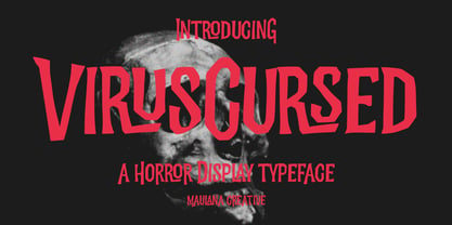 Virus Cursed is a Horror Vibe Decorative display font. With Bold Sharp stroke, Upright and fun character with a bit of ligatures. To give you an extra creative work. Virus Cursed font support multilingual more than 100+ language. This font is good for logo design, Social media, Movie Titles, Books Titles, a short text even a long text letter and good for your secondary text font with Script. Make a stunning work with Virus Cursed font. Cheers, Maulana Creative
 - Fishercat by Maulana Creative,
$16.00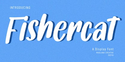 Fishercat is a cool handwritten font such a comic vibes. With sharp bold stroke, slant and fun character with a bit of ligatures. To give you an extra creative work. Fishercat font support multilingual more than 100+ language. This font is good for logo design, Social media, Movie Titles, Books Titles, a short text even a long text letter and good for your secondary text font with sans or serif. Make a stunning work with Fishercat font. Cheers, MaulanaCreative
 - Cedora by Lafontype,
$19.00 Cedora is a humanist sans serif designed with a playful appearance. Cedora comes in 14 styles with 7 weights ranging from thin to black each of which represents multiple languages allowing you to do editorial activities. In the terminal section the size is made a little thinner so that the shape doesn't look so sharp and the x-height and open counter have been taken into account so that it is good enough for a small text size.
 - Eggnog by Deniart Systems,
$20.00 Eggnog is a slightly heavy typeface that renders very well at even very small typesizes and looks sharp in large headlines. This typeface is egg-ish in shape and we've included a half-dozen eggs in case you're inspired to have some eggnog for breakfast! Eggnog includes a large assortment of extended characters to support many of Europe's languages, including Czech, Danish, Dutch, Esperanto, Finnish, French, German, Italian, Hungarian, Polish, Portuguese, Romanian, Spanish, Swedish, Turkish & Welsh.
 - MC Cartinz by Maulana Creative,
$16.00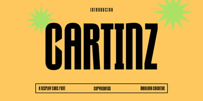 Cartinz is a modern sharp condensed sans display font. With bold consist stroke, fun character with a bit of ligatures and alternates. To give you an extra creative work. Cartinz font support multilingual more than 100+ language. This font is good for logo design, Social media, Movie Titles, Books Titles, a short text even a long text letter and good for your secondary text font with sans or serif. Make a stunning work with Cartinz font. Cheers, Maulana Creative
 - Infamous Rush by Maulana Creative,
$15.00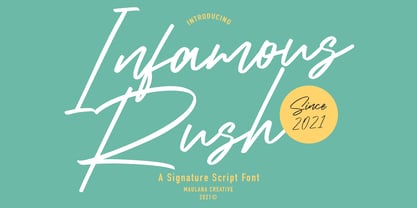 Infamous Rush is a fancy signature font. With sharp felt-tip stroke, slanted and fun character with a bit of ligatures. To give you an extra creative work. Infamous Rush font support multilingual more than 100+ language. This font is good for logo design, Social media, Movie Titles, Books Titles, a short text even a long text letter and good for your secondary text font with sans or serif. Make a stunning work with Infamous Rush font. Cheers, MaulanaCreative
