10,000 search results
(0.036 seconds)
- RT Singular by Estudio Calderon,
$23.00 RT Singular is a Sanserif with human touch based on Renaissance inscriptions. It was designed in orden to be use specially in health, beauty and scientific brands. The version 1.0 of RT Singular includes a Regular style with the following specifications. - Available as a suite of OpenType® features, as ligatures and alternate characters - A character set supporting most Central European and many Eastern European languages - German capital sharp S
 - Performance by ParaType,
$25.00 Performance is a set of perforated plates that appear to be characters. The construction of characters is described by sequences of holes whose shape and placement define the appearance and mood of font styles. An interesting feature of the design is an absence of side bearings and leading. Due to this feature a text article set by Performance forms a perforated coherent surface similar to postage stamp block.
 - Moby by Beware of the moose,
$15.99 Moby is based on a grid of squares and has four different variations – from sharp corners to rounded with two steps in between. The letter is playful despite its grid and has the most common punctuation marks making the moby usable in most western european languages ... and even usable for Icelandic texts. The letter is named after my dog, the cutest Barbet (French water dog) in the world.
 - Voska by Letrasupply Typefoundry,
$15.00 Voska font is a new collection of display serif typeface. Well designed font with high-contrast proportion, short serif and legit x-heights. Either sharp or rounded shape version both have classy, elegant yet explicit looks that works perfect mostly for branding, editorial purpose and more project on printing. Voska font contains alternate characters, ligatures and discretionary ligatures that give you an easy way to create awesome project.
 - Mezz by Adobe,
$29.00Clarinetist Milton ?Mezz? Mezzrow (1899-1972) was a remarkable jazz musician, as becomes evident upon reading his autobiography Really the Blues. His sharp tone and serpentine lines inspired English lettering artist and jazz lover Michael Harvey to create a condensed, oblique display typeface with the look of a chiseled alphabet in the musician's honor. Vertical formats such as book jackets and posters will be invigorated by Mezz as the display face. - Causten by Trustha,
$25.00 Causten is a geometric sans serif font family with maintains rationality in designing each form. With use the sharpness of the eyes, and remain logical, so that balance is maintained in each form. So, it will get a clean, neat, and perfect shape. Causten comes with 9 weights and matching oblique, making it 18 styles. It makes perfect for all creative projects. Also, some alternative glyphs will be an attractive choice.
 - Arta Machine by Wacaksara co,
$12.00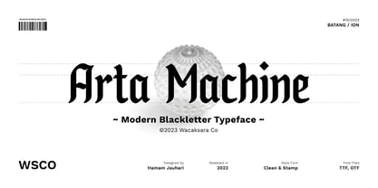 Introducing "Arta Machine" font, a modern blackletter typeface that skillfully combines classic elegance with contemporary flair. This versatile font family offers two unique styles: 'clean' for a sleek and refined appearance, and 'stamp' for a bold and rugged aesthetic. This font is perfect for use as poster designs, branding, logos, apparel, cards, packaging, quote, web, headline, tattoo, or other design needs. Features : Multilanguage Alternates PUA Encoded Ligatures Thank you.
 - Gamesome by Mevstory Studio,
$20.00 Gamesome is SPORTY, FUTURISTIC, and SHARP font. It will make your design looks sporty and also futuristic design. Gamesome Really fit for retro, futuristic, automotive, and gaming themed designs. Just look how it performs on the preview that I have provided, you will see its capabilities. But it will also work well with other themes. I can’t wait to see what you guys will come up with with using this font!
 - Nanami by Thinkdust,
$10.00 A font inspired by the oriental flavours of Japan, Nanami a confident font with clear, clean lines which are well defined without being obtrusive. The distinctly sharp edges slice through empty space like Samurai swords, proudly wearing curves and corners like a Samurai wears their traditional ceremonial armour, and just as fierce. If Nanami isn't quite floating your boat why not check out its counterparts Nanami Rounded and Nanami Handmade.
 - Prelom by Tour De Force,
$25.00 Prelom is modern serif family inspired by retro designed typefaces. Comes in 5 Normal weights, 5 true Italics and 5 Condensed weights. With tall x-height, sharp serifs like fishing hooks, original Italics and distinctive character overall design, Prelom is ideal family for editorial use or branding. Beside extended Latin character set, Prelom contains Cyrillic characters as well. It is equipped with Initials, Ligatures, Fractions and Tabular Numbers as OpenType features.
 - Hero fire by Alit Design,
$23.00 Hero Fire is a dynamic and bold typeface that embodies the essence of a powerful superhero. The characters are meticulously crafted with strong serifs, exuding strength and resilience. The design seamlessly blends classic typography with iconic superhero elements, making it a distinctive and impactful choice for display purposes. Illustrations: The typeface is adorned with illustrations inspired by the superhero universe. Each character is meticulously detailed, featuring elements such as: Fire: Flame motifs gracefully intertwine with certain characters, adding a touch of intensity and energy. Swords: Sharp and sleek sword illustrations are incorporated into select characters, symbolizing heroism and the strength to overcome challenges. Skulls: Subtle skull designs enhance the edginess of the typeface, capturing the essence of a fearless and bold superhero. Shields: Protective shields are cleverly integrated into specific characters, emphasizing the font's ability to safeguard and endure. Wings: Majestic wing illustrations accompany certain characters, representing the freedom and soaring spirit of a superhero. Characteristics: Bold and Strong: Hero Fire commands attention with its bold and robust characters, making it perfect for headlines and attention-grabbing text. Serif Display: The typeface features classic serifs that add a touch of sophistication, making it suitable for both modern and traditional designs. Versatile Usage: Hero Fire is designed for versatility, lending itself well to various design applications such as posters, comic books, branding, and more. Usage Recommendations: Hero Fire is particularly well-suited for projects that require a strong and impactful display font. Its superhero-themed illustrations make it a perfect choice for comic book titles, movie posters, gaming graphics, and any design where a bold and dynamic aesthetic is desired. Embrace the power of Hero Fire to infuse your designs with a heroic and captivating spirit!
 - The Auratype by Auratype Studio,
$9.00 Hai Folks! The Auratype is retro and classic typeface who inspired by the 60s - 80s designs with more unique explored style like swosh and alternate character. This font made from manual sketch with many many scratch then finished to font. Make your designs project with this font and extras illustration to give more superb. This font also suitable to design like logo, sticker, tees design, banner, poster, sign, display design, packaging and more superb designs! Enyoy with our product and feel free contact us for support! Features : Full set of Upper & Lowercase Character Number & Punctuation Swosh Alternate Extras Illustration Multilingual Language PUA encoded Opentype Features _________ ▼To using the feature OpenType Stylistic alternate (including swosh), you must use program that supports OpenType such as Adobe Illustrator CS, Adobe Indesign, Corel Draw X6-X7 and Microsoft Office 2010 or later versions. Additional way to access alternate/swoshes are using Character Map (Windows), Nexus Font (Windows), Font Book (Mac), or more program which has Pop Character. ▼For more information about accessing alternative, you can see on this link : http://adobe.ly/1m1fn4Y ✌ Get in touch with author https://www.instagram.com/wahyudwi.cc/ https://www.instagram.com/auratype/ https://www.behance.net/fontsfighters ❤ Thank you for purchasing our product and supporting us! We hope this font can be part of your designs project. If you have other queries, questions or issues, just feel free and have fun to contact us directly. We are glad if we can help you more! If you are happy with our product, please put your star into our design reviews, it was so fantastic moment for us. Thanks! :)
 - Dare by Device,
$39.00 Dare is a bold, single-weight titling font in capitals only. It is built from flat-pen strokes, with looping bowls and sharp, incised darts. It borrows a pinch of the hand-drawn swagger of Bauer's Cartoon (designed in 1936 by H. A. Trafton), used as Dan Dare's signature logo in the British boy's comic Eagle, and also the upward-pointing serifs of machine-moderne typefaces such as Dynamo (designed by K. Sommer for Ludwig & Mayer in 1930). Suitable for book covers, magazines, branding, packaging – any place where an impactful, contemporary statement is required, but still with an undertone of 20th century tradition.
 - ITC Tickle by ITC,
$29.99When Patricia Lillie was growing up, she thought the coolest thing in the world would be finding her own name listed in a library catalog. The fantasy came true in 1986 when her first children's book was published. Five more followed. The thrill of seeing her work on library shelves hasn't abated, but today, Lillie is just as likely to see one of her typefaces on the cover of a book. She has created several display faces and image fonts. My first typeface designs were based on lettering I'd done while working for a library, doing graphics work for the children's section," she explains. "I currently do a lot of web design, but type is my favorite thing." The Tickles (ITC Tickle and ITC Tickle Too) are Lillie's first ITC typeface releases. "I was playing around with a Sharpie marker one day and liked the way the letters looked," she recalls. "I started redoing the letters from scratch in Fontographer to see what developed, and liked those letters too." ITC Tickle is a bi-form font (with both cap and lowercase letters of the same size) that clearly breaks a typographic rule or two. ITC Tickle Too has the same basic lettershapes, but they've grown clusters of stipples that give a three-dimensional quality to the design. The result is a friendly, offbeat display family that's guaranteed to add a giggle to your work." - Kinoble by Jehoo Creative,
$19.00 Kinoble is a font that combines the clean look of sans-serif with a touch of handwriting for a natural feel. It comes in different weights, from regular to black, and has an italic style for added variety. This makes it suitable for various design purposes, from subtle to bold. Whether you need it for titles, logos, or any kind of display text, "Kinoble" adds a modern twist while staying easy to read. It's like a versatile tool in your design toolbox, offering a unique blend of style and clarity.
 - ITC Medea by ITC,
$40.99The designer of ITC Medea , Silvio Napoleone said: “I've always had an interest in early letter shapes, particularly how they influenced modern typographic designs. While I was on vacation in Greece, I had a chance to see, first-hand, examples of early letterforms and typography. They really made an impression on me.” The idea of combining the ancient and the modern to create something new was the primary inspiration behind ITC Medea. ITC Medea is essentially a careful blending of the modern sans serif with the elegant forms of the uncial. At first glance, Medea appears to be constructed of geometric shapes. However, closer inspection reveals many calligraphic subtleties. Stroke terminals are flared slightly in characters like the 'e' and 'c.' The top curve of the 'd' is more pronounced than the bottom, and characters like the 'o' are elliptical rather than round. “I gravitated towards the simplicity and legibility of the uncial and half-uncial,” Napoleone recalls. “I thought it would make a great titling font, and I was surprised at how attractive ITC Medea looked in a body text.” - HWT Bernice by Hamilton Wood Type Collection,
$24.95 HWT Bernice is an ornament font system designed by Marian Bantjes. The basic shapes were designed by Bantjes for the Hamilton Wood Type Museum's border stamping machine as a contemporary application for this 150 year old machine, which punches shapes into end grain wood to form continuous border patterns. The digital version expands a bit beyond the punch machine and allows designers to assemble a multitude of options using flipped and rotated variations of these 6 basic shape sets using simple keystrokes.
 - Eloisa by StuArt,
$9.00 Eloisa is based on the penmanship of Andrea Stuart's eponymous aunt. The slow, meticulous strokes with which Eloisa writes is the result of formal (and meticulous) instruction in cursive writing back in her secondary education in an exclusive all-girls school. The interesting mix of smooth curves and sharp strokes combined with the slanted orientation make for an elegant yet dynamic visual appeal. Eloisa is perfect for branding, invitations, greetings, or any classy rendering of text you may imagine. Be classy!
 - FS Dillon by Fontsmith,
$80.00 Bauhaus Geometric, economical, functional... The good, wholesome, modernist values that once fired up the tutors and students of the Bauhaus became the inspiration for FS Dillon after an exploration of the work of the pre-war art and design powerhouse in the Fontsmith studio. The font combines simplicity and directness with a characteristic Fontsmith warmth. Letterforms are compact, with a generous x-height, and built for maximum clarity and impact. The Bauhaus sought beauty through function. FS Dillon achieves it. Made for TV The weights of fonts for TV sometimes have to be adjusted so as not to “blow” on-screen. FS Dillon was originally drawn for the on-screen presentation branding of Film Four, whose primary colour was red. Black type on a red background looks heavier than white, so Dillon needed two weights that would allow white and black type to be used together, looking balanced and equal. Type design is an organic process. Years after developing FS Dillon, we revisited it, redrawing elements and adding italics to maintain consistency. Olympic You don’t get a much higher confirmation of the functional fitness of a typeface than to have it selected to guide visitors around an Olympic complex. FS Dillon was selected as the font for signage at some of the key venues at the London 2012 Olympic Park, helping to get spectators, athletes and officials from all over the world to their seats and starting blocks on time.
 - Vinila by Plau,
$30.00 Grotesques can answer a really wide variety of design problems and go from small sizes to large without missing a beat. Vinila is Flora de Carvalho's take on the genre. The family’s multi-purpose intention comes from having 4 widths - from compressed to extended, each with 6 weights and obliques. Rhythm and music played an important part in the design of this font, which started off as the lettering for a Brazilian Music album. Its distinctiveness comes from having powerful ink traps that go from elegant and supple in the lighter styles to commanding and impactful in the heavier styles. A distinct rhythm is achieved, making it a strong face for editorial design, branding projects and so much more. Vinila is the ideal companion to expressive display faces, where it serves a supporting role with a marked presence. We use Vinila every day in our own brand identity. We've had some of the best designers use it and test it in many different environments, printed, digital, mobile and more (they really like it!). Also in the package, Vinila Variable is an experimental version of Vinila, where you can have a virtually infinite mix of weights, widths and slant, all from a single font file. Available when you license the complete family. Vinila pairs happily with our cheerful Manteiga , elegantly with our organic didone Tenez and mechanically with our monospaced Odisseia . What other matches can you think of?
 - Lincoln Electric by Canada Type,
$30.00 Lincoln Electric started its life as an in-house experimental film type Thomas Lincoln drew shortly after concluding his work as part of Herb Lubalin’s famed crew in the late 1960s,. The master alphabet was drawn on illustration boards using pen and ink and press-type lines. The typeface was initially made for use in the branding and promotional material of Lincoln’s new design outfit. This alphabet’s forms are a spin on Bifur, the all-cap deco face designed by Adolphe Mouron (known as Cassandre) in 1929, and published by the Deberny & Peignot foundry in France. Lincoln Electric evolves Cassandre’s idea further by constructing new shapes more in line with minimalist principles rather than art deco geometry — something clearly evident in Lincoln’s minuscules, which exhibit a clear connection to Bauhaus ideas More than 50 years after the typeface’s design, Thomas Lincoln found the original film alphabet tucked away in his archives and brought it over to Canada Type for digital retooling. The result is a modern and thoroughly elaborate set of fonts that belonging prominently in a 21st century designer’s toolbox. The following features are included in Lincoln Electric: • Three fonts for chromatic layering. • More than 1900 glyphs in each font. • Expanded Latin and Cyrillic character sets. • Small caps and Caps-to-small-caps. • Six different sets of stylistic alternates. • Ordinals and case-sensitive forms. For a showing of the stylistic set variations and a sample of demonstration of chromatic layering, please consult this PDF.
 - Sánchez Niu by Latinotype,
$- Sánchez Niu is a redesign of Sánchez—one of the first font families by Latinotype designed in 2011. In the typedesign industry the terms ‘nova’, ‘neue’, ‘next’, ‘new’ are often used to refer to a typeface that has been modified in different ways: redesign, technical readjustments, greater number of characters, etc. At Latinotype we are now starting to use the word ‘niu’ to refer to these kinds of typefaces. Niu is an adaptation of the original word ‘new’, i.e., we have adapted this English word to the phonology and spelling of our own language but keeping the original meaning. Race mixing, diversity, change and adaptation are part of the essence of Latin American culture and, at Latinotype, we are all constantly expressing these elements in everything we do. Latin Power! This new version includes improvements that make it work well with longer text. Such improvements have not had a major effect on the look of the font, though. We have adjusted the original proportions and added a number of new characters as well as OpenType features such as small caps, oldstyle figures, tabular numbers and stylistic alternates. Sánchez Niu contains a set of 720 characters that support 219 languages. The font is well-suited for long text, headlines and logotypes, and it has been optimised for web usage. Sánchez Niu comes with two free fonts—Regular and Regular Italic! Corrections, digital editing and review by César Araya, Rodrigo Fuenzalida and Alfonso García.
 - Britti Sans by Nois,
$24.00 Britti Sans is a modern grotesque typeface that has geometric details and deep roots in industrial design principles. Its opentype features (alternate characters, localised characters, multilingual characters) give it greater versatility allowing it to adapt to a wide range of contexts. Among its features are contextual alternates, uppercase and lowercase localized Sharp S, numerators and denominators, a wide range of currency symbols including the Bitcoin symbol, emojis and icons, proportional and tabular numbers, fractions and circled numbers. The family has 7 styles + italics and a two-axis variable cut. Any suggestion to continue improving Britti Sans will be welcome.
 - Linoblox by Ana's Fonts,
$12.00 Linoblox is a sans and ornaments font family made using hand-carved linoleum, based on my Bloxhall art deco font. This collection has a quirky handmade look, but can also be used in retro and vintage designs, such as collages. The fonts have a realistic ink stamp texture that will look great in logos, notes and quotes, social media posts, and branding and packaging. Linoblox includes: Linoblox font in three variations: regular, jumpy and underlined An ornaments font, with doodles, swashes, smudges and frames (Please note: this is the same set of ornaments as the Notes From Home serif font)
 - Skaligari by PintassilgoPrints,
$24.00 Skaligari is a sharp and energetic typeface, somewhat expressionist, somewhat eighties, punk, new wave, always edgy. It's an all-caps font with two options for each letter and also for each numeral. Turn on the Contextual Alternates OpenType feature to instantly cycle these glyphs. There are yet stylistic alternatives, as well as graphical elements to add a twist here and there. Wild and full of energy, Skaligari is a winning choice for sports and music-related ideas, skate films and labels, logos, apparel, zines. And, as creativity has no limits, how about some wedding invitations? Just play it loud!
 - Grigory by Hanoded,
$15.00 I have always been fascinated by Grigory Rasputin, the rogue ‘monk’ who influenced the Russian Tsar Nicholas and - according to rumours - bedded the Tsarina. Grigory font was handmade with the use of a Chinese marker pen and rough paper. Grigory comes with all the trimmings; some alternate glyphs, a few double letter ligatures, a great amount of diacritics and basic Cyrillic as well.
 - Oceanside Sans by Bebop Font Foundry,
$19.00 Oceanside Sans is a display typeface produced in 2022 by Bepop Font Foundry. This typeface was born out of a month-long trip to the Bahamas. The scenery, both natural and architectural, was stunning, yet restrained. Each settlement featured its own flavor of beautiful hand-painted signs promoting local businesses - fresh fish & Conch, liquor, ice, gifts, and more. Oceanside pays homage to the visual vernacular of the islands we visited during our stay.
 - DT Skiart Lexiconic by Dragon Tongue Foundry,
$10.00 Apparently, Lexicon is the most expensive font in the world. ‘Skiart Lexiconic’ has been on a long growing path getting to where it is now. This font family was originally inspired by the san serif font ‘Skia’, by Mathew Carter for Apple. ‘Skiart’ was designed to feel more like a serifed font, but without any actual serifs. It took a small step between sans serif and serif fonts. Next on the path towards a serif font came Skiart Serif Mini, with tiny serifs added. This was a true serif font, although they were subtle. Then came ‘Skiart Serif Leaf’. and now... We present to you... DT Skiart Lexiconic. Having evolved from the Skiart family, we chose to give it the serifed styling of Lexicon. This is no way a copy or clone of Lexicon. It still has the basic bones of the original Skiart font, but the position, shape and size of the serifs were very much influenced by the world famous Lexicon font. DT Skiart Lexiconic is not the most expensive font in the world.
 - Sirkle by Invasi Studio,
$19.00 Sirkle is a semi-serif typeface for display, constructed with sharp and curvy characters. All Letters are handcrafted and made to fit each other perfectly without exception, with a modern and edgy style that gives them a unique look. Sirkle comes with ligatures, alternates, and supports 60+ Latin-based languages. The Sirkle is ideal for logotype, signage, posters, packaging, and much more! Features: Uppercase & Lowercase Numerals & Punctuation Alternates and Ligatures Multilanguage Supports 60+ Latin based languages
 - Pronter by Larin Type Co,
$16.00 Pronter It is a stunning vintage font that comes in three styles: Regular, Rough and Stamp style and also includes two font styles: shadow and rough shadow. This font contains many alternates, so make them up to the extent that your design's creativity is enough. Pronter font versatile it can be used both in modern projects and in vintage ones, as a main or additional one. This font is easy to use, has OpenType features.
 - Chevane Dream by GuseType,
$15.00 Chevane Dream is a decorative serif font, this font is inspired by starlight. The characteristic of this font is its sharpness and light weight, which makes this font look more elegant and luxurious. Chevane Dream can be used for various projects such as branding & identity, posters, magazines, logos, albums and much more. Chevane Dream also has several features including multilingual support glyphs, alternative glyphs and ligatures, this feature can make your writing look more stylish.
 - Gerova by Asenbayu,
$15.00 Gerova is a serif display font that is aesthetically pleasing and has beautiful curves. Gerova font also gives the impression of luxury with a sleek and sharp serif. This font provides a unique collection of glyphs that are perfect for completing a variety of projects, such as logo designs, identities, product labels, fashion, magazines and more. Gerova font features Open Type Format (OTF), alternative styles, ligatures, kerning, uppercase & lowercase letters, numeral, punctuation and multilingual support.
 - Estricta by Graviton,
$24.00 Estricta font family has been designed for Graviton Font Foundry by Pablo Balcells in 2017. It is a sans serif typeface with a geometrical and mechanic appearence, its sharp, angular edges provide a strong and solid design. It has been conceived to be most suitable for short and middle length text blocks, as well as on all sized headlines. Estricta consists of 12 styles. Each containing small caps and glyph coverage for several languages.
 - Enforcer by Tour De Force,
$25.00 Modern simple typeface expressing sharp and bright words without need for writing something really smart. Made by Dusan Jelesijevic one day when he left without anything smart to say or write, so he just grabbed a pencil and forced the paper to be cooperative. Someone said that this typeface looks like the ancient Greeks went in present future and used contemporary equipment for writing those letters. It is ideal for branding and avantgarde identities.
 - Martellas by Edignwn Type,
$18.00 The font collection is called "Martellas", it is a display font for logotype. These collections contain script and sans serif font. Every font comes with 4 style typefaces (regular, rounded, rough and stamp). Martellas give more extras 1 pack hawaii illustrations. This script font includes some alternates and ligatures. The Martellas matches apply in some designs such as the logo, poster, label, badge, packaging, t-shirt, branding, quotes and more custom design.
 - Oyko by The Northern Block,
$39.00 A geometric typeface that follows the grid but understands the rule to go off-grid. The design is sharp, square and engineered yet has plenty of craftsmanship in each character to give it a more human and friendly touch. Oyko is best suited to immersive interfaces, including mobile apps, video games, virtual reality and the web. Details include five purposeful weights with italics, over 500 characters, five variations of numerals, stylistic zeros, and OpenType features.
 - Bottle Fork by PizzaDude.dk,
$15.00 Here is my font with carved out letters, like a really bad stamp. Each lowercase letter has 3 different versions, and that makes your text more natural, organic and handmade. Normally I kern my fonts throughout, but this time there is no kerning at all...and that's odd, when we're not talking about monospaced fonts. Anyway, Bottle Fork has its flaws and jumpy x-height...but that's exactly the charm of it all! :)
 - PiS LIETZ Rathoga by PiS,
$38.00 Welcome to the Jet Age! LIETZ Rathoga jumps right out of the covers of vintage Space-Hero comics and onto your flickering cathode ray tube monitor. Fight the evil Zombies of the Stratosphere with sharp serifs! Race the Rocketmen with narrow stroke widths and fast italics! Loaded with Ligatures for more firepower! Team up with Rathoga's brothers and sisters from the LIETZ font family and you will triumph over the hordes of evil! Power on!
 - Marshfield by Adam Fathony,
$10.00 Monoline Fonts with strong identity for an outdoor design, camping, wild, journey, adventure, masculine, and etc. Opentype features are available on Marshfield such as Ligatures, Stylistic Alternates (Up to 6 Alternates), Contextual alternates, and Terminal Alternates. Marshfield Comes with 2 Type of Fonts, Script and Cursive. On each type of fonts have 3 different style, Clean (sharp corner), Round (Rounded Corner), and Rough (Rough Version). 6 Fonts in Total for completing your design style.
 - Articulat CF by Connary Fagen,
$25.00 Articulat® CF is a streamlined, updated take on midcentury type design. Strong, sharp, and well-spoken, Articulat was built from scratch to be bold, clean, and clear. Articulat® CF pairs well with itself, as it has many weights to choose from. It also works well with fonts that contrast strongly, such as Wayfinder® CF and Olivette CF. All typefaces from Connary Fagen include free updates, including new features, and free technical support.